10,000 search results
(0.04 seconds)
- Trevor by TypeTogether,
$36.80 Teo Tuominen’s Trevor took its first breath as a revival of an 18th century antiqua, but culminated in an entirely new and good-natured family. Trevor is an affable slab serif in nature: both heavy and kind. Known for their familiarity and their dark colour, the terminals of slab serifs put additional weight along the line to maintain an inky presence. Their clunky forms reveal slight immaturity and arouse the reader’s sympathy for the subject at hand. Trevor connects with others by consciously riding the line between being personal and commanding. One goal with Trevor was to pair the robust nature of a low contrast slab serif with more sophisticated elements, such as the ball terminals. So wherever one looks in Trevor, rounded corners rule the day, softening the overall appearance by mimicking ink spread made by old metal type. The easygoing look is tempered by very few inktraps and sharp corners, mostly to the inside of characters and in acute angles. Whatever Trevor is paired with, it has an altruistic outlook in that it sees the best in others. It’s the neighbourly type family — the neighbour you actually want. Trevor’s almost monolinear weight and high x-height give it a typewriter look in the extralight and light weights, but the whole family was made to work with many other font styles, design work, and information structures. It certainly finds its home in packaging and advertising, its sturdy verticality and narrowness fit the needs of headlines and intro text, and its seven weights are primed for plays and involved text needing many layers of distinction. The black weight is treated like a separate display style with altered ball terminals and serifs to capitalise on the added heft. Trevor’s seven roman weights cover the Latin A Extended glyph set to bring its kindly and commanding outlook to your projects. Along with alternate version of the ‘R’ in the black weight, its OpenType features include both tabular and proportional lining and oldstyle figures, ligatures, and fractions. The complete Trevor family, along with our entire catalogue, has been optimised for today’s varied screen uses.
 - Arrow Callouts JNL by Jeff Levine,
$29.00 Here’s a set of arrow shaped callouts in two varieties within one font. The black-on-white letters are on the upper case keys, and the white-on-black characters are on the lower case keys. The numerals 1 thru 10 in black-on-white are in the standard key positions, while the white-on-black numbers are on the same keys when engaging the “shift” key. The 'zero' key houses the number '10'. For a more dynamic look, the font is also available in an oblique version.
 - Spirala MF by Masterfont,
$59.00 So elegant yet so childish, makes this font a perfect choice for for sweets packaging...
 - Lehavot MF by Masterfont,
$59.00 Here is you next choice of the desired romantic greeting font you were looking for.
 - FG Tindra by YOFF,
$13.95FG Tindra is beautiful and works great for humorous or childish greeting cards - just try! - Buster by ITC,
$29.99Buster is a shadowed typeface that Tony Wenman designed in 1972 for Letraset transfer sheets. - H74 Lucky's Flash by Hydro74,
$20.00 Lucky's Tattoo Flash is a unique tattoo styled font with sharp edges and a mean streak that can only be defined by the amount of whiskey it consumes.
 - Grand Pix by TipoV,
$20.00 Grand Pix is a font family designed for the limitations of the old days low resolution monochromatic screens. Even with few pixels, it brings together legibility and personality.
 - Richy by Sensatype Studio,
$15.00 Richy unique chic font with any beauty shape and fancy ligature suitable for brand and logo design. Crafted by graphic designer who works for a lot of companies, we often are requested to design a logo in a unique style but with a classy shape. So, we try to brainstorming and create this font to make the idea is going out. This is perfect for BRANDING and LOGO DESIGN. You will get classy, chic, and certainly unique logos with this font. To make it look more unique, here we prepared some ligatures: ab ah cb ch eb eh ak am ck cm ek em an ap cn cp en ep ar cr er ca ea ss ob oh ub uh ib ih ok om uk um ik im on op un up in ip or ur ir ka at ga Richy-font is also included full set of: uppercase and lowercase letters multilingual support numerals punctuation Wish you enjoy our font. :)
 - ITC Puamana by ITC,
$29.99From the fluid brushstrokes of Teri Kahan's lettering comes a tropical treasure: ITC Puamana, graceful as a palm tree in the ocean breeze. “Puamana” is a Hawaiian word with several meanings; among them are “the blossoming of miraculous power” and “sea breeze.” ITC Puamana captures the essence of the tropics, suggesting the sway of palm trees in the ocean air. With its ragged edges and italic slant, this brush-written alphabet has a unique visual texture that graces the page with spirited movement. Sketched on the beach in Maui by west coast designer Teri Kahan, ITC Puamana first saw life as apparel art for a Hawaiian clothing company. Now this versatile typeface is a complete alphabet that's useful for both text and titles. ITC Puamana can be put to use in everything from book jackets to in-store signage. - Childish by Balpirick,
$15.00 Proudly Present, Childish Font. Childish is a Sweet Handwritten Font. This sweet font has nice smooth lines. Childish is perfect for product packaging, branding project, magazine, social media, wedding, or just used to express words above the background. Enjoy the font, feel free to comment or feedback, send me PM or email. Thank you!
 - Amourette by Lunas Type,
$19.00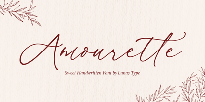 Amourette is a sweet and modern handwritten font. This sweet handwritten font invokes a feeling of nostalgia and warmth. Amourette comes with begining swashes, ending swashes and also love swashes connection. Amourette is perfect for many design needs such as merch, T-shirts, titles, wedding, book covers, social media posts, websites, events, and many more.
 - FS Conrad by Fontsmith,
$50.00 Art into type In 2008, Fontsmith were approached by their friend, Jon Scott, to investigate whether a typeface could assume the aesthetic of one artist’s body of work. Jon’s not-for-profit charity, Measure, was organising an event for the artist, Conrad Shawcross, whose giant mechanical installation, entitled Chord, was going on public display in the long-disused Kingsway tram tunnel in Holborn. Chord explores the way we perceive time, as either a line or a cycle. Two enormous machines with dozens of rotating arms and moving in opposite directions, weave rope with almost infinite slowness. An unusual brief Phil Garnham visited Conrad in his Hackney studio to get a feel for his work and ideas. “Conrad is a very clever and philosophical guy. He struggled to see how typeface design had any relevance to him and his art. This was going to be a challenge.” The artist presented the type designer with a pile of rope and a huge diagram of sketches and mathematical workings. “This was, in essence, my brief.” Phil developed three concepts, the simplest of which ticked all the boxes. “The idea of the strokes in the letterforms appearing and ending at peaks or points of origin fitted perfectly with Conrad’s idea of time occurring and ending at two ends of the sculpture.” Two versions Phil planned modules for two versions of the typeface: one with five lines in the letterforms and one with seven. He then drew the modules on-screen and twisted and turned them to build the machine that is FS Conrad. “This is not a simple headline typeface,” says Phil. “It’s not a rigid structure. It has varying character widths, and it’s informed by real typographic insight and proportions so that it actually works as piece of functioning, harmonious type.”
 - Aago by Positype,
$22.00 Aago is year-long project to create sans inspired by Positype's popular Aaux Next typeface, but not beholden to its previous conventions. 54 fonts spread across 3 widths, 9 weights, and each with matching italics. Drawn from the ground up to “just work well” across print and screen uses, Aago provides a comfortable, not too wide footprint with hopes of becoming a go-to utilitarian typeface perfect for packaging, branding and identity systems, poster and billboards, small and HD screens alike.
 - Lucky Goldfish by Hanoded,
$15.00 I am not really sure if goldfish in general are lucky. They tend to swim in circles in a bowl, but maybe, years from now, scientists discover that these goldfish count themselves lucky to be in a bowl, rather than in a stream in Asia. Personally, I think they’d be better off in a stream. Lucky Goldfish font is a cute and happy font, ideally suited for book covers, posters and toy packaging. Comes with a school of diacritics too.
 - SST Japanese by Monotype,
$236.99 Designed for global branding and supporting 93 languages, the SST® typefaces blend the organic readability and controlled structure of modern sans serif designs. In combining these attributes, the SST family is understated, versatile – and sure to be a timeless design. The SST Japanese Pro family has 6 fonts in total. It spans four weights from ultra light to bold, and has two condensed weights to further expand the family’s vast range of uses. SST’s subtle design traits provide a quietly handsome and consistently friendly typographic presence that can be used for just about any typographic application. Broad range branding applicability, combined with coverage for almost a hundred languages, makes SST one of the most widely accessible and usable typefaces available. Originally designed in partnership with the global consumer brand, Sony, the SST family is one of the most comprehensive type families available. Since extensive multi-lingual support was a critical design goal from the beginning, Akira Kobayashi, Monotype type director and primary designer on the project, turned to a network of local designers around the world for their individual language expertise. As a result, the details – which could be as subtle as stroke curvature and width – are consistent across Latin, Greek, Cyrillic, Arabic and multiple Asian languages. SST performs equally well in print and on-screen and the designs can be used at very small sizes in packaging and catalogs; while massive print headlines – even complicated wayfinding projects — pose no stumbling blocks to the family’s typographic dexterity.
 - Grafical by Halbfett,
$30.00 Grafical is a contemporary take on 19th-century sans serifs. In this family, the amount of geometry inherent within the letterforms has been amped up. Many shapes have received further streamlining, too. All the geometric forms you see have been optically corrected, ensuring their delivery of better legibility. Grafical ships in two different formats: depending on your preference, you can install the typeface as two Variable Fonts or use the family’s 16 static OpenType font files instead. The static fonts offer eight weights, running from Extralight through Black. Each weight has an upright and an italic font available. While the static-format fonts offer a good intermediary-step selection, users who install the Variable Fonts have vastly greater control over their text’s stroke width. The Grafical Variable and Grafical Variable Italic font’s weight axes allow users to differentiate between almost 1,000 possible font weights. That enables you to fine-tune your text’s exact appearance on-screen or in print. Grafical is the perfect tool for a range of design uses, including text on the web, text in print, and text in motion graphics. Its fonts are typographic workhorses – not just from their legibility perspective but also because of the amount of OpenType features they include. There are ligatures, for instance, as well as proportional and tabular lining and oldstyle figures, fractions, numbers placed inside circles, and even Roman numerals. Users can also substitute alternate versions of the “a”, “g”, “i”, “j”, “y”, “G”, and “Q” into their work.
 - Kontext H by Elster Fonts,
$20.00 Imagine a font that is easier to read the smaller it is – or the further away the text is. There are already many line screen fonts, I wanted to take it to the extreme and use as few lines as possible, while keeping the grid of the fonts metrics. The result is a typeface that lives up to its name. Each individual line makes no sense on its own; individual letters are only recognisable in the context of all associated lines, individual letters are most likely to be recognised in the context of whole words. Attached to a building wall, text would be readable from a great distance and become increasingly difficult to decipher the closer you get to the building. Placed on the ground or on a large flat roof, text would only be readable from an aeroplane or - depending on the size - in Google Earth. Kontext has old style figures, superscript numerals, case-sensitive questiondown and exclamdown and an alternative ampersand, 390 glyphs at all. Use the same value for font size and line spacing to keep the lines in the grid, or change the line spacing in 10% steps. Change the spacing in 100-unit or 25-percent increments increments to keep the grid. The »H« in the font name stands for horizontal (lines). The numbers in the font name refer to the brightness of the background and letters themselves, with the first number describing the background and the second the letters. Starting with »00« (white) to »200« (dark) See also my Family Kontext Dot
 - Achates by Karandash,
$29.00 Good, faithful Achates… Named after the trusty Trojan that followed Aeneas throughout his adventures, Achates is a humanist sans workhorse well suitable for broad range of design projects. Its soft, delicate and almost cursive shapes define warm and friendly typeface that is legible and easy on the reader's eye. Following into the footsteps of its namesake, it is humble, informal yet stable and trustworthy. Ideally suited for advertising and packaging, editorial and publishing, logo, branding and creative industries, poster and billboards, small text and signage as well as web and screen design. Achates provides a broad range of advanced typographical features such as language localization, alternates, stylistic alternates, extended ligatures, fractions and case-sensitive forms. It comes with a complete figure range set of old-style, lining and tabular figures. The family has extensive multilingual support, covering more than 70 Latin-based languages and specially designed Cyrillic with Bulgarian and Russian localization. As Achates was a humble hero, a devoted friend and faithful companion to Aeneas on his journey to greatness, so this font can be your trusty sidekick on your creative path. The marvelous Agate is also named after the Trojan hero. It is considered as the stone to call on for support when you need stability and grounding in your life. Along with its supportive energy, the Agate stone has been long admired for its incredible beauty. So… a Trojan hero or a thing of beauty – it is up for you to decide… or just maybe both!
 - Kontext V by Elster Fonts,
$20.00 Imagine a font that is easier to read the smaller it is – or the further away the text is. There are already many line screen fonts, I wanted to take it to the extreme and use as few lines as possible, while keeping the grid of the fonts metrics. The result is a typeface that lives up to its name. Each individual line makes no sense on its own; individual letters are only recognisable in the context of all associated lines, individual letters are most likely to be recognised in the context of whole words. Attached to a building wall, text would be readable from a great distance and become increasingly difficult to decipher the closer you get to the building. Placed on the ground or on a large flat roof, text would only be readable from an aeroplane or - depending on the size - in Google Earth. Kontext has old style figures, superscript numerals, case-sensitive questiondown and exclamdown and an alternative ampersand, 390 glyphs at all. Use the same value for font size and line spacing to keep the lines in the grid, or change the line spacing in 10% steps. Change the spacing in 50-unit or 25-percent increments to keep the grid. The »V« in the font name stands for vertical (lines). The numbers in the font name refer to the brightness of the background and letters themselves, with the first number describing the background and the second the letters. Starting with »00« (white) to »200« (dark) See also my family Kontext Dot
 - Arsapia by URW Type Foundry,
$49.99 Michael Hoffmann manufactures digital fonts for 30 years. At URW++ he contributed to the technological progress. Over the years, he also specialized in the ideal representation of fonts on screen and the complex assembly of international fonts with scripts of all countries. In his latest project he put the emphasis on developing a highly readable typeface. Less interested in the design as in the functionality of this typeface, he designed Arsapia which he has now installed as a system font on all his computers. Michael Hoffmann studied Japanology at the University of Hamburg and traveled in the early years of his professional activity frequently to Japan, there to train the IKARUS font production tools to Japanese customers. In his spare time he plays guitar or golf depending on the weather. The typeface Arsapia has been designed in such a way that all three font styles Light, Regular and Bold have the same width. When a user therefore opts for the use of Arsapia Light, even though he has already written his text in Regular, nothing changes with respect to the letter tracking. When choosing the Bold for emphasis: Nothing changes except the blackness of the letters. A font change does not engender unwanted line and page breaks of itself. All letters can be clearly distinguished from each other. 1 l I O 0 are all different. For programmers and lovers of monospaced fonts Michael Hoffmann has developed a fourth typeface: Arsapia Mono. This is the perfect terminal font.
 - FF Signa Round by FontFont,
$72.99 FF Signa Rounded is a natural complement to the rest of the FF Signa super family – and can stand on its own in a variety of print and on-screen applications. The design is Ole Søndergaard’s rounded branch in his FF Signa family three. In it, he took the distinctive shapes and proportions of FF Signa Sans and created a warm, inviting design for text and display copy. Like its parent design, FF Signa Round is not a humanistic sans, nor is it based on 19th-century grotesques. Its characters are minimalist interpretations of letterforms – distinctive, yet easy to read. Thanks to FF Signa Round’s large x-height, open counters and simple character shapes, the design does not overpower the message – and draws the reader in. At substantial sizes, especially in the bolder weights, the design communicates with amiable conviction. At text sizes, FF Signa Round remains inviting and legible. It can be used as a companion to the rest of the FF Signa family, providing depth of style and breadth of reach. The collection of designs can also be used on their own for brand, brochure, publication, and way-finding design in digital and hard copy environments. Like the rest of the FF Signa family, OpenType® Pro fonts of FF Signa Round provide for the automatic insertion of ligatures and alternate characters, and also offer an extended character set supporting over 100 languages, including most Central European and many Eastern European – in addition to Cyrillic and Greek.
 - Ropers by Ardyanatypes,
$17.00 Feel how the tones mesmerize you - say HELLO to "Ropers" - a Bold Serif Typeface with agile and alive ligatures and alternates. Designed to use in mid-tones harmonic, the stark contrast of the bold & wondrous uppercase of the regular serif balances calmly to mix matches your works More unique with the ligatures and alternates shape stream will make your typography truly eccentric Ropers are easy to pair with other fonts and no special software is required to type out the standard characters of the Typeface. To access the Opentype Ligatures and Alternates you will need software that supports Opentype features in fonts. super match with various types of works such as promotional themes, greetings, products cover, brands logo, and much more. No need to worry, Ropers are also available in multi-language usage, which makes your work easier. Thank you and have a nice day
 - Shakeglow by Alandya TypeFoundry,
$12.00 Shakeglow script is an elegant combination of a script and a narrow modern serif. It is slender, feminine and classy, while still maintaining a friendly feel. Shakeglow script is versatile and will work perfectly for fashion, e-commerce brands, trend blogs, wedding boutiques or any business that wants to appear upscale and chic. With its many variant stylistic characters, Shakeglow script is perfect for creating original and functional designs. It has extensive language support and alternates, stylistic sets that add visual interest to every letter. You can use the Shakeglow script for high-end logotypes and magazine headlines, but let’s not forget greeting cards, invitations, posters, book covers, ads and the various web and screen usages. The overall feel of the font is elegant, sophisticated with a touch of informal and it is ideal if you want to convey a sense of class and style.
 - Trakya Sans by Bülent Yüksel,
$19.00 Thrace (/θreɪs/; Greek: Θράκη, Thráki; Bulgarian: Тракия, Trakiya; Turkish: Trakya) is a geographical and historical region in Southeast Europe, now split among Bulgaria, Greece, and Turkey, which is bounded by the Balkan Mountains to the north, the Aegean Sea to the south, and the Black Sea to the east. It comprises southeastern Bulgaria (Northern Thrace), northeastern Greece (Western Thrace), and the European part of Turkey (East Thrace). Trakya Sans is a modern sans serif with a geometric touch. Futura, Avant Garde and the like. It has a modern streak which is the result of a harmonization of width and height especially in the lowercase letters to support legibility. Ideally suited for advertising and packaging, editorial and publishing, logos, branding and creative industries, posters and billboards, small text, way-finding and signage as well as web and screen design. Trakya Sans provides advanced typographical support for Latin-based languages. An extended character set, supporting Central, Western and Eastern European languages, rounds up the family. The designation “Trakya Sans 500 Regular” forms the central point. The first figure of the number describes the stroke thickness: 100 Thin to 900 Bold. "Trakya Sans" comes in 5 weights with matching italics plus "Trakya Sans Alt", also 5 weights and italics so a total of 20 styles. The family contains a set of 630+ characters. Case-Sensitive Forms, Classes and Features, Small Caps from Letter Cases, Fractions, Superior, Inferior, Denominator, Numerator, Old Style Figures just with one easy touch in all graphic programs. Trakya Sans is the perfect font for web use. You can enjoy using it.
 - Trakya Slab by Bülent Yüksel,
$19.00 Thrace (/θreɪs/; Greek: Θράκη, Thráki; Bulgarian: Тракия, Trakiya; Turkish: Trakya) is a geographical and historical region in Southeast Europe, now split among Bulgaria, Greece, and Turkey, which is bounded by the Balkan Mountains to the north, the Aegean Sea to the south, and the Black Sea to the east. It comprises southeastern Bulgaria (Northern Thrace), northeastern Greece (Western Thrace), and the European part of Turkey (East Thrace). Trakya Slab is a modern slab serif with a geometric touch. It has a modern streak which is the result of a harmonization of width and height especially in the lowercase letters to support legibility. Ideally suited for advertising and packaging, editorial and publishing, logos, branding and creative industries, posters and billboards, small text, way-finding and signage as well as web and screen design. Trakya Slab provides advanced typographical support for Latin-based languages. An extended character set, supporting Central, Western and Eastern European languages, rounds up the family. The designation “Trakya Slab 500 Regular” forms the central point. The first figure of the number describes the stroke thickness: 100 Thin to 900 Bold. "Trakya Slab" comes with 5 weights and italics; "Trakya Slab Alt" also comes with 5 weights and matching italics, giving a total of 20 styles. The family contains a set of 630+ characters. Case-Sensitive Forms, Classes and Features, Small Caps from Letter Cases, Fractions, Superior, Inferior, Denominator, Numerator, Old Style Figures just with one touch, easy to access in all graphic programs. Trakya Slab is the perfect font for web use. Enjoy using it.
 - Silver Raven by Ferry Ardana Putra,
$12.00 Hello there! We are introducing our new font - Silver Raven! This font is font created and inspired from the street writing of New York, and generated by creative hands of graffiti addictions. It has an incredibly unique design that can be perfect for a range of creative branding and packaging projects. Take your designs to the next level with this stunning font! You can apply this font to t-shirt designs, posters, covers, video thumbnails, merchandise, wall, and so on to make it look special. ——— Silver Raven features: A full set of uppercase and lowercase Numbers and punctuation Multilingual language support PUA Encoded Characters OpenType Features Layered Style +257 Total Glyphs Graffiti Swashes and Ornaments included! ——— Silver Raven Includes: Silver Raven (OTF/TTF) ——— ⚠️To enable the OpenType Stylistic alternates, you need a program that supports OpenType features such as Adobe Illustrator CS, Adobe InDesign & CorelDraw X6-X7, Microsoft Word 2010 or later versions. There are additional ways to access alternates/swashes, using Character Map (Windows), Nexus Font (Windows), Font Book (Mac) or a software program such as Pop Char (for Windows and Mac). ⚠️For more information about accessing alternative, you can see this link: http://adobe.ly/1m1fn4Y ———
 - Tipo Movin CDMX by Ixipcalli,
$- La versión propuesta por la SEMOVI (Secretaria de Movilidad) es un estilo más angosto y ortográfico, creadó con la finalidad de aligerar las aplicaciones tipográficas del sistema. Se emplea oficialmente en todas las aplicaciones del sistema de Movilidad Integrada de la Ciudad de México. El creador de la tipografía es Lance Wyman. En esta edición, los tipos minúsculas son una adaptación “no oficial” para el Tipo Movin CDMX, enriqueciendo la tipografía a un estilo visual de altas y bajas, por lo que se prescinde del diseño base como trabajo propio para enfatizar los tipos minúsculas exclusivamente, además de que se han añadido algunos caracteres de acentuación extendiendo su uso a otros lenguajes. Los tipos son una nueva propuesta por Ixipcalli en el presente año 2023. The version proposed by SEMOVI (Secretary of Mobility) is a narrower and more orthographic style, created with the purpose of lightening the typographic applications of the system. It is officially used in all the applications of the Integrated Mobility system of Mexico City. The creator of the typeface is Lance Wyman. In this edition, the lowercase types are an “unofficial” adaptation for the Tipo Movin CDMX, enriching the typography to a visual style of highs and lows, so the base design is dispensed with as my own work to emphasize the lowercase types exclusively, In addition, some accentuation characters have been added, extending their use to other languages. The types are a new proposal by Ixipcalli in the current year 2023.
 - Marian Churchland by Comicraft,
$39.00 Tall, thin and elegant, Marian Churchland’s fonts are very much like her.. and now available from those awfully nice chaps at Comicraft to allow you to pretend that you are too! Marian Churchland was born in Canada in 1982, and was raised on a strict diet of fine literature and epic fantasy video games. She has a BA in Interdisciplinary Studies (English Literature and Visual Arts) from the University of British Columbia, and has been doing professional illustration work, including book covers and magazine articles, since she was 17. Last year, she became the first woman to solo-illustrate a CONAN story, and this year she’s illustrating three issues of ELEPHANTMEN for Image Comics. See the families related to Marian Churchland: Marian Churchland Journal.
 - Xyngia by ROHH,
$40.00 Xyngia is a professional modern sans serif typeface. Thanks to its excellent legibility it is a great choice both for on-screen use as well as print purposes. Xyngia is designed for use in long and short paragraphs of text, headlines and user interfaces. Its design nuances gives it distinctive character making it an interesting option for brand identification and logo design. Xyngia consists of 22 fonts - 11 weights and their corresponding italics. It has extended language support (over 1000 glyphs) and true italics, as well as broad number of OpenType features, such as small caps, case sensitive forms, standard and discretionary ligatures, stylistic sets, contextual alternates, lining, oldstyle, tabular and small cap figures, slashed zero, fractions, superscript and subscript, ordinals, currencies and symbols.
 - Gernsheim by Brenners Template,
$19.00 Gernsheim is a semi condensed display sans serif font family. This font family has been created for use in headlines and logo display fitted on showcase screen. 9 weights and 18 font styles make up the initial release. To increase the adoption of a wide range of display fonts, the individual glyphs' handle fluctuations were subtly applied. The compromise of disproportion between straight lines and curves improves glyphs autonomy and relieves tension. And by applying rounded corner effects to each style, it presents the reader with softness and comfort. It is designed so that the rebellious disproportion created by heavy styles transition to flat and classy tenderness as the thin style approaches. Try the uniqueness and excitement of individual styles for yourself
 - Bs Monofaked by Feliciano,
$37.92Monospaced become very popular among graphic designers. Nevertheless, I’ve noticed that in most cases that designers use monospaced typefaces is not because of their particular features caused by the strict rules of design — all characters share the same advanced width — rather because of it’s ‘electronic derived’ appearance. So, I decided to create a typeface that keeps the characteristics that, in my opinion attract designers to this particular sort of types, but deliberately break the main rule: characters do not share the same width — but they they look like they do! Characters are better balanced compared to truly monospaced types, giving more even typographic color while used in text setting. One weight might enough to please electronic type lovers. Designed in 2000. - Rooney by Jan Fromm,
$45.00 Rooney is based mainly on old-style serif construction principles, such as the angle of stress, the open letterforms and the medium contrast, which lends the typeface a serious feel. Nonetheless Rooney is equipped with rounded shapes and soft curves that add a warm and smooth overall impression. Rooney combines these two different approaches: It has distinctive, original letterforms, but remains very readable and versatile. It includes six weights from Light to Black and Italics. The Rooney family comes with a Pro version, which is intended for professional designers. It contains lots of OpenType features such as small caps, ligatures, different figure sets and alternate glyphs. With around 840 glyphs, Rooney Pro is a powerful tool for any kind of typographical task.
 - CAL iWasLike Pro by California Type Foundry,
$47.00 CAL iWasLike™ Pro is totally for sure the amazing friendly font you need for, like, everything! Its conversational tone makes reading fun and enjoyable! Designed for friendly, paragraph reading ease on screen or medium res print, with the full set of OpenType features. It's design gives it the most even text shade for digital fonts, and has less holes in the text for easier reading. iWasLike™ is a large x-height, informal text and caption font designed to render well for Apple Quartz and Microsoft devices, low res to high res printing, with full Western Central European, and Turkish support, small caps, superiors, inferiors, fractions, as well as some special additions like music symbols, pricing feature, arrows, and two sets of circled numbers.
 - Trebuchet MS by Microsoft Corporation,
$49.00Trebuchet™ Family, designed by Vincent Connare in 1996, is a humanist sans serif designed for easy screen readability. Trebuchet Family takes its inspiration from the sans serifs of the 1930s which had large x heights and round features intended to promote readability on signs. The typeface name is credited to a puzzle heard at Microsoft, where the question was asked, 'could you build a Trebuchet (a form of medieval catapult) to launch a person from the main campus to the consumer campus, and how™' The Trebuchet fonts are intended to be the vehicle that fires your messages across the Internet. 'Launch your message with a Trebuchet page'. Character Set: Latin-1, WGL Pan-European (Eastern Europe, Cyrillic, Greek and Turkish). - Tyneside by Trequartista Studio,
$25.00 created in 2023, Tyneside is corporate and not too eccentric, but still has a strong character that makes it a the perfect starting point for the new Tyneside text font family. Clarity is very important when displaying a lot of information on the screen. The ranking table is full of names and times and while the display typeface should stand out, the text pieces should be eye-catching and very legitimate. We sharpened the corners, made some shapes easier to read and more modular, clean and sporty overall. We are very satisfied that Tyneside managed to capture the “spirit of sporting enthusiasm” in the personality of the typeface. We hope to create a growing family of typefaces in the future and maintain our partnership
 - Sensa by Fontfabric,
$47.00 Sensa is a handmade font family consisting of 21 fonts. It is divided into 6 subfamilies, each contributing to its wide range of visual power – Sensa Brush, Sensa Pen, Sensa Wild, Sensa Sans, Sensa Serif and Sensa Goodies. Only your imagination is the limit. Pick any of the font as a leading one and the rest of the fonts can accompany it with ease. To work together in all possible combinations, all fonts in this package were created with that simple idea in mind. Sensa is applicable for almost every design project - from advertising, packaging, editorial and branding, to web and screen projects. For a beauty and tender sensation or for more male and strong communication – you have a wide selection.
 - Alterhard by Popskraft,
$19.00 The Alterhard typeface combines the inimitable craftsmanship of the great condensed styles of the early twentieth century and at the same time looks organic and even unusual among modern ones. A distinctive feature of the Alterhard typeface is the smooth transition from the geometrically strict extremely compressed shapes of the bold typefaces to the classic sparse shape of the compressed typeface in light weights. Also unusual for vertical fonts are oblique elements in lowercase letters, which give uniqueness, liveliness and originality to the classic type of font. This allows the Alterhard typeface to be used in any design field such as corporate identity, typography, posters, web design, and other design areas. The set comes in 9 font sizes for rich typography.
 - Anelo by SullivanStudio,
$9.95 Anelo is about beauty with objectivity. A handmade sans serif with a humanist style. 889 Latin and Greek glyphs covering lots of Western and Eastern European alphabets. You can use Anelo from a LaTeX equation (there are 117 Greek/Coptic glyphs; please see image #6 in the gallery for an example of an Anelo/Computer Modern combination) to billboards and traffic signs. Its crisp, upright, handmade aspect takes communication to a direct and personal level. Anelo has some important OpenType features, like kerning, standard ligatures, old style/tabular/proportional figures and diagonal fractions. There are 25 currency symbols, including Euro ₠ €, Shekel ₪ and Bitcoin ₿. Each Anelo style has a condensed version, which gives room to many interesting combinations. For best results on screen, the Semibold Family is recommended.
 - Jheronimus by Aronetiv,
$9.99 Jheronimus is a neo-humanistic grotesque. A font with an open aperture. It has straight terminals and a moderated height of the lowercase characters. Jheronimus is a font with a uniform ordered rhythm. Well readable on the screen in small size. Consistent letter proportions. The rounded elements are pill shaped and the font has pronounced connections strokes. Punctuation marks are well decorated. Jheronimus will satisfy the demanding typographer. There are oldstyle figures in the best traditions of humanism. The bright recognizable character is combined with a clear form. This creates a sharp, crystal impression. Jheronimus is suitable for the design of an ambitious, temperamental text. It is stylistically similar to the paintings of the Dutch artist Hieronymus Bosch. From this comes its name.