10,000 search results
(0.039 seconds)
- Songbook JNL by Jeff Levine,
$29.00 Songbook JNL is based on a promotional blurb from the back of a piece of vintage sheet music. Its interesting style of slab serif lettering with strong Art Deco influence was worthy of re-drawing into a digital typeface. This design is the 900th release from Jeff Levine Fonts since its inception in January of 2006.
 - Old Songs JNL by Jeff Levine,
$29.00 Hand lettering of the song title on the 1914 sheet music for “Dear Old Girl” was the working model for Old Songs JNL. A condensed Roman typeface available in both regular and oblique versions, this titling font exhibits a casual, nonconformist design that isn’t quite traditional, nor is it part of the Art Nouveau movement popular at the time.
 - Meilleur by Heinzel Std,
$16.00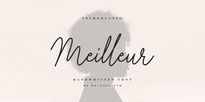 Meilleur is a flowing handwritten font, described by an elegant touch, perfect for your favorite projects. It looks stunning on wedding invitations, thank you cards, quotes, greeting cards, logos, business cards and every other design which needs a handwritten touch. Fall in love with its incredibly distinct and timeless style and use it to create spectacular designs!
 - Busted Soul by Heinzel Std,
$17.00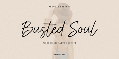 Busted Soul is a flowing handwritten font, described by an elegant touch, perfect for your favorite projects. It looks stunning on wedding invitations, thank you cards, quotes, greeting cards, logos, business cards and every other design which needs a handwritten touch. Fall in love with its incredibly distinct and timeless style and use it to create spectacular designs!
 - Beauty Sabila by Rastype Studio,
$14.00 Beauty Sabila Script are beautiful and modern fonts. Looks amazing on wedding invitations, thank you cards, mothers day card, quotes, greeting cards, logos, business cards and any other design. This font is PUA encoded which means you can access all glyphs and swashes with ease! The font includes OpenType features with alternative styles, ligatures, and multiple language support.
 - Gothic Christmas by Mvmet,
$16.00 Gothic Christmas is a spooky Christmas display font yet playful and fun on the same time. You can use it for anything ranging from t-shirts, book designs, and greeting cards to stickers and posters, or anything that needs a casual touch. Fall in love with its incredibly versatile style, and use it to create lovely designs!
 - Guardian Circus by Balpirick,
$15.00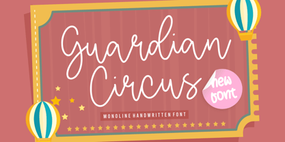 Guardian Circus Font. Guardian Circus is a Monoline Handwritten Font. Guardian Circus is a sweet, thin and natural handwritten font. It looks friendly and adaptable and it will certainly enhance each and every one of your designs. Guardian Circus also multilingual support. Enjoy the font, feel free to comment or feedback, send me PM or email.
 - Conscription JNL by Jeff Levine,
$29.00 The sheet music for the 1914 Word War I comic novelty song "When the War Breaks Out in Mexico I'm Going to Go to Montreal" had one of those overly-worded song titles popular during this period (13!), along with interesting sans serif hand lettering. It now debuts digitally as Conscription JNL in both regular and oblique versions.
 - Deco Pen JNL by Jeff Levine,
$29.00 Hand lettering found across the sheet music cover of 1931's "Bend Down, Sister" [from the Eddie Cantor film "Palmy Days"] covered a couple of varying Art Deco styles; both made with a round-tipped pen nib. Deco Pen JNL combines the best of both styles into one design that's available in both regular and oblique versions.
 - Ipsum Semi by Rawblind Basetype,
$19.99 Fresh new type from the Netherlands. An original, lively, eclectic semi-slab serif intended for general use. Quirky yet seriously usable, the family features enough weights to fit any design situation and all fonts are suitable for screen and print. Full Latin-script language support, including Maltese, Turkish, Vietnamese, Greenlandic, Azerbaijani, Afrikaans and localized Polish and Romanian. Download the Quick Start Cheat Sheet here to help you get the most out of Ipsum Semi. For requests or remarks, feel free to get in touch.
 - Tag Banger by Okaycat,
$12.50 TagBanger WADE1 is the first in a short graffiti font series. This series will showcase the hand-styles of various mature street artists that Okaycat is working with. This first release highlights the style of one such graffiti writer, WADE1, who has an eclectic writing style after many years proliferating street art. Long-term graffiti artists develop their own style over their careers, spending as many endless hours honing their letter-forms as any full-time professional typographical artist. Style, individuality, and originality are everything. These attributes are key to the graffiti artist's tao. A writer who copies, or "bites" loses respect -- their work will be painted over or "crossed out" by all other writers. Okaycat's TagBanger series aims to demonstrate just how widely these individual styles can diverge, likely due, at least in part, to the social pressures of a community that ruthlessly punishes copycats. WADE1's tags were transformed into vector format from a generous sampling of their most recent scrawls. Our TagBanger series may not be composed of the most legible or beautiful fonts, but we imagine there are uses for these whenever highly unusual handwriting is needed. TagBanger WADE1 is extended, containing the full West European diacritics & a full set of ligatures, making it suitable for multilingual environments & publications.
 - Christmas Spirit 2 by Alphabet Zoo,
$14.00 Christmas Spirit was designed to incorporate some of the most familiar icons of the Christmas season into a highly decorative font. Each letter is unique with its own design, and lends itself to a festive environment. From the A as a decorated Christmas tree, to a reindeer that translates into a Z, Christmas Spirit will liven up holiday greetings, invitations, and announcements.
 - Olivia Sans by Stabenfonts,
$45.00 The rounded Sans with edges. Olivia Sans got curves on the outlines and edges on the inlines. So it can be very legible and space efficient at the same time: the curves keep the distinctions between the letters, the corners keep the influences from broadnibbed pens with a subtle horizontal stress for great legibility. Olivia has personality without being obtrusive. Three weights (light, regular, bold) are equipped with real italics, SmallCaps, different sets of figures, accents for almost every latin script, arrows, symbols. A fourth weight (black) comes without italics or SmallCaps, but all the other features. Olivia: with or without.
 - Egyptienne F by Linotype,
$29.99Adrian Frutiger designed Egyptienne F for the Deberny & Peignot Foundry in 1956. This was the first of several Egyptians designed by Frutiger, see also Glypha and Serifa. “Egyptian” or “Egyptienne” is a typographic designation for roman typefaces with slab (or square or rectangular) shaped serifs; and those that have bracketing between main stroke and serifs (like this one) are known as “Clarendon-style Egyptians”. Egyptienne F has a medium x-height and excellent character spacing for setting text in small point sizes. Legible, flexible, and neutral in appearance, Egyptienne F is a good choice for books, magazines, and on-screen presentations. - Whatzis JNL by Jeff Levine,
$29.00Whatzis JNL is a collection of over 85 decorative question marks gathered from the Jeff Levine font collection and assembled into one convenient file for use in specialty projects where ad copy is based on questions or curiosity. No need to search through dozens of fonts for your background images, as they're all here. Ads such as "Have a question about your insurance?," "What's New at Harper, Jones and Harper?" or "Ask Us! - We are the Experts!"... or signs saying "May We Help You?" benefit from some well placed display question marks - especially when printed in contrasting colors or screened-back in halftones. - Letro by Thinkdust,
$10.00 Letro’s sturdy, slab serif form and sleek alternates make it perfect for any sort of display, whether it’s professional or personal, casual or serious, big, small, on a computer screen or on paper. Letro does everything: elegant while slightly blocky, stylised while legible, solid but full of finesse, this font isn’t the jack of all trades, it comes close to being the master. Letro comes in two weights, light and regular, with support for a multitude of languages. When you need a font with serifs to get the job done, Letro is your go to type.
 - Olivia Serif by Stabenfonts,
$45.00 The rounded Serif with edges. Olivia Serif got curves on the outlines and edges on the inlines. So it can be very legible and space efficient at the same time: the curves keep the distinctions between the letters, the corners keep the influences from broadnibbed pens with a subtle horizontal stress for great legibility. Olivia has personality without being obtrusive. Three weights (light, regular, bold) are equipped with real italics, SmallCaps, different sets of figures, accents for almost every latin script, arrows, symbols. A fourth weight (black) comes without italics or SmallCaps, but all the other features. Olivia: with or without.
 - Kubo Sans by Jehoo Creative,
$15.00 Kubo Sans is a Typefamily based on square geometric shapes and subtle as possible. It is designed to be as thick and strong as possible following its basic shape as well as being versatile. Equipped with 10 weights ranging from Thin to Extra Black, making Kubo sans very suitable for use on the body and even perfectly applied to headlines / titles, giving a bold and strong impression to the design. With a complete weight, Kubo sans will be very integrated for design needs such as, Poster, Cover, Magazine, Web Ui, social media posts, advertisements, books, quotes, movie screens, thumbnails, and many more.
 - Isotonic by Emtype Foundry,
$69.00 Isotonic started out as a spin-off with the idea of creating a text oriented version of Ciutadella, it has since taken on a life of its own. Building on a foundation that has proven to work very well, we decided to open the counters and increase the x height. Even though it is not strictly a text font, it works surprisingly well in body sizes and screens. The soft corners gives charm, closeness and an appropriate voice for sports, science, tech, economy etc. Learn more about the design process of Isotonic at the Emtype’s Blog.
 - Nubian by G-Type,
$39.00 Nubian was one of the first typefaces ever designed by G-Type and is an elegantly proportioned, crisply modern sans serif family. Comprising five weights from Thin to Bold with true matching italics, each font also includes two sets of figures (lining and old-style numerals) and an extended European character set. Nubian has a noticeably open, semi extended appearance providing very even 'colour' and excellent legibility when set as text. The contemporary letterforms work well at all sizes in print and on screen making Nubian a great choice across all media. The family has been updated to OpenType with extended language coverage.
 - Lucida Calligraphy by Monotype,
$40.99 Lucida Calligraphy is a chancery cursive script typeface family designed by Kris Holmes and Charles Bigelow. It is a very legible and readable typeface, designed for use on screen and in print environments. Lucida Calligraphy was originally released in one weight. It is now available in five weights, from Thin to Black. Lucida Calligraphy is part of the Lucida superfamily of fonts from Bigelow & Holmes. Lucida is highly regarded for legibility and its extensive range of type styles. The Lucida Calligraphy typeface family has a Standard character set with 255 glyphs supporting the basic range of Latin languages.
 - Niveau Grotesk by HVD Fonts,
$40.00 Niveau Grotesk—the companion of Niveau Serif —is a type family of six weights plus matching italics and small caps. It was designed by Hannes von Döhren in 2013. Influenced by classical nineteenth-century faces, the fonts are based on geometric forms. Because of its straight architecture, Niveau Grotesk has a “punch” in big sizes but is very legible in smaller sizes and longer texts—in print or on screen. Niveau Grotesk is equipped for complex, professional typography with alternate letters, arrows, fractions and an extended character set to support Central and Eastern European as well as Western European Languages.
 - Misha Gergoval by Rotterlab Studio,
$15.00 Misha Gergoval Script is a new and fresh font script that comes in a vintage and neat style. This font can be used easily, even in mixing and matching with other fonts so that it can provide alternatives and new sensations for designers or craftsmen, in working on various projects. Misha Gergoval comes with uppercase letters, lowercase letters, numbers, punctuation, and so many variations on each character including OpenType alternatives to allow you to customize the design. This font is perfect for all your projects such as wedding invitations, greeting cards, branding materials, business cards, quotes, posters, badges, greeting cards, or you can use these fonts for various (vintage) logo projects and more. The characters are ideal for creating interesting messages, mixing and matching Misha Gergoval with a group of alternative characters that are suitable for your project.
 - Mimeograph Lettering JNL by Jeff Levine,
$29.00 Mimeograph Lettering JNL is based on one of the numerous plastic lettering templates once manufactured by the A.B. Dick Company of Chicago and is available in both regular and oblique versions. The mimeograph utilized a porous drum which inked the backside of a waxed stencil sheet. Unlike traditional stencils which have cut out areas that are directly inked or painted, a mimeo stencil has the area to be printed scratched away by removing the wax coating with a stylus. The resulting image allows the ink from the drum to seep through the sheet and transfer to the blank paper. As with a companion font (Mimeograph Template JNL), the character shapes follow the routed letters of the template, complete with rounded terminals. A previous font release [designed with flat terminals and some alternate characters] is available as Interoffice Memo JNL.
 - Katlynne by Ryan Williamson,
$5.00 Katlynne is unpredictable. Katlynne is erratic. Katlynne is beautiful. Katlynne is an alternating contrast, sans serif type family. Arbitrarily separating the characters into ‘rounder’ and ‘straighter’ letterforms to determine what contrast each glyph will take. Katlynne is inspired by the observations made while watching the inexperienced use of broad tip pens. I found how and when individuals rotated their pen gave a visually intrusive, if not also pleasantly conspicuous effect. Often, the pen would naturally rotate horizontally (vertical contrast) on the rounder letterforms, and vertically (reverse contrast) on the straighter ones. This is more or less the formula Katlynne adopts as the contrast changes throughout the styles. Katlynne’s severity of contrast varies from ‘Negative Three’ to ‘Positive Three’ in four weights. With a central style ‘Book’ being the sensible, low contrast font in the family. Within the family there are four weights with 7 contrast styles, with complimenting true italics. Giving a total of 56 fonts! Katlynne's array of options works for creating stylistic similitude within layouts, where conspicuous title faces are needed with a cohesive text face to compliment. Alone, the ends of the contrast spectrum (Negative and Positive Three) create striking word forms for advertising, packaging and anywhere else a loud voice is needed.
 - 1742 Civilite by GLC,
$38.00 In the late medieval period appeared a "semi-cursive" writing, the French "écriture de civilité". Quickly, it is carved and melted down in lead for printing. It is a very elegant running font, with numerous variants, both final than initial characters, many of the accented small characters were present in the model I was inspired by, after “Fournier Le jeune ”, in his catalogue "Modèles des caractères de l'imprimerie et des autres choses nécessaires au dit art nouvellement gravés par Simon-Pierre Fournier le jeune" published in 1742 in Paris. A render sheet, included in the font file, makes all characters easy to identify on keyboard. This font, very attractive and decorative may be used for web-site titles, posters and flyer designs, editing ancient texts, labels, greeting cards... and anything you want! It supports as easily enlargement as small size, remaining elegant and pretty.
 - Potbank by Asdesign,
$50.00 Like many cities in the Midlands and North of England, Stoke-on-Trent has a rich history linked to making and industry. In Stoke’s case it was pottery. In the early 1900s bottle kilns could be seen covering the landscape of the six towns making up Stoke-on-Trent with hundreds of factories producing some of the best ceramics in the world. But by the 1990s most of these had gone. Torn down for development of housing or just left to rot. During the next few decades Stoke continued to change. The industry was in a decline and Stoke itself was seen as another poor midlands city with a dwindling industry. Then in 2008, Spode, one of the largest and most famousceramics factories in Stoke entered into administration. Pens cast aside, drawings left half finished, designs left in the turned-off kilns; Spode factory was abandoned. This was a real shock and the way everything was getting thrown into skips to be put on the tip was heartbreaking. Thankfully people salvaged some of the technical drawings, sketch design, old sample pieces and ceramics that people hard worked so hard on. Potbank has been in development over a number of years taking inspiration from the heritage and designs from the ceramics industry. It has a mixed Clarendon and Antiqua style structure with its main purpose to be used as a printed type.
 - The Urbanists by Arendxstudio,
$18.00 The Urbanists is a free style font that has the characteristics of street art that shows freedom and is filled with unique characters. Features : • Character Set A-Z • Numerals & Punctuations (OpenType Standard) • Accents (Multilingual characters) • Ligature • Swash There it is! I really hope you enjoy it.
 - Ferocious by Arendxstudio,
$15.00 Predator - Brush Font is a free style font that has the characteristics of street art that shows freedom and is filled with unique characters Features : • Character Set A-Z • Numerals & Punctuations (OpenType Standard) • Accents (Multilingual characters) • Ligature • Alternate There it is! I really hope you enjoy it
 - Hugehito Brush by ijemrockart,
$13.00 Introducing a lovingly handmade new typeface, Hugehito Brush, a fun and imperfect modern brushed script font with a tough of uniqueness driven. Design like a professional with this typeface that fits perfectly for your wedding invitations, street ads, Instagram posts, t-shirt design, branding, and much more.
 - Diagonal ND by Neufville Digital,
$29.60 Inspired by Barcelona’s Diagonal street, Antoni Morillas designed Diagonal ND in 1970. A sans that alternates straight and inclined lines, with a strong rhythm and its own personality. Its range of possible usages are very varied: signage, headlines, packaging, etc. Diagonal is a Trademark of BauerTypes SL
 - FP Elsinore by Fontpartners,
$29.00 FP Elsinore was custom made for street name signs in the city of Elsinore. The font has a straightforward and very classic expression, that blends harmoniously with the architecture of this old coastal city. The corners are gently rounded, because the font is mainly used in signage.
 - Superion by Subectype,
$19.00 Superion is a supercharged, street-wise brush font bursting with energy. Extra attention was given to quick strokes and sharp details. This font is perfect for challenging jobs, titles, t-shirts, websites, hoodies, clothing, headline, logotype, branding, advertising, event and various energetic print and digital media projects.
 - The Overcook by Arendxstudio,
$22.00 The Overcook is a free style font that has the characteristics of street art that shows freedom and is filled with unique characters Features : • Character Set A-Z • Numerals & Punctuations (OpenType Standard) • Accents (Multilingual characters) • Ligature • Alternate There it is! I really hope you enjoy it
 - Endurance by Monotype,
$92.99Endurance Pro was designed by Steve Matteson to fill the need for a more graceful, less industrial-looking neo-grotesque sans serif design. The name Endurance lends itself to the reality that the typeface was designed to work well under extreme conditions from billboards to mobile phone screens. Endurance Pro was designed with on-screen legibility as a key attribute, and with careful detailing for a more polished appearance in large sizes. Endurance Pro has an wide-ranging character set with WGL support (Greek, Cyrillic and Eastern European characters) to meet the needs of multinational companies and creative professionals who desire OpenType's typographic features (with old style figures, proportional figures, fractions, superiors and a slash zero). - Nauman by The Northern Block,
$- A modern humanist sans serif made for the screen. Broad open letter forms are combined with precise geometry to create a functional and legible font that’s ideally suited to the web and on-screen applications. To reinforce readability and create more distinction at small point sizes serif like details have been drawn into uppercase ‘I’, ‘J’ and lowercase ‘i’ and ‘j’. Other characters of distinction include a serifed number 1 and a crossed out zero. Nauman is a highly legible font family aimed at large interface based projects. Details include over 800 characters with alternative lowercase a, e, I and M. 7 variations of numerals, true small caps with accents, manually edited kerning and Opentype features.
 - Mr Tiger by Hipopotam Studio,
$30.00 After the success of our best-selling Mr Black, we decided to once more use my grandfather’s dry transfer lettering sheets. My grandfather was a Polish military cartographer and he left us some used-up sheets. The letters didn't transfer so well but we liked the way they were damaged. Mr Tiger has upper- and lowercase characters with up to four alternate glyphs. First three variations are only slightly damaged but the fourth one is usually more distorted. All of the glyphs have a very high resolution so they can be used in a large scale and they will still look great. One of the best things in Mr Tiger is the OpenType Contextual Alternates feature. It will automatically set alternate glyphs depending on frequency of appearance of the same character. The script doesn’t throw random glyphs. For example in the word “HIPPOPOTAMUS” you will automatically get three different “P” glyphs and two “O” glyphs. It really works great but of course you can always fine tune it by hand.
 - Fontella by Canada Type,
$24.95 Italian type design master Aldo Novarese was not famous for making calligraphic designs, nor had he any interest in them. He is much better known for his text faces, and quite innovative sans serif and decorative designs which became the definition of what we now know as techno and modern. But in 1968, Novarese surprised everyone with a fantastic flowing deco script entitled Elite. Novarese's formula of simple soft curves and toned-down swashes makes for one of the most unique alphabets ever seen, not to mention one of the best flowing and most legible scripts. This is now its digital incarnation, named Fontella. Fontella's applications are virtually limitless. This is the sort of script that can feel at home pretty much anywhere; a sign, a fridge magnet, a bumper sticker, a greeting card, a movie poster, a book cover, music artwork, magazine ads, newsletter headlines, etc. Digitized from original specimen and expanded with a few built-in alternates and ligatures by Rebecca Alaccari, the font was named after the famed jazz singer Fontella Bass. These letters are just so sweet they had to be called Fontella.
 - Texicali by FontMesa,
$25.00 Texicali is a multiple weight type design based on our FontMesa logo. The idea was simple: create a sans serif with a few slab serifs added resulting in a style that could feel at home just about anywhere. The regular/standard set works well for general use while the Alt set is perfect for when you want to add a little country charm. The Alt set has a few additional alternate letters built in which are easily accessed using Adobe Creative Suite products such as Illustrator and In Design. The X version, with its higher x-height lowercase, is ideal for signage where you want the look of a lowercase, however your sign still needs to be readable from the street. Larger x-heights also come in handy for web use helping to make the text more readable on smaller devices. The price of font styles are subject to change without notice.
 - Merc by Canada Type,
$24.95 Merc is a four-letter word that stops just one y short of Mercy. Merc is also the standard street abbreviation for mercenary, or a soldier for hire. Now that the global security business has become a two hundred billion dollar industry, we thought you would like to have your very own affordable merc. Knew you'd be pleased. Merc is based on an all-cap metal face called Agitator, designed by Wolfgang Eickhoff and published by Typoart in 1960. The rough brush letters look like they were made by someone who is capable of elegance but has no time for it. These are letters that live to catch the eyes and warn them loudly: Doom is here, and if you want it screamed out, this Merc is at your service. This font contains more than 460 glyphs, which means quite a few stylistic alternates and support for the majority of Latin languages.