10,000 search results
(0.041 seconds)
- Pall Mall by Red Rooster Collection,
$45.00Based on the early ‘Pall Mall’ typefaces. - Linotype Funny Bones by Linotype,
$29.00Linotype Funny Bones is part of the Take Type Library, chosen from the contestants of the International Digital Type Design Contests of 1994 and 1997. The font was designed by the German artist Ingo Preuss and is available in two weights, one and two. Linotype Funny Bones one consists of two different alphabets containing only capital letters and offers a variety of interesting combinations. Weight two and one set of capitals of weight one are somewhat light and delicate, while the other set of capitals of weight one are of a strongly constructed nature, which makes for a good contrast. The carefully constructed details of the font detract from its legibility, but Linotype Funny Bones is perfect for short texts and headlines in point sizes larger than 12. - Chaweng by profonts,
$41.99 Chaweng is a coastal region on Ko Samui, an island in the Golf of Thailand, about 20 miles off the mainland. The design of Chaweng is based on some 'Latinese' characters Peter Rosenfeld detected while celebrating Chinese New Years Eve with people from Thailand and China on the beach of Chaweng. Ralph M. Unger took on the idea and developed a completely new typeface, very beautiful, very 'Latinese'. Chaweng obviously shows some of the typical characteristics of Chinese ideograms, still keeping a high level of legibility. To add something really special, Unger digitized the Chinese signs of the zodiac which change annually, on the occasion of the Chinese New Years Eve.Chaweng is perfect for signs and small texts, e.g. for any Asian restaurant and shops, menues, displays, China towns etc.
 - Nosegrind by Scriptorium,
$24.00Nosegrind is a bit of a departure from our usual more traditional font offerings. It's based on skate-culture graffiti gleaned from various samples of similar style found on walls in Austin and online. The font includes two character sets, one which is plain and one which is enhanced with outlines. In normal usage the characters should nest, with slight overlap from one character to the next as shown in the sample to the right, but the lower case characters in the font are spaced evenly but not pre-nested, leaving the degree of overlap up to the user - nesting is easily adjusted with the tracking option in programs like Photoshop, Quark or InDesign. Ultimately Nosegrind will be added to our Modern Fonts collection, where it ought to fit in nicely. - Joanna Sans Nova by Monotype,
$50.99 The Joanna® Sans Nova family is the only typeface in the Eric Gill Series that was not initially designed by Gill. Created by Monotype Studio designer Terrance Weinzierl over a three-year period with digital applications at the forefront of the design criteria, Joanna Sans Nova is a humanist sans serif based primarily on Gill’s original Joanna. The design comprises 16 fonts, from thin to black, each with a complementary italic. Joanna Sans Nova has a larger x-height to ensure high levels of legibility – even on small digital screens. Due to its inherent humanist proportions, Joanna Sans Nova is surprisingly comfortable for longer form reading. Its low contrast in character stroke weights also improves imaging in a variety of environments. In addition, the calligraphic and fluid details enable the roman and italic designs to shine in headlines and other display uses. Joanna Sans features a robust range of OpenType features for fine typography, including small caps, old style figures, proportional figures, ligatures, superscript and subscript figures and support for fractions. With over 1000 glyphs per font, Joanna Sans supports more than 50 languages – in Latin, Greek and Cyrillic scripts. “I've always been a fan of Gill’s work, explains Weinzierl, and found the simple, humanist qualities of Joanna really fitting for a sans serif design. I wanted to make something with Gill flavor, but with more harmony in the extreme weights than Gill Sans – and with my twist on it. I went through six or seven different italic designs before landing on the current direction.” “The original Joanna had a very distinct italic, Weinzierl continues. “It’s very condensed, and has a very shallow angle. I wanted to have an italic that stood out, but in a different way. I took a cursive direction for the italic details, which are wider and slanted more, both improving character legibility.” The Joanna Sans Nova typeface family is part of the new Eric Gill series, drawing on Monotype’s heritage to remaster and expand and revitalize Eric Gill’s body of work, with more weights, more characters and more languages to meet a wide range of design requirements. The series also brings to life new elements inspired by some of Gill’s unreleased work, discovered in Monotype’s archive of original typeface drawings and materials of the last century.
 - Maestro by Canada Type,
$24.95 Out of a lifelong inner struggle, Philip Bouwsma unleashes a masterpiece that reconciles classic calligraphy with type in a way never before attempted. Maestro takes its cue from the Italian chancery cursive of the early sixteenth century. By this time type ruled the publishing world, but official court documents were still presented in calligraphy, in a new formal style of the high Renaissance that was integrated with Roman letters and matched the refined order of type. The copybooks of Arrighi and others, printed from engraved wood blocks, spread the Italian cancellaresca across Europe, but the medium was too clumsy and the size too small to show what was really happening in the stroke. Arrighi and others also made metal fonts that pushed type in the direction of calligraphy, but again the medium did not support the superb artistry of these masters or sustain the vitality in their work. As the elegant sensitive moving stroke of the broad pen was reduced to a static outline, the human quality, the variety and the excitement of a living act were lost. Because the high level of skill could not be reproduced, the broad pen was largely replaced by the pointed tool. The modern italic handwriting revival is based on a simplified model and does not approach the level of this formal calligraphy with its relationship to the Roman forms. Maestro is the font that Arrighi and his colleagues would have made if they had had digital technology. Like the calligraphic system of the papal chancery on which it is modelled, it was not drawn as a single finished alphabet, but evolved from a confluence of script and Roman; the script is formalized by the Roman to stand proudly in a world of type. Maestro came together on screen over the course of several years, through many versions ranging widely in style, formality, width, slant, weight and other parameters. On one end of the spectrum, looking back to tradition it embodies the formal harmony of the Roman capitals and the minuscule which became the lower case. On the other it is a flowing script letter drawing on the spirit of later pointed pen and engravers scripts. As its original designers intended, it works with simple Roman capitals and serifs or swash capitals and baroque flourishes. The broad pen supplies weight and substance to the stroke which carries energy through tension in balanced s-curves. Above all it is meant to convey the life and motion of formal calligraphy as a worthy counterbalance to the stolid gravity of metal type. The Maestro family consists of forty fonts distributed over two weights. The OpenType version compresses the family considerably down to two fonts, regular and bold, each containing the entire character set of twenty fonts, for a total of more than 3350 characters per font. These include a wide variety of stylistic alternates, ligatures, beginning and ending letters, flourishes, borders, rules, and other extras. The Pro version also includes extended linguistic support for Latin-based scripts (Western, Central and Eastern European, Baltic, Turkish, Welsh/Celtic, Maltese) as well as Greek. For more thoughts on Maestro, its background and character sets, please read the PDF accompanying the family.
 - Heikudo Freedom by Hanzel Space,
$25.00 A typeface that proves its usefulness over time. Letter strokes that produce unique characters on each glyph so that they display a natural impression. This font is very suitable for branding, film titles, book titles, quotes, product names and the business you want to create. What's Included : Heikudo Freedom Standard glyphs Works on PC / Mac Simple installations Accessible in the Adobe Illustrator, Adobe Photoshop, Adobe InDesign, even work on Microsoft Word.
 - Rockinsoda by Holis.Mjd,
$14.00 Rockinsoda child’s handwriting style font with little improvisation on uppercase mode, although these fonts are all uppercase fonts. This font also has alternate on lowercase letters that can be used for the last letter or word cover. This font is perfect for something related to food, children, kids illustrations, book titles, website title, writing on video, or anything you can try to gain experience in graphic design needs.
 - Our Pal Hal NF by Nick's Fonts,
$10.00Of the many lettering gurus who published chapbooks on handlettering during its heyday, one of the most prolific was H. C. Martin. This quirky poster face was offered in one of his many Idea Books, and it remains as fresh and frolicsome today, some seventy years later, as when it first appeared. Both versions of this font include the complete Unicode Latin 1252 and Central European 1250 character sets. - Helado by B2302,
$39.00 Helado is an elegant, modern sans-serif font, based on the idea to work as close as possible on the geometric forms of the circle and the square. Following swiss design classics Helado comes in these weights: LIGHT, REGULAR, BOLD and EXTRABOLD. Helado might be used as a headline font, for any kind of layout, it might also be transformed into that fashion label logotype you are working on. Have fun!
 - Pusekatt by Hanoded,
$15.00 Pusekatt means Pussycat in Norwegian. It was finished on a rather gloomy monday, which reminded me of Norway and I just like cats. There you have it: the naming of fonts explained. It ain't rocket science for sure! There is nothing gloomy about Pusekatt font: it is a very lively, happy and useful poster face. It comes with extensive language support, one alternative (yes, one) and a lot of feline grace.
 - Vonnes by Font Bureau,
$40.00 Vonnes was designed by David Berlow working closely with Neville Brody on corporate redesign for Jim Von Ehre at Macromedia. Core weights are loosely based on Bauer’s Venus, 1907–1910. Berlow expanded the ideas behind the series to 56 fonts, the heart of the redesign. The Macromedia program was hailed as one of the most successful models of modern total design for innovative cutting edge companies; FB 2007
 - Zoom by MDS,
$9.00 This font is fast. Carving apexes, drafting competitors, and breaking away for the finish line. This is a sleek and extended font family designed for top speed while squeezing into tight places. Zoom is intended for display and would be right at home, nested gently on a carbon fiber bike frame, forged as the nameplate on the back of a vehicle, or printed stoutly on any number of sporting products.
 - Majordomo by J. DeAngelis Design,
$24.00 Majordomo font is a font that was based on a vintage unnamed alphabet I found in an old font book. I traced it and added serifs and weight. Majordomo is a person who speaks, makes arrangements, or takes charge for another. Typically, the term refers to the highest (major) person of a household (domo) staff, one who acts on behalf of the (often absent) owner of a typically large residence.
 - Renais by Wiescher Design,
$39.50 Renais is a set of Renaissance Initials. The embellished letters are on the keys A through Z. The letters without embellishments are on the lowercase letters a through z. The embellishments without the letters are in alphabetical order on the following keys: 1234567890!§$%&/()=?,.-;:_ You can superimpose the three forms for special effects, they are designed to fit exactly over each other. Have fun! Gert Wiescher - forever discovering old fonts!
 - Krazy Kracks NF by Nick's Fonts,
$10.00This playful offering, suggestive of Cooper Black on some serious drugs, is based on the so-called “California” style of lettering used extensively in travel posters of the 30s to the 50s. This version is based on its interpretation by Carl Holmes in a Walter T. Foster artbook entitled ABC of Lettering. Both versions of this font include the complete Unicode Latin 1252 and Central European 1250 character sets. - Graphen by Picador,
$24.00 Graphen family is a hand drawn typeface with 5 different weights. This font contains script that replaces glyphs with their alternates. It is based on checking the same glyphs in close range - not on a random appearance. Every weight was designed with attention to detail, so it can be used in small sizes and even on big posters. Weights include different features, such as dingbats or old style figures.
 - Lycian Monolith by Thomas Käding,
$- I know what you're thinking: Where can I find a Lycian font that looks good and is easy to use? Look no further! This font has the Lycian characters both in their unicode positions, and where you can find them on the keyboard. The glyphs in this font were based on those on a Kerei monument in Lycia. I am not an archaeologist, so your feedback would be most welcome.
 - Climbing Nevis by Braw Type,
$12.00 Put on your climbing boots and go on an adventure! Climbing Nevis is a modern condensed display font which comes in 3 exciting styles. With big, bold characters, Climbing Nevis is a perfect choice for headings, branding, signage, advertising, magazine layouts and much more! Working on an adventure themed project? Try Climbing Nevis Rough for a rugged, outdoor look. FEATURES Uppercase and lowercase letters Numbers, punctuation and symbols Multilingual support
 - Smile Power by Ef Studio,
$15.00 Say hello to Smile Power! You can use this font for psychedelic theme design or any purpose you want. Smile Power will fit on headline, logotype, tittle, poster, and so on. It will be nice to mix and match with simple sans serif. You also will get psychedelic graphics inside the file as alternates. The combination of psychedelic letter and psychedelic icon will make your design on point!
 - Mother VP by VP Creative Shop,
$20.00 Introducing Mother Serif Typeface - 5 fonts Mother is named after all the moms and children left behind. This typeface is feminine, fragile typeface with 5 fonts loaded with ligature glyphs, alternates and multilingual support to enchant your next project. Very versatile fonts that works great in large and small sizes. Mother is perfect for branding projects, home-ware designs, product packaging, magazine headers - or simply as a stylish text overlay to any background image. Uppercase, lowercase, numeral, punctuation & Symbol Light Regular Medium Bold Black ligature glyphs ab ac ad ae ag ai al am an ap ar as at au ba be bi bl bo br ca cc ce ch ci cl co cr cs ct cu da de di do dr ea ec ed ee ei el em en eo ep er es et eu fa fb ffb fh ffh fj fk ffk ft fft ga gi gl gn go gr ha he hi ho hy ic id ie il im in io ip ir is it iv ka ke la le li ll lo lu ma me mi mo mp na nc nd ni no nt oc od ol om op or os ot ou pa pe pi po ra rc rd re ri ro sh si sm sp su ta te th ti to tr ts tt ul um un ur us ut ff fi fl ffi ffl st alternates Multilingual support How to access alternate glyphs? To access alternate glyphs in Adobe InDesign or Illustrator, choose Window Type & Tables Glyphs In Photoshop, choose Window Glyphs. In the panel that opens, click the Show menu and choose Alternates for Selection. Double-click an alternate's thumbnail to swap them out. Feel free to contact me if you have any questions! Mock ups and backgrounds used are not included. Thank you! Enjoy!
 - Atrament by Suitcase Type Foundry,
$75.00The Atrament font family was originally conceived in 2003 as the corporate display type family for Suitcase Type Foundry. Its original source of inspiration is the front cover of the Devetsil - Revolucni slovn’k almanac (1922), designed by Karel Teige. The lettering on this cover is a condensed sans serif with rounded stroke terminals. Atrament is significantly broader than the model and its characters are better balanced, reflecting the evolution of semi-condensed sans serifs throughout the 1960s. The horizontal strokes of both lower and upper case are less stressed than the vertical stems. Noteworthy are the unusual tiny gaps in the apex and vertex of letters with diagonal strokes, designed to prevent ink from spreading and smudging the letter shapes. This detail is one of the main features of the font's character. The general feel of the italics closely matches the strictly vertical, parallel character of the regular cut. When converting the family to OpenType the alternate character shapes from the Alternator weights were incorporated in the regular cut, which allows the user to switch selected characters from one shape to another within the same font. A number of glyphs and accents were corrected, and all the glyphs missing in the Suitcase Standard character set were added, along with the relevant kerning pairs. The individual weights of Atrament Std thus contain accented upper and lower case, small caps, alternate glyphs for most European languages, nine types of numerals, superscript characters, caps glyph versions, and much more. Its narrow proportions make Atrament the perfect choice whenever economy of space is a must. It is however not very well suited for setting long texts. Ideal for headlines and display use, it is perfect for situations where the text needs to make a great impact in a little space. - Maiandra by Galapagos,
$39.00The Maiandra family of typefaces were inspired by an early example of Oswald Cooper's hand-lettering, as seen in an advertisement for a book on home furnishing, circa 1909. Although many of Oz Cooper's letterform designs were cast in metal type, this particular one was not. Cooper's design itself was inspired by examples of letterforms he had admired in his study of Greek epigraphy (inscriptions). Cooper combined those ancient forms with the flair characteristic of design styles of his time. The result was an attractive design possessing subtle, purposeful irregularities, or "meanders" in his skilled brushwork. The Cooper design exhibits a unique warmth and harmony in text, while presenting a compelling rhythm, color and texture on the page. "Realizing the presence of this uniform warmth and readability," notes Dennis, "I decided to expand the design into a family of three weights with companion italics." The weights for the Maiandra family were selected for their versatility in usage over a broad range of output device resolutions. Indeed, "the consideration of eventual display resolutions, be they for screen or printer, provided the greatest challenge in the design of this typeface family," explains Dennis. Creating shapes that conform to the rigors of digital letterforms and modern rendering environments, without losing the unique characteristics of Oz Cooper's original design, is what Dennis has accomplished with his tribute to this great designer of the past. Maiandra, whose name derives from the Greek 'maiandros', meaning 'meander,' is intended for extended text use, as well as for informal subject matter, such as business correspondence, brochures and broadsides. "An example of a good use for Maiandra," notes Dennis, "is in printed matter relating to the turn-of-the-century art period known as the Arts and Crafts Movement. It can stand alone or be used with designs that complement its shape and color." - Text Tile by Tetradtype,
$25.00 TextTile is a system of heavy sans titling faces which can be utilized to carry a repeating chromatic pattern across words and letters. It stands apart from other chromatic faces, where layered effects typically interact only within each letter and do not carry through from one letter to another. The pattern repetition across letters of varying widths is achieved through OpenType substitution, using conditional alternates for each successive letter to allow for a seamless appearance across words, regardless of letter combinations. Though the pattern exists on a strict grid and the letters' widths and spacing must be highly regular in order to preserve the pattern repeat, the letterforms themselves are not rigid; rather, they appear organic, lively. The initial release includes patterns inspired by a classic buffalo plaid, separated into its horizontal and vertical components to maximize the creative possibilities for layering one-, two-, three-, and even four-color plaid patterns. Kits are available to produce the plaid pattern in detail—with overlapping diagonal hatching fully visible—or as a simplified version in which transparency can be used to simulate plaid or to create a checkered or striped effect. The TextTile family of fonts is a flexible canvas for mixing and matching a broad array of patterns to create a unique look. Check back for more pattern releases and take a look at the online specimen to see what is possible with the current offerings. Usage Notes For best results use an OpenType aware program. Enabling Contextual Alternates will ensure pattern alignment. For patterns that are made up of vertical stripes or columns using the Stylistic Alternate/Stylistic Set 1 will shift the columns. Stylistic Set 2 will change 1-0 into blocks of patterns.
 - Journal Sans New by ParaType,
$40.00 The Journal Sans typeface was developed in the Type Design Department of SPA of Printing Machinery in Moscow in 1940–1956 by the group of designers under Anatoly Schukin. It was based on Erbar Grotesk by Jacob Erbar and Metro Sans by William A. Dwiggins, the geometric sans-serifs of the 1920s with the pronounced industrial spirit. Journal Sans, Rublenaya (Sans-Serif), and Textbook typefaces were the main Soviet sans-serifs. So no wonder that it was digitized quite early, in the first half of 1990s. Until recently, Journal Sans consisted of three faces and retained all the problems of early digitization, such as inaccurate curves or side-bearings copied straight from metal-type version. The years of 2013 and 2014 made «irregular» geometric sans-serifs trendy, and that fact affected Journal Sans. In the old version curves were corrected and the character set was expanded by Olexa Volochay. In the new release, besides minor improvements, a substantial work has been carried out to make the old typeface work better in digital typography and contemporary design practice. Maria Selezeneva significantly worked over the design of some glyphs, expanded the character set, added some alternatives, completely changed the side-bearings and kerning. Also, the Journal Sans New has several new faces, such as true italic (the older font had slanted version for the italic), an Inline face based on the Bold, and the Display face with proportions close to the original Erbar Grotesk. The new version of Journal Sans, while keeping all peculiarities and the industrial spirit of 1920s-1950s, is indeed fully adapted to the modern digital reality. It can be useful either for bringing historical spirit into design or for modern and trendy typography, both in print and on screen. Designed by Maria Selezeneva with the participation of Alexandra Korolkova. Released by ParaType in 2014.
 - Nema by Hurufatfont,
$29.00 Nema is a sans serif family built in calligraphic structure. It consists of 14 styles including 7 weights and italics. Even if the character structure is constructed in classical geometric proportions, some letters were treated flexibly.
 - Pretty Magnolia by Seemly Fonts,
$12.00 Pretty Magnolia is a sweet and unique display font. It can easily be matched to an incredibly large set of projects, so add it to your creative ideas and notice how it makes them stand out!
 - Berliyan by Sulthan Studio,
$12.00 Berliyan Script is a beautiful font with OpenType features and includes start and end swashes, numbers, punctuation, alternatives, binders and also supports other languages. Berliyan Script is a beautiful and sweet script font with extraordinary nuances.
 - Learn Write by Letterafandi Studio,
$12.00 Learn Write is a playful handwritten font. Whether you’re using it for crafts, digital design, presentations, or making greeting cards, this font has the potential to become your favorite go-to font, no matter the occasion!
 - Buggy Ride by Jonahfonts,
$35.00 A biform type face, with open & closed rounded forms which give it a different appeal suitable for some interesting titling and short bits of copy. Try using it for small captions, greeting cards, logos and packaging.
 - Shantika Script by Masinong Studio,
$14.00 Shantika Script is inspired by a retro and hand lettering style and features a very bouncy baseline. This font is ideal for logos, handwritten quotes, product packaging, headers, posters, merchandise, social media, greeting cards and more.
 - Swadi Marker by Sipanji21,
$15.00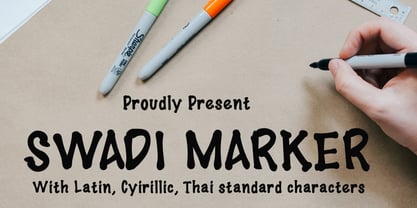 Swadi Marker is a sweet and friendly serif font and features Cyrillic and Thai character. Its natural and unique style makes it incredibly fitting to a large pool of designs. The only limit is your imagination!
 - Vellona by Gatype,
$10.00 Vellona is a really cool handcrafted brush font deliberately created with a natural texture finish, it is perfect for invitations, brand projects, logos, greeting cards, news, web, product packaging, posters, blogs, everything including personal charm, etc.
 - FM Birthday 1.0 by The Fontmaker,
$20.00 FM Birthday 1.0 consists of 26 birthday related words and phrases -- all custom made and handwritten. Add a personal touch to your greeting cards or party invitation designs with the help of these hand lettered captions.
 - Sendu Senja by Mazkicibe,
$11.00 Sendu Senja Font is a Handwritten and modern font combined with a sweet touch and beautifully curved each letter. Sendu Senja Font is great for: Wedding invitations, fashion magazines, logos, signatures, and suitable for watermark photography.
 - Thanks Friend by Attractype,
$12.00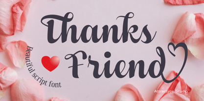 Thanks Friend is a beautiful script font with thickness suitable for greeting card designs, invitations, t-shirt sublimation, event lettering, and crafts. This font features a lovely swash in all lowercase and several ligatures and alternatives.
 - Gentle Ghostly by Supfonts,
$19.00 Gentle Ghostly will be perfect for halloween lettering, beautiful frame for your home, book covers, greeting cards, logos, marketing, magazines or anything that requires cute handwritten lettering :) What's inside: - Gentle Ghostly Script - Multilingual support - Cricut support
 - Rostey by Dhan Studio,
$17.00 Rostey is a beautiful calligraphic brush font, specially designed for a variety of designs today, very suitable for branding, logos, business cards, posters, invitations, greeting cards, news, product packaging, blog posters, all including personal charms etc.
 - Northern Petal by Tanincreate,
$16.00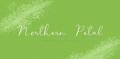 Northern Petal is a casual script font with a touch of naturally connected handwritten feel. It is perfect for eye-catching branding projects, text overlay to any background, social media, wedding invitations, greeting cards and more.
 - Vadher by Dhan Studio,
$20.00 Vadher is a very cool handmade brush font that is intentionally made with natural texture results, suitable perfectly for invitations, brand projects, logos, greeting cards, news, web, product packaging, posters, blogs, everything including personal charm etc.