10,000 search results
(0.056 seconds)
- TessieAnimals by Ingrimayne Type,
$18.95 A tessellation is a shape that can be used to completely fill the plane. Simple examples are isosceles triangles, squares, and hexagons. Tessellation patterns are eye-catching and visually appealing, which is the reason that they have long been popular in a variety of decorative situations. These Tessie fonts have two family members, a solid style that must have different colors when used and an outline style. They can be used separately or they can be used in layers with the outline style on top of the solid style. For rows to align properly, leading must be the same as point size. To see how patterns can be constructed, see the “Samples” file here. Shapes that tessellate and also resemble real-world objects are often called Escher-like tessellations. This typeface contains many Escher-like tessellations that resemble animals including horses, goats, rabbits, fish, frogs, and other vertebrates. Most or all of these shapes were discovered/created by the font designer during the past twenty years in the process of designing maze books, coloring books, and a book about tessellations. (Earlier tessellation fonts from IngrimayneType, the TessieDingies fonts, lack a black or filled version so cannot do colored patterns. The addition of a solid style that must be colored makes these new fonts a bit more difficult to use but offers far greater possibilities in getting visually interesting results.)
 - TessieFlyingBirds by Ingrimayne Type,
$19.95 A tessellation is a shape that can be used to completely fill the plane—simple examples are isosceles triangles, squares, and hexagons. Tessellation patterns are eye-catching and visually appealing, which is the reason that they have long been popular in a variety of decorative situations. These Tessie fonts have two family members, a solid style that must have different colors when used and an outline style. They can be used separately or they can be used in layers with the outline style on top of the solid style. For rows to align properly, leading must be the same as point size. To see how patterns can be constructed, see the “Samples” file here. Shapes that tessellate and also resemble real-world objects are often called Escher-like tessellations. This typeface contains many Escher-like tessellations that resemble flying birds. Most or all of these shapes were discovered/created by the font designer during the past twenty years in the process of designing maze books, colorings books, and a book about tessellations. (Earlier tessellation fonts from IngrimayneType, the TessieDingies fonts, lack a black or filled version so cannot do colored patterns. The addition of a solid style that must be colored makes these new fonts a bit more difficult to use but offers far greater possibilities in getting visually interesting results.)
 - Agger serif by S6 Foundry,
$29.00 Agger is a contemporary serif typeface featuring large open counters, curved, round forms, creating a modern and elegant glyph set. The extreme contrast between thick and thin strokes gives Agger a harmonic and stylish look. Designed with an elegance to the letterforms, the font is adapt for the beauty and the cosmetic industry, giving each project a unique style and feel. Agger is perfectly suited for editorial design, branding, magazines, logos, headings, and more. The family Latin supports Western, Central, South Eastern, South American, Oceanian, Pan African, Vietnamese, and Sámi.
 - Siarog by Linecreative,
$16.00 Looks simple and powerful. This is the reason why we want to offer you the Siarog font. This font gives off a clean, powerful and very elegant feel. This font is perfect for use in headlines, posters, branding, titles, and other graphic designs. What you get dear, you will get : Siarog- A clean San serif font including Upper & Lowercase characters(ALL CAPS), Stylistic alternates Character (11 Character) Supports Multi linguage (Latin Western Europe), Numbers and Punctuation
 - PORT118 - Unknown license

- Anne's Hand by National Eating Disorders Assn,
$10.00 Anne's Hand is a custom handwriting font of Anne Hubbard, who tragically lost her battle with anorexia nervosa this past January. Anne loved to write, so her brother Richard designed a custom font of her handwriting as a tribute to her memory. All proceeds from its sale will go to the National Eating Disorders Association to support programs and services like the NEDA Navigators and Loss Support Network, programs that many families count on for support.
 - Gista Danes by Aqeela Studio,
$20.00 Gista Danes feel equally charming and elegant. It looks lovely on wedding invitations, thank you cards, quotes, greeting cards, logos, business cards, and every other design that needs a handwritten touch. This font is PUA encoded, which means you can easily access all of the glyphs and swashes! It features a varying baseline, smooth lines, gorgeous glyphs, and stunning alternates.
 - Handayani by RahagitaType,
$17.00 Handayani is a flowing and neat lettered handwritten font, that feels equally charming and elegant. This font is PUA encoded which means you can access all of the glyphs and swashes with ease! It features a varying baseline, smooth lines, gorgeous glyphs and stunning alternates. Fall in love with its incredibly versatile style and use it to create spectacular designs!
 - Wonder Dream by Sabrcreative,
$15.00 Welcome to Sabr Creative, where imagination comes to life through fonts like our delightful Wonder Dream. This display font is designed to bring smiles to kids and kids at heart with its cute and happy style. The Wonder Dream font is perfect for adding a touch of whimsy to your creative projects, from children's books to playful invitations and more.
 - Hello Bucin by Sealoung,
$15.00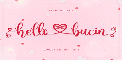 Hello Bucin feels equally romantic and whimsical. It looks lovely on wedding invitations, thank you cards, quotes, greeting cards, logos, business cards and every other design which needs a handwritten touch. This font is PUA encoded which means you can access all of the glyphs and swashes with ease! It features a varying baseline, smooth lines, gorgeous glyphs and stunning alternates.
 - Bitstream Vera Sans - Unknown license

- Genteta by Typephases,
$25.00 In the tradition of the stock cuts that printing type foundries offered as metal, these spot illustrations remind you —for their look and technique— of vintage publications like victorian age newspapers and magazines. Similar to their counterparts in the Whimsies, Absurdies, Ombres, Bizarries and Whimsies series, the Genteta is another collection of little people in funny and absurd situations, recreated in black ink, from imagination and with no reference or models, and then carefully digitized. The Genteta trio of dingbats includes more than 150 new images. Their vectorial file format means you can use them at any size with no loss of quality. Every Genteta dingbat offers ready-made images for a variety of creative projects. They can be used as they come or easily customized in any graphics program. At small sizes they are ideal spot illustrations with a whimsical touch; at large sizes they can bring a whole page, a spread or even a big poster to life. Use them in creative projects including, but not limited to, flyers, brochures, book jackets and editorial illustration.
 - Plate Gothic by Monotype,
$29.00Around the turn of the twentieth-century, Steel and copper plate engraving was the most sophisticated and expensive method for producing business cards, stationery, and formal announcements. In engraved printing, the image is incised, or engraved into a hard, flat plate. Ink is applied to the plate, and then wiped off; leaving only the ink that is trapped below the surface in the incised areas. When the paper is pressed against the flat plate, the ink is drawn out of these areas and transferred to the paper. The results are twofold: printing which sits above the surface of the paper, and the reproduction very delicate lines and shapes. For business and formal printing, engraved printing was, and is, considered the best. The problem is that not everybody can afford the best. Type foundries, in the early 1900s, figured that if they could produce a typeface for traditional printing, which had appearance of engraving, they would be able to satisfy the needs of those forced to live with modest printing budgets. Engravers faces were born. Fredric Goudy’s Copperplate Gothic was one of the most popular. Plate Gothic is a version of this style updated for digital technology. It has all the charm and charisma as the metal type and yet is perfect for today's needs. - Gemma by Homelessfonts,
$49.00 Homelessfonts is an initiative by the Arrels foundation to support, raise awareness and bring some dignity to the life of homeless people in Barcelona Spain. Each of the fonts was carefully digitized from the handwriting of different homeless people who agreed to participate in this initiative. Please Note: these fonts include only the latin alphabet; no accented characters, no numbers or punctuation. MyFonts is pleased to donate all revenue from the sales of Homelessfonts to the Arrels foundation in support of their mission to provide the homeless people in Barcelona with a path to independence with accommodations, food, social and health care. Gemma was born in Madrid 37 years ago. After spending many years in the capital, she decided to start over again and moved to Barcelona. A series of misfortunes and wrong decisions left her on the street. Gemma is a calm, emotional person who likes to take her time to do things and, if there’s one thing the street can offer, it’s time. The street lets you listen carefully, watch without being seen. Being in the street isn’t pleasant at all. Seeing people who’ve just showered go past makes you miss even more things that many take for granted. Breakfast, a clean smell, paying for a metro ticket. Being homeless is much more than having nowhere to sleep. Life in the street is hard, says Gemma, but she also sees the positive side. “It’s the best way to get to know human beings.” She likes to see the street as if it were a school. A school she has been in and out of for too long.
 - Jump by Linotype,
$40.99Jump is a lighthearted, handwritten script. Its quick and informal style is perfect for short notes and messages to convey charisma. The letters 'jump' up and down on the baseline giving words and sentences a lively impression. Try out Jump for invitations, cards, and announcements when you are aiming for the hand-made effect. - Busted by Canada Type,
$24.95 Busted is the very strange and out-of-character outburst of Bill Troop, a guy who was classically trained in everything, from classical piano and literature to classical photography and type design. As far as we could tell, Bill Troop is the kind of guy whose appearance and voice instantly trigger thoughts of black and white photos, fedoras, and pre-industrial age Europe. A few years ago, he even moved from the United States to England, where it took him less than a week to feel at home and start sounding like a Norwich native. Then something happened and the poor dude just snapped. Busted is the controversial result of the blood rushing to his head. If you know what exactly happened to him, please let us know. Concern, consideration and human interest story aside, Busted is a fascinating thing. It is a set of four interchangeable thick outline fonts where the same letter forms turn from wild to wilder to broken to somewhat clean. Mix them up in a setting and you have words that snarl with a sneer. Life's too short. Take it all with a grain of salt. Scream whenever you feel like it. Busted Pro is a single font combining all four character sets, and rigged with an OpenType pseudo-randomizer in the contextual alternates feature, which you can disable or enable anywhere in your setting for maximum visual shock just the way you like it. Works just as well in PAL or SECAM. Don't be fooled by imitations, and don't get caught with your drawers down.
 - Mommie by Hubert Jocham Type,
$59.90 In the early 1980s, at the start of my career, I had the opportunity to work in a print shop with classic lead setting. In those days I would study issues of U&lc magazine from ITC. What really caught my attention were scripts in the Spencerian style. I’ve been fascinated by this American penmanship tradition ever since. A few years ago I developed a font. Boris Bencic used it when he was redesigning L’Officiel magazine in Paris. I took these initial forms and developed them into the font Mommie when I started my own foundry. Although I usually design text typefaces, working on Mommie taught me how complex it can be to create a script headline font. The biggest challenge in this process has been to keep it alive and fresh. The Regular weight is only made for very big headlines. The thin lines with the bold drops are very elegant. For smaller sizes use the Medium and Small weight. It won the TDC 2008 award and was Judges Choice of Christian Schwartz.
 - Miguity by Nathatype,
$29.00 Miguity is a display serif font in thick volumes designed to leave professional, formal, lovely impressions. This font’s character is the hook on the final corners of each letter. Plus, some of the letters show swinging wipes on their edges. It surely eases the eyes to explore the text to add its readability. Features: Ligatures Stylistic Sets Multilingual Supports PUA Encoded Numerals and Punctuations You can use Miguity on various designs, for example the posters, banners, logos, magazine covers, quotes, name cards, headings, printed products, merchandises: social media, and so on. Find out how to use this font by watching the font preview. Hopefully you have great experience using this font. Feel free to contact us if you require more information when you are experiencing a problem. Thank you. Happy designing.
 - Waldorfschrift by Joachim Frank,
$23.00 The Waldorfschrift family was created in digital form in the years 1993-1994 by Joachim Frank, inspired by the naturally organic letters from the anthroposophical movement of the 20th century of Rudolf Steiner . In nature there are no right angles, straight lines or complete uniformity, but instead round corners, varying thicknesses and all kinds of variability. This is what the anthroposophical movement created in their buildings, their art, in their music – and also in their lettering. And this Font is like the plants in nature: it grows upwards, branches out, letters hugs to some letters, with others they keeps more distance, some letters proudly stretch their belly, others crouch in the corner - a completely natural font. Take a look at the brand of Weleda (the natural cosmetics company), Demeter (one of the biggest organic foods companies), Filderklinik (a great anthroposophical hospital in Germany) and you will see these great companies work with different but organic letter styles. More recently, Joachim revisited the Waldorf fonts with modern type design software and added extra characters such as the euro sign, and extra weights to make the fonts useable for a wide variety of design tasks. Dez 21: A big update: All fonts have been digitized again and given a complete character set, new kerning, minor bugs removed.
 - Kelso Round by Talbot Type,
$18.00Kelso Round is a highly original, outline display font. Each character is represented by a single continuous line to create a fluid and rhythmic look. A friendly and distinctive typeface that’s both easy to read and easy on the eye. Also available as Kelso, with sharper edges. - Rafaella by Lián Types,
$37.00 To Rafaella, a menina dos cachos. We, designers, have grown accustomed to seeing that lowercase letters—not only in calligraphy but also in typography (1)—may be very playful and decorative. Almost every part of them can become a potential swash, ligature or decorative accolade (2) if the designer has some expertise regarding this matter. However, since we are living in an era that elevates the status of handcrafts, lettering has gained a lot of ground in different kinds of mediums, and with it there’s a sort of overuse of capitals. This may be due to the reason that lettering pieces need a high impact to convey their messages and many times why big capitals are the only solution. With this in mind, I started Rafaella: A font consisting entirely of capitals which go from unadorned to very decorative. Rafaella has ductus and forms vaguely based on the 1970s Bookman-like styled fonts. The presence and behaviour of serifs and ball terminals in this style were the perfect excuse to make really attractive aternates which the user can choose from the glyphs panel. The result is a font full of life. Able to be both very playful and formal due to its roman style which can be combined with (and between) a wide range of other styles of expressive scripts or geometric fonts with nice results (3). Also try Rafaella Shade Solo combined with Rafaella or Rafaella Bold for a layer effect to emphasize any given word or phrase. NOTES (1) See my fonts Erotica from 2013 or Dream from 2014. (2) Accolades is a wonderful word that refers to the ornaments made around the words in the spencerian style of calligraphy (3) Combinations often seen in different pieces of lettering were usually a contrast of style is wanted.
 - Sandena by Polyglyphic,
$40.00 Sandena began as an attempt at a harmonic convergence between the classic lines of Palatino and the curved flair of Optima - both favorites of mine from the great Hermann Zapf. As I’ve always loved the Swash characters of the 50’s and 60’s letterforms, I incorporated these alternatives to offer the more complete package that you see here - a humanist font in the truest calligraphic sense. This OpenType font family comes in four weights and includes condensed and Swash Cap alternates. Sandena offers multiple-character foreign language support and is being offered in a number of packages best-tailored for your unique application.
 - Substance by FaceType,
$24.00 The grotesque workhorse: Substance fulfills the primary role of emphasizing content. Containing 8 weights + italics (800+ glyphs each) Substance is a workhorse with loads of subtle OpenType features (small caps, a choice of lining, tabular and old style figures, numerators, denominators, tabular figures and signs, fractions, ligatures), 21 currency signs and a diversity of symbols and arrows. Substance provides everything you need for demanding briefs like signage or corporate design.
 - Supporting Cast JNL by Jeff Levine,
$29.00 Supporting Cast JNL is a hybrid of similar designs for hand lettering found on title cards from two morality photoplays from 1936 dealing with drug abuse, "Cocaine Fiends" and "Marihuana" respectively. The films were produced with the hope of educating the public against the dangers of illicit drugs, but they have taken on a cult status because of the dated approach to the problem. Despite all this, it is the Deco-influenced hand lettering which is being celebrated in this font release, not the subject matter of the films.
 - Sincerely Yourz by Outside the Line,
$19.00 Sincerely Yourz is another font in the Love Letters series from Outside the Line. It is a hand-printed font with extra letter spacing. All the letters have about the same height. All vowels are lower case whether they are caps or not. This font has a fresh contemporary hand-lettered look. While it can be used as a headline font it is really designed for body copy.
 - Caligor by Letterhend,
$14.00 Caligor is a Display Typeface Family which is suitable for you who needs a typeface for headline, logotype, apparel, invitation, branding, packaging, advertising etc. This typeface is comes in uppercase, lowercase, punctuations, symbols & numerals, stylistic set alternate, ligatures, etc also support multilingual and already PUA encoded. this font come in 3 versions, regular, edge, and stamp. the regular with clean and neat look of the font, edge version is look like a little bit of the normal version with rough edge, and stamp version that gives an aged feel on it.
 - Noema Pro by DBSV,
$130.00 About family “Noema Pro” Steps… The name “Noema” is again borrowed from ancient Greek word, which may have different meanings depending on the phrase: meaning, logic, significance, purpose, reason, value, nod, implied. In this font i tried and here(like in “ErisPro”) to give a different illustration in letters with a reverse dial(…sloping or recline) from Italic, simply because of whims or because the monotony is tiring me… This series is composed and includes twenty-four fonts with 658 glyphs each, with true italics, true Sloping and supports of course: Latin, Greek & Cyrillic.
 - WILD2 Keetoowah by Fontry West,
$10.00 Keetoowah evolved from a just a few letters in a sketch for a sorority t-shirt design. They loved it and kept asking for more of the same. The only solution was to make a font. These characters were made to be broken up, two toned, rotated, merged and jammed together. But, Keetoowah has a serious side. It has a great Southwestern flavor like smokey BBQ and patterned blankets.
 - Sharpe by Mans Greback,
$29.00 Sharpe is a stylish serif typeface family. The type has been drawn by Måns Grebäck during 2018 and 2019. It is clear, sharp and has brave, lively letter forms but with a conservative backbone. The five font weights balance beautifully in contrast to each other, and each weight has an italic equivalent, totaling in ten styles from Thin to Black. Each style contains ligatures and support for a wide range of languages.
 - Nexgen SLD by Alphabet Agency,
$20.00 Nexgen SLD font family is a modern sans serif font. The family includes 6 fonts, 3 weights each with 2 styles; regular and italic. The fonts are designed to be clean and easy to look for readability. The straight lines and diagonal cut at the corners of each character give the fonts their solid modern tech look. The family works great in all kinds of themes especially in tech, science and sports themes.
 - Quant by Hoftype,
$49.00 Quant is a contrasted typeface with a fresh and well-reasoned appearance. It owes allegiance to classical structure but is a free design and does not refer to any historical model. Although it has strong qualities as a reading type, its distinct and powerful ductus makes it superb for headlines and in display sizes. Quant is well-equipped for ambitious typography. The Quant family consists of 8 styles, comes in OpenType format with extended language support for more than 40 languages. All weights contain small caps, proportional lining figures, tabular lining figures, proportional old style figures, lining old style figures, matching currency symbols, fraction and scientific numerals.
 - Searches by Redy Studio,
$17.00Searches – Elegant Ligature Fonts Searches is a font that you should give a chance, if you are looking for a different look, Searches is a good place to start! There is always inspiration in fonts! Searches is an elegant, messy and lovely script. But Searches is not your ordinary script font; it has been developed to perfection by its creator, and it is sure to inspire you as well. You will fall in love with the movement of the letters, and you will find yourself using this font for many design projects to come. It comes with 92 ligatures, numbers, and other necessary glyphs. Searches features: A full set of upper & lowercase characters Numbers & punctuation 92 Gorgeous ligatures accents characters PUA Encoded Characters – Fully accessible without additional design software. Feel free to give me a message if you have a problem or question. Thank you so much for taking the time to look at one of our products. - P22 Elven by IHOF,
$24.95 The rounded shapes of P22 Elven show the influence of the 10th-century Irish half-uncial. Effective for projects dealing with mystery, fantasy, or historical drama.
 - Janda Swirly Twirly by Kimberly Geswein,
$5.00 A more legible version of Janda Love & Rain, these decorative capitals are paired with neat lowercase letters that give you a girly flair with maximum legibility.
 - Rome Ionic by 38-lineart,
$17.00 Rome Ionic is a serif display font inspired by architectural features in ancient Roman building columns. The Ionic columns are taller and slender compared to 'Doric and Corinthian' columns. On the Ionic Capitol column, there is a geometric spiral like a paper roll. We used those elements in this roman style font. The base of this font is serif shaped, more slender and towering, and equipped with 8-18 stylistic set alternates. This is the development of the basic shape on which we added spiral ornaments to the left and right. This serif font's characteristic is soft and simple, not sharp and complicated like Doric and Corinthian. The composition of the softness of the basic and alternate fonts does not reduce the splendor of this font. We complemented this font with support for the Latin extend as an analogy to the Roman region. Rome Ionic is perfect for 'impressive luxury and power' designs. With this font, your branding will show the robustness and refute the splendor of other products.
 - Ubicada - Personal use only

- Oblogram JNL by Jeff Levine,
$29.00Oblogram JNL was built on the structure of Yorso Square JNL, but takes on the appearance Of a "techno" design as if drawn by a child's imagination. Unbalanced stroke weights give the appearance of a makeshift design, and can even double as "Modern Grunge" in its own right because of its willingness to break all typographic rules. - Rajjah Familia by Creativemedialab,
$20.00 Rajjah Familia - Blackletter font family Blackletter (sometimes black letter), also known as Gothic script, Gothic minuscule, or Textura, was a script used throughout Western Europe from approximately 1150 until the 17th century. Blackletter is currently widely used in modern creative design trends ranging from tattoo lettering, calligraphy, clothing brands, music, sports, labels and much more. Rajjah Familia looks gothic but easy to read, neat and beautiful. Comes with light, regular, medium and bold version. Rajjah is the right choice for your next projects!
 - Naori by Eotype,
$16.00 Naori is a stylish serif font characterized by contrast between thick and thin lines. This font has a serif style that features a modern-classic blend design. This font has alternate and ligature features that give you access to a unique collection of letters.
 - Eola by Eotype,
$14.00 Eola is a stylish serif font characterized by contrast between thick and thin lines. This font has a serif style that features a modern-classic blend design. This font has alternate and ligature features that give you access to a unique collection of letters.


