10,000 search results
(0.04 seconds)
- Turnpike - Personal use only
- Candela Book - 100% free
- Tranceform - 100% free
- cursiveedgar - Unknown license
- Shoot the Messenger - Unknown license
- Futurex Variation Alpha - Unknown license
- comic andy - 100% free
- launchpad - Unknown license
- Army Beans - Unknown license
- Fluffster - Unknown license
- Hall Fetica Narrow Italic - Unknown license
- BPmono - Unknown license
- Hypertension - Personal use only
- Shoot the Messenger - Unknown license
- Orotund - Unknown license
- ZeroGene - Unknown license
- Healthy Alternative - Unknown license
- Middle Ages - Unknown license
- Face Front - Unknown license
- Daydream Daily - 100% free
- tulisan tanganku - Unknown license
- quiñók - Unknown license
- Menaion Medieval - Unknown license
- Beast vs Buttercrumb - Unknown license
- lydeke Handwrithing - Unknown license
- Habana by Vladislav Ivanov,
$15.00 - Little Japan by Okaycat,
$19.50 - Masherbrum Slab by Juraj Chrastina,
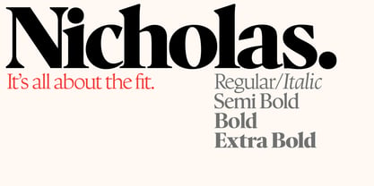
$29.00 - Nicholas by Shinntype,
$39.00 - SmoothyPro by Resistenza,
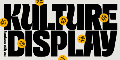
$39.00 - TAN KULTURE by TANTypeCo.,
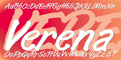
$17.00 - Verena by Autographis,
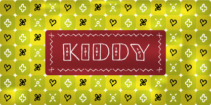
$39.50 - Kiddy by Gaslight,
$20.00 - Scott Room - Personal use only
- Bright Gesture DEMO - Personal use only
- The Astise - Personal use only
- Enchanted Land - Personal use only
- Galaxus - Personal use only
- 101! Dad Goes Formal - Unknown license
- 101! In My Pocket - Unknown license


