10,000 search results
(0.041 seconds)
- Altemus Birds by Altemus Creative,
$11.00
- Love Castle by Epiclinez,
$18.00
- Paint Kicks by Fargun Studio,
$12.00
- Weird Garden by Rashatype,
$10.00
- Breezy by Wiescher Design,
$19.00
- Chicory by Ascender,
$29.99
- Picaflor Soft by RodrigoTypo,
$29.00
- Charming Beauty by Epiclinez,
$12.00
- Astro Bats by Greater Albion Typefounders,
$5.00
- Uertas by Sign Studio,
$15.00
- Egyptian Slab by Wooden Type Fonts,
$20.00
- Little Malio by Evo Studio,
$13.00
- Honey Painting by Zefrar,
$19.00
- Super Head Club by Fonts of Chaos,
$10.00
- XComputerBugs by Ingrimayne Type,
$14.95
- Quarter Arabic by syria arabic,
$25.00
- Luben by Octopi,
$7.00
- Aldous by Monotype,
$40.99 - Grunt Grotesk by Tkachenko design,
$30.00
- Marie Jeanne by A New Machine,
$19.00
- Bubblegum Pop by Device,
$39.00
- Just Style by Epiclinez,
$18.00
- Party Invite JNL by Jeff Levine,
$29.00
- Dark Misery by Seemly Fonts,
$12.00
- F2F TechLand by Linotype,
$29.99 - Janda Hide And Seek by Kimberly Geswein,
$5.00
- Loyola Pro by RodrigoTypo,
$30.00
- Podunk JNL by Jeff Levine,
$29.00 - Bushwick JNL by Jeff Levine,
$29.00
- Jules Thicket by Rachel White Art,
$14.00
- Amonus by Ronin Design,
$15.00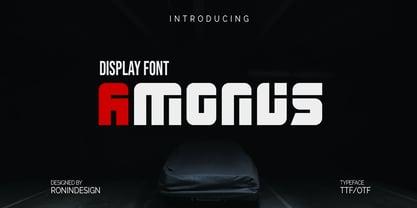
- Make No Sense by Atom,
$14.00
- Savings And Loan JNL by Jeff Levine,
$29.00
- Millesime by Chank,
$99.00
- Xan by Autographis,
$39.50
- Grosfer by Typeskets,
$17.00
- SPENGLER by AdultHumanMale,
$10.00
- F2F Entebbe by Linotype,
$29.99 - Art And Design JNL by Jeff Levine,
$29.00
- Hardwatt by Gleb Guralnyk,
$13.00