10,000 search results
(0.192 seconds)
- Tall Skinny Condensed by Outside the Line,
$19.00 This is the tallest, skinniest, most condensed, non serif font I know of. I designed this because I felt a serious need for that one big, thin word to fit in a narrow space. It is great for ‘SALE!’ in a one column ad. Also is a life saver for several long words in a narrow space like Merry Christmas... If you need a full character set take a look at the new Ultra Condensed 3 font family. Ultra Condensed was based on Tall Skinny Condensed with some changes and a full character set. Ultra Condensed Lettered is a hand lettered version and Ultra Condensed Line is a lighter hand drawn version
 - Rolling Brush by Ditatype,
$29.00 Rolling Brush is a script font that gives handwriting appearance with original and personal brush details. This font is made beautifully so that the letters are connected to each other, creating a continuous and flowing look. Each letter is attached to the previous letter and continues to the next letter, creating beauty in writing unity. This font shows brush details on each letter. Brush strokes displays a rough, organic texture to the edges of the letters, adding dimension and visual life. These details give a unique impression to this script font. On the other hand, even though it has a rough border, this script still maintains a natural and elegant aesthetic touch. Some letters may have dramatic twists, while others are simpler. This flexible shape creates an expressive and creative look to the lettering. Because it is designed with a rough border, it would be better if you use this font at a large text size so it is more easy to read. Enjoy the various features available in this font as well. Features: Alternates Ligatures Multilingual Supports PUA Encoded Numerals and Punctuations Rolling Brush is suitable for any designs that want to convey a warm, personal and alluring impression. You can use this font in the design of greeting cards, invitations, logos, labels, and many other design projects that want to create uniqueness through a natural, handwritten touch. Find out more ways to use this font by taking a look at the font preview. Thanks for purchasing our fonts. Hopefully, you have a great time using our font. Feel free to contact us anytime for further information or when you have trouble with the font. Thanks a lot and happy designing.
 - Rhythm by Positype,
$42.00 I hate the idea of revivals. I have publicly said I choose not to do revivals because they make me uncomfortable. This is as close as I have been to crossing my own line. To be direct, Rhythm is based on the ATF typeface, Ratio (I just recently learned the foundry of origin). I came across this typeface from a printed specimen years ago when I was in school and held onto it. It was unique and I loved how well integrated the inline worked within both the flourish and serif of the glyphs—it was old, but not, reminiscent, but fresh. My specimen was limited in the glyph offering (it was c. 1930ish) and I realized a lot would need to be done to ‘finish’ it and bring it to contemporary expectations. I didn't want to do ‘retro’ and tried to avoid the visual trappings associated with it. What I did want to do is interpret what I had in the specimen and reinterpret it digitally, refining its construction and extending its typographic equity along the way. The ‘One’ and ‘Two’ (and their matching ‘Solids’) styles diverge providing various elaborations that coordinate well between rigid bracketed serifs and compact tails. I further expanded the glyph offering to include a full diacritic set, old style numerals, fractions, stylistic alternates, swashes, titling alternates and controlled flourishes that adhere to the efficient framework of the script. And yes, I refer to it as a ‘script’ because calling it a ‘cutesy serif’ seems wrong :) I hope this is seen less as a slavish revival and more as a championing of a really unique typeface. The Original Typeface was Adastra, designed by Herbert Thannhaeuser for the Foundry D. Stempel AG in Frankfurt, Germany.
 - SST Japanese by Monotype,
$236.99 Designed for global branding and supporting 93 languages, the SST® typefaces blend the organic readability and controlled structure of modern sans serif designs. In combining these attributes, the SST family is understated, versatile – and sure to be a timeless design. The SST Japanese Pro family has 6 fonts in total. It spans four weights from ultra light to bold, and has two condensed weights to further expand the family’s vast range of uses. SST’s subtle design traits provide a quietly handsome and consistently friendly typographic presence that can be used for just about any typographic application. Broad range branding applicability, combined with coverage for almost a hundred languages, makes SST one of the most widely accessible and usable typefaces available. Originally designed in partnership with the global consumer brand, Sony, the SST family is one of the most comprehensive type families available. Since extensive multi-lingual support was a critical design goal from the beginning, Akira Kobayashi, Monotype type director and primary designer on the project, turned to a network of local designers around the world for their individual language expertise. As a result, the details – which could be as subtle as stroke curvature and width – are consistent across Latin, Greek, Cyrillic, Arabic and multiple Asian languages. SST performs equally well in print and on-screen and the designs can be used at very small sizes in packaging and catalogs; while massive print headlines – even complicated wayfinding projects — pose no stumbling blocks to the family’s typographic dexterity.
 - Regave by Wahyu and Sani Co.,
$25.00 Introducing Regave, a typeface inspired by Danish style lettering based off the work of Knud Valdemar Engelhardt (1882–1931) who designed the street signs for the Copenhagen suburb of Gentofte. The Engelhardt's design was loosely based on the lettering of two Danish architects of the time: Thorvald Bindesbøll (designer of the Carlsberg logo) and Anton Rosen. The signs were so successful that they’re still in use today. The most noticeable characteristic of Danish style are: a flat apex of the A the widening of diagonal terminals a double-storey g with its loop terminating before it forms the bottom most stroke (Erik Spiekermann coined this a Danish g) a single-story g with a stumpy tail a K with an almost laterally moved crotch, connected to the stem by an extra horizontal stroke widened diagonal connecting strokes forming flat apex or baseline strokes Regave comes in 11 weights from Thin to ExtraBlack with matching italics and also available in Variable Font format for more flexibility in weight selection. This family also equipped with useful OpenType features such as Ordinals, Superscripts, Subscripts, Stylistic Alternates, Stylistic Sets, Proportional Lining, Standard Ligatures, Fractions, Numerators & Denominators. Each font has 490+ glyphs which covers Western & Eastern Europe, and other Latin based languages – over 200 languages supported! Regave will be suitable for many creative projects. This masculine, strong and unique typeface will be suitable for logos, posters, presentations, headlines, lettering, branding, quotes, titles, magazines, headings, web banners, mobile applications, art quotes, advertising, packaging design, book title, and more!
 - Chordette for Guitar by Ukefarm,
$10.00 Description Chordette for Guitar Chord Fonts are tuned EADGBE. Create a guitar chord chart or chord sheets quickly and easily. Guitar Chord Fonts Chordette contains high quality guitar chord fonts. Each guitar chord is mapped to a specific key on the keyboard, so you can type out chords. It’s a lot easier than dealing with images to create a guitar chord chart or song sheet. It’s a favorite tool for teachers, music therapists, and musicians. What instruments are supported? Chordette for Guitar is tuned EADGBE and supports Guitar. Chordette is available in multiple tunings for most stringed instruments. Most versions of Chordette support multiple instruments. App / Instruments Supported / Tuning Chordette for Guitalele / Guitalele, Baritone Guitar / ADGCEA Chordette for Ukulele / Concert Ukulele, Banjolele / GCEA Chordette for Soprano Uke Soprano Ukulele ADF#B Chordette for Baritone Uke / Baritone Ukulele / DGBE Chordette for Mandolin / Mandolin, Irish Tenor Banjo, Irish Bouzouki / GDAE Chordette for Banjo / Banjo /gDGBD Chordette for Tenor Banjo / Tenor Banjo, Tenor Guitar, Mandola / CGDA Chordette for Guitar / Guitar / EADGBE Each version of the Chordette font uses the same chord sets and keyboard mappings. If you play multiple instruments, you can create a chord sheet for one, then use another Chordette font to transpose the song to another. For example, you can create a song for Mandolin, then instantly transpose it for Guitar and Ukulele - just by changing fonts! Chordette for Guitar is priced at $10, which includes the guitar chord font sets for both Mac and Windows. For help and support, please visit http://ukefarm.com/chordette/help.html
 - Garcon Grotesque by Thomas Jockin,
$50.00 From pastiche to sophistication, Garçon Grotesque improves on a classic for today's designer. Designed in a multitude of weights, extended latin character set, small capitals and a working lowercase, Garçon is built for any situation that calls for sophistication, elegance and culture. Built in five weights, Garçon Grotesque allows for great flexibility. Use the Bold weight for beefy headlines. Use the the medium and regular weights for subheads and decks. Use the Light and Thin weights for a softer, more delicate tone. All weights have the same size spurs, so you can mix and match! Right out of the box, Garçon Grotesque offers full language support to most eastern european speaking territories. Most foundries release these accent characters as a "pro" release at an additional fee. Just because you speak Turkish or Croatian, shouldn't mean you have to pay more than a designer who speaks English. Please see the Specimen PDF for more information about languages supported. Accessible as an OpenType Feature, Garçon Grotesque offers alternate forms of the uppercase "J", and the lowercase "a" and "g". Use Stylistic Set 01 for the alternate form capital J. Use Stylistic Set 02 for the alternate form of the lowercase a. Use Stylistic Set 03 for the alternate form of the lowercase g. Also accessible as an OpenType Feature, Garçon Grotesque offers tabular figures in all five weights. Perfect for menus, tabular figures allow for number listings to align easily and without shifting if a different font weight is selected for emphasis.
 - Corpid by LucasFonts,
$49.00 The name Corpid derives from “Corporate Identity” — which is what this family of low-contrast sans-serifs was made for. Corpid was originally commissioned by Studio Dumbar in the Netherlands as a corporate typeface for the Dutch Ministry of Agriculture, Nature Management and Fishing. The font was designed to replace the existing standard typeface (a well-known business-like sans-serif) to provide the organization with a unique and strong identity. Although it was designed to fit strict technical requirements, Corpid has a personality all of its own. This was in part a result of what Luc(as) calls “creating tension” between the inner and outer curves of each character. “I tend to put a little more diagonal contrast into fonts than is the case in most neutral sans serif fonts. This brings a certain humanistic touch to the typeface. Much more subtle here than in Thesis – but although it is almost invisible, it is still palpable.” Corpid was gradually expanded into a five-weight, three-width family. The new Corpid SemiCondensed has double functionality. It is a no-frills, compact headline font that offers optimum legibility in sizes from small to huge. It is also a great space-saving text typeface for magazines, newsletters or annual reports: economic, versatile, and provided with several different numeral sets. In this OpenType type version, all weights come with Small Caps. With its wealth of numeral styles and complete character sets (including Central European) the Corpid family is now well equipped to tackle the most complex of typographic tasks.
 - Ricardo by Bureau Roffa,
$19.00 Rather than confining itself to a single style, Ricardo combines the best of two worlds: the conceptual clarity of a geometric design with the legibility and warmth of a humanist design. Its open counters, crisp joints, and even texture allow for effective use in long-form text settings, while its simple geometric shapes combined with some unexpected details make it highly suitable for display settings such as branding and marketing. Ricardo contains seven carefully chosen weights, ranging from ExtraLight to ExtraBold. The Medium weight functions as a slightly darker alternative to the Regular. Ricardo’s 812 glyphs per style support over a hundred languages, and also include arrows and case-sensitive punctuation. The Ricardo family consists of three subfamilies: Ricardo, Ricardo ALT, and Ricardo ITA. Ricardo contains the most conventional forms, and is the most suitable option for long-form text. Ricardo ALT contains simplified shapes for the a, j, u, and t, which are also accessible through Stylistic Set 2 within Ricardo (in opentype-savvy applications). The cursive-like italics of Ricardo ITA provide a slightly more eccentric alternative to the standard italics. Furthermore, all styles contain stylistic alternates that swap the blunt apexes in A, M, N, V, W, v, w, y, and 1 for pointier ones. These are also accessible through Stylistic Set 1. Other opentype goodness includes: (discretionary) ligatures, smallcaps, case-sensitive forms, fractions, nine sets of numerals, and more. David Ricardo (1772-1823) is considered the first of the classical economists, and combined ground-breaking mathematical abstractions with an understandable down-to-earth way of explaining his ideas.
 - Camelin by Gian Studio,
$15.00 Introducing Camelin sant display is a complete typeface that is modern, simple and clean. As a typographic display it is useful for posters, logotypes, titles and short text in general. This font is easy to read and bold, easy to play. the embellished serif of the hat is slightly different from the usual hat to create an alternative glyph. We also designed an attractive uppercase set inside, to enhance your design. Enjoy!
 - JH Fares by JH Fonts,
$45.00Jh Fares is a modern / simple Kufic style font. The user may notice plenty of white space around the text leading to a highly readable font. The Kufic script is one of the oldest Arabic Handwriting, first appeared in el Koufa - Iraq. The original calligraphy was derived from the Aramaic letters; later it went thru lots of enhancements. Its typical uses include decorative writings for Mosques / palaces, Magazines / Newspapers / Books titles and Greetings. - Hophus Roghus by Bombastype,
$35.00 Hophus Roghus is a Display Serif font, inspired by vintage brewery logos. This font family comes with a layer system: Regular, Inset and Shadow. You need to unlock the uppercase alternative character for the main course. This font will be suitable for your any design needs. Like branding, logo, sign, header, etc. So final question: what are you waiting for just looking around like that ? Buy this font asap so your urge will be fulfilled.
 - HS Loxy Gold by Helipad Space,
$21.00 Introducing, HS Loxy Gold! A Stencil Bold Display Font with the strong touch. It looks heavy and boldy that can be used for all your project needs.This font can be used at any time and on any project. So, HS Loxy Gold Font can't wait to give its touch to all your design projects such as magazine, book, poster design, printing, personal branding, promotional materials, logotype, product packaging, etc. Thank You HS
 - Black Asylum by KC Fonts,
$14.00 Black Asylum from KC Fonts is a handmade font that’s inspired by the title names of slasher horror movies of the 70’s and 80’s. Nothing else resembles it in the slightest, as it’s a font that demands respect, it’s a font that instills fear from deep within & it’s perfect for all of your horror needs! Black Asylum has an extended character set for multilingual support to scare the pants off of everyone worldwide!
 - Airbolt by Zealab Fonts Division,
$9.00 Airbolt is sporty, futuristic, and sharp font. It will make your design looks sporty and also futuristic design. Airbolt is a great fit for retro, futuristic, automotive, and gaming themed designs. Just look how it performs on the preview that I have provided, you will see its capabilities. But it will also work well with other themes. I can’t wait to see what you guys will come up with with using this font!
 - Enforcer by Tour De Force,
$25.00 Modern simple typeface expressing sharp and bright words without need for writing something really smart. Made by Dusan Jelesijevic one day when he left without anything smart to say or write, so he just grabbed a pencil and forced the paper to be cooperative. Someone said that this typeface looks like the ancient Greeks went in present future and used contemporary equipment for writing those letters. It is ideal for branding and avantgarde identities.
 - Nilakandi by Locomotype,
$19.00 Nilakandi is an elegant display script font. The sturdy and thick construction feels so strong which is the result of a combination of classic typeface and modern calligraphy. The OpenType features are very rich with many alternative fonts on stylistic sets so you will easily mix and match typography in each of your designs. With nearly 600 glyphs, Nilakandi supports many languages. Don't waste time, it's time you put Nilakandi in your font collection folder.
 - HiFi by Pelavin Fonts,
$25.00 HiFi is a geometric script whose genesis lies in drive-in movie theaters, vintage auto emblems and radio dials. It embraces the stylistic tenets of retro futurism and proposes that the evolution of design styles, rather than being linear, is a circular process, continually revisiting and reshaping itself. It evokes the 40s & 50s and pre-transistor electronics when you turned your radio on and waited patiently for the tubes to warm up.
 - Sculptura CT by CastleType,
$29.00 A wonderful, very condensed, 3D font. A few years ago, I was commissioned to digitize the letters from this typeface for the words 'LEGENDS OF RODEO' and liked the look of it so much that I went ahead and digitized the rest of the alphabet. This CastleType revival is very clean-cut and contains uppercase, numerals, and punctuation. Sculptura was originally designed by the Swiss designer, Walter J. Diethelm (1913-1986) in 1957.
 - Junior Clerk JNL by Jeff Levine,
$29.00 Junior Clerk JNL is the plain sans serif version of the lettering found on the cover of the sheet music for 1919's "The World is Waiting for the Sunrise". The song title was originally set in a decorative sans serif with an engraved line adorning each character. This version of the more fanciful design is available as the companion font Legal Eagle JNL. Junior Clerk JNL is available in both regular and oblique versions.
 - Lazy Morning by Hanoded,
$15.00 I can’t remember when I had a true lazy morning.. I was a looong time ago, before I had children! Even now, when I’m down with the flu, I can’t stay in bed for too long - it really seems like a waste of time! Lazy Morning is a nice handwritten font. I made it with a Sharpie pen. It comes with all diacritics and double letter ligatures for you to play with.
 - Qafidut by Twinletter,
$18.00 Qafidut Groovy is a psychedelic-inspired retro typeface with a bold and playful character. It’s ideal for branding, product packaging, or even just to add a little flair to your editorial work. This elegant typography has a simple and contemporary look but with a touch of beautiful simplicity to give a modern feel to every curve of the letter. what are you waiting for start using this font to create your own special project now!
 - Abduction IV - Unknown license

- Mount Hills by Ergibi Studio,
$20.00 Mount Hills, this typeface has been made carefully to make sure its premium quality and luxury feel. The many alternate character on serif makes this typeface unique and stands out rather than the regular sans font, perfectly for headlines, logos, posters, packaging, T-shirts, coffee shops, restaurants, magazine's headers, signs or gift/post cards, cafe's and weddings or any type of advertising purpose.
 - Screamous by Fikryal,
$22.00 Screamous – Unique Display This font is very suitable to be applied in various aspects of design, and your branding. It’s perfect for logos, branding, title, social media posts, advertisements, product packaging, product designs, label, photography, watermark, special event, magazine, web designs, etc. Features : Multilingual Support If you have any questions please don’t hesitate to contact me follow my Instagram: fkryall Thank you
 - Creatify by Fikryal,
$18.00 Creatify – Font is a bold script font. It’s perfect for logo, branding, title, social media posts, advertisements, product packaging, product designs, label, photography, watermark, special event, magazine, web design, etc. Features : Creatify ( Uppercase, Lowercase ) Contextual alternates Stylistic alternate Ligatures Multilingual Support If you have any questions please don’t hesitate to contact me. follow my Instagram: fkryall Thank you Fikryal Studio
 - Lemon Mocktail by Fikryal,
$20.00 Lemon Mocktail – Display Serif This font is very suitable to be applied in various aspects of design, and your branding. It’s perfect for logos, branding, title, social media posts, advertisements, product packaging, product designs, label, photography, watermark, special event, magazine, web designs, etc. Features : Multilingual Support If you have any questions please don’t hesitate to contact me follow my Instagram: fkryall Thank you
 - Timothy Signature by Typesthetic Studio,
$13.00 Timothy Signature is a flowing handwritten font, described by an elegant touch, perfect for your favorite projects. Fall in love with its incredibly distinct and timeless style and use it to create spectacular designs! Fall in love with its incredibly versatile style and use it to create gorgeous wedding invitations, beautiful stationary art, eye-catching social media posts, and much more!
 - Molaka by Maulana Creative,
$12.00 Molaka Modern Script Font consisting of a fashionable sophisticated signature-style script with it's own unique curves and an elegant inky flow. Molaka Modern Script Font is perfect for branding projects, logo, wedding designs, social media posts, advertisements, product packaging, product designs, label, photography, watermark, invitation, stationery and any projects that need handwriting taste. Thanks for use this font, MaulanaCreative
 - Moonart by Scratch Design,
$12.00 Introducing “Moonart” It's handwritten with natural and rough character. This font is suitable for designs that emphasize the authenticity of slightly rough writing. Perfect for creating Instagram quote posts, novel or book typefaces, branding, invitations, labels, packaging, stationery, etc. This is a full font, which features all uppercase and lowercase letters, numbers and punctuation, stylish alternates, multilingual, alternates and ligatures. Enjoy this font!
 - Russeline by Stringlabs Creative Studio,
$25.00 Russeline is a sweet and simple script with an authentic vibe. Fall in love with its authentic feel and use it to create gorgeous wedding invitations, beautiful stationary art, eye-catching social media posts, and cute greeting cards. The Chellyne font is a great choice to increase the prominence in your project. Although the typography is traditional, the basic elements are great.
 - Beauty One by Attype Studio,
$15.00 Introducing Beauty One, a stylish monoline script style font. This beautiful script font offers your personal touch to your latest art project with fresh, curvy and beautiful look. Beauty One offers is perfect for many different project such as logo, branding, invitation, flyer, posters, social media posts, advertisements, product packaging, product designs, label, photography, special events or anything that need monoline script taste.
 - Paper Sign by Arukidzfl,
$12.00 Paper Sign is a new, modern, and fresh script with a handwritten and style making this font look elegant, natural, stylish and perfect for any awesome project that need a handwritten taste. Paper Sign would perfect for photography, watermark, social media posts, advertisements, logos & branding, invitation, product designs, label, stationery, wedding designs, product packaging, special events or anything that need handwriting taste.
 - Balpoine by Krntype Studio,
$18.00 Introducing Balpoine! a wonderful Handwritten, monoline font display. made with a unique and high curve style that makes it look different Balpoine is an eye-catching, and clean handwritten font. balpoine comes with an accent language and ligatures. This font is suitable for handwriting logos, Wedding invitation cards, T-shirts, merchandise, quotes, social media posts, advertising, and a lot more!
 - Humaira by SimpleType Studios,
$18.00 Humaira is a modern Sans serif font that embodies elegance and charm in every character. It is perfect for luxury logos, branding, classy editorial designs, women magazines, cosmetic brand, promotional designs, the fashion industry, and more. Humaira is perfect for branding projects, logo, wedding designs, social media posts, advertisements, product packaging, product designs, label, photography, watermark, invitation, stationery and any projects
 - Champagne Toast by Fikryal,
$20.00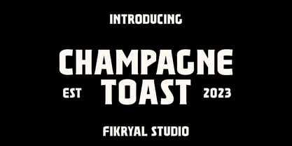 Champagne Toast – Display Serif This font is very suitable to be applied in various aspects of design, and your branding. It’s perfect for logos, branding, title, social media posts, advertisements, product packaging, product designs, label, photography, watermark, special event, magazine, web designs, etc. Features : Multilingual Support If you have any questions please don’t hesitate to contact me follow my Instagram: fkryall Thank you
 - Cuttauri Script by Nk Studio,
$14.00 Cuttauri is a lovely modern script, with an authentic feel. Use it to create gorgeous wedding invitations, beautiful stationary art, eye-catching social media posts, and cute greeting cards. This font is PUA encoded which means you can access all of the glyphs and swashes with ease! It also features a variety of special features including alternate glyphs and ligatures.
 - Patrick Cleo by Ergibi Studio,
$19.00 Patrick Cleo is a sophisticated signature font in manuscript style and with an elegant ink flow. Patrick Cleo has swashes for the lowercase only, which makes it perfect for projects that need an elegant glow, like logos, wedding designs, branding, social media posts, advertisements, product packaging, product designs, labels, photography, watermarks, invitations, stationery and any project that requires a handwriting touch.
 - Flogotop by Smartfont,
$29.00 FLOGOTOP works great in branding, logos, headlines, posters. The different weights and combinations give you full range to explore a whole host of applications, from tech startup, local events to concerts, festivals. FLOGOTOP LOGOMARK 52 logo marks inspired by geometry and clean, crisp, and universally symbolic design language. Make stunning logo designs with this eye-catching set of versatile shapes.
 - Jorgey by Gatype,
$12.00 Jorgey's casual brush script has a nice texture and flow. Jorgey has many alternatives to make it look like real handwriting; four sets of lowercase and two sets of uppercase. suitable for design projects; logos, branding, posters, quotes, beautiful wedding invitations, beautiful stationery art, eye-catching social media posts, and cute greeting cards and other designs. It is unique, very natural and attractive
