10,000 search results
(0.299 seconds)
- Movie Production JNL by Jeff Levine,
$29.00 Inside the pages of the August, 1930 issue of “The New Movie Magazine” is an ad for Warner Brothers-First National Pictures – hand lettered in a bold Art Deco sans. This was the basis for Movie Production JNL, which is available in both regular and oblique versions.
 - Bubble Dubble family by OKSHUtypeCO,
$9.00 Bubble Dubble- a new fresh handmade playful font. Very suitable for greeting cards, branding materials, business cards, quotes, posters, and more!This font are perfect for wedding postcard. Or you can create perfect and unique design of your logo, blog, stationery, marketing, magazines and more :) Multilingual OK
 - Aaux Next Wide by Positype,
$22.00 When the original Aaux was introduced in 2002, I intended to go back and expand the family to offer more versatility. Years went by before I was willing to pick it up again and invest the proper time into building a viable and useful recut. Just putting a new designation and tweaking a few glyphs here and there would not do the designer or the typeface justice; instead, I chose to redraw each glyph's skeleton from scratch for the four main subsets of the super family along with their italics. Each glyph across the super family is 'connected at the hip' with each style—each character carries the no frills, simple architecture that endeared so many users to it. The new recut expands the family to an enormous 72 typefaces! The original has spawned Compressed, Condensed and Wide subsets—all with corresponding weights—for complete flexibility. Additionally, all of the original weight variants have all been incorporated within the OpenType shell: Small Caps and Old Style Figures are there along with new tabular figures, numerators and denominators, expanded f-ligatures and a complete Central European character set.
 - Aaux Next by Positype,
$22.00 When the original Aaux was introduced in 2002, I intended to go back and expand the family to offer more versatility. Years went by before I was willing to pick it up again and invest the proper time into building a viable and useful recut. Just putting a new designation and tweaking a few glyphs here and there would not do the designer or the typeface justice; instead, I chose to redraw each glyph's skeleton from scratch for the four main subsets of the super family along with their italics. Each glyph across the super family is 'connected at the hip' with each style—each character carries the no frills, simple architecture that endeared so many users to it. The new recut expands the family to an enormous 72 typefaces! The original has spawned Compressed, Condensed and Wide subsets—all with corresponding weights—for complete flexibility. Additionally, all of the original weight variants have all been incorporated within the OpenType shell: Small Caps and Old Style Figures are there along with new tabular figures, numerators and denominators, expanded f-ligatures and a complete Central European character set.
 - Happy Holidays by Comicraft,
$19.00 Back in 2006 when we first released our Happy Holidays font, we thought the War on Christmas was over! We'd taken down our Menorahs, our Christmas trees, reclining Buddhas and red, black and green Kwanzaa decorations, and were prepared to sprinkle nothing more than a little Season's Greetings over our end of year celebrations. When we saw our friends and neighbors at department stores, we'd greet them with a simple, cordial, non-denominational “Happy Holidays.” But the font showed up at our company party this year having learned over 200 new languages (and, it must be said, a little bit loaded on Stylistic Alternates) in a mood to celebrate EVERYTHING. It was wishing people happy Bodhi Day, Solstice, Festivus, you name it! It even brought (count 'em) THREE new outfits based on the colors of Christmas, Hanukkah and Kwanzaa. So may the designs on the cups of the hot beverages that take you through the long dark coffee break of the soul that stretches from Halloween to Thanksgiving to New Year's Day be a little more festive this year with the refreshed, Remastered, all-inclusive spirit of Happy Holidays!
 - Aaux Next Cond by Positype,
$22.00 When the original Aaux was introduced in 2002, I intended to go back and expand the family to offer more versatility. Years went by before I was willing to pick it up again and invest the proper time into building a viable and useful recut. Just putting a new designation and tweaking a few glyphs here and there would not do the designer or the typeface justice; instead, I chose to redraw each glyph's skeleton from scratch for the four main subsets of the super family along with their italics. Each glyph across the super family is 'connected at the hip' with each style—each character carries the no frills, simple architecture that endeared so many users to it. The new recut expands the family to an enormous 72 typefaces! The original has spawned Compressed, Condensed and Wide subsets—all with corresponding weights—for complete flexibility. Additionally, all of the original weight variants have all been incorporated within the OpenType shell: Small Caps and Old Style Figures are there along with new tabular figures, numerators and denominators, expanded f-ligatures and a complete Central European character set.
 - Amitale by Hackberry Font Foundry,
$24.95 Amitale (A-mi-tah'-lay) is the union of Amitale Book and Amitale Wide into a new 8-font book family in my continuing objective of designing a better font family for readability in booklets. My goal here is for a full range of styles from light, regular, bold, and black without the plugged counters and clunky feel of most bold fonts. In my use, personally. I do not use Amitale Book Bold. I use Wide for the bold and Wide-Bold for the black style. In many ways, Amitale is Brinar with bracketed serifs. Many people find Brinar to be an exceptionally readable and beautiful humanist sans. This new serif font family has many of the same characteristics. This is also the debut of my new OpenType features set for 2009. There are more and more ligatures for your fun and enjoyment: bb gg ff fi fl ffi ffl ffy fj ft tt ty Wh Th and more. Like all of my fonts, there are: caps, lowercase, small caps, proportional lining figures, proportional oldstyle figures, & small cap figures, plus numerators, denominators, superiors, inferiors, and a complete set of ordinals 1st through infinity.
 - Aaux Next Comp by Positype,
$22.00 When the original Aaux was introduced in 2002, I intended to go back and expand the family to offer more versatility. Years went by before I was willing to pick it up again and invest the proper time into building a viable and useful recut. Just putting a new designation and tweaking a few glyphs here and there would not do the designer or the typeface justice; instead, I chose to redraw each glyph's skeleton from scratch for the four main subsets of the super family along with their italics. Each glyph across the super family is 'connected at the hip' with each style—each character carries the no frills, simple architecture that endeared so many users to it. The new recut expands the family to an enormous 72 typefaces! The original has spawned Compressed, Condensed and Wide subsets—all with corresponding weights—for complete flexibility. Additionally, all of the original weight variants have all been incorporated within the OpenType shell: Small Caps and Old Style Figures are there along with new tabular figures, numerators and denominators, expanded f-ligatures and a complete Central European character set.
 - Linotype Devanagari by Monotype,
$103.99 The new Linotype® Devanagari typeface is a traditional text face now available in five weights (from Light to Black) and suitable for a wide variety of print and digital uses. A compact design, Linotype Devanagari also provides economy of space where textual real estate is at a premium. In addition, its large character set enables the setting of Hindi, Marathi, Nepali and is suitable for Sanskrit passages. The design’s open counters ensure high levels of legibility at small sizes and at modest resolution. The history of Linotype Devanagari is quite extensive. Inspired by the late 19th and early 20th century Nirnaya Sagar designs, it was originally designed in 1977 by Mathew Carter for phototypesetting systems. It was then revised and expanded for digital typesetting by the Linotype letter-drawing studio headed by Georgie Surman under the art direction of Fiona Ross. This new, enhanced revival was designed by Lisa Timpi and Gunnar Vilhjálmsson with Fiona Ross as a consultant. This new Linotype Devanagari is part of a project to refresh the pivotal Linotype Bengali and Linotype Gujarati typefaces and make them available for the first time in the popular OpenType font format.
 - Steagal by insigne,
$24.75 I love geometric sans serifs, their crispness and rationality. Le Havre taps into this style, but for a while, I've wanted to create a font recalling the printed Futura of the 1940s, which seems to have an elusive quality all its own. After seeing an old manual on a World War II ship, I developed a plan for "Le Havre Metal" but chose to shelve the project due to Le Havre's small x-height. That's where Steagal comes in. When Robbie de Villiers and I began the Chatype project in early 2012 (a project which led one publication to label me the Edward Johnston of Chattanooga!), we started closely studying the vernacular lettering of Chattanooga. During that time, I also visited Switzerland, where I saw how designers were using a new, handmade aesthetic with a geometric base. I was motivated to make a new face combining some of these same influences. The primary inspiration for the new design came from the hand-lettering of sign painters in the United States, circa 1930s through 1950s. My Chatype research turned up a poster from the Tennessee Valley Authority in Chattanooga, Tennessee, which exhibited a number of quirks from the unique hand and style of one of these sign artists. Completing the first draft of Steagal, however, I found that the face appeared somewhat European in character. I turned then to the work of Morris Fuller Benton for a distinctly American take and discovered a number of features that would help define Steagal as a "1930s American" vernacular typeface--features I later learned also inspired Morris Fuller Benton's Eagle. The overall development of Steagal was surprisingly difficult, knowing when to deliberately distort optical artifacts and when to keep them in place. Part of type design is correcting optical illusions, and I found myself absentmindedly adjusting the optical effects. In the end, though, I was able to draw inspiration from period signs, inscriptions, period posters, and architecture while retaining just enough of the naive sensibility. Steagal has softened edges, which simulate brush strokes and retain the feeling of the human hand. The standard version has unique quirks that are not too intrusive. Overshoots have almost been eliminated, and joins have minimal corrections. The rounded forms are mathematically perfect, geometric figures without optical corrections. As a variation to the standard, the “Rough” version stands as the "bad signpainter" version with plenty of character. Steagal Regular comes in five weights and is packed with OpenType features. Steagal includes three Art Deco Alternate sets, optically compensated rounded forms, a monospaced variant, and numerous other features. In all, there are over 200 alternate characters. To see these features in action, please see the informative .pdf brochure. OpenType capable applications such as Quark or the Adobe Creative suite can take full advantage of the automatically replacing ligatures and alternates. Steagal also includes support for all Western European languages. Steagal is a great way to subtly draw attention to your work. Its unique quirks grab the eye with a authority that few typefaces possess. Embrace its vernacular, hand-brushed look, and see what this geometric sans serif can do for you.
 - Lugano by Greater Albion Typefounders,
$14.00 Lugano has it’s inspiration in 1920s advertising material and is ideal for lively banner lettering, posters and cover design. Four typefaces are offered - Lugano comes in regular, alternate, striped and alternate striped forms. Try it out and inject a little fun into your work today!
 - Syarom Gladies by Arttype7,
$10.00 Syarom Gladies is a handmade font that has a unique alternative style. This font can be used with a clean style or with an alternative style of the old style. It is very suitable for logos, weddings. magazines, album covers, and much of your work.
 - Boulogne by Liartgraphic,
$20.00 The latest collection from Liarttype is Boulogne sans serif font with a modern and unique style and is equipped with several alternates and ligatures and is multilingual. Boulogne is suitable for use in your work as a logo, branding, landing page, logotype and others.
 - Dunkelbunt by PintassilgoPrints,
$20.00 Dunkelbunt is freely inspired by works and words of the wildly eccentric artist, architect and designer Friedensreich Hundertwasser. It’s an all caps font, with 2 cuts for each letter, loaded with imaginative energy and organic forms that will certainly make your designs shine. Enjoy!
 - Sun by LucasFonts,
$49.00 Sun is a family of compact typefaces closer to old industrial-style American newspaper headlines than to Luc(as)’s other designs. The fonts also work in text, and have been used for corporate identity and editorial projects for more than two decades now.
 - Rexagus by Liartgraphic,
$20.00 The latest collection from Liarttype is Rexagus sans serif font with a modern and unique style and is equipped with several alternates and ligatures and is multilingual. Rexaus is suitable for use in your work as a logo, branding, landing page, logotype and others.
 - P22 Folk Art by P22 Type Foundry,
$24.95 Primarily based on the work of German settlers in Pennsylvania, this collection showcases a variety of needlework and folk art styles of the early United States. Produced in conjunction with the Philadelphia Museum of Art, this set is a digital recreation of homespun Americana.
 - MBF Modifi by Moonbandit,
$15.00 Modifi is a straight cut modern monospace font. This typeface is inspired by the digital monotone living in urban lifestyle. Modifi has a few alternates to supply you with variety in your work and is perfect as a headline, title, branding, logo and many others.
 - Tag by ITC,
$29.00Tag is the work of American designer David Sagorski and influenced by street art. It is an all caps typeface which includes a complete set of alternate capitals and amusing spot illustrations. The graffiti style of Tag is ideal for vivid, eye-catching headlines. - 9 Months by Tkachev,
$25.00 9 months is a decorative face with two font styles. It would look nice on candy and food package, in children's books and magazines. This work is devoted to the period in my wife's life when she was pregnant during 9 months with our daughter.
 - ITC Highlander by ITC,
$29.99ITC Highlander font is the work of Dave Farey and loosely based on the handwriting of the late American graphic artist and lettering master Oswald Cooper. ITC Highlander is a unique font family, but not so unusual that it is limited only to display applications. - Local Printer JNL by Jeff Levine,
$29.00 Based on William Page’s Skeleton Antique wood type (circa 1865), Local Printer JNL is available in both regular and oblique versions. Primarily used for text passages, the type design also works well in headlines and sub-headlines needing less emphasis and a touch of subtlety.
 - Dichigan by Motokiwo,
$15.00 Dichigan is a modern, beauty calligraphy font, and will work perfectly for weddings, food, e-commerce brands, trend blogs, boutiques or any business that wants to appear upscale and sweet. Features: Uppercase & Lowercase Standard Ligatures Contextual Alternates Numerals & Punctuations (OpenType Standard) Multilingual characters PUA Encoded
 - Carimbo by Misprinted Type,
$15.00 Carimbo is probably one of the most handy dirty fonts around. It works well with most projects, creating that stamp-like effect, without being too much distressed. It has 2 uppercase variations, so you can combine letters without repeating them in the same word.
 - Simply Happy by Seemly Fonts,
$14.00 For stationery, logos, t-shirts, print design, website headers, photo frames, flyers, music album covers, posters, image sliders, and much more, Simply Happy is a handwritten typeface that works beautifully. Your favorite creative ideas will come to life when you add this typeface to them.
 - ITC Kick by ITC,
$29.99ITC Kick is the work of California designer Patty King, a bold and energetic brush script. The marked contrast of stroke weight lends the forms dynamism. ITC Kick is a stylish, graceful calligraphy font which will lend headlines a sense of modernity and sophistication. - Slenco by Patria Ari,
$20.00 Slenco Font Family is suitable for headlines of all sizes, editorial design, branding, packaging, web and broadcast use, etc. This font designed with modern forms, so each individual character is quickly and easily recognized. Such distinctness makes it good for signage and display work.
 - Anamorphic by TEKNIKE,
$39.00 Anamorphic is a display monospace handwriting font. The typeface is a distinct hand drawn font using a felt tip marker. The Anamorphic name is derived from Greek words meaning “formed again”. Anamorphic is great for display work, invitations, writing, architecture, posters, logos and headings.
 - Ceriel by Holis.Mjd,
$14.00 Ceriel is a font inspired by fairy tale books, this font is drawn so that it will get a natural touch or feel. This font can be used for promotional posters, social media branding, work titles, book titles, movie titles, and in other designs.
 - Carl Brown by Muntab Art,
$18.00 Carl Brown fonts includes uppercase letters, numerals, a large range of punctuation. Serif font with modern style. Created for poster, web design, branding, illustrations, badges and some other works. Please contact us if you have any question, we are happy to help you! Thank you!
 - Nice and Easy JNL by Jeff Levine,
$29.00 The hand lettered title and credits for the 1937 film “Easy Living” (starring Jean Arthur and Edward Arnold) featured playful, casual Art Deco sans serif lettering. This became the working model for Nice and Easy JNL, which is available in both regular and oblique versions.
 - MarkusLow by The Northern Block,
$16.70 This typeface is named after Markus Low, the designer of the 1965 award-winning font Basilea. The design pays close attention to the original work combining romanesque styling with clean lines and functionality. Details include a complete character set, manually edited kerning and Euro symbol.
 - Astoria Sans by Alan Meeks,
$45.00 The Sans serif companion to Astoria. Based heavily on Gill especially in the mid weights and with a consistant series of condensed weights. Designed specifically as a text face it still works very well as a headline font. There are 6 weights with accompanying Italics.
 - Colosseum by Alan Meeks,
$45.00 Although a sans serif, Colosseum owes its style to the original Trajan Roman form. Borrowing some characteristics from Friz Quadrata, in its san serif form it is more adaptable to text usage whilst still having a modern and original look which works well in headlines.
 - Alterous Text by ZetDesign,
$15.00 Alterous is made for a bold impression on each of your works. This font can be used for title and text display so it is suitable for all types of designs, whether posters, flyers, banners, t-shirts, screen printing, magazines, newspapers, logos, and others.
 - Ayulinda by Patria Ari,
$17.00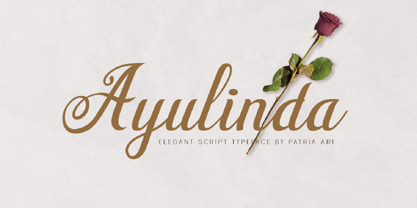 Ayulinda is a luxurious wedding script typeface with its own beautiful alternate glyphs that you can experiment with. Ayulinda is perfect for branding projects, wedding invitation, branding, logo, social media posts, advertisements, product packaging, product designs, label,poster, and any projects that you work on.
 - Attaurel by Goodigital13,
$20.00 They works perfect for you who needs a typeface for headline, logotype, apparel, invitation, branding, packaging, advertising etc. The combination of the font will make your design more beautiful and luxury. This font is suitable for any design like wedding, branding, quotes, and etc.
 - Indy Italic by ITC,
$29.00Indy is the work of Chicago-based lettering designer Charles Hughes. The lowercase letters link together to evoke the look of true handwriting and complement a generous and graceful capital alphabet. Indy is a refined handwriting script ideal for anything needing a touch of elegance. - Soft2911 by Ivan Kostynyk,
$15.00 This font was a product of self-initiated project I started a while back. It started and finished as a project that I was working on while procrastinating at school, for fun; however, I spent enough time to not give it out for free.
 - Charlie by Fype Co,
$16.00 Charlie is a contemporary and stylish display sans serif typeface. Charlie is made with inspiration from art deco style. Charlie works best for use in such as book titles, stationery designs, quotes, branding, logos, packaging designs, posters, and more. it's look classy and authentic!