10,000 search results
(0.049 seconds)
- Humblest Pro by Gleb Guralnyk,
$15.00 Hi. Introducing a new version of my one of the most popular fonts. Now Humblest Pro includes much more characters and has west european multilingual support. This font has a smooth and clean shape without any grain unlike the original one. Almost all of the capital leters has two version, for the begining and for the ending of the word. The final alternative letter will be automatically replaced if you type a big last letter in the word (check out if the "contextual alternates" opentype feature is activated). Decorative swashes are now a part of the font. To use this decorative lines just type an underscore character and the corresponding number from _00 to _39 (make sure that “standard ligatures” opentype feature is activated). Also a lot of ligatures for small letters are available, please check out the previews with all available glyphs. Thank you and have fun!
 - Donita by MrLetters,
$15.00 Donita Script is a soft and beautiful font that has a connection to the upper part of the letter, this is something unique but very beautiful, luxury and charming. This font is to complement your design needs in making amazing works. Donita Script is perfect for branding, wedding invitations, magazines, mugs, business cards, quotes, posters, and many more that you can use on your big project will be very beautiful. Donita Script has been equipped with the OpenType feature and has many glyphs. and of course having a lot of flying machines will be able to choose letters to your liking, lots of variations and choices for each letter, so you can adjust your design choices and also have other languages supported.which you will get in this package: This font is very suitable for use with programs that support OpenType features such as Adobe Photoshop Cs / Adobe Photoshop CC, Adobe Illustrator CS / Adobe Illustrator CC, Adobe Indesign, and Corel Draw and many more programs that support OpenType. If you have any questions, don't hesitate to contact me via email at: hello.mrletters@gmail.com Thank you and happy designing :-)
 - Fenway by Krafted,
$10.00 Are you ready to delve into the rich depths of history? Are you ready to make your branding bold? Are you looking for a statement font that exudes prominence, style, and adventure? Introducing Fenway - A Clean Script Font. This clean script font can be used for a host of different content needs and projects. Use it to make your headings stand out, enhance your logos, style up your business cards, elevate your website and social media, and bring class, style, and history across all your channels. Get ready to captivate, engage, and inspire your audience and clients with Fenway. What you’ll get: - Multilingual & Ligature Support - Full sets of Punctuation and Numerals Compatible with: - Adobe Suite - Microsoft Office - KeyNote - Pages Software Requirements: The fonts that you’ll receive in the pack are widely supported by most software. In order to get the full functionality of the selection of standard ligatures (custom created letters) in the script font, any software that can read OpenType fonts will work. We hope you enjoy this font and that it makes your branding sparkle! Feel free to reach out to us if you’d like more information or if you have any concerns.
 - Mynaruse Royale by insigne,
$22.00 Mynaruse Royale is an expansion of Mynaruse Titling. It features script capitals and widely tracked and smaller titling capitals. Mynaruse Royale has plenty of character and, with its powerful and sharp serifs it draws in the eye. Mynaruse Royale is useful in settings that call for titling with an extra touch of elegance, such as a storefront, wedding program or formal invitation. Mynaruse Royale contains a number of OpenType alternates, including alternate forms for the capitals that are large, drop cap like capitals instead of the calligraphic script capitals found in the default forms. Additionally, there are non-widely tracked lowercase forms that work well with the included alternate characters and ligatures. The lowercase forms are 80% smaller in height than the Mynaruse lowercase forms, so the families are not interchangeable, but they can be used together. The calligraphic script capitals could also be used separately as drop capitals. OpenType-capable applications such as the Adobe suite or Quark can take full advantage of automatically replacing ligatures and alternates. This family also includes the glyphs to support a wide range of latin based languages.
 - Hadriano by Monotype,
$29.99When traveling in Paris, American designer Frederic W. Goudy did a rubbing of a second century marble inscription he found in the Louvre. After ruminating on these letterforms for several years, he drew a titling typeface in 1918, all around the letters P, R, and E. He called the new face Hadriano" as that name was in the original inscription. Robert Wiebking cut the matrices, and the Continental Typefounders Association released the font. Goudy designed a lowercase at the request of Monotype in 1930, though he didn't really like the idea of adding lowercase to an inscriptional letterform. The lowercase looks much like some of Goudy's other Roman faces. Compugraphic added more weights in the late 1970s, and made the shapes more cohesive. Hadriano has nicely cupped serifs and sturdy, generous body shapes. Distinctive individual letters include the cap A and Q, and the lowercase e, g, and z. Hadriano™ is an excellent choice for impressive headings and vigorous display lines." - Celtiberica by Celtibérica,
$24.00 What was the inspiration for designing the font? Ancient script from Celtiberian culture. What are its main characteristics and features? Very ancient scripts in lead or bronze. Usage recommendations: As you like, Archeological designs.
 - Luedickital by URW Type Foundry,
$39.99 Lüdickital is a handwriting script design. Lüdicke wasn´t satisfied with existing scripts which he though of too stylish and uneven. He simply digitized his own handwriting and developed a regular and a bold.
 - Black Jacky by IbeyDesign,
$19.00 Black Jacky Bold Script Font is versatile script font that has a wide spectrum of applications ranging from greeting cards to headlines and is guaranteed to add a romantic feel to your next project.
 - Sitcom by GroupType,
$19.00 If there was an American Typeface Hall of Fame, Bank Gothic, designed by the great Morris Fuller Benton would hold a place of special distinction considering this design has survived so many trends in typographic fashion since being introduced in 1930. It's just as desirable today as it was over eighty years ago; arguably more. Today, Bank Gothic is a very popular choice as a titling face for science fiction books, posters and countless television and movie titles. It is also a popular typeface for use in computer games and digital graphics. GroupType’s 2010 revival of this American classic is true to the design, the period, and Benton’s aesthetic. GroupType worked with some of the most talented and experienced type designers that were historically grounded and sensitive to this design project. Fortunately, Mr. Benton has left us a large selection of other great typefaces for insight and guidance. GroupType’s new revival includes the original three weights in regular and condensed style but also a new small cap and lowercase in each font necessary for 21st century typography.
 - HWT Roman Extended Fatface by Hamilton Wood Type Collection,
$24.95 The design of the first "Fat Face" is credited to Robert Thorne just after 1800 in England. It is considered to be the first type style designed specifically for display or jobbing, rather than for book work. The first instance of Fat Face in wood type is found in the first wood type specimen book ever produced: Darius Wells, Letter Cutter 1828. This style was produced by all early wood type manufacturers. The style is derived from the high contrast, thick and thin Modern style of Bodoni and Didot developed only decades previously. The extended variation makes the face even more of a display type and not at all suitable for text. This type of display type was used to compete with the new Lithographic process which allowed for the development of the poster as an artform unto itself. This new digitization by Jim Lyles most closely follows the Wm Page cut. The crisp outlines hold up at the largest point sizes you can imagine. This font contains a full CE character set.
 - Futura PT by ParaType,
$30.00 Futura is a classic geometric sans serif, one of the crucial typefaces of the 20th century. It remains relevant today and is widely used in logos, headings, web and print. Futura was designed by Paul Renner for Bauersche Gießerei (Bauer) in 1927. The typeface is based on simple geometric forms and is close in the aesthetics to 1920s-30s constructivism and the Bauhaus. Futura PT is the most complete Cyrillic version of Futura. It’s a type system of 25 styles: 16 regular and 9 narrow, from Thin to Extrabold. Futura PT has linear and old style figures, subscripts and fractions. The typeface supports more than 100 languages: Western and Central European Latin and the Cyrillic-extended. The Cyrillic version of Futura was designed by Vladimir Yefimov in 1991–1995. He partially redesigned the typeface in 2007, making it a wholesome consistent system, and Isabella Chaeva added new styles. The typeface was released under the name Futura PT. Isabella Chaeva returned to work on Futura in 2022. The typeface has three new styles, old style figures and extended Cyrillic support.
 - Jode by Putracetol,
$22.00 Introducing Jode, a new elegant display serif font that is perfect for creating luxurious and sophisticated designs. Inspired by luxury serif fonts used in display covers, we combined it with an elegant typeface style to create Jode. With a lot of options and alternates, you can make great display combinations for lettering. Jode is ideal for logos, headings, covers, posters, quotes, product packaging, headers, merchandise, social media, greeting cards, and more. This font is versatile and works well with various design themes, especially those that require a touch of luxury and elegance. Jode comes with OpenType features that include many alternates and end swashes, which can be accessed using programs that support OpenType features such as Adobe Illustrator CS, Adobe Photoshop CC, Adobe Indesign, and Corel Draw. Additionally, Jode supports multiple languages. The Jode font package includes files, making it accessible to anyone with a font-compatible device. It features uppercase and lowercase letters, OpenType alternates and ligatures, numbers, punctuation, and symbols. Get Jode and elevate your designs to new heights of elegance and sophistication.
 - Bodoni Poster by Linotype,
$29.99 Giambattista Bodoni (1740–1813) was called the King of Printers and the Bodoni font owes its creation in 1767 to his masterful cutting techniques. Predecessors in a similar style were the typefaces of Pierre Simon Fournier (1712–1768) and the Didot family (1689–1836). The Bodoni font distinguishes itself through the strength of its characters and embodies the rational thinking of the Enlightenment. The new typefaces displaced the Old Face and Transitional styles and was the most popular typeface until the mid-19th century. Bodoni’s influence on typography was dominant until the end of the 19th century and even today inspires new creations. Working with this font requires care, as the strong emphasis of the vertical strokes and the marked contrast between the fine and thick lines lessens Bodoni’s legibility, and the font is therefore better in larger print with generous spacing. Chauncey H. Griffith’s Poster Bodoni displays characteristics of the advertisement fonts of the first half of the 20th century. The font was most often used for posters and signs, eventually including neon signs.
 - Yalindha by Attype Studio,
$16.00 Yalindha is lovely script font with swash on ending word. This font perfect for valentine & wedding theme design. Combine it with Tallove ending swash & Alternates Character to make perfect design for yor projects. Yalindha perfect for valentine promotion, wedding invitation, branding, logo, invitation, stationery, social media post, product packaging, merchandise, blog design, game titles, cute style design, Book/Cover Title and more. What's Included : - Yalindha Font - Multilingual Support --- Hope you enjoy with our font! Attype Studio
 - Flanker Tanagra by Flanker,
$12.00 In order to give new imput to the art of typeface design in Italy, Nebiolo Company held, in March 1910, an artistic competition for a new alphabet conception, so the best-ranked design would be transformed into a real new typeface. 42 competitors participated and, although the first prize was not technically awarded, "Ancora" resulted as the best typeface, created by the designer-typographer Natale Varetti of Turin. Nonetheless, the new alphabet was transformed into a full-fledged metal typeface in 1924, renamed "Tanagra" in honor of the Greek city in the center of Boeotia. The new font, although not significantly detached from the classical Roman form, introduced decorative elements that allowed its use in both rational and artistic compositions. This font appears very clear and easy to read, with very high ascenders and some decorations that make it distinctly retrò. Finally, after almost 100 years, this peculiar character has been digitized taking it as a model the shapes of the 16 points size (other dimensions have significantly different contrasts and proportions). To adapt it to modern use, some glyphs have been modified, but all the originals are available as Stylistic Alternate OTF, as well as all the swashed variants while the missing ones were added.
 - Scroll by Canada Type,
$24.95Earlier this year, my eyes fell upon a discarded wedding invitation on the sidewalk. A closer look at it revealed that it had at one point been victimized by rain. Some of the fancy script letters were not quite broken, but sort of melted and run-down, while the rest were still somewhat intact. That's how Scroll was conceived, as an idea for a script where thicks and thins blend to produce a wet appearance. Unlike most available broken scripts, the Scroll script was originally drawn in its own juiced context, and not based on any existing script. This font is great for atmospheric antiquity, deep natural poetry, still life captioning, gothic music posters and collateral, or horror literature and poetry covers. - Etruria by Dima Pole,
$34.00 Font Etruria is based on a real Etruscan inscriptions and realistic accurately simulates the writing of the Etruscans. The idea of the font Etruria is to give an opportunity for anyone to touch the past of mankind! The character of the Etruscan alphabet involves the creation of a font with only uppercase letters. However, I did not limit this font by that. Etruria has not only a lowercase is different from uppercase, but an additional sets of alternative characters. In General, the main characteristic of Etruscan writing is randomness and diversity of characters. Differs from lowercase to uppercase is only the first step on the road to make randomness effect. Next to the aid of the OT features. To recreate the randomness effect, in Etruria there are several OT features (Contextual Alternates, Stylistic Alternates and Stylistic Sets), which built a script to simulate randomness. Additionally, another script creates the effect of random positioning. Together they create incredibly realistic Etruscan inscription. Thus, any of these features can be disabled at will. I also used a small line spacing, because it is characteristic of the Etruscan writing. Actually the Etruscan writings is a mirror of the writings compared with the current European alphabets. I didn't use this feature all the letters, because this would make the font difficult to perceive, but to make the font characteristic of the Etruscan style, Etruria has a few letters in mirror image. However, if for someone it may seem unusual, mirrored letters can be disabled instead of them will appear more familiar to them. Another feature of Etruscan writing is the use instead of a space dotacentered. Font Etruria has this feature, there is a OT feature Stylistic set ss03. Naturally, it also can optionally be disabled. All these features can be used together, separately, or turn it off. The main goal achieved! The text typed in Etruria, creates full impression of these Etruscan inscriptions.
 - Gillebra by CBRTEXT Studio,
$15.00 Gillebra is a modern calligraphic monoline script font with soft, clean curves. It contains a complete set of uppercase & lowercase letters, a wide variety of punctuation marks, numbers, and multilingual support. Perfect for adding a touch of elegance to your projects and branding. Also with their help, you can make beautiful wedding inscriptions or frames for your home. This font is also suitable to be used to help your business, such as book covers, stationery, marketing, magazines, and more.
 - Et Cetera by Scholtz Fonts,
$25.00 Et Cetera is a beautiful, hand-lettered script. It abounds in OpenType features such as terminal swashes and ligatures and is best used with OpenType savvy software with the “standard ligatures” and “contextual alternates” features turned ON. Et Cetera is comprehensive and vigorous. Most letters in the font are connected, but, as in typical handwriting fonts, not all are connected. Most characters have a consistent shape within the font, but not all. Some characters in Et Cetera are sensitive to their position in the text and change depending on the adjoining characters. This contributes to the casual and relaxed style of Et Cetera; not allowing the features of the font to get between the reader and the message. A wealth of OpenType features lie beneath the mellow exterior of Et Cetera. These Open Type features make few demands on the user which makes for a versatile script font that requires no expertise from the user, performs well at larger sizes, and remains legible even when setting copy at very small sizes. Et Cetera comes in three styles, Black, Regular & Line. Et Cetera Black is dramatic and bold, making a powerful statement. Et Cetera Regular is elegant and romantic, perfect for wedding stationery and clothing brands. Et Cetera Line is delicate and feminine, portraying a smooth, flowing effect. Et Cetera is a breezy, light, yet expressive font that is perfect for titling work, product packaging and romantic stationery.
 - Able by T-26,
$39.00The history of Able’s connection with the Harry Potter phenomenon is really up in the air. It’s a catch-22 in this business - you either promote your own work and negotiate expensive exclusive licenses, or you work with a promoter and sell your designs to anyone and everyone. It could have been an in-house designer at Rowling’s publisher, Scholastic, or a freelancer who proposed Able for the headings and such. The responsible party licensed it from T26, and JK Rowling’s storytelling made it a star. (I suppose it’s ironic that there’s a whole lot of unwritten history in the typography business.) Able’s rise to fame really is a classic love story between reading and type design. If the books weren’t so popular, Able might still be waiting for some Mexican fast food chain to pick it up for packaging design. The movie deal certainly made the font all the more recognizable, what with its merchandising campaign. Popularity can also cripple a great decorative face. It’s always being recognized as “The Harry Potter Font.” It might just have to wait a few decades for the Potter phenomenon to subside to be freed from the “Chamber of Pigeonholed Fonts.” In the meantime, I’m sure that a lot of fledgling graphic design apprentices are reading their new Potter books, being charmed by the idea of type design when they’re not turning the pages too fast to notice. - Nimbus Sans by URW Type Foundry,
$35.00 The first versions of Nimbus Sans have been designed and digitized in the 1980s for the URW SIGNUS sign-making system. Highest precision of all characters (1/100 mm accuracy) as well as spacing and kerning were required because the fonts should be cut in any size in vinyl or other material used for sign-making. During this period three size ranges were created for text (T), the display (D) and poster (P) for small, medium and very large font sizes. In addition, we produced a so-called L-version that was compatible to Adobe’s PostScript version of Helvetica. Nimbus was also the product name of a URW-proprietary renderer for high quality and fast rasterization of outline fonts, a software provided to the developers of PostScript clone RIPs (Hyphen, Harlequin, etc.) back then. Also in the 80s, a new, improved version of the Nimbus Sans, namely Nimbus Sans Novus was designed. Nimbus Sans Novus was conceptually developed entirely with URW’s IKARUS system, i.e. all styles harmonize perfectly with each other in terms of line width, weight, proportions, etc. On top of that, Nimbus Sans Novus contains more styles than Nimbus Sans. Now, Nimbus Sans is also available as Round (like the popular URW fonts Futura Round and Eurostile Round). The Round versions are intended to facilitate the work of designers and typographers. The fonts can be used directly, without further preparatory work in graphic programs as finished, high-quality Rounds.
 - Ministry by Device,
$39.00 A 14-weight sans family based on the original British ‘M.O.T.’ (Ministry of Transport) alphabet. A capitals-only, single-weight design was drawn up around 1933 for use on Britain’s road network, and remained in use until Jock Kinnear and Margaret Calvert’s ‘Transport Alphabet’ was introduced for Britain's first motorway in 1958. The identity of the original designer is not preserved; however, Antony Froshaug in a 1963 ‘Design’ magazine article mentions Edward Johnston as an advisor. Speculation that it was based on Johnston’s London Transport alphabet is discussed in archived government documents from 1957: “So far as I am aware, the Ministry alphabet was not based on Johnston’s design; indeed, it has been suggested that Gill got his idea from Johnston. Our alphabet was based on advice from Hubert Llewellyn-Smith (then chairman of the British Institute of Industrial Art) and Mr. J. G. West, a senior architect of H. M. Office of Works.” A 1955-57 revision of the alphabet which polished the somewhat mechanical aspects of the original may be the work of stone carver and typographer David Kindersley. For the digitisation, Rian Hughes added an entirely new lower case, italics and a range of weights. The lower case mimics the forms of the capitals wherever possible, taking cues form Gill and Johnston for letters such as the a and g, with single-tier versions in the italic. A uniquely British font that is now available in a versatile family for modern use.
 - Nimbus Sans Round by URW Type Foundry,
$35.99 The first versions of Nimbus Sans have been designed and digitized in the 1980s for the URW SIGNUS sign-making system. Highest precision of all characters (1/100 mm accuracy) as well as spacing and kerning were required because the fonts should be cut in any size in vinyl or other material used for sign-making. During this period three size ranges were created for text (T), the display (D) and poster (P) for small, medium and very large font sizes. In addition, we produced a so-called L-version that was compatible to Adobe’s PostScript version of Helvetica. Nimbus was also the product name of a URW-proprietary renderer for high quality and fast rasterization of outline fonts, a software provided to the developers of PostScript clone RIPs (Hyphen, Harlequin, etc.) back then. Also in the 80s, a new, improved version of the Nimbus Sans, namely Nimbus Sans Novus was designed. Nimbus Sans Novus was conceptually developed entirely with URW’s IKARUS system, i.e. all styles harmonize perfectly with each other in terms of line width, weight, proportions, etc. On top of that, Nimbus Sans Novus contains more styles than Nimbus Sans. Now, Nimbus Sans is also available as Round (like the popular URW fonts Futura Round and Eurostile Round). The Round versions are intended to facilitate the work of designers and typographers. The fonts can be used directly, without further preparatory work in graphic programs as finished, high-quality Rounds.
 - Senkron by Gurup Stüdyo,
$19.00 Senkron is composed of "normal" and a "blok" styles. Senkron ("normal") was designed as a pure and modern neo grotesk font. The anatomy of the letters are designed to achieve an equal text color. For this purpose, the legs of the letters “R” and "K" are designed with a vertical angle to prevent the white space that would occur in the middle of these letters. In the minuscule, the characteristic features of letters such as ‘a’, ‘l’, ‘t’ are concretized and legibility is supported in the text. Considerable attention has been paid to the harmony between the anatomical structures of the letters and the diacritical mark’s structure. Senkron Blok is arranged for situations which have diacritical marks overflow to leadings of the headline and headline typographical color is affected negatively from this situation. For this purpose, majuscule diacritical letters are resolved within the letter height. However, when this is done, new forms are obtained by integrated diacritical marks with letters instead of directly merging them. The idea behind this approach is to preserve the typographic value of diacritical marks and emphasize the semantic value of diacritical letters. 82 letters have been redesigned in this way.
 - Pilgrim by Linotype,
$29.99 Pilgrim is a re-cut of a Linotype face that Eric Gill originally designed for a book published by the Limited Edition Club of New York. Admired for its tranquil dignity, the Pilgrim type is both firm and elegant. Its general appearance resembles that of Gill’s Joanna font family. The contrast of the font is not very strong. The serifs are bracketed. Eric Gill, who designed the type on which Pilgrim is closely based, observed one sort of model for his lettering - the incised monumental letter of Roman origin. This is clearly seen in his capitals, but is also true of his lowercase letters, which have little of the calligraphic or engraved qualities of most other type designs. Gill’s types are Roman in the classic sense, yet also particular to Gill himself.
 - Hudson NY by Andrew Footit,
$12.00 Hudson NY is a display font that gives you strong and bold typography with three different styles that make up the family, a regular, serif and slab serif. Hudson NY is an adaptation and progression of Roper Font, and like Roper font it comes in regular and a press versions, giving the user some cool options when creating artwork. The golden thread that ties this family together is its American sports and college styling, it gives Hudson NY an authentic look but at the same time there is a modern approach to the character set. I would like to thank the talented Kurt Dee for allowing me to use his awesome pictures of New York City to create this the overall theme for this project, please go check out his instagram @kurtdee.
 - Electrostatic JNL by Jeff Levine,
$29.00 Electrostatic JNL was inspired by the 1930s lettering for radio station WMCA in New York City. It was found as part of an ad for the station in a 1932 radio broadcasting trade magazine. WMCA went on the air Feb. 6, 1925. According to Wikipedia, the "MCA" call letters stood for the Hotel McAlpin, where the station's original studio and transmitter were located. "W" is the call sign prefix for all broadcast stations East of the Mississippi River; with the exception of KDKA (Pittsburgh), which was the nation's first commercial radio station. This bold novelty typeface with lightning bolds intersecting the characters can be used to represent anything from electricity to stormy days; power generators to brute force and so forth. Electrostatic JNL is available in both regular and oblique versions.
 - CoolKids by SevenType,
$29.99 CoolKids was inspired by the song “Signs of Life” by Arcade Fire. Since the lyrics talk about some cool kids we wondered what a typeface with the name cool kids would look like. We immediately knew it had to be laid back yet bold and to stand out from the crowd. After designing the bold script we decided to include a light, regular and medium weight to offer you more options for your designs. It comes with initial and final alternates, that show up automatically, to make it feel more natural and similar to handwriting. Every character was carefully drawn and connections are real smooth. This casual font-family speaks most Latin languages, both in their basic and alternate forms. CoolKids is great for creating logos, packaging, posters and much more. More important than to create a font is to use it… so now it’s up to you to create something awesome with it. Feel free to share your designs with us via email to hi@seventype.com We would love to see and share them with the world!
 - Gara Gara by Daylight Fonts,
$50.00 This is a new generation of Garamond. This delicate and powerful Roman will captivate you and those who have seen your typography!
 - Gizela by Type Salon,
$11.00 Gizela shows her personality with a feminine, sensual, seductive and art deco vibes. Perfect for late December invitations and New Year's cards.
 - Legionary by Tkachev,
$25.00 Legionary is a new sans-serif with six font styles. It would look nice in magazines, on food packages, posters and flyers.
 - CircusKS by Baseline Fonts,
$24.00CircusKS is a new, original typeface based on carnival and circus posters from the late 1800s. Extended Character set for multilanguage support. - Allegias by ZetDesign,
$10.00 Allegias is our new product in a futuristic and modern style. This font is suitable for clothing, logos, magazines, banners, and more.
 - Mandala FX by Matthias Luh,
$16.00 Mandala FX is a new comic font mada by Matthias Luh. It has a nice style and quite a lot of characters.
 - VLNL Hollandsche Nieuwe by VetteLetters,
$20.00 Raw herring is the Dutch sashimi. Every year at the beginning of the summer a new batch of freshly caught herring arrives at Holland’s quays. Fishing boats actually race each other to be the first boat bringing it home. The fresh herring is called ‘Hollandsche Nieuwe’ (Holland’s new). This typeface, designed by Donald Roos, is based on the typography of Dutch fish shops and stalls. Inspired by lettering from the 30’s and 40’s, infused with some ‘techno’ flavour, Hollandsche Nieuwe is the brand new fresh fishy type flavor on your computer! It is traditionally eaten with sliced onions and pickles. Simply pick up the fish by the tail, open your mouth and take a bite! Enjoy!
 - Pasarela by Los Andes,
$26.00 The street is the new runway. Pasarela is a display typeface inspired by the new culture of fashion in the streets. A global phenomenon across continents, traveling through social networks, fashion bloggers and street style. Everything is possible, everything is combined. The new culture of fashion is eclectic with hints of each culture at miles away. The complexity generated by the start page of this mix styles is solved perfectly with his neutral and clean tone, streamlined structure and thin strokes. It has been designed in two weights plus a set of borders that can generate graphic compositions for application in blogs, magazines, posters and tv. No one needs to be a fashion victim to cross the pasarela.
 - Architype Renner by The Foundry,
$99.00 The geometry of Paul Renner’s sans letterforms was tempered by optical correction to follow earlier typeface proportions, with capitals close to old-style forms, yet still retaining the spirit of the New Typography. His early experimental characters were included as alternatives in the sans which was to become the Futura released by Bauer in 1927–30. Unusually, old style figures also appeared in his early versions but they too were soon discarded. Foundry Architype Renner as a new four weight family has been developed from the original Renner Regular and Bold, created by The Foundry for the first Architype Collections in the early 1990s. This new family features the old style figures and the experimental elements.
 - Cantate by Intellecta Design,
$26.90 a bold and brute script font
 - Zoomba by Lebbad Design,
$24.95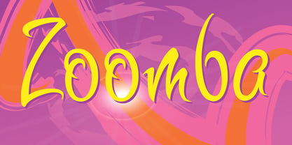 Zoomba is a cool edgy script.
 - Veneto by Scriptorium,
$18.00An attractive antique-looking script font.