10,000 search results
(0.038 seconds)
- Nokarin by Alit Design,
$18.00 Introducing Nokarin Font Nokarin Font Inspired by elegant script with handwritting. Carefully designed to work together in harmony making it perfect for wedding favors, book covers, greeting cards, logos, branding, business cards and certificates, even for any design work that requires classic, formal or extravagant. Attempt calligraphy Desired, delight in those riches from claiming OpenType features and tell its exquisite fun and fervor make you euphoric What's more support your creativity! you might utilize this font precise undoubtedly. Elegant script “Nokarin Font” are very easy to apply to any design, especially those with an elegant and smooth concept, apart from that this font is very easy to use in both design and non-design programs because all alternates and glyphs are supported by Unicode (PUA).
 - Mangrove by Set Sail Studios,
$18.00 Bring your letters to life with the Mangrove Font Duo! A delightfully playful pairing of Sans and Script fonts. These perfectly balanced typefaces have been carefully designed to work not only as standalone fonts, but also to pair together effortlessly—delivering undeniably eye-catching typography bursting with character. Throw a script letter in the middle of the sans font, try the swooping sans ligatures or it’s uplifting small-caps, the possibilities are numerous. It’ll work in lowercase or uppercase, and with a choice of 3 weights per font, that’s six fonts in total for you to experiment with! Language Support • English, French, Italian, Spanish, Portuguese, German, Swedish, Norwegian, Danish, Dutch, Finnish, Indonesian, Malay, Hungarian, Polish, Croatian, Turkish, Romanian, Czech, Latvian, Lithuanian, Slovak, Slovenian.
 - Basilia by Linotype,
$29.99 Among the countless typefaces available today, the Modern Face style is relatively underrepresented. During the 19th century and then later with the competition from the mechanized hot metal types and film setting, a number of attractive headline types appeared in this style. For text, however, the available types were limited to those based on tried and true classics like Walbaum, Didot and Bodoni, which were created between 1780 and 1830, as well as a few variations from the end of the 19th and beginning of the 20th centuries. The demand for new Modern text types remained nonexistant until the 1960s. Such was the situation when the Haas'sche Schriftgiesserei (Haas Type Foundry) commissioned me to come up with a concept and sketches of a new hot metal type. I was able to convince the director of the foundry that there was a niche to be filled with contemporary Modern typography. Another reason for the production of a new type was of a technical nature: the introduction of a new setting technique should not be limited to existing typefaces, but instead should lead to innovative text types suited to the demands of the new applications. André Gürtler, Basilia's designer: I began to work on the concept and initial designs of the new text type in 1968. I wanted to give the type a classical look, expressed above all in the strong stroke contrast between the robust verticals and fine horizontal strokes and serifs. This is one of the main characteristics of Modern typography.""This new typeface, Basilia, is distinguished by its soft, open appearance as well as a number of details which together mark a departure from historical models. For example, it has nothing of Bodoni's round letters and their angular, narrow spacing, and displays instead round forms with a much softer stroke in the curves. It was very important to me to avoid the Modern characteristic of stiff, vertical, grid-like strokes and to create instead a lighter, more transparent type. I retained the Modern style by using straight horizontal serifs at right angles to the strokes to still give the type its sense of rigidity." Three sketches for Basilia (normal, italic, and bold) were finished in 1973. Only the 9-point size was produced at first. In the following years, basic weights were made and adapted to filmsetting."
 - Streetscript Redux by Eclectotype,
$40.00 Streetscript Redux is an update to the now discontinued Streetscript. In the original version, it seems a lot of users didn't like the s’s in the font, and after seeing them redrawn (not always with the best results!) a few times, I decided to make a new version of the font with less idiosyncratic s’s, and this is the result, Streetscript Redux. (I should have listened to my other half - “those s’s look like fives,” she said) All other features of the original Streetscript are intact (barring a couple of s-ligatures no longer necessary). There’s been a little tweaking of some outlines, and slight changes with spacing too, but for the most part, all I've done is redraw those pesky five-like s’s, so that you don't have to.
 - Albion Signature by TofinoType,
$90.00 Albion Signature is a value packed font of exceptional character, with lots of old world charm to make your next project personal and special. Containing over 2,200 glyphs, it’s large enough to handle any demanding project, big or small. It also contains over 400 flourishes in three sections (dingbats, geometric shapes, and misc. geometric shapes) in numerous styles, that can be used in endless combinations. It’s like several fonts in one. Everything you need to do a stellar project is included. A script font that lines up perfectly with a few extra endings and hidden treasures spread throughout. It also contains a complete easy to use PDF index, so you will be able to find exactly the glyph you are looking for fast. This font can only enhance the fonts that you already own, making them more versatile and useful. On its own, it is a very elegant calligraphy script, that will make every project you create look great. The capital letters overlap and intertwine just like in days gone by, for a unique style. Also included are tools that can give you very precise spacing, right inside a word processor. Usage: Photoshop styles, InDesign, personal promotion logos, monograms & signatures.... That’s where it shines, yet it’s still great for art, cards, fancy documents, really fancy labels & even notes to Mom. Imagine, most people used to write letters like these at one time. Now you too can have documents that look like the work of a studied penman.
 - Circus Stars by Vladislav Ivanov,
$20.00 Circus stars is Vladislav Ivanov font with a retro touch, inspired by the look of old circus and movie posters. It works well with normal size text, but it works even better for large displays, short words, or even just to incorporate a few or single characters in a design.
 - 750 Latin Uncial by GLC,
$38.00 This font was inspired by the Latin script used in European monasteries from circa the 5th to 8th centuries, before the Carolingian “Caroline” (look at our 825 Karolus). It was a regular script, rounded, written slowly, used mainly for specially meticulous books, with a few ligatures, legible, but only with lowercase. The capitals consisted of enlarged lower cases, but here, we have preferred to use two slightly different patterns. Our lower cases are a synthesis from a lot of variants (mainly from the “First Bible” of Charles The Bald), the upper cases were mainly inspired from a 700’s manuscript from the abbey of Fécamp (France). We have adapted the font for contemporary users, differentiating between U and V, I and J, which has no relevance for ancient Latin scribes, and naturally with Thorn, Oslash, Lslash, K, W... punctuation and the usual accented characters which did not exist at the time. It can be used with 799 Insular Title.
 - Allisha Croft by Maulana Creative,
$11.00 Allisha Croft is a beautiful feminine script font, With a high contrast stroke clean and fun characters. It has Opentype features of ligatures, makes it a perfect choice for branding and digital designs. Use this font for logos, social media, websites, blogs, instagram, social media, business cards, branding, and more! Allisha Croft font support multilingual more than 100+ language. and good pair for your secondary text font with sans or serif. Make a stunning work with Allisha Croft beautiful feminine script font. Cheers, MaulanaCreative
 - Goldshift by Maulana Creative,
$10.00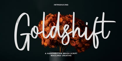 Goldshift is a modern handwritten brush script font, With a rough brush stroke and fun characters. It has Opentype features of ligatures and extra swash, makes it a perfect choice for branding and digital designs. Use this font for logos, social media, websites, blogs, instagram, social media, business cards, branding, and more! Goldshift font support multilingual more than 100+ language. and good pair for your secondary text font with sans or serif. Make a stunning work with Goldshift handwritten brush script font. Cheers, MaulanaCreative
 - Bastardre Hand by DC Design,
$32.00Bastardre Hand is a beautiful calligraphic face based on medieval miniscule script. With characters closer together yet still recognizable and easy to read, this font works well for illuminated text designs and wherever the look of a scribe's hand is desired. Bastardre Hand has punctuation and diacritics for: Afrikaans, Albanian, Bassa, Cebuano, Danish, Dutch, English, Estonian, Faeroese, Finnish, Flemish, French, Frisian, Gaelic, German, Haitian Creole, Hiligaynon, Hmong, Indonesian, Italian, Iloko, Kurmanji Kurdish (Roman script), Marshallese, Norwegian, Papiamento, Portuguese, Spanish, Swahili, Swedish, Tagalog, Trukese, Wolof, Xhosa, Zulu. - Beautinela by Almarkha Type,
$29.00 Beautinela Script is a beautiful mono-line font, perfect for logo design, branding, clothing design, signature, posters, wedding invitations and so much more! My goal with this font was to create an easily legible script font which would work for a wide variety of purposes. This font retains my personality within the characters as they were initially based off my own handwriting and later tidied up to create a set of consistent characters. Having that handmade feel and personal touch certainly gives it a hint of authenticity.
 - Timeout by DearType,
$35.00 Timeout is a fresh, casual script paired with a bold, impactful sans and lots of goodies. It is modern, stylish and it comes in two variations for easy use: - Timeout - long ascenders, descenders and caps - for more impact. - Timeout B - short ascenders, descenders and caps - for easy stacking. The combo between the script and the headline-style sans works perfectly for various applications such as logos, posters, fashion photos, ads, postcards, branding, T-shirts, web images, product packaging and basically for anything you need to look sexy, interesting and informal. The script has some sweet ligatures, stylistic alternates and swashes that will make your designs stand out and capture attention, especially paired with some of the goodies.
 - Skate by DearType,
$29.00 Skate is a multifunctional font family of a script in five weights and a bold complementary sans. It is a versatile combination that works best in large sizes - think billboards, posters, magazine and website headlines, as well as packaging. The Skate family is edgy and packs quite a punch which also makes it suitable for branding projects that rely heavily on type. Both the script and the sans have Latin Extended and Cyrillic support, while the script also comes with a variety of ligatures and stylistic sets for even more design freedom. The Skate family was inspired by urban culture, so it is a great fit for projects that cater to a bold and youthful audience.
 - Amhara by Ingo,
$38.00 A “latin” alphabet modelled on the ethiopian Ge'ez script - an experiment that works. Amhara was created by transferring the typical forms of the Ethiopian Amharic script to the west European alphabet. Because Amharic is traditionally written with an expanded pen tip, it shows the typical ductus also characteristic of the uncial scripts of late antiquity and the early Middle Ages. So this font »Amhara« has a somewhat sacramental effect. And, although the individual forms look foreign, the overall picture is strangely familiar. The two styles of »Amhara« include a number of ligatures which dispose of many non-attractive letter combinations. Stylistic alternates are available for some letters, too. Read more about this font at ingoFonts...
 - DIN Next Slab by Monotype,
$56.99 Now even more design possibilities with the popular DIN Next. With its technical and neutral character, DIN Next has earned a permanent place in contemporary typography. Now, DIN Next Slab expands the font family further, offering new design potential. Now comes the next step, DIN Next Slab, also produced under the direction of Akira Kobayashi. On a team with Sandra Winter and Tom Grace, Kobayashi is creating the new font variant based on the optimized shapes of DIN Next. The expansion will make the popular font all the more flexible and versatile. Apart from that, the geometric slab serifs underline the technical and formal nature of the font and emphasize a central design element of DIN Next. However, the team did have some challenges to overcome. While it is relatively easy to imagine DIN Next Light with slab serifs, the amount of available space quickly disappears when it comes to the Black styles. Winter explains that many tests and trials were necessary to find a compromise between space, letters and the serif shapes. Experiments with modified contrast in the weight or only one-sided serifs were quickly abandoned. The central, technical and powerful character of the font changed too much. Nevertheless, it was necessary to simplify slightly the shape of some letters, such as the ‘k’ or ‘x’, for example. These changes, first developed in the Black styles, were applied to all weights in order to lend the font a consistent appearance. Like DIN Next, DIN Next Slab also has seven weights, which cover the range from Ultralight to Black, each with matching italic. There are various character sets in all of the styles and the four middle weights have small capitals available. DIN Next Slab harmonizes perfectly with the styles of DIN Next: the basic letterforms and weights are identical. Both versions of the font can work together perfectly, not just in headlines and body text, but also within a text; they complement each other very well as design variations. With the new DIN Next Slab, Monotype expands the DIN Next super family consistently. With DIN Next Slab, you can underscore the technical and formal nature of the understated font not only in headlines, but in texts, as well. In this way, you have new and diverse potential for application, thanks to the way the different styles of DIN Next combine perfectly.
 - Electric Cable by Harald Geisler,
$39.00 ''Sometimes, you fall in love with someone, and, sometimes, you fall in love with something. I fell in love with the work of Harald Geisler. Harald and I met through our work on a couple of Kickstarter projects (Typographic Wall Calendar and The Montserrat Typeface). We sympathised immediately with each other, and that lead us to start a new project. The electricity we felt was captured in Electric Cable (that’s what we named it), a typeface designed in our own image and likeness. Electric cable is connected, and that power leads it to write unexpected things. It’s a letter for the flâneur: it carries within itself a high voltage that makes it lively. It has energy and spark. That’s exactly what we would like in a person. It is a display typeface, current and contemporary. It is based on the connection of two friends who felt the need to create a common language even without speaking the same language. In editorials use, your words will become strikingly beautiful. Electric Cable features geometric, humanistic qualities,and also some script, but ,above all, it has a sense of humor.’’ Julieta Ulanovsky (Usage tip: Use the “
 - Petale by LomoHiber,
$15.00 Petale is my new elegant experimental typeface I'd love to present. At the beginning, I was intended to create a bold wide font, I started sketching options and came out with the letter 'M' design first. I thought it may be interesting and had continued developing the style with letters N, O, etc., spending hours on some letters to match the design and my vision. I liked how it looked (especially digits) and added different weighs. And it came out pretty stylish. You may like it to use in magazine designs, posters, websites, packaging, branding, logo, and so on. Petale can grant your work some graceful modern touch with a brutalist-feminine note. Works well with elegant and strict serif fonts. Also try to experiment with script fonts. I used my Stormy Youth font: https://www.myfonts.com/fonts/lomohiber/stormy-youth and Bodoni 72 Smallcaps If you have some issues or questions, please let me know: lhfonts@gmail.com Hope you'll enjoy using Petale! Language support: Afrikaans, Albanian, Bulgarian, Catalan, Croatian, Czech, Danish, Dutch, English, Estonian, Finnish, French, German, Hungarian, Icelandic, Italian, Latvian, Lithuanian, Maltese, Norwegian, Polish, Portuguese, Romanian, Russian (Русский), Slovak, Slovenian, Spanisch, Swedish, Turkish, Ukrainian (Украинский), Zulu
 - Tinderbox by Device,
$29.00 16th and 17th century formal handwriting forms the basis for Tinderbox, an antique script. Preserving the rough impression of a quill pen on parchment, Tinderbox evokes old manuscripts, ecclesiastical texts, gothic inscriptions, faded tattoos and horror literature; spooky calligraphy for the digital age.
 - Daito by insigne,
$29.99 It’s alive! Insigne’s new creation, Daito, is now functional, built to process your logos, business cards, magazine layouts, packaging and more without the slightest glitch. But this new slab serif is no heartless churn of the same factory nuts and bolts. Daito is designed to greet your reader with a friendly face. Inspired by types from the era of the Space Race, this new take on some old faces brings a contemporized, unique set of serif forms to the font race. Daito comes complete with a variety of weights to help you find the best settings for your current needs or moods. Need soft and playful? Daito light communicates its message gently with softened serif. Need a different feel with more authority? With the touch of a few buttons, engage the powerful Black or striking Bold. Additional features with Daito include stylistic alternates, ligatures, titling capitals and small caps among other typographic features. Please note: use magical OpenType-savvy applications such as Adobe Creative Suite, QuarkXPress, etc to keep your font from malfunctioning, shorting, attacking people, or attempting a world takeover. Daito also speaks Western, Eastern, and Central European languages. However, Japanese is not available for this edition. It’s not every day you find a top-of-the-line font like Daito. This machine can handle most anything on your list, short of folding your laundry (though it may make your laundry look nicer). Don’t wait. Order yours today while supplies last.
 - Pompeian Cursive by Wordshape,
$30.00 Pompeian Cursive is a calligraphically-inspired display typeface featuring a limited number of alternate characters and a handful of graceful ligatures. A lively set of non-lining numerals accompanies, as well as a few calligraphically-inspired flourishes for ornament. The history of this typeface: Oswald Cooper’s relationship with the Barnhart Brothers & Spindler foundry was one instigated under the auspices of creating new styles of type in lieu of following stylistic trends. In 1927, BB&S requested that Cooper create a script-like cursive typeface design in step with Lucien Bernhard’s Schoenschrift and ATF’s similarly-styled Liberty typeface. In response to BB&S’s desire to emulate instead of innovate, Cooper wrote to Mcarthur, “I am desolated to see Barnhart’s hoist the black flag. Your own efforts through the years to boost the foundry into a place in the sun as an originator seem wasted.” Still, Cooper took up the task at hand, creating a delicate, sophisticated type design which he named Pompeian Cursive. The typeface featured a limited number of alternate characters and a handful of graceful ligatures. A lively set of non-lining numerals accompanied, as well as a few calligraphically-inspired flourishes for ornamenting the end of lines of type accompanied the typeface, as well. By reviewing the few remaining original drawings for the type, as well as copious samples of Pompeian Cursive from both Cooper & BB&S' proofing process and period-specific type specimens, Wordshape presents the first digital version of this classic hybrid script/sans typeface, complete with all original alternate characters and ornaments. Pompeian Cursive has been intensively spaced and kerned for the finest setting for weddings, announcements, and general display work. - What was the inspiration for designing the font? While researching a biographic essay for Japan’s IDEA Magazine, I came across the original proofs and drawings for Pompeian Cursive. While a number of foundries have released interpretations of Cooper’s assorted typefaces, they stray from the original rather dramatically in parts. Cooper is without a doubt my favorite type and lettering designer, and to bring a refined return to his original intentions is an immense gift. - What are its main characteristics and features? Pompeian Cursive is a typeface which functions as both a display face and a limited text face. It features classy, thoughtful, and delicate swash capitals and rugged lowercase characters with a low x-height and gracefully long ascenders and descenders. - Usage recommendations: Display type or text-setting. Perfect for newspaper work, editorial design, materials intended to invoke an "old-timey" flavor, or just about anything in need of personality.
 - Sales Convention JNL by Jeff Levine,
$29.00 In its heyday, the Starlight Room of the Waldorf-Astoria in New York City quite frequently printed lunch and dinner menus for not only their rotating bill of fare, but also for special events held there. The 1937 Electrolux (Eastern) Appreciation Banquet has its own menu cover, and the lettering was in a simple, yet Art-Deco influenced condensed block design with squared features. This simple and quirky typeface has been digitally redrawn as Sales Convention JNL, and is available in both regular and oblique versions.
 - FF Blur by FontFont,
$68.99 British type designer Neville Brody created this display FontFont in 1991. The family contains 3 weights: Light, Medium, and Bold and is ideally suited for advertising and packaging, festive occasions, editorial and publishing, logo, branding and creative industries as well as poster and billboards. FF Blur provides advanced typographical support with features such as ligatures, alternate characters, and case-sensitive forms. It comes with tabular lining and proportional lining figures. In 2011, FF Blur was added to the MoMA Architecture and Design Collection in New York.
 - On Your Mark JNL by Jeff Levine,
$29.00 Images of ‘lost’ or forgotten signs from the past are on a number of sites all over the web. One in particular partially revealed a vintage sign for “J. Yormark Shoes" behind a barbershop sign at 15 – 8th Avenue in New York City. The sign remained until 2014. The stencil effect made by the formation of the stained glass letters inspired On Your Mark JNL, which is available in both regular and oblique versions. The font’s name is a play on the shoe vendor’s name… “Yormark”.
 - Rotato by VIP Graphics,
$8.49 Rotato is a lowercase only geometric slab-serif typeface that brings versatility to any design. This minimalist but distinctive font is defined by its crisp composition and modern elements — designed for optimal legibility at all sizes. Out now in all lower case, Rotato leaves an understated impression of elegance & futurism. Currently available in three standard weights, more coming soon: Rotato Light - Clean and classy Rotato Regular - Elegant and elite Rotato Bold - Strong and classic FEATURES Three (3) Font Weights + Italics Numbers and Punctuation New (v2): Extended Ligatures & Nordic Character Set Special Characters Rotato is a dynamic font that works great across various applications: from branding & logos to technology & fashion — whether in a giant heading, or paragraphs of body text. Thanks for checking out Rotato; we hope you enjoy using it.
 - Beauty Starlight by Ardian Nuvianto,
$23.00 Beauty Starlight is a mesmerizing script font that radiates elegance and grace. With its intricate and flowing letterforms, this font captures the essence of celestial beauty, making it a perfect choice for projects that demand a touch of sophistication and charm. The delicate curves of Beauty Starlight bring a sense of refinement to your designs, making it ideal for wedding invitations, luxury branding, and any creative endeavor that seeks to convey a sense of timeless beauty. The script's versatility allows it to seamlessly blend into various design contexts, offering a touch of glamour and individuality. The effortless strokes of Beauty Starlight evoke a sense of handwritten artistry, providing a personalized and human touch to your projects. Whether you're designing logos, packaging, or social media graphics, this font invites you to infuse your work with a celestial glow. Embrace the celestial beauty of Beauty Starlight script font and watch as your designs shine with an ethereal allure. Elevate your typographic expressions with this font that blends grace with a touch of starlight magic.
 - Newsbreaker JNL by Jeff Levine,
$29.00 Based on scans of some 1906 newspaper headlines detailing the devastation of the San Francisco earthquake, Newsbreaker JNL is a modern take on vintage typography. With a few letterform characteristics somewhat reminiscent of DeVinne, this typeface was perfect in its day for expressing news headlines - and it holds up just as well today for titling or banner ad copy. Available in regular and oblique versions.
 - Ring Eyes by Ochakov,
$11.00 Now you can see... the new direction of the big family called Ring - Ring Eyes! That's a very unique Ring & truly devoted. There are only four styles, but they are all very important. Ring Eyes font like our eyes held a million stories. Ring Eyes font like other of the Ring Family is the perfect choice for headlines, logos, branding, packaging, publications, and much more.
 - Wuxtry Wuxtry by Comicraft,
$29.00 Oyez! Oyez! Oyez! All citizens having business before the Honorable, the Supreme Court of the Comicraft Authority, are admonished to draw near and give their attention, for Wuxtry! Wuxtry! is now kerning. Tempered and tested to tackle typography in troubled times, this companion to Extra! Extra! affords each and every proclamation, declaration and attestation with the air and veracity of New England Newsies in the 1900s!
 - Murisa Ulyana by Murisa Studio,
$10.00 we would like to introduce one new font which we have released in this march. Murisa Ulyana is our newest font. Still inspired by the oval shape, this font is very cute and eye-catching. It is very fitting if you use it for designs that are cheerful and happy. You can also use it for baby and children's product names. Get it right now.
 - Modernline by Ef Studio,
$10.00 NEW UPDATE : BOLD VERSION Modernline is an organic handwritten font that is suitable for branding, signature, wedding invitation, promotion, product packaging, and other needs. This font is modern, simple, but still authentic. You will get full set of lowercase and uppercase letters, numerals and punctuation, multilingual symbols, lowercase beginning and ending swashes, ligatures and extra swashes. Now come with 2 weights, regular and bold.
 - Jamaika by eyetype,
$16.00 Jamaika is a font scrip, so, font script that is beautiful and unique, it is a model of modern calligraphy typefaces, in combination with a calligraphy writing style. Specific OpenType features include contextual alternates, stylistic alternates, initial and final forms, multiple alternate glyphs for many letters (accessed through the glyphs panel), multilingual support (including multiple currency symbols), ligatures, standard numbers. Perhaps the most fun thing about Jamaika is that it includes multiple versions of all ascending and descending letters, making it lots of fun to play with layouts and compositions. Font features include: Standard ligatures Initial Alternates Terminal Alternates Can be used for various purposes. such as headings, logos, wedding invitation, t-shirt, letterhead, signage, lable, news, posters, badges etc. The OpenType features can be very easily accessed by using OpenType-savvy programs such as Adobe Photo Shop, Adobe Illustrator, Adobe InDesign and CorelDraw X6-X7, You can also access most most of these awesome features in Microsoft Word and other similar programs
 - Gaslon by Canada Type,
$24.95 Gaslon is a slight reinterpretation and major expansion of a 1973 film type called Corvina Black, originally designed for VGC by A. Bihari. While the original typeface was popular in its own right, there were some things in it that were too quirky to work in the display applications it was intended for. Some of the letter combinations just didn't work to their visual optimum. For example the a and o were too similar, ditto the C and G, the E, F and J were too overwhelming to be set properly within certain display uses. Gaslon eliminates these problems by the inclusion of plenty of alternates for the vast majority of the original letters. In fact, the original a is itself now an alternate to a gorgeous new one. The Gaslon Alt font includes tremendous possibilities for both unicase use, and proper use in conjunction with the main font. This is our true homage to a typeface that had great potential more than three decades ago, but was overlooked by digitizers because of a few quirks it had in film type contexts. Full of curves and invitation, Gaslon ranks very high among the friendliest poster faces ever made. It is ideal for friendly store signs, children book covers, and plenty of other applications. In fact, if you're planning on contributing to a few protests around your neighborhood or city, you would probably be better off using Gaslon to help your sign/placard carry words and slogans that are big but friendly. Nothing beats "DOWN WITH GAS PRICES" set in a nice imaginative mix of the many Gaslon letters. The OpenType version of Gaslon is a single font that contains all the alternates and niceties programmed within features accessible by OT-friendly programs.
 - Sleeve Notes by Wing's Art Studio,
$12.00 Sleeve Notes: A font from the analogue age. Inspired by album covers and hand-written song lyrics. Sleeve Notes is an experimental script font and all-caps pair with a loose hand-written style that explores the golden-age of record stores, vinyl albums, cassettes and CDs. It imagines our teenage selves kicking back with a coke (oversized headphones on) discovering a new band and studying the notes on their latest album. Besides production credits, the best sleeves (otherwise known as liner notes) included photos, cool artwork and hand-written song lyrics that gave the listener a human connection to the mind of the artist. This font embraces it's subtle ink blotches and rough edges; all imperfections that build to create a sense of a hastily written lyric, set-list or just a fun little scribble. The package includes six fonts in total; the regular script with two complete sets of alternatives, then two sets of all-caps, and finally the special characters font that features a decorative alphabet plus symbols and underlines. For authentically retro, hand-made looking lettering, it's a great choice and offers the flexibility few other fonts can match. Check out all the visuals to see it action!
 - Keneisha by Seniors Studio,
$17.00 Keneisha is a calligraphic script font with varying baseline, which is designed to convey elegance and style. It is smoothline, clean and feminine. Works perfectly for logos, magazines, menus, books, invitations, wedding / greeting cards, packaging, labels, t-shirt etc. Including initial and terminal letters, alternates, ligatures and multiple language support.
 - MC Tamoth Utamo by Maulana Creative,
$16.00 Tamoth Utamo handwritten display font. This font is good for logo design, Social media, Movie Titles, Books Titles, a short text even a long text letter and good for your secondary text font with signature or script typeface. Make a stunning work with Tamoth Utamo handwritten display font. Cheers, Maulana Creative
 - Mattoa by Bombastype,
$35.00 Introduce Mattoa, a bold and sporty script. This font is very great for bold logotype . Comes with many swashes options that you can play with. Will works well for both modern and retro style. If you need a font for your display purposes, you defintely need to consider this font.
 - Aryzena by Scratch Design,
$9.00 Aryzena is handwritten, textured, artistic brush script. This font also has swash characters that make your design more attractive and natural, giving your text an authentic and laid-back characteristic. This font works well in designs for clothing, tittle books, quotes, branding, logos, packaging designs, posters, invitation, mural and more!
 - Headson by Garisman Studio,
$20.00 Introducing Headson Headson combines attractive curves with a fresh urban edge; delivering a stylish script which is guaranteed to add an eye-catching appeal to your logo designs, brand imagery, quotes, product packaging, merchandise & social media posts. - Simple installation - Work for PC and MAC - Multilingual Support Thank You! GRSMN Std. 2012
 - MC Robneys Hut by Maulana Creative,
$15.00 Robneys Hut modern display font. This font is good for logo design, Social media, Movie Titles, Books Titles, a short text even a long text letter and good for your secondary text font with signature or script typeface. Make a stunning work with Robneys Hut modern display font. Cheers, Maulana Creative
 - Clowed Rollnow by Maulana Creative,
$14.00 Clowed Rollnow brush handmade font. This font is good for logo design, Social media, Movie Titles, Books Titles, a short text even a long text letter and good for your secondary text font with signature or script typeface. Make a stunning work with Clowed Rollnow brush handmade font. Cheers, Maulana Creative