10,000 search results
(0.034 seconds)
- BD Aubergin by Typedifferent,
$15.00 The typeface with a slice: BD Aubergin is somehow reminiscent of the bauhaus era but with a modern twist, great for the use in titling and giving character to your print and screen work. The variable version morphs from filled (flat) to sliced.
 - Lino Cut by ITC,
$29.99Lino Cut is the work of British designer Bob Anderton, who was inspired by the strong effect of linocut images. Capitals and lowercase letters should be set closely. Lino Cut can bring its unique, eye-catching style to a variety of display applications. - Lambada by ITC,
$29.99Lambada font is the work of British designer David Quay, a font with a Latin American look. It should be used with closer letter and word spacing. Lambada will create eye-catching headlines and is perfect for wherever a festive appearance is desired. - Renova Pro by Elsner+Flake,
$40.00 Renova was designed by Elsner+Flake in the late 90s as a contractual work. The font family comes as a typical Office pack in EuropePlus layout for at least 72 Latin languages. It is optimized for good legibility in small point sizes.
 - Sutton Place JNL by Jeff Levine,
$29.00 Named for a Manhattan neighborhood, Sutton Place JNL is based on a 1930s-era poster advertising training in the “Household Arts” that was produced by the Federal Art Project in Ohio; a segment of the larger Depression Era WPA (Works Progress Administration).
 - Brandegoris by Scriptorium,
$12.00Brandegoris is a set of traditional split-pen capitals with two forms for most of the letters. It is excellent for headers and titles, especially on web pages and also works well as initial characters in combination with a serif text face. - Willgets Calligraphy by Soft Creative,
$20.00 Willgets Calligraphy is a classic calligraphy font. This is a classic thin font with an italic style. Here you will get a beautiful classic font. This font is available in several modern swirls that can make your work look elegant, sweet and perfect.
 - Belle Amour by Craft Supply Co,
$15.00 Belle Amour – Modern Calligraphy is an handwritten script font based on the expression of real handwriting. Cattus – Modern Casual Script will work perfectly for fashion, e-commerce brands, trend blogs, wedding boutiques or any business that wants to appear upscale and chic.
 - Stephanie by ActiveSphere,
$30.00 Stephanie is a rounded geometric display font and works best in display applications, such as posters, headline, magazine, product branding, corporate branding, signage, logos and titles. Each style has a full upper and lower-case, accents, punctuation and a selection of monetary symbols.
 - Better Saturday by Din Studio,
$29.00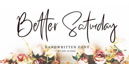 Introducing Better Saturday for your better work. With a classy and natural handwritten style, it brings a classy and chic typeface. Better Saturday is best used for weddings, branding, logotype, and quotes. Features: Beautiful Ligatures PUA Encoded Multilingual Support Numerals and Punctuation
 - Kyrial Sans Pro by Mostardesign,
$- Designed in 2011 by Olivier Gourvat, this font family has generous proportions with a range of weights make it a versatile family for print, text, signage, branding and web design work. Kyrial Sans Pro offers lots of OpenType goodness and broad language support.
 - Kunze by Kitchen Table Type Foundry,
$15.00 Kunze font was inspired by the work of German graphic artist Carl Kunze (Minden, 1884). Kunze is a fat display font; a little rough around the edges, a little wonky in places, but very distinguishable and useful. Comes with extensive language support.
 - Dopamine by Luke Thompson,
$30.00 Dopamine is a friendly, flowing sans serif typeface. It works best for large headlines, particularly in packaging or editorial projects. Its most interesting feature is the flowing line across the top of many of the characters, creating smooth waves from one to another.
 - Losta Nova by Creativemedialab,
$20.00 Minimal and modern sans serif consists of 10 weights from hairline to black as well as variable versions. Works great for branding, fashion, modern, and casual valentine design theme. Designing a logo is made easy with lots of alternates to play with.
 - Vivala Slab by Johannes Hoffmann,
$15.99 The family includes eight styles being seven uprights and an inline style. Vivala Slab is ideal for use in headline sizes, but it also works properly within text blocks and information design. Opentype features are ligatures, ordinals, fractions, numerators, denominators, superscript and subscript.
 - Carot Sans by Storm Type Foundry,
$39.00 Carot Sans is designed on the basis of three elements - square, circle and triangle. Simple and fresh typeface for visual identities, book covers, magazines and advertisement. The whole Carot system of 64 members offers a modern alternative for all types of design work.
 - Superstar by ITC,
$40.99Superstar was designed by Colin Brignall, who was inspired by American sportswear graphics during the process. The font is an inline sans serif that incorporates wedge-like cutouts instead of curves. Superstar is an excellent choice for design work related to sports activities. - Phaley by Typebae,
$15.00 Phaley is a soft and charming handwritten signature script font that effortlessly exudes elegance and grace. With its delicate curves and timeless beauty, it adds a touch of allure and personality to any design or document, transforming words into works of art.
 - Digitek by ITC,
$29.00Digitek is the work of David Quay, a futuristic typeface inspired by output of a coarse resolution computer bitmap. This condensed font is best in large headlines with large letter and word spacing. Digitek is perfect for anything needing a computer-age look. - John Sans by Storm Type Foundry,
$49.00 The idea of a brand-new grotesk is certainly rather foolish – there are already lots of these typefaces in the world and, quite simply, nothing is more beautiful than the original Gill. The sans-serif chapter of typography is now closed by hundreds of technically perfect imitations of Syntax and Frutiger, which are, however, for the most part based on the cool din-aesthetics. The only chance, when looking for inspiration, is to go very far... A grotesk does not afford such a variety as a serif typeface, it is dull and can soon tire the eye. This is why books are not set in sans serif faces. A grotesk is, however, always welcome for expressing different degrees of emphasis, for headings, marginal notes, captions, registers, in short for any service accompaniment of a book, including its titlings. We also often come across a text in which we want to distinguish the individual speaking or writing persons by the use of different typefaces. The condition is that such grotesk should blend in perfectly with the proportions, colour and above all with the expression of the basic, serif typeface. In the area of non-fiction typography, what we appreciate in sans-serif typefaces is that they are clamorous in inscriptions and economic in the setting. John Sans is to be a modest servant and at the same time an original loudspeaker; it wishes to inhabit libraries of educated persons and to shout from billboards. A year ago we completed the transcription of the typefaces of John Baskerville, whose heritage still stands out vividly in our memory. Baskerville cleverly incorporated certain constructional elements in the design of the individual letters of his typeface. These elements include above all the alternation of softand sharp stroke endings. The frequency of these endings in the text and their rhythm produce a balanced impression. The anchoring of the letters on the surface varies and they do not look monotonous when they are read. We attempted to use these tricks also in the creation of a sans-serif typeface. Except that, if we wished to create a genuine “Baroque grotesk”, all the decorativeness of the original would have to be repeated, which would result in a parody. On the contrary, to achieve a mere contrast with the soft Baskerville it is sufficient to choose any other hard grotesk and not to take a great deal of time over designing a new one. Between these two extremes, we chose a path starting with the construction of an almost monolinear skeleton, to which the elements of Baskerville were carefully attached. After many tests of the text, however, some of the flourishes had to be removed again. Anything that is superfluous or ornamental is against the substance of a grotesk typeface. The monolinear character can be impinged upon in those places where any consistency would become a burden. The fine shading and softening is for the benefit of both legibility and aesthetics. The more marked incisions of all crotches are a characteristic feature of this typeface, especially in the bold designs. The colour of the Text, Medium and Bold designs is commensurate with their serif counterparts. The White and X-Black designs already exceed the framework of book graphics and are suitable for use in advertisements and magazines. The original concept of the italics copying faithfully Baskerville’s morphology turned out to be a blind alley. This design would restrict the independent use of the grotesk typeface. We, therefore, began to model the new italics only after the completion of the upright designs. The features which these new italics and Baskerville have in common are the angle of the slope and the softened sloped strokes of the lower case letters. There are also certain reminiscences in the details (K, k). More complicated are the signs & and @, in the case of which regard is paid to distinguishing, in the design, the upright, sloped @ small caps forms. The one-storey lower-case g and the absence of a descender in the lower-case f contributes to the open and simple expression of the design. Also the inclusion of non-aligning figures in the basic designs and of aligning figures in small caps serves the purpose of harmonization of the sans-serif families with the serif families. Non-aligning figures link up better with lower-case letters in the text. If John Sans looks like many other modern typefaces, it is just as well. It certainly is not to the detriment of a Latin typeface as a means of communication, if different typographers in different places of the world arrive in different ways at a similar result.
 - Ceciliany by Brenners Template,
$19.00 Ceciliany is a classy font family that adds calligraphic touches to the basic structure of the display serif. Italic styles share a language set and OpenType Features compared to static styles, but have a completely different metrics In addition, an elaborate and detailed kerning system is also operated separately. 9 weights and 18 unique styles offer designers the amazing creativity of the serif font family. It offers a variety of options for editorial design as well as typography work for various channels. Features 9weights, 18styles Optimized Kernings Stylistic Set Fractions Oldstyle Figures Discretionary Ligatures : AM, AR, BA, BR, CA, CH, CR, DE, EA, El, FR, GA, GH, HR, IL, IM, JA, KA, KR, Ki, LA, LE, LO, MA, Ma, Me, NA, NE, NT, Nu, PS, RA, RE, RO, Ro, SA, ST, TH, UB, Ze, Zo, ft, li. Standard Ligatures : ff, fi, fl. * In particular, ligatures displayed in preview images can be easily applied to Adobe apps. Check out the ligature features of the software you are using.
 - Neue Haas Unica by Linotype,
$53.99 The Neue Haas Unica™ family is an extended, reimagined version of the Haas Unica® design, a Helvetica® alternative that achieved near mythical status in the type community before it virtually disappeared. Originally released in 1980 by the Haas Type Foundry and designed by Team ’77 — André Gürtler, Erich Gschwind and Christian Mengelt— for phototypesetting technology of the day, the design was never successfully updated for today’s digital environments – until now. Toshi Omagari of Monotype Studio has given this classic a fresh, digital facelift with more weights, more languages and more letters to meet today’s digital and print needs. Available in 18 styles, the Neue Haas Unica family is remarkably appropriate for a wide range of applications, possessing a delicate gradation of weights and clear character shapes. The family's lighter weights are perfect for headlines and other large settings, as well as small blocks of copy at typical text sizes. The regular, medium and bold weights know no boundaries and the heavy and black designs are ideal for when typography needs to be powerful and commanding. Like the Neue Helvetica and Univers Next typefaces, the Neue Haas Unica family can be used just about anywhere – or for any project. In addition to its 9 tailored weights and complementary italics, the Neue Haas Unica family also possesses additional characters for Eastern and Central European, Greek and Cyrillic language support, which did not exist in the original design. A cosmopolitan typeface for today's modern, discerning design needs, the Neue Haas Unica collection is a new classic in the making—one that every designer should surely have at their disposal.
 - Olympukes 2012 by Barnbrook Fonts,
$30.00 Released on the occasion of the 2012 London Olympics, Olympukes 2012 was a new set of pictograms telling the ‘real’ story of the Olympics and extending the unofficial project that began in 2004. The occasion of the London games provided an opportunity to revisit the complex contradictions of the modern Olympics and to acknowledge the geopolitical shifts of the intervening eight years. The 2012 games arrived at a time of great economic and political uncertainty for the nation and Europe. Greece – the host of the 2004 games – was now located at Ground Zero of a disintegrating Eurozone and the United Kingdom was two years into a programme of austerity enacted by the coalition government of Conservatives and Liberal Democrats. Given that the previous London Olympics had been held in 1948, in a climate of recovery and austerity after a devastating World War (1948’s Olympiad was dubbed the ‘Austerity Games’) there was a sick irony to the 2012 games' arrival. The suppression of human rights in order to deliver the perfect games for PRoC’s Beijing games shocked no-one and yet, in London, the security measures seemed grossly excessive. Then again, in a country with an estimated 1.8 million cctv cameras, perhaps we shouldn’t have been so surprised. Another aspect of the Olympics that returned for 2012 was the unfettered commercialism – if you think the Games are about pure sport, about noble human endeavour, think again. Please note that Barnbrook Fonts is in no way affiliated with, or has received any endorsement from, the International Olympic Committee, the organising committees of the Olympic Games, or any national Olympic committee.
 - PMN Caecilia Sans by Monotype,
$50.99 Few projects are outside the range of PMN Caecilia® Sans. Drawn specifically for on-screen imaging, the family benefits from a large suite of weights, each with several stylistic variations. This is a design ideally suited to building digital interfaces, complex websites, apps, games, kiosks, HTML ads and large-scale brand identities. “My goal was to create a, friendly, versatile, ageless, yet discerning typeface family that will serve the needs of many users,” says Peter Matthias Noordzij. the typeface’s designer. “It is not intended to be eye-catching, but generous: enabling numerous visual and typographical expressions.” The use of Noordzij’s earlier design, PMN Caecilia, in Amazon’s Kindle® wireless reading devices, gave him the opportunity to study the behavior of the slab serif typeface in an on-screen environment. Although based on his earlier design, Noordzij incorporated fundamental changes to optimize PMN Caecilia® Sans’ digital performance. While PMN Caecilia has proven to be a steadfast serif typeface in print and on screen, the addition of a sans serif counterpart gives designers more flexibility when creating complex hierarchies. The combination of serif and sans serif makes the PMN Caecilia family a good choice for everything from print editorial projects to complicated web sites. A broad range of typefaces pair well with PMN Caecilia Sans. Humanist serif typefaces, such as Agmena™, Dante®, and Frutiger® Serif, set up dynamic typographic harmony, while designs like ITC New Veljovic™ Masqualero™ and Perpetua®, will create a striking counterpoint. And, of course, PMN Caecilia is a natural design partner – as are other slab serif typefaces, like the Aptifer™ Slab, Joanna® Nova and Soho® families.
 - Luis Serra by Homelessfonts,
$49.00 Homelessfonts is an initiative by the Arrels foundation to support, raise awareness and bring some dignity to the life of homeless people in Barcelona Spain. Each of the fonts was carefully digitized from the handwriting of different homeless people who agreed to participate in this initiative. Please Note: these fonts include only the latin alphabet; no accented characters, no numbers or punctuation. MyFonts is pleased to donate all revenue from the sales of Homelessfonts to the Arrels foundation in support of their mission to provide the homeless people in Barcelona with a path to independence with accommodations, food, social and health care. Luis Serra was born in Alicante. There he grew up and even started a family His life was there. But at the age of 35 he split up with his wife and decided to go to Barcelona in search of a new life. And it wasn’t easy for him. He had to turn his hand to all kinds of jobs and didn’t manage to find the stability he needed. Luis is a shy, retiring person who takes great pleasure in the little things in life such as walking in the mountains or celebrating the victories of his football team, Barça. After four years living in Barcelona, Luis found himself in a position he’d never imagined. “The street’s much worse now, there’s more trouble, there’s more tension,” says Luís. In the street he had to learn, as he always had, to move fast, to find a place to sleep and something to eat. Luís is one of those people who don’t let circumstances mould him, but adapts to them and always tries to do his best.
 - Franzi Variable by Wannatype,
$211.00 The new sans-serif Franzi typeface family – as neutral as can be, but at the same time individual and striking. Its unmistakable character lies in the detail, with no effect pushing itself to the fore. As a wide-running typeface with a relatively large x-height, the typeface family is perfectly suited to small text sizes but, with its elegant details, it leaves nothing to be desired in display applications either. Originally designed with constructed, often rectangular elements, Franzi has gradually been rounded during the development process and is now less hard in order to guarantee optimal legibility. Franzi Variable is designed alongside the italic and the weight axes. The italics are softly and elegantly drawn, while the upright characters appear much more severe. The design appeal reveals itself in the two-storey ‘a’ – a tribute to legibility in body copy; however, for those who prefer the geometric in applications, an alternative single-storey ‘a’ is also available. All styles have small caps, superscript and subscript lowercase letters, lining, non-lining and small caps figures, fractions as well as several ligatures, alternative fonts, symbols and arrows. The Latin uppercase letters are also available as discreet swash variants. In addition to the extended Latin alphabet, the typeface family also includes the complete Greek, Cyrillic and International Phonetic Alphabet IPA. Franzi was created as a further development of an order to produce a sign for a therapy practice in Vienna’s Franz-Hochedlinger-Gasse – hence the name, which is more common as an abbreviation for Franziska than as a diminutive for the male name Franz: Franzi is therefore a hybrid typeface name which has female tendencies.
 - Xenippa - Unknown license

- Xirwena - Unknown license

- WirWenzlaw - Unknown license

- California Bound JNL by Jeff Levine,
$29.00 California Bound JNL is based on the hand lettering found on the side of the old California Zephyr passenger trains; the route now being a part of Amtrak. This somewhat unusual Art Deco design is more utilitarian than decorative, yet it still captures the "Streamline Era" perfectly.
 - Mochita Display by Sign Studio,
$15.00 Mochita Display is indeed a font made to give a fun, funny and cute impression. Even so, it still maintains good detail and balances the negative space. This font would be perfect for logo designs, titles, product names, labeling, or anything with a fun design theme.
 - Passenger Train JNL by Jeff Levine,
$29.00 A 1940s travel poster for the Florida East Coast Railway (which then carried passengers but is now a freight line) had the railroad’s name hand lettered in a bold Art Deco sans. This inspired Passenger Train JNL, which is available in both regular and oblique versions.
 - Exquisito by Epiclinez,
$18.00 What makes a design creative? The typeface! Exquisito is a font that'll get your audience's attention. Whether you want to make the audience smile, laugh, or think, Exquisito will help you show off your creative side. The time to stand out from the crowd is now!
 - Meadowlark JNL by Jeff Levine,
$29.00 The cover of the 1908 sheet music for "When the Meadow-Larks Are Calling, Annie Laurie" has the title hand lettered in a semi-formal Art Nouveau Roman type design with gentle spurs. This is now available as Meadowlark JNL in both regular and oblique versions.
 - Sophisticated Lady NF by Nick's Fonts,
$10.00Legendary lettering artist Alf Becker called his original offering “Aristocrat”; this version is a little less pretentious, but still suitably snooty. Graceful and elegant, but with a few amusing turns. Both versions of this font contain the complete Latin 1252 and Central European 1250 character sets. - Craptoy by PizzaDude.dk,
$20.00Craptoy is a grunge Open Type font - full of different auto ligatures! That means you can write words like beer, letter, bubble, success (just to name a few) without having the double letter repeating itself! (You will need to use OpenType supporting applications to use the autoligatures). - KD Arguru Stencil by Kassymkulov Design,
$20.00 KD Arguru Stencil is a geometric display font that will give your projects an elegant look. It breaks away from traditional stencil faces by using circle as a main design element. Originally published in 2014, it's now been updated with changes to letter shapes, curves, OT features.
 - Nouveau Vaudeville by Jeff Levine,
$29.00 On the cover of the 1926 sheet music for “There Ain’t No Maybe in My Baby’s Eyes”, the title is rendered in Art Nouveau hand lettering; pen-drawn with rounded ends. The type design is now available as Nouveau Vaudeville JNL, in both regular and oblique versions.
 - Ovala SRF by Stella Roberts Fonts,
$25.00 Ovala SRF is one of a number of Ray Larabie designs provided to the Stella Roberts Fonts project and adapted by Jeff Levine. The net profits from my font sales help defer medical expenses for my siblings, who both suffer with Cystic Fibrosis and diabetes. Thank you.
 - Horse Thief JNL by Jeff Levine,
$29.00 The 1957 French publication “La Letra Dans La Peinture et la Publicite” (“The Letter tn the Painting and Advertising”) had an illustration of split-serif letters and numbers with a decidedly Western feel. This is now available as Horse Thief JNL in both regular and oblique versions.


