10,000 search results
(0.274 seconds)
- Tatype by Tural Alisoy,
$25.00 Tatype has a built-in support for Latin basic, Latin Extended, Cyrillic, Central Europe, Turkish, Baltic, Romanian, Euro, West European based languages. Alternative letterforms are ideal for customizing the overall appearance of a text, for usage in logos or they can even work as custom fonts for companies. OpenType features: Access All Alternates, Contextual Alternates, Case-Sensitive Forms, Discretionary Ligatures, Denominators, Fractions, Kerning, Standard Ligatures, Localized Forms, Numerators, Ordinals, Stylistic Alternates, Scientific Inferiors, Stylistic Set 1-11, Subscript, Superscript
 - Metropola by Tour De Force,
$25.00 Metropola is font family with 4 classic weights and variable version for those of you with specific visual appetite. Inspired with typefaces from Victorian era, Metropola carry out it's display characteristics and works equally well as typefaces for longer texts even it is not Metropola's main area of usage. Beside extended Latin character map, Metropola is equipped with Cyrillic set. Each weight contains dingbats and Open Type features such as Swashes, OldStyle numerals, Ligatures and Fractions.
 - Moula by 38-lineart,
$16.00 Moula is a modern sans serif with a geometric touch. Containing of 18 font, 9 uprights and its matching italics. It's shown a clean, minimalist, elegant, warmth, quirky, yet still purposed to be versatile and easy to read. Fit for various design or creative project. Support extended language (+ Cyrillic), fractions, tabular figures, ligatures and more. Perfectly suited for graphic design and any display use. It could easily work for web, signage, corporate as well as for editorial design.
 - Gromy by Eurotypo,
$28.00 Gromy is a casual, informal and friendly calligraphic font. It come with 561 glyphs, with OpenType features, swashes for all glyphs, stylistics sets, stylistics alternates and a lot of ligatures to play with your texts. Gromy can be used in works that require an informal and original feel, children's books, wedding invitations, greeting cards, posters, labels, t-shirt design, in ink or watercolour based designs, fashion, magazines, food packaging and menus, book covers and whatever your imagination holds!
 - MVB Fantabular by MVB,
$39.00MVB Fantabular proves that monospaced faces needn’t be formal or bland. Inspired by the letterforms of older typewriters, Akemi Aoki designed a playful family of three weights with italics. With every character the same width MVB Fantabular works wherever a monospaced font is needed, but the face is so loose and carefree it hides its fixed pitch construction well, allowing it to be used in other settings too. A sans serif version—MVB Fantabular Sans—is also available. - MVB Fantabular Sans by MVB,
$39.00MVB Fantabular proves that monospaced faces needn’t be formal or bland. Inspired by the letterforms of older typewriters, Akemi Aoki designed a playful family of three weights with italics. With every character the same width MVB Fantabular works wherever a monospaced font is needed, but the face is so loose and carefree it hides its fixed pitch construction well, allowing it to be used in other settings too. MVB Fantabular Sans is the sans serif version of MVB Fantabular. - Thalib by Omotu,
$18.00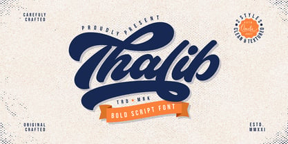 Thalib is an elegant bold script font with retro look. Comes with 2 styles, clean and textured. Suitable for logotype, branding, packaging design, poster design, website/display, editorial, headline, advertising, and more. Whats Include? Opentype support Multilingual support PUA encoded Features: Uppercase, lowercase, numerals, punctuations, alternates, contextual alternates, and stylistic sets Accessible in the Adobe Illustrator Glyphs panel, or under Stylistic Alternates in the Adobe Photoshop OpenType menu, Adobe InDesign, Corel Draw, even work on Microsoft Word
 - Keizer by Talavera,
$40.00 Keizer is a serif display typeface freely inspired by the display metal fonts of the early XXth century, reminiscent of those used in cartographic and book design. Its five versions display an open-face, an inline-flared, outline and decorated capitals, and an essential titling high-contrasted serif face. Keizer works well both on print and screen, ideal for book covers, posters and logos. Every weight includes small caps, petite caps, stylistic alternates and a neat set of ornaments.
 - Ensenada by Wordshape,
$30.00 Ensenada is a typeface designed based on hand-cut lettering that adorns businesses throughout the city of Ensenada in Baja California in Mexico. - What was the inspiration for designing the font? Looking at the hand-cut lettering in Ensenada, Mexico. Variations on this type of lettering are often used by Mexican pop-techno acts. - What are its main characteristics and features? It is a geometric display face that works in both retro and futuristic settings. - Usage recommendations: Display type
 - Cruz Quaste by Mans Greback,
$59.00 Cruz Quaste is a calligraphic medieval type, drawn by Måns Grebäck between 2018-2020. While traditional in character it is yet original, and could be described as a reinvented Gothic style. Its blackletter style it works great in historical contexts, or to give projects a tough feeling. Cruz Quaste contains OpenType features such as alternates and ligatures. The font is multilingual and supports all Latin-based European languages. It contains numbers, punctuation and all symbols you'll ever need.
 - Blackminster by Hanoded,
$10.00 Blackminster is a Gothic font, inspired by a handwritten set of letters (designed by Harry Lawrence Gage) I found in a 1916 book about lettering. I only had the ABC/abc to work with, so I designed the remaining glyphs myself. Use Blackminster for your Metal album covers, skateboards and downhill mountain bikes, or just anything that requires a bit of a Gothic look! Comes with a serious amount of diacritics and an alternate, swashy, g and y.
 - Double Take JNL by Jeff Levine,
$29.00Hey, what the hey! You'll have to look twice at this unusual typeface from Jeff Levine. Utilizing the sans serif lettering found in Trade Printer JNL, this novelty font combines two staggered outline versions that are blended together to give a double-image effect. This works best at large point sizes and with minimum word count. Use it for attention-getting phrases such as "You'll See Double" or "You Won't Believe Your Eyes" (or similar ad copy). - Turer by Eurotypo,
$28.00 Turer is a display font with a strong artistic personality. It is inspired by some works of Rudolph Koch (1876 - 1934) such as Wallau, Original Neuland or Koch Antiqua. It is characterised by its vertical strokes that thicken towards the ends, which hints at a serif without actually having it. Turer is composed of capitals; the lower case being small caps. It also has a great set of ligatures. Presented in two weight: Regular and Bold.
 - King Pong by Dan Auer,
$5.00 Inspired by apes and barrels, King Pong is a display font that's heavy, blocky, yet cheerful. Letterforms are brought to life through removal from a single square. Ascenders and descenders bring contrast and interest to the letterforms through a curved form cut at a 45 degree angle. King Pong works great for themes related to video games, technology, and music while the letterforms perform well in low-contrast environments and in very large formats – such as posters.
 - Meysha by Tegaki,
$16.00 Meysha was created with stylish and authentic handwritten characters. This font is PUA encoded and contains an extended Latin Character set. Meysha comes with 281 glyphs and 52 alternate characters as OpenType features (supported with contextual alternates mode). Meysha also includes 11 extended ligatures, allowing you to make you designs look more exclusive and pro standard. Meysha works perfectly for logos, display, product branding, wedding invitation cards, stationary, packaging, clothing, flyer, apparel, magazines, brochures, labels, posters, badges, and more.
 - Allrounder Antiqua by Identity Letters,
$40.00 Timeless Renaissance looks, gently updated. For novels and billboards alike. Allrounder Antiqua is an old-style serif member of the Allrounder superfamily. A timeless typeface based on classical proportions, Allrounder Antiqua is perfectly suitable for advanced book and editorial design well as packaging and branding. True: its main purpose is to set flawless body copy and to generate an evenly textured page—but its refined shapes work fantastically in display applications, too. Some details, such as the small and sharp bowl of the lowercase a, are fully appreciated in large sizes only. If you need a sophisticated serif typeface for packaging, food, fashion, consumer goods, or lifestyle branding, Allrounder Antiqua is up for it. It's also apt as an outstanding corporate typeface, be it for a more conservative venture or the latest hipster start-up. This classy serif typeface comes in four weights with corresponding true italics. Just like its sans-serif counterpart, Allrounder Grotesk, Allrounder Antiqua is equipped with plenty of Opentype Features like small caps, six sets of figures, case-sensitive forms, superiors, fractions and many ligatures. You will find alternate letters with swashes within this extended character set, as well as all the accented glyphs necessary to support more than 200 Latin-based languages. Historical Background The (French) Renaissance-influenced typeface started as Moritz Kleinsorge's graduation project within the "Expert Class Type design" course of the Plantin Institute for Typography, located in the famous Museum Plantin-Moretus in Antwerp, Belgium. There, Moritz Kleinsorge decided to create a revival of Robert Granjon's "Ascendonica Romain", described as "a beautiful face; typical of Granjon's mature style" in the inventory list of available material. "To touch punches and matrices cut by Robert Granjon back in 1567 was an invaluable inspiration", Moritz explains. Over time, the typeface moved away from being a true revival. Rather, it evolved into a Granjon-inspired typeface. That typeface is now available as Allrounder Antiqua. Perfect Pairing: Allrounder Antiqua + Allrounder Grotesk Allrounder Grotesk is the ideal complement to Allrounder Antiqua. They both share common vertical metrics and a common color. This allows you to pair both typefaces within the same layout—even within the same paragraph—without creating visual disruption. Head over to the Family Page of Allrounder Grotesk to get more information about this typeface. Design Trick: Bilingual Design With the Allrounder Superfamily Combining Allrounder Grotesk with Allrounder Antiqua is an ideal approach for bilingual designs, wherein both languages get the same emphasis yet are distinguished with two different typefaces. It's also best practice to set headlines in a different typeface than the body text if they harmonize with each other. Allrounder Grotesk and Allrounder Antiqua provide you with the perfect pair for this purpose.
 - Bombelli Light Hand by Wiescher Design,
$39.50 Bombelli is a font that looks like it has been handwritten by a meticulous architect in one of those hand-drawn blueprints of the old days. I chose the name to honor one of my ex-bosses -- a graphic designer-architect who taught me a lot of things when I was young and needed the money. One of the things he taught me – and probably the most important one – was to always be on time in the morning. He never said a word about me being late, but it worked. He taught me about being meticulous in detail and many other things I only appreciated much later. This clear and straightforward font deserves bearing his name. Your grateful type designer Gert Wiescher
 - Manihot by PintassilgoPrints,
$26.00 Manihot is a cool display sans-serif font, loaded with interlocks, ligatures and alternates to render your message in a nice eye-catching way, topped off with the usual je-ne-sais-quoi of PintassilgoPrints fonts. The family brings rough and clean styles and yet a very useful dingbat font with dozens of tiny graphics to complement your words. It’s up, witty, honest and just impossible to ignore. Give it a go!
 - CA Superpilot by Cape Arcona Type Foundry,
$29.00 Introducing the CA Superpilot Sans & Script family pairing - the ultimate package designed specifically for creatives and designers. The CA Superpilot Sans font family, with its contemporary take on Futura, is the perfect choice for those seeking a sleek and modern typeface. With five weights and italics, this font is flexible enough to be used in any project. In addition, it includes an extensive Central European character set and alternate characters, ensuring that your designs will stand out in any language. On the other hand, the CA Superpilot Script font family is a monoline script font that takes inspiration from vintage camera equipment logos and type designations from the 1950s. The result is a unique and retro-inspired typeface that adds personality and charm to any project. With regular and italic styles, you have plenty of options to work with. Despite being a script typeface, its bold strokes and clean lines make it ideal for captivating and impactful headlines in uppercase. Using these two fonts together gives you unmatched flexibility for any project, whether it's branding, website design, or print design. Don't miss out on this essential font pairing - get it today!
 - Double Porter by Fenotype,
$30.00 Double Porter - an elegant font collection. Double Porter includes following: • 6 fonts - a clean and textured version of each. • Ornaments • Catchwords • Ending swash ornaments for the script Double Porter is a clean cut script font with five strong sans fonts. All the fonts are designed to work nice together. Here’s a short introduction to the fonts: • Double Porter 1 -Clean connected script with Swash Alternates for caps and lowercase letters with ascender or descender. The Script also has Contextual Alternates that add variation & make the flow smooth. Contextual Alternates are automatically on. • Double Porter 2 -Wide Sans Serif font. • Double Porter 3 -Bold version of Double Porter 2 • Double Porter 4 -Semi condensed Sans Serif • Double Porter 5 -Condensed Bold Sans Serif • Double Porter 6 -Serif version of Double Porter 5 • Double Porter 7 -Set of 60 icons and ornaments • Double Porter 8 -Set of 68 Catchwords • Double Porter 9 -Set of 62 Ending Swashes and Strokes designed to go with Double Porter 1 - the script. In addition there is a “Printed” version of every Double Porter font. Printed versions are named Double Porter P x. Printed versions are exactly the same but the shapes have rugged outlines and a worn-out texture. Double Porter has wide language support including West European, Central European, Baltic, Turkish and Romanian character sets.
 - Vellvé by ITC,
$29.99For over 30 years, Tomás Vellvé created beautiful graphics and distinctive typefaces in his native homeland of Spain. First drawn as a phototype display design in 1971, Vellvé’s only typeface in digital form is an uncommon solution to the problem of creating a new sans serif design. The end result, which bears his name, is a design that stands out from the crowd of other sans serif typefaces. The phototype version was only available in a single, light weight. With the release of the digital fonts, however, three additional weights as well as a companion italic for the light weight were created.The typeface designs were originally drawn for Agfa Monotype (now Monotype Imaging) in 1996 as part of the company’s “Creative Alliance” initiative. Through an exclusive licensing arrangement, the Vellvé™ family has now been added to the ITC Typeface Library.ITC Vellvé is a wide design with strong calligraphic overtones. This is no “anonymous” design like so many modern sans. Letters like the `R, `e and `s clearly show the hand of Tomás Vellvé in the design process. Vellvé provides a fresh choice between geometric sans serifs such as Helvetica® and industrial sans serifs like Futura®. - Blackhaus by Canada Type,
$25.00Almost a half of a millennium after being mistaken for the original 4th century Gothic alphabet and falsely labeled "barbaric" by the European Renaissance, the blackletter alphabet was still flourishing exclusively in early 20th century Germany, not only as an ode to Gutenberg and the country's rich printing history, but also as a continuous evolution, taking on new shapes and textures influenced by almost every other form of alphabet available. Blackletter would continue to go strong in Germany until just before the second World War, when it died a political death at the height of its hybridization. For almost 50 years after the war, blackletter was very rarely used in a prominent manner, but it continued to be seen sparely in a variety of settings, almost as a subliminal reminder of western civilization's first printed letters; on certificates and official documents of all kinds, religious publications, holiday cards and posters, to name a few. In the early 21st century, blackletter type has been appearing sporadically on visible media, but as of late 2005, it is not known how long the renewed interest will last, or even whether or not it will catch on at all. The last few years before World War II were arguably the most fascinating and creative in modern blackletter design. During those years, and as demonstrated with the grid-based Leather font, the geometric sans serif was influencing the blackletter forms, taking them away from their previous Jugendstil (Art Nouveau) hybridizations. Blackhaus is a digitization and elaborate expansion of a typeface called Kursachsen Auszeichnung, designed in 1937 by Peterpaul Weiss for the Schriftguss foundry in Dresden. This is one of very few designs from that time attempting to infuse more Bauhaus than Jugendstil into the Blackletter forms. This is why we used a concatenation of the words blackletter and Bauhaus to name this face. The result of injecting Bauhaus elements into blackletter turned out to be a typeface that is very legible and usable in modern settings, while at the same time harking back to the historical forms of early printing. The original 1937 design was just one typeface of basic letters and numbers. After digitizing and expanding it, we developed a lighter version, then added a few alternates to both weights. The Rough style came as a mechanically-grunged afterthought, due to current user demand for such treatment. Having the flexibility of 2 weights and many alternates of a blackletter typeface is not a very common find in digital fonts. More specifically, having the flexibility of 2 weights and alternates of a 20th century blackletter typeface is almost unheard of in digital fonts. So the Blackhaus family can be quite useful and versatile in an imaginative designer's hands. - Turbinado by Aerotype,
$48.00 The ten font Turbinado™ Set was designed to be clear and easy to read with a friendly personality, ideal for advertising and packaging in both text and display settings. Included are three weights of brushed casual script, each with a dry version, two condensed all caps faces, another hand printed caps face and an Elements package with 100 brushed elements that include swashes, botanicals, shells, arrows, repeatable patterns and a few other doodads that play well with the fonts. Like our most recent release Fave, all of the fonts use the OpenType standard ligature feature to automatically differentiate consecutive lowercase letters and numbers, using separate glyphs rather than a single ligature so they can be set on a curve or colored separately, etc. They also automatically differentiate like characters that are separated by another letter when standard ligatures is enabled. The script fonts have alternate characters like swash glyphs for ends of words and a few ligatures too; single crossbar to unite the At and Att letter combinations etc. The two condensed faces also have a third set of less uniform glyphs that can be used to create a more quirky, fun and bouncy effect (see the ‘she sells seashells’ graphic above) when the discretionary ligature feature is on. The script fonts have 10+ lowercase t (and double t) crossbar alternates that can be selected from the OpenType glyph table manually, or you can enable the contextual alternates feature to automatically insert a bigger crossbar as the surrounding letters allow throughout a text box or document. Hello? Are you still there? :) And for those intrepid typographers who would rather fashion their own lowercase t to custom fit a specific design, all of the lowercase t ascenders and crossbars are also available separately in the glyph table, and can be combined manually.
 - Otsu Sans by TeGeType,
$- The OTSU SANS family is a new sans-serifs typefaces family based on a geometric design. It can be use for text as for titling applications.
 - Otsu Slab by TeGeType,
$19.00 The OTSU SLAB family is a new slab-serifs typefaces family based on a geometric design. It can be use for text as for titling applications.
 - Tip by Suomi,
$40.00 New, slightly calligraphic sans family with seven weights, Roman and Italic, all with Old Style Numerals and Small Caps, for both headlines and body text use.
 - Boogaloo Avenue NF by Nick's Fonts,
$10.00A new take on the perennial Art Deco favorite, Broadway, interpreted by 1930s lettering artist Harold Holland Day, and named after a 1960s R&B song. - Copperplate Classic Medium by Wiescher Design,
$49.50 Copperplate was the classic nineteenth century engravers typeface, consisting of capitals and small caps only. Among others (for example Deberny & Peignot) F. W. Goudy's cut for ATF around 1901 is probably the most widely known. Copperplate typefaces are traditionally used for business cards and all that "serious" stuff. My Copperplate Classic is a completely new design, based on some old samples. To make it look more up-to-date and elegant, I gave it some extra swings here and there. The old fonts were all designed with clogging corners or points that can break off in the minds of its designers. Today we do not have those problems any longer, so I could give my Copperplate Classic real sharp pointed serifs. To give you more choice I now added this medium cut in three variations, medium, sans and rounded! Enjoy! Gert Wiescher
 - Copperplate Classic Light by Wiescher Design,
$88.00 Copperplate was the classic nineteenth century engraver's typeface, consisting of capitals and small caps only. Among others (for example Deberny & Peignot) F. W. Goudy's cut for ATF around 1901 is probably the most widely known. Copperplate typefaces are traditionally used for business cards and all that "serious" stuff. My Copperplate Classic is a completely new design, based on some old samples. To make it look more up-to-date and elegant, I gave it some extra swings here and there. The old fonts were all designed with clogging corners or points that can break off in the minds of its designers. Today we do not have those problems any longer, so I could give my Copperplate Classic real sharp pointed serifs. To give you more choice I now added this light cut in three variations, light, sans and rounded! Enjoy! Gert Wiescher
 - Nahual Claw by Rodrigo Navarro Bolado,
$32.00 From the depths of an antique civilization is born "Nahual" inspired by my ancestral Prehispanic Culture, with traits that allows it to mimetize itself, hours of painstaking dirty work with the only goal to show all it knows we want to see, to finally give the Jaguar "Serifclaw" attack. This is a display fontface, it comes in two types, "Claw" basically the text font, and "Copete" that are the construction pieces for every single glyph of the entire font, this last also has the negative spaces of some glyphs (a, e, o, A, B, O, for example) I include them but I prefer the font without them. Comments are welcome! rodrigonabo@gmail.com
 - Things by PizzaDude.dk,
$20.00 OMG! I never thought I'd finish this font! Actually, the idea came to me in the late 1990-ies, but the sketches lied at the bottom of the "fonts I will complete one day In the future" pile ... also called "fonts I most likely won't complete...EVER" pile! :) Anyway, I started up with letters for both upper and lowercase, no numbers or punctuation. I figured if people ever purchased this font, all they would need were upper- or lowercase letters. But the rest of the glyphs seemed to miss out, so I made the numbers and some punctuation. But I still found the font incomplete...therefore I redid all the punctuation (from "standard" punctuation to "picturish" punctuation) and added two additional sets of letters. Meaning that there is 4 different versions of letters to choose from: 2 different lowercase, and 2 different lowercase. I had a lot of fun drawing this font, and some fun doing the detective work finding out how the MANY lettershapes should look! I hop you too have fun using this font! :)
 - Rollgates Victoria by Cotbada Studio,
$16.00 It's too much fun! Of all the fonts I have designed, this is my favorite. Thin strokes and delicate embellishments really do it for me and I hope it's for you too! You won't find curves like this in regular fonts. This is modern meets the classic, minimally meets the decorative. Look at the numbers ... then, look again. They have curves of all kinds of unusual places. If you want to stand out then this is the font for you. Logo or title, fashion distribution to masthead, monogram or Instagram, create beautiful art with this font. Rollgates Victoria can do it!
 - Waterlord by Raditya Type,
$14.00 Waterlord is made to support the work of designers who are used to making work with contemporary styles. This font is great for various design styles, modern or old school.
 - Atlantide by Cerri Antonio,
$30.00 Atlantide Regular and Decor - decorative fonts, works well as an identity logo type, poster and 3D works. Atlantide Decor has all the glyphs already to create vector and 3D compositions.
 - Ongunkan Latin Space by Runic World Tamgacı,
$50.00 The product of 3 weeks of work. It was a very nice style, it became a font that plays with the perception of the brain. Use it in beautiful works.
 - Ahmed by Linotype,
$187.99Ahmed is a modern Arabic headline face, first produced by Linotype-Hell Ltd. in the early 1980s. Originally developed as a simplified face, its design recalls the inscriptional and decorative tile work lettering of the medieval period. The strong treatment of the tails of certain characters departs from the more traditional style of tapering these finials, introducing a modern feel to the design. The contrasting proportions of the tall vertical strokes and the rather elongated counters lend a monumental look to Ahmed, allowing its effective use in titling. During the later 1980s Ahmed was developed into a traditional typeface, with the introduction of medial forms to improve character spacing and balance. Recently, Ahmed has been converted into the OpenType font format, ensuring its continued popularity as a heading face for newspaper typesetting. The Ahmed typeface contains two weights, Ahmed and Ahmed Outline. Both of the OpenType fonts include Latin glyphs from Clearface Gothic Roman inside the font files, allowing a single font to set text in both most Western European and Arabic languages. The two Ahmed fonts include the Basic Latin character set and the Arabic character set, which supports Arabic, Persian, and Urdu. They include tabular and proportional Arabic, Persian, and Urdu numerals, as well as a set of tabular European (Latin) numerals. - Stylish Title JNL by Jeff Levine,
$29.00 The cover title for the July, 1935 issue of Harper’s Bazaar magazine was hand lettered in a condensed, squared slab serif design with a few stylized characters. This is now available as Stylish Title JNL, in both regular and oblique versions. For many years, each issue of the magazine had its title rendered in different type styles; offering many unique variations to coincide with that month’s cover art.
 - Trick Or Treat by Comicraft,
$19.00Bats, Cats, Ghosts and Ghouls, Zombies, Witches and Spiders galore. Cackling to herself alone in her coven, our very own Scary Godmother, Lilou, threw eyes of newts and wings of bats into her cauldron and sent her unearthly children down the street with mischief in mind. Our Halloween Dingbats have every kind of Spooky Monster she could imagine, and a few more besides. Keep your porch light on. Trick or Treat - Desmo by Craft Supply Co,
$20.00 Introducing Desmo Reversed Contrast Slab Serif Font Unique Design Meet Desmo Reversed Contrast Slab Serif Font. Its reversed contrast sets it apart. Thick horizontal lines and thin verticals create a striking look. This design choice grabs attention, perfect for impactful displays Versatile Display Font Desmo shines in display settings. Whether for headlines, posters, or advertising, it stands out. Its bold features ensure readability from a distance. Moreover, its unique style makes every design engaging. Engaging Typography Desmo’s typography is designed to captivate. Its slab serifs add a touch of elegance. The font’s balanced spacing ensures clarity in every word. Therefore, it’s ideal for brands aiming to make a statement. Accessibility and Ease of Use This font is accessible to a wide range of users. Its simplicity avoids complex vocabulary. Easy to install and use, Desmo suits various design projects. Additionally, its compatibility with multiple software enhances its versatility.
 - Turntable Stencil JNL by Jeff Levine,
$29.00 A disc jockey-only promotional sleeve for a 1964 [45 rpm] release of “Close to Me” and “Let Them Talk” by Dan Penn featured the song titles printed in a stencil typeface on the record sleeve. Closely resembling a stencil version of Franklin Gothic but with its own unique characteristics, this design has been reinterpreted as Turntable Stencil JNL and is available in both regular and oblique versions. For trivia buffs, Dan Penn is a singer-songwriter-record producer, often collaborating with Dewey Lindon “Spooner” Oldham; both closely associated with the late Rick Hall’s Fame recording studios in Muscle Shoals, Alabama. In 1964, Hall started the Fame record label, and for a time it was distributed by Vee-Jay Records of Chicago, the first major Black-owned record label in the United States. Penn’s release was only the second for the new label; Fame 6402.