10,000 search results
(0.039 seconds)
- Rotis Sans Serif by Monotype,
$45.99 Rotis is a comprehensive family group with Sans Serif, Semi Sans, Serif, and Semi Serif styles, for a total of 17 weights including italics. The four families have similar weights, heights and proportions; though the Sans is primarily monotone, the Semi Sans has swelling strokes, the Semi Serif has just a few serifs, and the Serif has serifs and strokes with mostly vertical axes. Designed by Otl Aicher for Agfa in 1989, Rotis has become something of a European zeitgeist. This highly rationalized yet intriguing type is seen everywhere, from book text to billboards. The blending of sans with serif was almost revolutionary when Aicher first started working on the idea. Traditionalists felt that discarding serifs from some forms and giving unusual curves and edges to others might be something new, but not something better. But Rotis was based on those principles, and has proven itself not only highly legible, but also remarkably successful on a wide scale. Rotis is easily identifiable in all its styles by the cap C and lowercase c and e: note the hooked tops, serifless bottoms, and underslung body curves. Aicher is a long-time teacher of design and has many years of practical experience as a graphic designer. He named Rotis after the small village in southern German where he lives. Rotis is suitable for just about any use: book text, documentation, business reports, business correspondence, magazines, newspapers, posters, advertisements, multimedia, and corporate design.
 - Trump Mediaeval Office by Linotype,
$50.99The Trump Mediaeval Office family is designed after the model of the original serif family produced by Georg Trump in 1954. Trump released this typeface through the C.E. Weber type foundry in Stuttgart, and Linotype quickly cut the face for mechanical composition. Thereafter it became popular around the world. One of the most prolific German type designers of the 20th century, Trump created numerous typefaces in several different styles, but Trump Mediaeval is often regarded as his best work. Trump Mediaeval is an old style serif typeface, with new inherent quality that could only have come about after centuries of variation on this theme. It bears some resemblance to the classic Garamond typefaces, yet its characteristic letters set it apart in a positive way. Akira Kobayashi, Linotype’s Type Director, released his own revived design, Trump Mediaeval Office, in 2006. Trump Mediaeval Office has two weights, each with an italic companion. Unlike the original design, Kobayashi has harmonized the varying letterforms across the two weights, allowing Regular and Bold text to stand side by side harmoniously. Trump Mediaeval’s numbers now match across weights as well, optimizing their legibility in sizes large and small. Decades ago, Trump Mediaeval was a popular choice for setting book texts, because of its robust serifs. These are exactly what make the face a good choice for office application today; on lower-resolution printers, these serifs will still remain a strong feature on the letterform, increasing legibility along the line of text. - Radley by Variatype,
$12.00 Radley is an urban all-caps font designed for sports branding and logotype. Including 4 fonts to make your project awesome, get it now! FONT FEATURES Additional Accents 66 Languages Kerning Alternates SOFTWARE RECOMMENDATION Adobe Photoshop Adobe Illustrator
 - Kate Greenaway's Alphabet by Wiescher Design,
$49.50 Some time ago I bought my smallest book ever: Kate Greenaway’s Alphabet* 57 x 72 mm. I thought it was the sweetest little book I had ever seen. Not knowing about the fame of the designer Kate Greenaway (1846-1901), I put it in some dark drawer and looked at it from time to time. Kate’s books were all outstanding successes in English publishing history; she was an icon of the Victorian era. Some of those books are still being reprinted today. This little gem I had accidentally acquired has become very rare and I have not found any reprints yet. So I thought maybe I could adapt her drawings for use on today’s computers. I ventured to redraw her delicate illustrations, blowing them up 300 percent, being forced to simplify them without losing her touch. It took quite some time! While redrawing them, I discovered that she most certainly drew them in at least three different sessions as well. Then I scanned my drawings and put them in a font. To make the font more usable, I added the ten numerals in Kate’s style; the original does not have those. I hope she would have liked my adaptations. Yours in a very preserving mood, Gert Wiescher. * Kate Greenaway’s Alphabet, edited by George Rutledge & Sons, London and New York, ca. 1885.
 - Futura Headline EF Pro by Elsner+Flake,
$103.00 The design of Futura seems to be timeless. This typeface family which had been developed in 1926 by Paul Renner for the Bauer Type Foundry in the style of constructivism and as part of the Bauhaus movement, experienced, however, in the course of the past 90 years, repeated time-appropriate revivals which guaranteed its on-going popularity. The version of the Futura EF Pro contains the original character constructions which Dennis Megaw described as the “first designs of Futura” in 1938 in “20th century sans serif types, Typography no. 7” (See: Dr. Christopher Burke: Paul Renner, Princeton Architectural Press, New York 1998). What makes it exceptional is the extension into three weights: “Text”, “Headline” and “Index” which came about as part of a degree dissertation at the Hochschule für Bildende Künste (HFBK) in Hamburg. In this context, the accompanying documentation “Die Kritik der reinen Futura” (“The Critique of the Pure Futura”) by Katharina Strauer was published by the Materialverlag, Hamburg, in 2003. Some copies are still available at Elsner+Flake.
 - Futura Text EF Pro by Elsner+Flake,
$103.00 The design of Futura seems to be timeless. This typeface family which had been developed in 1926 by Paul Renner for the Bauer Type Foundry in the style of constructivism and as part of the Bauhaus movement, experienced, however, in the course of the past 90 years, repeated time-appropriate revivals which guaranteed its on-going popularity. The version of the Futura EF Pro contains the original character constructions which Dennis Megaw described as the “first designs of Futura” in 1938 in “20th century sans serif types, Typography no. 7” (See: Dr. Christopher Burke: Paul Renner, Princeton Architectural Press, New York 1998). What makes it exceptional is the extension into three weights: “Text”, “Headline” and “Index” which came about as part of a degree dissertation at the Hochschule für Bildende Künste (HFBK) in Hamburg. In this context, the accompanying documentation “Die Kritik der reinen Futura” (“The Critique of the Pure Futura”) by Katharina Strauer was published by the Materialverlag, Hamburg, in 2003. Some copies are still available at Elsner+Flake.
 - Margot by Eclectotype,
$36.00 Like a lovechild of American Typewriter and Cooper Black, typewritten in melted chocolate, this is Margot. A bold single weight display typeface in roman and italic styles, Margot is boisterous but cuddly; warm but impactful. Margot comes fully loaded with a bunch of esoteric dingbats (grouped in the ornament feature), four figure styles (proportional- and tabular- lining, and proportional- and tabular- oldstyle), a spattering of swash capitals (K, Q and R), stylistic alternates and one discretionary gi ligature in the Roman. Stylistic alternates are split into stylistic sets thus: SS01 - alternate forms for ampersand and asterisk, and # changes to an attractive numero symbol. SS02 - in the Roman, a and g change to single storey versions; in the italic, the ae digraph changes to a less ambiguous double storey version. SS03 - the lining figure 3 gets changed to its alternate form. SS04 - the lining figure 4 gets changed to its alternate form. Margot is perfect for friendly headlines, logos, T-shirts (I love New York, perhaps?), food packaging and videogame apps. Margot gets its name from my equally boisterous and cuddly cat. Enjoy!
 - Mikha by Eurotypo,
$19.00 Mikha, designed by Carine de Wandeleer, is a delightfully handwritten family font which keeps the casual drawing of a marker with clean strokes. Its slight bounce and intentional irregularity, gives your words a wonderful flow. This new font family with 736 glyphs, includes Regular, Condensed and Sans. It has OpenType features such as Stylistics alternates, Swashes, Ligatures, up to five Stylistic sets by letter, initial and terminal forms in upper and lower, ornaments that allow you to mix and match pairs of letters and a Central European language support to fit your design. This OpenType features may only be accessible via OpenType-aware applications, or the Character Map to view and copy any of the extra characters to paste into your favorite text editor/app. This will help your creativity and make it easier to make expressive and elegant your typographic work. Also with Mikha Sans it is possible to write all in capitals. Mikha looks lovely on wedding invitations, greeting cards, logos, posters, labels, t-shirt design, logos, business-cards and is perfect for using in ink or watercolor based designs, fashion, magazines, food packaging and menus, book covers and whatever your imagination holds! Enjoy it!
 - Haboro Contrast by insigne,
$- Meet Haboro Contrast, the stylish little sister of the Haboro hyperfamily. While built from the same clean, geometric shapes of Haboro Sans, this new addition has been rebalanced for elegant performance with her high-contrast sans letterforms and has been adjusted to provide the greatest impact for each weight. It's a personality all her own, gentle in approach yet refined and modern with a confident appearance. Capitalize on Contrast's style with OpenType features, too. Packed with options like OpenType ligatures, stylistic sets, fractions, crafted small caps and old-fashioned figures, this font will keep your work fresh and attractive. If you need even more combinations for the right statement, use the entire Haboro hyperfamily and create the right balance to capture your reader's eye. Haboro Contrast (along with the rest of the Haboro family) has been tested for the web and is ready for use in both print and digital applications. Designed to serve as a display character for such publishing projects as magazines and company brochures, Contrast gives you comfort in having a great amount of versatility in the fonts you rely on. It's a prime example where high contrast simplicity lends itself to achieve excellent design results.
 - Iron Lake by Alphabet Agency,
$15.00 Iron Lake is inspired by the pioneer era. The font has a decorative slab serif that really gives the font its vintage western look. The font works great for vintage, western, country, outdoors and rural themes.
 - Bala Cynwyd, a font crafted by the talented Nick Curtis, is a unique and charming typeface that invokes a sense of nostalgia and warmth. Named after a small, picturesque suburb of Philadelphia, Bala ...
- Exo Slab Pro by Polimateria,
$35.00 Exo Slab Pro is a slab serif with a technological and futuristic tone. Even though it has a very peculiar look and many distinct shapes that pop out in an headline, it also works well as whole creating a nice shade of text. Large x-height, ink-traps and a modest contrast ensures that this font will work well even on small font sizes. Loaded with opentype features Exo Slab provides a huge versatility. You can use it on rigorous work as well as on more funny projects. From Branding to Editorial, from Paper to Screen, from Today to the Future. Please see our promotional video.
 - Futura by Linotype,
$42.99 First presented by the Bauer Type Foundry in 1928, Futura is commonly considered the major typeface development to come out of the Constructivist orientation of the Bauhaus movement in Germany. Paul Renner (type designer, painter, author and teacher) sketched the original drawings and based them loosely on the simple forms of circle, triangle and square. The design office at Bauer assisted him in turning these geometric forms into a sturdy, functioning type family, and over time, Renner made changes to make the Futura fonts even more legible. Futura’s long ascenders and descenders benefit from generous line spacing. The range of weights and styles make it a versatile family. Futura is timelessly modern; in 1928 it was striking, tasteful, radical — and today it continues to be a popular typographic choice to express strength, elegance, and conceptual clarity. NEW: the new Futura W1G versions features a Pan-European character set for international communications. The W1G character set supports almost all the popular languages/writing systems in western, eastern, and central Europe based on the Latin alphabet including Vietnamese, and also several based on Cyrillic and Greek alphabets Futura® font field guide including best practices, font pairings and alternatives.
 - Chamelton by Alex Khoroshok,
$9.99 Chamelton, a vast layered font family, provides a creative spectrum through layers, colors, and weights, including 109 Sans Serifs, 3 script weights, + 198 extras. You can use the family as a complete design kit or a component of your work. Most styles are stand-alone fonts, but some layers work only in combination. Creating a multi-colored layered font is simple and compatible with any layer-supporting graphic software, including Adobe Suite, Sketch, Figma, etc. See Specimen PDF for more details.
 - Willona by Nk Studio,
$19.00 Willona is a subtle and elegant font. This font has a lovely touch of character, perfect for a variety of designs. The Willona features varied baselines, unique smooth lines, and stunning alternatives. Add to your most creative ideas and see how to make art! Alternative Glyph Styles (including Uppercase, Lowercase, Numbers & Punctuation) Works on PC & Mac Simple installation. Accessible in Adobe Illustrator, Adobe Photoshop, Adobe InDesign, even works in Microsoft Word. Multilingual Support Thank you ! Hope you enjoy our fonts!
 - ITC Beesknees by Monotype,
$29.00ITC Beesknees font is the work of David Farey. He credits a number of sources as inspirations for his work, including Pushpin Studio, Peter Max, Bob Zoell and the Marx Brothers, whose typographic titles he admired as much as their cinematic humor. He was going to name the font 'Horse Feathers' or 'Monkey Business' after Marx Brothers films, then the name got shortened to 'Business', which then got transformed to 'Beesknees'. ITC Beesknees font contains a capital and small caps alphabet. - Mount Loneli by Letterday Studio,
$20.00 Mount Loneli is a subtle and lovely font. This font has a lovely touch of character, perfect for a variety of designs. Mount Loneli features varied baselines, unique smooth lines, and stunning alternatives. Add to your most creative ideas and see how to make art! fastener, Alternative Glyph style (including Uppercase, Lowercase, Numbers & Punctuation) Works on PC & Mac Simple installation. Accessible in Adobe Illustrator, Adobe Photoshop, Adobe InDesign, even works in Microsoft Word. Multilingual Support Thank you ! Hope you enjoy our fonts!
 - Kods Hulling by Imoodev,
$20.00 Kod's hulling is rounded sans serif with visual elegance, smooth curves, and beautiful ligatures clear, making your work look true and attractive. A very versatile font that works in both large and small sizes. This font is suitable for a wide variety of projects such as invitations, logos, branding, magazine, photography, card, product packaging, mugs, quotes, poster, labels, signatures, and more. A font that is perfect for all business sectors including personal projects, studio, corporate, creative agency, industrial, company, etc.
 - Gilbertino by Keristyper Studio,
$14.00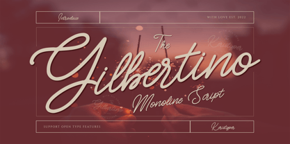 Gilbertino is casual script font With a clean stroke, super slanted, and fun character. This font is great for vintage designs, logos, labels, badges, posters, and more. Multilingual support: Afrikaans, Albanian, Catalan, Danish, Dutch, English, Estonian, French, Finnish, German, Icelandic, Indonesian, Italian, Malay, Norwegian, Portuguese, Spanish, Swedish, Zulu, and many more. What’s Included : Standard & Multilingual glyphs Ligature Works on PC & Mac Simple installations Accessible in Adobe Illustrator, Adobe Photoshop, Adobe InDesign, and even work on Microsoft Word. Hope you enjoy our font!
 - Candra Winata by Straight.Co,
$20.00 candra winata is a subtle and lovely font. This font has a lovely touch of character, perfect for a variety of designs. candra winata features varied baselines, unique smooth lines, and stunning alternatives. Add to your most creative ideas and see how to make art! fastener, Alternative Glyph style (including Uppercase, Lowercase, Numbers & Punctuation) Works on PC & Mac Simple installation. Accessible in Adobe Illustrator, Adobe Photoshop, Adobe InDesign, even works in Microsoft Word. Multilingual Support Thank you ! Hope you enjoy our fonts!
 - Cemains by Imoodev,
$20.00 Cemains is a modern sans serif typeface with visual elegance, smooth curves, and beautiful ligatures clear, making your work look true and attractive. A very versatile font that works in both large and small sizes. This font is suitable for a wide variety of projects such as invitations, logos, branding, magazine, photography, card, product packaging, mugs, quotes, poster, labels, signatures, and more. A font that is perfect for all business sectors including personal projects, studio, corporate, creative agency, industrial, company, etc.
 - Imperio by Juan I. Siwak,
$40.00 Imperio is a font inspired by old posters, especially those related to constructivism and futurism. It reflects both the rationalism of Bauhaus as a propagandist and revolutionary spirit of an era. On the other hand it is not nostalgic, but instead looks for its own way to get diagonals where there was rigidity. The poster itself is the language of graphic design, and geometry is its ally. This font aims for that goal. It has two variants that derive from its source. Imperio Giga Black attempts to be a negative typography, starting with the black and then searching for small windows in which they begin to uncover the morph. This is an extreme and modern font. Imperio West is a metamorphosis of the original one, with decorative details which transform it into a typeface of wood and saloon font. In all cases we recommend its use in large sizes (up to 20pt) and main titles. Imperio UltraBlack can work in smaller sizes than Imperio Regular.
 - Deco Sans by Alan Ronn,
$30.00This font was created while looking at the various shapes my handwriting consistently took, especially in the ways that letters would have breaks in them. Over the course of a few months I continually tweaked the letter forms and shapes, and lo and behold, I developed Deco Sans. This family currently only includes a thin weight, as I'm only one person, and very busy with college. I'm continuing work on a regular, bold, and possibly a future italic weight, but these may not be released for many months to come. As this is a very thin font, it should be used at sizes no smaller than around 16 or 18pt as it tends to get lost in whitespace, and looks best at large sizes. As such, this weight should be considered more of a display font than a text font, however, I predict a regular weight to be very readable and much more useable for the everyday. - 1514 Paris Verand by GLC,
$20.00 This set of initial decorated letters was inspired by a font in use in the beginning of 1500s in Paris. Exactly, we have used the set that Barthélémy Verand employed for the printing of Triumphus translatez de langage Tuscan en François, (from “Triumph” of Petrarque) in the year 1514. Some letters, lacked, have been reconstructed to propose a complete alphabet. It appears that the printer used some letters to replace others, as V, turned over to make a A, or D to make a Q. The original font’s letters were drawn in white on a black background only, but it was tempting to propose a negative version in black on white. It is used as variously as web-site titles, posters and flyers design, publishing texts looking like ancient ones, or greeting cards, all various sorts of presentations, as a very decorative, elegant and luxurious additional font. This font supports strong enlargements remaining very smart and fine. It’s original medieval hight is about one inch equivalent to about four lines of characters. This font may be used with all blackletter fonts, but works particularly well with 1543 Humane Jenson, 1557 Italic and 1742 Civilite, without any anachronism.
 - Environ by MADType,
$- Environ is a rounded and modular font. Because it utilizes many straight lines, it works well for small blocks of text at small sizes.
 - Jot by Typadelic,
$19.00A playful slab-serif font. This typeface is versatile enough to be used in any type of design work, be it serious or fun. - Caramello by FHFont,
$17.00 Caramello is a handwritten script font with signature style. Suitable for element design, weddings, events, t-shirts, logos, badges, stickers, and other awesome work.
 - Maison Paris by Shakira Studio,
$19.00 "Introducing Maison Paris - Where Modern Elegance Meets Timeless Sophistication! Maison Paris is the font that defines contemporary style, making it an absolute must-have in today's design scene. This font effortlessly marries modern chic with timeless sophistication, embodying the very essence of what's trending now in the world of typography. With a versatility that knows no bounds, Maison Paris is your key to creating stunning designs that demand attention in today's competitive landscape. Whether you're crafting a high-end brand's logo, a cutting-edge editorial layout, or a minimalist wedding invitation, this font adds an element of tasteful extravagance that's currently sought after. Don't miss the chance to infuse your designs with the most sought-after modern stylish serif font of the moment. Maison Paris is your ticket to ensuring your projects are impeccably current and stylish. Embrace the future of design today with Maison Paris!" Here's what you get: Regular, Italic All Multilingual symbol Opentype features ( ligature, alternate ) Accessible in the Adobe Illustrator, Adobe Photoshop, Adobe InDesign, even work on Microsoft Word. PUA Encoded Characters - Fully accessible without additional design software. Multilingual character supports : (Afrikaans, Albanian, Catalan, Croatian, Czech, Danish, Dutch, English, Estonian, Finnish, French, German, Hungarian, Icelandic, Italian, Lithuanian, Maltese, Norwegian, Polish, Portuguese, Slovenian, Spanish, Swedish, Turkish, Zulu) Follow my shop for upcoming updates, and for more of my work, Thank you!
 - Palmire by Mas Anis Studio,
$23.00 Hi There! Meet our first modern serif typeface Palmire Palmire is a stylish font that is both modern and minimal. A light font that is perfect for feminine logo marks, fashion mastheads & editorial design (works great in layout design for quotes or body copy). The ligatures feature is so amazing, you can convert regular random word to elegant logo just by using the ligature. And there is 75+ ligature to support your amazing design project! Is there anything else? Of course! it has multilingual characters too! We work so hard to keep this elegant font looks elegant, classy, readable, stylish, eye-catching, and easy to use. You can easily pair them with script or sans serif font from all over the world to make your work more interesting!
 - Merisca by Pixesia Studio,
$23.00 Introducing Merisca - Modern Condensed Serif Font Merisca is a modern condensed serif font that is perfect for a wide range of design projects. The sleek and stylish design of this font is sure to add a touch of sophistication to your work, making it ideal for branding, packaging, and other design applications. Whether you are looking to create a minimalist and chic look or want to add some flair to your designs, Merisca is the perfect font choice. With its condensed serif style and modern aesthetic, Merisca is sure to enhance any design project. FEATURES - Stylistic Alternates - Ligatures - PUA Encoded - Uppercase and Lowercase letters - Numbering and Punctuations - Multilingual Support - Works on PC or Mac - Simple Installation - Support Adobe Illustrator, Adobe Photoshop, Adobe InDesign, also works on Microsoft Word Hope you Like it. Thanks.
 - Civane by insigne,
$- High atop the mountain of fonts, a new structure has been raised--one solid and strong against the challenges of time. Civane is a victorious conqueror among fonts, standing above the clutter and the mundane. Its firm structure joins effortlessly with graceful calligraphy in a new flowing, inscriptional typeface. Civane is inspired by monuments of great civilizations, whose lofty inscriptions remain chiseled into the very stones and columns of their structures. The font’s medium contrast with its flared stroke ends lead the reader to feel the solemn presence found in these great obelisks and shrines. Even Civane’s thinnest weight holds a quiet power over its audience. Still, its classic lines provide a beautiful flow between the strong letters, allowing the reader’s eye to move easily across the page. Civane supports OpenType features and comes with upright italics, alternates, ligatures, old-fashioned figures, titling and small caps. Preview all these features in the interactive PDF manual. The font family has 48 fonts, with three widths and eight weights. The font family also includes glyphs for 72 languages; over 550 glyphs per font stand ready for you to command throughout your design. Civane is built for advertising and display typesetting as well as title and small text, making it an excellent choice for websites as well as flyers and packaging. Use it for defining your brand or for creating designs that evoke academia, militaria, monuments, automobiles, signs, and so on. Its 48 well-designed fonts are well-equipped to help you leave your mark on history. Production assistance from Lucas Azevedo and ikern.
 - Cigar - Unknown license

- Kress Titling by RMU,
$30.00 In 1923, the Schriftguss AG, Dresden, released this all-caps Art Deco font designed by Otto von Kress. From the existing basics, the now available font was completely redrawn and redesigned for modern use.
 - Bernhard Cursive by RMU,
$25.00 Bernhard Cursive ExtraBold is one of Lucian Bernhard's most expressive fonts which are worth to get preserved for now and times to come. An ideal font face for advertisements, posters, flyers, titles and subtitles.
 - Standgrow by FHFont,
$19.00 Standgrow is script font with authentic clean brush style, this font basically script calligraphy with vintage style. Suitable for design, element design, wedding, event, t-shirt, logo, badges, sticker, and awesome work.
 - Diashapes by Curvature Creations,
$10.00 My font Diashapes has been created by the power Point shape Diagonal Stripe and its angles act like curves. It is a unique font that stands out like a building frame work.
 - Wonderfebia by FHFont,
$15.00 Wonderfebia is Script Wedding Font with modern calligraphy style so much opentype feature include of the font. Suitable for design, element design, wedding, event, t-shirt, logo, badges, sticker, and awesome work.
 - Magentasia by FHFont,
$16.00 Magentasia is Brush Script Font with Handlettering Brush Style, with opentype feature include of the font. Suitable for design, element design, wedding, event, t-shirt, logo, badges, sticker, and awesome work, etc...
 - Caxton by ITC,
$29.99 Caxton font is the work of Canadian designer Leslie Usherwood. Caxton is a serif font graced with subtle details and calligraphic influence resulting in elegant simplicity suitable for both text and display.
 - Mallaire by Rochart,
$20.00 Mallaire is a calligraphy font with an exclusive style and a touch of classic, inspired by the handwriting of ancient manuscripts. Carefully designed to work together in harmony that makes it very suitable for wedding media, book covers, greeting cards, logos, branding, business cards and certificates, even for any design work that requires a classic, formal or luxurious.
