10,000 search results
(0.032 seconds)
- New Year Poster by FontaZY,
$10.00 This display font is perfect choice for the whole variety of New Year greeting cards, advertisements, posters and banners. It has alternative graphic symbols, that fills any word or line with holiday spirit.
 - KR Back To School Dings - Unknown license

- Catholic School Girls Intl BB by Blambot,
$20.00This font is, like, totally inspired by the handwriting of, like, teenage girls. You’ll note that the [ ] keys are actually adorable little hearts! Totally rad! This font includes enough European characters to fill a loose leaf binder. - Choose Time by Stripes Studio,
$20.00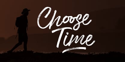 Choose Time is a super casual hand brushed script with detailed brush stroke texture, and a quirky, Can be used for various purposes. such as the title, signature, letterhead, signage, labels, newsletters, posters, logos, correspondence, wedding invitations, badges, etc. Choose Time Font international Support for a review of most Western languages included.
 - Musty Scoot by Bogstav,
$15.00 Got a pair of jeans that goes well with both party and casual living? A shirt that would fit well to a Hollywood movie premiere and would be suitable to pick up the kids from the kindergarten? If so, you know exactly what I mean, when I say that the Musty Scoot font is suitable for anything! Well, almost anything...maybe not that highway sign, or that security sign at the airport!!! But suitable for anything for children, toys, adventures, handcraft, invitation, restaurants, playgrounds, libraries...etc etc Each letter has 7 slightly different versions, which automatically cycles as you type. There is even a version of right/left sided arrow to choose from!
 - Scoot Charrita by Rotterlab Studio,
$15.00 Scoot Charrita script Fresh & modern new Scoot Charrita script with handcrafted calligraphy style, decorative characters and dancing baseline! Very pretty on invitations such as greeting cards, branding materials, business cards, quotes, posters and more!! Scoot Charrita Script comes with 353+ glyphs. Alternate characters are divided into several Open Type features such as Swash, Stylistic Sets, Stylistic Alternates, Contextual Alternates. The Open Type feature can be accessed using Open Type savvy programs such as Adobe Illustrator, Adobe InDesign, Adobe Photoshop version of Corel Draw X, and Microsoft Word. And this Font has provided PUA unicode (custom coded font). so that all alternative characters can be easily accessed in full by a craftsman or designer. Thank You
 - Chorles Elegant by HansCo,
$15.00 Chorles Serif Font is a classy display serif font with unique look that is perfect for multipurpose projects. I made Chorles Serif Font inspired by the concept of romantic vibes and made it into a modern yet luxury style. This font is also looks elegant and will fit well in any design and very recommended for logo, crafts, posters, books, branding, quotes, print templates, packaging, invitations, product labels, advertising, wedding project and more. This typeface comes in uppercase, lowercase, with punctuation, symbols, numerals, ligature and stylistic alternates.
 - Choob Stripes by Aah Yes,
$2.95Choob Stripes is reminiscent of pipes and tubes, and other mechanical works. Upper Case has the small circle, lower case doesn't. - Typewriter Spool by Typodermic,
$11.95 Introducing Typewriter Spool, a typeface collection inspired by the timeless beauty of the Underwood No. 5, and carefully crafted for the modern designer who appreciates the artistry of typewritten text. With 122 fonts to choose from, Typewriter Spool offers a stunning variety of styles that are sure to add an air of erudite elegance to any project. One of the standout features of Typewriter Spool is its incredible attention to detail. Each letterform has been meticulously modeled after the classic manual typewriters of the twentieth century, resulting in a collection of fonts that exude a sense of refined authenticity. And with seven weights, three widths, and underline available in the clean and precise Typewriter Spool CLN, you’ll have all the options you need to create polished and professional-looking text. For those seeking a more realistic typewriter effect, the smooth and slightly misaligned Typewriter Spool SFT is an excellent choice. With six weights, three widths, and an automatic variation shuffle for the alphanumeric characters, this font offers a convincing manual typewriter appearance that will make your work truly stand out. Looking for something a little more unique? Typewriter Spool XRX offers a fascinating blend of typewritten text with the aesthetic of multiple generations of faxing and photocopying. And with six weights, three widths, underline, and a variation shuffle effect, you’ll have endless possibilities for creating eye-catching designs. For those seeking a touch of vintage charm, Typewriter Spool RUF offers a worn ink ribbon texture and clunky misalignment that harks back to the days of classic typewriters. And with four weights, underline, and a variation shuffle effect, you’ll have everything you need to create stunningly authentic-looking text. All Typewriter Spool fonts include fractions, punctuation, and mathematical symbols, as well as smart quotes for added convenience. With its wide range of weights, widths, special effects, and language support, Typewriter Spool is truly the last typewriter typeface you’ll ever need to buy. So why settle for ordinary typography when you can elevate your work to the level of artistry with Typewriter Spool? Try it today and experience the difference for yourself. Most Latin-based European, Vietnamese, Greek, and most Cyrillic-based writing systems are supported, including the following languages. Afaan Oromo, Afar, Afrikaans, Albanian, Alsatian, Aromanian, Aymara, Azerbaijani, Bashkir, Bashkir (Latin), Basque, Belarusian, Belarusian (Latin), Bemba, Bikol, Bosnian, Breton, Bulgarian, Buryat, Cape Verdean, Creole, Catalan, Cebuano, Chamorro, Chavacano, Chichewa, Crimean Tatar (Latin), Croatian, Czech, Danish, Dawan, Dholuo, Dungan, Dutch, English, Estonian, Faroese, Fijian, Filipino, Finnish, French, Frisian, Friulian, Gagauz (Latin), Galician, Ganda, Genoese, German, Gikuyu, Greenlandic, Guadeloupean Creole, Haitian Creole, Hawaiian, Hiligaynon, Hungarian, Icelandic, Igbo, Ilocano, Indonesian, Irish, Italian, Jamaican, Kaingang, Khalkha, Kalmyk, Kanuri, Kaqchikel, Karakalpak (Latin), Kashubian, Kazakh, Kikongo, Kinyarwanda, Kirundi, Komi-Permyak, Kurdish, Kurdish (Latin), Kyrgyz, Latvian, Lithuanian, Lombard, Low Saxon, Luxembourgish, Maasai, Macedonian, Makhuwa, Malay, Maltese, Māori, Moldovan, Montenegrin, Nahuatl, Ndebele, Neapolitan, Norwegian, Novial, Occitan, Ossetian, Ossetian (Latin), Papiamento, Piedmontese, Polish, Portuguese, Quechua, Rarotongan, Romanian, Romansh, Russian, Rusyn, Sami, Sango, Saramaccan, Sardinian, Scottish Gaelic, Serbian, Serbian (Latin), Shona, Sicilian, Silesian, Slovak, Slovenian, Somali, Sorbian, Sotho, Spanish, Swahili, Swazi, Swedish, Tagalog, Tahitian, Tajik, Tatar, Tetum, Tongan, Tshiluba, Tsonga, Tswana, Tumbuka, Turkish, Turkmen (Latin), Tuvaluan, Ukrainian, Uzbek, Uzbek (Latin), Venda, Venetian, Vepsian, Vietnamese, Võro, Walloon, Waray-Waray, Wayuu, Welsh, Wolof, Xavante, Xhosa, Yapese, Zapotec, Zarma, Zazaki, Zulu and Zuni.
 - Sheol Einsocal by Warisand,
$17.00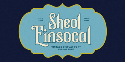 Sheol Einsocal is a Vintage Font inspired by beautiful vintage sign art and lettering. The font comes with unique alternate design characters to give your designs an elegant and artistic look. It is perfect for logo and packaging design, short phrases or headlines.
 - Shooting Star by Stefani Letter,
$10.00 Shooting star is a cool and playful handwritten font. It is defined by smooth curves and is perfect for kids theme or cheerful designs. but also It’s ideal for book, packaging and logo projects. Add this lettered font to your designs and notice how it makes them come alive!. This font is PUA encoded which means you can access all of the cute glyphs with ease! It also features a wealth of including ligatures.
 - Painting With Chocolate - 100% free

- Eat More Chocolate - Personal use only

- PT Chocolate Dip - Unknown license

- Chocolate Box Pro by CheapProFonts,
$10.00 The lowercase has classical Roman letterforms, and together with the cute, swirly capitals they make for a slightly more feminine take on the genre. Trajan lettering - with added sugar! ALL fonts from CheapProFonts have very extensive language support: They contain some unusual diacritic letters (some of which are contained in the Latin Extended-B Unicode block) supporting: Cornish, Filipino (Tagalog), Guarani, Luxembourgian, Malagasy, Romanian, Ulithian and Welsh. They also contain all glyphs in the Latin Extended-A Unicode block (which among others cover the Central European and Baltic areas) supporting: Afrikaans, Belarusian (Lacinka), Bosnian, Catalan, Chichewa, Croatian, Czech, Dutch, Esperanto, Greenlandic, Hungarian, Kashubian, Kurdish (Kurmanji), Latvian, Lithuanian, Maltese, Maori, Polish, Saami (Inari), Saami (North), Serbian (latin), Slovak(ian), Slovene, Sorbian (Lower), Sorbian (Upper), Turkish and Turkmen. And they of course contain all the usual "western" glyphs supporting: Albanian, Basque, Breton, Chamorro, Danish, Estonian, Faroese, Finnish, French, Frisian, Galican, German, Icelandic, Indonesian, Irish (Gaelic), Italian, Northern Sotho, Norwegian, Occitan, Portuguese, Rhaeto-Romance, Sami (Lule), Sami (South), Scots (Gaelic), Spanish, Swedish, Tswana, Walloon and Yapese.
 - Marshmallow Hot Chocolate by Nicky Laatz,
$17.00 Say hello to Marshmallow Hot Chocolate Brush - A super-casual, super-versatile all caps brush font. Great at both Small and large sizes : Fine texture details on its edges make it pop at larger sizes, and at smaller sizes its stays crisp, neatly balanced and nicely legible. Perfect for making a statement - use it in quotes, punchy headers, posters, flyer design, packaging, in your illustrations that need legible handwritten captions - and so much more. Although Marshmallow Hot Chocolate is an all caps font, you will find uppercase and lowercase keystrokes have alternate characters. Opentype Ligatures are included to make it look more naturally handwritten in your designs. Four extra swashes are included in the glyphs set - open your glyphs panel to access them. Play with the letter spacing to get different looks and effects.
 - PR Scrolls 04 by PR Fonts,
$15.50 Inspired by food labels, signs and coats of arms, PR-Scrolls is a collection of images which can be used for framing text in contexts where antiquity, craftsmanship, or traditional quality are conveyed. There are several sets of glyphs which work together to make a variety of shapes, or banners of custom length. Most of the glyphs are presented in a range of four or more widths.
 - PR Scrolls 02 by PR Fonts,
$10.00 Inspired by food labels, signs and coats of arms, PR-Scrolls is a collection of images which can be used for framing text in contexts where antiquity, craftsmanship, or traditional quality are conveyed. There are several sets of glyphs which work together to make a variety of shapes, or banners of custom length. Most of the glyphs are presented in a range of three or more widths.
 - Chocolate Bar JNL by Jeff Levine,
$29.00 Chocolate Bar JNL emulates hand-lettering on the sheet music for a song selection called "Shoe Shine Boy" from Connie's Hot Chocolates of 1936 (an all-black musical revue). The lettering was not found in the song's title, but rather in the name of the show itself.
 - PR Scrolls 05 by PR Fonts,
$10.05 Inspired by food labels, signs and coats of arms, PR Scrolls is a collection of images which can be used for framing text in contexts where antiquity, craftsmanship, or traditional quality are conveyed. Most of the glyphs are presented in a range of four or more widths.
 - PR Scrolls 03 by PR Fonts,
$10.00 Inspired by food labels, signs and coats of arms, PR-Scrolls is a collection of images which can be used for framing text in contexts where antiquity, craftsmanship, or traditional quality are conveyed. There are several sets of glyphs which work together to make a variety of shapes, or banners of custom length. Most of the glyphs are presented in a range of three or more widths. Scrolls 3 has a greater unity of detail, and a greater variety of form than our earlier designs.
 - Paper Cut - Personal use only

- KG All Things New - Personal use only

- Old Dog, New Tricks - Unknown license

- SF New Republic SC - Unknown license

- Brave New Era G98 - Unknown license

- SF New Republic SC - Unknown license

- SF New Republic SC - Unknown license

- SF New Republic SC - Unknown license

- New Lincoln Gothic BT by Bitstream,
$50.99New Lincoln Gothic is an elegant sanserif, generous in width and x-height. There are twelve weights ranging from Hairline to UltraBold and an italic for each weight. At the stroke ends are gentle flares, and some of the round characters possess an interesting and distinctive asymmetry. The character set supports Central Europe, and there are three figure sets, extended fractions, superior and inferior numbers, and a few alternates, all accessible via OpenType features. Back in 1965, Thomas Lincoln had an idea for a new sanserif typeface, a homage of sorts, to ancient Roman artisans. The Trajan Column in Rome, erected in 113 AD, has an inscription that is considered to be the basis for western European lettering. Lincoln admired these beautiful letterforms and so, being inspired, he set out to design a new sanserif typeface based on the proportions and subtleties of the letters found in the Trajan Inscription. Lincoln accomplished what he set out to do by creating Lincoln Gothic. The typeface consisted only of capital letters. Lincoln intentionally omitted a lowercase to keep true his reference to the Trajan Inscription, which contains only magiscule specimens. The design won him the first Visual Graphics Corporation (VGC) National Typeface Competition in 1965. The legendary Herb Lubalin even used it to design a promotional poster! All this was back in the day when typositor film strips and photo type were all the rage in setting headlines. Fast forward now to the next millennium. Thomas Lincoln has had a long, illustrious career as a graphic designer. Still, he has one project that feels incomplete; Lincoln Gothic does not have a lowercase. It is the need to finish the design that drives Lincoln to resurrect his prize winning design and create its digital incarnation. Thus, New Lincoln Gothic was born. Lacking the original drawings, Lincoln had to locate some old typositor strips in order to get started. He had them scanned and imported the data into Freehand where he refined the shapes and sketched out a lowercase. He then imported that data into Fontographer, where he worked the glyphs again and refined the spacing, and started generating additional weights and italics. His enthusiasm went unchecked and he created 14 weights! It was about that time that Lincoln contacted Bitstream about publishing the family. Lincoln worked with Bitstream to narrow down the family (only to twelve weights), interpolate the various weights using three masters, and extend the character set to support CE and some alternate figure sets. Bitstream handled the hinting and all production details and built the final CFF OpenType fonts using FontLab Studio 5. - Happy New Year Party by Putracetol,
$26.00 Happy Ney Year Party is a playful and quirky display font. I made this font especially for New Year and holidays. This font has 8 decoration versions : regular, firework, splash, ribbon, star, trumpet. These decorations are related to New Year decorations, making this font the perfect fit for any new year or holiday themed activity / project. Happy Ney Year Party perfect for crafter, gift, tshirt, card event, anniversary, birthday,greeting cards, logotype, branding, poster, packaging, stationery, website, and any other projects requiring a handwritten and luxurious touch. This font is also support multi language.
 - New Yorker Type Pro by Wiescher Design,
$45.00 New-Yorker-Type was one of the first typefaces I tried my hand at in 1985. I meant it as a revival of the typeface used by the New Yorker magazine. I did not scan it. I just looked at the type and redrew it completely by hand. Only much later did I come to know, that there is a bundle of similar typefaces of that period. Rea Irvin's design for New-Yorker magazine was just one of them, maybe the best. In the next step I repaired some of the mistakes that I made more than thirty years ago. Now on the eve of 2020 I gave the font a complete overhaul and added a set of Swash Initials, Cyrillic and Greek glyphs and many ligatures. The font now has 1075 glyphs and is all set for most latin writing systems. On top of that I made two versions, a Classic one with rounded corners and a pointed Pro version for a more up-to-date look. Take your pick. Yours sincerely, honoring Rea Irvin a great type- and magazine-designer, Gert Wiescher
 - New Thin Roman JNL by Jeff Levine,
$29.00 The 1912 publication "Essentials of Lettering" has an example of a hand lettered, condensed spurred serif design called "Compressed Roman". This is now available digitally as New Thin Roman JNL in both regular and oblique versions.
 - Times New Roman Seven by Monotype,
$67.99In 1931, The Times of London commissioned a new text type design from Stanley Morison and the Monotype Corporation, after Morison had written an article criticizing The Times for being badly printed and typographically behind the times. The new design was supervised by Stanley Morison and drawn by Victor Lardent, an artist from the advertising department of The Times. Morison used an older typeface, Plantin, as the basis for his design, but made revisions for legibility and economy of space (always important concerns for newspapers). As the old type used by the newspaper had been called Times Old Roman," Morison's revision became "Times New Roman." The Times of London debuted the new typeface in October 1932, and after one year the design was released for commercial sale. The Linotype version, called simply "Times," was optimized for line-casting technology, though the differences in the basic design are subtle. The typeface was very successful for the Times of London, which used a higher grade of newsprint than most newspapers. The better, whiter paper enhanced the new typeface's high degree of contrast and sharp serifs, and created a sparkling, modern look. In 1972, Walter Tracy designed Times Europa for The Times of London. This was a sturdier version, and it was needed to hold up to the newest demands of newspaper printing: faster presses and cheaper paper. In the United States, the Times font family has enjoyed popularity as a magazine and book type since the 1940s. Times continues to be very popular around the world because of its versatility and readability. And because it is a standard font on most computers and digital printers, it has become universally familiar as the office workhorse. Times?, Times? Europa, and Times New Roman? are sure bets for proposals, annual reports, office correspondence, magazines, and newspapers. Linotype offers many versions of this font: Times? is the universal version of Times, used formerly as the matrices for the Linotype hot metal line-casting machines. The basic four weights of roman, italic, bold and bold italic are standard fonts on most printers. There are also small caps, Old style Figures, phonetic characters, and Central European characters. Times? Ten is the version specially designed for smaller text (12 point and below); its characters are wider and the hairlines are a little stronger. Times Ten has many weights for Latin typography, as well as several weights for Central European, Cyrillic, and Greek typesetting. Times? Eighteen is the headline version, ideal for point sizes of 18 and larger. The characters are subtly condensed and the hairlines are finer." - New Car Tag JNL by Jeff Levine,
$29.00 Around 2018 or 2019, the State of Florida introduced new letter and number characters on its auto plates. Inspired by this change, Jeff Levine Fonts offers up a digital version of this lettering named New Car Tag JNL, which is available in both regular and oblique versions (for those who want a more sporty look). Some people prefer a rounded 'zero' to differentiate between the regular zero and the letter 'O'. You can find this alternate character located on both the solid bar and broken bar glyphs.
 - New Century Schoolbook LT by Linotype,
$29.99Under the commission of the American Century Magazine"", Linn Boyd Benton designed a new text typeface in 1894 with a design typical of the Neorenaissance movement in typography. Morris Fuller Benton produced various interpretations of this font for American Typefounders and the companies Linotype, Intertype and Monotype quickly took up the typeface. New Century Schoolbook font is a very legible font, fairly narrow and with relatively little stroke contrast. This font is from Morris F. Benton and appeared in 1915. - Iwata News Mincho Std by IWATA,
$199.00 数多くの新聞社で使われてきた伝統ある「岩田新聞明朝体」を再現した「イワタ新聞明朝体」と、かなを現代風にアレンジした「イワタ新聞明朝体新がな」があります。
 - Mic 32 New Stencil by moretype,
$25.00 Mic 32 New Stencil is the third variation of the popular Moretype family Mic 32 New. This stencil version provides an industrial flavour to the futuristic rounded geometry of Mic 32 New. Mic 32 New Stencil still has all the normal Opentype features including small caps, tabular, proportional and old style numerals and ligatures.
 - Iwata News Gothic Pro by IWATA,
$309.00
- Late Breaking News JNL by Jeff Levine,
$29.00 Re-drawn from a screen capture of a vintage newspaper front page, Late Breaking News JNL is a traditional sans serif that's perfect for headlines, titling and other forms of announcements.


