10,000 search results
(0.051 seconds)
- BlincType Letterpress Fontpak by Chank,
$99.00 Add some old fashioned charm to your designs with the distressed alphabets in the new BLINCtype Letterpress Fontpak, a brand new font collection containing 8 letterpress-inspired fonts from the creative minds at Blinc Publishing in St. Paul, MN. The BLINCtype Letterpress Fontpak contains a handy concise assortment of old-school display fonts. From the old Western "WANTED" poster look of Prospect Modern, to the no-nonsense all-caps classic Goshen and its lowercase companion Gideon, these fonts are inspired by wooden letterpress blocks and other archaic technologies. It's like having your own letterpress print studio! Except it's all instantly downloadable right now as easy-to-use fonts! Designers love working with the Cheltenham-esque Gomorrah and its grittier, grungier counterpart, Sodom. The bouncy Golgotha has a rough and tumble readiness that exudes a hand-made charm, while Hamilton Offset has a cryptic, experimental look and feel that gives the impression of double-vision. You also get the newest member of the Blinc font family, Player Piano, which was based on punch-cut stencil letters on an old player piano paper song roll. Purchase the BLINCtype Letterpress Fontpak today and you'll be able to download and start using these 8 great fonts right away! The BLINCtype Letterpress Fontpak contains the fonts: Gideon, Golgotha, Gomorrah, Goshen, Hamilton Offset, Player Piano, Prospect Modern and Sodom.
 - Directa Serif Variable by Outras Fontes,
$170.00 Directa Serif Variable is a text type family in one single font file. It explores new possibilities for the original type family released by Outras Fontes some years earlier, which is designed to save space with the highest readability. The variable font is composed of two axes of variation: Weight (100–900) and Italic (0–1). It also contains 18 predefined styles between Thin and Heavy and their respective italics. So now you can adjust the weight of the type by interpolating it in real time using any variable font compatible app. There are hundreds of possibilities between the values of 100 (Thin) and 900 (Heavy). And if you're feeling adventurous, you can also use the Italic axis to interpolate instances between Roman (0) and Italic (1) and see what happens in the middle. This new technology can be very useful for web and video animations. Directa Serif Variable is also highly recommended for newspapers, magazines, corporate communication and so on. It has a large set of characters, including Western, Central European, Baltic, Scandinavian, Icelandic, Romanian and Turkish unicode ranges. The variable font also includes several ligatures, a complete set of small caps, sets of lining, old style and tabular figures, as well as fractions, superior and inferior numbers. These features can be easily accessed using any OpenType-compatible software.
 - FF Bauer Grotesk Paneuropean by FontFont,
$40.99FF Bauer Grotesk is a revival of the metal type Friedrich Bauer Grotesk, released between 1933 and 1934 by the foundry Trennert & Sohn in Hamburg Altona, Germany. The geometric construction of the typeface, infused with the art deco zeitgeist of that era, is closely related to such famous German designs as Futura, Erbar, Kabel and Super Grotesk that debuted a few years earlier. However, FF Bauer Grotesk stands out for being less dogmatic with the geometry, lending the design a warmer, more homogenous feeling. The oval “O” is a good example of that, as well as characteristic shapes like the capital M or the unconventionally differing endings of “c” and “s” which make for a less constructed look. The design was started by Thomas Ackermann, and he collaborated with Felix Bonge to evolve his original ideas into this fresh, modern geometric typeface family. FF Bauer Grotesk contains 6 weights with accompanying italics, and a wide range of OpenType typographic features including small caps, figure styles, fractions and contextual alternates. NEW: the new FF Bauer Grotesk W1G versions features a pan-European character set for international communications. The W1G character set supports almost all the popular languages/writing systems in western, eastern, and central Europe based on the Latin alphabet including Vietnamese, and also several based on Cyrillic and Greek alphabets. - Annyeong by Ditatype,
$29.00 Annyeong welcomes you with a display font that captures the essence of Korean vibes. This display is a celebration of the dynamic and inviting nature of Korean design. It's a versatile tool that allows you to infuse your projects with a sense of cultural richness and visual impact. The characters in Annyeong are generously sized, ensuring a powerful and visually striking impact. The bold weight adds a sense of solidity, embodying the strength and confidence found in Korean aesthetics. Infused with Korean vibes, Annyeong brings a touch of cultural richness to every letter. In addition, enjoy the features here. Features: Stylistic Sets Multilingual Supports PUA Encoded Numerals and Punctuations Annyeong fits in headlines, logos, posters, flyers, branding materials, greeting cards, print media, editorial layouts, and many more designs. Find out more ways to use this font by taking a look at the font preview. Thanks for purchasing our fonts. Hopefully, you have a great time using our font. Feel free to contact us anytime for further information or when you have trouble with the font. Thanks a lot and happy designing.
 - Narapati by Dotzeem,
$15.00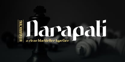 Introducing, Narapati is a clean Blackletter Typeface for your Design Narapati is a clean Blackletter Typeface for your Design that is fit for your next creative project such as logos, product packaging, Logotype, Letterhead, Poster, Apparel Design, Label, and etc. This Narapati Typeface includes also support a Multilingual Characters.
 - Disposable by PizzaDude.dk,
$20.00 Disposable is somewhat similar to some letters that are about to disintegrate. The letters are a little worn and give a good impression of something eco or organic. I've created 6 different versions of all the letters, just so your text will look even more organic and handmade!
 - Bibliophile Script by Sudtipos,
$79.00 A friend once jokingly told me that what I really do is mine extinct arts for parts to use in modern things, like going to the scrapyard to pick up bumpers, quarter-panels and dashboards off of Datsuns and Ponies to build a shiny new Ferrari. I still kind of grin at that, but I certainly do spend a lot of time looking at old things and imagining ways they would work today. This shiny new Ferrari here is called Bibliophile, and it contains scrap heap parts from various pages by Louis Prang, the Prussian-American printer and publisher who inspired my Prangs fonts. This is my second engagement with the late 19th century man, and it’s quite a bit more intricate than just an italic Didone with a connected lowercase. Bibliophile marries Round Hand calligraphy with Italian capitals, two styles not often relayed in the same alphabet, but work together beautifully when combined well. When you combine them well with a few long-practised tricks of the trade, then mix in a few trusted features from my previous work over the years, you get my usual crazy exuberance, like 17 different shapes for the d, 21 different forms for the y, endings, beginnings, swashes, ornaments, and so on. It’s no secret that I can get carried away when I’m so consumed by an idea. — Bibliophile comes in 2 weights, each of them with over 900 glyphs covering all the latin languages. Bibliophile also comes with a bold weight, something I’m always reluctant to do with something as adventurous and complex as the structure of this historical mashup. But I couldn’t chase away the idea of increasing the contrast while maintaining the hairlines in a lowercase this narrow. Part of it was the curiosity about the outcome, and part was the sheer challenge of it. I think it turned out OK. Words set in either weight will show delicateness and elegance, and the more time you spend inside the font and micro-manage the setting, the more ways you will find to magnify either. Bibliophile can be as muted or luxurious as you want it to be. This is the kind of alphabet that fits well in fashion marketing and high-end packaging, from the very subdued to the super-exquisite. Enjoy the gleaming new vehicle made with freshly polished old parts.
 - OT Replica by OzType.,
$35.00 Replica seamlessly blends organic and geometric elements to create a captivating geometric grotesque font that draws its creative essence from the principles and design philosophy of organic architecture. Replica's journey towards this harmonious equilibrium begins with a deep exploration of organic architecture, a design philosophy that celebrates the integration of the built environment with the natural world. Drawing inspiration from the works of architects like Frank Lloyd Wright and Antoni Gaudí, Replica seeks to capture the essence of flowing lines, biomorphic shapes, and the seamless fusion of structure and surroundings. At the heart of Replica's design process lies a commitment to translating these organic principles into a typographic form that resonates with viewers in a way that is both visually captivating and functionally versatile.
 - The Humble Script by Letterfreshstudio,
$15.00 The Humble Script is new quality calligraphy font. High-quality script fonts come with modern and vintage touches in them. Inspired by a mixture of copper calligraphy with handlettering style. OpenType feature with Stylistic Alternatives, Swash, Ligatures, Stylistic sets. It allows you to mix and match letter pairs to fit your design, and also comes with modern ornaments to make this font look elegant and perfect. The Humble Script is attractive like a smooth, clean, feminine, sensual, glamorous, simple and very easy to read. The classic style is perfect to be applied in various formal forms such as invitations, labels, menus, logos, fashion, make up, stationery, letterpress, romantic novels, books, greeting / wedding cards, packaging, labels, and more. The Humble Script also supports in pragram, Adobe Illustrator, Adobe Photoshop, Adobe InDesign, Corel Draw X version, Microsoft Word.Language Support : Albanian, Basque, Breton, Chamorro, Danish, Dutch, English, Faroese, Finnish, French, Frisian, Galician, German, Icelandic, Italian, Malagasy, Norwegian, Portuguese, Spanish, Swedish.
 - Quaint Gothic SG by Spiece Graphics,
$39.00 Distinctively Art Nouveau with a touch of Arts & Crafts, Quaint Gothic is a typographic gem from the late nineteenth century. Also known as Desdemona, this undulating and organic typeface is a versatile and refreshing alternative to many of the font designs on the market today. Quaint Gothic comes complete with an alternate set of caps and a new set of lowercase characters. And for your convenience, a nifty set of small caps and small figures are included in this version. You may also want to access the word-on-a-wave logotypes like “to” and “and” located in the special character slots. They’re great for constructing provocative headlines and titles. Quaint Gothic is also available as an OpenType font. It contains lining and oldstyle figures, prebuilt fractions, stylistic alternates, a wide variety of discretionary ligatures and word ornaments. These advanced features currently work in Adobe Creative Suite InDesign and Illustrator. Check for OpenType advanced feature support in other applications as it gradually becomes available with upgrades.
 - Best Choice by Dharma Type,
$9.99 Best Choice is a family of next-generation monospaced fonts for developing, programming, coding, and table layout. Some desirable features in monospaced fonts are listed below. 1.Easy to distinguish 2.Easy to identify 3.Easy to read Best Choice has very distinguishing letterforms for confusable letters such as Zero&Oh, One&I, and Two&Z. A lot of ingenuity makes this family very distinguishable. Italics have a very large inclination angle to be distinguished from their Roman. For the same reason, Italics are slightly lighter than Romans. Italic is not cursive Italic. It is near the slanted Roman. This is an intentional design to identify Italic letters. Cursive is not suitable for programming font. Very clean and natural letterform is good for reading. Common curvature for tails and hooks makes harmony and a sense of unity. Best Choice supports almost all Latin including Vietnamese and Cyrillic. Try this all-new experiment.
 - Blessinhet Script by madjack.font,
$14.00 Blessinhet Script is a modern and clean calligraphy script, with elegant characters dancing along the baseline. It can be used for various purposes such as logos, wedding invitations, postal, t-shirts, letterhead, signage, labels, news, posters, badges and more. OpenType features with alternative styles, binders and multi-language support. To activate the OpenType Stylistic alternative, you need a program that supports OpenType features such as Adobe Illustrator CS, Adobe Indesign & CorelDraw X6-X7, Microsoft Word 2010 or newer versions. How to access all alternative characters, using Windows Character Map with Photoshop: https://www.youtube.com/watch?v=Go9vacoYmBw How to access all alternative characters using Adobe Illustrator: http://youtu.be/iptSFA7feQ0 There are additional ways to access alternatives / swashes, using Character Map (Windows), Nexus Fonts (Windows), Font Book (Mac) or software programs such as PopChar (for Windows and Mac). Need help? If you need help or advice, please contact me by email madjack.font@gmail.com Thank you!
 - Austina Capitton by HansCo,
$15.00 Austina Capitton is our new modern, clean, and stylish monoline signature font and was created to look as a naturally handwritten as possible. Built with unique style in OpenType features, this script comes to life as if you are writing it yourself. This font is very suitable to be used to brand a product because if you write a brand name it will look like your company signature. Austina Capitton is perfect for photographers, bloggers, trademarks, magazines, fashion, logos, business cards and much more. There are two styles in this font package, they are Alt and Regular. You can use Regular style if you like the curve of the font or you can use Alt style if you like simple and minimal ones. It's highly recommended to use it in OpenType capable software - like a Coreldraw, Photoshop, Illustrator and Indesign. This font come with Uppercase, Lowercase, Numbers, Punctuation and swash. It offers Multilingual Support, works on Mac and Windows OS and is easy to install. Enjoy!
 - Helter Slab by Dora Typefoundry,
$15.00 NEW! Helter is a slab-serif font that gives off a clean and very elegant feel that has a strong and bold look. the slab is thick and does not regret the size of the width. The slab-serif helter is perfect for your upcoming project which is applied especially to various other formal forms such as invitations, labels, logos, magazines, books, greeting / wedding cards, packaging, fashion, make up, stationery, novels, home decor labels, book / cover titles, special events and many more. Features: • Full set of uppercase letters, • Numbers & Punctuation • Characters with accents • Supports Multiple Languages This type of family has become a work of true love, making it as easy and enjoyable as possible. I really hope you enjoy it! I can't wait to see what you do with Helter Slab! Feel free to use the #Dora Typefoundry tag and # Helter Slab font to show what you've done visit my Instagram : https://www.instagram.com/doratypefoundry/
 - Slighty Script by ijemrockart,
$15.00 Introducing my new font Slighty Script is a unique blend of classic and modern font. imperfect style ups and downs, like a dance letters, smooth, clean and simple. Perfect for wedding, event, invitation, escort card, table number, header menus, display, logos, slider blog, custom address, stamps, packaging, greeting card, etc. Slighty Script including alternate glyph and beautiful swirl in a font including stylistic sets, Ligatures etc. The Open Type features can be accessed by using Open Type savvy programs such as Adobe Illustrator CS, Adobe Indesign & CorelDraw X6-X7 and Microsoft Word. And this Font has given PUA unicode (specially coded fonts). so that all the alternate characters can easily be accessed in full by a craftsman or designer. If you don't have a program that supports OpenType features such as Adobe Illustrator and CorelDraw X Versions, you can access all the alternate glyphs using Font Book (Mac) or Character Map (Windows).
 - Wonderting Script by ijemrockart,
$15.00 Introduce my new font Wonderting Script is a unique blend of classic and modern font. imperfect style ups and downs, like a dance letters, smooth, clean and simple. Perfect for wedding, event, invitation, escort card, table number, header menus, display, logos, slider blog, custom address, stamps, packaging, greeting card, etc. Wonderting Script including alternate glyph and beautiful swirl in a font including stylistic sets, Ligatures etc. The Open Type features can be accessed by using Open Type savvy programs such as Adobe Illustrator CS, Adobe Indesign & CorelDraw X6-X7 and Microsoft Word. And this Font has given PUA unicode (specially coded fonts). so that all the alternate characters can easily be accessed in full by a craftsman or designer. If you don't have a program that supports OpenType features such as Adobe Illustrator and CorelDraw X Versions, you can access all the alternate glyphs using Font Book (Mac) or Character Map (Windows).
 - Neon Bugler by Breauhare,
$35.00 Neon Bugler is a font based on the third logo created by Harry Warren in early 1975 for his sixth grade class newsletter, The Broadwater Bugler, at Broadwater Academy in Exmore, Virginia, on Virginia’s Eastern Shore. This font design has these principles as its parameters: The letters generally follow what would be natural stroke directions; no sharp corners, all gentle turns; no lines back up over each other, cross each other, or run into each other. All of this civility between the lines produces an unintentional but welcome neon quality about it. This font can have a variety of vibes depending on its context--it has a certain nostalgia to it, yet it also has a slick, clean, futuristic look. It can even be used in a semi-grunge setting. This is a very versatile font! And if you like this font, check out the new boxy version of it, Neon Bugler Squared! Digitized by John Bomparte.
 - D.I.Y. Time by Latinotype,
$19.00 D.I.Y. Time is a hand drawn type system designed by Luciano and Coto inspired by the DIY philosophy which has been transformed into a whole global counterculture movement, identifying the new generations that reprice the handwork, paying attention to quality, processes and materials used in the manufacture of goods and objects, food, clothing, furniture etc. This beautiful philosophy inspires us every day. Is present in our homes, in our lifestyle and this time we have given him way through a typeface family that mixes different styles but integrates them through language handmade. The result is a typeface based on hand lettering drawing with different brushes and pens on paper. With versions ranging from organic proposals as DIY time hand to other based on the classic proportions of Gill as DIY time sans. To accompany a set of compound words designed on the needs of small farmers and a set of ornaments illustrated, everything you need to begin to make your own.
 - Magdaline Script by Hrz Studio,
$17.00 Magdaline Script is new quality calligraphy font. High-quality script fonts come with modern and vintage touches in them. Inspired by a mixture of copper calligraphy with handlettering style. OpenType feature with Stylistic Alternatives, Swash, Ligatures, Stylistic sets. It allows you to mix and match letter pairs to fit your design, and also comes with modern ornaments to make this font look elegant and perfect. Magdaline Script is attractive like a smooth, clean, feminine, sensual, glamorous, simple and very easy to read. The classic style is perfect to be applied in various formal forms such as invitations, labels, menus, logos, fashion, make up, stationery, letterpress, romantic novels, books, greeting / wedding cards, packaging, labels, and more. Magdaline Script also supports in pragram, Adobe Illustrator, Adobe Photoshop, Adobe InDesign, Corel Draw X version, Microsoft Word.Language Support : Albanian, Basque, Breton, Chamorro, Danish, Dutch, English, Faroese, Finnish, French, Frisian, Galician, German, Icelandic, Italian, Malagasy, Norwegian, Portuguese, Spanish, Swedish.
 - Marthine Diamond by Timurtype,
$14.00 Introduced by Timurtype Studio! Marthine Diamond is a Modern Handbrushed Script Font This font unlocks the appeal of contemporary design with a modern handwritten font, a symphony of sophistication and spontaneity. This font effortlessly combines the precision of digital craftsmanship with the organic flow of hand-drawn elegance. Each letter is a brushstroke of innovation, adding a dynamic and bespoke touch to your project. The sleek curves and smooth lines of modern hand script fonts create visual harmony, infusing your designs with a sense of stylish authenticity. Enhance your creative expression, as these fonts integrate seamlessly into a modern aesthetic, offering the perfect balance between avant-garde pieces and timeless works of art. Let your words take on a new dimension, where art blends technology and tradition, giving life to a contemporary narrative that is visually striking and uniquely yours Marthine Diamond Font also supports multilingualism. Enhance your designs with our original fonts, feel free to comment or provide feedback, Enjoy the fonts 😊 Thank You
 - Marat by Ludwig Type,
$45.00 Although originally conceived as a magazine face – with strong serifs and open character shapes for good legibility in small sizes, and compact letter forms optimized for narrow columns and tight headlines – Marat evolved into a comprehensive family for general use. This specific construction and the round forms of the letters create an elegant, soft and friendly appearance. The typeface suits a wide range of typography, e.g. editorial, brochures, packaging and corporate design. In particular, in bold weights it works surprisingly well, which is not always the case with serif faces. Marat includes oldstyle and lining figures (both proportional and tabular), a wide range of language support and various OpenType features (e.g. ligatures, case-sensitive forms, fractions, superiors and inferiors). It is the perfect companion for Marat Sans, a clean and lively sans serif typeface. Marat has been selected by the Type Directors Club of New York to receive the Certificate of Excellence in Type Design 2008.
 - Bikini Season by Los Andes,
$37.00 Summer has come! Boho girl is going on her beach vacation. Relaxed, spontaneous, feminine, irreverent, though. Like a girl with a Gipsy soul, she just grabs her Bikini and turns away! This is the new font duo by the couple Coto and Luciano. Bikini includes a sans version, based on the proportion and structure of Roman capitals, but with a contemporary flavor and a clean style that give the typeface a chic touch. The other version of this font duo is a modern calligraphy script of handmade style. The mix is just perfect: opposites attract creating a very interesting counterpoint. Can you guess who is the designer behind each style? This font duo is intended to be used for posters, labelling or branding. The sans and script styles add visual hierarchy when composing text. Feel the fresh free spirit of its OpenType features and ornaments! Please see User Guide Every season is Bikini season!
 - Sequel Sans by OGJ Type Design,
$35.00 Sequel Sans is a new chapter in the book of neogrotesque typefaces. Its core idea and its name were conceived in collaboration with the max bill georges vantongerloo foundation. The main inspiration for its design were the sans-serif typefaces used by Max Bill, the larger-than-life Swiss architect, artist, and designer. Honoring these roots, I designed Sequel Sans to be a clean and adaptable font family that is built upon a comprehensive system of styles. 8 weights, each with a corresponding italic, and a matching set of Variable Fonts are available in 4 optical sizes. These range from standard (for text sizes) to Subhead to Headline to Display—larger optical sizes come with tighter spacing and a number of gently adjusted glyph shapes. Like the great neogrotesques found in mid-century Swiss Style designs, Sequel Sans is a vessel that you can fill with any kind of content. It will amplify your message while retaining its own modernist character.
 - Envisage by Type Innovations,
$39.00 Envisage is a distinctive new grotesk design by Alex Kaczun. Characterized by distinct details throughout as particularly visable in the capitals A, H and N. There is a more organic and natural feel to the overall design as in the sutle curves introduced in many of the lower case letter forms, specifically the a, h, m and n. And, especially evident in the warm overall curves within the l‘case g. In addition, incorporating flexibility in form and function, Alex has also included alternate letter forms in this OpenType font; allowing the graphic designer a choice in the overall look and feel. Envisage has impact and zeal. It's a wonderful choice for a distinctively unique headline treatment, and works equally well in text in a large range of point sizes. Use this friendlier sans serif as an alternate to Futura and Gill Sans. We think you will like what you see. The large Pro font character set supports most Central European and many Eastern European languages.
 - Spry Roman by Stephen Rapp,
$49.00 Handmade, expressive, lively, organic— …words typically used to describe a script font or a casual sans. Spry Roman opens up new possibilities. It’s origin is handwritten letters created using a pointed nib on slightly toothy paper. While based on a Roman form, the letters are designed to break out of the mold and dance along the baseline. Spry Roman Pro is a fully featured opentype font. Among the 964 glyphs are loads of alternate characters and swash letters; a full set of small caps; simple fractions; case sensitive punctuation; and a variety of ornaments, border elements, and flourishes. It also includes a full dose of language support for not only main characters, but also for alternates and small caps. Ligatures have been kept to a minimum to allow users the option of tracking text. **Please note that the Pro version has all the glyphs of the others combined. The smaller versions are for those who don't have opentype savvy apps like Adobe Illustrator.
 - Garota Serif - Personal use only

- Internacional by Los Andes,
$26.00 Internacional, inspired by the International Style, is a Latin American-flavored neo-grotesque sans serif typeface made with organic ingredients and sweetened with organic sugar and chocolate. Internacional is well-suited for corporate identity, branding, publishing projects, logotypes, magazines and advertising. Its large x-height and small difference between x-height and cap-height make it a high-impact font, ideal for powerful headings, while providing legibility. Internacional was designed for use with short and mid-length paragraphs that require a balanced type color. Internacional is an extended width font with rounded forms and angled terminal ends, in characters such as “c” or “a”, which make it suitable for use in advertising and branding. The proportional relation in height between uppercase and lowercase letters may be useful when composing text in German language. The Internacional font family comes in 7 weights with matching italics and includes an alternative version, with the same number of styles, yet it tastes differently. Special thanks to everyone in the Latinotype Team (especially to Rodrigo Fuenzalida) for their support, help with corrections and digital editing.
 - Cabrito by insigne,
$24.00 After my son was born, I found myself reading him a lot of books. A LOT of books. Some were good, some were great, but I found myself wanting to develop something using my skills and interests to make something that only I could make. In short, I realized my son needed to be indoctrinated—I mean, introduced into the wonderfully wild world of fonts. So, I set about to make a board book to teach about typography, called “The Clothes Letters Wear.” You can learn more about the book here. I’ve made the captivating illustrations bright and colorful, and the use of different letter forms makes for a fascinating read to delight ages young and young at heart. And, as an added bonus, this children’s book has a custom designed font. I’m always looking for an excuse to design a new font, and this book created the perfect alibi. Drum roll, please. I now give you … Cabrito (“little goat” en Español). This new serif typeface incorporates the latest research on typographic legibility for children, features to make it—well, extra legible. A little background: studies show that Bookman Old Style is one of the most readable typefaces, and as a consequence or perhaps the reason why, it is used thoroughly for children’s books. This font became my initial inspiration for the typeface. Then, I found more legibility research saying that (brace yourselves) Comic Sans is also very legible for beginning readers, much due to the large x-height and softer, easily recognizable forms. In addition, forms that are closer to handwriting also seem to be more legible. Once I threw all that into my cauldron and stewed it a bit, the result was a pleasantly rounded typeface that includes not-so-strictly geometric, handwriting-inspired forms for the b, d, p, and q. Es guapo! Cabrito’s slender weights are simple and fun, with extras that turn any “bah humbug” into a smile. Add lighter touches to your project with the typeface’s included sparkles or rainbows (not included). Splash a little more color on the page with the firmer look of the thicker weights. Cabrito’s upright variations across all weights are matched by optically altered italics, too, giving you even more variety with the font family. This modern typeface’s bundle of alternates can be accessed in any OpenType-enabled software. The fashionable options involve a significant team of alternates, swashes, and meticulously refined aspects with ball terminals and alternate titling caps to decorate the font. Also bundled are swash alternates, old style figures, and small caps. Peruse the PDF brochure to check out these options in motion. OpenType-enabled applications like the Adobe suite or Quark allows comprehensive control of ligatures and alternates. This font family also provides the glyphs to aid a variety of languages. Cabrito is a welcoming, everyday font family by Jeremy Dooley. Use it to convey warmth and friendliness on anything from candy and food packages to children’s toys, company IDs or run-of-the-mill promotional material. Cabrito’s unique appearance and high legibility make it equally at home in print as it is on a screen.
 - Green Fairy by Maria Montes,
$39.00 Green Fairy is a chromatic font family highly ornamented for display purposes. Green Fairy’s characters have been specifically designed to accommodate its loops and ornaments following a modern typeface structure. Green Fairy has four chromatic weights: 1. Green Fairy Outline 2. Green Fairy Dots 3. Green Fairy Stencil 4. Green Fairy Full The outline weight has been created as the base or structure for the other weights. You can combine these weights as well as add colours to obtain multiple effects and type styles. Green Fairy has also three combined weights (combos) to simplify your work flow, for these occasions when you only want to use one single colour in your font: 5. Green Fairy Dots Combo 6. Green Fairy Stencil Combo 7. Green Fairy Full Combo GREEN FAIRY ORIGINS The origin of this typeface is the lettering I designed in October 2015 as part of my illustrated cocktail artwork called “Absinthe. La Fée Verte (The Green Fairy)”. Originally, this lettering only featured eight letters “AB·SINTHE” vector drawn in Illustrator. Right after creating the full-colour artwork, I designed a fountain-letterpress print version of it, in collaboration with Ladies of Letters, A.K.A. Carla Hackett and Amy Constable from Saint Gertrude Fine Printing. At the beginning of 2016 –and thanks to the project @36daysoftype– I found the motivation, and most importantly the deadline, to draw the rest of the twenty-six letters of the uppercase alphabet using Illustrator. I started 2017 having my first two calligraphy courses sold out, so I took this amazing opportunity to devote myself to Green Fairy for a few months. In February 2017, I purchased the font software Glyphs and I started to re-draw all twenty-six letters of the uppercase alphabet again. PRODUCTION PROCESS Green Fairy started being one weight, but quickly turned into a layered/chromatic font. Things were going more or less fine till I arrived to the Dots weight: 1) I started drawing squares following a grid; 2) Then, the squares turned into diamonds following the same grid; 3) Then, the grid wasn’t working so well on the round letters so I tried randomising the position of the diamonds but it didn’t work; 4) So I went back to the grid, and this time scaled down the size of the diamonds creating a visual half-tone effect. I spent over four weeks working on the Dots weight and I felt like I was in the middle of a very long tunnel and I couldn’t see the light at the end. I encountered many other problems along the way but by June 2017, I felt I was back on track again. I kept working, tweaking, re-drawing and re-adjusting, and then the diacritics came on board… And then more re-drawing, re-tweaking, re-adjusting and then numbers… And then spacing, symbols, and currencies… And then more spacing, kerning, contextual kerning for triplets… In September 2017 I told myself “that’s it, I’m going to finish it now!” But guess what? More re-tweaking, testing, hinting, testing, rendering, testing… For those of you not familiarized with typeface design, it is extremely time consuming and it requires a lot of hard work, focus and determination. This project could not have been possible without the help of these generous professionals: Jose Manuel Urós, typeface designer based in Barcelona and my teacher twice in the past; Jamie Clarke, freelance letterer and typeface designer who has released a couple of chromatic fonts recently; Troy Leinster, Australian full-time typeface designer living and working in New York City; Noe Blanco, full-time typeface designer and hinting specialist based in Catalonia; And Nicole Phillips, typographer currently relocating from Australia to New Zealand. To all of you: THANK YOU VERY MUCH!
 - Sangkuriang - Unknown license

- Zygo by Zang-O-Fonts,
$25.00A wide, square font, ZygoSE fits perfectly into a clean, dynamic design piece. - Graffiti Drips by m u r,
$15.00 Capitals are messy. Lowercase letters are clean. A drippy, runny, messy graffiti font.
 - KG Change This Heart by Kimberly Geswein,
$5.00 Short, wide thin-stroked writing. Although handwritten, it is a very clean style.
 - LFT Etica Mono by TypeTogether,
$35.00 Milan-based Leftloft studio has produced a third leg to its hit Etica font family: LFT Etica Mono. Meant to be a coder’s go-to font for everyday use as much as a designer’s way to invoke a certain genre, it is part of a broader and more versatile family that already contains almost 80 sans and serif fonts. LFT Etica Mono’s ten weights carry the same modern, recognisable DNA of the Etica family while hewing to the defined requirements of a coding typeface: space, density, distinct forms, and clarity. It uses the same instroke on the ‘c’ and open form of the ‘a’ for which the Etica family is famous, but adds something new in the form of an additional italic style. Monospaced fonts usually incorporate slanted letters as italics, as does LFT Etica Mono, but its default italics have warmer, cursive shapes while the alternate italics are simply slanted. The default ‘a’ is a simplified bowl and stem instead of a two storey shape; the ‘d, f, i, l, t, y’ and others gain an outstroke tail; the ‘e’ is one smooth stroke; and the default ‘k’ is looped. These characters have basic, slanted alternates if the cursive look isn’t desired, and includes a set of arrows and geometric shapes. The monospaced design, by nature, makes the typeface useful in coding and in low readability situations. And how does LFT Etica Mono work from the designer’s perspective? The starting point was the need for a monospaced Etica companion intended for technical applications: captions in graphic layouts, small text, confined or predefined space, and overall tone. Flat terminals and counters maintain the colour and versatility of the original typeface, but choosing between the organic cursive or blunt slanted alphabet will give every layout its own character. Of particular aesthetic interest may be the & and % symbols. Designed to be applied to the common visual environment, the new LFT Etica Mono font family completes a more complex system. One benefit is to give an expressive tone — less serious and more friendly — to something inherently technical, to bytes and bots, to encode the beautiful life.
 - Victim - Unknown license

- Subway Ticker - Unknown license

- The Glamz by Just Font You,
$16.00 Meet The Glamz, a brand new auto-chic font. Designed to fulfil your trend-catching things with the edgy style and undeniable artsy look. Perfectly fit for your fashion branding stuff, handwriting logo, inspirational quote poster, oh well you name it.
 - Athabasca by Greater Albion Typefounders,
$16.00 Athabasca is "Wild West" Tuscan on steroids. Remember those stylised tall and narrow typefaces that used to appear in Wild West comics, Western movies, "Wanted" posters and so forth? Well, here’s a new, 2017 released take on the idea. Have fun!
 - Compass St by TipografiaRamis,
$35.00 Compass St – a new addition to the existing Compass TRF Stencil fonts, originally released in 2010. Package consists of two fonts with rather different, both decorative, styles. Typeface is released in OpenType format with extended support for most Latin languages.
 - Westmore by Solotype,
$19.95Based on one of the earliest Tuscans, from Thorowgood's foundry. The original was very poorly rendered in 1822, but keep in mind that decorative types were still quite new in the early 1800s. We redrew it, but kept it recognizable.


