10,000 search results
(0.147 seconds)
- KR Valentine Heart - Unknown license

- Sariah by melifonts,
$5.00 Sariah is a beautifully simple handwritten typeface, composed of clean lines and exaggerated ascenders. It is perfect for a sweet note, a photo caption, an address label, or a graphic print.
 - Rosemarine by ahweproject,
$9.00 Rosemarine is an elegant and clean serif font. Whatever the topic, this font will be a wonderful asset to your font library, as it has the potential to enhance any creation.
 - Reliva Sans by Rillatype,
$14.00 Reliva Organic Sans is a typeface that comes with many alternates and ligatures to make this font unique. Reliva is just the perfect font to make logotype, branding, packaging, and quotes.
 - Bastian by Akifatype,
$14.00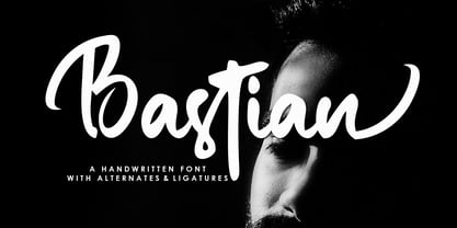 Bastian is a modern handwritten font, organic, dynamic and energetic sytle.Can used for various purposes. such as the title, signature, logo, correspondence, wedding invitations, letterhead, signage, labels, newsletters, posters, badges, etc.
 - Crafty Notes by Illushvara,
$12.00 Crafty Notes is a clean, thin and simple handwritten font. Its natural and unique style makes it incredibly fitting to a large pool of designs. The only limit is your imagination!
 - Adept Sans by Lumiks Design,
$8.00 Adept Sans is a rounded, modern and clean font that make it suited for small text to high-impact headlines. The family contains six fonts, 3 weights and its matching italics.
 - Misegar by Owl king project,
$39.00 Creambelly is a clean and slim sans-serif font. It is perfect for product packaging, branding project, magazine covers, social media, logotypes, or just used to express words above the background.
 - MBF Future Voyage by Moonbandit,
$15.00 Future Voyage, a clean modern futuristic sans serif display font. This typeface is perfect for minimalist scifi theme. Perfect usage as logo, poster, display, headline, t-shirt design and many more.
 - Circle typeface by oscarpmlopes,
$25.00 Circle typeface is a font inspired by the circle geometric form. The result is a very clean and harmonious design that can be used for many different purposes, contexts and styles.
 - Borka by Wirtu,
$8.00 Borka is sans-serif, clean and simple family that can be used for wide variety of purposes. It is well suited for web text, advertisements, designs, flyers, posters, brochures and more.
 - Arbor Brush by GroupType,
$29.00 Arbor Brush is a fresh and lively brush script from the FontHaus design studio. The design is organic, strong, painterly, and anything but tentative. Great for advertising, menus, signage, or display.
 - Christmas Preference by Seemly Fonts,
$12.00 Christmas Preference is a clean, simple, and natural handwritten font. Not too thin and not too thick, balanced and varied, this font was designed to enhance the beauty of your projects.
 - Acta Variable by DSType,
$350.00 Acta Variable is a clean and fresh type system that remains conservative enough for newspaper setting. The complete Acta Variable allows the possibility to modify the Weight and Optical size axis.
 - Belly Swing by Bogstav,
$16.00 Belly Swing is natural, organic and kind of cute. It's my handmade sans font with contextual alternates - meaning that you have 3 different versions of each lowercase letter to choose from!
 - SteamCourt by insigne,
$22.00 Think smart. Think regal. Think SteamCourt, a new font designed specifically for the card game SteamCourt. A bit of background if you will: In early 2014, some friends from my college days banded together to form their own game company. Their first launch? A current Kickstarter they named SteamCourt. I love Kickstarter. It’s a fantastic platform, a great way for individuals to introduce the public to their visions. I've started a couple of them myself--both including fonts designed specifically for the projects. The first is Chatype, a font created exclusively for the city of Chattanooga. The second: Cabrito, a font developed as part of the children’s typeface book, The Clothes Letters Wear. It’s wonderful to work with so many others who come alongside to help you vision become reality. Naturally, hearing of my friends' project, I contacted them about adding a new face to their venture as well. I gave them carte blanche. They wanted steampunk. It was a great challenge, the result of which is now SteamCourt, an unforgettable display typeface that draws from the mix of Victorian regals, metallic and brass engineering, cogs, clocks and blackletter typography. It evokes a time of skillfully forged metalwork and an era of intrigue and excitement, filled with audacious feats of engineering and innovation and the perilous journeys of the airship. While influenced by the era of blackletter, SteamCourt is an unmistakable departure from the style of two centuries past, yet it still shines in its given display roles with a distinct regal twist. The serifs are asymmetrical, yet the characters are all specially and delicately balanced. It’s an eye-catching alternative to blackletter with modern steampunk touches. The game’s signature typeface has sizeable language support on top of 90 alternate characters as well. In addition to a generous number contextual alternates, SteamCourt features stylistic alternates that allow for buyers to customize its visual appearance for their preferences, helping to make it a superior option for packaging, branding and enormous typesetting logotypes as well as shorter textual content. Check out the game, but grab the font, too, to be a part of that crib created as a companion for the new game in court. It'll be the ace up your sleeve for many rounds of design ahead.
 - Basilio by Canada Type,
$29.95 In the late 1930s, old Egyptiennes (or Italiennes) returned to the collective consciousness of European printers and type houses — perhaps because political news were front a centre, especially in France where Le Figaro newspaper was seeing record circulation numbers. In 1939 both Monotype and Lettergieterij Amsterdam thought of the same idea: Make a new typeface similar to the reverse stress slab shapes that make up the titles of newspapers like Le Figaro and Le Frondeur. Both foundries intended to call their new type Figaro. Monotype finished theirs first, so they ended up with the name, and their type was already published when Stefan Schlesinger finished his take for the Amsterdam foundry. Schlesinger’s type was renamed Hidalgo (Spanish for a lower nobleman, ‘son of something’) and published in 1940 as ‘a very happy variation on an old motif’. Although it wasn’t a commercial success at the time, it was well received and considered subtler and more refined than the similar types available, Figaro and Playbill. In the Second World War, the Germans banned the use of the type, and Hidalgo never really recovered. Upon closer inspection, Schlesinger’s work on Hidalgo was much more Euro-sophisticated and ahead of its time than the too-wooden cut of Figaro and the thick tightness of Playbill. It has a modern high contrast, a squarer skeleton, contour cuts that work similarly outside and inside, and airy and minimal solutions to the more complicated shapes like G, K, M, N, Q and W. It is also much more aware of, and more accommodating to, the picket-fence effect the thick top slabs create in setting. Basilio (named after the signing teacher in Mozart’s Figaro) is the digital revival and major expansion of Hidalgo. With nearly 600 glyphs, it boasts Pan-European language support (most Latin languages, as well as Cyrillic and Greek), and a few OpenType tricks that gel it all together to make a very useful design tool. Stefan Schlesigner was born in Vienna in 1896. He moved to the Netherlands in 1925, where he worked for Van Houten’s chocolate, Metz department store, printing firm Trio and many other clients. He died in the gas chambers of Auschwitz in 1944. Digital revivals and expansions of two of his other designs, Minuet and Serena, have also been published by Canada Type.
 - Savigny by insigne,
$22.00 Savigny began as an offshoot of Le Havre. Le Havre met my design objective of a geometric sans serif with a strong art deco touch. Le Havre’s primary inspiration came from the art deco titling of the 1930’s, and the lower case was just icing. The art of the 1930’s is of particular interest to me, and I love the art deco era and its art, and the simplicity of geometric shapes. I am mostly interested in designing display typefaces. In many ways Le Havre was the exact opposite of another popular insigne offering, Aviano Sans. Le Havre has very high ascenders, a lower case and is very condensed. Aviano Sans has no lowercase and extremely extended capitals. With the rise of webfonts I began to see Le Havre being used frequently online. It’s short x-height and very tall ascenders made it difficult to read in on screen text settings as it was intended as display type. With this observation, I felt that there is more room for a geometric sans in the insigne catalog. So I set about to design a new geometric sans using the successful skeleton of the Le Havre family. Although I planned to extend the Le Havre line, the new family is so drastically different I decided on a new name: Savigny. The face evolved and began to take on a few humanist touches. Designed from the very beginning as a webfont, the design is open and pleasing to the eye, with a tall x-height. To optimize it for onscreen settings, the spacing is generous. In addition, it includes extended and condensed members, making it insigne’s first superfamily. The family includes over 100 OpenType alternate characters. These include several style sets. Some are stemless, others are purely geometric, and in a nod to Savigny’s origins, Art Deco titling alternates. Please see the informative .pdf brochure to see these features in action. OpenType capable applications such as Quark or the Adobe suite can take full advantage of the automatically replacing ligatures and alternates. This family also includes the glyphs to support a wide range of languages. Savigny is a great choice for a professional designer who wants a well rounded typeface family that is ready for the web.
 - Mellow Morning by Set Sail Studios,
$18.00 Inject some irresistible fun into your designs with the Mellow Morning Font Duo! This playful font duo consists of a fast flowing signature script, and a charming small caps font as the perfect companion. But that's not all - also included is a bonus doodle font containing 45 hand-drawn doodles - designed to add an eye catching, hand-made appeal to your Mellow Morning fonts. The Mellow Morning Family includes; Mellow Morning Script • A clean, free-flowing handwritten signature font containing upper & lowercase characters, numerals, and a large range of punctuation. Mellow Morning Script Alt • This is a second version of Mellow Morning Script, with a completely new set of both upper and lowercase characters. If you wanted to avoid letters looking the same each time to recreate a custom-made style, or try a different word shape, simply switch to this font for an additional layout option. Mellow Morning Small Caps • A clean, charming handwritten all-caps font. Contains 2 sets of a-z letters, simply switch between upper and lowercase to toggle between both sets. Also includes 8 stylised letters for extra flair, accessible via a Glyphs panel or by switching on Stylistic Alternates. Mellow Morning Small Caps Italic • An italicised version of Mellow Morning Small Caps, which can be used for a more fast-hand flow to your text. Mellow Morning Doodles • A set of 45 doodles designed to pair with the Script & Small Caps fonts. Simply install this as it's own font, and type any A-Z or a-s character to generate each doodle. Language Support • All Mellow Morning fonts support the following languages; English, French, Italian, Spanish, Portuguese, German, Swedish, Norwegian, Danish, Dutch, Finnish, Indonesian, Malay, Hungarian, Polish, Croatian, Turkish, Romanian, Czech, Latvian, Lithuanian, Slovak, Slovenian
 - The "Aint Nothing Fancy" typeface by David Kerkhoff is a delightful embodiment of simplicity and authenticity, perfectly capturing the essence of its name. This font stands out for its unpretentious,...
- Selfie Neue Rounded by Lián Types,
$29.00 INTRODUCTION When I started the first Selfie back in 2014 I was aware that I was designing something innovative at some point, because at that time there were not too many, (if any) fonts which rescued so many calligraphy features being at the same time a monolinear sans. I took inspiration from the galerías’ neon signs of my home city, Buenos Aires, and incorporated the logic and ductus of the spencerian style. The result was a very versatile font with many ligatures, swashes and a friendly look. But… I wasn’t cognizant of how successful the font would become! Selfie is maybe the font of my library that I see the most when I finally go out, (type-designers tend to be their entire lives glued to a screen), when I travel, and also the font that I mostly get emails about, asking for little tweaks, new capitals, new swashes. Selfie was used by several renowned clients, became part of many ‘top fonts of the year’ lists and was published in many magazines and books about type-design. These recognitions were, at the same time, cuddles for me and my Selfie and functioned as a driving force in 2020 to start this project which I called Selfie Neue. THE FONT "Selfie for everything" Selfie Neue, because it’s totally new: All its glyphs were re-drawn, all the proportions changed for better, and the old and somehow naive forms of the first Selfie were redesigned. Selfie Neue is now a family of many members (you can choose between a Rounded or a Sharp look), from Thin to Black, and from Short to Tall (because I noticed the feel of the font changed notoriously when altering its proportions). It also includes swashy Caps, which will serve as a perfect match for the lowercase and some incredibly cute icons/dingbats (designed by the talented Melissa Cronenbold) which, as you see in the posters, make the font even more attractive and easy to use. You'll find tons of alternates per glyph. It's impossible to get tired with Selfie! Like it happened with the old Selfie, Selfie Neue Rounded was thought for a really wide range of uses. Magazines, Book-covers, digital media, restaurants, logos, clothing, etc. Hey! The font is also a VF (Variable Font)! So you can have fun with its two axes: x-height and weight, in applications that support them. Let me take a New Selfie! TECHNICAL If you plan to print Selfie Neue VF (Rounded or Sharp), please remember to convert it to outlines first. The majority of the posters above have the "contextual" alternates activated, and this makes the capitals a little smaller. I'd recommend deactivating it if you plan to use Selfie for just one word. Use the font always with the "fi" feature activated so everything ligatures properly. The slant of the font is 24,7 degrees, so if you plan to have its stems vertical, you may use Selfie with that rotation in mind. THANKS FOR READING
 - Biblia Serif by Hackberry Font Foundry,
$24.95 This all started with a love for Minister. This is a font designed by Carl Albert Fahrenwaldt in 1929. In the specimen booklet there’s a scan from Linotype’s page many years ago. They no longer carry the font. I’ve gone quite a ways from the original. It was dark and a bit heavy. But I loved the look and the readability. This came to a head when I started my first book on all-digital printing written from 1994-1995, and published early in 1996. I needed fonts to show the typography I was talking about. At that point oldstyle figures, true small caps, and discretionary ligatures were rare. More than that text fonts for book design had lining OR oldstyle figures, lowercase OR small caps—never both. So, I designed the Diaconia family using the Greek word for minister. It was fairly rough. I knew very little. I later redesigned and updated Diaconia into Bergsland Pro—released in 2004. It was still rough (though I impressed myself). Now, with 4-font Biblia Serif family 13 years later, I’ve cleaned up, made the fonts more consistent internally, added more functional OpenType features, and brought the fonts into the 21st century. I used the 2017 set of features: small caps, small cap figures, oldstyle figures, fractions, lining figures, ligatures and discretionary ligatures. These are fonts designed for book production and work well for text or heads. Finally, in 2021, I went over the fonts entirely and remade them in Glyphs.
 - Gulim by Microsoft Corporation,
$129.00Gulim™ features plain strokes similar to sans serif designs, and works well for on-screen display such as user interfaces. This Gulim font file is 5.2 MB in size. Gulim is a trademark of Microsoft Corporation. Gulim Character Set: Latin 1, Korean code page 949 - Diane Script by GroupType,
$27.00 In 1995, FontHaus came upon a rare opportunity to create a revival of Aries, a little known and previously unavailable typeface by the legendary Eric Gill. Discovering a lost typeface by one of the major designers of the 20th Century, was the discovery of a buried treasure, and being the first type company to release it was an honor. Thirteen years later, FontHaus came across another little known typeface treasure: Diane. Designed by the legendary French designer Roger Excoffon in 1956, this remarkable script has never been faithfully recreated until now. In close collaboration with Mark Simonson, FontHaus and Mr. Simonson painstakingly researched rare type books, publications, European metal type services, and period showings from the United States, England, Germany and from the University of Groningen in the Netherlands. Finding full specimens of the font turned out to be quite a challenge. In most cases, only the caps and lowercase were shown. Furthermore, the more we researched Diane, many curious facts came to light. The caps in earlier specimens of Diane are completely different from specimens published later, suggesting that the face was redesigned at some point, perhaps in the mid-1960s. So we are left with two different sets of caps. The original had very elaborate, swirly strokes, very characteristic of Excoffon¹s gestural designs for posters and logos. Later on, these appear to have been replaced by a set of simpler, more traditional script caps. The original caps are criticized in one source Mark found (Practical Handbook on Display Typefaces, 1959) as being "exquisite" but "not highly legible". Perhaps this is what led to the simpler caps being introduced. Nevertheless, FontHaus's release includes not only both sets of caps, but a range of alternates and a number of new characters not originally available such as the Euro, and a magnificent alternate Ampersand to name a few.
 - ITC Aram by ITC,
$29.99Jana Nikolic was finishing her degree program at the Faculty of Applied Arts, in Belgrade, with a final project that would combine her two majors: type and book design. Three stories from William Saroyan's My Name Is Aram would provide the text for the book, to be set in a typeface that Nikolic would design. Nikolic knew something special was happening the moment she put pen to paper. The letters just emerged," she recalls. "I started to explore a few new pens and found one I loved. I was able to make its tip bend with pressure." Like the family Saroyan writes about, the design flowing from Nikolic's pen would be simple but a little quirky. "When there were a whole bunch of little black letters around me," continues Nikolic, "I saw that this was going to be a very interesting typeface family." Nikolic drew Latin and Cyrillic letters, lowercase and capital letters, wide letters and narrow letters. She was surprised at how quickly and easily the design came. "There were no badly written letters," she says. "I hardly had to rework them and they fit together remarkably well." ITC Aram's standard character complement consists of one set of lowercase letters and two sets of capitals: one narrow and the other wide. The wide caps can be used with the standard lowercase, or mixed with the narrow caps for a variation on "cap and small cap" copy. The ITC Aram create the opportunity to mix and combine the letters into playful typographic expressions. Words and sentences that twinkle; text that seems light and alive - one runs the risk of creating work that is both delightful and charming when setting copy in ITC Aram." - Vimland Black - Personal use only

- Cimero Pro - 100% free

- SUNCUT - Personal use only

- Argillites - Personal use only

- Reactor Sans - 100% free

- LT Anomaly - 100% free

- Brewsky - 100% free

- Hetilica - Personal use only

- Aracne Ultra Condensed Regular - Personal use only

- Prakrta - Unknown license

- Source Code Pro - 100% free

- Bebas - Unknown license

- Kanna-W4 - Personal use only

- Fireye GF 3 - Unknown license

- Crimson Petal - Personal use only


