10,000 search results
(0.033 seconds)
- The Little Bonjour by IbraCreative,
$23.00 The Little Bonjour is natural cute and casual handwritten font. The Little Bonjour is suit best for wedding theme, playful concept, love letter, Easter gift card typeface, fashionable theme, fashion sale banner, branding projects, logo, wedding designs, social media posts, advertisements, product packaging, product designs, label, photography, watermark, invitation, stationery and any projects that need casual handwriting taste.
 - The Last Shuriken by Arterfak Project,
$26.00 Konichiwa! Introducing our brand new font "The Last Shuriken" a Japanese-style typeface. Inspired by modern Japanese food branding and anime title. Designed in a bold stroke, this font is an all-caps font that has the same cap height and different shapes. The Last Shuriken is perfect for display, especially for Japanese food, title, logo, poster, short quote, movie, games, apparel. Complete with stylistic alternates and PUA Encoded with multilingual support! Thank you. Ramz.
 - The Moon Milter by Letterhend,
$19.00 Introducing, The Moon Milter is a vintage sans serif font. Inspired by 50s 60s signages, this font made to bring back the good ol' days. This type of font perfectly made to be applied especially in logo, headline, signage and the other various formal forms such as invitations, labels, logos, magazines, books, greeting / wedding cards, packaging, fashion, make up, stationery, novels, labels or any type of advertising purpose. Features : numbers and punctuation multilingual -PUA encoded We highly recommend using a program that supports OpenType features and Glyphs panels like many of Adobe apps and Corel Draw, so you can see and access all Glyph variations. How to access opentype feature : letterhend.com/tutorials/using-opentype-feature-in-any-software/
 - The Thief Bird by Lemur,
$14.00 The Thief Bird is an informal grotesque font. Although informal and grotesque may seem to be two quite different ideas, we have to dig into the origin of this typeface in order to understand the matter. The concept behind The Thief Bird was inspired by the adaptation that the vintage sign painters made when they took the grotesque style characters they saw in newspapers and magazines and reproduced them using a brush, aiming to make the prices of the products displayed on wooden boards stand out, as opposed to highlighting large headlines (such as the idea behind fonts like Franklin Gothic). The Thief Bird takes the language from sign painters and turns it into a font --this time around not aiming to set prices but to bring children stories to life. Thus, some legibility features from grotesque fonts were mixed with the brush calligraphy to add grace and zest to a font intended for children. The Thief Bird is a playful display font, with cheerful ligatures and alternate characters. It is really attractive for setting short paragraphs that tell stories for little people. The Thief Bird has one single weight and it’s ideal to be used in storybooks, candy packaging, films, toys, logos, labels, etc. The font has an extended set of 643 characters supporting 219 Latin languages. It has a complete set of small caps, sensitive cases, more than 30 pairs of ligatures, alternate characters and much more. This cool, informal and laid back typeface will be the perfect match for illustrations of fairy tales, comics for children and any product or publishing for the little ones. The Thief Bird supports this languages: Abenaki, Afaan Oromo, Afar, Afrikaans, Albanian, Alsatian, Amis, Anuta, Aragonese, Aranese, Aromanian, Arrernte, Arvanitic (Latin), Asturian, Atayal, Aymara, Bashkir (Latin), Basque, Bemba, Bikol, Bislama, Bosnian, Breton, Cape Verdean Creole, Catalan, Cebuano, Chamorro, Chavacano, Chichewa, Chickasaw, Cimbrian, Cofán, Corsican Creek,Crimean Tatar (Latin),Croatian, Czech, Dawan, Delaware, Dholuo, Drehu, Dutch, English, Estonian, Faroese, Fijian Filipino, Finnish, Folkspraak, French, Frisian, Friulian, Gagauz (Latin), Galician, Ganda, Genoese, German, Gikuyu, Gooniyandi, Greenlandic (Kalaallisut)Guadeloupean, Creole, Gwich’in, Haitian, Creole, Hän, Hawaiian, Hiligaynon, Hopi, Hotcąk (Latin), Hungarian, Icelandic, Ido, IgboI, locano, Indonesian, Interglossa, Interlingua, Irish, Istro-Romanian, Italian, Jamaican, Javanese (Latin), Jèrriais, Kala Lagaw Ya, Kapampangan (Latin), Kaqchikel, Karakalpak (Latin), Karelian (Latin), Kashubian, Kikongo, Kinyarwanda, Kiribati, Kirundi, Klingon, Ladin, Latin, Latino sine Flexione, Latvian, Lithuanian, Lojban, Lombard, Low Saxon, Luxembourgish, Maasai, Makhuwa, Malay, Maltese, Manx, Māori, Marquesan, Megleno-Romanian, Meriam Mir, Mirandese, Mohawk, Moldovan, Montagnais, Montenegrin, Murrinh-Patha, Nagamese Creole, Ndebele, Neapolitan, Ngiyambaa, Niuean, Noongar, Norwegian, Novial, Occidental, Occitan, Old Icelandic, Old Norse, Oshiwambo, Ossetian (Latin), Palauan, Papiamento, Piedmontese, Polish, Portuguese, Potawatomi, Q’eqchi’, Quechua, Rarotongan, Romanian, Romansh, Rotokas, Sami (Inari Sami), Sami (Lule Sami), Sami (Northern Sami), Sami (Southern Sami), Samoan, Sango, Saramaccan, Sardinian, Scottish Gaelic, Serbian (Latin), Seri, Seychellois Creole, Shawnee, Shona, Sicilian, Silesian, Slovak, Slovenian, Slovio (Latin), Somali, Sorbian (Lower Sorbian), Sorbian (Upper Sorbian), Sotho (Northern), Sotho (Southern), Spanish, Sranan, Sundanese (Latin), Swahili, Swazi, Swedish, Tagalog, Tahitian, Tetum, Tok Pisin, Tokelauan, Tongan, Tshiluba, Tsonga, Tswana, Tumbuka, Turkish, Turkmen (Latin), Tuvaluan, Tzotzil, Uzbek (Latin), Venetian, Vepsian, Volapük, Võro, Wallisian, Walloon, Waray-Waray, Warlpiri, Wayuu, Welsh, Wik-Mungkan, Wiradjuri, Wolof, Xavante, Xhosa, Yapese, Yindjibarndi, Zapotec, Zulu, Zuni.
 - The White Moon by Just Lett,
$15.00 The White Moon feels equally charming and elegant. This stunning script font is a stylish homage to classic calligraphy. It features a varying baseline, smooth lines, and gorgeous glyphs. Get inspired by its authentic feel and use it to create gorgeous wedding invitations, beautiful stationary art, eye-catching social media posts, and cute greeting cards.
 - Down The Wall by Hanoded,
$15.00 I have no great love for walls, especially when they are built to keep people out. When I started working on this font, I realized it looked a bit like protest graffiti, found on… yes, walls. Down The Wall is a great little font: it is handwritten, messy and in your face. It has no real baseline and glyphs jump all over the place. Use it for book covers, posters, album covers - anything really. It certainly would look good on a wall too! Comes with a whole bunch of diacritics, so whatever you have to say, the world will understand.
 - We The People by K-Type,
$20.00 This typeface is extrapolated from the ‘We the People’ calligraphy of the handwritten US Constitution Preamble which employed a style based on German Text and Square Text exemplars from George Bickham’s penmanship copy-books, the most celebrated being The Universal Penman published in 1743. The original Constitution document was transcribed onto parchment by Jacob Shallus, a Pennsylvania Assistant Clerk, over a weekend in 1787. Shallus’s biographer, Arthur Plotnik (The Man Behind the Quill, 1987), notes that he was paid $30, a modest monthly wage at the time. He also suggests that the calligraphic headings, ‘We the People’ and ‘Article’, may have been inserted by Shallus’s 14 year old trainee son, Francis, “The manner in which the ‘Article’ headings are squeezed into the space Shallus allowed for them suggests a second hand—and perhaps not a very experienced one.” The unconventional backslant of the headings would seem to support this contention, and at the end of the document there is perhaps a novice’s inconsistency in the structure of the letter n between that used for ‘done’ and those used for ‘In Witness’. However, one has to admire the elegant swagger of the wavy t, h and l which the K-Type font extends to the b, f and k. Also, the simpler, Schwabacher-style W, an enlarged version of the lowercase w, is a little less flamboyant than the capital W from the German and Square texts in Bickham’s manuals. For designers using OpenType-aware applications, the typeface includes some Alternates, including a Bickham-style W, the letters t, h and n with added flourishes, two simpler forms of the A, and a few roman numerals for numbering articles. Also some ornamental flourishes and a round middle dot/decimal point. Punctuation marks are drawn in square, calligraphic style, but an alternative round period/full stop, for use with currency and numerals, is available at the period centered position (though placed on the baseline), accessed by Shift Option 9 on a Mac, or Alt 0183 on Windows. The full phrase, ‘We the People’, has been placed at the trademark keystroke and can be accessed by Option 2 (or Shift Option 2) on a Mac, or Alt 0153 on Windows. For designers who find the backslant awkward or unpleasant, the licensed typeface also includes two additional fonts which have a vertical aspect that may be more conducive to graphic design layouts. ‘We The People Upright’ and ‘We The People Upright Bold’ both retain the distinctive style, and the heavier weight is only slightly emboldened, just enough to add some punch.
 - Take The Money by Kitchen Table Type Foundry,
$15.00 Take The Money is a wonky all caps font, made with a Sharpie pen. The name was inspired by something I read in the newspaper: apparently a Danish artist received €72.000 from a museum to create two works of art. The works of art should depict the average income of someone from Austria and someone from Denmark - in real money. The museum then loaned him the €72.000 and told him he'd receive €3.300 for his work. The artist decided that €3.300 would merely cover the costs, so he delivered two empty canvases and called the work: Take The Money And Run.
 - The Amoret Collection by Set Sail Studios,
$16.00 Introducing the Amoret Collection; A stunning pair of luxury script and sans fonts, designed to contrast & compliment each other with elegant beauty and contemporary style. Design luxurious logos, branding, product packaging, wedding invites and quotes in a flash. Here's what's included; Amoret Sans • A classy, high contrast sans font containing uppercase characters only, numerals and a large range of punctuation. Creates a perfect pairing contrast with the Amoret Script fonts. Amoret Script • A thin and elegant script font with exaggerated strokes and a loose flow. Contains upper & lowercase characters, numerals and a large range of punctuation. Amoret Script Alt • This is a second version of Amoret Script, with a completely new set of upper & lowercase characters. If you wanted to avoid letters looking the same each time to recreate a custom-made style, or try a different word shape, simply switch to this font for an additional layout option. Amoret Script Alt also contains 4 swashes assigned to the [ ] { } keys. Fonts include multilingual support for; English, French, Italian, Spanish, Portuguese, German, Swedish, Norwegian, Danish, Dutch, Finnish, Indonesian, Malay, Hungarian, Polish, Croatian, Turkish, Romanian, Czech, Latvian, Lithuanian, Slovak, Slovenian
 - The Pinesicle Stock by Letterhend,
$17.00 Introducing, Pinesicle Stock - A display typeface font with horror theme but fun and playful at the same time. This font has unique looks very suitable for horror, thriller and spooky theme design. Comes with two style, regular and bloody. This font also perfectly made to be applied especially in logo, and the other various formal forms such as invitations, labels, logos, magazines, books, novels, labels or any type of advertising purpose. Features : two styles, regular & bloody version uppercase and lowercase numbers and punctuation multilingual PUA encoded We highly recommend using a program that supports OpenType features and Glyphs panels like many of Adobe apps and Corel Draw, so you can see and access all Glyph variations.
 - The Giant Monster by Sipanji21,
$20.00 "The Giant Monster" is a bold 3D display font featuring solid, inner, and shadow characters. Fonts like this offer various styles within the same typeface, providing depth and dimension to the text. The solid characters provide a bold and straightforward appearance, while the inner characters offer depth and a three-dimensional effect within the letterforms. The shadow characters contribute to the font's depth by adding shadowing or highlighting behind each character. With its multi-layered design, "The Giant Monster" allows you to create text that appears voluminous and impactful. This font is suitable for projects such as posters, titles, or any design endeavor that requires a bold and dynamic typographic style with a three-dimensional effect.
 - DEMONA The GUNTER by Tony Type Studio,
$5.00 Demona the Gunter is the result of a journey towards self-discovery and part of an ongoing process of exploration. A font featuring a more evolved design while maintaining a charmingly simple style. The extreme contrast between thick and thin strokes gives Demona the Gunter a harmonious and stylish look. It comes in 6 weights with matching regular and italic fonts and includes alternate and ligature versions. The entire character set supports many Latin based languages. Demona the Gunter is perfect for editorial design, movie titles, branding, magazines, logos, headers and more
 - The Kogles Script by Letterhend,
$19.00 Please welcome our newest script typeface, The Kogles, a nice script typeface with retro feel. This font is perfect to be applied especially in logos and the other various formal forms such as invitations, labels, logos, magazines, books, greeting/wedding cards, packaging, fashion, make up, stationery, novels, labels or any type of advertising purpose.
 - Designer's page on Abstract Fonts.
- Captain Kidd Demo - Unknown license

- Crystal Radio Kit - Unknown license

- Vinyl repair kit - Unknown license

- Euro Icon Kit by TypoGraphicDesign,
$9.00 The typeface EURO Icon Kit is designed at 2020 for the font foundry Typo Graphic Design by Manuel Viergutz. The display font is inspired by the here and now. 763 glyphs incl. icons, dingbats & symbols. Decorative extras like arrows, emojis, ornaments, geometric shapes, catchwords, decorative ligatures (type the word #LOVE for ❤ or #SMILE for ☺ as OpenType-Feature dlig) and stylistic alternates (20 stylistic sets) + sign of the zodiac. Have fun with this font & use the DEMO-Font (with reduced glyph-set) for FREE!
 - Travel Kit SG by Spiece Graphics,
$39.00 Here’s an intriguing mixture of 1930s deco and modern tech fashion. Travel Kit Medium is a sturdy semi-serif hybrid with one foot in the past and another in the present. It is slightly low-waisted with extended crossbars on the capital A, E, F, H, K, and P. But the capital B, M, R and X are distinctively contemporary with the E and M repeated as unicase letters in the lowercase. Optional retro characters (notably the unicase e and m) have been provided if you prefer a more traditional overall look - and your software allows access to these characters. Simply find and replace the more modern letters with the older ones. In addition, small caps with even more alternate characters have been included for greater flexibility and convenience. Travel Kit Medium with Alternates is now available in the OpenType format. In addition to small caps, lining figures, oldstyle figures, and petite figures, this expanded OpenType version contains additional stylistic alternates and historical forms. These advanced features work in current versions of Adobe Creative Suite InDesign, Creative Suite Illustrator, and Quark XPress. Check for OpenType advanced feature support in other applications as it gradually becomes available with upgrades.
 - Mid Century Sans by Dharma Type,
$19.99 Mid Century Sans (MCS) is composed of high-geometric shapes. László Moholy-Nagy —professor in the Bauhaus— said “Typography is a tool of communication. It has to be communication in its most intense form. The emphasis must be on absolute clarity since this distinguishes the character of our own writing from that of ancient pictographic forms.” As same as you can see in modern typefaces in the early twentieth century, MCS has very efficient, clear and minima letterforms. There are not any decorative parts in the skeleton of letters. At the same time, Mid Century Sans has one more feature. In the middle of the twentieth century, one big movement which was called Mid-century modern had occurred. The Mid-century modern movement in the U.S. was an American reflection of the International and Bauhaus movements and it was slightly more organic in form and less formal than the International Bauhaus-style. In other words, it was friendly and stylish. We added Mid-century-spices to the Bauhaus-modernism. The basic letter form is geometric yet it has very friendly strokes and human touch. Mid Century Sans consists of 8 weights and their matching Italics for a wide range of usages. Farther, Mid Century Sans is supporting international Latin languages and basic Cyrillic languages including Basic Latin, Western Europe, Central and South-Eastern Europe. Also MCS covers Mac Roman, Windows1252, Adobe1 to 3. This wide range of international characters expands the capability of your works. Lowercase "a" has OpenType stylistic alternates for advanced typography.
 - Nut Kit 4F by 4th february,
$30.00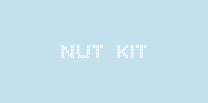
- Sign Kit JNL by Jeff Levine,
$29.00During trips to the Miami Beach Public Library as a youth, Jeff Levine first caught sight of the signs made with a product called the Webway Sign Cabinet, manufactured by the Holes- Webway company of St. Cloud, MN. Having purchased an old set, Jeff has carefully re-drawn the alphabet and unique contrasting numbers from the original assortment, adding in an extended character set to his font. - FS Kim Variable by Fontsmith,
$349.99Unconventional beauty FS Kim is bold and intriguing – exuberant and unmissable, but playing a supporting role when needed. This typeface shines brightest as a display font, and is perfect for applications across fashion, theatre, cultural projects and pretty much any brand that wants to make a statement. While FS Kim is dramatic, it’s incredibly versatile, too, and works to showcase content in a stylish, striking way. This font makes you look, and makes you curious – perfect for brands and publishers that relish unconventional beauty. A playful text version While FS Kim’s text version is more constrained than the display, the strength and playfulness remain. Modifications for the text version include larger x-heights, longer ascenders and descenders, wider proportions and spacing, longer and more defined serifs and a lower contrast. “The overall idea is that it’s not an optical size,” Radoeva explains. Text and display maintain a strong connection that mean they can be used together. A display with a twist The calligraphic starting point helped to create familiar forms, while a contemporary display feel is achieved through short wedge serifs, with bold touches added through the font’s exaggerated forms and details. FS Kim’s narrow proportions, short ascenders and descenders, and tighter spacing make the font suitably compact for display use. The overall aesthetic feels bold and sharp, but closer inspection reveals that all the corners are softened. Decorative inlines In an unusual twist, FS Kim’s display version was first drawn using a broad-nib pen to create familiar forms and elegance while still breaking from serif traditions and making it all about standout character. There are also two additional styles, based on the Regular and Black with inlines – in uppercase, figures and symbols. The inline brings an extra option for an even stronger, more decorative display use. - Tres Tres Chic by dooType,
$39.00 First partnership between Firmorama.com & dooType studios, Très Très Chic is a display font, developed to be versatile and illustrative, with strong features that provide personality to the drawing. The characters were built based in primary geometric forms and the gentle delicate lines, in their main purpose, make this font very appropriate to the feminine universe. On the other hand, this font has its form filled with black, that could be applied evenly for a composition more dynamic and amazing, with variation of shapes and weight.
 - Bit Blocks TTF BRK - Unknown license

- Reverse Calendar Blocks JNL by Jeff Levine,
$29.00 Reverse Calendar Blocks JNL is the third typeface from Jeff Levine that allows the user to create a vintage-style calendar. Other versions available are Calendar Blocks JNL and Monthly Calendar JNL. The layout for the font is as follows: Numerals for displaying a year are on the 0-9 keys The 1-31 dates are located on the A-Z and a-e keys The combination dates of 23/30 and 24/31 are located on the f and g keys Days of the week (Sunday through Saturday) are on the keys h though n Months are found on the o through z keys A blank box (for balancing out layouts) is on the period key
 - Narkiss Block Mutag MF by Masterfont,
$59.00 A practical font family - Geometric forms make this elegant font family a great companion for invitations and signs, indoor and outdoor.
 - Ye Olde Block NF by Nick's Fonts,
$10.00Lewis F. Day, in his book Alphabets Old and New, offered this typeface as an example from sixteenth-century England of lettering incised in wood. The font is essentially monocase, but there several lowercase letters are alternate letterforms. Please note that, due to the ornate nature of the letterforms, this font does not contain math operators, fractions or superior numbers. Both versions of the font include 1252 Latin and 1250 CE (with localization for Romanian and Moldovan) character sets. - VTC-Bad Tattoo Hand One - Personal use only

- As seen on TV Skew - Unknown license

- Dawning of a New Day - Personal use only

- Brave New Era (outline) G98 - Unknown license

- KR Happy New Year 2002 - Unknown license

- Brave New Era (narrow) G98 - Personal use only

- Brave New Era (flat) G98 - Unknown license

- Times New Roman PS Cyrillic by Monotype,
$67.99In 1931, The Times of London commissioned a new text type design from Stanley Morison and the Monotype Corporation, after Morison had written an article criticizing The Times for being badly printed and typographically behind the times. The new design was supervised by Stanley Morison and drawn by Victor Lardent, an artist from the advertising department of The Times. Morison used an older typeface, Plantin, as the basis for his design, but made revisions for legibility and economy of space (always important concerns for newspapers). As the old type used by the newspaper had been called Times Old Roman," Morison's revision became "Times New Roman." The Times of London debuted the new typeface in October 1932, and after one year the design was released for commercial sale. The Linotype version, called simply "Times," was optimized for line-casting technology, though the differences in the basic design are subtle. The typeface was very successful for the Times of London, which used a higher grade of newsprint than most newspapers. The better, whiter paper enhanced the new typeface's high degree of contrast and sharp serifs, and created a sparkling, modern look. In 1972, Walter Tracy designed Times Europa for The Times of London. This was a sturdier version, and it was needed to hold up to the newest demands of newspaper printing: faster presses and cheaper paper. In the United States, the Times font family has enjoyed popularity as a magazine and book type since the 1940s. Times continues to be very popular around the world because of its versatility and readability. And because it is a standard font on most computers and digital printers, it has become universally familiar as the office workhorse. Times?, Times? Europa, and Times New Roman? are sure bets for proposals, annual reports, office correspondence, magazines, and newspapers. Linotype offers many versions of this font: Times? is the universal version of Times, used formerly as the matrices for the Linotype hot metal line-casting machines. The basic four weights of roman, italic, bold and bold italic are standard fonts on most printers. There are also small caps, Old style Figures, phonetic characters, and Central European characters. Times? Ten is the version specially designed for smaller text (12 point and below); its characters are wider and the hairlines are a little stronger. Times Ten has many weights for Latin typography, as well as several weights for Central European, Cyrillic, and Greek typesetting. Times? Eighteen is the headline version, ideal for point sizes of 18 and larger. The characters are subtly condensed and the hairlines are finer." - Iwata News Mincho NK Pro by IWATA,
$309.00 数多くの新聞社で使われてきた伝統ある「岩田新聞明朝体」を再現した「イワタ新聞明朝体」と、かなを現代風にアレンジした「イワタ新聞明朝体新がな」があります。
 - Iwata News Gothic NK Pro by IWATA,
$309.00 数多くの新聞社で使われてきた伝統ある「岩田新聞呉竹体」を再現した「イワタ新聞ゴシック体」と、かなを現代風にアレンジした「イワタ新聞ゴシック体新がな」があります。
 - Iwata News Gothic NK Std by IWATA,
$199.00 数多くの新聞社で使われてきた伝統ある「岩田新聞呉竹体」を再現した「イワタ新聞ゴシック体」と、かなを現代風にアレンジした「イワタ新聞ゴシック体新がな」があります。
 - Times New Roman Small Text by Monotype,
$67.99In 1931, The Times of London commissioned a new text type design from Stanley Morison and the Monotype Corporation, after Morison had written an article criticizing The Times for being badly printed and typographically behind the times. The new design was supervised by Stanley Morison and drawn by Victor Lardent, an artist from the advertising department of The Times. Morison used an older typeface, Plantin, as the basis for his design, but made revisions for legibility and economy of space (always important concerns for newspapers). As the old type used by the newspaper had been called Times Old Roman," Morison's revision became "Times New Roman." The Times of London debuted the new typeface in October 1932, and after one year the design was released for commercial sale. The Linotype version, called simply "Times," was optimized for line-casting technology, though the differences in the basic design are subtle. The typeface was very successful for the Times of London, which used a higher grade of newsprint than most newspapers. The better, whiter paper enhanced the new typeface's high degree of contrast and sharp serifs, and created a sparkling, modern look. In 1972, Walter Tracy designed Times Europa for The Times of London. This was a sturdier version, and it was needed to hold up to the newest demands of newspaper printing: faster presses and cheaper paper. In the United States, the Times font family has enjoyed popularity as a magazine and book type since the 1940s. Times continues to be very popular around the world because of its versatility and readability. And because it is a standard font on most computers and digital printers, it has become universally familiar as the office workhorse. Times?, Times? Europa, and Times New Roman? are sure bets for proposals, annual reports, office correspondence, magazines, and newspapers. Linotype offers many versions of this font: Times? is the universal version of Times, used formerly as the matrices for the Linotype hot metal line-casting machines. The basic four weights of roman, italic, bold and bold italic are standard fonts on most printers. There are also small caps, Old style Figures, phonetic characters, and Central European characters. Times? Ten is the version specially designed for smaller text (12 point and below); its characters are wider and the hairlines are a little stronger. Times Ten has many weights for Latin typography, as well as several weights for Central European, Cyrillic, and Greek typesetting. Times? Eighteen is the headline version, ideal for point sizes of 18 and larger. The characters are subtly condensed and the hairlines are finer."


