10,000 search results
(0.027 seconds)
- Magic Story by Orenari,
$20.00 Welcome to Magic Story! Magic Story is a beautiful and magical font. It was made inspired by vintage magical story book. This will bring you to the world of fairy tales vibes. Touch your craft and design projects with this fantastic font and create a lovely works you're proud of.
 - Blattwerk by Volcano Type,
$39.00 The shapes of "Blattwerk" (german for leafage) are based on an abstract leaf. The geometrical sans serif font has several standard and decorative ligatures and will work best as a display typeface for logos, headlines and short texts. The individual letters can also be used to form symbols or patterns.
 - Espectro by Corradine Fonts,
$24.95Espectro is a fabulous font full of swashes and alternates. Its free strokes give to your work a special feeling doing it very expressive and mysterious. Try the Open type version if you want to access to all its wonderful possibilities. Espectro has also a set of 26 related dingbats. - Designator by TEKNIKE,
$39.00 Designator is a display modular monospace font. The typeface has a distinct technical geometry using sharp angled corners. "Designator" name is derived from Latin "designare" and means to mark, point out or to indicate. Designator is great for team sports, display work, invitations, writing, architecture, fashion, posters, logos and headings.
 - AZ Script by Artist of Design,
$25.00 AZ Script font was inspired from a need to have a "worn look" on bold headline script of letters This font utilizes an "old look" to the line work which is designed to have a "worn feel" to it. Ideal for use as headline or sub-head text in you design.
 - AZ Text by Artist of Design,
$20.00 AZ Text font was inspired from a need for a generic worn san serif text of letters that looks old. This font utilizes an "old look" to the line work which is designed to have a "worn feel" to it. Ideal for use as the body or text in your design.
 - Schwung by Hubert Jocham Type,
$29.90 Schwung is a brush script headline typeface. It has round elegant swirls that get stronger in the alternate version. Ideal for food packaging and product branding, it is designed to be clear and self-confident. Schwung does not need very much space to make it work perfectly on food labels.
 - Fawazeernelly by MAKYN,
$20.00 FawazeerNelly is a Bilingual Display Typeface, the Arabic font is based on Kufi Maghribi script with high contrast strike thicknesses. And the Latin font is an italic high contrast font that compliments the Arabic. They work best for titles and Poster Designs. It is an Authentic Design with a modern flavor.
 - Mouncella by Muksal Creatives,
$10.00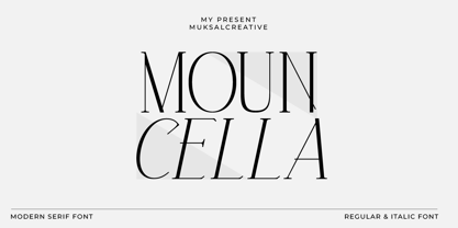 Mouncella Modern serif Font typeface with beautiful alternate, special glyphs, ornament and multilingual support. It's a very versatile font that works great in large and small sizes. Perfect for editorial projects, Logo design, Clothing Branding, product packaging, magazine headers, or simply as a stylish text overlay to any background image.
 - Docklands by Hemphill Type,
$22.00 An authentic collection of engineered fonts, constructed in East London. Docklands is a handmade font family inspired by the creation of the London docks in the early 18th century. The rough edged sign written style is evocative of the era when iron works and boatbuilding wharfs lined the River Thames.
 - Silfer Queen Script by Soft Creative,
$18.00 Introducing Silfer Queen Script vintage calligraphy font. Silfer Queen Script is a classic calligraphy font. This is a classic thin font with an italic style. Here you will get a beautiful classic font. This font is available in several modern swirls that can make your work look elegant, sweet and perfect.
 - Vatican by Alan Meeks,
$45.00 Vatican is a calligraphic face. The lower case is influenced by the lettering of Arthur Baker but the caps are more formal, the shape of the Cap V reminded me of a Bishops Mitre which led eventually to the name. The lighter weight works particually well in small text pieces
 - Rosegar by Muksal Creatives,
$15.00 Rosegar Modern sans serif typeface with beautiful alternete, special glyphs, ornament and multilingual support. It's a very versatile font that works great in large and small sizes. Perfect for editorial projects, Logo design, Clothing Branding, product packaging, magazine headers, or simply as a stylish text overlay to any background image.
 - Magioline by Muksal Creatives,
$10.00 Magioline Modern serif Font typeface with beautiful alternate, special glyphs, ornament and multilingual support. It's a very versatile font that works great in large and small sizes. Perfect for editorial projects, Logo design, Clothing Branding, product packaging, magazine headers, or simply as a stylish text overlay to any background image.
 - Blammingst by Maulana Creative,
$12.00 Blammingst is a clean script font modern casual and smooth moonlike stroke font includes opentype features Ligatures and Alternate lowercase. It support multilingual more than 100+ language. This font is suitable for logo design, Movie Titles , Books Titles and any awesome project you create. Make stunning work with Blammingst. Cheers, MaulanaCreative
 - ITC Pious Henry by ITC,
$29.99ITC Pious Henry is the work of South Carolina designer Eric Stevens, a typeface which for him evokes a feeling of the rural South. Maybe it's a naive quality that belongs on a 'Boiled Peanuts' sign," he says. The letters of ITC Pious Henry seem to dance across page or screen." - Southen by Garisman Studio,
$20.00 SOUTHEN combines attractive curves with a fresh urban edge; delivering a stylish script which is guaranteed to add an eye-catching appeal to your logo designs, brand imagery, handwritten quotes, product packaging, merchandise & social media posts Advantages: - Simple installation - Works for PC and MAC - Multilingual Support - Extra Swashes - Detailed dry brush
 - Teknik by ITC,
$29.99Teknik font is the work of British designer David Quay and was inspired by the powerful geometric styles of the 1920s Soviet Constructivist movement. It is typographically categorized as an Egyptian style due to its slab serifs. Teknik is a strong, precise font suitable for a wide variety of headline applications. - Perfect Moment by Muksal Creatives,
$10.00 Perfect Moment Modern serif Font typeface with beautiful alternate, special glyphs, ornament and multilingual support. It's a very versatile font that works great in large and small sizes. Perfect for editorial projects, Logo design, Clothing Branding, product packaging, magazine headers, or simply as a stylish text overlay to any background image.
 - Monday Today by Sensatype Studio,
$15.00 Monday Today is a fun and playful cute typeface. It is perfect for logotype, flyer, greeting cards, packaging, book cover, printed quotes, headings, etc. What will you get: All Characters (from A to Z) Numbers and Punctuation Works on PC & Mac Simple installations PUA Encoded Thanks and have a wonderful day. :)
 - Opkrop by Jipatype,
$25.00 Opkrom is Thai language mean Crispy or Crunchy. With informal sans serif style look like semi handwriting give feel friendly and warm . It support major Latin scripts and Thai scripts. It have stylistic set for Thai script. Opkrop is suited for headline on packaging, print ad and various graphic work.
 - Evil Laughter by Hanoded,
$10.00 I am working on my Halloween font collection and realised I did not have a ‘blood drip font’. So, I bought a second hand typewriter and typed all the glyphs. Then I made the blood drips using syrup, paper and gravity! The result is a halloween font with a twist!
 - Art Week JNL by Jeff Levine,
$29.00 Art Week JNL is a wider variant of the lettering style used on many WPA (Works Progress Administration) posters for the arts in the Depression-era 1930s. Wider than the version used for Concert Series JNL, it also features an ‘A’ with a rounded top rather than the flat, square version.
 - Ma Braille by Echopraxium,
$5.00 The "Ma" in "Ma Braille" is used as a minimalist way to say "Negative Space". "Ma" in japanese arts is an "esthetical usage of emptiness". Thus this font explicits the negative space around visible braille dots in each glyph. A. Font user guide a.1. Lowercase glyphs { A..Z } In these glyphs, dots are represented as "black squares" while the negative space is displayed as 1 or 2 white filled polygons. a.2. Uppercase glyphs { a..z } In these glyphs, dots are represented as "white squares" while the negative space is displayed as 1 or 2 black filled polygons. a.3. Digits: they are just the same than a..j, but the "North US version" is also provided in ascii codes 0xE0..0xE4 (1..5) and 0xE7..0xEB (6..0). a.5. "Dashed Border": a.5.1. "Black dashed" border glyphs; { £, ¥, µ, Â, Ä, Ê, Ë, Î, Ï, Ô } a.5.2. "White dashed" border glyphs; { Ö, Õ, °, ô, ö, î, ï, û, u, õ } B. Posters Poster 1: "Font Logo" version 1, it displays "Ma Braille" text surrounded by the "black dashed border" glyphs. Poster 2: "Font Logo" version 2, it displays "MA" glyphs in big size and smaller "Braille" glyphs within "M" and within "A" as well. Poster 3: the classical pangram to test a font "The Quick Brown Fox jumps over the Lazy dog". Poster 4: Article 1 of the Human Rights: All human beings are born free and equal in dignity and rights. They are endowed with reason and conscience and should act towards one another in a spirit of brotherhood. Poster 5: the "Glyph set" (Border glyphs not included) with A..Z, a..z, digits and special characters.
 - Fontleroy NF Pro by CheapProFonts,
$10.00 I have completely redone the spacing in this font, making the sidebearings more conventional. And after replacing the kerning with fresh pairs working together with the new spacing the font looks like a real gem. I love it! The inline version has a wider spacing after the letters CEK = no connecting words. Otherwise just as lovely and retro! Nick Curtis says: "Here’s a strange hybrid: I took the lower case from the formal script font Stuyvesant, straightened out its rather extreme 22° slant, and combined them with caps from the font Bellevue, again making them upright, and adding an inline effect. The result is a font that flows very nicely, with a nice balance between clean lowercase characters and swashy caps. Thanks to Deb Dunbar for naming this font. Fontleroy Brown is the solid version, produced at the request of the King of Ding, Jeff Levine." ALL fonts from CheapProFonts have very extensive language support: They contain some unusual diacritic letters (some of which are contained in the Latin Extended-B Unicode block) supporting: Cornish, Filipino (Tagalog), Guarani, Luxembourgian, Malagasy, Romanian, Ulithian and Welsh. They also contain all glyphs in the Latin Extended-A Unicode block (which among others cover the Central European and Baltic areas) supporting: Afrikaans, Belarusian (Lacinka), Bosnian, Catalan, Chichewa, Croatian, Czech, Dutch, Esperanto, Greenlandic, Hungarian, Kashubian, Kurdish (Kurmanji), Latvian, Lithuanian, Maltese, Maori, Polish, Saami (Inari), Saami (North), Serbian (latin), Slovak(ian), Slovene, Sorbian (Lower), Sorbian (Upper), Turkish and Turkmen. And they of course contain all the usual “western” glyphs supporting: Albanian, Basque, Breton, Chamorro, Danish, Estonian, Faroese, Finnish, French, Frisian, Galican, German, Icelandic, Indonesian, Irish (Gaelic), Italian, Northern Sotho, Norwegian, Occitan, Portuguese, Rhaeto-Romance, Sami (Lule), Sami (South), Scots (Gaelic), Spanish, Swedish, Tswana, Walloon and Yapese.
 - Haboro by insigne,
$- Haboro is a powerful workhorse. It’s a neoclassical font developed for numerous uses, ranging from editorial and corporate to web pages and apps. This new face from insigne Design takes a modern twist on the high-contrast typeface genre known as the Didone. Recognized for their ability to convey clarity, the geometric simplification of the Didone genre adds a level-headed rationality to whichever work it’s applied. Didones are used to lend style and sophistication to a wide number of applications—everything from style or cosmetic labels to annual reports. With its unique take on this classic genre, Haboro—with its slight wedge-shaped serifs and unique terminals—is still defined by elegance, tradition and timelessness. Even more to its versatility, this multi-purpose text face features whimsical terminals, which liven up even the most serious texts. If you desire, you can also opt for the more usual ball terminals by activating OpenType alternates. The Haboro family consists of seven weights from a Thin to a Black along with matching italics. The contrast from the letters’ thick strokes and thin strokes draws the eye to your design, making Haboro a powerful visual tool for communicating your message. The typeface also contains numerous ligatures and alternates. Choose between serif variants such as ball terminals or standard serifs by utilizing OpenType alternates. We recommend using the default contextual alternates and discretionary ligatures in order to benefit from all members of this fantastic font family. In addition, Haboro has a sizable set of option glyphs and numerous other OpenType variables to give your text the unique touches it needs. Haboro has all of the attributes you need to undertake your next project. Use its modified elegance to shape and mold your next design, whether a web site, app, branding package, or magazine. You’ll find there’s no job Haboro can’t take on.
 - Rangarang by Si47ash Fonts,
$24.00 "At last, something beautiful you can truly own!" This is the first Persian Arabic & Latin COLOR font ever designed! Chromatic or Color fonts are fairly new. And Persian Arabic color fonts are extremely rare. Here, you get a font that supports both Arabic and Latin! Rangarang [means colorful] font comes in with a wonderful color set and variety in forms. Every single glyph has a unique palette of colors. If you look closely at the glyphs, you'll see complex paths and connections in every single one of them. Each glyph could be seen as a typographic artwork! Rangarang font is great for entertainment design, posters, business cards, website titles, magazine illustrations, logotypes, book covers, banners, billboards,... There are countless options! Notes: - SVG fonts contain vector letters with gradients and transparency. - These fonts will show up in apps that are compatible with color fonts, like Adobe Photoshop CC 2017.0.1 and above, Illustrator CC 2018. Learn more about color fonts and their support in third-party apps on: www.colorfonts.wtf - Don't worry about what you see here in the preview section in your browser. You may see the glyphs in black here, but this font is working EXACTLY how you can see it in the font pictures I put here. So if you use it in apps that support colored fonts, you can be sure that after installing the font on the system you will be able to use it like every other font. Shahab Siavash, the designer has done more than 30 fonts and got featured on Behance, Microsoft, McGill University research website, Hackernoon, Fontself, FontsInUse,... Astaneh and Hezareh text and headline fonts, Yaddasht and Yadgar handwriting fonts,... already got professional typographers, lay-out and book designers' attention as well as some of the most recognizable publications in Persian Arabic communities.
 - Kosnat Trunks by Alit Design,
$22.00 Kosnat Trunks is a striking sans-serif display font that seamlessly blends retro aesthetics with a touch of modern design. With its wavy ligatures and a whopping 920 meticulously crafted glyphs, this font is a typographic masterpiece that will elevate your design projects to new heights. Key Features: Retro Charm: Kosnat Trunks exudes a delightful retro charm that harks back to the styles of the past, making it perfect for vintage-inspired designs. Wavy Ligatures: The unique wavy ligatures add a playful and dynamic element to the font, making your text visually captivating and memorable. Vast Glyph Library: With an extensive collection of 920 glyphs, Kosnat Trunks offers you unparalleled versatility in your design work. This includes uppercase and lowercase characters, punctuation, symbols, and special characters. PUA Unicode: Kosnat Trunks supports the Private Use Area (PUA) Unicode, ensuring compatibility across various platforms and applications. This feature allows you to access alternate characters and glyphs effortlessly. Multilingual Support: Whether your project requires Latin-based characters or extends to various international languages, Kosnat Trunks has you covered with its comprehensive multilingual support. Ideal Usage: Vintage Branding: Create eye-catching logos and branding materials for retro-inspired businesses and products. Poster Art: Craft attention-grabbing posters and promotional materials that demand attention. Editorial Design: Elevate your magazine layouts, book covers, and editorial spreads with this unique font. Packaging: Design packaging that stands out on the shelf and tells a compelling story. Web Design: Use Kosnat Trunks to add a touch of nostalgia and personality to your website headers and titles. Kosnat Trunks is not just a font; it's a design tool that empowers you to infuse your projects with a sense of nostalgia and style. Elevate your typography game with this versatile and captivating typeface.
 - Avenir Next Cyrillic by Linotype,
$49.00 The original Avenir typeface was designed by Adrian Frutiger in 1988, after years of having an interest in sans serif typefaces. The word Avenir means “future” in French and hints that the typeface owes some of its interpretation to Futura. But unlike Futura, Avenir is not purely geometric; it has vertical strokes that are thicker than the horizontals, an “o” that is not a perfect circle, and shortened ascenders. These nuances aid in legibility and give Avenir a harmonious and sensible appearance for both texts and headlines. In 2012, Akira Kobayashi worked alongside Avenir’s esteemed creator Adrian Frutiger to bring Avenir Next to life, as a new take on the classic Avenir. The goal of the project was to take a beautifully designed sans and update it so that its technical standards surpass the status quo, leaving us with a truly superior sans family. Since then, Monotype expanded the typeface to accommodate more languages. Akira’s deep familiarity with existing iterations of the Frutiger designs, along with his understanding of the design philosophy of the man himself, made him uniquely suited to lead the creation of different language fonts. Avenir Next World family, the most recent release from Monotype, is an expansive family of fonts that offers support for more than 150 languages and scripts that include Latin, Cyrillic, Greek, Hebrew, Arabic, Georgian, Armenian and Thai. Avenir Next World contains 10 weights, from UltraLight to Heavy. The respective 10 Italic styles do not support Arabic, Georgian and Thai, since Italic styles are unfamiliar in these scripts/languages. Separate Non-Latin products to support just the Arabic, Cyrillic, Georgian, Hebrew and Thai script are also available for those who do not need the full language support.
 - Avenir Next World by Linotype,
$149.00 The original Avenir typeface was designed by Adrian Frutiger in 1988, after years of having an interest in sans serif typefaces. The word Avenir means “future” in French and hints that the typeface owes some of its interpretation to Futura. But unlike Futura, Avenir is not purely geometric; it has vertical strokes that are thicker than the horizontals, an “o” that is not a perfect circle, and shortened ascenders. These nuances aid in legibility and give Avenir a harmonious and sensible appearance for both texts and headlines. In 2012, Akira Kobayashi worked alongside Avenir’s esteemed creator Adrian Frutiger to bring Avenir Next to life, as a new take on the classic Avenir. The goal of the project was to take a beautifully designed sans and update it so that its technical standards surpass the status quo, leaving us with a truly superior sans family. Since then, Monotype expanded the typeface to accommodate more languages. Akira’s deep familiarity with existing iterations of the Frutiger designs, along with his understanding of the design philosophy of the man himself, made him uniquely suited to lead the creation of different language fonts. Avenir Next World family, the most recent release from Monotype, is an expansive family of fonts that offers support for more than 150 languages and scripts that include Latin, Cyrillic, Greek, Hebrew, Arabic, Georgian, Armenian and Thai. Avenir Next World contains 10 weights, from UltraLight to Heavy. The respective 10 Italic styles do not support Arabic, Georgian and Thai, since Italic styles are unfamiliar in these scripts/languages. Separate Non-Latin products to support just the Arabic, Cyrillic, Georgian, Hebrew and Thai script are also available for those who do not need the full language support.
 - Passport48 by Coniglio Type,
$19.95 Passport48 exclusively in otf. opentype format, originally debuted in 1997 as Passport, close to the beginning of the indie typographer boom. Almost 25 years have passed since it was introduced at MyFonts as PS1 and later in 2003 in TT TrueType.** It was designed by Joseph Coniglio of Coniglio Type as a revival. Historically, Passport was digitized from a shiny black enamel 1948 Royal Silent Deluxe portable. Kept on the ship of merchant marine, Captain John O’Learn, it was a salty manual typewriter with no intrinsic value as a collectable, even though it is awash as a work horse and a fine communicator of it’s time.. **NOTE: Little Passport family leaves the nest: The old weight variations, styles and formats have been eliminated to allow the original face to be stand alone, on its own attributes. For those purchasing their first typewriter fonts and to our diehard collectors as well, Passport presents a friendly new port-of-entry. A simple set, that is freed of many of the normal distressed points and paths that had made most “typewriters” authentic looking, but difficult to print and manipulate in layouts back in the day. It’s smooth nature comes from its impressions struck directly onto a piece of carbon paper bypassing the silk ink ribbon and going directly from metal to carbon paper transferring to a piece paper with very little tooth. Examine the glyphs to be certain you have what you need from this minimalist set, Passport48 is intended for ease of use and affordability. This is a warm font in a cold cruel world and a real port in the storm! It is versatile in today’s layouts with 24 years of worldwide sales. …Please enjoy the fruits of its travels, hoping your destinations and explorations into graphic design and letter composition are happy ones. -Joe Coniglio, the Pacific Northwest (2021).
 - DT Decopolis Hotel by Dragon Tongue Foundry,
$9.00 DT Decopolis Hotel is a sharply stylised Sans Serif Art Deco font, crafted with a wide oval, dissected and contrasted against precision straight edges and pixel sharp corners. The Capitals have a raised centre line, aligning with the tall lowercase height. A nostalgic looking Art Deco font referencing the 1920's to 1940's during the Golden age of Hollywood, Art Moderne and the rise of luxury items from 100 years ago. Totally geometric with great variations in glyph widths designed to attract attention and create Headlines. DT Decopolis Hotel is a display font with clean simple lines, intended to create a sleek elegance that displays the sophistication of a by-gone era. With both upper and lower-case, this font is Great for Logotypes, Headlines, Strap-lines and smaller descriptive text to give that authentic Art Deco look and feel. Evoking the Art Deco Era of the Great Gatsby, glamorous Hotels and Movie Theatres of the period. Packed with over 500 glyphs, you will enjoy the uniqueness of this typeface! Inspired by 1920's Art Deco, Artisual Deco is a 2020's celebration dedicated to the hundred-year-old history of geometric design. This retro typeface will be the perfect fit for your logo designs or graphic project. DT Decopolis Hotel is a perfect choice for designs with a luxurious but minimalist look and feel. Useful in headlines, logos or product packaging it will match perfectly against sloped script fonts. The typeface works perfectly in both All-Caps or full Upper and lower case. Use with Contextual/Standard Ligatures turned on when possible. to allow the letters to match their neighbours. This will also enable larger Caps for the first letter of a new sentence.
 - Sharp End by Asritype,
$18.00 Sharp End fonts support Latin Based Languages only (see Tech Specs). Sharp End's creation is inspired by Gothic sharpness shape but only applied to the ends of normal letters. Make the font look beautiful and elegant, look as semi-serif, as calligraphic touch or others. The base of the Capital Characters is set a little bit lower than the small cases/lowercases. On small/normal size typing, the difference is less visible (obscure), but will be more visible/more clear as the typing set larger. Thus, Sharp End fonts will work well for both text and display. The fonts has also character variants. The character variations (in PUA) set in 5 stylistic sets ss01 ... ss05 (see Sharp End opentype features poster). So, these character variations will be easier accessible in more common application such as MS Words, Text Edit or the others. The glyphs may also be accessed via Character Map, Character viewer, insert character, insert symbol or other similar tools. You can use Sharp End for most of typing and design means such as: greeting, invitation, wedding and other cards; books, magazines, news, banners, logos, Pamphlets, advertising etc., for printing or digital/web display. As addition, with 3 weight variants, the regular will fit for longer text for normal use, while the bold and semi-bold is more suited for the covers, impressions, titling, Logos, design or other usage. With its smoothness curve and sharp ends, Sharp End will pairs well to most fonts of various kinds: Sans Serif, Serif, Handwritten, Scripts and others. As the example in one poster, Sharp End is paired with Astonice and Apresia Script (ornamented script font, one of the richest letter variations and ornaments). Thank you for visiting. Again, thank you very much for downloading this awesome fonts.
 - Avenir Next Hebrew by Linotype,
$79.00 The original Avenir typeface was designed by Adrian Frutiger in 1988, after years of having an interest in sans serif typefaces. The word Avenir means “future” in French and hints that the typeface owes some of its interpretation to Futura. But unlike Futura, Avenir is not purely geometric; it has vertical strokes that are thicker than the horizontals, an “o” that is not a perfect circle, and shortened ascenders. These nuances aid in legibility and give Avenir a harmonious and sensible appearance for both texts and headlines. In 2012, Akira Kobayashi worked alongside Avenir’s esteemed creator Adrian Frutiger to bring Avenir Next to life, as a new take on the classic Avenir. The goal of the project was to take a beautifully designed sans and update it so that its technical standards surpass the status quo, leaving us with a truly superior sans family. Since then, Monotype expanded the typeface to accommodate more languages. Akira’s deep familiarity with existing iterations of the Frutiger designs, along with his understanding of the design philosophy of the man himself, made him uniquely suited to lead the creation of different language fonts. Avenir Next World family, the most recent release from Monotype, is an expansive family of fonts that offers support for more than 150 languages and scripts that include Latin, Cyrillic, Greek, Hebrew, Arabic, Georgian, Armenian and Thai. Avenir Next World contains 10 weights, from UltraLight to Heavy. The respective 10 Italic styles do not support Arabic, Georgian and Thai, since Italic styles are unfamiliar in these scripts/languages. Separate Non-Latin products to support just the Arabic, Cyrillic, Georgian, Hebrew and Thai script are also available for those who do not need the full language support.
 - El Fonte Angelia by Gilar Studio,
$16.00 Hello Everyone.. Introducing a new Font " El Fonte Angelia " Beautiful Serif Type Family is inspired by the serif typefaces used in editorial media in the 70s and 80s.such as the soft and gentle shapes found in Cooper or the fluid, angled strokes in Windsor— mixed into one single design that features familiar, fresh, modern flavors. Designed to reflect nature, it creates a sense of natural softness and expressiveness. We pushed the concept into a usability focused direction, to work as a bold tool and beautiful communicator. El Fonte Angelia variable allows fluid design across 5 weights The font broadens its use by supplying weights all the way from Light to Bold. The natural curves, swells and sloping trunks, grow in character as the font gains weight. Whilst the thinner weights have lowered contrast and optical corrections to create a warm and gentle appearance. El Fonte Angelia character set incorporates additional symbols, stylistic alternates, unique ligatures and case sensitive punctuation - producing a stable workhorse family ready to tackle projects of any size.The type family melds organic curves and gentle repetition into powerful and harmonious type. At large point sizes you can appreciate the letter shapes, whilst the same restraint and focus creates an even texture for small point sizes and long reading. Its variety of weights provide a range of choices that will help you find the best typographic color for your project. Lighter weights are well-suited for body text while heavier ones are ideal for high impact headlines. The available stylistic alternates offer a number of different characters that give your logo or business card a unique look. Check my other Font here : https://gilarstudio.com/ Thank you Regards, Gilar Studio
 - Teramo by ROHH,
$29.00 Teramo™ is daring, sharp and dynamic. Its personality is derived from asymmetry and movement. It is a contemporary serif family full of modern design elements playing with proportions of works of XV and XVI century masters such as Francesco Griffo or Claude Garamond. The family features four optical sizes. Display sizes feature extreme stroke contrast and are intended for fashion, lifestyle, cosmetics, magazine, business, hi-tech and advertising use. Text styles are created for all kinds of body copy — long and short paragraphs, books and websites in any modern design context. They are crafted to be elegant and legible, featuring more generous spacing and scrupulous kerning. Display weights are designed as modern, extraordinary variations on didone style. Teramo’s letterforms are merging classical proportions and precise, contemporary details such as asymmetric serifs, sharp edges and unconventional glyph shapes. Another important factor constituating Teramo’s personality is an angled axis, unusual for didone families and giving the typeface much more organic and dynamic feel. Teramo features a lively true italics strongly related to cursive handwriting. The italic styles imply movement, energy and fluency, introducing a new color to paragraph text, as well as being a powerful and interesting standalone display type. The family introduces additional titling letter variations for headlines and display uses, such as sharp and modern lowercase “y” or uppercase alternates for better all caps typography. Teramo consists of 56 fonts in 4 optical sizes - 28 uprights and their corresponding true italics + 2 variable fonts. It has extended language support as well as broad number of OpenType features, such as case sensitive forms, standard and discretionary ligatures, titling alternates, contextual alternates, lining, oldstyle figures, slashed zero, fractions, superscript and subscript, ordinals, currencies and symbols.
 - TT Cometus by TypeType,
$19.00 Dynamic, attractive and catchy - the new TypeType display font! Please note! If you need OTF versions of the fonts, just email us at commercial@typetype.org TT Cometus is an expressive typeface that captivates from the first time you read a text set in it. Despite its massiveness, the typeface is malleable and dynamic, like a comet piercing the space in order to achieve the only goal - to capture the attention of the viewer. TT Cometus is a slab serif whose strong serifs are serifed at the junctions with the vertical stroke to give the typeface a dynamic and modern character. Thanks to this solution, some elements of the font evoke associations with calligraphic works, while display elements remain stable thanks to massive serifs. The pointed endings of the letters c, y, e, t and noticeable inflows of arches and semi-ovals make the character of TT Cometus dynamic. The contrast between the thicknesses of the horizontal and vertical elements is small, but in the serifs, inflows, and letter endings, the contrast is pronounced. The nature of the font is balanced, and its friendliness is supported by the smoothness of shapes. Oriented towards the viewer, flowing yet massive and dynamic, TT Cometus is suitable for use in eye-catching projects. This is a display font that shows its character better in a large body size and can be used in printed materials or on the web. The font looks flawless in headlines and logos, and is suitable for use in branding. TT Cometus consists of 5 faces: 4 upright and one variable font. Each face has 568 glyphs. The font contains 18 OpenType features, including a large number of ligatures, sets of alternative characters for the ampersand and the letter g.
 - Zapfino Extra Paneuropean by Linotype,
$103.99ZapfinoExtra is an OpenType format typeface available in two versions. The Contextual version contains a treasure-trove of extra contextual features. When created in 2004, this was the most advanced OpenType font released to date. By purchasing the Contextual version, users of OpenType-supporting applications, such as Adobe InDesign, may access all of the features available in the entire Zapfino family through just two fonts, Zapfino Extra LT Pro (Contextual), and Zapfino Forte LT Pro! Unfortunately, most non-Adobe applications currently do not support the contextual features made possible by recent OpenType developments. Users of Quark XPress and Microsoft Office should instead purchase all of the non-contextual fonts of Zapfino Extra Pro family, in order to access all of the Zapfino family's 1676 glyphs. The Zapfino family's character set supports 48 western and central European languages. More Zapfino History: Today's digital font technology allowed the world-renowned typeface designer/calligrapher Hermann Zapf to finally realize a vision he first had more than fifty years ago: creating a typeface that could capture the freedom and liveliness of beautiful handwriting. The basic Zapfino™ font family, released in 1998, consists of four alphabets with many additional stylistic alternates that can be freely mixed together to emulate the variations in handwritten text. In 2003, Herman Zapf completely reworked the Zapfino design, creating Zapfino™ Extra. This large expansion of the Zapfino family was designed in close collaboration with Akira Kobayashi. Zapfino™ Extra includes a cornucopia of new characters. It features exuberant hyper-flourishes, elegant small caps, dozens of ornaments, more alternates and ligatures, index characters, and a very useful bold version-named Zapfino™ Forte. Use Zapfino to produce unusual and graceful advertisements, packaging, and invitations. Zapfino Extra is so joyously abundant that it's tempting to over-indulge, so be sure to check out the tips for working well with the possibilities!" - Supernett cn by FaceType,
$19.90 ›Hi! Please note you are visiting Old Supernett. We decided to upgrade it: more styles, more glyphs, more features, more everything! View New Supernett here: Supernett 2019› Georg from FaceType Supernett – a versatile hand drawn/handmade/handwritten font – is tailored for large font sizes but also impresses with an astounding legibility in small typesettings. Supernett is fairly condensed for space-saving headlines. The extensive character set supports Central and Eastern European as well as Western European languages. Each style contains more than 4700 glyphs to let the font look real hand-made. Three OpenType features are specially created to enhance this impression, with a maximum effect when applied to big type: Alternating Letters For a truly hand-drawn look, letters and numerics alternate randomly between three different variants → activate Contextual Alternates Rotating letters All glyphs rotate randomly and slightly around their own axis → activate OpenType Swashes Varying Baseline Shift Each single glyph moves individually up or down → activate OpenType Titling Alternates More OpenType Features: Case Sensitive Forms This feature shifts various punctuation marks to a position that works better with all caps typography → It is deployed when an app’s all-caps styling is applied Slashed Zero The problem with the numeral 0 is that it can look too much like O in some typefaces. This feature replaces every zero with a slashed zero → activate Zero with a Slash Fractions Substitutes figures separated by a slash by proper fraction glyphs. A date however, written like 10/12/2013 will remain unchanged → activate Fractions Stylistic Set 03 Choose between two different styles of bullet (•) → activate Stylistic Set 03 Stylistic Set 04 Choose between two different styles of Y → activate Stylistic Set 04 View other fonts from Georg Herold-Wildfellner: Sofa Serif | Sofa Sans | Mila Script Pro | Pinto | Supernett | Mr Moustache | Aeronaut | Ivory | Weingut
 - Modern Love by Resistenza,
$39.00 Breaking from our catalog of typefaces to create a new handwritten font family, Modern Love was born out of our desire to see what would happen if we took a step back from the norm. We weren’t looking for the perfection of the many calligraphy techniques, but more of a natural way of writing with the same tools. Our escapist experiment into casual lettering culminated into 4 fonts: Modern Love Regular, Grunge, Rough and Caps. Modern Love Regular is a hand-painted script, each glyph individually designed with a pointed brush and walnut ink. The aim was to create an effortless hand-drawn feel while keeping the contrast high density. Playful, yet polished, this font works very well when accentuated with the family’s two distinctive styles: Modern Love Grunge, simulating a washed-out effect, perfect to add a vintage look to your projects; and Modern Love Rough, with its crunchy borders, makes letters visibly rough-around-the edges and gives large letters an unmistakeable pop. All three fonts include a hand-painted set of ornaments, swashes and alternates to limitlessly customize and decorate your texts, accessible through Opentype features. Modern Love Caps is the fourth font, a handwritten Sans Serif that ties the family together with its simplicity and readability. Designed with a pointed nib and Indian ink, this font boasts a different style that perfectly complements Modern Love Regular, Grunge and Rough. The result is a fresh font family perfect to create headlines, posters, DIY hand-lettered artwork, books, holiday cards, wrapping paper, invitations, T-shirts, labels, packaging for cosmetics, fashion supplies, food products, artisanal goods, and an endless array of options for your projects. Modern Love…when brush meets passion. Check out also ‘Modern Love Slanted’ Turquoise Nautica