10,000 search results
(0.04 seconds)
- ITC Officina Serif by ITC,
$40.99 When ITC Officina was first released in 1990, as a paired family of serif and sans serif faces in two weights with italics, it was intended as a workhorse typeface for business correspondence. But the typeface proved popular in many more areas than correspondence. Erik Spiekermann, ITC Officina's designer: Once ITC Officina got picked up by the trendsetters to denote 'coolness,' it had lost its innocence. No pretending anymore that it only needed two weights for office correspondence. As a face used in magazines and advertising, it needed proper headline weights and one more weight in between the original Book and Bold." To add the new weights and small caps, Spiekermann collaborated with Ole Schaefer, director of typography and type design at MetaDesign. The extended ITC Officina family now includes Medium, Extra Bold, and Black weights with matching italics-all in both Sans and Serif -- as well as new small caps fonts for the original Book and Bold weights."
 - The Chastha Script by madjack.font,
$20.00 Chasta. script Chastha Script is a romantic typography. sans, an elegant & fun vintage script font. Can be used for various purposes such as logos, wedding invitations, t-shirts, letterhead, signage, news, posters, badges etc. Chastha Script features 521+ glyphs and extruded fonts, alternate characters, ligatures, strokes, and multiple language support. See all the glyphs here: http://s28.postimg.org/7osts7ezx/All_Glyphs.jpg To enable the OpenType Stylistic alternative, you need a program that supports OpenType features such as Adobe Illustrator CS, Adobe Indesign & CorelDraw X6-X7. How to get alternate glyph access from open type fonts: http://youtu.be/iptSFA7feQ0 There are additional ways to access alternatives/swashes, using the Character Map (Windows), Nexus Font (Windows), Font Book (Mac) or a software program such as PopChar (for Windows and Mac). How to access all alternative characters, using the Windows Character Map with Photoshop: https://www.youtube.com/watch?v=Go9vacoYmBw Need help? If you need help or advice, please contact me by email. Thank You!
 - Breathing Austria by Natural Ink,
$12.00 Breathing Austria- Duo Font is a new modern script font with an irregular base line. Trendy and feminine style. Breathing Austria- Duo Font With Extras looks beautiful in wedding invitations, thank-you cards, quotes, greeting cards, logos, business cards, and more. Perfect for use in ink or watercolors. Including initial letters and terminals, alternatives and support for many languages. To activate the OpenType Stylistic alternative, you need a program that supports OpenType features such as Adobe Illustrator CS, Adobe Indesign & CorelDraw X6-X7, Microsoft Word 2010 or newer versions. There are additional ways to access alternatives / swash, using Character Map (Windows), Nexus Fonts (Windows), Font Books (Mac) or software programs such as PopChar (for Windows and Mac). How to access all alternative characters: https: //www.youtube.com/watch? v = Go9vacoYmBw https: //www.youtube.com/watch? v = XzwjMkbB-wQ need help or have questions, let me know. I am happy to help :) Thank you & Congratulations on the Design!
 - Hello Master by Alpha Bento,
$12.00 Hello Master Script Font DUO This type is a new modern script font with an irregular base line. Trendy and feminine style. Hello Master Script Font DUO looks beautiful in wedding invitations, thank you cards, quotes, greeting cards, logos, business cards, and more. Perfect for use in ink or watercolors. Including beginning and end letters, alternatives and support for many languages. To enable the OpenType Stylistic alternative, you need a program that supports OpenType features such as Adobe Illustrator CS, Adobe Indesign & CorelDraw X6-X7, Microsoft Word 2010 or newer versions. There are several additional ways to access alternatives / swashes, using Character Maps (Windows), Nexus Fonts (Windows), Font Books (Mac) or software programs such as PopChar (for Windows and Mac). How to access all alternative characters: - http://youtu.be/iptSFA7feQ0 - https://www.youtube.com/watch?v=Go9vacoYmBw Need help or have a question, let me know I am happy to help :) Thank you & Congratulations on Design! Best Regards, Alpha Bento
 - Just One by Supersemarletter,
$11.00 Just one is a fun and friendly handwritten font. Its casual charm makes it look very simple, easy to read and, ultimately, very versatile. This font will look amazing in any context, whether it’s used on a DIY, outdoor project or as a main title!. Honestly it works perfectly for headlines, logos, posters, packaging, T-shirts and much more. Font Features : • Regular version • Character set A-Z in uppercase and lowercase • Numerals & Punctuation • Accented Characters • Multiple Languages Supported Recommended to use in Adobe Illustrator or Adobe Photoshop with opentype feature. If you have questions, just send me a message and I'm glad to help.
 - Ginza Display Inline by Positype,
$22.00Sometimes you get an idea stuck in your head and the only way to get rid of that demon is to put something down on paper. A year later the doodles became a skeleton, and then the skeleton had a body, then the body had a name, then the name got a personality. What was left was a clean set of ten fonts that encompass a very simple skeleton with a lot of visual appeal. During the process, I saw ways to expand the typeface's display capabilities by producing inline styles as well as a down-and-dirty rough set. Each font has a full set of glyphs that include Central European and Small Cap characters. - Ginza by Positype,
$22.00Sometimes you get an idea stuck in your head and the only way to get rid of that demon is to put something down on paper. A year later the doodles became a skeleton, and then the skeleton had a body, then the body had a name, then the name got a personality. What was left was a clean set of ten fonts that encompass a very simple skeleton with a lot of visual appeal. During the process, I saw ways to expand the typeface’s display capabilities by producing inline styles as well as a down-and-dirty rough set. Each font has a full set of glyphs that include Central European and Small Cap characters. - Ginza Display Rough by Positype,
$22.00Sometimes you get an idea stuck in your head and the only way to get rid of that demon is to put something down on paper. A year later the doodles became a skeleton, and then the skeleton had a body, then the body had a name, then the name got a personality. What was left was a clean set of ten fonts that encompass a very simple skeleton with a lot of visual appeal. During the process, I saw ways to expand the typeface's display capabilities by producing inline styles as well as a down-and-dirty rough set. Each font has a full set of glyphs that include Central European and Small Cap characters. - Murisa Baby Fish by Murisa Studio,
$10.00 Murisa BabyFish is our next font in early 2022. This font is inspired by the joy of children playing. Their joy is reflected in the creation of this font. Cheerful, joyful and colorful, are the strengths of this font. This font is perfect for use in your products that are targeting children and teenagers. Babyfish will lead your product to success. Get it right now.
 - Retail Packaging JNL by Jeff Levine,
$29.00 The retail storage box for a vintage metal numbering stamp manufactured by the American Numbering Machine Company had its brand name hand lettered in an Art Nouveau style that most likely went back to the 1920s, as the company was in existence from 1908 to around 1971. Numbering machines were used in offices, schools, libraries, and anywhere a series of numbers needed to be marked onto printed items. Similar to what was called a ‘crash numberer’ used in letterpress shops, the machines could be set to do a run of digits [for example: 4000, 4001, 4002] or repeat numbers for forms used as carbon copies. As computers took over most forms of printing, the use of numbering machines dwindled, but they are still available. The American Numbering Machine Company was one of several Brooklyn, New York companies that specialized in the manufacture of these machines. Retail Packaging JNL replicates the lettering from their packaging, and is available in both regular and oblique versions.
 - Xtra Sans by Typolar,
$58.00 In its characteristics Xtra Sans is a combination of modern grotesks/grotesques and traditional calligraphy. Its upright and compact letterforms generate a sturdy effect as in the early 20th century grotesks Nobel, Kabel or Erbar. On the contrary, dynamic inside forms (counters) give the characters a fluent appearance. As a result, Xtra Sans stands out in large size, while remaining highly legible in small and long text. In 2007 Xtra Sans received a Certificate of Excellence in Type Design from Type Directors Club, New York. In 2002, still unpublished, it was awarded a bronze prize at the Morisawa Awards, Tokyo.
 - ITC Korinna by ITC,
$40.99New York designers Ed Benguiat, Victor Caruso, and the staff at Photo Lettering, Inc. developed the ITC Korinna typeface family during the 1970s. ITC Korinna is based on an older German design that was originally cast at the beginning of the 20th century. That ITC Korinna was created speaks to the status that Art Nouveau had for designers during the 1960s and 70s. Thanks to their keen reviving of this ever-popular style, computer users can still use this type style today. ITC Korinna is perfect for display and advertising typography, as well as for headlines in newsletters and magazines. - Nomaden by Krafted,
$10.00 Looking to make your brand unique and memorable? Maybe you wish to create advertisements that draw attention? A captivating vintage font is a great way to do it! Introducing Nomaden – A Vintage Typeface Font. This exquisite font will look fantastic on packaging, clothing, printed material, and everything else your brand needs. On top of this, you can also use it for websites and social media, making sure that you always stand out from the crowd. What you’ll get: Multilingual & Ligature Support Full sets of Punctuation and Numerals Compatible with: Adobe Suite Microsoft Office KeyNote Pages Software Requirements: The fonts that you’ll receive in the pack are widely supported by most software. In order to get the full functionality of the selection of standard ligatures (custom created letters) in the script font, any software that can read OpenType fonts will work. We hope you enjoy this font and that it makes your branding sparkle! Feel free to reach out to us if you’d like more information or if you have any concerns.
 - Blinkstar by Great Studio,
$15.00 Blinkstar Font Duo is a playful script containing many choices of alternative characters to choose from as well as ligatures that look natural to add to the authenticity of letters. A collection of strange and initial swash tips is also included to add finishing touches or fill the design space in your type design. Blinkstar scripts are calligraphy handwriting fonts, loaded with awesome opentype features, and full alternative upper and lower case character sets. make custom letters a dream thanks to all the extra decorative choices you can enter for beautiful and unique customizations - swash, endings, alternative letters and ligatures all make it the prettiest little thing since tutus and tiara. Designed to work harmoniously, this duo font consists of super fine and casual signature scripts and a complete and clean set of all sans serif letters. Sans Serif fonts consist of two outline fonts of different weights, and a regular version. Layer them with different colors and turbidity to get a million different views. This font is perfect for branding, logos, web and editorial design, branding, prints, invitations, crafts, quotes, and more. Including Files: • Blinkstar Script • Blinkstar Sans Regular • Blinkstar Sans Outline Need help? If you need help or advice, please contact me by e-mail "Greatstudio92@gmail.com" Thank you for your purchase! Cheers, Great Studio
 - Ignatius by ITC,
$29.00Ignatius is the work of British type designer Freda Sack, a traditional roman typeface featuring an open, engraved effect. The stately capitals can be used alone or combined with the complementing lowercase and both should be set closely. Ignatius will give any work a classic look. - Loose by Zeptonn,
$20.00 Loose is a hand-drawn font with a slightly sloppy yet relaxed look. All glyphs have been handcrafted by illustrative designer Zeptonn. It contains lots of Open Type goodness to ensure you'll be able to give your entire text that random and handcrafted feeling. It's great for setting fun text for headers, posters or cards. Or hey, you could use it as a nice alternative for something that starts with "Comic" and ends with "Sans"! The typeface contains nice takes on traditional standard ligatures, a few discretionary ligatures and even provides contextual and stylistic alternates. This is all provided to ensure your text can have that awesome loose feeling!
 - Csemege by Roland Hüse Design,
$19.00 Csemege is a fully cursive even script inspired by Hungary's 60' 70's shop signages of mostly food and grocery stores and restaurants, and their neon light scripts. Csemege means Delicatessen in Hungarian. I have developed this set of characters with Contextual alternates and a few Stylistic alternates to make the letter connections smooth and perfect. It has a friendly look yet decorative and elegant script. For best result please make sure you are using this font with softwares that supports open type features and you have these features turned on: Contextual alternates, Stylistic alternates and Standard ligatures. Language support (accents) : Western European and Hungarian.
 - Mittelhorn by High Peak,
$23.00 Mittelhorn is a clean, readable, distinctive neo-grotesque. Use it for logotypes, web, signage, or editiorial design. Make a statement and choose one of the alternate sick glyphs… Main features: The family comes in three weights and matching italics Reinterpreted numbers and punctuation Comprehensive character sets for Western and Central European language Selected alternate uppercase sick glyphs for extra character Each glyph in this family was crafted with intention and care. It is a creative yet versatile and very readable font that you can easily use on a range of applications - headlines, billboards, signage, web copy, editorial, publishing… Most of all, have fun with it!
 - Areplos by Storm Type Foundry,
$53.00To design a text typeface "at the top with, at the bottom without" serifs was an idea which crossed my mind at the end of the sixties. I started from the fact that what one reads in the Latin alphabet is mainly the upper half of the letters, where good distinguishableness of the individual signs, and therefore, also good legibility, is aided by serifs. The first tests of the design, by which I checked up whether the basic principle could be used also for the then current technology of setting - for double-sign matrices -, were carried out in 1970. During the first half of the seventies I created first the basic design, then also the slanted Roman and the medium types. These drawings were not very successful. My greatest concern during this initial phase was the upper case A. I had to design it in such a way that the basic principle should be adhered to and the new alphabet, at the same time, should not look too complicated. The necessary prerequisite for a design of a new alphabet for double-sign matrices, i.e. to draw each letter of all the three fonts to the same width, did not agree with this typeface. What came to the greatest harm were the two styles used for emphasis: the italics even more than the medium type. That is why I fundamentally remodelled the basic design in 1980. In the course of this work I tried to forget about the previous technological limitations and to respect only the requirements then placed on typefaces intended for photosetting. As a matter of fact, this was not very difficult; this typeface was from the very beginning conceived in such a way as to have a large x-height of lower-case letters and upper serifs that could be joined without any problems in condensed setting. I gave much more thought to the proportional relations of the individual letters, the continuity of their outer and inner silhouettes, than to the requirements of their production. The greatest number of problems arose in the colour balancing of the individual signs, as it was necessary to achieve that the upper half of each letter should have a visual counterbalance in its lower, simpler half. Specifically, this meant to find the correct shape and degree of thickening of the lower parts of the letters. These had to counterbalance the upper parts of the letters emphasized by serifs, yet they should not look too romantic or decorative, for otherwise the typeface might lose its sober character. Also the shape, length and thickness of the upper serifs had to be resolved differently than in the previous design. In the seventies and at the beginning of the eighties a typeface conceived in this way, let alone one intended for setting of common texts in magazines and books, was to all intents and purposes an experiment with an uncertain end. At this time, before typographic postmodernism, it was not the custom to abandon in such typefaces the clear-cut formal categories, let alone to attempt to combine the serif and sans serif principles in a single design. I had already designed the basic, starting, alphabets of lower case and upper case letters with the intention to derive further styles from them, differing in colour and proportions. These fonts were not to serve merely for emphasis in the context of the basic design, but were to function, especially the bold versions, also as independent display alphabets. At this stage of my work it was, for a change, the upper case L that presented the greatest problem. Its lower left part had to counterbalance the symmetrical two-sided serif in the upper half of the letter. The ITC Company submitted this design to text tests, which, in their view, were successful. The director of this company Aaron Burns then invited me to add further styles, in order to create an entire, extensive typeface family. At that time, without the possibility to use a computer and given my other considerable workload, this was a task I could not manage. I tried to come back to this, by then already very large project, several times, but every time some other, at the moment very urgent, work diverted me from it. At the beginning of the nineties several alphabets appeared which were based on the same principle. It seemed to me that to continue working on my semi-finished designs was pointless. They were, therefore, abandoned until the spring of 2005, when František Štorm digitalized the basic design. František gave the typeface the working title Areplos and this name stuck. Then he made me add small capitals and the entire bold type, inducing me at the same time to consider what to do with the italics in order that they might be at least a little italic in character, and not merely slanted Roman alphabets, as was my original intention. In the course of the subsequent summer holidays, when the weather was bad, we met in his little cottage in South Bohemia, between two ponds, and resuscitated this more than twenty-five-years-old typeface. It was like this: We were drinking good tea, František worked on the computer, added accents and some remaining signs, inclined and interpolated, while I was looking over his shoulder. There is hardly any typeface that originated in a more harmonious setting. Solpera, summer 2005 I first encountered this typeface at the exhibition of Contemporary Czech Type Design in 1982. It was there, in the Portheim Summer Palace in Prague, that I, at the age of sixteen, decided to become a typographer. Having no knowledge about the technologies, the rules of construction of an alphabet or about cultural connections, I perceived Jan Solpera's typeface as the acme of excellence. Now, many years after, replete with experience of revitalization of typefaces of both living and deceased Czech type designers, I am able to compare their differing approaches. Jan Solpera put up a fight against the digital technology and exerted creative pressure to counteract my rather loose approach. Jan prepared dozens of fresh pencil drawings on thin sketching paper in which he elaborated in detail all the style-creating elements of the alphabet. I can say with full responsibility that I have never worked on anything as meticulous as the design of the Areplos typeface. I did not invent this name; it is the name of Jan Solpera's miniature publishing house, in which he issued for example an enchanting series of memoirs of a certain shopkeeper of Jindrichuv Hradec. The idea that the publishing house and the typeface might have the same name crossed my mind instinctively as a symbol of the original designation of Areplos - to serve for text setting. What you can see here originated in Trebon and in a cottage outside the village of Domanín - I even wanted to rename my firm to The Trebon Type Foundry. When mists enfold the pond and gloom pervades one's soul, the so-called typographic weather sets in - the time to sit, peer at the monitor and click the mouse, as also our students who were present would attest. Areplos is reminiscent of the essential inspirational period of a whole generation of Czech type designers - of the seventies and eighties, which were, however, at the same time the incubation period of my generation. I believe that this typeface will be received favourably, for it represents the better aspect of the eighties. Today, at the time when the infection by ITC typefaces has not been quite cured yet, it does absolutely no harm to remind ourselves of the high quality and timeless typefaces designed then in this country.In technical terms, this family consists of two times four OpenType designs, with five types of figures, ligatures and small capitals as well as an extensive assortment of both eastern and western diacritics. I can see as a basic text typeface of smaller periodicals and informative job-prints, a typeface usable for posters and programmes of various events, but also for corporate identity. Štorm, summer 2005 - Shrub by Chank,
$59.00 The new OpenType font Shrub feels like a printed, textural typestyle, influenced by the great slab-serif fonts of the 20th century and organic, messy effects of old Xerox copiers. You might call this one a “multi-messter font” because it not only comes grainy and coarse, but also features a special stylistic alphabet set to add extra schmutz as you see fit. Users of Adobe’s Creative Suite applications can access this feature as either “Stylistic Set #1” in InDesign or “Stylistic Alternates” in Illustrator. The extra blotches can be turned on or off as you see fit. Put a little organic texture mixed with old-school legibility to make you flyers and other designs look like they were really printed! Shrub speaks with a compelling, grounded personality in a voice that’s easy to read.
 - Augsburg Initials by Kaer,
$18.00 Hey! I'm happy to introduce to you my new initial's set. These drop caps I found in the "Introductorium in astronomiam" manuscript. It was printed in Augsburg in 1489 by Erhard Ratdolt. I've added some lost letters and assembled a full alphabet. Augsburg is a medieval gothic style font. Set of dim colored and monochrome grunge style emblems. Engraved initial drop caps. Perfect for vintage premium identity, Middle Ages posters, luxury packaging. If you want dark and strong medieval style concepts, please try it. --- *You can use color fonts in PS since CC 2017, AI since CC 2018, ID since CC 2019, macOS 10.14 Mojave* *Please note that the Canva & Corel doesn't support color fonts!* --- Please feel free to request any help you need: kaer.pro@gmail.com Best, Roman. Thank you!
 - Evening Initials JNL by Jeff Levine,
$29.00 Evening Initials JNL are based on a few random examples of some unusual Art Deco initials found within the pages of an old Dover clip art book. A complete set of letters was redrawn from scratch and are offered for your creative endeavors as a digital type font.
 - Varmint PB by Pink Broccoli,
$14.00 Varmint is an offbeat flair serif font inspired by the titling of the early 1970's "Yosemite Sam & Bugs Bunny" comics from Gold Key. Playing up a Capitals and Alt-Capitals character set, with just a few ligatures, this wonderful typeface is funky and fun to type with.
 - Transdoshan Scratch by Edd's Aurebesh Fontworks,
$5.00 Working on a Star Wars project? This font is in Aurebesh, the main written language of the Star Wars universe. In this case I designed a font that looks like it has been scratched into a wall. All the additional letters from the Aurebesh character set are includes, as well as numbers and symbols.
 - Screenfont_8_Sans by fontkingz,
$19.00The Screenfont_8 font-family is specially designed for use with Flash and other Screendesign applications so that it doesn't blur or fill. In contrast to most other pixelfonts Screenfont_8 also works well in Flash dynamic and input text fields. Screenfont_8 fonts include a full character set and also contain outlines for any print application. - Quitong by Arendxstudio,
$14.00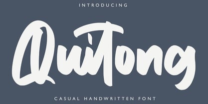 Quitong - Handwritten Font is a handwritten with a natural & stylish flow. This collection of scripts is perfect for personal branding. this works well for many applications. Everything from personal branding & wedding invitations to advertising could benefit from this collection of signature fonts Features : • Character Set A-Z • Numerals & Punctuations (OpenType Standard) • Accents (Multilingual characters) • Ligature
 - Sungent by Alexey Makarov,
$16.00 This font was inspired by the mountains of Altay. Soft lines and a little asymmetry add a natural touch to Sungent. This font will help add authenticity and personality to your digital work. Contains over 1500 kerning pairs. Language support: Contains full set of Latin alphabet, including diacritical marks for European languages and Cyrillic alphabets.
 - Arhoky by Product Type,
$17.00 If you are looking for a unique and unique gothic blackletter font that will set your project apart from the rest, look no further! ARHOKY is the perfect font for adding a touch of elegance to all kinds of creative work - including wedding invitations, tattoos, and packaging designs. Use it immediately to realize amazing projects!
 - Cherkessk by Arendxstudio,
$15.00 Cherkessk - Handwritten Font is a handwritten with a natural & stylish flow. This collection of scripts is perfect for personal branding. this works well for many applications. Everything from personal branding & wedding invitations to advertising could benefit from this collection of signature fonts Features : • Character Set A-Z • Numerals & Punctuations (OpenType Standard) • Accents (Multilingual characters) • Ligature
 - Hurstville by Arendxstudio,
$15.00 Hurstville - Brush Signature Font with a natural & stylish flow. This collection of scripts is perfect for personal branding. this works well for many applications. Everything from personal branding & wedding invitations to advertising could benefit from this collection of signature fonts Features : • Character Set A-Z • Numerals & Punctuations (OpenType Standard) • Accents (Multilingual characters) • Ligature • Swash
 - Jojo by Canada Type,
$24.95 A little more flower and a little less power, please. Fun, friendly, fashionable, and feminine to a fault, Jojo takes display typography to a whole new level, where eyes can’t help but appreciate the day and the design at hand. It takes a graphic designer very little imagination to see these letters on posters, book covers, clothes, and craft paraphernalia. Or how about a sign over a bakery? A music sleeve? A romantic comedy titling? Cosmetics products? Pretty much anywhere! Jojo takes its name from a Beatles song about getting back to where we once belonged. It also takes most of its shapes from vintage photo-setting days, when an art nouveau typeface called Spring, by B. Jacquet, was putting happy times back where they belonged, which was everywhere. The original photo-setting face came in just 26 letters and 10 numerals. This digital retooling optimizes the original forms and expands on them, for a full character set of over 430 glyphs, including ligatures and stylistic alternates, and support for the majority of Latin languages.
 - Life by Bitstream,
$29.99Designed by Francesco Simoncini and W. Bilz, this design follows Times New Roman in structure, but differs in some details. Unlike Times New Roman, the boldface is a weighted version of the roman. - Royal Kevino by Hanzel Space,
$25.00 This modern serif typeface features serifs. Perfect for gorgeous logos & titles, Royal Kevino will pair beautifully with many fonts and work well with whatever project you're working on. That's it! If you have any questions at all , feel free to pop me a private message , I'm always more than happy to help you along :) Happy creating! Hanzel Studio
 - Compliments by E-phemera,
$20.00 Compliments was inspired by a few hand-lettered words on a 1930s brochure by Western Union entitled “The Yellow Blank is Correct for Every Social Need.” It is now available in OpenType format with contextual alternates for a better script effect.
 - Brigstone by Tony Type Studio,
$13.00 Brigston Calligraphy is a calligraphic font with a modern style and an elegant touch, inspired by Italian women's handwriting and ancient manuscripts. Carefully designed to work together in harmony making it perfect for wedding favors, book covers, greeting cards, logos, branding, business cards and certificates, even for any design work that requires modern, formal or extravagant. Try Calligraphy Desired, enjoy the wealth of OpenType features and let its elegant fun and excitement make you happy and boost your creativity! You can use this font very easily.
 - Pioggia by Fontdation,
$15.00 Introducing Pioggia, a modern and playful serif font. This clean and minimalistic serif is crafted with love and high attention to the details. Packed with OpenType features (such as alternate chars, swashes, ligatures, etc), lets you play and explore every characters available. Pioggia is very versatile, suits best for almost everything, whether you're working on classic themed design, or the modern ones. If you're often working with a magazine, layouts, logotypes, hipster-quote writings, t-shirt designs, etc, Pioggia is your next go-to font.
 - Stones by Fana Studio,
$20.00 STONES is a supercharged, street-wise brush font bursting with energy. With extra attention to quick strokes and sharp details, STONES is guaranteed to deliver an unapologetically loud & fast-paced message; ideal for logos, apparel, quotes, product packaging, or anything which needs a typographic turbo-boost. What you get : Numeral and Punctuation International Language Works on PC & Mac Simple installations Accessible in the Adobe Illustrator, Adobe Photoshop, Adobe InDesign, even works on Microsoft Word. Thank you for your purchase! Hope you enjoy with our font!
 - Herra Maddison by Jinan Studio,
$20.00 Herra Maddison is the embodiment of modern elegance, offering you an exquisite script font with exceptional swashes and multilingual support. Whether you’re a designer working on wedding themes, branding, or promotional materials, this font will elevate your work, infusing it with a timeless and stylish charm that captivates the eye and the heart. Make Herra Maddison your choice for sophisticated, elegant designs that leave a lasting impression. Features A set of uppercase and lowercase glyphs Number, symbol, and punctuation Multilingual Support Alternates and ligatures PUA encoded
 - Whiteblack by Fontador,
$24.99 Whiteblack is a slab serif with a soft touch, designed for contemporary typography and comes up with 6 weights for positive and negative settings plus handslanted obliques. In dark backgrounds, especially for signage and on screen, negative settings glow and appear heavier than positive settings. To avoid the „glow-effect“ the typeface contains special weights for an optimal balance between white and black. A large x-height and open apertures not only creates space for smaller sizes, but also lends Whiteblack a solid balanced and generous character for print and screen. Many OpenType features including 324 ligatures, contextuel alternates, and stylistic set built into all cuts. The font contains 1.076 glyphs with a wide range of flexibility for Latin language support for every typographical needs. Whiteblack brings elegance and a certain warmth wherever a contemporary slab serif typeface is needed, special for signage, brands, magazines and corporate design.
 - Cream Cheese by Rocket Type,
$10.00 Cream Cheese and Onion Bagels go together like apples and oranges. Taste this brand new font duo from Rocket Type! Great for branding, broadcast, and childrens books!