10,000 search results
(0.02 seconds)
- Realitas by Eko Bimantara,
$24.00 Realitas is an experimental display font designed and published by Eko Bimantara in August 2022. This typeface deeply explores letterforms beyond common boundaries and creates new possibilities in letter structure. It has more than 300 glyphs which covered broad latin languages.
 - Tamarind Brush by OCSstudio,
$13.00 Introducing the new Tamarind Brush Font! A casual font, with brush letters. Perfect for: using bold, brushed handwritten based designs :) Use it for Branding, Logos, Greeting Cards, Stationery Designs, Invitations, T-shirts, Clothing, Packaging Designs, Posters, Typography Designs and much more!
 - Kasmine by Fargun Studio,
$12.00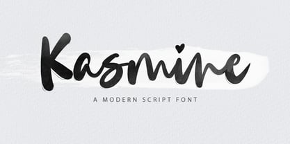 Kasmine is a handwritten stylish copperplate calligraphy font with a dancing baseline and a classic and elegant touch. Can be used for various purposes. such as headings, signature, logos, wedding invitations, t-shirts, letterheads, signage, labels, news, posters, badges etc.
 - Astalamet Pro by GRIN3 (Nowak),
$10.00 Astalamet Pro is a new, completely redesigned and improved version of my font AstalametPure, which was released for the first time in 2001. Language support includes Western, Central and Eastern European character sets, as well as Baltic and Turkish languages.
 - Lawson by Okaycat,
$29.50 Okaycat Font Foundry proudly presents "Lawson"! A retro classic style font, perhaps futuristic, containing European accents. Beautifully connected cursive with high legibility and style for your design, great for print and publication. See the new textured version Lawson Vintage please.
 - Dianda by RagamKata,
$14.00 Hello, new retro serif called Dianda! Dianda is a stylish font that is both retro and bold font. Works great for logos, magazine, social media. It come with a unique lower and uppercase plus numbers, punctuation & multilingual letters, alternates and ligatures.
 - Churchward Brush by BluHead Studio,
$20.00 BluHead Studio LLC is pleased to announce the release of Churchward Brush by New Zealand typeface designer Joseph Churchward. This showcard brush hand-lettered design looks great for flashy headlines and signage! The Italic is especially fun to work with!
 - Soul Taker by Gassstype,
$27.00 Hello Everyone, introduce our new product Font Soul Taker This is a Monsters Display Font.This is a Textured Natural Style and classy style with a clear style and dramatic movement. You can activate 3 Ligatures and 7 Alternate glyphs OpenType panel.
 - ATC Abernathy by Avondale Type Co.,
$20.00 ATC Abernathy, is a soft serif typeface based on retro package design. With a modern influence, it bridges the gap between old and new. Contains 330+ glyphs, full alphabet, ligatures, numerals, accents and punctuation. ATC Abernathy was released in 2018.
 - FancyPants by Adriprints,
$8.00 FancyPants is the first script font for Adriprints. It is always a challenge to jump into something new, and cursive script was right up that alley. FancyPants is a semi-linking, quirky, cursive script available with extended glyphs for international use.
 - Blowfish Inline by Robert Petrick,
$19.95 Blowfish Inline is a new addition to my Blowfish Family. Based on my original Blowfish design I have created a more illustrative form. I think it adds to the feeling of "Classic" and extends it's functionality and novelty.- Robert W. Petrick
 - Altwien by XTOPH,
$32.00 Altwien is a blackletter display font. Inspired by the old street-signs of Vienna and Salzburg. It’s a clear and simplistic looking condensed typeface. Put Altwien into a contemporary, fresh or modern context and get a completely new and unique style.
 - Nagotire by HafisHidayat,
$20.00Introducing the elegant and fashionable Nagotire handwritten font, which looks like a signature, this font is purposely made with a quirky alternative. Nagotire is suitable for greeting cards, product packaging, news, invitations, posters, blog posters, branding, business cards, logos, etc. - Courage by Positype,
$35.00 High-contrast? High impact? Have Courage? Eye-catching and (extra, extra) bold, Courage balances ultra-high stroke weight, delicate details, and unique letterforms with a self-indulgent passion that will make you feel a little guilty using it. Honestly, use it large and don’t try to force it into a small space, because these fearless letterforms need room to move. Flavored with both upright and italic styles, each font includes an indulgent level of alternates, swashes and titling options, visual elements and more. A backstory with a different name Years ago, I was commissioned to take my Lust typeface and produce something unique to use for large format graphics for an event…cool. It needed to be hyper-contrast with a lot of over-the-top details. With a tight turnaround, I looked for primers within my development catalogue to help me, and settled on some early work on a typeface I had drawn called Hedonist. I used those sketches and its conventions to retrofit and build out Lust Hedonist (only to see the project go bust on the client’s end). I intended to go back shortly after the Lust Hedonist release to finalize a retail version of the OG Hedonist, but I never could settle on the look of the 'g' or the numerals, got distracted with other projects, and never picked it back up… until last year. After randomly doodling a fat, flat ‘g’ with an extremely tilted counter axis, I knew immediately how it could be used and that (re)set things in motion. Only problem was, in the process of refining the letterforms I began truly dissecting the pieces, rediscovering all of the recklessness within Hedonist, and decided on fundamentally rewriting the approach to the typeface… literally flaying it to the bone. I’m much, much happier with this finished typeface now, but the name no longer fit the moniker given to the first, adolescent approach—there’s far more audacity and cleverness in these letterforms, tenacious in their resolution now. As a result, the name Courage fit the mettle of this typeface so much more, so I kept it.
 - FF Good by FontFont,
$72.99 FF Good is a straight-sided sans serif in the American Gothic tradition, designed by Warsaw-based Łukasz Dziedzic. Despite having something of an “old-fashioned” heritage, FF Good feels new. Many customers agree: the sturdy, legible forms of FF Good have been put to good use in the Polish-language magazine ‘Komputer Swiat,’ the German and Russian edition of the celebrity tabloid OK!, and the new corporate design for the Associated Press. Although initially released as a family of modest size, the typeface was fully overhauled in 2010, increasing it from nine styles to 30 styles, with an additional 30-style sibling for larger sizes, FF Good Headline. In 2014, the type system underwent additional expansion to become FontFont’s largest family ever with an incredible 196 total styles. This includes seven weights ranging from Light to Ultra, and an astonishing seven widths from Compressed to Extended for both FF Good and FF Good Headline, all with companion italics and small caps in both roman and italic. With its subtle weight and width graduation, it is the perfect companion for interface, editorial, and web designers. This allows the typographer to pick the style best suited to their layout. As a contemporary competitor to classic American Gothic style typefaces—like Franklin Gothic, News Gothic, or Trade Gothic—it was necessary that an expanded FF Good also offers customers both Text and Display versions. The base FF Good fonts are mastered for text use, while FF Good Headline aims for maximum compactness. Its low cap height together with trimmed ascenders and descenders give punch to headlines and larger-sized copy in publications such as newspapers, magazines, and blogs. There is even more good news about FF Good: it has something of a serif companion. Łukasz Dziedzic built FF Good to work together with FF More, creating in a powerhouse superfamily that is versatile in both its function and aesthetic.
 - Ma Braille by Echopraxium,
$5.00 The "Ma" in "Ma Braille" is used as a minimalist way to say "Negative Space". "Ma" in japanese arts is an "esthetical usage of emptiness". Thus this font explicits the negative space around visible braille dots in each glyph. A. Font user guide a.1. Lowercase glyphs { A..Z } In these glyphs, dots are represented as "black squares" while the negative space is displayed as 1 or 2 white filled polygons. a.2. Uppercase glyphs { a..z } In these glyphs, dots are represented as "white squares" while the negative space is displayed as 1 or 2 black filled polygons. a.3. Digits: they are just the same than a..j, but the "North US version" is also provided in ascii codes 0xE0..0xE4 (1..5) and 0xE7..0xEB (6..0). a.5. "Dashed Border": a.5.1. "Black dashed" border glyphs; { £, ¥, µ, Â, Ä, Ê, Ë, Î, Ï, Ô } a.5.2. "White dashed" border glyphs; { Ö, Õ, °, ô, ö, î, ï, û, u, õ } B. Posters Poster 1: "Font Logo" version 1, it displays "Ma Braille" text surrounded by the "black dashed border" glyphs. Poster 2: "Font Logo" version 2, it displays "MA" glyphs in big size and smaller "Braille" glyphs within "M" and within "A" as well. Poster 3: the classical pangram to test a font "The Quick Brown Fox jumps over the Lazy dog". Poster 4: Article 1 of the Human Rights: All human beings are born free and equal in dignity and rights. They are endowed with reason and conscience and should act towards one another in a spirit of brotherhood. Poster 5: the "Glyph set" (Border glyphs not included) with A..Z, a..z, digits and special characters.
 - LiebeGerda by LiebeFonts,
$29.00 Go out into the wilderness. Cut down a tree. Stop and smell the roses. And then treat yourself with this unplugged, hand-lettered typeface. LiebeGerda is an effortless-but-refined, spontaneous-but-elegant brush font. She is ready for your next project, and she wants to add that little crafty something that makes the difference. Her natural breath of fresh air lets you escape those same old monotonous script fonts you’ve been using. After our successful first brush font, LiebeDoris, and our first interconnected script, LiebeLotte, we’re combining both genres and taking them to the next level: an interconnected brush script. OpenType magic varies LiebeGerda’s letterforms: Most characters have no less than three different variations that are automatically shuffled and inserted as you type. Plus, the “All-Caps” OpenType feature exchanges uppercase letters with less-swashy variants. Now you know why every one of the four styles contains more than 1,200 characters! Ulrike of LiebeFonts painted LiebeGerda’s four styles individually from scratch and carefully adjusted every detail by hand. Rather than being one typeface with different weights, LiebeGerda is a package of four individual fonts that go together really well. Ulrike’s high level of type-nerdy craftsmanship shows. When you use LiebeGerda, your designs will easily convince your audience that they’re looking at a hand-crafted piece of lettering. Feel free to add a few of the stacked ligatures like “the”, “for”, and “new” to round off the illusion. Last but not least, LiebeGerda has a lot more detail than most other brush fonts. That means there’s no ugly, lazy bézier artifacts in the brush traces. You can print words at billboard size, and people will still believe they smell the paint from your brush!
 - Alles Kaputt by Kitchen Table Type Foundry,
$16.00 Alles Kaputt means ‘everything’s broken’ in German. I always wonder why my stuff breaks so easily, especially my mobile phones (I have had 7 in the last two years). Maybe I am careless, but I believe that there is a more or less scientific explanation that chaos and destruction are far easier than harmony and creation. I am no scientist, so don’t take my word for it! Alles Kaputt is a nice script font. I made it with a felt tip pen I borrowed from the kids. Use it for texts on product packaging, book covers and websites. Or, whatever you fancy!
 - Stretto by Canada Type,
$29.95 Stretto (Italian for narrow) is a revival, correction and expansive update of an Aldo Novarese reverse-stress font called Sintex, which he did for VGC in 1973. Openly idiosyncratic and playfully rebellious in its design, this alphabet fuses the straights and rounds in an unusual manner, riffing on the idea of hand-made sign and wood type forms while adhering to its odd grid’s parameters. In spite of its counter-stress, its legibility is high and even, helped by its unicase forms and very distinct counters. First released in 2007, it became quite popular with film studios and nostalgia designers (Sintex was the font used for David Bowie’s Hunky Dory album and Life on Mars? single). A dozen years later we revisited it for an update. Stretto now comes with over 660 characters and includes Pan European language support.
 - VLNL Spaghetti by VetteLetters,
$35.00 Originally drawn in 1999 as a college project with the ambition to make the ‘most beautiful’ alphabet in the world. After these heroic beginnings Spaghetti lay dormant in the VLNL vaults for many years, appearing to silently peter away. Now look at it! Ten years hence, it is finally being served up in glorious OpenType, precisely al dente. As automated special sauce, each lowercase character before or after a space receives a nice little ball ending to round things off. And finally, the parmesan cheese sprinkled on top is like a tasty bunch of ligatures – enough to make your mouth water.
 - Hand Printing Press by Fontscafe,
$39.00 Hand printing typography revolutionized the way books were published. The earliest printing presses made it possible for newspapers to reach the doorstep every morning, for information to freely be shared among the masses for the first time on a large scale…and the fonts that were used in those classic times are forever embedded within the collective memories of societies across the planet. It is to this collective memory that we give a visual form with our new Hand Printing Press Pack. Up for grabs are a set of 10 Hand Printing fonts plus one "Stamps" elements font. The fonts are: the Normal, the Stencil, the Eroded, the Meshed and the Scraped in REGULAR and BOLD versions; each of them displaying a simplistic yet classic printing style and as often happens lately, we are also offering you an "elements" pack, the "Stamps" font, to go with these to create your customized stamp giving to your creations a touch of "official documentation".
 - Waratah Gothic by Bean & Morris,
$35.00 The Waratah flower is the the emblem of the State of New South Wales, Australia and is unique in its color and design. So too is this new contemporary sans serif typeface that bears its name. With a warmth and friendliness that echoes its origin Waratah Gothic is at home in both text and display and has potential to become a font family with a variety of weights and italics. For corporate, packaging or simple one-line display settings Waratah Gothic is sure to please. Waratah Gothic features a generous x-height and subtle rounding on alternate terminals providing a softness that makes for easy reading.
 - Foundry Gridnik by The Foundry,
$96.00 The new Foundry Gridnik typeface family features an expressive range of 10 weights – from Light to Extra Bold, each with accompanying Italics. Foundry Gridnik was developed from the single weight monospaced 'typewriter’ face, originally created by Dutch designer Wim Crouwel in the 1960s. Crouwel's devotion to grids and systems led to his affectionate nickname of ‘Mr Gridnik’, and this inspired the new typeface family name. Foundry Gridnik’s distinct geometric design has been described as ‘the thinking man’s Courier’. Crouwel said, ‘I am a functionalist troubled by aesthetics’, and although Gridnik is based on logic, rationality and strict adherence to the grid, it also has a human dimension that sets it apart.
 - TT Slabs Condensed by TypeType,
$29.00 TT Slabs Condensed update 1.110 What’s new. • Case Sensitive Forms • Tabular Figures • Fractions • Numerators • Denominators • Superiors • Scientific Inferiors TT Slabs Condensed it is a condensed version of our TT Slabs font family. This new version is designed for strong headlines and design presentations. Very well suited for designers who create Identity and logos, as well as for interior design and navigation. The special features of the typefaces include the classic formula: Thin, Light, Regular, Bold & Black. Scope: food packaging, packaging of household appliances, newspapers, magazines, headers, signs, theatrical scenery, logos, interior design, decoration of shops. Optimized for the websites, mobile applications, and printing materials.
 - Naluka by Arterfak Project,
$20.00 Introducing our brand new ethnic font "Naluka". Funny, joyful, and unique! The new exploration of the ancient-style font, inspired by the geometric tribal ornaments and wood texture applied to the font as the special effect to gives this font looks more fun and friendly! Naluka is created especially for specific themes such as summer, holiday, tropical, ethnic, cartoon, beach, cultural, children, and many more! This font is suitable for displays, packed with OpenType features that you can combine to express your concept! Font featured: Uppercase Lowercase Numbers & Punctuation Stylistic alternates Stylistic set Custom ligatures Multilingual characters Dingbats font Thank you so much for watching. Good luck and happy designing!
 - Zwart by Holland Fonts,
$30.00Originally created with cutting in red litho film, as a headlining typeface for Vinyl music magazine. Its geometric structure was very applicable for early type design experiments on the computer. ...in the early 1980s, he (Max Kisman) became the designer of a small, independent music magazine Vinyl. This Amsterdam-based publication was set up very much as a response to the innovative British magazine, The Face. Responding to Neville Brody's radical designs for that magazine, Kisman began to experiment by creating new headline typefaces for each issue... (Emily King. New Faces: type design in the first decade of device-independent digital typesetting. 1987-1997. - Eurostile Candy by Linotype,
$40.99Eurostile Candy is a fun spinoff from Akira Kobayashi's Eurostile Next family. As the name implies, it is based on Eurostile but with many striking new features. Most obviously, the corners and joints have been rounded off to give it a more friendly and softer feel. On top of those changes, the main skeleton of many characters have been modified. Any extra strokes have been removed - such as in the a, s, or t - and joints have been simplified to create even more square shapes - like in the n and r. With these contemporary and futuristic-styled alterations, Eurostile Candy is a cool new design great for many display projects. - Barlington by Mega Type,
$14.00 Barlington is a monoline script that is classic, vintage, and fun. This font can be used easily, even in mixing and matching with other fonts so that it can provide alternatives and new sensations for designers or craftsmen, in working on various projects. This font can be used for various purposes such as logos, wedding invitations, t-shirts, letterhead, signage, labels, news, posters, badges, and more. Barlington comes with uppercase letters, lowercase letters, numbers, punctuation, and so many variations on each character including OpenType alternatives, and multiple language support. If you have any question, don't hesitate to contact me by email : megatype04@gmail.com Thanks so much for looking and enjoy it!
 - ITC Roswell by ITC,
$40.99Roswell was designed by Jim Parkinson, who acknowledges the 'spacey' ancestry of its name. Yes, Roswell, New Mexico. There was a big anniversary of 'the incident' in the news while I was designing in Roswell. "The incident" is of course the alleged UFO crash in Roswell. "I thought the name was acceptable as a serious font name, while, on another level, having a strangely humorous edge," says Parkinson. Roswell looks great in large sizes on a poster or in a magazine layout. It started out as "a variation on American gothic forms like Railroad Gothic", says the designer, but Roswell is an original design with eccentricities of its own." - Ames' Text by Greater Albion Typefounders,
$16.00 Ames’ text is designed for use in its own right and also as a complement to our Ames’ Roman family. Ames’ text is a ‘New-Style’ Didone family offered in three weights and three widths. It is designed to embody clarity combined with contrast between horizontal and vertical strokes, but with sufficient stroke width in both directions to display well at small point sizes. All typefaces include small capital forms, new and old style numerals (and ‘small capital’ numerals for consistency). Ames’ text is distinctive enough for use in headings and titles, but comes into it own as a text face. Keep a lookout for our forthcoming Ames Display faces…
 - Citix Two Condensed by Eurotypo,
$58.00 Citix Two Condensed is a new font derived from Citix Regular –a traditional pen-formed flowing script–, but containing a complete new set of capital letters, titling, ligatures and swashes. This font may be a good option to combine with Citix Regular, specially in fine tune and accurate works, suitable for commemorative letters, invitations cards, lettering, logotype design and the most elegant visual communications projects. This font comes with five different kinds of capitals, Contain full OpenType features to work with: a full set of swashes, stylistic alternates, standard and discretional ligatures. Small caps, Central European Languages, Case sensitive forms, Old style numerals, ornaments and tails.
 - Barosa by NREY,
$19.00 Hi, friends! Introducing new typeface - Barosa. It is a new display font with 2 styles and cool characters. Typeface designed as monolite, all descending and ascending elements has same size as most characters. Barosa has multilingual support includes cyrillic. Many ligatures make your typography most variable. Barosa Typeface was inspired by ethnic slavonic style which combining classic typography with awesome features bring classic touch on this culture. It works well with normal size text and for large displays or short words. You may combine uppercase and smallcase in the text body, as alternates symbols. The Barosa typeface is suitable for : product packaging, labeling, logo, classic shop, ethnic shop, titles, etc
 - Syracuse by Woodside Graphics,
$19.95Syracuse is a font inspired by the typefaces of the "Arts & Crafts" designers of the early 20th Century. As such, it has a distinct "hand" look. In "Syracuse" you will find hints of Dard Hunter's work at the Roycrofters in East Aurora, New York, a little of the Art Nouveau style of 1900 Vienna, even a touch of Charles Rennie Mackintosh's design ideas in Glasgow, Scotland. The font was named for the city in New York where Gustav Stickley produced his Craftsman furniture. Syracuse owes a debt to all of these sources yet is original and different from any other "Arts & Crafts" font available. - Birdman by Yock Mercado,
$9.99 Birdman is a modern blackletter font that merges rebellion and chicano style, elevating them to a new dimension of minimalism and edginess. With its trendy and condensed design, this geometric typeface captivates instantly. Its versatility makes it the perfect companion for impactful headlines, high-flying logos, and groundbreaking advertisements. Birdman challenges typographic conventions with its boldness, attracting all eyes with its simple elegance. With Birdman by your side, words take flight, releasing their rebellious and contemporary essence. Each stroke is a cry of originality, and each letter tells a tale of modernity and authenticity. Feel how this font elevates your designs, soaring toward new typographic horizons.
 - Uni Neue by Fontfabric,
$29.00 Uni Neue is the whole new redesigned version (remake) of Uni Sans – one of the most recognizable and signature font families of Fontfabric type foundry. From major changes like proportions, widths and thickness (weights) to the smaller details, this new family enables us to feel and understand the font at a completely new level. Uni Neue is а modern sans serif with a distinctive character and geometric feel. The rounded corners give the typeface a friendly look, yet it retains a professional quality suitable for branding even the most serious corporate identities. The attention to detail paid during its development means that this typeface offers a vast range of design possibilities – it helps users create eye-catching designs and brands that really stand out. It is perfect for TV, screen, editorial and publishing, logos, branding, advertising and packaging. It supports a wide range of languages, including Extended Latin, Cyrillic and Greek. The family has seven weights, ranging from Thin to Black, with corresponding italics. The font was manually hinted to ensure great web and desktop performance.
 - Newspoint by Elsner+Flake,
$35.00 The design of the Newspoint typeface is based on the tradition of the American sans serif faces of the last century. This form expression was greatly influenced by the News Gothic type which was created by Morris Fuller Benton in 1908, and has, once again, become very popular. When the development of sans serif types such as Futura and Kabel by Renner and Koch began in 1925, the design of American sans serif types receded somewhat into the background. In the 1950’s, however, they experienced a renaissance which continues to this day. Thanks to its clean design and the relatively large x-height, the Newspoint is well suited for informative texts in newspapers, magazines, and brochures. In packaging design, as well, the Newspoint can display its strength in small print. Newspoint was developed as a customer-specific variation of the News Gothic. In contrast to the News Gothic, however, the face appears to be softer and more appealing thanks to the changed interpunctions. If so desired, the alternative characters give the typeface expanded individuality and a richness of design options.
 - Scion by Type Innovations,
$39.00 ‘Scion’ is an original design by Alex Kaczun. The inspiration for the typeface came from the Toyota SCION logo, which bears its name. In Alex’s own words, "I loved the simplicity, proportions and hi-tech look of the logo and decided to create an entire new design series based on its unique look". The fonts come in five flavors: thin, light, regular, bold and black. All the font weights were designed systematically on tabular widths so that the user can make adjustments to overall type color without changing the line length. In addition, Alex Kaczun has provided us with several alternate glyph substitions to further enhance the overall appeal of this contemporary new design. The large Pro font character set, which supports most Central European and many Eastern European languages, makes this typeface series ideally suited for display copy as well as text composition. In the near future, Alex plans to include a narrow, compressed and ultra expanded, along with true-drawn italic variations to further expand the possibilities of this great new display series.
 - Jorge by Galapagos,
$39.00(pronounced hor-hay) Some years ago my wife and I had our evening meal in a restaurant on what is called the northshore of Massachusetts. Of course, if you check a globe or map you'll see that the pilgrims needed a compass, it should have been called the eastshore as it's on the east end of the rectangle/hook we call the Commonwealth of Mass. In any event, the menu our waitress gave us was hand-lettered with shapes that I used to develop the 4 fonts called Jorge. When I brought the preliminary drawings into the office Steve Zafarana, a designer and cartoonist referred to them as Jorge's new design, the name stuck. - Exec Demiserif by Wiescher Design,
$35.00 I created my new »EXEC« Sans and this Demiserif cut during the years 2018 to mid 2020. As the entire »EXEC«-family the Demiserif also has 7 weights, ranging from Thin to Bold (no italics, doesn’t look nice). The Demiserif is also suited well for editorial, book text, advertising and packaging, logo, branding, small text as well as web and screen design. »EXEC«-Demiserif has advanced typographical support including ligatures, small caps, alternate characters, case-sensitive forms, fractions, super- and subscript characters. »EXEC«-Demiserif comes with a range of figures, oldstyle and lining figures, each in tabular and proportional widths. »EXEC«-Demiserif supports Basic-, Western-, and Central-European Latin-based languages including Turkish.
 - Nouveau Poster JNL by Jeff Levine,
$29.00 When master letterer Hugh Gordon and his student, Ross F. George developed a set of lettering pens between June 16, 1913 and Sept. 1, 1914, they had no idea that their invention (which they named Speed-Ball®) would still be in use nearly a hundred years later. The C. Howard Hunt pen company [originally of Camden, New Jersey] became the original (and sole) distributor of these pens. By 1915 an instructional booklet entitled "Modern Pen Lettering" was produced, and it was copiously illustrated with examples of layouts, lettering techniques and an assortment of alphabets for the user to learn. Nouveau Poster JNL is Jeff Levine's interpretation of a sanserif design found within the pages of this vintage publication.