10,000 search results
(0.041 seconds)
- Breve Sans Title by DSType,
$50.00 Breve was designed for use in editorial projects. Simple but with enough personality to stand by is own, in a quest for a more forceful and contemporary appearance. All the fonts in Breve superfamily, share the same exact structure, both in terms of anatomy and functionality. The Text versions provide a softer and warm feel to the typographic palette and is intended for use in much longer passages of text, while the Title versions are distinguished by non-descending letterforms, making the titles and headlines much more uniform and interesting. The News version is more classic, with ball terminals and classic proportions, while the Display is, somehow, the set of fonts we had to design: extra-black, ultra-contrasted, proud-display fonts.
 - Künstlerschreibschrift by URW Type Foundry,
$35.99 After inventing a new metal typecasting procedure that allowed for the production of more detailed typefaces, the famous German typefoundry D. Stempel AG developed Kuenstler Script in 1902 - 1903. Originally called Kunstlerschreibschrift (artistic handwriting), this design was based on English copperplate script styles from the late 1800s. In 1957, Hans Bohn added the heavy Kuenstler Script Black weight to the family. Like intricate handwriting put to paper with a feather and an inkwell, Kuenstler Script makes almost any text look distinguished and elegant. Kuenstler Script is a joining script; and because of its fine hairlines and small x-height, it is best used at sizes above 12 pt. The typeface works well in advertising work and on invitations, greetings cards, business cards, and certificates.
 - Salma Arabic by Zaza type,
$29.00 Salma is a modern typeface inspired by the Naskh Mastry style. It stands out from traditional fonts with its high contrast and new connections between letters, creating an eye-catching aesthetic that will make any text stand out. Its bold lines and timeless appeal make Salma perfect for headlines and display typography, as well as other design projects. It comes in 5 weights ranging from light to black, allowing users to customize their designs with OpenType features. The unique look of Salma makes it ideal for logos or branding materials that require a distinctive touch. With its strong presence across different media platforms such as print publications or digital displays, this versatile typeface can be used to create impactful visuals.
 - Montoro Display by FoxType,
$12.00 Montoro Display is a Brand New Luxury Typeface with a powerful font family. It has a dependable and uncompromising style, with controlled letterforms and modern touches. It looks amazing in logos, magazines, and movies . Montoro Font would be perfect for branding, headlines, Captions, paragraph, and posters . The various weights allow you to experiment with a wide range of applications. It's created to make an impression without sacrificing its beauty and readability. It's shown a clean, minimalist, warmth, quirky, yet still purposed to be versatile The Typeface includes Six Weights - Regular, Medium, SemiBold, Bold, ExtraBold, and Black. All offer wide language support, upper and lower cases, numerals and extended punctuation. Thank you for taking the time to look into the font.
 - Breve Display by DSType,
$50.00 Breve was designed for use in editorial projects. Simple but with enough personality to stand by is own, in a quest for a more forceful and contemporary appearance. All the fonts in Breve superfamily, share the same exact structure, both in terms of anatomy and functionality. The Text versions provide a softer and warm feel to the typographic palette and is intended for use in much longer passages of text, while the Title versions are distinguished by non-descending letterforms, making the titles and headlines much more uniform and interesting. The News version is more classic, with ball terminals and classic proportions, while the Display is, somehow, the set of fonts we had to design: extra-black, ultra-contrasted, proud-display fonts.
 - Breve Slab Title by DSType,
$50.00 Breve was designed for use in editorial projects. Simple but with enough personality to stand by is own, in a quest for a more forceful and contemporary appearance. All the fonts in Breve superfamily, share the same exact structure, both in terms of anatomy and functionality. The Text versions provide a softer and warm feel to the typographic palette and is intended for use in much longer passages of text, while the Title versions are distinguished by non-descending letterforms, making the titles and headlines much more uniform and interesting. The News version is more classic, with ball terminals and classic proportions, while the Display is, somehow, the set of fonts we had to design: extra-black, ultra-contrasted, proud-display fonts.
 - NEOMETRA - Personal use only

- MightyContour - 100% free

- Manometer Serif by Fontador,
$18.99 Manometer Serif is a pneumatic ultra-black serif typeface with variable pressure. Fat but stylish.
 - Manometer by Fontador,
$18.99 Manometer is a pneumatic ultra-black slab serif typeface with soft corners and fine counters.
 - Dhefentha by Yoga Letter,
$16.00 "Dhefentha" is a unique and elegant handwritten font. Equipped with uppercase letters, lowercase letters, numerals, punctuations, swash, titling, uppercase alternates, ligatures and multilingual support. This font is very suitable for Valentine's Day, wedding, engagement, Christmas, fall and others.
 - Beautiful Easter by Yoga Letter,
$14.00 "Beautiful Easter" is a quirky and cute handwritten font. This font is decorated with bunny ears in the uppercase. Equipped with uppercase, lowercase, numerals, punctuation, and multilingual support. It is suitable for Easter, spring, wedding moments, and others.
 - Fancy Kingdom MS by Redcollegiya,
$9.00 Fancy Kingdom is elegant serif font family wich great for wedding invitation, greeting cards, book covers or any fairy design. This kit includes 3 typefaces: - Regular - without curls; - Decorative - uppercase and lowercase with curls; - Combined - uppercase with curls.
 - Pitlines by Mevstory Studio,
$20.00 Pitlines is a display fonts collection. Pitlineswill perfect for many project: fashion, magazines, logo, branding, photography, quotes, blog header, poster, advertisements, etc. Files Includes: Pitliness Regular.otf Pitlines Italic.otf What's Included? Uppercase & alternate uppercase letters, numbers, punctuation Multilingual support
 - Umba Sans by TypeThis!Studio,
$29.00 UMBA Sans is a contemporary typeface designed by Anita Jürgeleit. The wide shaped curves show a new aesthetic appeal in an unexpected pleasant way. Umba Sans fulfills your corporate design needs as well as your editorial demands and helps to push your design to the next level. Thirty styles from thin to bold and matching italics - as well as small caps and alternates - help you create a contemporary design. Umba Sans provides a wide range of variations. Your design may have many faces but it all matches together. Separate styles for alternate and small caps will show up in your font menu, making sure that you stay aware of the wide range of possibilities your new favourite typeface provides. If you like our fonts, you might want to sign up at: www.typethis.studio
 - Bodoni Classic Ad by Wiescher Design,
$55.00 I became interested in designing Bodoni Classic because of a lazy graphic designer at Jacques Damase publishing house. He had to change a single letter on a bookcover about J. B. BODONI. The French call him Jean Baptiste instead of Giambattista! And that unknown graphic designer just took any old “J” from some newly cut Bodoni. All the new Bodoni cuts have square serifs, whereas the originals had rounded serifs and slightly concave feet. The single letter “J” with the squared off serif was for me like a road sign to start redesigning the entire Bodoni family. That’s exactly what I started in 1993 and a dozen years later I am finished. Okay, I am still adding new Bodoni Classics, but those are my personal additions. Yours very retro, Gert Wiescher
 - Alpha Bravo by Wiescher Design,
$39.50 AlphaBravo was born on a napkin. I was just doodling, playing around with letterforms when the ballpoint glided a little bit too far and suddenly I had my first letter with the dash sticking out on the left of the e’s horizontal line. I quickly checked on how many letters I could let a line stick out! Then I wrote a couple of words that way and letters joined in the most unusual places, creating new closed forms. I gave the font a try and quickly discovered, that I had stumbled onto an interesting new typeface. I didn't know how to call it, so I simply used the first two letters of the alphabet, Alpha and Bravo. Looking forward to Charlie and Delta, your very curious, Gert Wiescher.
 - Bodoni Classic Initials by Wiescher Design,
$55.00 I became interested in designing Bodoni Classic because of a lazy graphic designer at Jacques Damase publishing house. He had to change a single letter on a bookcover about J. B. BODONI. The French call him Jean Baptiste instead of Giambattista! And that unknown graphic designer just took any old “J” from some newly cut Bodoni. All the new Bodoni cuts have square serifs, whereas the originals had rounded serifs and slightly concave feet. The single letter “J” with the squared off serif was for me like a road sign to start redesigning the entire Bodoni family. That’s exactly what I started in 1993 and a dozen years later I am finished. Okay, I am still adding new Bodoni Classics, but those are my personal additions. Yours very retro, Gert Wiescher
 - Bodoni Classic Chancery by Wiescher Design,
$55.00 I became interested in designing Bodoni Classic because of a lazy graphic designer at Jacques Damase publishing house. He had to change a single letter on a bookcover about J. B. BODONI. The French call him Jean Baptiste instead of Giambattista! And that unknown graphic designer just took any old “J” from some newly cut Bodoni. All the new Bodoni cuts have square serifs, whereas the originals had rounded serifs and slightly concave feet. The single letter “J” with the squared off serif was for me like a road sign to start redesigning the entire Bodoni family. That’s exactly what I started in 1993 and a dozen years later I am finished. Okay, I am still adding new Bodoni Classics, but those are my personal additions. Yours very retro, Gert Wiescher
 - Bodoni Classic Text by Wiescher Design,
$55.00 I became interested in designing Bodoni Classic because of a lazy graphic designer at Jacques Damase publishing house. He had to change a single letter on a bookcover about J. B. BODONI. The French call him Jean Baptiste instead of Giambattista! And that unknown graphic designer just took any old “J” from some newly cut Bodoni. All the new Bodoni cuts have square serifs, whereas the originals had rounded serifs and slightly concave feet. The single letter “J” with the squared off serif was for me like a road sign to start redesigning the entire Bodoni family. That’s exactly what I started in 1993 and a dozen years later I am finished. Okay, I am still adding new Bodoni Classics, but those are my personal additions. Yours very retro, Gert Wiescher
 - Parca by Vasava Fonts,
$30.00 Parca is a straightforward new take on the classic tradition of Grotesk sans, setting a new standard in the category. The letterforms are crafted with a gentle and careful drawing process that features small details like subtle tappering on the stems and optical corrections avoiding excessive geometry artefacts. Parca is indicated for design projects and branding when you are in the need of a neutral yet warm feeling allowing the content to be the focus and letting the forms to support it. A careful kerning and spacing features have been develop for the font, allowing it to be used either for small text or huge headlines. Parca is presented in a robust family of five weights plus matching italics and it supports most of the latin-based European languages.
 - Bodoni Classic Hand by Wiescher Design,
$55.00 I became interested in designing Bodoni Classic because of a lazy graphic designer at Jacques Damase publishing house. He had to change a single letter on a bookcover about J. B. BODONI. The French call him Jean Baptiste instead of Giambattista! And that unknown graphic designer just took any old “J” from some newly cut Bodoni. All the new Bodoni cuts have square serifs, whereas the originals had rounded serifs and slightly concave feet. The single letter “J” with the squared off serif was for me like a road sign to start redesigning the entire Bodoni family. That’s exactly what I started in 1993 and a dozen years later I am finished. Okay, I am still adding new Bodoni Classics, but those are my personal additions. Yours very retro, Gert Wiescher
 - Razom Script by DizajnDesign,
$39.00 Razom Script is a typeface with deep roots in pointed brush calligraphy that takes advantage of current font technology to go beyond handwriting and reach new limits. A successful blend between printed and handwritten letterforms is visible when comparing upper and lowercase. The weight of the typeface evolve in a way that pushes the limits of a script typeface to suggest new uses. Normally, families are developed in weights, not proportions. Also, having several weights in a script family is rather rare. But in Razon Script, as the fonts gain weight, big differences show up in the font outlines: the thin weight looks soft and delicate but as we examine darker variables, they also seem to get broken. The counters of the letters rotate from vertical to horizontal during this process.
 - Last Midnight by The Ampersand Forest,
$45.00 Suggested by J.M.Bergling’s 1917 “New Romeo Initials, Last Midnight is a display face created in a distinctive pseudocalligraphic Belle Époque style that we’ve come to associate with beloved fairy tales. Rich in typographic goodies, with two additional stylistic sets and a host of standard ligatures, Last Midnight now even has a Roman small caps set in both smooth and rough varieties — great for all of your tale-telling, folkloric, swashbuckling, & spellcasting needs! Part of The Ampersand Forest's Sondheim Series.
 - Modesto by Parkinson,
$25.00 Modesto is a loose-knit family based on a signpainters lettering style popular in the late-19th and early-20th centuries. It evolved from the lettering I used for the Ringling Bros. and Barnum & Bailey Circus Logo. The Modesto family was not planned. It just happened, a few fonts at a time over about fifteen years. In 2014 four new Italic fonts were added. There is a downloadable MODESTO USER MANUAL PDF in the Gallery section for this family.
 - Demos Next by Linotype,
$50.99 The Demos® Next typeface family is a complete renewal and expansion to Dutch type designer Gerard Unger’s classic from 1975. This enhanced typeface design introduces subtle changes to character shapes, proportions and spacing to improve legibility and readability in print and on screen. The new expanded family now has 6 weights of regular and condensed designs, each with a complementary italic for a total of 24 typefaces, and provides a welcome set of OpenType® typographic features.
 - Color Paper by Artyway,
$16.00 New expressive font "ColorPaper". It was made using the negative space of letters and it looks amazing! This design captures you with its originality and simplicity. Thoroughly selected geometric shapes make a piece of art out of every symbol. Unfold the full potential of this font, experiment with the color and get pleasant impressions. Production of an original and expressive design of a poster, title, logo, emblem using this font is very simple and fascinating. Make sure yourself.
 - True North Textures by Cultivated Mind,
$18.00 True North is back but now in a distressed version and new styles! True North Textures is a vintage typeface with 18 fonts and a monoline script. True North Textures comes with distressed labels, extras and free banners. Extras include wild animals, catchwords, numbers, mountains, symbols, tools, leaves and trees. True North Textures is a headline font with alternate capitals. Combine all 18 styles with the script, banners, labels and extras and you get a wonderful distressed vintage design.
 - Ballyhaunis NF by Nick's Fonts,
$10.00Lewis F. Day, in his 1910 classic Alphabets Old and New, filed this work by Laurence Schall under the category of Celtic-inspired, and surely it is both. This font included a few special extras, including a Celtic cross in the florin position, a Celtic knot is the dagger position, a shamrock as the asterisk, and a double shamrock in the double-dagger position. Both versions of this font include the Latin 1252 and Central European 1250 character sets. - Bubbleboddy Neue by Zetafonts,
$29.00 Bubbleboddy Neue is the redesign of one of the first Zetafonts typefaces. It preserves the original round and chunky flavor and adds three new weights and a complete cyrillic and greek character set to infuse your design with an original 80s touch and all the juicy sweetness of a bubblegum. Born for logos and display use, the family has now got a complete facelift with better readability onscreen for web use and offline for text setting.
 - Fido Pro by Canada Type,
$29.95Fido Pro is the official font of dog owners everywhere. Woof! When the original Fido font was published in 2009, it became an instant hit with cartoon channels, comic book artists, toy makers, cereal packagers and game developers. Now, more than a decade later, we decided to pick it up and give it the Pro treatment. This new version boasts more than 800 glyphs, including 117 interlocking ligatures, plenty of alternate glyphs, and and Pan-European language support. - Villain by Clint English,
$25.00 Villain is a new handwritten, multi-alternate glyph font. This font was created with a natural flow in mind. Since it's meant to look handwritten, Villain comes with 3 different glyphs per letter and number and even a few alternate symbols, as well. Pro Tip: Play with the baseline shift of each character to get an even more realistic, organic result. *Note: Grunge overlay texture is for previews only. Villain Font is completely clean and free of texture.
 - Periodical JNL by Jeff Levine,
$29.00 Periodical JNL is based on one the many stylized titles from the cover of the 1920s Spanish magazine "Nuevo Mundo" (New World). Each cover displayed a beautiful piece of period artwork along with the magazine's name in different lettering styles of the time (Art Nouveau and early Art Deco). The original design features an "engraved" look and now has an oblique counterpart. Also available are solid versions (without the inside lines) in both regular and oblique styles.
 - Beau's Varsity by Beau Williamson,
$4.99 I designed this font a few years ago to address a direct problem. My work demanded small paragraphs of text to be screenprinted in a varsity font style. The house varsity was rather uneven and created small blobs of ink at sharp angles when printed. I designed Beau's Varsity to address both of these problems. The new font eliminated the blobbing, and I like to think my original design is a step up in evenness from the other options.
 - Mayfair by Canada Type,
$24.95The long awaited and much requested revival of Robert Hunter Middleton's very popular classic is finally here. Mayfair Cursive was an instant hit for Middleton in 1932, and it went on being used widely until late into the 1970s, in spite of it never having crossed over to film type technology. Like a few of its contemporary designs, most notably the work of Lucien Bernhard, Mayfair is a formal script that is somewhat based on traditional italic forms with swash uppercase, but also employs subsidiary hairline strokes in some of its lowercase as an emphasis to the script's cursive traits. Why these gorgeous letters never made the leap into photo typesetting is a mystery to us. But here they are now in digital form, almost three quarters of a century since they first saw the light in metal. Mayfair was redrawn from original 48 pt specimen. It also underwent a major expansion of character set. Plenty of swash characters and ligatures were added. An alternate set of lowercase was also made, in order to give the user a choice between connected and disconnected variations of the same elegant script. Mayfair ships in all popular font formats. While the Postscript Type 1 and True Type versions come in two fonts (Mayfair and Mayfair Alt), the OpenType version is a single font containing all the extra characters in conveniently programmed features that are easily accessible by OpenType-supporting software applications. We are quite sure today's graphic designers will be appreciative of having access to the face that all but defined menus, romance covers, wine and liquor labels and chocolate boxes for almost two 20th century generations. - Slenderline by Blankids,
$23.00 Introducing of our new product the name is Slender clean Signature font. inspired by signature and stylish handwriting, Slender font is good for logotype, wedding invitation design, badge, headline, signature, packaging and any more. Slender font have 336 Glyphs and many alternative character so you can mix and match like a you want, Slender font include 17 Mutilingual Support (Afrikaans, Albanian, Catalan, Danish, Dutch, English, Estonian, Finnish, French, German, Icelandic, Italian, Norwegian, Portugese, Spanisch, Swedish, Zulu)
 - Pantai Bali by DYSA Studio,
$19.00 Pantai Bali is a new organic siganture font. This another collection of script is perfect for your next branding project, excellent for your business. Pantai Bali have a natural edges, so this font gives an authentic handcrafted feel style. Pantai Bali is perfect choice for people looking for clean, modern, minimalist, elegant, beauty design styles. Suitable for almost any graphic designs such as logo, branding materials, business cards, gift cards, t-shirt, cover, thumbnail, print, poster, photography, quotes .etc
 - Gladies by DYSA Studio,
$25.00 Gladies is a New Modern Serif Typeface. This another collection of Serif is perfect for your next branding project, excellent for your business. Gladies have a smooth edges, so this font gives an authentic handcrafted feel style. Gladies is perfect choice for people looking for clean, modern, minimalist, elegant, beauty design styles. Suitable for almost any graphic designs such as logo, branding materials, business cards, gift cards, t-shirt, cover, thumbnail, print, poster, photography, quotes .etc
 - Laceria by DYSA Studio,
$19.00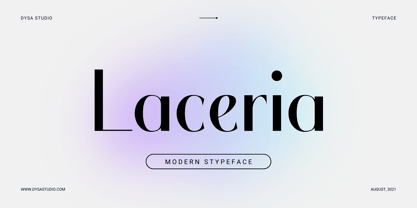 Laceria is a New Modern Serif Typeface. This another collection of Serif is perfect for your next branding project, excellent for your business. Laceria have a smooth edges, so this font gives an authentic handcrafted feel style. Laceria is perfect choice for people looking for clean, modern, minimalist, elegant, beauty design styles. Suitable for almost any graphic designs such as logo, branding materials, business cards, gift cards, t-shirt, cover, thumbnail, print, poster, photography, quotes .etc
 - Mirabella by Larin Type Co,
$15.00 Mirabella script- a new handmade calligraphy font. This font is ideal for branding and decorate your any project, are perfect for wedding invitation or your blog. Also with their help, you can create a logo or beautiful frame for your home. Or just use for your small business, book covers, stationery, marketing, magazines and more. Also for you, I have prepared many alternatives that will help you make your project more unique. Following international symbols support: ÀÁÂÃÄÅĄÇĆÈÉÊËĘÌÍÎÏÐÑŃŁÒÓÔÕÖØÙÚÛÜŚŠŸÝŹŻŽßàáâãäåçèéêëìíîïðñòóôõöøùúûüýÿąćęłńśšźżž

