10,000 search results
(0.101 seconds)
- Variable by MADType,
$34.00 Variable is a sans-serif monoline typeface family that can be used in a variety of typographic environments. The UltraThin weight is perfect for use at large sizes in magazines or anywhere a hairline effect is needed. The Black weight feels reminiscent of wooden router lettering. Variable is very versatile due to its calming curves and can be used in print or on-screen environments.
 - Rude Slab SemiWide by DSType,
$50.00 Rude was designed as a dichotomy between the Grotesque and Humanistic typographic shapes: a no-nonsense Sans and a very muscular Slab Serif companion. Showing the historically demanded consistency for such kind of typefaces, this is one of DSType's most wide-ranging and flexible type systems, introducing seven weights across seven widths, from Thin to Black and ExtraCondensed to ExtraWide, along with a wonderful set of Icons.
 - Acaraje by Latinotype,
$39.00 Acarajé is a grotesque font that stands out thanks to its versatility. Its personality blossoms through its particular modulation, which grows with weights; making it a rather jovial typeface that does not abandon the characteristics of more classic grotesques. With two styles available: normal and italic, and a variety of 7 weights that range from "Black" to "Regular", this font offers incredible flexibility for your designs.
 - Rude SemiWide by DSType,
$50.00 Rude was designed as a dichotomy between the Grotesque and Humanistic typographic shapes: a no-nonsense Sans and a very muscular Slab Serif companion. Showing the historically demanded consistency for such kind of typefaces, this is one of DSType's most wide-ranging and flexible type systems, introducing seven weights across seven widths, from Thin to Black and ExtraCondensed to ExtraWide, along with a wonderful set of Icons.
 - Rude Slab Wide by DSType,
$50.00 Rude was designed as a dichotomy between the Grotesque and Humanistic typographic shapes: a no-nonsense Sans and a very muscular Slab Serif companion. Showing the historically demanded consistency for such kind of typefaces, this is one of DSType's most wide-ranging and flexible type systems, introducing seven weights across seven widths, from Thin to Black and ExtraCondensed to ExtraWide, along with a wonderful set of Icons.
 - Displace 2.0 by Serebryakov,
$35.00 Displace 2.0 is a display sans-serif font family. Displace 2.0 is a humanistic sans-serif based on the calligraphic shapes with a pronounced handwriting contrast and open forms typeface. It has a natural thick-thin swelling and shrinking of the strokes as if it were draw calligraphicaly. Displace font family includes five weights with italics: Light, Regular, Medium, Bold and Black. Try it!
 - Vast by ParaType,
$30.00 Vast is a variable sans serif with a range of styles from thin to black and from normal to extra wide. This versatile font family of both of a serious and friendly nature can be used for various purposes, such as text, logos, headings, and branding. Vast was designed by Manvel Shmavonyan with the assistance of Alexander Lubovenko and released by Paratype in 2021.
 - Algoria by Sealoung,
$15.00 Algoria is a functional sans serif that includes open character openings, a uniform distribution of white and black, and excellent readability. The general neutrality of the font patterns is not without elegance, and all the details of the typeface are crafted with mathematical precision and love. Typographic designs are developed for the widest possible range of tasks that any quality corporate font must accomplish.
 - Goth Chic by Comicraft,
$19.00 This pale face -- a Byronic offering from the disaffected youth section of our library -- will provide that slightly sad, sunken eyed feeling most closely associated with Doc Martins, heavy crosses and clothes as black as the blaquest heart... so if you're looking for tragic tramp stamp typography, we think our tattoo parlor maid to wear font will provide just the right amount of Goth Chic.
 - ZT Mostion by Zelow Type,
$14.00 Introducing "ZT Monstion," a fusion of sans and grotesque styles, both in bold weight, radiating an essence of simplicity and modernism. Crafted meticulously, this typeface embodies the purity of sans-serif aesthetics while embracing the boldness of grotesque forms. Its carefully refined x-height and expertly smoothed angles create a mesmerizing balance, where minimalistic design meets commanding boldness. With each character empowered by the weighty black typography.
 - Yukas by Alex Camacho Studio,
$25.00 Yukas is a funky and sexy typeface where the proportions are based on the optical balance between black strokes and white shapes. Ideal to enjoy on a large scale. It takes its references from the psychedelic movement, old-school western movie posters, and mid-19th century American wood type with those big, heavy capital letters. Includes several Open Type alternatives to customize your design however you want.
 - Tact Slab by Pesic,
$35.00 Tact Slab is geometrically slab serif font, black and condensed looks glyphs, with an alternative glyph set to improve its use in different graphic contexts. Tact Slab is compatible with the sans serif font Tact. It is suitable for use in the fields of science, art, architecture, urban planning, techniques, electronics, advertising, futuristic themes, sport, film, computers, phones, video games, magazines... Contains all Latin and Cyrillic glyphs.
 - TA Bankslab by Tural Alisoy,
$33.00 The building of the Northern Bank of St. Petersburg's Baku branch was built in 1903-1905. It was the first Art Nouveau-style building in Baku, Azerbaijan. Later the bank was transformed into the Russian-Asian Bank. After the oil boom in Baku in the 19th century, branches of many banks and new banks were opened in the city. The branch of the Northern Bank of St. Petersburg was among the first banks that was opened in Baku. N.Bayev was the architect of the building for the branch of the Northern Bank of St. Petersburg located at Gorchakovskaya 3 in 1903-1905. The building currently houses the Central Branch of the International Bank of Azerbaijan. My purpose in writing this is not to copy and paste the information from Wikipedia. What attracted me to the building was the word "Банкъ" (Bank) written in Cyrillic letters, which was also used in Azerbaijan during the Soviet era. The exact date of the writing is not known. Every time I pass by this building, I always thought of creating a font of this writing someday. I had taken a photo of the building and saved it on my phone. I did a lot of research on the font and asked a lot of people. However, some did not provide information at all and some said they did not have any information. I was interested in the history of this font but I do not know if this font really existed or it was created by the architect out of nowhere. If there was such a history of this font, I wanted to recreate this font and make it available. If not, I had to create it from scratch in the same way, using only existing letters on the building. Finally, I made up my mind and decided to develop the font with all letters I have got. It was difficult to create a font based on the word, Банкъ. Because in the appearance of the letters, the midline of the letters on A, H, K was very distinct, both in the form of inclination and in more precise degrees. The serif part of the letters, the height of the upper and lower sides, differed from each other. I don't know whether it was done this way when the building was constructed or it happened over time. I prepared and kept the initial version of the font. I took a break for a while. I started digging on the story of the font again. Meanwhile, I was researching and got inspired by similar fonts. Unfortunately, my research on the font's history did not yield any results. I decided to continue finishing up the font. After developing the demo, I created the font by keeping certain parts of these differences in the letters. In addition, I had to consider the development of letters in the Cyrillic, as well as the Latin alphabet, over the past period. Thus, I began to look at the appearance of slab-serif or serif fonts of that time. In general, as I gain more experience in developing fonts, I try to focus on the precision of the design for each font. In recent years, I specifically paid attention to this matter. YouTube channel and articles by Alexandra K.'s of ParaType, as well as, information and samples from TypeType and Fontfabric studios on the Cyrillic alphabet were quite useful. I gathered data regarding the Latin alphabet from various credible sources. I do not know if I could accomplish what I aimed at but I know one thing that I could develop the font. Maybe someday I'll have to revise this font. For now, I share it with you. I created the font in 10 styles. 7 weight from Thin to Extra Black, an Outline, Shadow, and Art Nouveau. The Art Nouveau style was inspired by the texture in the background used for the text on the building. The texture I applied to capital letters adds beauty to the font. If you like the font feel free to use it or simply let me know if your current alphabet doesn't support this font.
 - TA Bankslab Art Nouveau by Tural Alisoy,
$40.00 TA Bankslab graphic presentation at Behance The building of the Northern Bank of St. Petersburg's Baku branch was built in 1903-1905. It was the first Art Nouveau-style building in Baku, Azerbaijan. Later the bank was transformed into the Russian-Asian Bank. After the oil boom in Baku in the 19th century, branches of many banks and new banks were opened in the city. The branch of the Northern Bank of St. Petersburg was among the first banks that was opened in Baku. N.Bayev was the architect of the building for the branch of the Northern Bank of St. Petersburg located at Gorchakovskaya 3 in 1903-1905. The building currently houses the Central Branch of the International Bank of Azerbaijan. My purpose in writing this is not to copy and paste the information from Wikipedia. What attracted me to the building was the word "Банкъ" (Bank) written in Cyrillic letters, which was also used in Azerbaijan during the Soviet era. The exact date of the writing is not known. Every time I pass by this building, I always thought of creating a font of this writing someday. I had taken a photo of the building and saved it on my phone. I did a lot of research on the font and asked a lot of people. However, some did not provide information at all and some said they did not have any information. I was interested in the history of this font but I do not know if this font really existed or it was created by the architect out of nowhere. If there was such a history of this font, I wanted to recreate this font and make it available. If not, I had to create it from scratch in the same way, using only existing letters on the building. Finally, I made up my mind and decided to develop the font with all letters I have got. It was difficult to create a font based on the word, Банкъ. Because in the appearance of the letters, the midline of the letters on A, H, K was very distinct, both in the form of inclination and in more precise degrees. The serif part of the letters, the height of the upper and lower sides, differed from each other. I don't know whether it was done this way when the building was constructed or it happened over time. I prepared and kept the initial version of the font. I took a break for a while. I started digging on the story of the font again. Meanwhile, I was researching and got inspired by similar fonts. Unfortunately, my research on the font's history did not yield any results. I decided to continue finishing up the font. After developing the demo, I created the font by keeping certain parts of these differences in the letters. In addition, I had to consider the development of letters in the Cyrillic, as well as the Latin alphabet, over the past period. Thus, I began to look at the appearance of slab-serif or serif fonts of that time. In general, as I gain more experience in developing fonts, I try to focus on the precision of the design for each font. In recent years, I specifically paid attention to this matter. YouTube channel and articles by Alexandra K.'s of ParaType, as well as, information and samples from TypeType and Fontfabric studios on the Cyrillic alphabet were quite useful. I gathered data regarding the Latin alphabet from various credible sources. I do not know if I could accomplish what I aimed at but I know one thing that I could develop the font. Maybe someday I'll have to revise this font. For now, I share it with you. I created the font in 10 styles. 7 weight from Thin to Extra Black, an Outline, Shadow, and Art Nouveau. The Art Nouveau style was inspired by the texture in the background used for the text on the building. The texture I applied to capital letters adds beauty to the font. If you like the font feel free to use it or simply let me know if your current alphabet doesn't support this font.
 - Sonrisa by CastleType,
$59.00 Sonrisa is a design that evolved from my sketches of the skeletal structure of Jakob Erbar’s Koloss, trying to discover its underlying essence without all the contrast and bulkiness of the original design. Sonrisa Thin was the resulting font, from which the other weights of the family were developed. Gentle curves, open counters, generous x-height, and sleekly tapered terminals give Sonrisa a very legible, modern, elegant appearance. When she saw the first draft of this typeface, the smile on my friend Jennifer’s face gave me the idea to call it “Sonrisa” (Spanish for “smile”). Jennifer, a clinical psychologist, described Sonrisa’s personality as: "happy, clean, clear, open, joyful, spacious, playful, calm. I can see it being used for body product lines such as oils and lotions. Can see it being used in home/travel magazines or even Architectural Digest. Yoga magazine, definitely." Sonrisa is what some foundries call a “Pro” typeface family with all the bells and whistles that provide typographic versatility: true small caps, oldstyle numerals, arbitrary fractions, discretionary ligatures, and other powerful OpenType features. All fonts in the family, except Sonrisa Titling, support most European languages, including modern Greek and languages that use the Cyrillic Alphabet. (Cyrillic glyphs designed in consultation with Ukrainian type designer, Sergiy S. Tkachenko.) Sonrisa is available in the original Thin, monoline version as well as six weights (Light, Regular, Medium, Bold, Extra Bold, Black), and a Titling font that is essentially a display font construction kit. If you enjoy using Sonrisa even half as much as I enjoyed creating it, then I know you will have a “sonrisa” (smile) on your face!
 - Analogue Pro by Ingo,
$42.00 very traditional forms strongly slanted italic consistant proportions extraordinary ligatures swashes alternate letters alternate figures lower case l with a hooked “foot” Believe it or not, there are hardly any sans serif fonts in which the lower case letter l also has the hooked form of an l. Instead, we readers have to constantly distinguish whether we are seeing an uppercase I or a lower case l — just take a look at the word “Illinois”... The ingoFont Analogue was developed for exactly this reason. The intent: To create a pretty much »ordinary«, even classical font with its most striking characteristic being the inclusion of the “crooked l.” As a model, I used the »mother of all sans serifs«, Akzidenz Grotesk from Berthold, with its beginnings going back to the 19th century. Analogue is so to say a new interpretation of Akzidenz Grotesk from ingoFonts. All characters — following the model — have been newly designed. And if you want to emphasize the shape of the hooked foot even more, you can also activate the alternate styles for d, h, m, n (Style Set 1). Conversely, the alternate a somewhat softens the “hooked” impression (Style Set 2). The slanted versions — it isn’t truly a real cursive font — are noticeably stronger with 13° than the italics in comparable fonts, and were given a round e with a mind of its own which distinguishes itself considerably compared to the upright characters in the overall appearance of the font. More modern and formal solutions in detail were chosen for some of the characters, for example the M was given lightly slanted sides; the a reflects the curves of the s; the “feet” of a, l and t match; the flared legs of K and R became a “foot”, too. General proportions were carried over almost completely with no changes from Akzidenz Grotesk as well as the slanted trimming on the open forms of a, c, e, s; in comparison, C, G and S were given straight endings. Analogue contains many ligatures, even discretional ligatures, plus proportional, old style as well as tabular figures. All in all, at first sight Analogue brings back memories of the charm of its well-known predecessor; and yet, many small differences give Analogue an unmistakable certain something...
 - Nagi Tanka by Design23,
$18.00 Nagi Tanka is a Lakota word meaning Great Spirit. This font is a combination of Arts & Crafts, modern grunge and Native designs. When the cap lock is on arrows appear in your letters. The lowercase provides the more plain Nagi Tanka font. Glyphs are included in the font that are great for labels and logos!
 - Alter Gotisch by Alter Littera,
$25.00 This is Alter Littera’s first original design. The font has been created by attempting not to reproduce any historical typeface in particular, but only to re-create the overall forms and style of classic black-letters from different time periods and places. Two specific sources must be acknowledeged nonetheless: (1) the “Black” type from William Caslon’s A Specimen of Printing Types (1785), and (2) the “Caslon Gotisch” type by D. Stempel A.G. (1926). In addition to the usual standard characters for typesetting in modern Western languages, the font includes a comprehensive set of special characters, alternates and ligatures, plus Opentype features, that can be used for typesetting as in antique writings and printings. The glyphs are clean, smooth and definitely readable, so the font will be suitable not only for large titles and headings, but also for full text pages. Specimen, detailed character map, OpenType features, and font samples available at Alter Littera’s The Oldtype “Alter Gotisch” Font Page.
 - IL Palamede by Notope,
$25.00 IL Palamede is a typeface with just one style, referring by its name to the French chess magazine Le Palamède. Connects with chess here not only the name. Each symbol is built on a 5x5 grid with 3x3 priority. At the same time, the logic here is higher than optical compensation, so you can observe here quite dense, for example "b". Thanks to this solution, the typed text is balanced in width, and it also creates the feeling of a chess cell, where black and white cells alternate. Connects with chess here not only the name. Each symbol is built on a 5x5 grid with 3x3 priority. At the same time, the logic here is higher than optical compensation, so you can observe here quite dense, for example, "s". Thanks to this solution, the typed text is balanced in width, and it also creates the feeling of a chess cell, where black and white cells alternate. Use this font for any purpose that includes winning or enjoying.
 - Diverge Variable by Vishnu Sathyan,
$2.90 Introducing Diverge, a dynamic variable font with two axes - Weight and x-height. Inspired by the sleek and modern design of driveways in apartment complexes, Diverge is a font that stands out with its contemporary, yet sophisticated look. The Weight axis of Diverge ranges from Thin to Black, offering designers a wide range of options to choose from. The Thin weight is perfect for delicate and refined designs, while the Black weight commands attention with its bold and impactful appearance. The x-height axis of Diverge ranges from 420 to 800, giving designers greater control over the font's legibility and versatility. Whether used in body text or headings, Diverge's x-height axis allows for greater flexibility in design, making it a valuable addition to any designer's toolkit. Diverge's variable design is perfect for a wide range of applications, from branding and advertising to editorial design and web development. Its unique look and feel will make any design project stand out from the crowd.
 - Quandor by Stiggy & Sands,
$29.00 The Quandor Family began as a digitization of a film typeface from LetterGraphics known simply as "Impacta". The original specimen included standard Capitals and Lowercase, as well as a Biform character set. We've fleshed out the original style and added an Oblique to the family, but we just couldn't leave it alone at that, and beefed it up to include an Ultra Black and Ultra Black Oblique style as well, because uber heavyweight font styles are the bees knees. Chocked full of features, including Biform alternates, SmallCaps, and SmallCaps Biform alternates, this family is built to perform. See the 5th graphic for a comprehensive character map preview. Opentype features include: - Full set of Inferiors and Superiors for limitless fractions. - SmallCaps feature. - Tabular and Proportional figure sets. - A small collection of Standard Ligatures. - Stylistic Alternates for Biform alternates and SmallCaps Biform alternates. Approx. 818 Character Glyph Set: Each style of Quandor comes with a glyphset that includes standard & punctuation, international language support, and additional features.
 - Squad by Fontfabric,
$- Squad is a humanist sans serif with semi condensed proportions. Inspired by Adrian Frutiger’s perfectionist style this typeface is a harmonious breed of humanist heritage and contemporary simplicity. The balanced characteristics, clear and legible silhouette and simultaneously vivid appearance of Squad makes it perfect for any design purpose. The figures are evident — it consists of 18 styles from Thin to Black; covers Extended Latin, Cyrillic and Greek with span for more than 130 languages; flawless functionality and supporting many OpenType features, such as localizations, tabular numerals, inferiors & superiors, numerators & denominators, fractions, discretionary liga- tures, case sensitivity etc. Designers: Svetlin Balezdrov, Svet Simov Features: • Over 780 glyphs in 18 styles (Thin to Black) • Extended Latin, Cyrillic and Greek scripts for more than 130 languages; • High x-height and Semi Condensed proportions; • Moderate contrast and vertical stress; • Humanistic characteristics and open vertical terminals; • True form of italics; • Coverage of multiple OpenType features; • Perfect for text, headlines and web;
 - Belda by insigne,
$29.99 Step into the beauty of Belda’s elegant form and discover the richness flowing from both its historic influence and its strong elements. At its heart, Belda's graceful style embodies the classical calligraphy of the Roman capital, best known from such Roman monuments as Trajan's Column. To lessen the possibility for error, the builders of these defining structures brushed their templates onto the marble before taking their first cuts from the expensive stone. These simple strokes now mark a simple but wonderful path full of life and mystery. Beyond a copy of the past, Belda has grown from its roots to offer a brave, new world of potential through its still-simple structure. The new design strongly contrasts thickness and stroke. Its delicate shape, curves and sharp serifs provide a unique style of harmony and beauty. The resulting balance? The lighter weight design remains subtle and elegant, while the combination in its bolder counterparts provides an intense luster and sparkle, pulling the reader’s eye to the font’s captivating features. A quick look beyond its surface of standard forms also reveals Belda has more layers to discover with OpenType small capitals, titling capitals and more. With a wealth of weights and many widths beside, the font is capable of serving as both text and titling. While especially strong as a movie title or poster font, it’s also great for book jackets, advertising, and packaging. So start your journey with Belda. The possibilities to explore on this path are practically endless. Production assistance from Lucas Azevedo and ikern.
 - Ainslie Sans by insigne,
$- Say g'day to Ainslie Sans, insigne Design’s new typeface. Like its big brother, the new face incorporates a mix of influences from Oz, although Sans is pared down from the original semi-serif. The original Ainslie was inspired by Mt. Ainslie and the city of Canberra’s inner suburb of the same name. Canberra is Australia’s capital--a planned city designed by American architect Walter Burley Griffin. Griffin’s style and geometric design for the city, which include Mt. Ainslie, are now also the same structure that make up the foundation of Ainslie Sans. Unlike the original Ainslie family member, though, Ainslie Sans does away with much of the aboriginal-inspired touches by eliminating the semi-serifs, forcing the font to borrow more heavily than its predecessor from Canberra’s distinct, geometric design and style. The result’s a spiffy Australian font that’s usable within a wide array of applications. The trendy typeface incorporates a multitude of alternates. You can access these in any OpenType-enabled application. Alternates, swashes and alternate titling caps allow you to customize the look and feel. Also incorporated are capital swash alternates, old style figures, and compact caps. Check out the PDF brochure to view these options in action. OpenType enabled applications can take complete benefit of your automatic replacing ligatures and alternates. This font also presents the glyphs to help a wide array of languages. Try it for copy. Try it for a headline. Try it alongside the original Ainslie. Whichever way suits you best, give it a burl. You won't be sad you did.
 - Tasman by Re-Type,
$30.00 Originally published by OurType, Dan Milne’s Tasman has found a new home at Retype. Milne first conceived Tasman as a typeface for newspapers. This influenced the proportions and look of the face considerably: the goal was to keep the personality as warm and playful as possible without losing the credible tone required to deliver all kinds of news. A sturdy, warm type family that is neither mechanical nor fragile. It borrows its name from Abel Janszoon Tasman (1603–1659), a Dutch seafarer, explorer, and merchant who mapped parts of Australia in 1642, including Van Diemen’s Land (now known as Tasmania). Tasman’s primary purpose is an unbiased presentation of information; it strives for neutrality over elegance. Its characters are sturdy and unambiguous, sporting strong serifs, punctuation, and diacritics, as well as generously sized small caps and hybrid figures. Rationalized letterforms give the face enough robustness to withstand the stress of screen applications and laser printing. The figures’ three-quarter x-height makes them considerably larger than traditional oldstyle numerals, yet they still integrate with the lowercase much better than lining figures do. Although initially intended for newspapers, Tasman’s somewhat corporate, objective appearance also makes it an excellent candidate for digital and print magazines, websites, annual reports, and corporate identities. Tasman is a suite of feature-rich OpenType fonts fully equipped to tackle complex, professional typography. The character set includes small caps, fractions, case-sensitive forms, bullets, arrows, special quotes, and nine sets of numerals. Besides standard Latin, its extensive character set supports Central European, Baltic, and Turkish languages.
 - Gentle Touch by Supfonts,
$15.00 Gentle Touch is a chic lettering font with exquisite accents. It is perfect for branding, wedding invitations and invitation cards and much more. This font includes a full set of gorgeous uppercase and lowercase letters, numbers, a large selection of punctuation marks, ligatures & Cyrillic support. Check out my blog: - https://www.instagram.com/di.zigner - pinterest.com/dmitriychirkov7 Enjoy
 - Propagate by Graptail,
$15.00 Propagate is a font display is made by hand, inspired by classic posters. Propagate comes with uppercase, lowercase, numerals, punctuations and so many variations on each characters include opentype alternates, common ligatures and also additional swash to let you customise your designs. Perfect to use for Logotype, Letterhead, Poster, Apparel Design, Label and etc.
 - Jhodes by Lemonthe,
$13.00 Jhodes is a perfect signature font, in classic style. Jhodes Font is perfect for many different project such as logos & branding, invitation, stationery, wedding designs, social media posts, advertisements, product packaging, product designs, label, photography, watermark, special events or anything. FEATURES Ligatures Alternate Swash Stylistic Uppercase and Lowercase letters Numbering and Punctuations Also Multilingual Support
 - Angelinea by Balpirick,
$15.00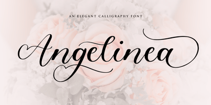 Angelinea is an Elegant Calligraphy Font. Angelinea is perfect for product packaging, branding project, megazine, social media, wedding, or just used to express words above the background. Angelinea also multilingual support. Uppercase & Lowercase font Stylistic Alternates Ligatures Symbols & Punctuation OpenType Features. Enjoy the font, feel free to comment or feedback, send me PM or email.
 - Playful Koala by Reyrey Blue Std,
$12.00 Playful Koala is a cute and fun typeface. It's hand-lettered with lots of love and made for the young at heart. Playful Koala will be perfect for books, greeting cards, logos, posters or anything that requires a fun and happiness look! Features : · All Uppercase and Lowercase · Number & Symbol · Supported Languages · Swash · PUA Encoded
 - Philomena Script by Letterhend,
$16.00 Philomena is a signature script that brings the classy and luxury look. The natural feel of the signature works perfect for those who needs a typeface for headline, logotype, apparel, invitations, branding, packaging, advertising etc. This font is comes in uppercase, lowercase, punctuation, symbols, numerals, stylistic set alternate, ligatures, etc., as well as multilingual support.
 - Gaillard by Jamalodin,
$16.00 Gaillard is a beautiful display font that is suitable for branding, wedding invitations, greeting cards, posters, name card, quotes, blog header, logo, fashion, apparel, letter, stationery and other projects. Gaillard come with alternative Rough Variations. Uppercase & Lowercase International Language & Symbols Support Punctuation & Number PUA Unicode Range Standard Stylistic Alternates Stylistic Set Character Variant Contextual.
 - Truens by Seventh Imperium,
$15.00 Truens is a vintage display typeface. It's an all uppercase serif font collection with a Script font that was inspired by the look and feel of old serifs. Truens features include badges, ornaments, catchwords, and Multiple Language Support. This fonts is very versatile, all the styles work well together and can look authentically vintage.
 - Armont by HansCo,
$15.00 Armont is a Vintage typeface font, it will add an old-time charm to any design project. This collection of font is perfect for everything your project with vintage, retro, wild or organic style. Features : Uppercase & Lowercase ( in All Caps ) Numbers & Punctuation Multilingual Alternate character & ornament How to access alternate / ornament ? : https://hanscostudio.com/tutorial/ Enjoy!
 - Olbrich Display NF by Nick's Fonts,
$10.00Based on lettering on a poster for an 1907 art exhibition by Joseph Maria Olbrich. Use uppercase characters for headlines, and lowercase letters for text use. For “dotted” spaces, use the underscore, and brackets or braces for framing characters. Both versions of the font include 1252 Latin, 1250 CE (with localization for Romanian and Moldovan). - Hook Eyes by HIRO.std,
$14.00 Hook Eyes is Display Font This font describes about funny, dynamic, selling, sale, humanist, easy going, and easy to use. FEATURES - Uppercase letters - Numbering and Punctuations - PUA Encoded Characters - Multilingual Support - Works on PC or Mac USE Hook Eyes works great in titles, sale campaign, product packaging, brand, poster, print, etc. Enjoy using! Thanks. HIRO.std
 - Rhinegold by Graptail,
$15.00 Rhinegold is a font display is made by hand, inspired by classic posters. Rhinegold comes with uppercase, lowercase, numerals, punctuations and so many variations on each characters include opentype alternates, common ligatures and also additional swash to let you customise your designs. Perfect to use for Logotype, Letterhead, Poster, Apparel Design, Label and etc.
 - Beauty Handwriting by Nirmana Visual,
$22.00 Beauty Handwriting is a Natural handwriting modern calligraphy font. full set of lowercase and uppercase letters, numerals and punctuation, multilingual symbols, lowercase beginning and ending swashes. 80 ligatures giving realistic hand-lettered style. Beauty Handwriting offers beautiful typographic harmony for a diversity of design projects, including logos & branding, social media posts, advertisements & product designs.
 - GALACTICOS by Sensatype Studio,
$15.00 Champione Modern Athletic Sport Font is a a Modern Futuristic Sport Font that stylish, fancy and unique characters are ready for Sport event What's Included: Character set A-Z All Uppercase Numerals & Punctuation Accented Characters (West Europe) Stylistic alternates Works on PC & Mac Recommended using Adobe Illustrator or Adobe Photoshop. Wish you enjoy our font. :)
 - October Sweets by Chekart,
$17.00 October Sweets is a terribly playful and creepy font. It comes with all caps uppercase and lowercase characters, a set of punctuation marks, numbers, Cyrillic characters, an alternative set of characters and numbers, ligatures and multilingual support. Ideal for Halloween parties, horror film festivals, product packaging, T-shirts, book covers, quotes, posters, branding projects, etc.