10,000 search results
(0.126 seconds)
- Tahu Bullats by HansCo,
$15.00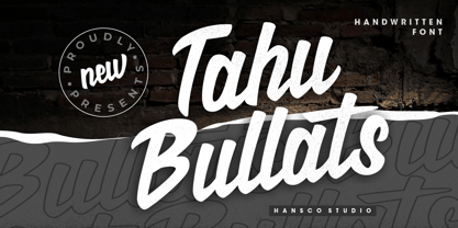 Tahu Bullats a Handwriting typeface. Tahu Bullats is a bold and fun typeface with many ligatures and alternates. Comes with a full uppercase, lowercase, numbers and punctuation + standard multilingual support. It’s great for branding, logo designs, lettering, logotype, clothing, posters, magazines, and much more. We recommend using Adobe Illustrator or Photoshop.
 - Mooono by Drawwwn,
$20.00 Mooono is retro futuristic monospaced font. The bright side (uppercase) is straight and to the point but the dark side (lowercase) is fat and funky. Mix up the upper and lower to create some serious spaced out vibes. I only saw the crescent, you'll see the whole of the mooono!
 - Blah Blah Upper by Comicraft,
$49.00 Because You Demanded It! The Collectors Item Classic BLAH BLAH BLAH makes a triumphant return as an all-uppercase comic book lettering workhorse. Complete with auto-ligatures and our groundbreaking Crossbar I Technology, to put that sneaky & enigmatic character exactly where it belongs! Includes full sets of Western & Central European accents.
 - Gremio by Rillatype,
$15.00 Introducing Gremio, Gremio is a modern logo font that made to fullfill your modern logo needs! simply mix and match the uppercase and lowercase to make an instant modern logo look with ease. Gremio also comes with slanted version to give you more option. This font also comes with multilingual support.
 - Futuristic Ballad by Chekart,
$17.00 Futuristic Ballad is a modern, stylish and elegant font. It comes with uppercase and lowercase characters, a set of punctuation marks, numbers, Cyrillic characters, an alternative set of latin and cyrillic, ligatures and multilingual support. This font is suitable for use in future technology projects, branding, logos, posters, product packaging, etc.
 - Dry Billow S by Tadiar,
$13.00 DryBillows Font is unusual decorative font carefully designed and well looking with Latin Extended character set. It is good for Text and Headers with lowercase and uppercase letters both! DryBillows ideally works in luxury, fashion, cosmetics, wine and food areas. Please see the large preview images to see how it works.
 - Display Art Two by Gerald Gallo,
$20.00 Display Art Two is a display font inspired by the art nouveau fonts popular at the turn of the 20th century. It is not intended for text use. It was designed specifically for display, headline, logotype, branding, and similar applications. Display Art Two has an uppercase alphabet, numbers, and punctuation.
 - Display Art Three by Gerald Gallo,
$20.00 Display Art Three is a display font inspired by the art nouveau fonts popular at the turn of the 20th century. It is not intended for text use. It was designed specifically for display, headline, logotype, branding, and similar applications. Display Art Three has an uppercase alphabet, numbers, and punctuation.
 - Displatter by Sronstudio,
$15.00 Displatter is a natural hand-brushed font, this font is perfect for logo, invitation, stationery, wedding designs, social media posts, advertisements, product packaging, product designs, label, photography, watermark, special events or anything. Displatter comes with full set of uppercase and lowercase letters, multilingual symbols, numerals, punctuation and ligatures. Thank You, Sronstudio
 - Brandon Selection by Yoga Letter,
$16.00 "Brandon Selection" is two fonts that collaborate to become an elegant and modern duo font. This font is a combination of serif and monoline fonts that collaborate to become an elegant font. Equipped with uppercase, lowercase, numerals, punctuation, and multilingual support. It is suitable for logos, businesses, branding, banners, and more.
 - Heart Strings by Seemly Fonts,
$12.00 Heart Strings, a charming and warm handwritten font, brings a delightful touch to designs centered around Valentine's Day. Its simplicity and distinctive style make it a perfect match for a wide range of creative projects. Let your imagination run wild—there's no limit to the sweetness this font can add! Uppercase
 - Goldbrick by Sarid Ezra,
$15.00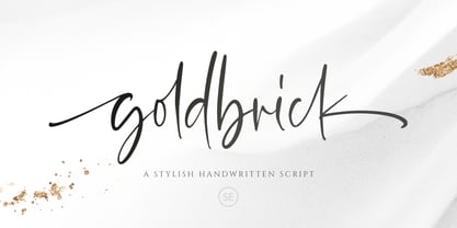 Goldbrick Script is a natural handwritten script that contains lowercase, uppercase, symbol, and also multi-lingual support. Comes with ligature, contextual alternates, stylistic alternates, also initial and terminal swash. Goldbrick Script is suitable for logo branding, beautiful fashion design, suitable for wedding invitation, or handwritten quote. It is already PUA Encoded.
 - Playcute by Patria Ari,
$15.00 Introducing, Playcute - a fun kids display typeface with solid shapes but still fun. With uppercase and lowercase option, you can play different glyph shapes to get the best combination. With this font, you can use it for book and magazine cover, social media, headline, logo, digital products, and more. Thank You!
 - Roselyn by Calamar,
$20.00 Roselyn Script is an elegant calligraphic font that will look awesome on wedding and event stationery, logos and branding materials, cards and so on. Roselyn Script includes Uppercase and Lowercase Latin Basic Characters, Numbers and Punctuation. Also the font contains ligatures and stylistic alternates to perfectly re-create natural calligraphy.
 - Lance Corporal NF by Nick's Fonts,
$10.00This font was inspired by Arts and Crafts lettering found on the cover of the Austrian journal Ver Sacrum (Sacred Spring), 1898. Primarily an uppercase-only font, there are several variants in lowercase positions. Both versions of the font include 1252 Latin, 1250 CE (with localization for Romanian and Moldovan). - Minimal by Kmaz,
$10.00 Minimal is a distinguished sans serif display family with minimalistic modern edges, designed by Khalid Al-Mazrouei and published by Kmaz. Minimal packs a complete set of uppercase and lowercase letters, numbers and punctuation and comes in 3 weights (Thin, Regular, and Bold). Perfect for headlines, magazines, and much more.
 - Biliner Meclan by madeDeduk,
$16.00 Biliner Meclan is a Minimalist Sans, use this font for any branding, product packaging, invitation, fashion, label, poster, logo etc. Feature Uppercase & Lowercase Number & Symbol International Glyphs Multilingual support Alternative Ligature Feel free to drop us a message any time and follow my shop for upcoming updates Hope you enjoy it.
 - CA Rusty Nail by Cape Arcona Type Foundry,
$19.00 Rusty Nail is a carefully hand-made uppercase only typeface with a full Central European character set which comes in two styles, Regular & Bold. It was created for a liquor company where hand-made letters were part of the corporate design. It’s perfect for labels or lettering with a "used look".
 - JAF Zalamander by Just Another Foundry,
$42.00 Blackletter, sans serif, graffiti, constructivism: all these influences are combined into a lively and dynamic – and somehow “disobedient” – typeface. Since blackletter fonts typically don’t look great when used in all-caps, Zalamander comes with a special Caps version that contains letter variants that combine nicely in uppercase. All fonts support Cyrillic.
 - Mono Polz by Four Lines Std,
$15.00 "Mono Polz" takes its inspiration from the zany and eccentric world of cartoons. Every letter is an explosion of creativity, with bold lines and playful shapes that'll make your designs pop right off the page. It's the perfect font to add a touch of comic mischief to your projects. - Uppercase
 - Dripping Drops by Prioritype,
$25.00 Inspired by paint dripping and combined with the graffiti artist culture, this font is both eye-catching and character. You can use them in your designs such as posters, skateboard boards, merchandise, music covers, t-shirts, music events etc. Features: -Uppercase -Lowercase -Numeral -Punctuation -Multilingual -PUA Encoded -Opentype Features Thanks.
 - Alchemia Decorative by Struvictory.art,
$19.00 ALCHEMIA is a modern sans serif font with mystical motives. The font is created in classic proportions and decorated with celestial and boho decor. ALCHEMIA is represented by sans serif lowercase and ornate uppercase. The font is suitable for the design on the theme of astrology, mysticism, spirituality, witchcraft, magic, esotericism.
 - Smart Casual by Scholtz Fonts,
$21.00 The name "Smart Casual" says it all. This is the font to use when you want to create that smart impression without being too formal. It is based on the font "Black Tie" but it is less formal than "Black Tie". It conveys an impression of relaxed elegance without being either sloppy or too intimate. Smart Casual is ideal for invitations to stylish but relaxed events, for advertisements that are intended to create that special ambience, for posters and for announcements. Smart Casual has a full character set and has been carefully letter-spaced and kerned. It comes in two styles: Baseline and Staggered. In "Baseline" all characters refer to the same baseline (the lower part of the characters are in line), while in "Staggered" the capitals are placed lower than the lower case characters, creating a slightly more dramatic, yet formal and retro look.
 - Leuk by Wilton Foundry,
$29.00 The Dutch word “leuk" translates loosely to English as pleasant, jolly, funny, witty, clever, nice, sweet, kind, nice, amusing, entertaining, and funny. Leuk, the font, is a small, highly legible font with a witty, sociable personality that engages it’s readers. My challenge in designing Leuk was to find a unique feature to set apart the font without losing the fundamentals of type design. In the process of doing so, I created a virtual font “smile and wink” in the “o” upper and lowercase with integrated stencil-connecting strokes within the “a,e, k, z, o, ß” to reveal Leuk’s calligraphic roots. Legible and friendly, Leuk is designed for use in advertising, brochures, promotion, book cover design, packaging, and the like. The Leuk family consists of Leuk Light, Leuk Light Italic, Leuk Regular, Leuk Italic, Leuk Bold, Leuk Bold Italic, Leuk Black, Leuk Black Italic in Opentype format.
 - Costanera by W Type Foundry,
$29.00 Costanera is a neohumanist typeface with both soft strokes and endings, which is inspired by 90s typefaces. It has an organic aspect and curved finials associated to the early calligraphy, while its straight angles give Costanera a technological and futuristic impression. Costanera weights go from thin to black, thus it can be used in short-impact phrases ideally using Black or Thin weight and extensive texts selecting the Book version. On the other hand, due to its calligraphic-futuristic features Costanera is perfectly suitable for different fields, such as vanguard technology, architecture, and signage topics. This typeface is composed of a Normal and Alternative version, adding 32 weights in total. Stylistic sets, small caps, ligatures, lining and old style numbers, fractions, circle numbers and arrows are part of the Opentype features. Moreover, this project comes with 790 glyphs that allows to write in 219 languages.
 - Informative by Latinotype,
$39.00 Informative is a typeface consisting of a whole family of sans fonts and a collection of thematic pictograms. This combination of two different types of communication reflects the current need for using text and images as means of conveying information in a complementary way. The family comes with a text version of 7 weights (with matching italics)—Thin, Light, Regular, Medium, SemiBold, Bold and Black, and includes 7 thematic icons sets which allude to elements related to alimentation, city, energy, people, politics, sports and work. Each set contains 88 glyphs and includes both outline and black versions. The text font contains a set of 423 glyphs that support 207 different languages. Informative is a clean, simple and versatile typeface well-suited for a wide range of graphic design and visual communication projects. This font has especially been designed for infographics, maps and digital applications.
 - Roisty by IbraCreative,
$17.00 Roisty – A Black Display Sans Serif Typeface Roisty, a sleek and contemporary black display sans-serif typeface, exudes sophistication and modernity in its design. With clean lines and a bold, assertive presence, Roisty commands attention while maintaining readability. The sharp contrast between its thick strokes and thin lines creates a visually striking appearance, making it an ideal choice for headlines, logos, and other display purposes. The typeface’s timeless elegance, combined with its versatile nature, ensures that Roisty stands out in both digital and print mediums, embodying a perfect blend of classic refinement and cutting-edge aesthetics. Roisty is perfect for branding projects, logo, wedding designs, social media posts, advertisements, product packaging, product designs, label, photography, watermark, invitation, stationery, game, fashion and any projects. Fonts include multilingual support for; Afrikaans, Albanian, Czech, Danish, Dutch, English, Estonian, Finnish, French, German, Hungarian, Italian, Latvian, Lithuanian, Norwegian, Polish, Portuguese, Slovak, Slovenian, Spanish, Swedish.
 - Tes by Alien,
$60.00 The Tes family was designed specially for a limited-edition book about Nikola Tesla and Resonance Waves. It needed to be modern and complete for a multilingual version of the book.
 - Alfie by Monotype,
$29.99 Alfie™ is lively, friendly, inviting and easy on the eyes. What more could you want in a script? How about four flavors of the same design? Alfie Script is a delightful connecting script with a touch of comfortable elegance. Use it for everything from social announcements to headlines and packaging. Alfie Casual is a little more laid-back with letters standing on their own. It works great in short blocks of text copy, subheads and navigational links. Alfie Informal has spirited serifs and its own demeanor, while Alfie Small Caps does a fine job of supporting its other siblings. There’s an immediacy to words and messages set in these lighthearted confections. Jim Ford was practicing drawing with a new brush pen when the inspiration for Alfie came to him. He had filled several pages in a notebook with letters and, at one point, realized that there might be a typeface among them. As it turned out, there were four. The process, however, wasn’t choosing one design and modifying it. The makings of all the designs were on the pages. It was just a matter of culling out the right collection of characters to build the foundations for the four flavors of Alfie. Because they share the same family roots, each design in the Alfie family can be paired and intermixed. Ford admits that there’s a hint of Emil Klumpp’s 1950s Murray Hill typeface (https://www.myfonts.com/fonts/bitstream/murray-hill/) in the Alfie family. Just enough to give the design a 50s vibe. (Some fashions never go out of style.)
 - Times Eighteen by Linotype,
$29.00In 1931, The Times of London commissioned a new text type design from Stanley Morison and the Monotype Corporation, after Morison had written an article criticizing The Times for being badly printed and typographically behind the times. The new design was supervised by Stanley Morison and drawn by Victor Lardent, an artist from the advertising department of The Times. Morison used an older typeface, Plantin, as the basis for his design, but made revisions for legibility and economy of space (always important concerns for newspapers). As the old type used by the newspaper had been called Times Old Roman," Morison's revision became "Times New Roman." The Times of London debuted the new typeface in October 1932, and after one year the design was released for commercial sale. The Linotype version, called simply "Times," was optimized for line-casting technology, though the differences in the basic design are subtle. The typeface was very successful for the Times of London, which used a higher grade of newsprint than most newspapers. The better, whiter paper enhanced the new typeface's high degree of contrast and sharp serifs, and created a sparkling, modern look. In 1972, Walter Tracy designed Times Europa for The Times of London. This was a sturdier version, and it was needed to hold up to the newest demands of newspaper printing: faster presses and cheaper paper. In the United States, the Times font family has enjoyed popularity as a magazine and book type since the 1940s. Times continues to be very popular around the world because of its versatility and readability. And because it is a standard font on most computers and digital printers, it has become universally familiar as the office workhorse. Times™, Times™ Europa, and Times New Roman™ are sure bets for proposals, annual reports, office correspondence, magazines, and newspapers. Linotype offers many versions of this font: Times™ is the universal version of Times, used formerly as the matrices for the Linotype hot metal line-casting machines. The basic four weights of roman, italic, bold and bold italic are standard fonts on most printers. There are also small caps, Old style Figures, phonetic characters, and Central European characters. Times™ Ten is the version specially designed for smaller text (12 point and below); its characters are wider and the hairlines are a little stronger. Times Ten has many weights for Latin typography, as well as several weights for Central European, Cyrillic, and Greek typesetting. Times™ Eighteen is the headline version, ideal for point sizes of 18 and larger. The characters are subtly condensed and the hairlines are finer. Times™ Europa is the Walter Tracy re-design of 1972, its sturdier characters and open counterspaces maintain readability in rougher printing conditions. Times New Roman™ is the historic font version first drawn by Victor Lardent and Stanley Morison for the Monotype hot metal caster." - Times Europa LT by Linotype,
$29.99In 1931, The Times of London commissioned a new text type design from Stanley Morison and the Monotype Corporation, after Morison had written an article criticizing The Times for being badly printed and typographically behind the times. The new design was supervised by Stanley Morison and drawn by Victor Lardent, an artist from the advertising department of The Times. Morison used an older typeface, Plantin, as the basis for his design, but made revisions for legibility and economy of space (always important concerns for newspapers). As the old type used by the newspaper had been called Times Old Roman," Morison's revision became "Times New Roman." The Times of London debuted the new typeface in October 1932, and after one year the design was released for commercial sale. The Linotype version, called simply "Times," was optimized for line-casting technology, though the differences in the basic design are subtle. The typeface was very successful for the Times of London, which used a higher grade of newsprint than most newspapers. The better, whiter paper enhanced the new typeface's high degree of contrast and sharp serifs, and created a sparkling, modern look. In 1972, Walter Tracy designed Times Europa for The Times of London. This was a sturdier version, and it was needed to hold up to the newest demands of newspaper printing: faster presses and cheaper paper. In the United States, the Times font family has enjoyed popularity as a magazine and book type since the 1940s. Times continues to be very popular around the world because of its versatility and readability. And because it is a standard font on most computers and digital printers, it has become universally familiar as the office workhorse. Times™, Times™ Europa, and Times New Roman™ are sure bets for proposals, annual reports, office correspondence, magazines, and newspapers. Linotype offers many versions of this font: Times™ is the universal version of Times, used formerly as the matrices for the Linotype hot metal line-casting machines. The basic four weights of roman, italic, bold and bold italic are standard fonts on most printers. There are also small caps, Old style Figures, phonetic characters, and Central European characters. Times™ Ten is the version specially designed for smaller text (12 point and below); its characters are wider and the hairlines are a little stronger. Times Ten has many weights for Latin typography, as well as several weights for Central European, Cyrillic, and Greek typesetting. Times™ Eighteen is the headline version, ideal for point sizes of 18 and larger. The characters are subtly condensed and the hairlines are finer. Times™ Europa is the Walter Tracy re-design of 1972, its sturdier characters and open counterspaces maintain readability in rougher printing conditions. Times New Roman™ is the historic font version first drawn by Victor Lardent and Stanley Morison for the Monotype hot metal caster." - Times Ten by Linotype,
$40.99In 1931, The Times of London commissioned a new text type design from Stanley Morison and the Monotype Corporation, after Morison had written an article criticizing The Times for being badly printed and typographically behind the times. The new design was supervised by Stanley Morison and drawn by Victor Lardent, an artist from the advertising department of The Times. Morison used an older typeface, Plantin, as the basis for his design, but made revisions for legibility and economy of space (always important concerns for newspapers). As the old type used by the newspaper had been called Times Old Roman," Morison's revision became "Times New Roman." The Times of London debuted the new typeface in October 1932, and after one year the design was released for commercial sale. The Linotype version, called simply "Times," was optimized for line-casting technology, though the differences in the basic design are subtle. The typeface was very successful for the Times of London, which used a higher grade of newsprint than most newspapers. The better, whiter paper enhanced the new typeface's high degree of contrast and sharp serifs, and created a sparkling, modern look. In 1972, Walter Tracy designed Times Europa for The Times of London. This was a sturdier version, and it was needed to hold up to the newest demands of newspaper printing: faster presses and cheaper paper. In the United States, the Times font family has enjoyed popularity as a magazine and book type since the 1940s. Times continues to be very popular around the world because of its versatility and readability. And because it is a standard font on most computers and digital printers, it has become universally familiar as the office workhorse. Times™, Times™ Europa, and Times New Roman™ are sure bets for proposals, annual reports, office correspondence, magazines, and newspapers. Linotype offers many versions of this font: Times™ is the universal version of Times, used formerly as the matrices for the Linotype hot metal line-casting machines. The basic four weights of roman, italic, bold and bold italic are standard fonts on most printers. There are also small caps, Old style Figures, phonetic characters, and Central European characters. Times™ Ten is the version specially designed for smaller text (12 point and below); its characters are wider and the hairlines are a little stronger. Times Ten has many weights for Latin typography, as well as several weights for Central European, Cyrillic, and Greek typesetting. Times™ Eighteen is the headline version, ideal for point sizes of 18 and larger. The characters are subtly condensed and the hairlines are finer. Times™ Europa is the Walter Tracy re-design of 1972, its sturdier characters and open counterspaces maintain readability in rougher printing conditions. Times New Roman™ is the historic font version first drawn by Victor Lardent and Stanley Morison for the Monotype hot metal caster." - Times Ten Paneuropean by Linotype,
$92.99In 1931, The Times of London commissioned a new text type design from Stanley Morison and the Monotype Corporation, after Morison had written an article criticizing The Times for being badly printed and typographically behind the times. The new design was supervised by Stanley Morison and drawn by Victor Lardent, an artist from the advertising department of The Times. Morison used an older typeface, Plantin, as the basis for his design, but made revisions for legibility and economy of space (always important concerns for newspapers). As the old type used by the newspaper had been called Times Old Roman," Morison's revision became "Times New Roman." The Times of London debuted the new typeface in October 1932, and after one year the design was released for commercial sale. The Linotype version, called simply "Times," was optimized for line-casting technology, though the differences in the basic design are subtle. The typeface was very successful for the Times of London, which used a higher grade of newsprint than most newspapers. The better, whiter paper enhanced the new typeface's high degree of contrast and sharp serifs, and created a sparkling, modern look. In 1972, Walter Tracy designed Times Europa for The Times of London. This was a sturdier version, and it was needed to hold up to the newest demands of newspaper printing: faster presses and cheaper paper. In the United States, the Times font family has enjoyed popularity as a magazine and book type since the 1940s. Times continues to be very popular around the world because of its versatility and readability. And because it is a standard font on most computers and digital printers, it has become universally familiar as the office workhorse. Times™, Times™ Europa, and Times New Roman™ are sure bets for proposals, annual reports, office correspondence, magazines, and newspapers. Linotype offers many versions of this font: Times™ is the universal version of Times, used formerly as the matrices for the Linotype hot metal line-casting machines. The basic four weights of roman, italic, bold and bold italic are standard fonts on most printers. There are also small caps, Old style Figures, phonetic characters, and Central European characters. Times™ Ten is the version specially designed for smaller text (12 point and below); its characters are wider and the hairlines are a little stronger. Times Ten has many weights for Latin typography, as well as several weights for Central European, Cyrillic, and Greek typesetting. Times™ Eighteen is the headline version, ideal for point sizes of 18 and larger. The characters are subtly condensed and the hairlines are finer. Times™ Europa is the Walter Tracy re-design of 1972, its sturdier characters and open counterspaces maintain readability in rougher printing conditions. Times New Roman™ is the historic font version first drawn by Victor Lardent and Stanley Morison for the Monotype hot metal caster." - Times by Linotype,
$40.99In 1931, The Times of London commissioned a new text type design from Stanley Morison and the Monotype Corporation, after Morison had written an article criticizing The Times for being badly printed and typographically behind the times. The new design was supervised by Stanley Morison and drawn by Victor Lardent, an artist from the advertising department of The Times. Morison used an older typeface, Plantin, as the basis for his design, but made revisions for legibility and economy of space (always important concerns for newspapers). As the old type used by the newspaper had been called Times Old Roman," Morison's revision became "Times New Roman." The Times of London debuted the new typeface in October 1932, and after one year the design was released for commercial sale. The Linotype version, called simply "Times," was optimized for line-casting technology, though the differences in the basic design are subtle. The typeface was very successful for the Times of London, which used a higher grade of newsprint than most newspapers. The better, whiter paper enhanced the new typeface's high degree of contrast and sharp serifs, and created a sparkling, modern look. In 1972, Walter Tracy designed Times Europa for The Times of London. This was a sturdier version, and it was needed to hold up to the newest demands of newspaper printing: faster presses and cheaper paper. In the United States, the Times font family has enjoyed popularity as a magazine and book type since the 1940s. Times continues to be very popular around the world because of its versatility and readability. And because it is a standard font on most computers and digital printers, it has become universally familiar as the office workhorse. Times™, Times™ Europa, and Times New Roman™ are sure bets for proposals, annual reports, office correspondence, magazines, and newspapers. Linotype offers many versions of this font: Times™ is the universal version of Times, used formerly as the matrices for the Linotype hot metal line-casting machines. The basic four weights of roman, italic, bold and bold italic are standard fonts on most printers. There are also small caps, Old style Figures, phonetic characters, and Central European characters. Times™ Ten is the version specially designed for smaller text (12 point and below); its characters are wider and the hairlines are a little stronger. Times Ten has many weights for Latin typography, as well as several weights for Central European, Cyrillic, and Greek typesetting. Times™ Eighteen is the headline version, ideal for point sizes of 18 and larger. The characters are subtly condensed and the hairlines are finer. Times™ Europa is the Walter Tracy re-design of 1972, its sturdier characters and open counterspaces maintain readability in rougher printing conditions. Times New Roman™ is the historic font version first drawn by Victor Lardent and Stanley Morison for the Monotype hot metal caster." - Blessing and Struggle by Colllab Studio,
$7.00 Presenting Blessing and Struggle! A Spontaneous Handwritten Font with all-caps glyphs. This font made with the perfect combination of each character. You can combine with Extra to get a unique combination. It looks original and can be used for all your project needs. Each glyph has its own uniqueness and when meeting with others will provide dynamic and pleasing proximity. This font can be used at any time and in any project. You can see in the presentation picture above, Blessing and Struggle looks unique and authentic style on design projects. So, Blessing and Struggle can't wait to give its touch to all your design projects such as quotes, poster design, personal branding, promotional materials, website, logotype, product packaging, etc. WHAT'S INCLUDED? 1. Blessing and Struggle Regular • The first version comes with uppercase, lowercase, ligatures, numeral, punctuation, symbols, and Standard Latin Multilingual Support (Afrikaans, Albanian, Catalan, Danish, Dutch, English, French, German, Icelandic, Indonesian, Italian, Malay, Norwegian, Portuguese, Spanisch, Swedish, Zulu, and More). 2. Blessing and Struggle Slant • The first version comes with uppercase, lowercase, ligatures, numeral, punctuation, symbols, and Standard Latin Multilingual Support (Afrikaans, Albanian, Catalan, Danish, Dutch, English, French, German, Icelandic, Indonesian, Italian, Malay, Norwegian, Portuguese, Spanisch, Swedish, Zulu, and More). 3. Blessing and Struggle Slant Bold • The first version comes with uppercase, lowercase, ligatures, numeral, punctuation, symbols, and Standard Latin Multilingual Support (Afrikaans, Albanian, Catalan, Danish, Dutch, English, French, German, Icelandic, Indonesian, Italian, Malay, Norwegian, Portuguese, Spanisch, Swedish, Zulu, and More). 4. Blessing and Struggle Semi Bold • The first version comes with uppercase, lowercase, ligatures, numeral, punctuation, symbols, and Standard Latin Multilingual Support (Afrikaans, Albanian, Catalan, Danish, Dutch, English, French, German, Icelandic, Indonesian, Italian, Malay, Norwegian, Portuguese, Spanisch, Swedish, Zulu, and More). 5. Blessing and Struggle Minus Slant • The first version comes with uppercase, lowercase, ligatures, numeral, punctuation, symbols, and Standard Latin Multilingual Support (Afrikaans, Albanian, Catalan, Danish, Dutch, English, French, German, Icelandic, Indonesian, Italian, Malay, Norwegian, Portuguese, Spanisch, Swedish, Zulu, and More). 6. Extra Swashes • Included 7 Dingbats. You can feature all with typing c_1 until c_7 (in all versions) A Million Thanks Colllab Studio
 - Bikol Mintz - Unknown license

- Bikerboys by Gassstype,
$27.00 Hello Everyone, introduce our new product Font Biker Boys This Is Hand Drawn Display Font.This is a Textured Natural Style and classy style with a clear style and dramatic movement. This font Biker Boys is great for your next creative project such as logos, printed quotes, invitations, cards, product.
 - Shrag Script by Open Window,
$- Shrag script is a brand new script from Open Window. It is finer than the model that won 35,00 friends. Originating from a fat marker drawing it's a comfortable font, fine performing in every minor detail. It is the embodiment of everything a fine handwritten script should be.
 - Mandarin Duck by Yasemin Varlik,
$10.00 Mandarin Duck is a very playful typeface where its design was inspired by the rare duck seen in New York once every year. The delicate tail of this duck creates the edges of the characters. It is bold and fun, a perfect typeface for children books and larger texts.
 - Gazardiel by Scriptorium,
$18.00Gazardiel is a decorative new script font with elaborate flourishes on the upper case characters, interlocking lower case and calligraphic-style weighting which creates a very attractive overall look. The upper case characters are quite complex, but still readable. It's an excellent font for invitations or other formal designs.
