10,000 search results
(0.023 seconds)
- Itoxina by FSdesign-Salmina,
$39.00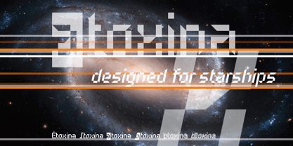 Itoxina is designed especially for the burgeoning market of starships and other space cruisers. Itoxina has been developed with the contribution of experts in navigation through space and time. The fonts are ideal for internal and external use (including zero-g and occasional bursts of cosmic rays), and with their simplified forms are expected to survive well in non-linear galaxies. With their unusual diagonal half-pixels the fonts are striking as abstract designs at astronomical sizes, where small text may be placed within the black holes formed inside the letters. On explicit suggestion of Mr. Spock true capital letters have been added.
 - Bosento by Gatype,
$12.00 Hi everyone, come back from us The Bosento font is perfect for Your projects today are branding, poster design, t-shirts, invitations, designs for children, and editorial design. You will find a lot of glyphs, including ligatures, to look elegant in this bold serif. OpenType features include style sets, character variants, starting and ending forms, and multilingual support. Important information: To access the alternatives, you must have access to an older version of Photoshop to copy/paste the glyphs from the included PSD, OR the Glyphs Panel, which can be found in Photoshop CC or any Version of Adobe Illustrator. Cheer!
 - Karsten by Nasir Udin,
$25.00 The first development of Karsten typeface was inspired by signs on some old Dutch-buildings in Java. Then in the making, it blends with modern style. It's a synthesis between two cultures, the East & the West. The typeface was named after the Dutch architect who gave major contributions to architecture and town planning in Indonesia, Herman Thomas Karsten. It comes in nine weights from thin to black with matching italics. Its mixture of weights provide a wide range of styles that will help you find the best vibe for your projects, for headlines or a short paragraph. See the full presentation on Behance
 - Timernis by Aga Silva,
$19.99 Timernis is humanist multilingual contrast sans serif available in eight weights from thin to black. All caps have this super elegant, classic proportions old school look and is based on 1940 stone engraving commemorative plaque. The engraving itself boasted sophisticated clean look and was a joy to look at. All caps: Would suit display usage such as: signage, titles, headers, engravings, high end packaging. Do try putting space between the letters in your selected word for suave and chic feel. Expanded round shapes are prevalent in lowercase, which is legible in small sizes and pleasant to the eye.
 - Bucintoro by Three Islands Press,
$24.00Bucintoro is a modern version of the rotunda blackletter, the Gothic book hand of Italy and Spain in the 14th, 15th, and 16th centuries. As the name implies, it's more "rotund" than the tall, angular Textur blackletter used in Germany that Gutenberg imitated. While the use of blackletter continued far into the 20th century in Germany and Scandinavia, the rotunda gave way to roman (and later also italic) letterforms in Italy, France, and Spain. It's less well known these days. Bucintoro has upper- and lowercase alphabets, numerals, punctuation, diacritics but lacks such modern characters as currency symbols. Has light, medium, and black weights. - XPawnShop by Ingrimayne Type,
$5.00 XPawnShop is a typographical chess font; the pieces are letters. The Pawn is an awkward letter P, the knight is a horse in the shape of an h, the bishop is a decorative letter B, the rook is an elephant with an R shape, the queen is a Q, and the king is an ornate K. Two other XPawnShop fonts are made of very simple pieces, but as a bonus, both have the set of dominoes from the unicode block 1F030 to 1F093. The key layout is a bit complicated; see the key guide for detailed information on how to position pieces correctly.
 - Darwin Pro by Los Andes,
$26.00 Darwin Pro, the sequel to Darwin, is ready to leave port and start new adventures. The font was redrawn, the language support was extended and a new set of figures was added. Darwin Pro comes in 7 weights plus italics and includes alternative characters available as an OpenType feature as well as oldstyle figures, numerators and denominators.
 - Buwah by Twinletter,
$15.00 Our Arabic style Buwah font is a modern and luxurious style to add a new dimension to your design projects. It’s ideal for magazine covers or packaging projects, or even business cards or logo designs. It’s also great for web designers looking to add something new to their portfolio or give their clients a unique experience.
 - Old Trail JNL by Jeff Levine,
$29.00 An image of an antique metal marking stencil [circa late 1890s or early 1900s] reading “Folck’s Roller Mills #196 New Surprise manufactured by Wolfe Brothers, Cumberland, MD” had the words “New Surprise” rendered in a Western/Victorian typeface. Those letters served as the model for Old Trail JNL, which is available in both regular and oblique versions.
 - Pirate - Unknown license

- H74 Le Venom by Hydro74,
$25.00 Hell Fire is a hybrid of traditional early sign painters block and a hint of urban modern day culture.
 - Grotesk Remix by bb-bureau,
$65.00 GroteskRemix — remix of a Grotesk typeface in 6 styles (thin - light - regular - medium - bold - black) language: all latin glyphs
 - DragonFyre by Scholtz Fonts,
$21.00 Beware: Here be Dragons! It Be Dangeroues to Venture Yonder! This warning, inscribed on a rock at the entrance of a cave in an inaccessible mountain in the far north of Scotland, provided the inspiration for the font DragonFyre. While I have not seen the actual rock myself, I have based the font on an accurate drawing of the original inscription. DragonFyre speaks of lands beyond our ken, of wistful faerie kingdoms, of dark happenings and white magic. Use it at your peril, for its very use will conjure up worlds long forgotten, places of faeries, elves and hobgoblins, of ogres and giants. Those who read texts written in this font may well have their lives strangely changed. I have included a complete character set of 242 characters; upper and lower case; as well as all accented and special characters. All characters have been carefully letterspaced and kerned. For maximum dramatic impact I suggest you use combinations of both upper- and lower-case characters.
 - Kubrick by Quadrat,
$25.00 Kubrick is an experiment in extremes. The Light font is very tall and slender, the Black font is very massive, and Kubrick's slender counters push some of its glyphs to the edge of recognition. The thin counters and negative spaces also give text set in Kubrick a definite visual sparkle, especially in all-uppercase settings. Because of its extreme letterforms, Kubrick is recommended only for large display use. The default letterspacing is set fairly wide to keep text legible. Kubrick was a double-experiment. One part of it was to see how heavy and massive a typeface I could make while still keeping it legible. The other part was to develop a Multiple Master font. Multiple Master fonts were a format developed by Adobe that allowed the user to change things like the weight and width of a typeface. Monollith started as just such a Multiple Master typeface, but when Adobe discontinued the Multiple Master format, I stopped work on the typeface. Later I decided to continue work on it, but as five separate font weights: Light, Medium, Bold, ExtraBold and Black. Very rectilinear letterforms with extremely narrow counters and negative spaces. The five fonts go from very thin and condensed to very heavy and extended. Use in large display settings where unornamented high visual impact is desired.
 - Bowling Script by Sudtipos,
$69.00 There is plenty of lyric and literature about looking over one's shoulder in contemplation. What would you have done differently if you knew then what you know now? This is the kind of question that comes out of nowhere. When it does and whether its context is personal or professional make very little difference. It's a question that can cause emotions to rise and passions to run hot. It can trigger priority shifts and identity crises. It's never easy to answer. Three years ago, I published a font called Semilla. My aim with that was to distill the work of Bentele, a lettering artist from early 1950s Germany. Picking such an obscure figure back then was my way of pondering the meaning and efficiency of objectivity in a world where real human events and existences are inevitably filtered through decades of unavoidably subjective written, printed and oral history. And maybe to pat myself on the back for surviving surprises mild and pleasant. Having been fortunate enough to follow my professional whims for quite some time now, I took another, longer look at my idea of distilling Bentele's work again. I suppose the concepts of established history and objectivity can become quite malleable when personal experience is added to the mix. I say that because there I was, three years later, second-guessing myself and opining that Bentele's work can be distilled differently, in a manner more suited to current cultural angles. So I embarked on that mission, and Bowling Script is the result. I realize that it's difficult to reconcile this soft and happy calligraphic outcome with the introspection I've blathered about so far, but it is what is. I guess even self-created first world problems need to be resolved somehow, and the resolution can happen in mysterious ways. Bowling Script is what people who like my work would expect from me. It's yet another script loaded with all kinds of alternation, swashing and over-the-top stuff. All of that is in here. These days I think I just do all that stuff without even blinking. But there are two additional twists. The more noticeable one is ornamental: The stroke endings in the main font are of the typical sharp and curly variety found in sign painting, while the other font complements that with ball endings, sometimes with an added-on-afterwards impression rather than an extension of the actual stroke. In the philosophical terms I was mumbling earlier, this is the equivalent of alternate realities in a world of historical reduxes that by their very nature can never properly translate original fact. The second twist has to do with the disruption of angular rhythm in calligraphic alphabets. Of course, this is the kind of lettering where the very concept of rhythm can be quite flexible, but it still counts for something, and experimenting with angular white space in a project of a very dense footprint was irresistible. After playing for a bit, I decided that it would interesting to include the option of using optically back-slanted forms in the fonts. Most scripts out there, including mine, have a rhythm sonically comparable to four-to-the-floor club beats. So the weirdly angled stuff here is your chance to do the occasional drumroll. Everyone knows we need one of those sometimes. Bowling Script and Bowling Script Balls fonts comes with 1600 characters and features extended Latin-based language support. There are also a basic version of both fonts without all the alternates and extra OpenType features. Bowling family ships in cross-platform OpenType format. We also want to present “Mute”, a visual essay narated by Tomás García and Valentín Muro, about digital life created specially to introduce Bowling Script.
 - Ardagh by SIAS,
$44.90 Ardagh is the younger ›Irish brother‹ of Arthur Sans. I thought it was about time for a new Art-Deco exercise in Irish type. Ardagh will adorn your title settings and headings, ennoble a new menu card, festivity invitation or label design. For a perfect combination with other languages in mixed settings, go to the Arthur Sans or Arthur Cabinet series. Ardagh matches Arthur Sans Medium and Arthur Cabinet Diamond, Onyx, Pearl and Timber in proportions and stroke weight. • Please note that ARDAGH is a capitals-only product! For more new wonderful Irish fonts look at Andron Gaeilge and Hibernica!
 - Viable Logic by Twinletter,
$12.00 Viable Logic font, has a neat and clean character new face sans serif fonts, in response to the need for innovative and new designs, for that this sans serif font family has different characters namely bold, thin and regular. This font is simple yet neat and elegant, the design of this typeface gives it a clean, modern look and a unique style to help give it a captivating look when you use it. This font is perfect for strong text with displays for a wide variety of branding, advertising, posters, banners, packaging, news headlines, magazines, websites, logo design, and more.
 - DINfun Pro Grunge by CheapProFonts,
$10.00 A collection of DIN Mittelschrift variants with some typical grunge style treatments. The Plain font is included if you buy the family pack, and can be mixed in. The DINfun Pro fonts are special versions of the classic DIN 1451 Mittelschrift, far removed from the original typeface's serious and no-nonsense roots. I have made them as companions to the classic, with some some very different expressions, complete with a large multilingual character set. Time to spice up that DIN profile! :) ALL fonts from CheapProFonts have very extensive language support: They contain some unusual diacritic letters (some of which are contained in the Latin Extended-B Unicode block) supporting: Cornish, Filipino (Tagalog), Guarani, Luxembourgian, Malagasy, Romanian, Ulithian and Welsh. They also contain all glyphs in the Latin Extended-A Unicode block (which among others cover the Central European and Baltic areas) supporting: Afrikaans, Belarusian (Lacinka), Bosnian, Catalan, Chichewa, Croatian, Czech, Dutch, Esperanto, Greenlandic, Hungarian, Kashubian, Kurdish (Kurmanji), Latvian, Lithuanian, Maltese, Maori, Polish, Saami (Inari), Saami (North), Serbian (latin), Slovak(ian), Slovene, Sorbian (Lower), Sorbian (Upper), Turkish and Turkmen. And they of course contain all the usual "western" glyphs supporting: Albanian, Basque, Breton, Chamorro, Danish, Estonian, Faroese, Finnish, French, Frisian, Galican, German, Icelandic, Indonesian, Irish (Gaelic), Italian, Northern Sotho, Norwegian, Occitan, Portuguese, Rhaeto-Romance, Sami (Lule), Sami (South), Scots (Gaelic), Spanish, Swedish, Tswana, Walloon and Yapese.
 - Visitor BRK Ten Pro by CheapProFonts,
$10.00 This is the first true pixel-font released by CheapProFonts. It may not be the first font based on a 5x5 pixel grid, but it probably has the best language support. The glyphs have all been optimized for Flash (by making the pixel shapes slightly overlapping) and should render sharp and perfect when set in 10px size (or multitudes of 10). As with all pixelfonts: make sure to place the text at coordinates with whole numbers, and always use left (and NEVER centered) alignment. ALL fonts from CheapProFonts have very extensive language support: They contain some unusual diacritic letters (some of which are contained in the Latin Extended-B Unicode block) supporting: Cornish, Filipino (Tagalog), Guarani, Luxembourgian, Malagasy, Romanian, Ulithian and Welsh. They also contain all glyphs in the Latin Extended-A Unicode block (which among others cover the Central European and Baltic areas) supporting: Afrikaans, Belarusian (Lacinka), Bosnian, Catalan, Chichewa, Croatian, Czech, Dutch, Esperanto, Greenlandic, Hungarian, Kashubian, Kurdish (Kurmanji), Latvian, Lithuanian, Maltese, Maori, Polish, Saami (Inari), Saami (North), Serbian (latin), Slovak(ian), Slovene, Sorbian (Lower), Sorbian (Upper), Turkish and Turkmen. And they of course contain all the usual "western" glyphs supporting: Albanian, Basque, Breton, Chamorro, Danish, Estonian, Faroese, Finnish, French, Frisian, Galican, German, Icelandic, Indonesian, Irish (Gaelic), Italian, Northern Sotho, Norwegian, Occitan, Portuguese, Rhaeto-Romance, Sami (Lule), Sami (South), Scots (Gaelic), Spanish, Swedish, Tswana, Walloon and Yapese.
 - Valenteena by Ingrimayne Type,
$9.95 Valenteena is in the spirit of the 19th century, but there are no other typefaces quite like it. It is geometric, using distorted hearts to form the letters. The lower-case letters are smaller versions of the upper-case letters. The overlay variant is derived by breaking ValentinaContour into its parts: the inner letter, the white inner border, and the black outer border. To use them one must have a program that allows layers of letters. Type in and format the inside variant to get the message you want. Also select the color you want this layer to have. Copy this layer twice, formatting one to the medium and and the other to outside. Color each of them in the colors you want and them combine the three layers, placing them so the letters exactly align. You will get letters with three colors.
 - Oxford Press by Set Sail Studios,
$17.99 Recreate authentic letterpress typography with Oxford Press, a set of chunky uppercase Serif & Sans fonts designed using real vintage metal letterpress blocks sourced from old printing companies. The Serif & Sans fonts each have two variations, 'Clean' and 'Rough'—with the latter having real, highly detailed hand-made letterpress textures applied to each letter. Each letter of the 'Rough' fonts also has an alternate texture, which can be accessed simply by switching between upper and lowercase characters. The 'Rough' fonts can make a striking impact as bold header text for posters, adverts, prints and packaging, whereas the 'Clean' versions are more suited for smaller accompanying text, cleaner designs or for applying your own textures and styles. Language Support • English, French, Italian, Spanish, Portuguese, German, Swedish, Norwegian, Danish, Dutch, Finnish, Indonesian, Malay, Hungarian, Polish, Croatian, Turkish, Romanian, Czech, Latvian, Lithuanian, Slovak, Slovenian.
 - Brandon Grotesque by HVD Fonts,
$40.00 Brandon Grotesque is a sans serif type family of six weights plus matching italics. It was designed by Hannes von Döhren in 2009/10. Influenced by the geometric-style sans serif faces that were popular during the 1920s and 30s, the fonts are based on geometric forms that have been optically corrected for better legibility. Brandon Grotesque has a functional look with a warm touch. While the thin and the black weights are great performers in display sizes the light, regular and medium weights are well suited to longer texts. The small x-height and the restrained forms lend it a distinctive elegance. Brandon Grotesque is equipped for complex, professional typography. The OpenType fonts have an extended character set to support Central and Eastern European as well as Western European languages. Brandon Grotesque won the TDC2 Award, 2011.
 - Francker Paneuropean by Linotype,
$103.99Francker is a sans-serif typeface family based on clean and simple principles of design. The letterforms' curves are inspired by the "super ellipse," a mathematical shape that is about halfway between an ellipse and a rectangle. Francker's lowercase letters appear somewhat reduced, as the a, b, n and u have no spurs. The family is available in nine weights, from Extra Light to Extra Black. Excellent areas of use for Francker signage, posters, magazines, advertisements, or logos; wherever a timeless, modern look is needed. Francker's fonts have a large character set that includes all glyphs in Linotype's W1G specification (World Glyph Set 1). Proportional figures are available as alternatives to the tabular defaults, via an OpenType feature. The Francker type was developed designed by Anders Francker (b. 1972), an engineer and designer living in Denmark. - Love Said by CBRTEXT Studio,
$16.00Love Said is a beautiful and clean calligraphic script font. This font is suitable for wedding invitations, logos, and branding. Love Said has complete uppercase and lowercase letters. This font also has many alternative letters for more than 670 glyphs. Multilingual support is also available in this font. The following features are available: - Uppercase - Lowercase - Standard Ligatures - Alternates (ss01,ss02,ss03,ss04,ss05,ss06,ss07,ss08) - Contextual Alternates - Contextual Ligatures - Kerning Have this font now and make your project look beautiful and elegant. Thank you and have a nice day. - Twirrewyn by Hanoded,
$15.00 Twirrewyn is Frisian for ‘Whirlwind’. I have always liked the Frisian language; it’s like a crossover between English and Dutch. When I studied journalism in Zwolle (a city close to Fryslân) there were a lot of Frisian students and I did pick up a few words! Twirrewyn is a handmade font family: the fat version was made using a brush and ink; the light version was made using that same ink, but with a broken satay skewer instead of a brush. And yes, you have guessed right, we eat a lot of Satay! ;-)
 - Smorgasbord by TypeSETit,
$25.00 It’s an all occasion Smorgasbord in this collection of 17 fonts originally designed for the social expression industry— all ranging from juvenile/cute to masculine, to formal. Whether you want to send a nice note of thanks, or create a poster for a Renaissance Festival, you can find the right look in Smorgasbord. SAVE over 85%' when you purchase the entire Smorgasbord collection! The Smorgasbord collection is composed of fonts that have not been available for several years at MyFonts, but have been updated and improved to Professional standards.
 - Lilette by Elyas Beria,
$5.00 This elegant typeface came out of a quick, back-of-the-napkin, sketch I did for a different typeface. After toiling on that typeface I looked back at the sketch and realized that I had lost some of the elegance and playful character of my original sketch. So, it was back to the drawing board and Lilette was born. Lilette is fun but also serious. Playful but elegant. Personal yet also industrial. That’s the power of a slab serif. Perfect for magazine headlines, wedding invitations, signs, posters, slides, promotions, product design, branding, logos, and so much more. Make this versatile typeface with 10 styles yours.
 - Evanston Tavern by Kimmy Design,
$10.00 Evanston Tavern is a square typeface and the sans-serif version to Evanston Alehouse. Inspired by the years that prefaced the ratification of the American Prohibition, this typeface mimics the signage commonly seen outside of saloons, taverns and alehouses during that time. Back to the modern era, Evanston Tavern is more than just a vintage inspired typeface. It works in modern and futuristic settings with multiple styles, opentype alternatives and ornamentation. The family provides a robust 61 total fonts, within it's 3 styles of regular, stencil and inline. Each sub family includes 4 weights and 5 widths. It has special features that add depth to the typeface, with discretionary ligatures and stylistic alternatives. It also includes a complimentary set of ornaments, including a vintage graphic set from the era, as well as modern frames, borders and icons. This typeface works great at logos, packaging, and other display settings. Pair this font with Evanston Alehouse and have a great combination of serif and sans-serif square letterforms and a large array of ornaments! Here’s a snapshot of what you get with Evanston Tavern: - 3 Styles: Regular, Stencil and Inline - 4 Weights: Light, Regular, Medium and Black - 5 Widths: 1826 (condensed), 1846 ( narrow) 1858 (regular), 1893 (wide) and 1919 (expanded) - 2 capital Heights: Capitals and small caps - 2 Alternatives: Discretionary Ligatures and Stylistic Alternatives - 1 Ornaments font with over 100 graphic extras
 - Radioactive - Unknown license

- LDJ Squirrel Tracks by Illustration Ink,
$3.00If squirrels could write, chances are they would love to use this perky new font from Jillustration. - Rubba by MADType,
$19.00 Rubba was created using rub-on type to create completely new letterforms from the bits of others.
 - Raleigh Gothic by Red Rooster Collection,
$45.00Based on the ATF typeface by Morris F. Benton, circa 1934. Steve created two additional new weights. - København C by Fontpartners,
$35.00 New versions available of our FP København font family: København C. C for Condensed, C for City.
 - Range Gothic by BA Graphics,
$45.00A new gothic with the look for today. Available in 3 weights, universal, works for all applications. - Shore Bodoni by BA Graphics,
$45.00A Bold new re cut of Bodoni, designed with a more contemporary look. Also has matching Italic. - Billiboldy by Gie Studio,
$10.00 Are you planning to do an amazing piece of work to make lots of people smile happily while taking your hat off every time? If so, this is the right time to give your work a little touch with a sincere and elegant writing. Introducing Billiboldy- A New Bold Script Font Billiboldy is a cursive and thick lettered handwritten bold script font, crafted to give your headlines and logotype projects a stylish touch. This font reads as strong, dynamic and can add tons of nostalgic character to your designs. This font includes Multilingual Options to make your branding globally acceptable. Features: - Ligatures - Stylistic Sets - Multilingual Support - PUA Encoded - Numerals and Punctuation - Special underscore character 7 style - Special doodles for front and back of letters or sentences Thank you for your visit and downloading premium fonts from Gie Studio
 - American Auto by Miller Type Foundry,
$26.99 Hot Dogs, Apple Pie, Baseball and great TYPOGRAPHY are deeply rooted in American culture. American Auto is a Type Family that embodies that culture visually. It joins a robust workhorse sans with a playful script that brings you back to 70+ years ago, while at the same time remaining as contemporary as any new 2019 design. This unique pair work together in harmony to create wonderful designs for a variety of uses. From book covers to posters, web sites to apps, American Auto is an excellent choice to create striking designs that stand out from the crowd! American Auto also features many Opentype Features such as: Alternate Characters, Initial & Final Forms, Contextual Alternates, Old Style Figures, Lining Figures, Numerators & Denominators, Fractions, and more! This typeface has really been designed to meet any challenge that a designer can throw at it!
 - Brava Sans by Rafael Jordan,
$30.00 Brava Sans (the naked & extended version of Brava Slab ) is a family of 8 weights, 2 widths and true italics. Designed for editorial purpose, it has a monolinear appearance with a humanist construction, open counters and a tall “x height” that give it a right personality for use in branding. Also Brava Sans has a lot of helpful features as a wide range cover of Latin languages, a lot of OpenType features, a new condensed width and two bolder and cooler weights that make Brava Sans a useful tool for the graphic designer. A full range of numerals (included old style figures, lining, numerators, denominators, superiors, subs, circled and black circled), small caps, forty ligatures (between standard & discretionary ligatures), a lowercase superior and inferior set and a stylistic set are some of the features that makes Brava Sans a solid choice.
 - Bahar by Hurufatfont,
$29.00 Bahar was inspired by the playful-energetic nature of Cooper Black from Souvenir's soft but confident stance and was born from the idea of creating a new structure by blending this structure with calligraphic strokes. The title and body are presented in two sets for perfect results. Bahar has a wide variety of character alternatives to create the perfect and fun title. It offers calligraphic flavors with swashes, start-finish forms, and fun ligatures. Bahar Text is prepared for Body texts and offers a good reading experience. Does not include swash and style alternatives. Bahar consists of five weights, Bahar Text four, a total of nine weights, and 18 styles with true italics. For each weight, there is a complete set of open type features including ligatures, small caps, old-style and table numbers, and positional numbers.
 - Catesque by Gumpita Rahayu,
$20.00 After several months discovering and developing the traits and personalities well balanced typefaces such like Frutiger and the other identical typefaces, Catesque was born as the new typefaces. The vocal flourish yet harmonious shapes not purely geometrically, it has imperfect rounded characters such as “O” “C” and “G”. Catesque can make some distinctness for large scale design as well as small text. The traits versatilities usable for many design applications, it’s comes with five weights from light to black plus mathcing italics. All characters included the Tabular figures, case-sensitive forms, fractions, and another most common numerals features such as super & subscript to accomplish the numeric design works such like menu, annual reports, etc. The alternate characters are included as well, all features can accessed with OpenType-savvy programs on Adobe Creative Suite via OpenType Panel.

