10,000 search results
(0.722 seconds)
- MBF Amoniac by Moonbandit,
$17.00 Amoniac is a geometric modern minimalist sans serif display font. A fusion of artistic old world and the future, creating a unique contrast of new style. This typeface consist of 3 weight with optional alternate glyph. Pick your own style, rounded or sharp. perfect usage includes logo, poster, display, headline, t-shirt design and many more.
 - Ancora by FAEL,
$20.00 I’m happy to announce the complete version of Ancora, a typeface I designed back in 2013. Ancora is a sans serif typeface with a distinctive style, inspired by the imagery in the production of the famous Port wine, such as boats, barrels, grapes, and bottle labels. Use Ancora for magazines, packaging, posters, stamps, brands and logos a new taste.
 - Sintonia by Bosstypestudio,
$14.00 Sintonia is a modern calligraphy font with a dancing baseline and a clean, classic and elegant touch. It can be used for various purposes such as headings, signature, logos, wedding invitations, t-shirt, letterhead, signage, lable, news, posters, badges etc.Hello Bella Script features 350 total glyphs with 100 alternate characters including OpenType Stylistic alternates, ligatures and international language support.
 - Bellastory by HafisHidayat,
$20.00 Bellastory is a font that is intentionally made with hand strokes using a brush pen, so that it gets a natural texture, and produces beautiful fonts for your various designs, this font is suitable for cover books, magazines, logos, invitations, business cards, screen printing, product packaging, posters, invitations, greeting cards, news, blogs, everything including personal charm.
 - Hollandia by Typehead Studio,
$20.00 Introducing our new exploration Hollandia, another vintage-inspired font . Collected from many references such as vintage signage, logo, badges, and old fashioned graphics. Hollandia font made carefully crafted with a high ornamental taste. Hollandia is perfect for many display purposes. You can use this font for poster, label, logo, signboard, t-shirt, book cover, decoration, merchandise, and more.
 - Hickory by FontMesa,
$25.00Hickory is the revival of an old unnamed font dating back to 1852 and was sold through a few different type foundries including Bruce, MacKellar Smiths & Jordan and James Conner's Sons. By the year 1900 this font disappeared from the major type foundries, now with the digital age of type we're proud to revive this old classic font that hasn't been used in over one hundred years. The original font was only available as an uppercase with punctuation and an ampersand. Today the character set has been updated to include a new lowercase, numbers and accented characters for Eastern, Central and Western European countries. Three fill fonts have been created for the Hickory font making it easier for you to add different colors, textures and patterns to the letters. You will need an application that works in layers such as Adobe Photoshop or Illustrator in order to use the fill fonts, some fill fonts may look good as a stand alone font, the Hickory fill fonts however do not look good used apart from the Hickory main font. I hope you enjoy this old font as much as I did making it. - Wild Bunch by Hanoded,
$15.00 The Wild Bunch, also known as the Doolin–Dalton Gang, was a gang of outlaws that terrorized Kansas, Missouri, Arkansas, and Oklahoma Territory during the 1890s. They robbed banks, killed lawmen and held up trains. Of course its members were hunted down and 'wanted' posters, with that typical 'Wild West' font, appeared all over. Wild Bunch is a 'wanted poster' type font. It is an all caps font, but upper and lower case differ slightly. A set of alternate, non-eroded, glyphs for the lower case (including alternate numbers) completes this font.
 - Last Dance by Wing's Art Studio,
$10.00 Last Dance: Redux - The 80s Feel-Good Script Font - Updated! Welcome to Last Dance: Redux, a new and improved version of my popular brush-script font inspired by 80s movie posters, VHS covers and Friday nights at the video store! This hand-drawn script aims to capture the feel-good vibes of movie blockbusters that won our teenage imaginations, while serving as the go-to font for recreating this unique and nostalgic period. The original Last Dance font features a gritty, hand-drawn texture that looks equally at home on an aerobics competition poster or steamy urban thriller - making great titles that look distinctly cinematic. Last Dance: Redux takes that original design and strips it back to it’s bare essentials resulting in a clean, uniform look that improves letter flow and readability. It’s also much lighter on system resources making it the preferred choice when using extensively across print and web projects. Both versions come with upper and lowercase characters along with punctuation, numerals and language support, plus two full sets of alternatives and a selection of underlines. Check out the visuals to see it in action!
 - Aristide by Jonahfonts,
$29.95 There are many fonts inspired by Toulouse-Lautrec. I felt this one was needed and tried to get that loose brush-stroke appearance typical of Toulouse’s style of his famous French Cabaret posters. Aristide Bruant a dancer and comedian made famous by Lautrec’s posters can now be further immortalized with this font.
 - The Mighty Avengers - Personal use only

- Godzilla - Unknown license

- Nostra 2003 J - Unknown license

- Mido by Design Eva Wilsson,
$30.00 Mido is designed with the aim to recreate all the power of the early 19h century slab serifs, but without their geometric monotony. The ambition was to make a humanist slab serif that would function both in smaller sizes, as headlines, and poster size. Careful attention has been payed to the spaces within and inbetween letters – they show slight irregularities to create dynamic negative spaces, which in turn makes the letters sit solidly together as words and sentences. Mido is suitable for packaging, posters, book covers, identities and headlines, as well as type set in smaller sizes. It comes with both upper- and lower case figures. The typeface Mido is an ongoing design project of which the first font is now released.
 - Intramural JL - 100% free

- Spaghetti Western by Comicraft,
$19.00 If you're a man with no name and you like your Westerns a little more continental, we've got a Fistful of Fonts for you! Load up your guns with our dynamite new offering, SpaghettiWestern. Lip synch the Good, the Bad AND the Ugly scripts you're presented with and we guarantee that Spaghetti Western will make Spanish lettering look a little bit more Mexican. Don't try to understand 'em, just rope and throw and grab 'em!
 - Song Plugger JNL by Jeff Levine,
$29.00 In the heyday of "Tin Pan Alley", a song plugger was one whose job it was to bring a publisher's song to the attention of performers, show producers and radio station executives; the forerunner of the promotion man who visited disk jockeys with new record releases in the hopes of getting them played on the air. Song Plugger JNL was based on hand lettering spotted on some late-1920s-early 1930s sheet music.
 - Konung by Dima Pole,
$23.00 Konung (konge, koning, ~king) – appointed guardian who is trusted to transfer the Wisdom (Kon) to a new land. Konung is a friendly type, which is an amalgam of several writing culture. It offers re-unite originally of kindred peoples and their Outlook on life. Konung type is soft and elegant, it includes 925 glyphs, Slavic and European alphabets, over 20 Opentype features, small caps, serif and sans-serif styles and so on.
 - Grand Slam SG by Spiece Graphics,
$39.00 Grand Slam is based on an old cardwriting style known as Poster Gothic. This dynamic letterstyle was used in the heyday of the Hollywood movie poster because of its powerful and snappy appeal. The face is of uniform thickness and made as wide as possible without interfering with legibility. Its vertical strokes seem to be thickened slightly where normal serifs would be. It is interesting to note that another group of tiny little serifs populate the entire design. Grand Slam comes with a complete set of alternates including small caps and small figures. A lowercase has been added for greater versatility. Grand Slam is now available in the OpenType format. In addition to small caps, lining figures, oldstyle figures, petite lining figures, and swashes, this expanded OpenType version contains some new stylistic alternates. These advanced features work in current versions of Adobe Creative Suite InDesign, Creative Suite Illustrator, and Quark XPress. Check for OpenType advanced feature support in other applications as it gradually becomes available with upgrades.
 - Size by SD Fonts,
$34.00 Retro style is hip, so are early 20th century poster fonts. Size is based on these extra condensed letter forms. In the 19th century the need to communicate commercial messages on limited poster space brought up extremely condensed fonts creating a new typographical look. Since not really legible in small sizes these fonts nearly disappeared with the change in the commercial communication in the 20th century. For a couple of years now, these extra condensed fonts have a revival copying the exact historical appearance of its predecessors. Size, though also seeking the inspiration in the historical draft, furthermore aims to interpret this compressed look in a more vivid way by not closing in on the open counters of the round letters, but having its stroke endings slightly curved. Since other characters are defined by straight strokes, Size displays a look more vital and candid, but still distinct, compared to its historical predecessors.
 - Leakpaint by Andrew Tomson,
$10.00 Hello friends! Drawing is a great way to pass the time. Sometimes, clumsy people can spill paint on paper or on an already completed drawing. What do we end up with? A ruined drawing or a new work of art? I think the latter. After all, every drawing is unique and a unique thing. Even if you are drawing a stick man! This font presents the opportunity to see what happens if invisible ink is spilled on it. This font is great for your new and unique projects for social media, lettering and just for home use! A little sloppy, a little bouncy, so it's so lively and magical! I wish you good luck and love!
 - Fresh Onion by Haksen,
$12.00 Hello Guys! I would like to present my new collection font with handmade style. Fresh Onion comes with natural taste of handwritten. with the real hand done I created them, also additional Extrude for a layered font to make good sensation feel. When you type with this font, I believe you will enjoy the sensation of the natural feel of this font, equipped with ligatures and extrude features make the display even stronger for your projects such as posters, logos, advertisements, book covers and all brands for your requirement. I recommend for you to use photoshop or illustrator to make design with this font and let see when you will say WOW :) So what include when You want to use them ? OTF Ligatures Numbers + Punctuation Non-English support Ligatures Extrude for a second layer font Please contact me if anything question,I'm glad to help :) Happy Designing, Haksen
 - Basil by Karandash,
$- A mix between tradition and innovation, Basil is a unique humanist slab serif well suitable for broad range of design projects - editorial, logotype, poster, etc. With its tall x-height and generous internal spaces, the type family was especially designed with legibility in mind and is well suitable for body text at small sizes. In the same time Basil is equally able as titling and headline font due to numerous distinctive visual features that shape its attractive appearance. A true workhorse, packed with lots of OpenType features and full multilingual support, the type family consisting of six weights, with Regular available for free! Basil type family received Special Mention in Cyrillic text Typeface category at 7th International Type Design Competition for non-Latin typefaces - Granshan 2014. It also was exhibited at New Bulgarian Typography exhibition part of Sofia Design week 2013 and then took part in several travelling exhibitions.
 - Kids Angel by Gian Studio,
$12.00 Inspired by creative children's writing in writing. Introducing the Kids Angel Font, our new and fun font collection. Combining hand drawn style with a modern touch. Kids Angel comes with a ligature alternative that you can use to give your project more options. Perfect for logos, notes, posters, t-shirts, stickers, posters, mugs, labels, etc. To access alternative glyphs, you'll need a program that supports OpenType features such as Adobe Illustrator CS and Adobe Indesign. How to use the open type feature https://helpx.adobe.com/illustrator/using/special-characters.html
 - Lemonade Soda by Gassstype,
$23.00 Hello Everyone, introduce our new product Lemonade Soda - Bold Handmade Carefully Crafted All Caps Display, inspired by the title of the sports poster and We make it very energetically. Lemonade Soda font with strong and challenging nuances. very suitable for the title, typography, Poster, magazines, brochures, packaging,Websites and much more for your design needs, making your designs more modern and professional Inspired by Logo style and combination with Cute Craft style. that will fulfill your design needs for quotes,sporty theme, logotype, wordmark, etc. This has many opentype features and support multi language.
 - Lokomotiv by Hanoded,
$15.00 The 1930 Geneva Motor Show (Salon International De l'Automobile Et Du Cycle) showcased a lot of new cars, but one item in particular took my interest: the amazing art deco poster announcing the show. Lokomotiv font was based on this poster. It is a very deco-ish font, futuristic, angular, with bold squares, rounds and triangles. As I had to work with just a handful of glyphs, and needed to fill an entire font, I made up the missing ones myself. Lokomotiv, by the way, is German for Locomotive.
 - Heinz by Wiescher Design,
$39.50 Heinz is inspired by the poster design of Heinz Schulz-Neudamm for Fritz Lang’s famous silent movie Metropolis. Heinz Schulz-Neudamm did quite a lot of work for the German branches of big American movie companies like 20th Century Fox or MGM. His most famous work is probably the title lettering for the Metropolis movie. The original drawing for that poster sold in 2005 in London for 398.000 Pound Sterling (approx. US $ 600.000). I designed a completely new font in the feeling of Heinz’s lettering. Enjoy. Yours historically, Gert Wiescher
 - Squabslab by Gassstype,
$23.00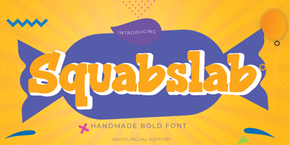 Hello Everyone, introduce our new product Squabslab - Handmade Bold Font Display, inspired by the title of the sports poster and We make it very energetically. Squabslab font with strong and challenging nuances. very suitable for the title, typography, Poster, magazines, brochures, packaging,Websites and much more for your design needs, making your designs more modern and professional This handmade font will make your design has a beautiful natural touch for each details. It is perfect for any design project as Invitation,logo, book cover, craft or any design purposes.
 - East Village JNL by Jeff Levine,
$29.00 The Federal Art Project division of the WPA (Works Progress Administration) employed numerous artists, musicians, actors and other creative sorts in a effort to help many survive the Great Depression of the 1930s. One of the posters created by this project was for a "Card Party and Barter Benefit" with proceeds going toward the Nassau Art Teachers Benefit Fund - taking place at the Coca-Cola plant in Rockville Centre, New York. East Village JNL was derived from this poster, and is available in both regular and oblique versions.
 - Blackbuster by Gassstype,
$25.00 Hello Everyone, introduce our new product Blackbuster - All Caps Bold Typeface Display, inspired by the title of the sports poster and We make it very energetically. Blackbuster font with strong and challenging nuances. very suitable for the title, typography, Poster, magazines, brochures, packaging, Websites and much more for your design needs, making your designs more modern and professional. This handmade font will make your design has a beautiful natural touch for each details. It is perfect for any design project as Invitation,logo, book cover, craft or any design purposes.
 - CA Cape Rock by Cape Arcona Type Foundry,
$39.00 CA Cape Rock, first released in 2007 and now reissued and expanded, is an impressive display typeface. Designed with a fat Clarendon and wood type in mind, the typeface’s bold and distinctive forms add spice and personality to any design that requires a strong display aesthetic. CA Cape Rock is particularly enjoyable for use in headlines and ideal for highlighted text. With already two dozen existing ligatures and many OpenType swashes, the new edition also received letters for use in the Central European and South Eastern European area. Cleaned and harmonized paths, a completely new kerning as well as a newly added Italic (Slanted) style are also among the new features.
 - Fugu by Positype,
$25.00 When Baka and Baka Too did very well commercially (Baka was named the Best Cursive Rough Script in 2005), I shied away from doing rough, handwritten scripts in fear as being seen as a one-trick-pony. A few years have passed and some early sumi-e brush ‘doodles’ kept appealing to me. I initially thought this new font would just fall under the Baka mantle and just become a new sibling, but as brush hit paper over and over again, the letters took on a different personality from Baka. This new font was turning out to be far more expressive, smooth and rough, tasty but sticky. This dichotomy demanded a new name. The rough and smooth texture suggested the name Fugu—oddly delicate while rough and functional.
 - Block Space by Putracetol,
$24.00 Introducing Block Space, a negative space font. This font is perfect for your projects related branding design, logo, posters, apparel, logotype, header, quote, invitation, greeting card, cover, poster, fashion design and any more. Come with lot of ligatures character, it's make this font more unique and stand out . This font is also support multi language.
 - BonaVia by Greater Albion Typefounders,
$9.95 BonaVia is an adaptation of Greater Albion's Bonning and Bonnington families. Its purpose made to enable the construction of banners and mastheads in the style of traditional streetsigns, and offered in Regular and 'Blanc' faces. A selection of decorative ends and fleurons are included. BonaVia is splendid on posters, signage, book and CD covers and labels with a period feel.
 - Tilda Script by Roman Polishchuk,
$25.00 Tilda Script Family is a clean and lining script with regular and non-connect versions in four weights. With this family you can craft solid logotypes with a unique look, set posters and ads, and even run longer lines of copy on packaging. Tilda Script is a versatile family with extensive language support and advanced typographic features including:Ligatures, Stylistic Alternates, Stylistic Sets.
 - Kharinniswa by Putracetol,
$36.00 Kharinniswa is a bold serif font with tons of beautiful alternative glyphs and multilingual support. This font is bold, clean, traditional, unique, fun and simple. Come with open type feature with a lot of alternates, its help you to make great lettering. Kharinniswa best uses for heading headlines, cover, poster, logos, quotes, product packaging, merchandise, social media & greeting cards and many more.
 - Ingy Star Tilings by Ingrimayne Type,
$9.00 IngyStarTilings allows one to create a variety of patterns that have stars. Some of them are quite common and others less so. A sample file is available that shows possible patterns that can be constructed with this typeface, including some non-star repeating patterns. As the posters indicate, some of the patterns constructed with the regular version are intended to be multicolored.
 - Lumiere Rosie by Kaligra.co,
$29.00 Introducing Lumiere Rosie – A Gorgeous modern sans serif with ton of stylistic alternates to choose. Its bold clean and simple. Works wonderfully on its own for logos, headlines, posters, packaging and many more! And with Three different weights to choose, your option to create more unique and versatile design is a lot wider. Have fun and create more. Your Imagination only your limit!
 - Almighton by Uncurve,
$20.00 Almighton is an aesthetic vintage typography font, inspired from the past, elegant signage, gold leaf , sign painting and old label product. Almighton comes with tons of alternates characters to make more eye cacthy . It is suitable for authentic logos, headings, sign painting, posters, letterhead, branding, magazines, album covers, book covers, movies, apparel design, flyers, greeting cards, product packaging, and more.
 - FM Ephire by The Fontmaker,
$16.00 FM Ephire is a hand-drawn, multilingual, type family of five weights with complimenting italics. Stuffed with tons of features, Ephire really shines through its artistic and stylish, yet elegant feel of natural handwriting. It is your best choice whenever you design greeting cards, banners or posters, and it also handles pretty well for body text, even in small sizes. Enjoy Ephire!
 - Prince Frog by Hanoded,
$15.00 Prince Frog started out as an attempt to 'pimp' Rabbit On The Moon font. It quickly evolved into an entirely different typeface with just a hint of 'Rabbit' in it. Prince Frog is a very happy, very legible font and would be ideal for children's book covers, posters and packaging. It comes with enough diacritics to keep even the most spoiled princess happy.


