10,000 search results
(0.056 seconds)
- Mizar Grotesk by Fatchair,
$9.95Mizar Grotesk is a sans-serif with a few quirks and a slight retro feel. - Sentico Sans DT by DTP Types,
$49.00Originally created as a custom project and now released as a full family in OpenType. - As of my last update in April 2023, HeadlineNEWS by Reference Type Foundry has not been specifically documented in my training data. However, I can provide you with a general description based on wha...
- Buffalo Bill by FontMesa,
$35.00 Buffalo Bill is a revival of an old favorite font that’s been around since 1888, the James Conner’s Sons foundry book of that same year is the oldest source I've seen for this old classic. If you're looking for the font used as the logo for Buffalo Bill’s Irma Hotel in Cody Wyoming please refer to the FontMesa Rough Riders font. New to the Buffalo Bill font is the lowercase and many other characters that go into making a complete type font by today’s standards. The Type 1 version is limited to the basic Latin and western European character sets while the Truetype and OpenType versions also include central and eastern European charcters. William F. (Buffalo Bill) Cody called America’s Greatest Showman was one of the United State’s first big celebrity entertainers known around the world, millions of people learned about the Old West through Buffalo Bill’s Wild West shows which traveled throughout the United States and Europe. William Cody, at age eleven, started work on a cattle drive and wagon train crossing the Great Plains many times, he further went on to fur trapping and gold mining then joined the Pony Express in 1860. After the Civil War Cody went on to work for the Army as a scout and hunter where he gained his nickname Buffalo Bill. In 1872 William Cody started his entertainment career on stage in Chicago along with Texas Jack who also worked as a scout, the Scouts of the Prarie was a great success and the following year it expanded to include Wild Bill Hickok and was eventually named The Buffalo Bill Combination. By 1882 Texas Jack and Wild Bill Hickok had left the show and Buffalo Bill conceived the idea for the traveling Wild West Show using real cowboys, cowgirls, sharpshooters and Indians plus live buffalo and elk. The Wild West shows began in 1883 and visited many cities throughout the United States. In 1887 writer Mark Twain convinced Cody to take the show overseas to Europe showing England, Germany and France a wonderful and adventuruos chapter of American history. The shows continued in the United States and in 1908 William Cody combined his show with Pawnees Bill’s, in 1913 the show ran into financial trouble and was seized by the Denver sheriff until a $20,000 debt (borrowed from investor Harry Tammen) could be paid, Bill couldn't pay the debt and the loan could not be extended so the assets were auctioned off. William Cody continued to work off his debt with Harry Tammen by giving performances at the Sell’s-Floto Circus through 1915 then performed for another two years with other Wild West shows. William F. Cody passed away in 1917 while visiting his sister in Denver and is buried on Lookout Mountain joined by his wife four years later. Close friend Johnny Baker, the unofficial foster son of William Cody, began the Buffalo Bill Memorial Museum in 1921, over the years millions of people have visited William Cody’s grave and museum making it one of the top visitor attractions in the Denver area. William F. Cody romantisized the West creating the Wild West love affair that many still have for it today through books and cinema.
 - Splinter2 - Personal use only

- Isabel Condensed by Letritas,
$30.00 Isabel Condensed and Isabel were made out of necessity to create a new font for children and teenagers, that could be enough friendly and versatile for text in words or even easy-to-read long texts. The purpose of Isabel is to combine all the nice and friendly features of the simple letters that the teachers teach to the pupils at primary school, as they starting to learn to read, together with the normal editorial fonts we read every day. In this way it generates a very joyful serif font, or even friendly font, with some conservative aspects. In other words, Isabel is a font that, despite of being a “classic features” typography, is proud to show its innocent and ingenuous elements, this gives to the font a new point of view. The family is composed of 3 parts: the regular version, the italic version and the unicase version. Each one of them has 5 weights. The italic version has 825 characters; the regular and unicase have 739 and are composed for 220 latin languages, plus cyrilic.
 - Bloem by Eurotypo,
$24.00 Bloem, two new fonts with oodles of character designed by Carine de Wandeleer. Its slight bounce and intentional irregularity gives your words a wonderful flow. The thick and thin strokes in this typeface combine balance and harmony. This new font family includes a sans regular and a script font. The script has OpenType features such as Stylistics and Contextual alternates, Swashes, Ligatures, up to nine Stylistic sets by letter that allow you to mix and match pairs of letters and a Central European language support to fit your design. This will help your creativity and make it easier to make the impressive and elegant typographic work. All OpenType features may only be accessible via OpenType-aware applications, or the Character Map to view and copy any of the extra characters to paste into your favorite text editor/app. Bloem Sans is a complementary handmade font, that works in harmony with Bloem script to create accurate typographic designs quickly! Bloem looks lovely on wedding invitations, greeting cards, logos, business-cards, fashion, magazines, food packaging and menus, book covers and whatever your imagination holds!
 - Frambuesa by Sudtipos,
$39.00 Organic versus geometric are two different universes that converges on nature systems and has its reflection on this new sans serif typeface. Frambuesa is a half humanist-half geometric sans that merges decorative curves with straight lines looking for a balance. The result: a solid but somewhat romantic, nostalgic type program that go ahead harmoniously, dancing to the rhythm of a naturally imperfect melody. Frambuesa can’t hide its family genetics. Structure and proportions come from Elisetta, her older sister they so both have a really good text performance. Regular variables and italics feel comfortable in a lot of contexts and are useful for little words or big title compositions. All seven weights are carefully adjusted to achieve soft transitions between one and the other resulting in high readability levels on program combinations and complex uses. This new font family name is a tribute to Lucia’s childhood, a very happy one. Frambuesa honors this sweet intense red fruit that her grandpa’s Coco gave to his grandchildren every Sunday in the summer.
 - Beatnik by Type Innovations,
$39.00 I was working at Bozell Worldwide, an advertising agency, on their yearly promotional pitch. An art director was looking for a condensed informal headline treatment to be used on one of the new ad campaigns. I took several different font designs and started to condense and scale the proportions in the hopes of finding several good solutions. They finally settled on a version of Times Roman, scaled horizontally to about 50 percent proportions. I liked the look so much that I later went back to the drawing board and refined the concept by adding slanted serifs and a varying alignment on all the letter forms giving the typeface a very casual and informal appearance. At about that time, I was reading a book by Jack Kerouac, and was so inspired by his writings on the ‘beat generation’ that I decided to name the font ‘Beatnik’. Afterwards, I added a set of true small capitals and old style figures. I'm currently working on additional weights and variations to expand this ‘hip’ new font series. Groovin' baby.
 - De Fonte Plus by Ingo,
$39.00 A variation of ”Helvetica according to the blur principle.“ The underlying typeface is ”Helvetica“, the only true ”run-of-the-mill“ typeface of the twentieth century. The distortion principle used simulates the photographic effect of halation and/or overexposure. The light weight, »DeFonte Léger«, nearly breaks on the thin points, whereas on those points where the lines meet or cross, dark spots remain. The characters are ”nibbled at“ from the inner and outer brightness. On the normal and semibold typestyles, »DeFonte Normale« and »DeFonte Demi Gras«, the effect is limited almost exclusively to the end strokes and corners, which appears to be strongly rounded off. The bold version »DeFonte Gros« is especially attractive. As a result of ”overexposure“, counters (internal spaces) are closed in, while characters become blurred and turn into spots; new characteristic forms are created which are astoundingly legible. The fat version »DeFonte Gros« is particularly appealing. “Overexposure” leads to drifted counters, letters blur into spots; new characteristic forms emerge, which are surprisingly easy to read.
 - Battista by preussTYPE,
$29.00 The BATTISTA typeface stands in the long tradition of the designs developed by Giambattista Bodoni, who made his famous typefaces in the end of the eighteenth century. Similar designs can be found on various specimen books e.g. Alexander Wilson, John Bell, Edmund Fry and Alexander Thibaudeau. One of the best italics was available by Stephenson Blake & Co. foundry form Sheffield, England. In the end of the nineteenth century an unknown punch cutter at the German type foundry Schelter & Giesecke made an very bold cut of this Bodoni design. He brought both designs, the regular and the italic to an new level of harmony. Compared to the original Bodoni designs the new typeface was a lot bolder, which was well taken by the audience in this time. The BATTISTA typeface is an remarkable design, assembled of ultra bold and very fine shapes, but in all, the spirit of Bodonis design was well preserved. BATTISTA is a classic display design. The fine details are best shown on larger text sizes.
 - Futura PT by ParaType,
$30.00 Futura is a classic geometric sans serif, one of the crucial typefaces of the 20th century. It remains relevant today and is widely used in logos, headings, web and print. Futura was designed by Paul Renner for Bauersche Gießerei (Bauer) in 1927. The typeface is based on simple geometric forms and is close in the aesthetics to 1920s-30s constructivism and the Bauhaus. Futura PT is the most complete Cyrillic version of Futura. It’s a type system of 25 styles: 16 regular and 9 narrow, from Thin to Extrabold. Futura PT has linear and old style figures, subscripts and fractions. The typeface supports more than 100 languages: Western and Central European Latin and the Cyrillic-extended. The Cyrillic version of Futura was designed by Vladimir Yefimov in 1991–1995. He partially redesigned the typeface in 2007, making it a wholesome consistent system, and Isabella Chaeva added new styles. The typeface was released under the name Futura PT. Isabella Chaeva returned to work on Futura in 2022. The typeface has three new styles, old style figures and extended Cyrillic support.
 - Antique Initials by Kaer,
$19.00 Hello, friends! I have a good news! At last I have finished working on my Antique Initials color font. Wow! It was a long and hard work because every initial is unique. I sketched each letter of the font very scrupulously from scratch. Each letter is uniquely designed and has a unique flower pattern in the background. I used a pale old color palette to color these letters. There came out two font variants: a black and white and a nice colored one. The font contains initials from A to Z (26 characters, lowercase glyphs are same). I hope you enjoy this font. Follow my shop to receive updates of products and the very hottest news! If you have any question or issue, please contact me: kaer.pro@gmail.com Please request to add additional characters and glyphs if you need! Thank you! You can use color fonts in PS since CC 2017, AI since CC 2018, ID since CC 2019, QuarkXPress since 2018, Pixelmator, Sketch, Affinity Designer Since macOS 10.14 Mojave, Paint.NET Windows only. Please note that the Canva do not support color fonts!
 - Rodley by Fettle Foundry,
$10.00 Rodley is a geometric sans-serif typeface and a ground-up redrawing of Bairne – the first ever typeface from Fettle Foundry – with a completely new character set that closer resembles the original vision for the typeface. The changes are so substantial that Rodley has taken on a life of its own, becoming a brand new typeface. Inspired by low-contrast Swiss and Modernist grotesque typefaces, with the addition of characterful geometric shapes, Rodley aims to be a more disruptive choice for brands, while retaining the appeal of those popular styles. Based upon a Latin S character set with additional glyphs, Rodley supports many latin-based languages, with a focus on pan-European and South American languages. Thorough kerning has been applied to uppercase/lowercase, uppercase/uppercase, lowercase/lowercase and CamelCase character combinations, with thorough attention paid to an incredibly large number of diacritical combinations. Available in 5 weights, from thin to bold, with matching italics, Rodley has been designed with a wide range of uses and sizes in mind.
 - Century 751 by Bitstream,
$29.99The year 1914 marked the appearance of Washington Ludlow's first typograph machine. This remarkable invention permitted typesetters to quickly cast a full line of lead type in one operation using supplied brass matrices, a procedure which was for the time a major technological improvement over the usual hand-set foundry type methods. Casting type the Ludlow way necessitated the creation of an entire range of new Ludlow typefaces, a development which made Ludlow not only a major manufacturer of printing machinery, but also one of the world's leading sources of professional type design. Renowned typographers such as Douglas C. McMurtrie and Ernest F. Detterer created original faces at Ludlow's request. Robert Hunter Middleton was Ludlow's design director for over fifty years, and during his distinguished career produced an entire library of typefaces representing virtually every known typographic style. He is recognized as one of the most prolific type designers of all time. Today, new Ludlow computer fonts are in preparation, including optically-correct versions of many classic Ludlow typefaces, drawn directly from the originals in the Ludlow company library. - Bebas Neue Pro by Dharma Type,
$14.99 Thank you for waiting. Finally, Bebas Neue has got lowercases! Bebas Neue is a world wide, the most popular font family with all caps released in 2010. Bebas Neue has been used from by big companies to by startup designers for many projects. In spite of the fact that Bebas Neue has only Uppercases, it became very popular font for these 10 years. At the same time, we received many requests for adding lowercases. To be honest, we had been developing whole new Bebas Neue with lowercases secretly for long time. Thinner Uppercase from thin to regular weights were redesigned for Pro. New lowercases were designed to match the Uppercases very carefully. You can access Tabular figures by using OpenType tnum features. Almost all European languages are supported by Pro. One more big thing is... Bebas Neue Pro has Italics! Please don't use sloped Bebas Neue. Pro has proper Italics! Bebas Neue “Pro” can extend your possibilities. Be the first to use this professional and premium Bebas Neue!
 - Isabel SemiCondensed by Letritas,
$30.00 Isabel SemiCondensed, together with Isabel condensed and Isabel were made out of necessity to create a new font for children and teenagers, that could be enough friendly and versatile for text in words or even easy-to- read long texts. The purpose of Isabel is to combine all the nice and friendly features of the simple letters that the teachers teach to the pupils at primary school, as they starting to learn to read, together with the normal editorial fonts we read every day. In this way it generates a very joyful serif font, or even friendly font, with some conservative aspects. In other words, Isabel is a font that, despite of being a “classic features” typography, is proud to show its innocent and ingenuous elements, this gives to the font a new point of view. The family is composed of 3 parts: the regular version, the italic version and the unicase version. Each one of them has 5 weights. The italic version has 825 characters; the regular and unicase have 739 and are composed for 220 latin languages, plus cyrilic.
 - Lapidaria by SIAS,
$34.90 Lapidaria is a typeface that may be described as a ‘geometric sans with humanist qualities’. Its mood is smart and sober, its appeal is calm, cool and classical. Though quite well performing even in longer text bodies, a particular strength of Lapidaria lies in display typography. The most peculiar aspect of Lapidaria is its new family concept: for the very first time ever a tricameral alphabet model has been realized as a general-use sans: uppercase, lowercase and middlecase letters blending smoothly into one typographic tone, thus offering entirely new typographic possibilities. – The middlecase (or uncial) sorts being accommodated in the lowercase positions of the Medior fonts. All nine fonts equally offer full character coverage for all Euro-Latin languages – and for Greek. There are a lots of special characters and ligatures. Last but not least, a set of ten ornament characters (in each font) will let you make sparkling designs which will thrill your clients. Each font contains about 500 characters, that makes over 4,500 in total for the complete Lapidaria family package. __________________________________________________________________________________________
 - Bodoni Sans by J Foundry,
$25.00Bodoni Sans is a new classic built on the foundation of two centuries of history. Fresh and contemporary, while feeling familiar. Stylish and sophisticated, confident and elegant. Bodoni Sans is more than just chopping off the serifs. The classical proportions of the capitals and x-heights were maintained, but the letterforms were rebalanced for use without serifs. Contemporary modifications were made to some widths, as well as an all new Light weight was created. High contrast is the key feature of Bodoni Sans. To maintain this contrast over a wide range of sizes, three optical sizes were drawn: Standard, Display and Text. Contrast adjustments were made for each optical size for optimal performance. The Standard was designed for the mid range of 12 to 60pt, Display for 48pt and above, and Text for 6 to 12pt. Web/Digital use was also considered while developing Bodoni Sans. The fonts were tested as web formats, and examined on a variety of screens, to ensure seamless use in both print and digital applications. - Aviano Didone by insigne,
$24.99 First released in 2009, Aviano Didone has been completely remastered and expanded with new weights and optical sizes. Aviano Didone's high contrast forms lend elegant beauty, luxury and romance to your designs and it's extended letterforms provide strength and power. Aviano's foundational classical forms give the face a look that is unique for Didone faces. Aviano Didone is a bold interpretation of vertically contrasted type. Aviano Didone comes in eight different weights and is packed with OpenType features. Want ball terminals for that logotype or headline? Flat serifs? Swash forms? Aviano Didone includes 102 alternate characters. Five style sets are available, and Art Deco inspired alternates, small forms, swash, titling and stylistic alternates. Aviano Didone also includes 40 discretionary ligatures for artistic typographic compositions. The new optical sizes allow Aviano Didone to be used on the web or in print without losing detail. Be sure to check out the rest of the Aviano series which can be used as complementary faces, including Aviano, Aviano Serif, Aviano Sans and Aviano Flare.
 - Ringtown by Fargun Studio,
$12.00 Ringtown is handwritten font with a signature style. perfect for branding projects, homeware designs, product packaging or simply as a stylish text overlay to any background image. Ringtown has an entire 2 alternate font set and marker style font. This is accessible simply by their own separate font file - just install this as normal and select Ringtown Alt 1, Ringtown Alt 2, Ringtown Marker and Ringtown Swash in your text-tool Fonts are provided in .otf formats Ringtown incudes 6 Font files: Ringtown -- A handwritten script font containing upper & lowercase characters, numerals and a large range of punctuation. Ringtown Alt 1– the second version of Ringtown, with a completely new set of both lower and uppercase characters. Ringtown Alt 2– the thirth version of Ringtown, with a completely new set of both lower and uppercase characters. Ringtown Swash -- A set of 36 hand-drawn swashes, with cool touch to underline you’re Ringtown text. Need help? If you need help or advice, please contact me by e-mail "fargunstudio@gmail.com" Thank you for your purchase!
 - The KR All American font by Kat Rakos is a unique and captivating typeface that immediately evokes a sense of patriotic pride and nostalgia. This font is characterized by its bold and robust letterfo...
- Francisco by Homelessfonts,
$49.00 Homelessfonts is an initiative by the Arrels foundation to support, raise awareness and bring some dignity to the life of homeless people in Barcelona Spain. Each of the fonts was carefully digitized from the handwriting of different homeless people who agreed to participate in this initiative. Please Note: these fonts include only the latin alphabet; no accented characters, no numbers or punctuation. MyFonts is pleased to donate all revenue from the sales of Homelessfonts to the Arrels foundation in support of their mission to provide the homeless people in Barcelona with a path to independence with accommodations, food, social and health care. The world is a very big place, the world is for travelling. And that’s what Francisco did, travel. Though born in Spain, he was raised in Brazil, where he worked as a graphic designer. He spent years hitchhiking round South America, his eagerness to see and learn new things preventing him from settling in one place. He returned to Spain an old man, to find his roots. Francisco never dreamed he’d end up in the street: “The experience of the street has taken away my vanity,” or that he would grow as a person there. “The only thing I’ve learnt in life is that in life you have to learn, because if you spend your life without learning you haven’t lived.” In Barcelona, the street changed his life and taught him just how tough it can be. Tough, but full of good people. He says that’s the best thing about the street.
 - Ranelte by insigne,
$- The beauty of a classic is that it never really goes out of style. The pure, simple elements which define its greatness only strengthen and solidify with time and exposure--elements like those that inspired Ranelte, the new sans serif from insigne design. While it pays homage to the enduring DIN series of the early-20th century, the new Ranelte is far from outdated. The classic style happily connects with its more modern side, incorporating a more pronounced curve than many of its contemporaries do. This accentuated curve helps pad the type against being cold or overly technical, especially with its inherent semi-modular form and geographic feel. In short, you end up with a good vibe at the intersection of high-tech and friendly. A versatile typeface, Ranelte is designed for headline use as well as print and web copy. Within this family’s three widths and eight weights (along with italics), the letter proportions remain easily readable through their tendency toward equalisation, while still avoiding strict monospacing. The typeface also features sophisticated typographical help in the form of OpenType features. Included in the set are case-sensitive types, fractions, super- and subscript characters, and stylistic alternates. It comes using a comprehensive array of old style and lining figures. All features comprehensively cover the Latin-based languages. Thinking about it again, a classic may never go out of style, but that doesn’t mean you can’t improve on it. A little adjustment can have a beauty all its own. So discover the tuning of Ranelte, and enjoy all the new things you can do with a classic.
 - Crystal Sky by Set Sail Studios,
$16.00 Add a little sparkle to your designs with Crystal Sky! A clean & modern signature-style font set, perfect for creating authentic hand-lettered text quickly & easily. With exaggerated strokes and an extra bouncy baseline, Crystal Sky has an unmistakable charm; perfect for logos, wedding stationery, cards, gift designs, product packaging and handwritten quotes. ★ New Update • Crystal Sky Hearts! Add some passion to your Crystal Sky text with Crystal Sky Hearts, a new font included in your download! These bonus designs add a beautiful, flowing decorative heart at the beginning, middle & end of your Crystal Sky Script text at the click of a button. Crystal Sky is packed full of great features to give you plenty of customisation options; Crystal Sky Alt • This font includes an entire alternate lowercase glyph set. If you wanted to avoid letters looking the same each time to recreate a custom-made style, or try a different word shape, simply switch to this font for an additional layout option. Crystal Sky Caps • Have you ever noticed that script fonts tend to be a bit tricky when it comes to typing in all-caps? 'Crystal Sky Caps' includes a totally separate set of A-Z letters - designed to work in harmony with each other during those moments when you need to hit your caps-lock button and go a bit wild! ★ New! Crystal Sky Hearts • Simply install this as its own separate font, and type any a-z or A-I character in this font to generate 1 of 35 heart decorations, designed to pair beautifully with the Crystal Sky Script font. (Please see the image above for a use guide).
 - Ablati by Hackberry Font Foundry,
$24.95 Ablati is the commercial release of the font designed during the production of our new font design book, “Practical Font Design”. It is a new serif font in my continuing objective of designing book fonts that I can really use. In many ways, Ablati is a very different direction for me. Designed to produce gaphics to use in the font design book, I was forced to really reconsider many of my working methods to make them work for outside readership. Like all designers, my internal design processes can get really sloppy. The book helped me clean up my act. Taking my inspiration from one of my favorite fonts of all time {though I've never really been able to use it much}, Romic, by Colin at Letraset, I decided to design a unilateral serif font. In most ways, this is a normal serif for me in that it has caps, lowercase, small caps with the appropriate figures for each case. This font has all the OpenType features in the new set developed for the book. There are several ligatures for your fun and enjoyment: bb gg ff fi fl ffi ffl ffy fj ft tt ty Wh Th and more. Several alternative forms, a dozen ornaments, and more. Like all of my fonts, there are: caps, lowercase, small caps, proportional lining figures, proportional oldstyle figures, & small cap figures, plus numerators, denominators, superiors, inferiors, and a complete set of ordinals 1st through infinity. Enjoy! The Oldstyle and Small Cap fonts are an attempt to have most of the OpenType characters available to people still using Type 1 and TrueType fonts.
 - FF Good Headline by FontFont,
$72.99 FF Good is a straight-sided sans serif in the American Gothic tradition, designed by Warsaw-based Łukasz Dziedzic. Despite having something of an “old-fashioned” heritage, FF Good feels new. Many customers agree: the sturdy, legible forms of FF Good have been put to good use in the Polish-language magazine ‘Komputer Swiat,’ the German and Russian edition of the celebrity tabloid OK!, and the new corporate design for the Associated Press. Although initially released as a family of modest size, the typeface was fully overhauled in 2010, increasing it from nine styles to 30 styles, with an additional 30-style sibling for larger sizes, FF Good Headline. In 2014, the type system underwent additional expansion to become FontFont’s largest family ever with an incredible 196 total styles. This includes seven weights ranging from Light to Ultra, and an astonishing seven widths from Compressed to Extended for both FF Good and FF Good Headline, all with companion italics and small caps in both roman and italic. With its subtle weight and width graduation, it is the perfect companion for interface, editorial, and web designers. This allows the typographer to pick the style best suited to their layout. As a contemporary competitor to classic American Gothic style typefaces—like Franklin Gothic, News Gothic, or Trade Gothic—it was necessary that an expanded FF Good also offers customers both Text and Display versions. The base FF Good fonts are mastered for text use, while FF Good Headline aims for maximum compactness. Its low cap height together with trimmed ascenders and descenders give punch to headlines and larger-sized copy in publications such as newspapers, magazines, and blogs.
 - Aquawax Fx by Zetafonts,
$39.00 Aquawax FX was developed by Francesco Canovaro as a new variant of the Aquawax family, one of the most beloved Zetafonts classics. This new typefamily is characterised by a contemporary and elegant design, that revisits the original design of 2008 with new geometric inventions, twisted with the current fluid zeitgeist. Aquawax FX builds on the original Aquawax family by adding counter-inktraps to the letterforms and emphasizing the inner contrast of curves and corners creating a smoother, flowing and dynamic look. While inktraps are a design feature that prevents ink from bleeding or filling small spaces in letterforms to achieve a cleaner, more readable look, anti-inktraps characterize the design with a distinctive watery appearance, suitable for logo design and titles. This watery effect is possible through a slight rounding of the inner and outer corners, keeping the original cuts at the letter terminals. A Space variant pushes FX experimentation furthermore, providing an alternate stencil-like style that takes legibility to the extreme, ready for logos and sci-fi headings. This does not limit the usability of Aquawax FX to mere display intent. The Aquawax FX font family includes two versions (Roman and Space), each with nine weights, ranging from Thin to Heavy, and matching italics. With a total of 36 variants plus one variable version, Aquawax FX is a versatile type family that can be used for a variety of design projects, from branding and packaging to editorial design and advertising. Aquawax FX offers a fresh re-interpretation of the original Aquawax letterforms and proportions, with a dynamic and flowing look that is sure to make your projects stand out.
 - Action Is, Shaded JL - Unknown license

- Restflaws by Maulana Creative,
$14.00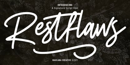 Restflaws is a casual script font. With medium mono-line stroke, fun character with a bit of ligatures and alternate characters. To give you an extra creative work. Restflaws font support multilingual more than 100+ language. This font is good for logo design, Social media, Movie Titles, Books Titles, a short text even a long text letter and good for your secondary text font with sans or serif. Make a stunning work with Restflaws font. Cheers, MaulanaCreative
 - Clockerts by Maulana Creative,
$13.00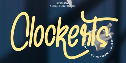 Clockerts is a fancy casual modern script font. With clean mono-line stroke, fun character with a bit of ligatures and alternates. To give you an extra creative work. Clockerts font support multilingual more than 100+ language. This font is good for logo design, Social media, Movie Titles, Books Titles, a short text even a long text letter and good for your secondary text font with sans or serif. Make a stunning work with Clockerts font. Cheers, MaulanaCreative
 - Southavely Signature by Maulana Creative,
$14.00 Southavely is a casual signature font. With regular mono-line stroke, slanted and fun character with a bit of ligatures. To give you an extra creative work. Southavely font support multilingual more than 100+ language. This font is good for logo design, Social media, Movie Titles, Books Titles, a short text even a long text letter and good for your secondary text font with sans or serif. Make a stunning work with Southavely font. Cheers, MaulanaCreative
 - Amerta Misty by Letterhend,
$16.00 Introducing, Amerta Misty, a modern calligraphic font with tons of swashes! They works perfect for you who needs a typeface for headline, logotype, apparel, invitation, branding, packaging, advertising etc. This typeface comes with uppercase, lowercase, punctuation, symbols, numerals, stylistic set alternate, ligatures, etc also multilingual support. We hope you enjoy Amerta Misty. Please feel free to comment if you have any thoughts or feedback. Or simply send me a PM or email me at letterhend@gmail.com
 - Afrocultures by IKIIKOWRK,
$17.00 Introducing Afrocultures - Exotic Typeface created by ikiiko. A handwriting with unique and exotic line curves typeface with ton of alternatives to choose. This typeface is perfect for an elegant logo, magazine layout, headline font, header page, beauty product, packaging product, quotes, or simply as a stylish text overlay to any background image. What's included? Uppercase & Lowercase Number & Punctuation Alternates & Swashses Multilingual Support Enjoy our font and if you have any questions, you can contact us by email : ikiikowrk@gmail.com
 - Anesthesa by Maulana Creative,
$14.00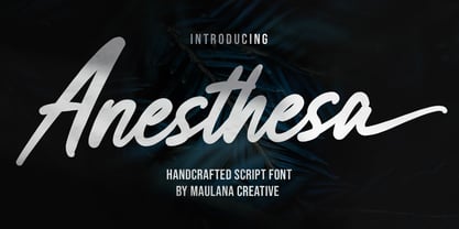 Anesthesa is a Casual script font. With bold mono-line stroke, slant and fun character with a bit of ligatures. To give you an extra creative work. Anesthesa font support multilingual more than 100+ language. This font is good for logo design, Social media, Movie Titles, Books Titles, a short text even a long text letter and good for your secondary text font with sans or serif. Make a stunning work with Anesthesa font. Many Thanks, Maulana Creative
 - Meat And Seafood by Edyta Demurat,
$28.00 This is a modern icon set with geometric shapes. A tasty set for the creation of the visual identity of shops, restaurants or bars. Thanks to its simplicity it will be perfect for printed and online materials. Baobaby Studio prepared an entire delicious set specially for you. Apart from “Meat and Seafood”, our offer also includes Dairy, Bread and Confectionery, Vegetables and Fruits. Everything in one style. Mix and match as you see fit. Bon appetit!
 - Borillaz by Maulana Creative,
$13.00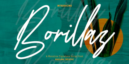 Borillaz is an expressive signature script font. With slant clean mono-line stroke, fun character with a bit of ligatures and alternates. To give you an extra creative work. Borillaz font support multilingual more than 100+ language. This font is good for logo design, Social media, Movie Titles, Books Titles, a short text even a long text letter and good for your secondary text font with sans or serif. Make a stunning work with Borillaz font. Cheers, Maulana Creative
 - Guyad by Maulana Creative,
$11.00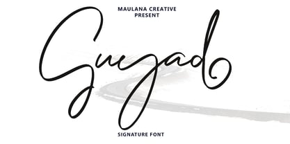 Guyad is a Casual script font. With bold mono-line stroke, slant and fun character with a bit of ligatures. To give you an extra creative work. Guyad font support multilingual more than 100+ language. This font is good for logo design, Social media, Movie Titles, Books Titles, a short text even a long text letter and good for your secondary text font with sans or serif. Make a stunning work with Guyad font. Cheers, MaulanaCreative
 - Mothman by Hanoded,
$15.00 In 1966 and 1967 a series of weird events spooked Point Pleasant, a small town in West Virginia. Townspeople described a creature that looked like a man, with red eyes and moth-like wings, which appeared at several locations around town. The Mothman myth was born. Mothman font is spooky as well. It is a very scratched and distorted typeface, completely hand drawn, using ink and various sharp utensils. Mothman font will surely leave a lasting impression!
 - [D]ONLINE by Don Citarella,
$20.00 [D]ONLINE is the first font family designed by Don Citarella for his blog, [D]ONLINE, and was created to provide a signature feel for its namesake. It combines a strong, medium stroke with arching end caps to embue the typeface with a futuristic curvilinear feel. This display font is best used for headlines, identities, wordmarks and other instances involving minimal copy and maximal whitespace The typeface includes 300 characters, including 45 accented glyphs and 30 ligatures.

