10,000 search results
(0.153 seconds)
- Fineday by Melvastype,
$29.00 Fineday is a clean and lining brush script. It is available with two different styles of uppercases: Style One and Style Two. Style One is swashy and decorative. Style Two is more plain and straightforward. Fineday is also available with connecting and non-connecting lowercases. All the Fineday versions have fancy alternate characters like ending swashes, tales and swashy ascenders. The family has an extended character set supporting most Central European and Eastern European languages.
 - Mintaka by Hoperative Design,
$12.00 Mintaka is a gorgeous and retro-styled script font crafted to add tons of stylish character to your designs. This font is PUA encoded, which means you can access all of the glyphs and swashes with ease! This font can be used for logos, branding, invitations, stationery, wedding designs, social media posts, and much more! Mintaka Features : Ligature Kerning Stylistic Alternates Swash PUA encoded which means you can access all glyphs Multilingual Support
 - Caslon Gotisch by RMU,
$25.00 A blackletter font by William Caslon (1692-1766), with Dutch influences, which appeared for the first time in a font sample book of William Caslon & Son, London, 1763. To access all ligatures in this font, it is recommended to activate both OT features Standard and Discretionary Ligatures. The round s occupies the number sign key, and typing N - o - period and activating this combination with the OT feature Ordinals gives you the numero sign.
 - Malibu Punch by Rachel White Art,
$12.00 Malibu Punch. I am loving this sassy script font! There are two versions: rough, with tons of texture, and smooth! I made it with an itty bitty brush and pretty watercolors. It's got loads of texture - check out those edges! Wobbly, rough watercolor edges! The capital letters work together, so it's like two fonts in one! The lowercase script is so sassy and full of attitude. Great for branding, logos, and quote art.
 - Milk Script by Sudtipos,
$59.00 The hand-lettered signage of 1920s and 1930s America produced many typographic jewels that digital type has yet to manifest. This face is but one of them. Unearthed by Alfredo Graziani and Alejandro Paul from a 1923 Speedball lettering manual, Milk Script is a distinctive upright script that offers well-nourished majuscules and sweet-flowing minuscules. A non-connecting variation of this versatile display script is also offered for additional aesthetic control.
 - Brominates by Maulana Creative,
$11.00 "Brominates" is an expressive signature font. With medium mono-line stroke, fun character with a bit of ligaturess. To give you an extra creative work. "Brominates" font support multilingual more than 100+ language. This font is good for logo design, Social media, Movie Titles, Books Titles, a short text even a long text letter and good for your secondary text font with sans or serif. Make a stunning work with "Brominates" font. Cheers, MaulanaCreative
 - Quintaras Signature Script by Maulana Creative,
$14.00 Quintaras is a complete script and sans font duo. With expressive signature mono-line stroke and condensed sans solid and outline stroke, fun character with some of ligatures. To give you an extra creative work. Quintaras font support multilingual more than 100+ language. This font is good for logo design, Social media, Movie Titles, Books Titles, a short text even a long text letter. Make a stunning work with Quintaras font. Cheers, MaulanaCreative
 - Sinyor Yebri by Maulana Creative,
$13.00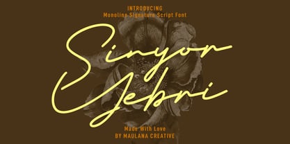 Sinyor Yebri is a modern signature script font. With consist regular mono-line stroke, fun character. To give you an extra creative work. Sinyor Yebri font support multilingual more than 100+ language. This font is good for logo design, Social media, Movie Titles, Books Titles, a short text even a long text letter and good for your secondary text font with sans or serif. Make a stunning work with Sinyor Yebri font. Cheers, Maulana Creative
 - Blinkest by Maulana Creative,
$13.00 "Blinkest" is a casual signature script font. With light mono-line stroke, fun character with a bit of ligatures. To give you an extra creative work. "Blinkest" font support multilingual more than 100+ language. This font is good for logo design, Social media, Movie Titles, Books Titles, a short text even a long text letter and good for your secondary text font with sans or serif. Make a stunning work with "Blinkest" font. Cheers, MaulanaCreative
 - Tropical Vibes by Flawlessandco,
$9.00 Introducing "Tropical Vibes" - A Display Retro Fon, a captivating display retro font that channels the essence of nostalgia and carefree spirit. There's some connected letters and some alternates that suitable for any graphic designs. This font support for some multilingual. Also contains uppercase A-Z and lowercase a-z, alternate character, numbers 0-9, and some punctuation. If you need help, just write me! Thanks so much for checking out my shop!
 - Givry by TypeTogether,
$49.00 The bâtarde flamande is a style of writing used predominantly in France and present-day Belgium in the 15th century. The style shares an ancestry with other writing styles traditionally grouped as blackletter— fraktur, textura, rotunda, and schwabacher. It had evolved, however, into an æsthetic far removed from its relatives. While high-contrast in nature, the bâtarde flamande is more delicate and dynamic than the austere and condensed fraktur and textura. Quick curves lack the rigidity of the schwabacher and rotunda. Flair through swashes is thematic, as are the variations in letterforms. The flowing rhythm, achieved through a letterform axis that is overall slightly rightward, is most noticable in the hallmark f and long s. Round forms are fused together for economy of space. It is a writing hand that, with its syncopation and fluidity, produces a vibrance uncharacteristic of other blackletters. Givry has been created in the spirit of the bâtarde flamande. It melds the particular traits compiled from the works of the style’s prominent scribes—Jean Fouquet, Loyset Liédet, and Jean Bourdichon. While suitable as an elegant and energetic display face, Givry was conceived for setting continuous text. The result of many refinements and adjustments is the preservation of the style’s irregular nature, as well as a consistency that continuous-text typography requires. Carefully researched and developed in OpenType format for a wealth of typographic features and support for more than forty languages, Givry is neither derivative nor experimental, but historically accurate. Of the many blackletter digital typefaces available, fraktur and all its connotations have become representative. In contrast, the bâtarde flamande is essentially non-existent in digital form, and has until now been overlooked. Givry provides designers and anyone searching for typographic expression a lively, delicate, and striking side to blackletter.
 - P22 Music by P22 Type Foundry,
$39.95 P22 Music Pro is a unique font system that allows the user to compose music with text editing and page layout programs capable of OpenType features and contextual substitutions. The OpenType features speed up the composing process by adding chords, contextual accidentals (sharps and flats), contextual key signatures and time signatures. P22 Music Pro covers a wide range of symbols and notation used in traditional western music composition. P22 Music Pro requires an application that uses OpenType features and is capable of contextual substitutions, such as Adobe InDesign or Illustrator. P22 Music is the companion, non-pro font included with P22 Music Pro and also sold separately. P22 Music also contains music symbols and notation and is suited for layout and text edit applications such as Microsoft Word that do not support Pro OpenType features. Unlike the P22 Music Pro font, the music symbols in the non-pro font are not tied to the staff lines, making them more useful for general design purposes. Staff lines are included as a separate character.
 - Gauche Display - Personal use only

- Orthotopes - Personal use only

- Scandinavia Brush by Mans Greback,
$69.00 Scandinavia Brush is a wild calligraphy font by Mans Greback, inspired by the untamed beauty of Nordic nature. It captures a rugged essence, with each stroke reflecting the raw energy and grace of natural environments. This brush-painted typeface is perfect for logos, handwritten designs, and tattoo art with its active and streetwise feel. Designed with a professional touch and high-quality craftsmanship, Scandinavia Brush comes in six versatile styles: Regular, Upright, Bold, Italic, and the combinations Bold Italic and Bold Upright. The range of styles allows you to create unique, expressive designs that capture the spirit of adventure, speed, and beauty. Use underscores _ anywhere in a word to make an underline swash. Example: Nord___ic Bru_sh Ideal for designer and art projects, or high-end handcrafted products, Scandinavia Brush brings a bold, authentic, and captivating touch to your creative endeavors. The font is built with advanced OpenType functionality and has a guaranteed top-notch quality, containing stylistic and contextual alternates, ligatures, and more features; all to give you full control and customizability. It has extensive lingual support, covering all Latin-based languages, from Northern Europe to South Africa, from America to South-East Asia. It contains all characters and symbols you'll ever need, including all punctuation and numbers. Mans Greback is a Swedish typeface designer with a passion for creating unique and versatile fonts. With an extensive background in design and typography, Mans has built a reputation for his meticulous attention to detail and prolific craftsmanship. His many fonts are widely used by designers around the world, making his work synonymous with creativity and innovation.
 - Salden by Canada Type,
$40.00 The Salden fonts are our tribute to the man who was dubbed the face of the Dutch book, and whose work is considered essential in 20th century Dutch design history. Helmut Salden’s exquisite book cover designs were the gold standard in the Netherlands for more than four decades. His influence over Dutch lettering artists and book designers ranges far and wide, and his work continues to be used commercially and exhibited to this very day. At the root of Salden’s design work was a unique eye for counter space and incredible lettering skills that never failed to awe, regardless of category or genre. This made our attention to his lettering all the more focused within our appreciation to his overall aesthetic. Though Salden never designed alphabets to be turned into typefaces (he drew sets of letters which he sometimes recycled and modified to fit various projects), we thought there was enough there to deduce what a few different typefaces by Salden would have looked like. The man was prolific, so there were certainly enough forms to guide us, and enough variation in style to push our excitement even further. And so we contacted the right people, obtained access to the relevant material, and had a lot of fun from there. This set covers the gamut of Salden’s lettering talents. Included are his famous caps, his untamed, chunky flare sans serif in two widths, his unique Roman letters and an italic companion and, most recognizable of all, his one-of-a-kind scripty upright italic lowercase shapes, which he used alongside Roman caps drawn specifically for that kind of combination titling. All the fonts in this set include Pan-European glyph sets. They’re also loaded with extras. Salden Roman (908 glyphs) and Salden Italic (976 glyphs) each come with built-in small caps (and caps-to-small-caps), quite a few ligatures, and two different sets of alternates. Salden Black and Salden Black Condensed (636 glyphs each) come with a set of alternates, and both lining and oldstyle figures. Salden Caps (597 glyphs) comes with a set of alternates, and Salden Titling (886 glyphs) comes with a quite a lot of swashed forms and alternates (including as many six variants for some forms), a few discretionary ligatures, and two sets of figures. There are also some form alternates for the Cyrillic and Greek sets included in all six fonts. These alphabets were enjoyably studied and meticulously developed over the past ten years or so. We consider ourselves very fortunate to be the ones bringing them to the world as our contribution to maintaining the legacy of a legendary talent and a great designer. The majority of the work was based on Salden’s original drawings, access to which was graciously provided by Museum Meermanno in The Hague. The Salden fonts were done in agreement with Stichting 1940-1945, and their sale will in part benefit Museum Meermanno.
 - Galiano by DearType,
$49.00 Galiano is an elegant combination of a script and a narrow modern serif. It is slender, feminine and classy, while still maintaining a friendly feel. Galiano is versatile and will work perfectly for fashion, e-commerce brands, trend blogs, wedding boutiques or any business that wants to appear upscale and chic. With its 1500+ glyphs the Galiano Script is perfect for creating original and functional designs. It has extensive language support and tons of ligatures, alternates, stylistic sets and swashes that add visual interest to every letter. The Galiano Font Family in a nutshell: - Galiano - a dancing baseline script with signature loops for ascenders and descenders - Galiano Inline - similar feel to Galiano, notably featuring a standartized x-height - Galiano Text - a simpler version of the script with no fancy loops for ascenders and descenders and no swashes and alts. - Galiano Serif + Italics - perfect for headlines - Galiano Ornaments - a set of 80 beautiful ornaments to embellish your typography. You can use the Galiano Family for high-end logotypes and magazine headlines, but let’s not forget greeting cards, invitations, posters, book covers, ads and the various web and screen usages. The overall feel of the font is elegant, sophisticated with a touch of informal and it is ideal if you want to convey a sense of class and style.
 - Odradeck by Harvester Type,
$20.00 Odradeck is a typeface that originated from the idea of creating a tall, but narrow font, while combining brutalism and technogenic. The difficulty was not to go to extremes and make the font moderately neutral in order to significantly increase the range of font applications. Odradeck came out with a strict, industrial, geometric, but moderately neutral semi-mono font with two axes of variability: height and slant. To all this, + 300 glyphs were added and, as a result, support for +80 languages. The structure of the font allows you to use it in a limited space, and its flexibility will allow you to fill and use this space to the maximum. You can apply it in a very wide range of designs. Whether it's a logo, packaging, banner, title, text, poster, merchandising, identity, branding or product design. Language support: Afrikaans, Albanian, Asu, Basque, Bemba, Bena, Breton, Catalan, Chiga, Colognian, Cornish, Croatian, Danish, Dutch, Embu, English, Esperanto, Estonian, Faroese, Filipino, Finnish, French, Friulian, Galician, Ganda, German, Gusii, Icelandic, Inari Sami, Indonesian, Irish, Italian, Jola-Fonyi, Kabuverdianu, Kalenjin, Kamba, Kikuyu, Kinyarwanda, Lower Sorbian, Luo, Luxembourgish, Luyia, Machame, Makhuwa-Meetto, Makonde, Malagasy, Manx, Meru, Morisyen, North Ndebele, Norwegian Bokmål, Norwegian Nynorsk, Nyankole, Oromo, Portuguese, Quechua, Romansh, Rombo, Rundi, Rwa, Samburu, Sango, Sangu, Scottish Gaelic, Sena, Serbian, Shambala, Shona, Soga, Somali, Spanish, Swahili, Swedish, Swiss German, Taita, Teso, Uzbek (Latin), Volapük, Vunjo, Walser, Zulu.
 - VLNL Thueringer by VetteLetters,
$30.00 We cannot imagine anyone not liking beer. Especially on a warm summer night there is simply little that can top an ice cold brewski. And with the current wave of home-brewed ales and lagers, Vette Letters decided to not stay behind and brew its own brand. Just so we can design our own beer bottle label using our own font. VLNL Thueringer comes from the drawing board of Jacques Le Bailly (a.k.a. Baron von Fonthausen), the German-French specialist in the fields of both beer and type design. One day Jacques got inspired by Albrecht Dürers 15th century Fraktur (blackletter) alphabet, and decided to design a contemporary rounded version of it. Although the historic context is clearly visible, Thueringer definitely stands its own ground. It's a modern techno-style blackletter with a (beer)truckload of interesting design details. Thueringer contains a number of ligatures and an alternate set of numbers. Apart from the regular uses like logos, posters, flyers and headlines we definitely would like to see our Thueringer used on beer bottle labels and crates, but also cafés and hipster bars would do well with this modern-day blackletter. Hell, even wine or liquor labels, football team jerseys, Oktoberfest flyers, it's just too much to mention. As long as it is accompanied by a cold beer.
 - Hiyida Script by Creative Lafont,
$12.00 Introducing Hiyida Script! Hiyida Script is modern script font, every single letters has been carefully crafted to make your text looks beautiful. With modern script style this font will perfect for many different project, example: weddings, invitations, greeting cards, posters, name card, quotes, blog header, branding, logo, fashion, apparel, letter, stationery, etc. Hiyida Script allows you to create custom dynamic text. you can access by turning on; Stylistic Alternates, Stylistic Set, Initial Forms, Terminal Forms as well as ligatures in Photoshop, Adobe Illustrator, Adobe InDesign or through a panel of glyphs such as Adobe Illustrator, Photoshop CC, Let's swirl from the reguler character into character alternative to get the text with the layout of your dreams. Hiyida Script features 801 glyphs and has given “Private Use Areas” PUA Encoded (specially coded fonts), with tons of alternate characters. The pack can be accessed in full by any crafter or designer, without the requirement for extra design software, Compatible With Silhouette Studio & Cricut Design Space. Files Include: - Hiyida Script Features: - Basic Latin A-Z and a-z - Numbers & Symbols - Stylistic Set & Ligatures - PUA Encode (specially coded fonts) - Latin Pro Support Character In order to use the beautiful swashes, you need a program that supports OpenType features such as Adobe Illustrator CS, Adobe Photoshop CC, Adobe Indesign and Corel Draw. Thanks for your visit :-)
 - Etelka by Storm Type Foundry,
$49.00 Etelka was designed for purposes of corporate identities, branding, product package design and outside lettering. It works anywhere an extremely legible typeface is needed. Package and label design often requires a wide choice of weights and widths: light and narrowed fonts to fit huge amount of mandatory informations onto a small box, or to squeeze text lines around a bottle, fat and wide styles to emphasize information on a poster or vehicle. The regular styles will serve well for business card, small texts and for your website. Etelka’s design idea is wide, open rounded square. Some details are extremely minimized: lower-case “a, n” or “u” lack their typical spur. The typeface has a distinctive industrial expression with all diagonals slightly softened, and her overall strict mono-linear principle is exceptionally broken only for fine optical adjustments in joints. Cyrillic and Greek scripts are present for international business, as well as rich latin diacritics. Etelka is actually very well suited for all kinds of visual communication, especially orientation systems in modern architecture. The first drawing of the font, which was later named “Etelka”, was submitted in 2004 for the Czech Television identity competition and was rejected by the jury. We later concluded that the design was worth extending to the current superfamily of 42 fonts. It is a reliable typeface for corporate identities and websites.
 - Oceantide Display by Elyas Beria,
$12.00 Oceantide Display is a whimsical and highly stylized nautical-themed font suitable for display use. The main focus is on standard English capital letters, with a few stylistic alternatives included. Lower case letters, numbers, and some symbols are included but are limited and there are a few limited international letters.
 - Sprint - Unknown license

- FS Millbank by Fontsmith,
$80.00 A sign of something better When designer Stuart de Rozario surveyed the fonts used in signage on London’s public transport systems, he reached a dead end. They seemed staid, sterile, lacking in personality, and ill-suited to use by modern brands. He was pointed in another direction entirely. ‘The driving force behind my thoughts was to design something more current and fresh without compromising legibility and clarity. A font with both personality and function, that’s versatile and large and small sizes, and effortless to read, but which also says something new.’ Speed reading Late for a meeting and can’t find your way? Trying to catch a flight? Lost in a hospital? Reading signs is a different business to reading a book or a newspaper. Text on signs needs to be deciphered quickly and effortlessly. So the legibility criteria for signage letterforms are different to those for normal reading, too. Throughout FS Millbank’s uppercase and lowercase alphabets, characters have been given features for extra definition, including: wide ink traps on the A, K, M, V, W, X and Y; a serifed i, accentuated spurs on the a, d, l u; and different x-height shapes on the b, g, p and q. Distinctive forms and generous, open internal shapes all help the quick reading of sign text, and wide, open terminals and counters allow similar letter shapes to be distinguished easily when viewed at different angles. Running down a corridor, maybe... Positive/negative Standard type tends to glow on the kind of dark backgrounds often used for signage, and look heavier than its true weight. To correct the imbalance caused by this optical trick, special weights of the typeface have to be drawn for these ‘negative’, light-on-dark applications. These are lighter than their comparable positive weights to overcome the ‘glow’ effect. After extensive tests of the negative weights, at all sizes, we achieved the right optical balance. Glowing, glowing, gone. Icons This wouldn’t be a signage typeface without its own set of icons, or symbols, to help people find what they’re looking for. So, to sit alongside the positive and negative fonts, we’ve created a comprehensive set of 172 icons, covering a wide range of applications from transport and user interface to information and directional. Designed within the typeface capital height, they sit on the baseline and are spaced centrally.
 - Fantique Four - Unknown license

- Spawned - Unknown license

- Touch Of Nature - Unknown license

- Bay Tavern by FontMesa,
$25.00 Bay Tavern is the first weathered version of our Tavern font that's based on Algerian. With three weights, open faced and outline versions to choose from you're sure to find the right style for your new project, restaurant menu, logo, t-shirt design or Pirate costume party. Bay Tavern includes all the same alternates as our regular Tavern font family. While our original Tavern font has been increased to include five weights additional weights for Bay Tavern will have to wait for now, adding the notched cut in's were all done by hand which causes a lot of cramping so a long break is needed before creating the extra weights. The Fill fonts in the Bay Tavern family are meant to be used with Bay Tavern Open fonts, if you're using Bay Tavern Open then select Bay Tavern Fill, if you're using Bay Tavern Open L then select Bay Tavern Fill L, if you're using Bay Tavern Open S then select Bay Tavern Fill S, if you're using Bay Tavern Open SL then select Bay Tavern Fill SL, the same rule goes for the Open X version.
 - Breadley Serif by Ardyanatypes,
$10.00 Breadley Serif It was a continuation version of the previous one (Breadley Sans) that come up with Serif type look, surely including small decorative on the ends of some of the strokes that make it more expressive. Still stunning great with an elegant look and stands strongly on its own as a heading and brand logo. This Serif version of BREADLEY fancier within sexy touch for business utilities use like business card, name sign, uniform as brand elevation, and many more. This serif BRADLEY typeface, obviously fit to embossed as an exclusive brand tag or even decorating your enormous office corner. You can view all of the available characters in the screenshots above, and you can try out the brand new BRADLEY SERIF now for any design matter. Breadley Serif also has five weights, plus an extra superbold weight, Ligatures, small caps, old-style numerals, and other OpenType features Latin and multilingual support A guide to accessing all alternatives can be read at http://adobe.ly/1m1fn4Y Adobe Photoshop go to Window – glyphs Adobe Illustrator go to Type – glyphs Thank you and have a nice day
 - Sutro Shaded by Parkinson,
$25.00 My affection for Slab Serifs began in the early 1960s in Kansas City when Rob Roy Kelly was at the Kansas City Art Institute, teaching and writing his book on American Wood Type. I got to know him just well enough to gain access to his fabulous collection of wood type and wood type catalogs. Later, in the1970s, I tried to re-create a Nebiolo Egiziano for Roger Black at New West magazine. And again for Roger, in the 1980s, I designed a Slab Serif logo for Newsweek Magazine. Finally, in 2003, designed the Sutro Family. There were things I didn't like about it, so, over time, I’ve been adding some things and dressing it up a little. Sutro Shaded has existed for a few years as a one color, outlined, drop-shadowed display font. It seemed like it was just dying for a little color. I added five more fonts: Fill, Gradient, Hatching, Rules and HiLite. These fonts can be used in different combinations to achieve various effects. There is a downloadable SUTRO SHADED USER MANUAL PDF in the Gallery section for this family.
 - Fakir Pro by Underware,
$50.00 Fakir | A Hindu ascetic or religious mendicant, especially one who performs feats of magic or endurance. The well known feats performed by them include sitting steadily on a bed of nails and walking on burning coals. Blackletter | A script used throughout Western Europe from approximately 1150 to 1500. It continued to be used for the German language until the 20th century. Fakir, a blackletter with a holy kiss is a contemporary interpretation of gone letterforms with origin in blackletters. More precisely, we based the construction on broadnip textura, with lots of broken, edgy, interrupted strokes – try to sit on a nail bed and you’ll know why fakirs like to read just these kind of fonts! After being abandoned for some time (not accepted, nearly forbidden), we would like to give our generation a blackletter from here and now. So Fakir is not a revival, but an all new 21st-century blackletter. Fakir is a set of edgy text and display fonts, ranging from tight and heavy to light and wide. It has 11 fonts, all supporting Underware Latin Plus character set, that covers 219 languages.
 - MoreLeaves by Ingrimayne Type,
$14.95 In 1990 I designed the font XLeafMeAlone. In 2006 I decided that it was time to improve it. Instead of adding to it, I created two new fonts containing almost 200 leaves: MapleOaks and More Leaves. Among the leaves you will find in MoreLeaves are elm, cottonwood, tulip tree, ash, hickory, locust, ginko, aspen, sassafras, hawthorn, beech, and birch. There are also a few that come from shrubs and I am not sure what they are, but they looked interesting so I put them in. You will not find oaks, maples, or sycamores--they are in MapleOaks. Why leaves? Because people like them. As a large part of the biological world that is all around us, leaves are fascinating in their shapes and endless variations. In XLeafMeAlone I took about 50 shapes and rotated them 180 degrees to give a typeface with approximately 100 glyphs. In each of these two typefaces, MoreLeaves and MapleOaks, there are almost 100 glyphs. Each of those glyphs is rotated in 90-degree increments to yield two families of four typefaces that should be very useful if one wants to create borders of leaves.
 - Grey Jewelry by Putracetol,
$22.00 Grey Jewelry - Stylish and Beautiful Serif Font. Introducing the new Grey Jewelry font! Inspired by modern and luxury typography, Grey Jewelry is a stylish and beautiful serif typeface that offers a professional touch, making it perfect for various design projects. This versatile font is perfect for creating unique and elegant typography designs, whether it's for headings, flyers, greeting cards, product packaging, book covers, printed quotes, logotypes, apparel designs, album covers, and much more. The font features alternative characters divided into several Open Type features, including Swash, Stylistic Sets, Stylistic Alternates, Contextual Alternates, and Ligature. These Open Type features can be easily accessed using Open Type savvy programs, such as Adobe Illustrator, Adobe InDesign, Adobe Photoshop, Corel Draw X version, and Microsoft Word. Grey Jewelry also supports multiple languages, making it suitable for a variety of global design projects. The Grey Jewelry font is available in a Zip package, which includes three formats: otf, ttf, and woff. The font package includes uppercase and lowercase letters, opentype alternates and ligatures, numbers, punctuation, symbols, and multilingual support. With Grey Jewelry font, your designs can now achieve a professional and stylish look that stands out from the crowd!
 - Krizi Amo Pro by CheapProFonts,
$10.00 Inspired by the lettering on a perfume, Halmos extrapolated a complete uppercase alphabet, and he also created a matching lowercase. Now the character set has been expanded completely, and this stylish Art Deco font is ready to create some headlines, new logos and wordmarks in many more languages. ALL fonts from CheapProFonts have very extensive language support: They contain some unusual diacritic letters (some of which are contained in the Latin Extended-B Unicode block) supporting: Cornish, Filipino (Tagalog), Guarani, Luxembourgian, Malagasy, Romanian, Ulithian and Welsh. They also contain all glyphs in the Latin Extended-A Unicode block (which among others cover the Central European and Baltic areas) supporting: Afrikaans, Belarusian (Lacinka), Bosnian, Catalan, Chichewa, Croatian, Czech, Dutch, Esperanto, Greenlandic, Hungarian, Kashubian, Kurdish (Kurmanji), Latvian, Lithuanian, Maltese, Maori, Polish, Saami (Inari), Saami (North), Serbian (latin), Slovak(ian), Slovene, Sorbian (Lower), Sorbian (Upper), Turkish and Turkmen. And they of course contain all the usual "western" glyphs supporting: Albanian, Basque, Breton, Chamorro, Danish, Estonian, Faroese, Finnish, French, Frisian, Galican, German, Icelandic, Indonesian, Irish (Gaelic), Italian, Northern Sotho, Norwegian, Occitan, Portuguese, Rhaeto-Romance, Sami (Lule), Sami (South), Scots (Gaelic), Spanish, Swedish, Tswana, Walloon and Yapese.
 - ZT Ravigsfen by Zelow Type,
$13.00 In a design landscape dominated by modern advancements, ZT Ravigsfen emerges as a stunning turning point. A work of sans-serif grotesque font that celebrates the style and audacity of classic sci-fi, this font takes users on a journey through time. With Nine Weights spanning from delicate thin to commanding black, ZT Ravigsfen offers boundless flexibility to embrace any design project. Its unique alternative style, featuring a central split, creates characters shrouded in mystery and wonder. This is more than just a font; ZT Ravigsfen is a narrative. Each letter is a blank canvas waiting to be filled with stories and adventures. Both uppercase and lowercase letters, while sharing similar forms, exude distinct auras, framing each word with a signature touch. ZT Ravigsfen Key Features: 9 Remarkable Weights 3 Styles (Grotesque, Oblique, & Alternate) Captivating Alternative Style Distinct Aura in Every Thickness Rich with 525 Glyph Free Updates Download now, discover unforgettable retro aesthetics, and embrace boundless creativity with ZT Ravigsfen. This font is the gateway to a new dimension of design waiting to be explored. I hope you have fun using ZT Ravigsfen. Thanks for using this font ~ Zelowtype
 - Macarons by Latinotype,
$35.00 The Macarons font family consists of a monoline version, regular and bold weights, and a set of gestural catchwords, which reflects the use of the ruling pen as a freestyle tool. Ornaments and dingbats are also included. Macarons is a display type based on the classic Garamond typeface. It’s inspired by the foodie culture and the slow food movement, which began as a rebellion against fast food and has now grown to a global scale. Every day, thousands of people around the world take pictures of their food, look for new recipes to try and recover old ones, enjoy wine-pairing, and value locally produced food. Macarons is a fresh and spontaneous looking typeface that has been designed by Coto Mendoza, who also has developed a hand-made product line (Ride my Bike, Ride my Bike Serif, Four Seasons, D.I.Y. Time, Dans le Cuisine and In a Jar). This font is not constructed out of modules: each character is drawn by hand. Macarons is ideal for cookbooks, menus, liquor bottle labels, food packaging, wedding invitations, greeting cards, tea boxes, food blogs, small shops, cupcake bakeries and so on. Try! A freshly-baked homemade macaron!
 - Plethora by Sudtipos,
$49.00 A few years ago I've discovered the work of one of the most prolific typeface designers of the Bruce type Foundry in NYC during late nineteenth century. Browsing Julius Herriet's work I found a very unique kind of ligatures in his patented "Old Style Ornamented" type design. Some letters were designed with a little top tail that allowed them to connect to each other. After that, I found that he also designed a single italic weight of the same font 7 years later. Since the beginning of the Opentype days I’ve been deeply obsessed with exploring different ways to build ligatures, so that lead me up to this point where I felt the need to create “Plethora”, this new font inspired by Herriet’s work. Extrapolating weights, adding variable technology and playing with additional interconnected letters and alternates. Definitely, Plethora means a large or excessive amount of something, and this font tries to bring back this abundance of details two centuries later. Available in 9 weights, from roman to italic, and also as variable format, “Plethora” supports plenty of latin languages and is a perfect choice for today’s design tides.
 - Quiller by Canada Type,
$24.95Quiller is another catch from the hot metal days, another one that managed to slip through the fingers of both the photo-typers and digitizers of last 4 decades. JJ Sierke’s Privat design from 1966 is now resurrected and heavily extended to be used by computer users everywhere. The original design was revived, and two whole new fonts were added to it - one with very unique swash caps and alternates, and one with many many ligatures and letter-combination ornaments. Quiller is a cross between brush calligraphy and very casual fast handwriting. It even has a slight Arabic simulation to it. Given such traits, the addition of a swash font and a multitude of ligatures comes in very handy to keep the natural flow of the font and maintain the elegance of its spirit. Those who like the auto-magic of OpenType’s intelligent substitution should like the fact that the OTF version is a single font with all the bells and whistles ready to go in the swash and discretionary ligatures features. If you use the latest versions of Adobe programs, the OTF version of Quiller is highly recommended. - I Heart It by Joanne Marie,
$40.00 Welcome to swash heaven! Since it’s been a few years that I made the very first heart swash font (featherly), I thought its time to create a new one and boy, this is massive! Made with love, I Heart It has over 2600 glyphs, is extremely smooth and is packed full of romance. There are 25 different swashes which connect to, not only, the lowercase alphabet but also on the left of the uppercase letters and the ligatures too. That’s not all! I’ve added 26 ornaments which will come in very handy for that additional touch of elegance and creativity in your designs. It’s all about the love, making this beautiful script font perfect for wedding stationery, engagements, and baby, family and friends orientated themes. Not only that - it can be used for logos, tattoos, delicious food and drink, mugs, clothing, the list is endless! They say that love conquers all and I Heart It will go a long way in expressing that through it’s illustrative design versatility, making it the perfect addition to your font collection. Once you’ve used it you’ll wonder how you’ve ever managed without it!
 - Biwa by Wordshape,
$20.00 Biwa is a new straight-sided family of formally nuanced grotesk typefaces. Biwa’s lighter weights feel subdued, cool in tone, and neutral, while the heavier weights are more robust and full of personality. Developed over the past few years by Ian Lynam and James Todd, the 14-member Biwa family and the accompanying 14-member Biwa Display family are paeans to the immediate moment when phototype arrived on the global scene — partially smooth and partially machined. Biwa and Biwa Display are neutral in tone, have enlarged x-heights, and look amazing on-screen and in print. Each weight is designed to be highly readable in print and on-screen. The italic variations are true italics, having a single-storied italic a and have been designed for smooth, fluid reading and text-setting. Lovingly spaced and kerned, the Biwa family works equally well for text typesetting and for display design work. Languages supported include Western European, Central, and South European as well as Vietnamese. The entire family is comprised of a range of weights and a matching display family that features rounded terminals for large-scale display work. An agate version of Biwa Black is provided for free.


