10,000 search results
(0.045 seconds)
- Novel Sans Pro by Atlas Font Foundry,
$50.00 Novel Sans Pro is the humanist grotesque typeface family within the largely extended award winning Novel Collection, containing Novel Pro, Novel Sans Pro, Novel Sans Hair Pro, Novel Sans Condensed Pro, Novel Mono Pro, Novel Sans Rounded Pro and Novel Sans Office Pro. Novel Sans Pro has a carefully attuned character design and a well balanced weight contrast. Classic proportions and the almost upright italic makes Novel Sans Pro being a modern humanist with the calligraphic warmth of a real italic. Many similarities with the other typeface families within the Novel Collection enable designers to combine the families and reach highest quality in typography. Novel Sans Pro [1020 glyphs] comes in 6 weights and contains small caps, an extra set of alternate glyphs, many ligatures, lining figures [proportionally spaced and monospaced], hanging figures [proportionally spaced and monospaced], small caps figures [proportionally spaced and monospaced], positive and negative circled figures for upper and lower case, superior and inferior figures, fractions, extensive language support, arrows for uppercase and lowercase and many more OpenType™ features.
 - AmpleNuSoft by Soneri Type,
$50.00 AmpleNuSoft is a display type family derived from the AmpleNutypeface by softening the edges. It has optical mono-linear stroke and a bit squarish form in nature. It has a seamless stroke movement instead of sharp angles formed by the junction of two strokes, which is a prominent feature of its design. It is designed to be a little eye-catching yet legible. It has clear and distinguishable letterforms, which help to elaborate and emphasize the message. It is graphically strong and commands the viewer's attention. The overall appearance of type is suitable for setting and using it as heading, title, headline, logotype, etc. The type family consists of twelve styles which include six upright weights and their italics. AmpleNuSoft has a bit more squarish counters and angles than Ample typeface, it even has straight terminals while Ample has a slight curve. In addition to this, few characters have some major or minor changes and the letter ‘g’ plus ‘y’ and their respective diacritics have alternate style variations. AmpleNuSoft is designed by Aakash Soneri during the period between 2020-2021.
 - Novel Sans Rounded Pro by Atlas Font Foundry,
$50.00 Novel Sans Rounded Pro is the humanist grotesque typeface family within the largely extended award winning Novel Collection], also containing Novel Pro, Novel Sans Pro, Novel Sans Hair Pro, Novel Sans Condensed Pro, Novel Mono Pro, Novel Sans Rounded Pro and Novel Sans Office Pro. Novel Sans Rounded Pro has a carefully attuned character design and a well balanced weight contrast. Classic proportions and the almost upright italic makes Novel Sans Pro being a modern humanist. Many similarities with the other typeface families within the Novel Collection enable designers to combine the families and reach highest quality in typography. Novel Sans Rounded Pro [1020 glyphs] comes in 6 styles and contains small caps, an extra set of alternate glyphs, many ligatures, lining figures [proportionally spaced and monospaced], hanging figures [proportionally spaced and monospaced], small caps figures [proportionally spaced and monospaced], positive and negative circled figures for upper and lower case, superior and inferior figures, fractions, extensive language support, arrows for uppercase and lowercase and many more OpenType™ features.
 - Novel Sans Condensed Pro by Atlas Font Foundry,
$50.00 Novel Sans Condensed Pro is the humanist grotesque typeface family within the largely extended award winning Novel Collection, containing Novel Pro, Novel Sans Pro, Novel Sans Hair Pro, Novel Sans Condensed Pro, Novel Mono Pro, Novel Sans Rounded Pro and Novel Sans Office Pro. Novel Sans Condensed Pro has a carefully attuned character design and a well balanced weight contrast. Classic proportions and the almost upright italic makes Novel Sans Condensed Pro being a space saving, modern humanist with the calligraphic warmth of a real italic. Many similarities with the other typeface families within the Novel Collection enable designers to combine the families and reach highest quality in typography. Novel Sans Condensed Pro [1020 glyphs] comes in 6 weights and contains small caps, an extra set of alternate glyphs, many ligatures, lining figures [proportionally spaced and monospaced], hanging figures [proportionally spaced and monospaced], small caps figures [proportionally spaced and monospaced], positive and negative circled figures for upper and lower case, superior and inferior figures, fractions, extensive language support, arrows for uppercase and lowercase and many more OpenType™ features.
 - Kindly by Up Up Creative,
$16.00 Introducing Kindly, a friendly, hand-drawn, all-caps font with tons of symbols, wingdings, and word art. I’ve been developing this style of lettering for years in my custom design and lettering work, and now I’ve taken the time to turn it into something anyone can use to design with authentic, hand-drawn typography. Kindly is perfect for invitations, design for children, branding, and editorial design and comes with more than 100 extra elements to bring some fun to your layouts. Kindly comes with 504 glyphs and a smattering of OpenType features, including stylistic sets, character variants, and multilingual support (including multiple currency symbols). The OpenType features can be very easily accessed by using OpenType-savvy programs such as Adobe Illustrator and Adobe InDesign. (To access these awesome features in Microsoft Word, you'll need to get comfortable with the advanced tab of Word's font menu. If you need help with this, ask me!) The wingdings, word art, and other fun elements are all PUA-encoded so you can easily use them in OpenType-savvy software or with a character map.
 - Novel Sans Office Pro by Atlas Font Foundry,
$50.00 Novel Sans Office Pro is the humanist grotesque typeface family optimized for office environments within the largely extended award winning Novel Collection, also containing Novel Pro, Novel Sans Pro, Novel Sans Condensed Pro, Novel Mono Pro and Novel Sans Rounded Pro. Novel Sans Office Pro has a carefully attuned character design and a well balanced weight contrast. Classic proportions and the almost upright italic makes Novel Sans Office Pro being a modern humanist with the calligraphic warmth of a real italic. Many similarities with the other typeface families within the Novel Collection enable designers to combine the families and reach highest quality in typography. Novel Sans Office Pro [1020 glyphs] comes in 6 weights and contains small caps, an extra set of alternate glyphs, many ligatures, lining figures [proportionally spaced and monospaced], hanging figures [proportionally spaced and monospaced], small caps figures [proportionally spaced and monospaced], positive and negative circled figures for upper and lower case, superior and inferior figures, fractions, extensive language support, arrows for uppercase and lowercase and many more OpenType™ features.
 - Caslon #540 by Linotype,
$29.99The Englishman William Caslon punchcut many roman, italic, and non-Latin typefaces from 1720 until his death in 1766. At that time most types were being imported to England from Dutch sources, so Caslon was influenced by the characteristics of Dutch types. He did, however, achieve a level of craft that enabled his recognition as the first great English punchcutter. The original Caslon specimen sheets and punches have long provided a fertile source for the range of types bearing his name. Identifying characteristics of most Caslons include a cap A with a scooped-out apex; a cap C with two full serifs; and in the italic, a swashed lowercase v and w. A few of the many interpretations from the early twentieth century were true to the source, as well as strong enough to last into the digital era. These include two from the American Type Founders company, Caslon 540 and the slightly heavier Caslon #3. Both fonts are relatively wide, and come complete with small caps, old style figures, and italics. - Arkhania by Adorae Types,
$16.00 Light the fire and get your spells ready for Halloween with this witchy font, Arkhania. This display family offers three different styles from which you can pick the one that best describes the atmosphere and mood of your composition: Striped, fun and wicked, Regular, a more strong and classical look, and Hollow, old styled and classy. All three typefaces inspired by the Triple Moon Goddess and its phases: Maiden, Mother, & Crone. Arkhania family features: 423 glyphs 3 styles 84 icons, drawings, swashes and flags Standard ligatures Alternate characters Contextual alternates Swashes more... In addition, there is Arkhania Sigils, a style filled with swashes, icons, drawings and symbols. Play with them, combine a few, choose from different beginnings and endings and create your own swashes, underlines and frames. You can also find flags and boxes along with common connectors. Tips for a clean and modern look: Combine this typeface with a sans serif, light or thin font, like Aeonian (Aeonian Light was used for these images), and let Arkhania cast a spell on the viewer.
 - Labyrindo by URW Type Foundry,
$39.99 Labyrindo is inspired on the classic Labyrinth. The oldest known labyrinth is 3200 years old and is to be found in Greece. The mythological king Minos held the monstrous son of his wife ‘Minotaurus’ prison in a labyrinth. Much later the labyrinth made his appearance in the medieval churches, this time as a pattern on the church floor. During the Italian renaissance the multiple gate labyrinth came in fashion. Paths led trough green hedges in beautiful palace gardens. These hedges where perfectly cut in rectangular shapes. Mainly meant as an aesthetic statement. Besides the origin of the physic labyrinth, it has always been a great source of story-telling and myths. I mention a few personal favourites (film) like, Pan’s Labyrinth (a journey to the underworld), Labyrinth (with David Bowie) and the Shining with Jack Nicholson (where a horrific scene takes place in a labyrinth). Not the most cheerful stories but fascinating and intriguing. A Labyrinth is mind boggling and mysterious but wonderful. I made graphic translation in this typeface.
 - AmpleNu by Soneri Type,
$50.00 AmpleNu is a display type family derived from the Ample typeface. It has optical mono-linear stroke and a bit squarish form in nature. It has a seamless stroke movement instead of sharp angles formed by the junction of two strokes, which is a prominent feature of its design. It is designed to be a little eye-catching yet legible. It has clear and distinguishable letterforms, which helps to elaborate and emphasize the message. It is graphically strong and commands the viewer's attention. The overall appearance of type is suitable for setting and using it as heading, title, headline, logotype, etc. The type family consists of sixteen styles which include eight upright weights and their italics. AmpleNu has a bit more squarish counters and angles than Ample typeface, it even has straight terminals while Ample typeface has a slight curve. In addition to this, few characters have some major or minor changes and the letter ‘g’ plus ‘y’ and their respective diacritics have alternate style variations. AmpleNu is designed by Aakash Soneri during the period between 2018-2020.
 - Mommie by Hubert Jocham Type,
$59.90 In the early 1980s, at the start of my career, I had the opportunity to work in a print shop with classic lead setting. In those days I would study issues of U&lc magazine from ITC. What really caught my attention were scripts in the Spencerian style. I’ve been fascinated by this American penmanship tradition ever since. A few years ago I developed a font. Boris Bencic used it when he was redesigning L’Officiel magazine in Paris. I took these initial forms and developed them into the font Mommie when I started my own foundry. Although I usually design text typefaces, working on Mommie taught me how complex it can be to create a script headline font. The biggest challenge in this process has been to keep it alive and fresh. The Regular weight is only made for very big headlines. The thin lines with the bold drops are very elegant. For smaller sizes use the Medium and Small weight. It won the TDC 2008 award and was Judges Choice of Christian Schwartz.
 - Baissano by Asensò,
$10.00 Baissano is an all-caps display typeface that is inspired by the Mediterranean culture, environment and typographical landscape. Its letterforms have been directly inspired by the many alphabets found all around the Mediterranean. For instance, the E is inspired by the Caucasian Albanian alphabet and the Y is inspired by the Greek psi letter (ψ), and that’s just to cite a few examples. Baissano also expresses the interconnection between nature and culture that has profoundly shaped the Mediterranean history and civilization. The letters have powerful and geometric stems, man-made elements, that express the notion of culture. Those are combined with smooth and curved nature-like loops and bowls that refer to the organic world. The combination of these two elements creates a poetic and unique typeface, that captures the Mediterranean spirit, its cultural heritage and its natural environment. Baissano is a titling typeface that is designed specifically for use at larger sizes, in titles and headlines, for example. Features : Uppercase Numbers and punctuation Alternates & ligatures Supported languages: English, French You can learn more about the Baissano typeface here.
 - Tavern by FontMesa,
$25.00 Tavern is a super font family based on our Algerian Mesa design, with Tavern we've greatly expanded the usability by creating light and bold weights plus all new for 2020 with the introduction of extra bold and black weights Tavern is now a five weight family. The addition of the bold weight made it possible to go further with the design by adding open faced shadowed, outline and fill versions. Please note, the fill fonts are aligned to go with the open faced versions, they may work with the outline versions, however you will have to apply them one letter at a time. The Tavern Fill fonts may also be used a stand alone font, however, the spacing is much wider than the regular solid black weights of Tavern. In the old days of printing, fill fonts rarely lined up perfect with the open or outline font, this created a misprinted look that's much in style today. To create that misprinted look using two different colors, try layering the outline fonts offset over the top of the solid black versions. Next we come to the small caps and X versions, for a font that's mostly seen used in all caps we felt a small caps would come in handy. The X in Tavern X stands for higher X-height, we've taken our standard lowercase and raised it for greater visibility in small text and for signage where you want the look of a lowercase but it needs to be readable from the street. In August of 2016 I started the project of expanding this font into more weights after seeing the font in use where someone tried creating a bold version by adding a stroke fill around the letters. The result didn't look very good, the stroke fill also caused the shadow line to merge with the serifs on some letters. This lead me to experiment to see if a new bold weight was possible for this font and I'm pleased to say that it was. After the bold weight was finished I decided to type the regular and bold weights together in a first word thin second word bold combination, however the weight difference between the two wasn't enough contrast. This lead me to wonder if a lighter weight was possible for this font, as you can see yes it was, so now for the first time in the history of this old 1908 type design you can type a first word thin second word bold combination. So why the name change from Algerian to Tavern? Since the original font was designed in England by the Stephenson Blake type foundry I decided to give this font a name that reminded you of the country it came from, however, there were other more technical reasons. During the creation of the bold weight the engraved shadow line was sticking out too far horizontally on the bottom right of the serifs dramatically throwing the whole font off balance. The original font encountered this problem on the uppercase E, L and Z, their solution was a diagonal cut corner which was now needed across any glyph in the new bold weight with a serif on the bottom right side. In order to make the light and regular weights blend well with the bold weight diagonal cut offs were needed and added as well. This changed the look of the font from the original and why I decided to change the name, additional concerns were, if you're designing a period piece where the font needs to be authentic then this font would be too new. Regular vs. Alt version? The alternate version came about after seeing the regular version used as a logo and secondary text on a major product label. I felt that some of the features of the regular version didn't look good as smaller secondary text, this gave me the idea to create an alternate version that would work well for secondary text in an advertising layout. But don't stop there, the alternate version can be used as a logo too and feel free to exchange letters between both regular and alternate versions. Where are the original alternates from Algerian? Original alternates from Algerian are built into the regular versions of Tavern plus new alternates have been created. We're excited to introduce, for the first time, all new swash capitals for this classic font, you're going to love the way they look in your ad layout, sign or logo. The best way to access alternate letters in Tavern is with the glyph map in Adobe Illustrator and Adobe InDesign products, from Adobe Illustrator you can copy and paste into Photoshop as a smart object and take advantage of all the text layer style features Photoshop has to offer. There may be third party character maps available for accessing alternate glyphs but we can't advise you in that area. I know what you're thinking, will there be a Tavern Condensed? It takes a lot of hours to produce a large font family such as this, a future condensed version will depend on how popular this standard version is. If you love Tavern we're happy to introduce the first weathered edge version of this font called Bay Tavern available in February 2020.
 - Sticky Pops by JSH creates,
$39.95 Sticky Pops is a fun handwritten script font, created by Jonathan S Harris in 2020. This style of lettering looks awesome on clothing, posters, signage/display signs, and just about anything to do with media.
 - Black Palm by Just Lett,
$17.50 Black Palm is handwritten font. Black Palm will be perfect for greeting cards, story books, posters, child books, handwritten notes, stand out brandings, and others. FEATURES: UPPERCASE lowercase Numeral and Puncuation Multilingual Accent Happy creating...
 - Alinton by Khurasan,
$10.00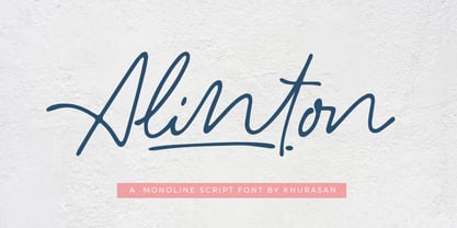 Introducing Alinton Signature Typeface - a font that is very fresh and unique style handmade. Alinton Signature Typeface is perfectly suited to logo, stationery, poster, apparel, branding, wedding invitation, card, tagline, layout design, and much more !!
 - KS Roam by Kreuk Type Foundry,
$16.00 KS Roam is a handmade display font with fun thick brush impression at a glance. Brush inspired display with strong, catchy & striking form display. KS Roam ideally suited for headline title, logo, branding, posters etc.
 - Black Ocean by Fargun Studio,
$14.00 Introducing Black Ocean!! Handwritten font with quick dry strokes and a signature style. perfect for branding projects, home ware designs, product packaging or simply as a stylish text overlay to any background image or posters.
 - Getrok by Prioritype,
$19.00 Typeface inspired by the wild style of street graffiti artists. There are two styles, namely regular and extrude. Great for poster design, product packaging, merchandise and so on. Features: Uppercase, Lowercase, Numeral, Punctuation & Multilingual. Thanks.
 - Kaleidoscope by Mysterylab,
$18.00 Kaleidoscope is a groovy retro font with roots in the Art Nouveau movement and the psychedelic sixties. Works great for trippy band or festival posters, logos, invitations, and anything that needs a flowing funky vibe.
 - OBO Regular by Wilton Foundry,
$29.00 OBO is a modern interpretation of the classical Italian letterforms with the readability of contemporary sans typefaces. OBO is ideally suited for creating identities for branding, posters, book covers, headlines, logotypes, restaurant menus, beer labels.
 - Latok by Juraj Chrastina,
$29.00 Latok is a fat geometric display family with an original vibrant feel for poster and editorial usage. You can choose Latok Small with wider gaps or Latok Large according to the size of the text.
 - Lucida Fax by Monotype,
$40.99Lucida is a family of fonts with one basic design, but offered in two variations. It has both serif and sans serif characters. Lucida is suitable for books/text, documentation/business reports, posters, advertisement, multimedia. - Briasantika by Brithos Type,
$11.00 Briasantika is a cursive and natural handwritten font. It looks beautiful on a variety of designs requiring a personalized style, such as wedding invitations, thank you cards, posters, flyer, greeting cards, logos and so on.
 - Amila Cuties by Prioritype,
$14.00 Introducing. Amila Cuties: Cheerful and funny font with a natural impression from hand strokes. Great for design projects like quotes, posters, merchandise, social media posts, covers, and more. Features: Uppercase, Lowercase, Numeral, Punctuation & Multilingual. Thanks!
 - Bronzen Abundance by Kaer,
$14.00 Vintage font with premium decoration. Classic line serif font. Bronzen Abundance is perfect to use in any alcohol labels, glamour posters, luxury identity, and more. Comes in four font styles: pattern, filled, line and colored.
 - Beitris by Kodhibanks,
$15.00 Beitris is a beautiful and elegant script font. Perfect for designing branding, blog logo, website logo, print ads, book covers, film covers, apparel, cards, logos, posters, etc. Beitris typeface gives you more alternatives in designing.
 - Hannah Joie by LightHouse,
$49.00Hannah Joie was influenced by the early lettering that appeared on posters in Israel (e.g. the 1950s). The style of the lettering was bold, heavy, and prominent. Hannah Joie is an OpenType/TTF Unicode font. - Axeleon Abstract by Sipanji21,
$16.00 Axeleon is great looking with a futuristic, rough, and metal-themed Display font. It will look great in death metal music projects, poster, logo band, band apparel, metal music logo, music album and much more!
 - Lucida Sans by Monotype,
$29.99Lucida is a family of fonts with one basic design, but offered in two variations. It has both serif and sans serif characters. Lucida is suitable for books/text, documentation/business reports, posters, advertisement, multimedia. - Greztro by Yoga Letter,
$17.00 "Greztro" is a unique display font. This font is equipped with uppercase, lowercase, numerals, punctuation, and multilingual support. It is suitable for Cinco de Mayo, Father's Day, Halloween, Christmas, stickers, posters, banners, branding, and others.
 - BD Mother by Typedifferent,
$25.00 BD Mothers’s main characteristic is the humorous blend of fat serifs, knobby curves and the thin square inner shapes. Perfect for use on posters, CD-jackets, titles in the range of cartoon, games and music.
 - MTF Hip Hip Yay by Miss Tiina Fonts,
$10.00 Hip Hip Yay is a fun and quirky display color font capable of taking any product out of the ordinary! Use it on bold and bright creations such as banners, posters, covers, titles, magazines, etc.
 - Amassian by Akifatype,
$12.00 Amassian is a modern smooth brush and natural handwritten font, organic, dynamic and energetic sytle.Can used for various purposes. such as the title, signature, logo, correspondence, wedding invitations, letterhead, signage, labels, newsletters, posters, badges, etc.
 - White Buttell by Trustha,
$14.00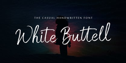 White Buttell is a handwritten brush script font. It has a natural style of a dry marker which makes it perfect for branding, advertising, poster designs, logos, book covers, magazines, packaging, website headers, and more.
 - Gaspol Remblong by Motokiwo,
$16.00 Gaspol Remblong - a natural handwritten script font with attractive style. It's fun typeface that recommended for headline, poster, movie, music, branding, and logo. Gaspol Remblong packed with Uppercase, Lowercase, Numeral, Punctuation, Multilingual, and also Ligature.
 - Infection by Ronin Design,
$15.00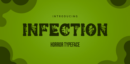 Infection is a horror and halloween font. Designed with a zombie virus touch will give a creepy impression, This font is ideal for labels, posters, or pretty much anything else that requires a creepy touch.
 - Lemonglory by limitype,
$17.00 Lemonglory is a modern font inspired by the shape of a leaf, with a unique shape this font is suitable for displays, logos, headlines, posters etc. Lemonglory is equipped with uppercase, lowercase, symbols and multilingual
 - Milk Made by loryn ipsum,
$12.00 Milk Made | a rounded retro font Milk Made is a fun rounded retro font inspired by mid-century magazine and print advertisements. Perfect for; retro brands, young brands, gen z branding, logos, social media, posters.
 - Arthur Hill by Trustha,
$15.00 Arthur Hill is handwritten with dry brush pen. With sharp details, this font is perfect for branding, logo, book covers, packaging, website headers, greeting cards, poster, merchandise, fashion campaigns, newsletters, album covers, quotes, and more.