10,000 search results
(0.255 seconds)
- Horror Dingbats - Unknown license

- Robu Choco Script by Typeverything,
$38.00 Choco is a new upright script family designed by Andrei Robu. It has four different weights with lots of alternate characters which makes this typeface perfect for logotypes and cool packaging.
 - Habana by Vladislav Ivanov,
$15.00This font opens a new era of typewriting and type design. At first sight, the font seems creepy, but it has a deep connection with some urban motives in its tune. - Little Japan by Okaycat,
$19.50Okaycat proudly presents Little Japan, our new dingbats font full of traditional Japanese icons. See the sights of Japan - beautiful Mount Fuji, geisha, sushi, sumo, shiriken, geta and so much more. - Taste Of Heaven by Crumphand,
$16.00 Introducing the new hand made font " Taste Of Heaven " This font made from real hand writing. Looks clean and cool What's Included ? Uppercase Lowercase Symbols Numerals Multilingual Supports Thank You, Regards!
 - Appetite by Serebryakov,
$49.00 Appetite is a bold sans font with a lot of sweet ligature glyphs. Specially designed for logotype, packaging & editorial design projects. Look at the new Appetite version — Appetite Pro — Release 2016!
 - SmoothyPro by Resistenza,
$39.00 Smoothy Pro, is a new version of Smoothy, our brushy textured font launched last summer. This summer we propose a smoother version without textures and also a light and slanted version
 - Hastag by Haksen,
$13.00 Just introduce my New Collection font. Hastag is a beautiful font for your brand and I love using this one with Photoshop for your requirement. What include : - Ligature - alternates for lowercase
 - Amiable Forsythia by Letterhanna Studio,
$19.00 Amiable Forsythia Script Font – a new modern, clean & fresh script with a lot of swashes and stylistic alternate, make this font looks elegant, natural, stylish and perfect for any awesome projects
 - Briskly Cabrales by Crumphand,
$19.00 Hello, Introducing my new font "Briskly Cabrales" The Briskly Cabrales is block handmade font. Strong, elegant, modern, calm. What's Inside The Fonts ? Uppercase Lowercase Symbols Numerals European Multilungual Thank you, Regards!
 - Clarence Alt by RodrigoTypo,
$25.00 It is a new version of Clarence, with very noticeable changes, very funny and informal signs. It also contains different variants like Shine, Extrude and you can combine them enjoy it! :)
 - Flax JY by JY&A,
$39.00David Philpott was inspired by the flax growing on the side of the motorway out of Wellington, New Zealand, and crafted this very distinctive, natural typeface family based on the plants. - Candlelight Dinner by Stefani Letter,
$14.00 Candlelight Dinner is a modern simple calligraphy font designed with an incredibly modern, beautiful feel, fresh, rich, and elegant. It’s great for Easter-themed greeting cards, branding materials, business cards, quotes, posters, and more! Candlelight Dinner will look outstanding in any context, whether it’s being used on busy backgrounds or as a standalone headline! This font is PUA encoded which means you can access all of the glyphs and swashes with ease! It features a varying baseline, smooth lines, gorgeous glyphs, and stunning alternates.
 - Advertisers Gothic by HiH,
$12.00 Advertisers Gothic is bold and brash, like the city it comes from, Chicago. It was designed by the accomplished German-American matrix engraver, Robert Wiebking, for the Western Type Foundry in 1917. As its name suggests, it was designed for commercial headliner work, much as Publicity Gothic by Sidney Gaunt for BB&S the year before. See our Publicity Headline. Alternate letters ‘A’ & ‘S’ are provided. The most popular ad words “Free!”, “New!” and “Sale” (with both esses) are provided at an angle for dramatic tension. Advertisers Gothic became quite popular because it was effective. It can work equally well for a flyer advertising a non-profit event as for a magazine product ad. This font refuses to be a wimp. Use it boldly. Advertisers Gothic ML represents a major extension of the original release, with the following changes: 1. A total of 335 glyphs (compare) with added glyphs for the 1250 Central Europe, the 1252 Turkish and the 1257 Baltic Code Pages. 2. Added OpenType GSUB layout features: pnum, ornm, liga, hist & salt ˜ with total 13 lookups. 3. Added 209 kerning pairs. 4. Revised vertical metrics for improved cross-platform line spacing. 5. The most popular ad words “Free!”, “New!” and “Sale” (with both esses) are provided at an angle for dramatic tension The zip package includes two versions of the font at no extra charge. There is an OTF version which is in Open PS (Post Script Type 1) format and a TTF version which is in Open TT (True Type)format. Use whichever works best for your applications.
 - Varidox by insigne,
$35.00 Varidox, a variable typeface design, allows users to connect with specific design combinations with slightly varied differences in style. These variations in design enable the user to reach a wider scope of audiences. As the name suggests, Varidox is a paradox of sorts--that is, a combination of two disparate forms with two major driving influences. In the case of type design, the conflict lies in the age-old conundrum of artistic expression versus marketplace demand. Should the focus center primarily on functionality for the customer or err on the side of advancing creativity? If both are required, where does the proper balance lie? Viewed as an art, type design selections are often guided by the pulse of the industry, usually emphasizing unique and contemporary shapes. Critics are often leading indicators of where the marketplace will move. Currently, many design mavens have an eye favoring reverse stress. However, these forms have largely failed to penetrate the marketplace, another major driving factor influencing the font world. Clients now (as well as presumably for the foreseeable future) demand the more conservative forms of monoline sans serifs. Typeface designers are left with a predicament. Variable typefaces hand a great deal of creative control to the consumers of type. The demands of type design critics, personal influences of the typeface designer and the demands of the marketplace can all now be inserted into a single font and adjusted to best suit the end user. Varidox tries to blend the extremes of critical feature demands and the bleeding edge of fashionable type with perceptive usability on a scalable spectrum. The consumer of the typeface can choose a number between one and one-thousand. Using a more conservative style would mean staying between zero and five hundred, while gradually moving higher toward one thousand at the high end of the spectrum would produce increasingly contemporary results. Essentially, variable fonts offer the ability to satisfy the needs of the many versus the needs of the few along an axis with a thousand articulations, stabilizing this delicate balance with a single number that represents a specific form between the two masters, a form specifically targeted towards the end user. Practically, a user in some cases may wish to use more conservative slab form of Varidox for a more conservative clientele. Alternatively, the same user may then choose an intermediate instance much closer to the other extreme in order to make a more emphatic statement with a non-traditional form. Parametric type offers a new options for both designers and the end users of type. In the future, type will be able to morph to target the reader, based on factors including demographics, mood or cultural influences. In the future, the ability to adjust parameters will be common. With Varidox, the level of experimentality can be gauged and then entered into the typeface. In the future, machine learning, for example, could determine the mood of an individual, their level of experimentality or their interest and then adjust the typeface to meet these calculated parameters. This ability to customize and tailor the experience exists for both for the designer and the reader. With the advent of new marketing technologies, typefaces could adjust themselves on web pages to target consumers and their desires. A large conglomerate brand could shift and adapt to appeal to a specific target customer. A typeface facing a consumer would be more friendly and approachable, whereas a typeface facing a business to business (B2B) customer would be more businesslike in its appearance. Through both experience, however, the type would still be recognizable as belonging to the conglomerate brand. The font industry has only begun to realize such potential of variable fonts beyond simple visual appearance. As variable font continues to target the user, the technology will continue to reveal new capabilities, which allow identities and layouts to adjust to the ultimate user of type: the reader.
 - Beardman Outline by Jafar07,
$10.00 Beardman is a condensed sans-serif font designed specifically for bold and powerful headlines and titles. With four variants available: regular, italic, regular outline, and italic outline, this font allows you to express yourself with a style that suits your design project. The name "Beardman" is inspired by the meaning of a man who is masculine but has a soft heart, and it is reflected in the font's design. With strong and sturdy letterforms, the font also has a gentle and smooth touch that gives an elegant and modern impression. With its strong and expressive appearance, "Beardman" is suitable for use in graphic design projects such as posters, brochures, magazines, websites, and much more. Add a touch of masculine yet gentle to your design with the "Beardman" font. What did you get? Regular, Italic, Regular Outline & Italic Outline Alternates & Ligatures Numbers & Punctuation Multilingual Support Works on PC & Mac Simple Installations
 - Romans Lovers by Alit Design,
$12.00 Introducing Roman Lover Elegant typeface + Bonus Boho Illustrations The Roman Lover Serif typeface is an elegantly themed font that has a dynamic serif style. The details of the shape of the "Roman Lover Serif Elegant typeface" are very smooth and flow to create unique and beautiful curves. Elegant Serif typefaces such as “Roman Lover Serif Elegant typeface” are very easy to apply to any design, especially those with an elegant and smooth concept, besides that this font is very easy to use both in design and non-design programs because everything changes and glyphs are supported by Unicode (PUA). The Roman Lover Serif Elegant typeface contains 573 glyphs with many unique and interesting alternative options. Plus, there's a cool serif font family for header and description text from Thin to Heavy. In the poster preview all the letters are in the Roman Lover Serif Elegant typeface.
 - Psychofun by Alit Design,
$15.00 Introducing Psychofun Typeface Psychofun Typeface is designed with a retro style concept that has a unique and cool shape. It is suitable for header text fonts, book covers and designs that have a retro and groovy concept, besides that Psychofun Typeface is also very good when used for body text. Psychofun Typeface has 5 families from Regular to Heavy. Display Serif typefaces such as “Psychofun Typeface” are very easy to apply to any design, especially those with an retro, groovy and classic concept, besides that this font is very easy to use both in design and non-design programs because everything changes and glyphs are supported by Unicode (PUA). The Psychofun Typeface contains 530 glyphs with many unique and interesting alternative options. Plus, there's a cool display serif font family for header and description text from regular to heavy. In the poster preview all the letters are in the Psychofun Typeface.
 - Beardman by Jafar07,
$10.00 Beardman is a condensed sans-serif font designed specifically for bold and powerful headlines and titles. With four variants available: regular, italic, regular outline, and italic outline, this font allows you to express yourself with a style that suits your design project. The name "Beardman" is inspired by the meaning of a man who is masculine but has a soft heart, and it is reflected in the font's design. With strong and sturdy letterforms, the font also has a gentle and smooth touch that gives an elegant and modern impression. With its strong and expressive appearance, "Beardman" is suitable for use in graphic design projects such as posters, brochures, magazines, websites, and much more. Add a touch of masculine yet gentle to your design with the "Beardman" font. What did you get? Regular, Italic, Regular Outline & Italic Outline Alternates & Ligatures Numbers & Punctuation Multilingual Support Works on PC & Mac Simple Installations
 - P22 Underground Pro by P22 Type Foundry,
$49.95 The P22 Underground Pro font family started in 1997 as the first and only officially licensed revival of Edward Johnston’s London Underground railway lettering. The original design by Richard Kegler sought to be as true to the original as possible. In 2007 P22 revised and expanded the fonts into a massive character set with additional weights, language support, and stylistic alternates. Endeavoring to make this font family a more versatile and useful tool for a designer, P22 sought to add true italics to this stalwart type design. The only other existing italic interpretation of Johnston’s Underground type was executed by the inimitable Dave Farey and Richard Dawson at Housestyle Graphics. We asked Dave Farey to imagine an Underground italic that would pair well with the P22 Underground, done as if Edward Johnston himself might approach the design challenge. This new italic version was then expanded for all six of the existing P22 Underground weights and characters sets by James Todd of JTD Type. Final mastering of the P22 Underground Pro roman and italic with a streamlined yet still expansive language coverage by P22 partner Patrick Griffin of Canada Type. These refinements remain true to the original Johnston design while employing contemporary typographic finesse to create six weights with optional alternates to increase legibility. The new P22 Underground Pro family is now a rock-solid and very versatile humanist sans serif font family that should be a cornerstone of any designer’s typographic toolkit. After five years in development, the new P22 Underground Pro is the most iconic and useful font family ever presented by P22 Type Foundry.
 - Front Page by Jonahfonts,
$35.00 Usage recommendations: Captions, packaging, cards, posters, ads, book jackets, manuals, menus.
 - Mediafont by La Boîte Graphique,
$25.00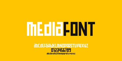 Mediafont is a modern geometric font ideal for titration, branding, poster.
 - Pricelist by Letterhead Studio-VG,
$- Price-list is the display font. Good for posters and magazines.
 - Fenotype Dingbats by Fenotype,
$19.00 A set of urban images for flyers, posters and LP-covers.
 - Olech by Sebastian Cabaj,
$14.00 Olech is great typeface for titles, posters, books, covers and labels.
 - 1543 Humane Jenson by GLC,
$38.00 In 1543 the well-known “De humani corporis fabrica” treatise on anatomy by André Vesale, was printed by Johann Oporinus in Basel (Switzerland). Various typefaces were used for this work, mostly in Latin but including Greek characters. Its Jenson-type font was the one which inspired this font. It is a very elegant one, including the “long s”, a few abbreviation forms and ligatures. As it was a Latin text, there were no accented characters and a few capitals were absent. I had to reconstruct them. A render sheet, in the font file, makes all characters easy to identify on the keyboard. This font may be used as a “modern” one for web-site titles, posters and flier designs, publishing ancient texts... and anything else you want! One of the most elegant types ever cut, it stands up very well to enlargement, remaining as readable as in its original small size.
 - SF Willamette - Unknown license

- SF Baroquesque - Unknown license

- SF DecoTechno - Unknown license

- SF Laundromatic - Unknown license

- SF Speedwaystar - Unknown license

- SF Hallucination - Unknown license

- SF Retroesque - Unknown license

- 1492_Quadrata_lim - Unknown license

- SF Wasabi - Unknown license

- Abiscuos - Unknown license

- Klickclack by Device,
$39.00 A loose sans for all mod happenings, beatnik poetry readings, hootenanny hoedowns and kartoon kapers. Ya dig? Also included is a flourished swash variation which is most definitely not intended for caps-only use.
 - Rebel Train Goes by Dharma Type,
$14.95 Based on retro vinyl records in the middle of 20th century. There are three other fonts designed by in the same concept. -Word From Radio -African Elephant Trunk -Moon Star Soul -Rebel Train Goes
 - Mess Hall JNL by Jeff Levine,
$29.00Modeled from a set of individual painting stencils, Mess Hall JNL is named for the armed services cafeteria where thousands of enlisted men endured bland, boring meals day in and day out for years. - Beautiful Things by Brittney Murphy Design,
$8.00 Beautiful Things is a wistful non-connecting script with sweeping ascenders and descenders and natural, flowing lines for an informal, yet elegant look. Contains over 700 glyphs, including foreign Latin characters, alternates and ligatures.


