10,000 search results
(0.034 seconds)
- Neubau Pro by TipografiaRamis,
$49.00 Neubau is a condensed geometric display typeface, designed in 2009. The inspiration for this face came from Joost Schmidt lowercase letters developed during 1925-28 in Bauhaus Dessau. Schmidt was one of the proponents of New Typography – a movement advocating the use of only lowercase letters which were constructed strictly geometrically using only ruler and compass. Neubau Pro is the new edition of Neubau fonts. The new typeface is an upgraded version of an old fonts (2009), with careful refinements to glyph shapes, and the extension of glyph amounts which enabled support of more Latin languages as well as Greek and Cyrillic languages. Neubau Pro is released in six styles with small caps, and true italics, and contains OpenType features. This typeface can be used for editorials and print designs.
 - Dueblo by alphabeet.at,
$40.00 Dueblo is a font family in serif, sans serif and semi serif with variability in weight and serifs. It's a classical antiqua with a sans serif basis, a semi serif version, two decor styles for headlines and initials and the italics in sans and in serif. The small caps, alternates as well as other useful optional and contextual open type features are included in the fonts. It has been in development since 2012 and in use for several projects and publications since 2015. It was worked on until 2020, the cyrillic and greek letters were added, and it was built up in a new and modern way. Now it's really ready for building words and paragraphs.
 - Laskey by Factory738,
$15.00 Laskey, a new retro serif, is now available! Laskey is a stylish font that is both retro and sophisticated. The serifs bring it back to tradition, while the smooth curves give it a 70s groovy vibe. Laskey is a perfect match for those vintage moodboards and logos. Numbers, punctuation, and multilingual letters are all included, as well as a distinct lower and uppercase. The ligature and italic fonts will come in handy for anything your imagination can think of! Laskey (Regular and Italic) Basic Latin A-Z and a-z Numerals & Punctuation Stylistic Alternates & Ligatures Multilingual Support for ä ö ü Ä Ö Ü ... Free updates and feature additions Thanks for looking, and I hope you enjoy it.
 - Toothpaste Two by Eclectotype,
$20.00 Toothpaste Two is a reworking of Toothpaste . The new font has all the features of the original Toothpaste, but is now even crazier, with the line twisting and turning over and under itself, making a tangled string of text bordering on the edge of legibility. As in Toothpaste, every letter and number connects and there are numerous contextual alternates and ligatures to keep it all running smoothly. This is a fun, decorative font. It would look good on kids' websites, scrapbooks, party invitations and the like. It works best in brighter colors on darker backgrounds, which give the characters a neon light quality. Also, try it with a stroke for a cool cartoony effect.
 - Cloister Initials by GroupType,
$29.00 Cloister Initials™ have become FontHaus's most popular decorative initials font since we began selling it in 1993. First released in 1919 for ATF, Goudy's "Cloister Initials", sometimes called Goudy Initials is recognized as "one of the most beautifully designed set of initials ever made". We agree. Our digital revival is historically accurate because it was referenced from the actual ATF 144-point brass matrices acquired at the now legendary and final ATF auction in Elizabeth, New Jersey in 1993. The exquisite design of each character inspire it's use. Perfect for holiday invitations, elegant note pads, as drop caps or in period design. We've even sold these initials for use as company logos.
 - Frenchute by Tipo Pèpel,
$22.00 France 1727, the book Le chemin Royal de la Croix is published. Centuries later the historical publication comes into the hands of Josep Patau, who uses its printed pages as a reference for a new digital typeface. Previously created for printing, those shapes adapt now to the screen and show the sophistication and authenticity of true Garalde types. Frenchute is a multipurpose typeface with 3 optical sizes. All the shapes were modified to cover different typographic needs. The diagonal axis and the moderate stroke contrast are taken further in the italics letterforms, where the design is far more expressive. The character set includes decorative forms and italic capitals with swashes, so the text looks prettier.
 - Combinado by My Creative Land,
$20.00 Please welcome a new Combinado Font Family that has it all: elegant display sans serif and serif fonts in three weights each; a modern calligraphy script that looks beautiful next to them; a sans serif font designed specifically for the best on-screen reading experience, which comes in two weights (for now! more to come); and the last but not least - Design Elements font that has more than 70 elements to compliment your designs. This font family is very universal and you can use it everywhere: websites, instagram ads, magazines, books, cards and invitation designs, as well as in all possible personal design project that do not fit in any of the listed categories! Enjoy!
 - Kelaskin by Product Type,
$17.00 Introducing Kelaskin, a classic serif font that exudes elegance and sophistication. Its timeless design is perfect for any project that requires a touch of old-world charm. Kelaskin features a stylistic set that alternates on both uppercase and lowercase letters, giving you more options to customize and create unique designs. This font is versatile and perfect for a wide range of applications, from branding to editorial design. Its multilingual support ensures that your message can be conveyed across various languages and cultures without any hiccups. With Kelaskin, you can bring a touch of timeless class to your design projects. Get Kelaskin now and elevate your design to a new level of beauty and professionalism.
 - Speedway SG by Spiece Graphics,
$39.00 Motoring at top speed calls for your own high-performance machine and a special racetrack font to run it on. Speedway was built with blacktop smooth caps to ease you through those short and dangerous curves. And its sleek, aerodynamic lowercase linking makes getting your speedy cruiser to the checkered flag a breeze. Developed in typeface alley for discriminating designers. And for the more adventurous, Speedway SG is now available in the OpenType Std format. Some new characters have been added to this OpenType version. Advanced features currently work in Adobe Creative Suite InDesign, Creative Suite Illustrator, and Quark XPress 7. Check for OpenType advanced feature support in other applications as it gradually becomes available with upgrades.
 - Gelato Fresco by Eclectotype,
$49.00 Gelato Fresco represents a coming-of-age of a script font that started life in 2011 as the popular Gelato Script. In 2018, Gelato Luxe sought to improve on Gelato Script, and now, with the addition of extra weights for the first time, Gelato Fresco takes the baton. What was always a typographically sophisticated and versatile font, has reached new levels of usability as it becomes a family. In its previous incarnations, the typeface has graced everything from designer handbags to prime-time TV shows; food blogs to wedding invitations; glossy magazines to (not so imaginatively!) ice cream shops. I can't wait to see what this even more versatile version gets used for.
 - Modesto Text by Parkinson,
$25.00 The Modesto Text Family is text in name only. It’s called Text because it has a Lower Case, and also to distinguish it from the rest of the Modesto clan. Modesto is a loose-knit family based on a signpainters lettering style popular in the late-19th and early-20th centuries. It evolved from the lettering I used for the Ringling Bros. and Barnum & Baily Circus Logo. The Modesto family was not planned. It just happened, a few fonts at a time over about fifteen years. In 2014 seven new Italic fonts and two Chromatic families were added. There is a downloadable MODESTO USER MANUAL PDF in the Gallery section for this family.
 - Andarillo by Franklin Veiga,
$10.00 Andarillo is a display typeface inspired by vintage travel posters and magazines. The complete glyph set contains uppercase, small caps, numerals, punctuation, ligatures and multilingual support. Andarillo is perfect for logotypes, magazines, titles, posters, advertising and branding communication.
 - Hapshash by K-Type,
$20.00 Hapshash is an all capitals font inspired by the 1960s psychedelic posters of British designers Hapshash and the Coloured Coat (Michael English and Nigel Waymouth), in particular their 1968 poster for the First International Pop Festival in Rome.
 - Evil Eye by Goodigital13,
$20.00 Suitable for various media, posters, banners, brochures, and various merchandising such as t-shirts, totte bags, stickers and much more perfect for display such as label, apparel, fashion, sticker, books, poster, and many more! Complete with OpenType features.
 - FF Attribute Text by FontFont,
$72.99 FF Attribute™ Text is a proportional design with a faux monospace appearance. It has an industrial strength, minimalist vibe, making it perfect for attention getting, theme-based headlines, posters, banners and navigational links. And, because it is such a robust family, FF Attribute can also be used for branding of blogs, games, web sites and tech products. FF Attribute comes in two families; Mono and Text. The Mono is a fixed width (monospace) design, while the Text is a proportional design. FF Attribute was, in fact, initially designed for the use in code editor software. Its seven roman and italic monospaced weights and extended character set supporting a many languages, also make it a powerful communications tool. But this is only the tip of the iceberg. In addition to the monospaced version, where all characters share a fixed width, there is also a proportional, “faux monospaced” version: FF Attribute Text. The Text family keeps the visual character of a monospaced typeface, but wide letters are given more space while narrow characters have been drawn with correct proportions and spacing. FF Attribute Text looks monospaced – but it’s not. Drawn by Viktor Nübel, FF Attribute Text’s 14 designs, huge character set, including box-drawing characters and user interface-icons, make it the Swiss Army Knife® of monospaced fonts.
 - Borsga by Baqoos,
$18.00 Borsga is a mono fraction linear sans apt for headline, editorial, branding, packaging, printed materials and typographic applications. 200+ glyphs with ligatures, fractions provided in opentype .otf and .woff format.
 - Konstantin Forte by Wiescher Design,
$39.50My son Konstantin needs a bold face for his bold recipes. So I made Konstantin Forte for him — and the rest of the world. Your bold family designer, Gert Wiescher. - Trafalgar Stencil JNL by Jeff Levine,
$29.00Trafalgar Stencil JNL gets its inspiration from a set of lettering stencils manufactured by Reese and Sons in Great Britain during the 1950s as does its counterpart, British Stencil JNL. - Habanero by Mans Greback,
$59.00 Habanero is a hot, bold and happy typeface. The font was created by Måns Grebäck in 2016, and it contains contextual alternates and ligatures to make your type stand out.
 - Barbou by Besnowed,
$19.99 Barbou was originally cut in 1925 by Monotype as a counterpart to Fournier, siblings that were different in design but both based on the work of Pierre-Simon Fournier. Whether by choice, accident or oversight, Fournier was preserved digitally, and Barbou was lost to history. Barbou was notably used by Stanley Morrison, in particular as the face of The Fleuron. I fell in love with Barbou when I saw it, and knew that I wanted to bring it to a new generation of designers and readers. This is a revival of Barbou, a faithful recutting with new weights, characters and many of the best features that modern font technology brings. Particular attention was paid to the original Monotype Barbou 178 specimen sheet. Originally only available in a single weight, Barbou has been recut with a variable weight, providing a large degree of flexibility between Regular and Bold. Barbou excels as a comfortable reading face for books, and the variable weight allows you to fine tune the darkness and texture of the page in a way never before possible. Barbou has a distinctive softness, and this revival of Barbou preserves much of the effect the medium of metal type had on the letterforms. This results in a subtly rounded yet defined type, elegant not worn, with the utmost attention and respect to the smallest of details. Barbou was originally cut with disparate x-heights for roman and italic, and this revival of Barbou features both the original italic, as well as a new italic redesigned at the same height as the roman. In Fournier’s time, roman and italic would not be mixed on the same line, but the type must change to meet the needs of a new generation. Barbou also features unique ligatures and alternates, old style numbers, small caps and a full Greek alphabet. Barbou is perfect for books and anywhere a comfortable reading face is required, and excels in flexibility.
 - Code Next by Fontfabric,
$39.00 10 years later, one of the first geometric typefaces in our portfolio and a popular favorite of yours is rising to a whole new level! We’re revealing the stand-alone type family Code Next—a staggering evolution from Code Pro in functionality, versatility, and application. The transformation includes 6 new weights, 10 new Italics, full support of Extended Cyrillic and Greek, full redesign and glyphs refinement, 2 variable fonts, to name but a few. Going back to 2011, the grotesque-inspired Code Pro was designed to complement memorable pieces that make a statement. Balancing between stylization and simplification, it was encoded with the distinct voice of basic organic shapes to stand the test of time. Little did we know, it would expand and live up to the potential of a “font from the future” as the new Code Next. Today, a type family of 22 styles, this geometric sans solidifies its relevance and carries a strong constructive aesthetic through simplified forms with a twist. These fit any modern design in print, web, and display visualization. Developed to go above and beyond, Code Next comes prepared for multi-script projects with Extended Latin, Extended Cyrillic, and Greek. Explore Code Next’s versatility and switch things up with the help of 2 variable fonts, more than 1280 glyphs, and an extensive OpenType features set including small caps, standard and discretionary ligatures, contextual and stylistic alternates, stylistic sets, case sensitive forms, and much more. Overview: • Font family of 22 fonts • 10 weights • Languages - Full support of Extended Latin; Extended Cyrillic; Greek • Entirely refined design and metrics • Glyph count - 1288 • Variable fonts - 2 fonts OpenType features: • Small Caps • Standard Ligatures • Discretionary Ligatures • Contextual Alternates • Stylistic Alternates • Stylistic Sets • Case-Sensitive Forms • Ordinals • Localized Forms • Lining Figures • Proportional Figures • Tabular Figures • Oldstyle Figures • Subscripts • Scientific Inferiors • Superscripts • Numerators and Denominators • Fractions • Roman figures • Extensive mathematical support • Navigation symbols
 - Austin Antique by HiH,
$10.00 “More is better” may have been the motto of Richard Austin of Austin and Son’s Imperial Letter-Foundry on Worship Street at Finsbury Square in London when he designed and cut his Antique typeface. The year it was created is uncertain, but it is known to have appeared in a specimen book produced in 1827. At first glance, the upper case letters of Austin Antique look very much like Figgins Antique. But, upon examination, one will note that the Austin face is much darker. In general, the letters designed and cut by Richard Austin have fatter strokes, larger serifs and smaller counters -- more metal and less daylight. The premise was that the darker the letter, the more attention an ad using the typeface would receive. In old pictures of London and Paris one may see walls crowded with posters and “bills” -- competing for the attention of the passerby. Morris and Updike aside, the early nineteenth century marked the beginning of a commercial as well as industrial revolution. Patterns of commerce were changing. With new methods of marketing came the need for new typefaces to support the new methods. Foundries found the display types were very profitable and competed most energetically and creatively for the trade. There was a lot of trial-and-error. Some ideas faded away. Others, like the Antiques or Egyptians, were refined and developed. From them came the Clarendons that were to prove both popular and long lasting -- because they worked. Their job was to sell goods, not please the aesthetic sensibilities of the critics. They did their job well. Austin Antique has a full Western European character set, plus the following ligatures: ct, st, fi, fl, ff, ffi and ffl. Tabular numbers. Surprisingly readable.
 - Stonetype by Kustomtype,
$20.00 Stonetype is a typeface that was used by stonemasons in the 70s & 80s of the last century. When I was starting as a stonemason, these were the first characters I had to draw, by hand, back then on grave monuments and memorial plaques. The idea was born to digitize all the material, to be saved for eternity. By digitizing all and fine tuning, plus the addition of some main characters, Stonetype has now grown into a user-friendly typeface that can, now still, be used by stonemasons, to improve their creation process times. But Stonetype can also easily be used in modern and contemporary designs. Stonetype is the perfect fit for graphic design, editorial design, magazines, posters, logotypes, brands and corporate design. Stonetype is designed by Coert De Decker in 2019 and published by Kustomtype Font Foundry.
 - Olympukes 2012 by Barnbrook Fonts,
$30.00 Released on the occasion of the 2012 London Olympics, Olympukes 2012 was a new set of pictograms telling the ‘real’ story of the Olympics and extending the unofficial project that began in 2004. The occasion of the London games provided an opportunity to revisit the complex contradictions of the modern Olympics and to acknowledge the geopolitical shifts of the intervening eight years. The 2012 games arrived at a time of great economic and political uncertainty for the nation and Europe. Greece – the host of the 2004 games – was now located at Ground Zero of a disintegrating Eurozone and the United Kingdom was two years into a programme of austerity enacted by the coalition government of Conservatives and Liberal Democrats. Given that the previous London Olympics had been held in 1948, in a climate of recovery and austerity after a devastating World War (1948’s Olympiad was dubbed the ‘Austerity Games’) there was a sick irony to the 2012 games' arrival. The suppression of human rights in order to deliver the perfect games for PRoC’s Beijing games shocked no-one and yet, in London, the security measures seemed grossly excessive. Then again, in a country with an estimated 1.8 million cctv cameras, perhaps we shouldn’t have been so surprised. Another aspect of the Olympics that returned for 2012 was the unfettered commercialism – if you think the Games are about pure sport, about noble human endeavour, think again. Please note that Barnbrook Fonts is in no way affiliated with, or has received any endorsement from, the International Olympic Committee, the organising committees of the Olympic Games, or any national Olympic committee.
 - Lions Den by Jesse Tilley,
$19.95 A font inspired by 40s movie posters. Enjoy!
 - Starring by Jesse Tilley,
$19.95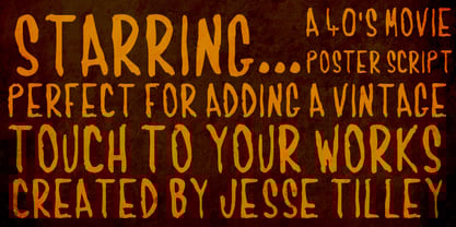 Another font inspired by 40s movie posters. Enjoy!
 - Green Mexican by Vozzy,
$10.00 Introducing a vintage look label font named "Green Mexican". You can see all available characters in the posters. This font has 4 styles. This font will look good on any retro design like poster, t-shirt, label, logo etc.
 - Slovenia by Garisman Studio,
$20.00 Introducing Slovenia Callygraphy Slovenia very perfect for logos, wedding invitations, posters, business cards, headlines, Instagram stories, youtube stories, book cover, poster promotion and many more! Includes many ligatures and opentype features, also Stylistic Sets with end & start love swashes.
 - Mystyline Decorative by Struvictory.art,
$14.00 Mystyline is a modern thin line condensed font inspired by hipster aesthetics. The letters are decorated with lines and dots. Mystyline is suitable for contemporary typographic posters (event design, movie posters, advertising, music production, photo overlays), hipster design etc.
 - Durer Gothic - Unknown license

- Cheetah - Unknown license

- HollyWould - Unknown license

- Espania - Unknown license

- Athena by Solotype,
$19.95This beautiful old design was originated at the Connor Foundry, New York, about 1888. Ideal for the small "in between" lines in modern versions of Victorian job printing. - The Vision Type by Oleg Coada,
$19.00 The Vision font is a display font with a temper. Has a bold and cheerful personality. Ideal if you want to add a new experience to your work.
 - Southern Colonialist by Intellecta Design,
$19.90Southern colonialist is a new slab typeface from Intellecta, based on ancient advertisements from the Wild West of America Good for titling and display usage; in many styles. - Alro by Artyway,
$12.00 New modern font with aesthetic principles of renowned Bauhaus design school. It's based on radically simplified forms, functionality and rationality. The embodiment of modernism, modern and authentic style.
 - North Blue by Aldedesign,
$18.00 North Blue is a new, stylish and quirky script. It was created to look as close to a readable script as possible, and includes great swash characters too.
 - Western Sky by FontMesa,
$25.00 Western Sky is a revival of a late 1800s Italian font known as Italian Slab Fancy or Dodge City. New to this font is the rope swash version.
 - Rotunde by Gerald Gallo,
$20.00 Rotunde is a very bold contemporary sans serif font. It is ideal for headlines, titles, branding, small blocks of text or wherever a fresh new look is desired.


