10,000 search results
(0.056 seconds)
- Gothic Extended by Wooden Type Fonts,
$15.00Based on a revival of one of the popular wooden type fonts of the 19th century, suitable for display, lower case missing but not always designed for this type of face. - Laberintia by Rodrigo Navarro Bolado,
$30.00 "And she, Pasiphae, gave birth to Asterion, who was also known by the name of Minotaur, since he had the face of a bull and the rest of a man. Minos wanted to beware against certain oracles by locking him in a maze. It was the labyrinth, the work of Daedalus, a construction of tangled revolts that strayed from the exit.” - Apollodorus from Atenas. LABERINTIA is a font inspired by Daedalus' masterpiece, The Cretan Labyrinth, an experimental, display typeface that creates textures, plays with the mind and loses anyone who dares to take a walk inside it.
 - Transit Station JNL by Jeff Levine,
$29.00 The thin and stylish Art Deco lettering of a neon sign above the Greyhound bus terminal entrance in a 1930s New York City photo inspired Transit Station JNL, which is available in both regular and oblique versions.
 - Vertical by Alias,
$60.00 Alias Vertical is a sans serif typeface with a vertical cut-off point for letter endings. The vertical cut-offs bend round characters (b, c, o, etc) into a squarish, high-shouldered shape, suggesting Roger Excoffon’s Antique Olive. In mid-weights, the typeface mixes Antique Olive with typefaces such as Gill or Johnston, for example the shape of the t, the l borrowing Johnston’s flick. Vertical has the same minimal difference in weight between verticals and horizontals as Gill and Johnston, and the same sharp connection point where curves meet straight lines. Like Antique Olive, Vertical has a narrow connection point here, adding contrast and definition. The overall effect feels austere at lighter weights and strident and graphic at bolder weights, and sharp and incised throughout. In the Bold and Black weights, the squarish and top heavy shape of Antique Olive is most noticeable. For example the wide uppercase, with the B having almost-even width between top and bottom curves, and the almost-overhang of the top curve of the G. But Vertical does not have as extreme an aesthetic or square shape as Antique Olive. As well as its wide design, the upper case is given extra authority by being a slightly heavier weight than the lower case. This is a device borrowed from Gill, and other ‘old’ typefaces, where the upper case is presented as a titling design. Modern sensibilities are more focussed on an even colour between upper and lower case. Vertical was originally intended as a sister typeface to Ano, like AnoAngular or AnoStencil. Vertical developed into a similar but separate design. Ano was designed for use in Another Man — in its modular, circle-base design, and the way there aren’t the amendments usually made in bolder weights to ensure letter clarity. This is for layouts where different weights are used together in different sizes so that the overall letter weight is the same, a feature of the magazine. Where Ano is simple and graphic, Vertical has nuance and texture. It is a pragmatic, utility design. In the balance between graphic and typographic, its focus is the latter.
 - Bayer Sans by Victory Type,
$20.00Bayer Sans, is based on the typography of the Austrian-born artist Herbert Bayer. Bayer worked as a teacher and graphic designer at the Bauhaus, a revolutionary German art school, during the 20's. His specialty was commercial art and he had many "radical" views on typography and its interaction with society. Bayer felt that written language should be merely a graphic version of spoken language. Thus, he advocated a single alphabet without majuscules and miniscules. Bayer's designs are simple, geometric letterforms that lend themselves to lowercase form. This font, based on the typography of Bayer and his students at the Bauhaus Werkstatt (studio), was digitally modeled by Noah Rothschild. Bayer Sans features a complete character set including European characters, alternate letters with adjusted widths and designs and ligatures. Included are the "f" characters and a special linked double-o. - Tutti Paffuti NF by Nick's Fonts,
$10.00 The specimen book Alphabete: ein Schriftatlas von A bis Z identified the pattern for this typeface as Stymie Black Flair. Although neither the designer nor the original foundry is identified, it bears a strong resemblance to the work of Dave West for Photolettering in the 60s and 70s. Big, beautiful and bodacious, it’s a natural choice for attention-grabbing headlines. Many alternate characters available: see the full character map. The PC PostScript, TrueType and OpenType versions contain the complete Latin language character set (Unicode 1252) plus support for Central European (Unicode 1250) languages as well.
 - Morgini by Gatype,
$14.00 Introducing new Morgini Serif Typefaces with lots of alternative characters, SWASH and unique ligatures. It appears regularly and boldly with lower and uppercase letters, numbers, punctuation marks plus multilingual letters. A must have for every modern graphic designer now! Morgini is a very versatile font. Perfect for branding projects, logos, magazine imagery, wedding invitations, posters, apparel, packaging, website headers, or simply as a stylish text overlay onto any background image.
 - Cralione by Jamalodin,
$16.00 Cralione Script Now Comes with updated neater glyphs, more stable kerning size, new punctuation & numbers. Cralione is a beautiful modern calligraphy script font that is suitable for branding, invitations, greeting cards, posters, name card, quotes, blog header, logo, fashion, apparel, letter, stationery and other projects. To access all OpenType Stylistic alternates, you need a program that supports OpenType features such as Adobe Illustrator, Adobe Photoshop, CorelDraw and Microsoft word.
 - Metalista by Suitcase Type Foundry,
$39.00 The Metalista font was created as a sign of undying admiration for the persistence of heavy metal culture. The angled font of almost fixed width proportions combines capitals with small letters for more variety and better definition of individual letters. Stressing the horizontal strokes subdued the historical Gothic character and emphasized a more modern signature, which is far different from the majority of current attempts at a modern adaptation of Fraktur fonts. We offer Metalista in three styles, or rather widths to be exact: Speed is inspired by the whiplash pace of 70s and 80s speed metal, and can tell and perform a lot even in a very small space; uncompromising Death balances on the fine line between expression and readability; and Metalista Black is the universal go-to, whether as megalomaniacal titles sprawled across the entire LP cover or as tiny texts for glam rock CD booklets.
 - Volterra by Blank Is The New Black,
$25.00 In today's typographic landscape, few would still consider Bodoni to have a "modern" feel, but there was once a time when it's vertical axis and thinned horizontal strokes were considered radical. Volterra—inspired by the forms of Bodoni—finishes what Bodoni started and eliminates the horizontal stroke altogether, breathing an elegant new energy into a 200-year-old classic. Named for the artist hired to paint loincloths over Michelangelo's "Last Judgement" when nudity in religious art was condemned, Volterra acknowledges that it is no easy feat picking up where a master left off. Volterra takes what has grown to feel traditional and transforms it into a delicate mixture of classic and modern, with razor-edged serifs and ultra-sharp strokes. Strictly a display face, the larger Volterra is used, the better it looks.
 - KG Sorry Not Sorry by Kimberly Geswein,
$5.00 A neat blocky solid font for headlines. In two weights.
 - Cirquela by Funk King,
$5.00 Cirquela is a new direction in type design for me. This is my first calligraphy font and my first hand drawn. This is a limited character set, but as I continue to explore this space, I hope to expand the character sets of fonts I offer for sale. In the meantime, please enjoy Cirquela. This is a fun font. Eccentric, yet it possesses a subtle formality in spite of itself. Passionate, furious, yet sublime.
 - Haenel Fraktur by RMU,
$25.00 A bold but nevertheless pleasant black-letter font which was released for the first time about 1840 by the Haenel'sche Printshop and Letterfoundery in Berlin. Haenel Fraktur contains a bunch of useful ligatures, and by typing 'N', 'o' and period you get an old style number sign by activating the Ordinals feature.
 - Yngreena by Ingrimayne Type,
$12.95 Yngreena is a serifed typeface with calligraphic origins. In updating it in 2011, I began to add alternative letters and reached the point where it made sense to create an alternative family of faces rather than include all the alternatives as part of an OpenType font. The letters K, R, V, W, Y, f, g, k, t, v, and w are tamer in Yngreena Alt. As a result, though it is still a decorative text face, Yngreena Alt is better suited for lengthier blocks of text than is the original Yngreena face.
 - Medieval Borders by Aah Yes,
$5.00 This is a large group of typefaces inspired by those borders and patterns you see going across documents from the Middle Ages and Medieval times, eventually becoming this collection of fonts where you can scroll various repeating patterns across a page, for example. You can get a repeating pattern that scrolls seamlessly by repeating the same letter. The default text displaying on the web-page is bbbbbbbb, for example. There's over 2 dozen basic styles, and each style has 52 designs within it, using the characters Upper Case A - Z and lower case a - z, with the lower case being the negative/reverse colour of the Upper Case version, it will be the corresponding design just reverse coloured and with an edging strip. There's also a space - but nothing else. The styles in these fonts usually have groups of six characters (A to F, G to L, M to R, S to X), and where the second group is a variation on the first - usually thicker lines - and the third grouping is another variation on that, usually thicker lines again, making the first 24 letters. (Sometimes there's three groups of eight characters). The pattern within a group normally starts off plain then gets busier as it progresses - such as there'd be a more complex pattern of circles and diamonds as you go through the letters. Then the letters Y & Z are somewhat different to the rest. There's four versions starting with Z, and they're a little bit different, and they're grouped in fives - getting bolder as you progress through the letters, but with similar patterns within each group of 5, and that makes the first 25 characters. The letter Z character is extra busy. Again, lower case is the reverse colour of the Upper Case. Mostly you can get patterns and borders that combine seamlessly by using letters within the same group of 6 or 8 (like maybe abdcedcb). There are a few occasions when that doesn't work out, because there may be circles or diamonds at the sides of the letters that don't match up with another letter that has a different pattern at the side. But you can create a pattern with the exact level of complexity you want perfectly easily. You can see examples of this in the poster images. Neighbouring letters without embellishments at the sides of the letters will usually fit together. Have fun with it, that's what it's there for. aah yes fonts
 - Therhoernen by Proportional Lime,
$9.99 Arnold Therhoernen. (Arnoldus ther Hornen, Drucker des Dictys , Arnold ter Hoernen, Arnold ther Hoernen, Arnoldus TherHornen.) Who was this guy? He was a printer active in the city of Cologne, having graduating from the university there. He learned his craft under Ulrich Zell. He printed books from 1470 to 1482 when the plague carried him off. Was he just another printer of the era? No, he brought out the first edition of the "Fasciculus temporum'' (The most popular work by a living author at that time.) And he was the first to use both a title page and page numbers. His page numbers, an idea probably suggested to him by Werner Rolevinck, were interesting in that they were centered half way down the page on the outer margin and were set in Roman Numerals.
 - Octa by TipografiaRamis,
$20.00 The Octa fonts are primarily intended for heading, display and decorative use. A close relative to Alert, Octa is angular by its structure but soft-outlined typeface with modern industrial strength expression. The Octa group fonts consist of five families - Octa, Octa Stencil, Octa Mono, Octa UniMono and Octa Tile: Octa and Octa Stencil - each family carry two weights of complete characters. Kerning pairs feature is included in both fonts. Octa Mono - two weights font of upper and lower case monospaced characters. Octa UniMono - two weights font of unicase (caps) monospaced characters. Octa Tile - single weight of capital letters, numbers and ornamental dingbats placed on tile squares with white and black backgrounds.
 - Glanlen by Bungletter,
$10.00 Glanlen Outline is a very Beautiful, elegant and unique Script font. Expertly designed to become a true favorite, this font has the potential to take your creative ideas to the highest level! Glanlen Outline is appealing because it's sleek, clean, feminine, sensual, glamorous, simple and highly readable, thanks to its many luxurious letter connections. I also offer a number of viable alternative styles for all letters. Classic style is very suitable to be applied in various formal forms such as invitations, labels, restaurant menus, logos, fashion, make up, stationery, novels, magazines, books, greeting cards/weddings, packaging, labels or all kinds of advertisements. for your purposes. . . . . . . Contains full set: -4 Type Font -Uppercase -Lowercase -Alternative -Ligature -Punctuation -Number -Multilingual support. Need help or have questions let me know. I'm happy to help. Thank you & Congratulations on the Design.
 - Caslon #540 by Linotype,
$29.99The Englishman William Caslon punchcut many roman, italic, and non-Latin typefaces from 1720 until his death in 1766. At that time most types were being imported to England from Dutch sources, so Caslon was influenced by the characteristics of Dutch types. He did, however, achieve a level of craft that enabled his recognition as the first great English punchcutter. The original Caslon specimen sheets and punches have long provided a fertile source for the range of types bearing his name. Identifying characteristics of most Caslons include a cap A with a scooped-out apex; a cap C with two full serifs; and in the italic, a swashed lowercase v and w. A few of the many interpretations from the early twentieth century were true to the source, as well as strong enough to last into the digital era. These include two from the American Type Founders company, Caslon 540 and the slightly heavier Caslon #3. Both fonts are relatively wide, and come complete with small caps, old style figures, and italics. - Glorisa by Black Studio,
$18.00 Glorisa is a new elegant serif font that will add a touch of luxury and style to your projects. This is a very versatile font that works well in large and small sizes. Perfect for editorial projects, magazine headers, Logo designs, Clothing Branding, product packaging, and showcasing masculine and feminine qualities. Glorisa is equipped with uppercase, lowercase, numbers and full punctuation + Multi language support and PUA-encode. To activate the OpenType Stylistic alternative, you need a program that supports OpenType features such as Adobe Illustrator CS, Adobe Indesign & CorelDraw X6-X7, Microsoft Word 2010 or a later version. Features: 3 Font weight Uppercase & lowercase letters Alternative & Ligature Styles Numbers & Punctuation Characters with accents Supports Multiple Languages This type of family has become a work of true love, making it as easy and enjoyable as possible. I really hope you enjoy it! I can't wait to see what you do with Glorisa! Feel free to use #Black Studio tags and #Glorisa Serif fonts to show what you've been up to.
 - Celtic Spiral by Kaer,
$19.00 Hi! This is a new classic Celtic font. With spirals, knots and animals’ faces. СelticSpiral font is perfect for printing of graphic arts, posters, packaging and t-shirts. The font is presented in usual and color versions. Only uppercase letters from A to Z and numbers set (36 characters)
 - Monstora by Blankids,
$18.00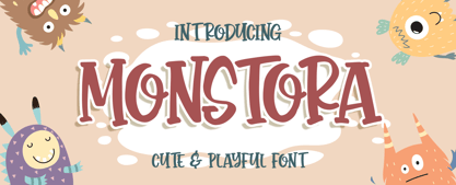 Introducing of our new product the name is Monstora Cute & Playful Font. Monstoray inspired by bouncy quirky this font is a fun theme very good for, book cover, poster, t-shirt, quote, logotype, craft and etc. MULTILINGUAL ACCENT : ØÆøæ¢ÐŒœÁĂÂÀÄĄÅÃǼĆČÇĈĊĎÉĔĚÊËĖÈĘĞĜĢĠĤÍĬÎÏİÌĮĨĴĶĹĽĻĿŃŇŅÑÓŎÔÖÒŐǾÕŔŘŖŚŠŞŜȘŤŢÚŬÛÜÙŰŲŮŨẂŴẄẀÝŶŸỲŹŽŻáăâäàąåãǽćčçĉċďéĕěêëėèęğĝģġĥíîïìįĩĵķĺľļŀńʼnňņñóŏôöòőǿõŕřŗśšşŝșťţŭûüűùųůũẃŵẅẁýŷÿỳźžż FEATURES : Uppercase Lowercase Number Punctuation Multilingual PUA Encode Opentype
 - Hello Valentica by Blankids,
$25.00 Introducing of our new product the name is Hello Valentica a Beauty Script Font. Hello Valentica inspired by modern script this font is a fun theme very good for book cover, wedding invitation, t-shirt, quote, logotype, craft and etc. FEATURES : Uppercase Lowercase Number Punctuation Multilingual PUA Encode Opentype
 - Gravitas by Studio K,
$45.00 This font owes its inspiration to the Bauhaus, the celebrated 1920s design collective which more or less invented modernism as we know it in the applied arts: from architecture and industrial design to graphics and typography. In its day, Bauhaus typography would have been considered brutally modern. Nowadays, when unadorned sans serifs are commonplace, it still has a freshness and quirkiness that sets it apart. With this new release I've tried to recapture the zeitgeist of those pioneering days.
 - Core Sans B by S-Core,
$20.00 The Core Sans B Family is a part of the Core Sans Series, such as N, NR, N SC, M, E, A, D, G, R and BR. The family has very small x-heights and large ascenders(descenders) which give an elegant feeling in body text. It is a sans-serif family but it’s structure is similar to serif fonts, so you can make paragraphs beautiful with this font family. It is very legible and readable even in small size because of its open counters and distinctive shapes. This font family consists of 7 weights (Thin, Light, Regular, Medium, Bold, Heavy, Black) and Italics for each format. Core Sans B supports complete Basic Latin, Cyrillic, Central European, Turkish, Baltic character sets. Each font includes proportional figures, tabular figures, oldstyle figures, numerators, denominators, superscript, scientific inferiors, subscript, fractions and case features. We highly recommend it for use in books, web pages, screen displays, and so on.
 - Let's Jazz by Unio Creative Solutions,
$9.00 Introducing “Let’s Jazz” - a playful typeface which is inspired by iconic mid-century American advertising and lettering. With this project we wanted to homage the dazzling graphics of those booming years and the result is a jazzy typeface that provides a condensed aspect with a bouncy rhythm. As previously said, Let’s Jazz gives the spontaneous vibe of this sensational music genre but it has been also designed with a strong focus to the very distinct look of Saul Bass graphics, which are honestly still fresh and convincing, even nowadays. Let’s Jazz offers two versions, Regular and Stamp. Each version contains more than 450 glyphs and covers several languages based on the Latin alphabet; the jazzy experience is enhanced with OpenType (OTF) support for small caps and includes some neat ligatures and alternates plus the oldstyle bouncy numerals*. This package is a powerful tool in a wide variety of design purposes: headlines, packaging, logotypes, badges, posters and much more. *Let’s Jazz has built-in OpenType features enabled for Adobe® Creative Suite® and any other opentype capable software. All the extra characters has been additionally coded with “PUA Unicode”, which basically means that this font duo is totally accessible without any additional design software. All the extra characters can now be copied straight out the FontBook (Mac) or CharacterMap (Win) and pasted into your favorite text editor. Official mini-tutorials available here: - How to access alternates, ligatures and swashes in Font Book®: https://youtu.be/mGKlvKr0ReI - How to use alternates, ligatures and swashes in Photoshop®: https://youtu.be/46ZtDbHwUAc Specifications: - Multi-language Support (Central, Eastern, Western European languages) - OpenType features (Standard and Discretionary Ligatures, Alternates, Small Caps, OldStyle Numerals) - PUA Coded Extra Characters Thanks for viewing, Unio.
 - Musty Scoot by Bogstav,
$15.00 Got a pair of jeans that goes well with both party and casual living? A shirt that would fit well to a Hollywood movie premiere and would be suitable to pick up the kids from the kindergarten? If so, you know exactly what I mean, when I say that the Musty Scoot font is suitable for anything! Well, almost anything...maybe not that highway sign, or that security sign at the airport!!! But suitable for anything for children, toys, adventures, handcraft, invitation, restaurants, playgrounds, libraries...etc etc Each letter has 7 slightly different versions, which automatically cycles as you type. There is even a version of right/left sided arrow to choose from!
 - Ashemore by insigne,
$34.99 Ashemore developed as a result of my visits to Barcelona, Spain and to Germany, followed soon after by a visit to Asheville, North Carolina. Blending the styles of art and architecture from these three areas may seem initially to result in an unusual formula, but the distinct and flamboyant style of Art Nouveau and the Arts and Crafts style combined with the more strict rules of a sans serif transfer well into a beautiful and very usable blend of these individually eccentric forms. The resulting font retains the Art Nouveau and Craftsman style flavors, which shine through the typeface despite its geometric base. One of the font’s defining characteristics is the unique terminators of its C, G and S. This face’s texture and rhythm also moves well in longer texts. These and other features give Ashemore a restrained bohemian vibe that seems particularly appropriate for a coffee house or an art gallery. The Ashemore family has a full range of six weights from thin to black and includes condensed and extended options for a total of 36 fonts. The typeface also includes some unique OpenType alternates that make the superfamily even more versatile. Ashemore is equipped for complex professional typography, including alternates, small caps and many alternate characters. The face also has a number of numeral sets, including tabular figures, fractions, old-style, lining figures and superiors and inferiors. OpenType-capable applications such as Quark or the Adobe Suite can take full advantage of automatic ligatures and alternates. You can find these features demonstrated in the .pdf brochure. Ashemore also includes the glyphs to support a wide range of languages, including Central, Eastern and Western European languages. In all, Ashemore supports over 40 languages that use the extended Latin script, making the new addition a great choice for multi-lingual publications and packaging. Ashemore was designed by Jeremy Dooley with production assistance from Lucas Azevedo and Marcelo Magalhaes. Kerning assistance from iKern.
 - Fielding by AVP,
$25.00 Characterized by generous unstressed curves, subtley waisted stems and asymmetric serifs, Fielding is a great choice for sure-footed stylish text and elegant headlines. Its warm classical forms resolve into highly readable text at any size both on paper and on screen. Six weights and corresponding italics provide a choice of styles while small capitals, superscript, subscript, fractions, a range of ligatures and cameo capitals will add refinement to the most demanding of layouts. Default numerals are of uniform height, a little smaller than capitals and are proportional: not 'old style' in the traditional sense, they nevertheless sit comfortably in general text. Tabular numerals and lining numerals are also available. Italic styles are lighter in weight and freer in form, skipping alongside their upright counterparts to provide pleasing emphasis or variation. The comprehensive latin character set includes eastern European, Baltic and Turkish languages. First designed for a quarterly magazine, Fielding can be used wherever a modern interpretation of tradition is required including branding and packaging, websites, news media, books, general publicity and smart documentation.
 - Renais by Wiescher Design,
$39.50 Renais is a set of Renaissance Initials. The embellished letters are on the keys A through Z. The letters without embellishments are on the lowercase letters a through z. The embellishments without the letters are in alphabetical order on the following keys: 1234567890!§$%&/()=?,.-;:_ You can superimpose the three forms for special effects, they are designed to fit exactly over each other. Have fun! Gert Wiescher - forever discovering old fonts!
 - Speedy by 4RM Font,
$26.00 Inspired by high speed, this font is made in only black in an italic style, giving this font an aura full of energy. Speedy fonts are suitable for use in futuristic themed graphic designs
 - Capsule by Eclectotype,
$40.00 Capsule is a reverse-stress, high-contrast, rounded sans-serif font with two distinct personalities. An all-caps face, there are however variations of some letters in the lowercase slots. The lowercase variants are more playful, with more bulbous elements that riff on phototype faces like Amelia and Data 70, but all can work together and be mixed and matched to your heart's content. Capsule boasts a bunch of esoteric discretionary ligatures to play around with, and stylistic alternates for 4, 7 and £. The language support is extensive enough to set essays in most Latin-based languages, even though that's the last thing you should be doing with this font! Capsule should be set large. The fit is tight and the kerning is aggressive. It's not what you'd call a workhorse, but Capsule is an All-Caps you'll (see what I did there?!) want to use for impactful headlines, cutting edge logos and post-modern layouts.
 - Funny Nature by URW Type Foundry,
$39.99 Funny Nature is not a typeface but a collection of small, comic-like symbols. Lüdicke used to work often for a supplier of gardening equipment etc. He had to come up with new, original and vivid ideas for the design of catalogues and ads. He designed Funny Nature, a wonderful collection of illustrations. Can you hear the humming and buzzuing, can you smell the flowers?
 - Lucas Brandis by Proportional Lime,
$9.99 In the early days of printing everything had to be worked out from scratch. This set of lettering is based on section headings used by the Printer Lucas Brandis (no known relation), the first printer to operate in the city of Lübeck around 1473. They remind me of a medieval version of the spray paint graffiti so often seen on the sides of trains. A bit on the crude side, but also and importantly extremely noticeable. So whether you use it for creating old styled printing or some wild modern eye grabbing text item, its robust and sturdy shapes will be certain to grab the eye.
 - Crop©Bats AOE - Unknown license

- Dirty Jab by PizzaDude.dk,
$15.00 Using Dirty Jabfor your graphical adventures is like having brunch when being hungry! The surface of the font is actually kind of grunge. Use the font at large sizes with reveal the authentic worn look. Comes with extensive language support and 6 contextual alternates that automatically cycles as you type!
 - VTC-BadEnglischOne - Personal use only

- Omed Brush by Alit Design,
$22.00 Presenting the Omed Brush Signature Script font by alitdesign. The Omed Brush Signature Script font is inspired by spontaneous and dynamic signature strokes with an ink texture that makes the Omed Brush Signature Script look real. The Omed Brush Signature Script font looks unique and charming which makes designs using the Omed Brush Signature Script look more prominent and cool. The Omed Brush Signature Script font is perfect for a collection of new fonts on your computer, tablet and smartphone for making unique designs or lettering. The Omed Brush Signature Script font is perfect for magazine cover designs, brochures, flyers. Instagram ads, Canva Design and so on with unique and modern concepts. besides that this font is very easy to use both in design and non-design programs because everything changes and glyphs are supported by Unicode (PUA). The Omed Brush Signature Script contains 804 glyphs with many unique and interesting alternative options. Language Support : Latin, Basic, Western European, Central European, South European,Vietnamese. In order to use the beautiful swashes, you need a program that supports OpenType features such as Adobe Illustrator CS, Adobe Photoshop CC, Adobe Indesign and Corel Draw. but if your software doesn't have Glyphs panel, you can install additional swashes font files. Thank You Alit
 - Sinkwitz Gotisch by preussTYPE,
$29.00 Sinkwitz Gotisch is a new release of the font of the same name originally designed by Paul Sinkwitz in 1942. The Sinkwitz Gotisch was 1942 by Schriftguss AG Dresden font cast first cast and later supplied by the East German firm VEB Typoart. Paul Sinkwitz (1899-1981) has created them. This font displays not the characteristics of a chunky Gothic, which have influenced the image of national socialism. Paul Sinkwitz was a painter, graphic artist, wood engraver, was interested in religious topics, which he had presented in numerous graphics. But also his interpretation of his Gothic font is modern, without having the font this is ugly. In addition to the GOTISCH he created Roman Uppercase letters, which perfectly harmonize with the lowercase letters. This extra font is called BASTARD. The digital version of Sinkwitz is a beneficial addition to a Gothic with calligraphic character and should be in any historically interested graphic design.
 - Abdo Line by Abdo Fonts,
$49.50 Abdo Line is a simple Naskh font for books and magazines. Accurate design and clarity of reading and writing space-saving, it comes in sixth weights: Thin, Light, Regular, Bold, Heavy and Black. This is an OpenType Font supporting Arabic, Persian, Urdu Languages and compatible with the various operation systems and modern software. This font also contains many of Stylistic Sets, Ligatures and Justification Alternatives.

