10,000 search results
(0.03 seconds)
- Hebrew Siddur by Samtype,
$59.00 This is a classic design from the beginning of the 20th century. This font can be used in many kinds of books. This font has the modern Hebrew punctuation: Shevana, Kamatz Katan, Dagesh Hazak, and Cholam Chaser.
 - House Bay by Maulana Creative,
$14.00 HouseBay Logo Script Font Give your designs an authentic handcrafted feel. HouseBay Logo Script Font is perfectly suited to logo, stationery, branding, typography quotes, magazine or book cover, website header, clothing, branding, packaging design, restaurant and more.
 - Judith by Maulana Creative,
$13.00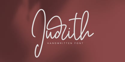 Give your designs an authentic brush handcrafted feel. Judith is perfectly suited to signature, stationery, logo, typography quotes, magazine or book cover, website header, flyer, clothing, branding, packaging design and more. Thanks for use this font. MaulanaCreative
 - Droobie NF by Nick's Fonts,
$10.00 An offering from the 1910 specimen book from Inland Type Foundry, originally called Drew, provided the pattern for this engaging little face. Both versions support the Latin 1252, Central European 1250, Turkish 1254 and Baltic 1257 codepages.
 - Asterica by Maulana Creative,
$12.00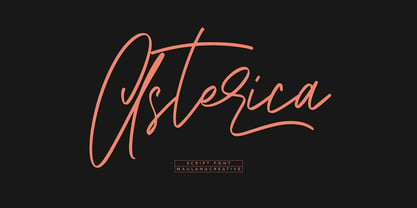 Give your designs an authentic brush handcrafted feel. Asterica is perfectly suited to signature, stationery, logo, typography quotes, magazine or book cover, website header, flyer, clothing, branding, packaging design and more. Thanks for use this font. MaulanaCreative
 - Brothest by Maulana Creative,
$12.00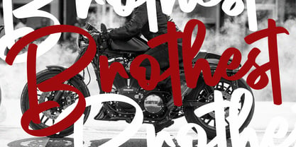 Brothest Street Swag Font Give your designs an authentic handcrafted feel. Brothest Street Swag Font is perfectly suited to logo, stationery, branding, typography quotes, magazine or book cover, website header, clothing, branding, packaging design, restaurant and more.
 - Gotlicks by Maulana Creative,
$14.00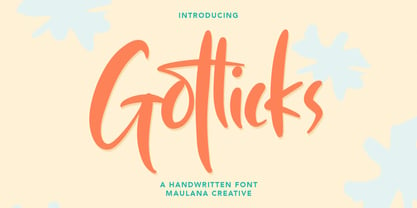 Gotlicks Handwritten Display Font Give your designs an authentic handcrafted feel. Gotlicks Handwritten Display Font is perfectly suited to logo, stationery, branding, typography quotes, magazine or book cover, website header, clothing, branding, packaging design, restaurant and more.
 - River Rocks by Maulana Creative,
$10.00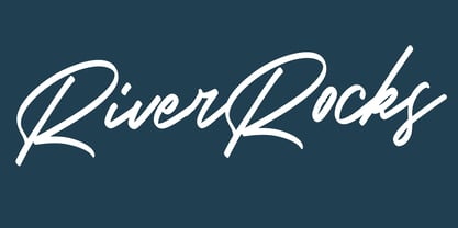 Give your designs an authentic handcrafted feel. "River Rocks Brush" is perfectly suited to signature, stationery, logo, typography quotes, magazine or book cover, website header, clothing, branding, packaging design and more. Thanks for use this font ~ Maulana
 - Spacetroops by Maulana Creative,
$14.00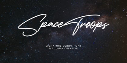 Give your designs an authentic brush handcrafted feel. Spacetroops is perfectly suited to signature, stationery, logo, typography quotes, magazine or book cover, website header, flyer, clothing, branding, packaging design and more. Thanks for use this font. MaulanaCreative
 - Joanna Solotype by Monotype,
$29.99Joanna Solotype is a headline typeface with Art Deco influence. The geometric shapes of the characters are emphasized by the three-line thick strokes. Use the Joanna Solotype font for book jackets and posters, signage and packaging. - Cardiolla by Maulana Creative,
$14.00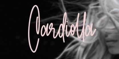 Give your designs an authentic brush handcrafted feel. Cardiolla is perfectly suited to signature, stationery, logo, typography quotes, magazine or book cover, website header, flyer, clothing, branding, packaging design and more. Thanks for use this font. MaulanaCreative
 - Linotype Cineplex by Linotype,
$29.99A typeface that shows its root in stencil lettering. Dario Muhafara created a modern sans serif type family which is ideally suited for cool, technical themes. A small caps font offer a widely usage in book production. - Stereomantic by Maulana Creative,
$15.00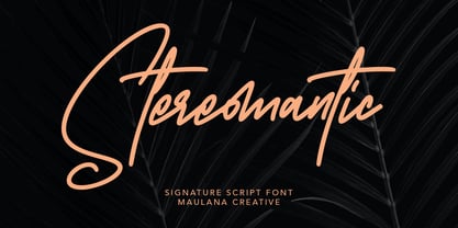 Give your designs an authentic brush handcrafted feel. Stereomantic is perfectly suited to signature, stationery, logo, typography quotes, magazine or book cover, website header, flyer, clothing, branding, packaging design and more. Thanks for use this font. MaulanaCreative
 - Alphasoil by Maulana Creative,
$12.00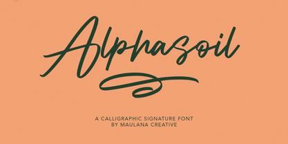 Give your designs an authentic handcrafted feel. "Alphasoil Signature Font" is perfectly suited to signature, stationery, logo, typography quotes, magazine or book cover, website header, clothing, branding, packaging design and more. Thanks for use this font ~ Maulana
 - Bucktooth by Tymime Fonts,
$35.00 Bucktooth is a cartoony typeface, inspired by vintage funny-animal comic books, suitable for children's entertainment, packaging or movie titles. Fancier and more upscale than your usual toon font, Bucktooth is fun with a touch of class.
 - Juxtapose by Maulana Creative,
$11.00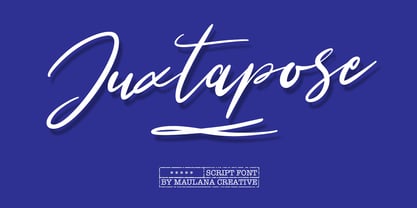 Give your designs an authentic brush handcrafted feel. "Juxtapose" is perfectly suited to signature, stationery, logo, typography quotes, magazine or book cover, website header, flyer, clothing, branding, packaging design and more. Thanks for use this font. MaulanaCreative
 - Machinkly by Maulana Creative,
$13.00 Give your designs an authentic handcrafted feel. "Machinkly Display Font" is perfectly suited to poster, stationery, logo, typography quotes, magazine or book cover, website header, clothing, branding, packaging design and more. Thanks for use this font ~ Maulana
 - LTC Italian Old Style by Lanston Type Co.,
$39.95LTC Italian Old Style is not to be confused with the English Monotype font also called Italian Old Style, which is an earlier design from 1911 based on William Morris’s Golden Type that is based on Nicholas Jenson’s Roman face. Goudy went back to Jenson’s original Roman and other Renaissance Roman faces for his inspiration and the result is what many consider to be the best Renaissance face adapted for modern use. Bruce Rogers was one of the biggest admirers of Italian Old Style and designed the original specimen book for Italian Old Style in 1924 using his trademark ornament arrangement. These ornaments are now contained in the pro versions of the Roman styles—Regular Pro and Light Pro. With most digitizations of old metal typefaces, one source size is often used as reference (as was Goudy’s method for his own cuttings of his Village foundry types) so that all sizes refer to one set of original artwork. The original hot metal fonts made by Lanston Monotype (from Goudy’s drawings) and other manufacturers used two or three masters for different size ranges to have optimal relative weights—smaller type sizes would need proportionally thicker lines to not appear thin and larger sizes would require thinner lines to not appear to bulky. The variations in size ranges can also be affected by the size of the cutter head in making the master patterns. The light weights of LTC Italian Old Style were digitized from larger display sizes (14, 18, 24, 30, 36 pt) and the regular weights were digitized from smaller composition sizes (8,10,12 pt). The fitting for the regular weights is noticeably looser to allow for better setting at small sizes. Very few font revivals take this approach. Italian Old Style, originally designed by Frederic Goudy in 1924, was digitized by Paul Hunt in 2007. In 2013, it has been updated by James Grieshaber and is now offered as a Pro font. The newly expanded Pro font includes all of the original ligatures, plus small caps and expanded language coverage in all 4 Pro styles. - Champagne & Limousines - Personal use only

- Whipsmart - Personal use only

- Skribler by Cool Fonts,
$24.00 Here’s a scratchy skribly font you can use to make something look grungy or use it reversed and it looks like it was scratched on a wall or something.
 - Grippo by Canada Type,
$24.95 The first Grippo sketches were done in the 1980s, but only now does it see the light of day as a complete series of interchangeable, layerable fonts. The original single-font concept was simple enough: Double the stems so they become sturdy handles. But then we elected to add more playfulness and versatility to the idea. By separating the main idea’s layers and producing them as individual fonts, layerability is achieved, and endless possibilities of play and variation arise. In 2D or 3D, colourful or demure, in titling or as initials, Grippo is a great eye-catcher that emphasizes the big fun aspect of your design. Each font of the Grippo suite comes with a few built-in alternates, a glyphset of over 385 characters, and support for the majority of Latin-based languages.
 - CA Coronado by Cape Arcona Type Foundry,
$19.00 CA Coronado is a nice display font for use in titles, logos and headlines. With its used look it creates a friendly and human feeling. Upper- and lower-case characters differ in details and can be mixed to get a vivid look. For the best authentic look, the ‘Regular’ can be used as filling and complements the Shadow-style.
 - Modulus by Andrew Footit,
$30.00 Modulus is a clean, minimal, modern sans typeface. It looks smooth in any layout with its sleek rounded lines, use it for your magazines, brochures and editorial layouts. Modulus makes awesome headings, it looks great on its own or with imagery, body copy looks neat and tidy. Modulus is one to add to your font collection.
 - Chalysta by BaronWNM,
$12.00 Introduces an old lettering style font. looks elegant, luxurious and classy. Chalysta is a form of handwriting with a sideways drag, which looks like it was handwritten in old scripts. Each lowercase has an alternate pull before the letter to make it look more natural. Very suitable for use in branding, wedding invitations, quotes, cards, etc.
 - Silver Thunder by Olivetype,
$18.00 Looking for a unique and badass font to add some edge to your designs? Look no further than Silver Thunder. This graffiti-inspired font is a good option for apparel, posters, headlines, magazines, and more. With its cool black metal aesthetic, Silver Thunder will give your work a truly one-of-a-kind look. Thank You!
 - Mrs Eaves XL Serif by Emigre,
$59.00 Originally designed in 1996, Mrs Eaves was Zuzana Licko’s first attempt at the design of a traditional typeface. It was styled after Baskerville, the famous transitional serif typeface designed in 1757 by John Baskerville in Birmingham, England. Mrs Eaves was named after Baskerville’s live in housekeeper, Sarah Eaves, whom he later married. One of Baskerville’s intents was to develop typefaces that pushed the contrast between thick and thin strokes, partially to show off the new printing and paper making techniques of his time. As a result his types were often criticized for being too perfect, stark, and difficult to read. Licko noticed that subsequent interpretations and revivals of Baskerville had continued along the same path of perfection, using as a model the qualities of the lead type itself, not the printed specimens. Upon studying books printed by Baskerville at the Bancroft Library in Berkeley, Licko decided to base her design on the printed samples which were heavier and had more character due to the imprint of lead type into paper and the resulting ink spread. She reduced the contrast while retaining the overall openness and lightness of Baskerville by giving the lower case characters a wider proportion. She then reduced the x-height relative to the cap height to avoid increasing the set width. There is something unique about Mrs Eaves and it’s difficult to define. Its individual characters are at times awkward looking—the W being narrow, the L uncommonly wide, the flare of the strokes leading into the serifs unusually pronounced. Taken individually, at first sight some of the characters don’t seem to fit together. The spacing is generally too loose for large bodies of text, it sort of rambles along. Yet when used in the right circumstance it imparts a very particular feel that sets it clearly apart from many likeminded types. It has an undefined quality that resonates with people. This paradox (imperfect yet pleasing) is perhaps best illustrated by design critic and historian Robin Kinross who has pointed out the limitation of the “loose” spacing that Licko employed, among other things, yet simultaneously designated the Mrs Eaves type specimen with an honorable mention in the 1999 American Center for Design competition. Proof, perhaps, that type is best judged in the context of its usage. Even with all its shortcomings, Mrs Eaves has outsold all Emigre fonts by twofold. On MyFonts, one of the largest on-line type sellers, Mrs Eaves has been among the 20 best selling types for years, listed among such classics as Helvetica, Univers, Bodoni and Franklin Gothic. Due to its commercial and popular success it has come to define the Emigre type foundry. While Licko initially set out to design a traditional text face, we never specified how Mrs Eaves could be best used. Typefaces will find their own way. But if there’s one particular common usage that stands out, it must be literary—Mrs Eaves loves to adorn book covers and relishes short blurbs on the flaps and backs of dust covers. Trips to bookstores are always a treat for us as we find our Mrs Eaves staring out at us from dozens of book covers in the most elegant compositions, each time surprising us with her many talents. And Mrs Eaves feels just as comfortable in a wide variety of other locales such as CD covers (Radiohead’s Hail to the Thief being our favorite), restaurant menus, logos, and poetry books, where it gives elegant presence to short texts. One area where Mrs Eaves seems less comfortable is in the setting of long texts, particularly in environments such as the interiors of books, magazines, and newspapers. It seems to handle long texts well only if there is ample space. A good example is the book /CD/DVD release The Band: A Musical History published by Capitol Records. Here, Mrs Eaves was given appropriate set width and generous line spacing. In such cases its wide proportions provide a luxurious feel which invites reading. Economy of space was not one of the goals behind the original Mrs Eaves design. With the introduction of Mrs Eaves XL, Licko addresses this issue. Since Mrs Eaves is one of our most popular typefaces, it’s not surprising that over the years we've received many suggestions for additions to the family. The predominant top three wishes are: greater space economy; the addition of a bold italic style; and the desire to pair it with a sans design. The XL series answers these requests with a comprehensive set of new fonts including a narrow, and a companion series of Mrs Eaves Sans styles to be released soon. The main distinguishing features of Mrs Eaves XL are its larger x-height with shorter ascenders and descenders and overall tighter spacing. These additional fonts expand the Mrs Eaves family for a larger variety of uses, specifically those requiring space economy. The larger x-height also allows a smaller point size to be used while maintaining readability. Mrs Eaves XL also has a narrow counterpart to the regular, with a set width of about 92 percent which fulfills even more compact uses. At first, this may not seem particularly narrow, but the goal was to provide an alternative to the regular that would work well as a compact text face while maintaining the full characteristics of the regular, rather than an extreme narrow which would be more suitable for headline use. Four years in the making, we're excited to finally let Mrs Eaves XL find its way into the world and see where and how it will pop up next.
 - Show Poster JNL by Jeff Levine,
$29.00 In the 1960 edition of Samuel Welo’s “Studio Handbook for Artists and Advertisers” is an example of poster lettering with the accompanying blurb “call this Chrysler”. This casual brushstroke design was slightly modified and then reworked into what is now Show Poster JNL and is now available in both regular and oblique versions.
 - Gold Standard by FontMesa,
$30.00 Gold Standard got its start from a few letters found on an old Gold Certificate from 1882. From those few letters spelling out the word GOLD, the rest of the alphabet was designed to match. The lowercase design was based on lettering found on an old silver certificate from approximately the same year.
 - Hoverunit by Typodermic,
$11.95 Introducing Hoverunit: the typeface that will take your design projects to new heights! This font is a throwback to the golden age of sci-fi, with a twist of modern creativity that will give your work an unmistakable edge. Inspired by the magnetic ink typefaces of the 1960s, Hoverunit has been brought back to life with a futuristic twist. Its sharp angles, sleek lines, and retro-futuristic feel make it the perfect choice for your next sci-fi-themed project. Whether you’re designing a book cover, movie poster, or album art, Hoverunit will give your work a unique and creative look. The Hoverunit typeface is available in a range of weights and styles, so you can use it for everything from headlines to body copy. And with its unique design, it’s sure to capture the attention of anyone who sees it. So why settle for boring, traditional typefaces when you can take your designs to the next level with Hoverunit? Try it today and see for yourself why this font is the perfect choice for all your creative projects. Most Latin-based European writing systems are supported, including the following languages. Afaan Oromo, Afar, Afrikaans, Albanian, Alsatian, Aromanian, Aymara, Bashkir (Latin), Basque, Belarusian (Latin), Bemba, Bikol, Bosnian, Breton, Cape Verdean, Creole, Catalan, Cebuano, Chamorro, Chavacano, Chichewa, Crimean Tatar (Latin), Croatian, Czech, Danish, Dawan, Dholuo, Dutch, English, Estonian, Faroese, Fijian, Filipino, Finnish, French, Frisian, Friulian, Gagauz (Latin), Galician, Ganda, Genoese, German, Greenlandic, Guadeloupean Creole, Haitian Creole, Hawaiian, Hiligaynon, Hungarian, Icelandic, Ilocano, Indonesian, Irish, Italian, Jamaican, Kaqchikel, Karakalpak (Latin), Kashubian, Kikongo, Kinyarwanda, Kirundi, Kurdish (Latin), Latvian, Lithuanian, Lombard, Low Saxon, Luxembourgish, Maasai, Makhuwa, Malay, Maltese, Māori, Moldovan, Montenegrin, Ndebele, Neapolitan, Norwegian, Novial, Occitan, Ossetian (Latin), Papiamento, Piedmontese, Polish, Portuguese, Quechua, Rarotongan, Romanian, Romansh, Sami, Sango, Saramaccan, Sardinian, Scottish Gaelic, Serbian (Latin), Shona, Sicilian, Silesian, Slovak, Slovenian, Somali, Sorbian, Sotho, Spanish, Swahili, Swazi, Swedish, Tagalog, Tahitian, Tetum, Tongan, Tshiluba, Tsonga, Tswana, Tumbuka, Turkish, Turkmen (Latin), Tuvaluan, Uzbek (Latin), Venetian, Vepsian, Võro, Walloon, Waray-Waray, Wayuu, Welsh, Wolof, Xhosa, Yapese, Zapotec Zulu and Zuni.
 - Berling Nova by Linotype,
$29.99Swedish designer Karl-Erik Forsberg created the original Berling typeface in 1951. Owned by Verbum in Sweden, Berling was completely redesigned and released in 2004, under the name Berling Nova. Forsberg (1914–1995) is considered one of Sweden’s most masterful graphic designers, and his original Berling has come to be seen as possibly the most definitive Swedish typeface. But a redesign was necessary in order to secure that the spirit of Berling would survive in the digital age. Linotype, the distributor of the original Berling™ , provided its collection of source materials to the designers working on Berling Nova. Additionally, Akira Kobayashi — Linotype’s Type Director — lent them his advice as their project advanced. Berling Nova is available in two optical sizes: Text and Display. The original Berling was a classic Renaissance roman face, with fine terminals and sharp, beak-like serifs. If one looks at Berling’s old lead type proofs in the smaller type sizes, it is clear that these had a fuller and more readable form than in later digital versions. So, in order to help return the new Berling Nova to its original splendor, both the base forms and the serifs were softened and inflated. In the text version, the x-height has been increased a bit (by 4%), the diagonal axis is less apparent, and special glyph ranges, such as those for small caps and old style figures, have been included in the font’s character sets. The display version still has the unmistakable “Berling” character that displays Forsberg’s mastery. Berling Nova is well suited for longer text passages in books, publications, and magazines. This typeface fulfils all the demands that one can make on a legible newspaper typeface. Access to both text and display versions are important to the demanding typographer. This is the first time since the typeface was digitalized that it is possible to use it in order to create truly beautiful and functional typography in all type sizes. - Meastro by Ferry Ardana Putra,
$39.00 It's been a while... more than three months we developed our brand new font. We call them "Meastro". Fun fact though, we want to call it "Maestro", but you know... we were afraid of the copyright thing. Meastro Script is a fun, bold, luscious, retro display script font. We crafted this font very carefully and make them very smoothly attach to each other. Especially, on the script version. You can see every character's tail beautifully connected one to another without using ligatures' help. This font takes full advantage of the Open Type format with several automatic ligatures that occur as you type for your preferred design. Moreover, the manual stylistic alternates allow you to choose the letters you prefer. Alternates occur automatically as you type in supported programs when you have "Ligatures" or "Stylistic Alternates" turned on. Meastro is Created with a ton of stylistic alternates, swashes, and ligatures, and also comes with layerable fonts to recreate the effect without uncomfortable overlaps of the extruded shadow effect. On this pro pack, you will also get the Meastro Display font! On this font you will meet the unique blocky and squared design, making your design feel classic and retro-like. Combine them and “boom”, you will be the “Maestro” of the vintage design! This retro typeface is perfect for logotypes, t-shirts, vintage badges, retro quotes, branding, packaging, posters, signboards, social media needs, etc. ——— Meastro features: A full set of uppercase and lowercase characters Layered Style Numbers and punctuation Multilingual language support PUA Encoded Characters OpenType Features +553 Total Glyphs (Script) +235 Total Glyphs (Display) +238 Stylistic Alternates +30 Ligatures +69 Swashes and more (Shiny and Graffiti Spray Effect Included!) ——— ⚠️To enable the OpenType Stylistic alternates, you need a program that supports OpenType features such as Adobe Illustrator CS, Adobe InDesign & CorelDraw X6-X7, Microsoft Word 2010, or later versions. There are additional ways to access alternates/swashes, using Character Map (Windows), Nexus Font (Windows), Font Book (Mac), or a software program such as Pop Char (for Windows and Mac).
 - Fancy Glow by Nathatype,
$29.00 Are you ready to rock your design project? Now you can make stunning design project with Fancy Glow. A touch of sophisticated yet fancy style font. The perfect way to brighten up your project. Fancy Glow is a script font that resembles actual handwriting. This one is suited to any sizes of text. The curves of the characters convey a sense of elegance and will not go out of style. In addition, it has more fascinating features that allows you maximize your design. Features: Stylistic Sets Ligatures Multilingual Supports Numerals and Punctuations PUA Encoded It can be used for many design projects, such as poster, logo, book cover, branding, heading, printed product, merchandise, quotes, social media campaign, etc. Learn more about how to use it by seeing the font preview. Thank you for purchasing our fonts. Please don’t hesitate to contact us, if you have any further question or issues. We’re happy to help. Happy Designing.
 - P22 Barabajagal by IHOF,
$29.95 P22 Barabajagal is a unique take on the display fat face by way of doodling fun. Somewhat informed by the shapes of an early 1970s film type called Kap Antiqua Bold, this font’s aesthetic is the stuff of boundless energy and light humour, where an uncommon “peak” angle drawing perspective results in sturdy trunks, fat bottom curls, and active ascenders eager for mobility in space. This is the kind of font that makes you wonder whether it was drawn with rulers, protractors and compasses, or just by a mad doodler’s crazy-good free hand. Regardless, Barabajagal easily turns the geometry of modern forms into an exercise in sugar-loaded fun. It’s a very good tool to use in design geared at kids and young adults, such as food and toy packaging, books, animation, cartoons and games. Barabajagal comes with over 550 glyphs, lots of alternates, and a few ligatures and swash caps. It also contains extended support for Latin languages.
 - VIP by Canada Type,
$29.95 VIP is a humanist sans serif uppercase and figures combined with a freshly redrawn revival of the classic Constanze initials originally designed by Joachim Romann for Stempel in 1956. As well as a vehicle to revive the Constanze initials, VIP was inspired by modern typography found in many artful books, on many product packages, and on the windows and literature of high-end restaurants, jewelry stores, haute couture fashion sellers, architecture firms and trendy brand name establishments. If you've walked through the soho or downtown of any major metropolitan, you've seen them: Widely tracked words or lines starting with a script majuscule and going on with clean and comfortable sans serif caps. If classy modern combination typography is your thing, you will find much pleasure in using VIP. VIP was updated with expanded language support in 2012. It now supports a very wide range of codepages, including Cyrillic, Greek, Central and Eastern European, Turkish, Baltic, Vietnamese, and of course Celtic/Welsh.
 - 1529 Champ Fleury Initials by GLC,
$42.00 In 1529, Geofroy Tory, French scholar, engraver, printer, publisher and poet, was publishing the well known so called Champ Fleury, printed by Gilles de Gourmond, in Paris. It is a fully illustrated handbook where the author explains how to draw Roman characters. The font used for the text - a Humane/Jenson type - was not a very beautiful one, but rough and ready, and the book is well known for its capital letters designs. We are offering here the two complete historical type sets and more -- we have entirely redrawn the lacked letters: J, U and W, Eth, Lslash, Thorn and Oslash in the two initial forms. The text font, 1529 Champ Fleury Regular is now containing all characters for West European (including Celtic), Baltic, East and Central European and Turkish language, and the Initial set 1529 Champ Fleury Init is containing two complete alphabets, with a very great effort to be as close as possible to the original pictures.
 - Mansheen by Dora Typefoundry,
$10.00 Mansheen is a simple and sweet display font. Authentic beautiful & delightful touches make it the perfect partner to present funny and childish feelings in any design. It's perfect for children's books, funny greeting cards, meal package designs, logos and many others, where simple abstract cartoons or graphics are used. But clearly, its use can be more extensive. I did a few design examples, so you can see how it works. WHAT YOU GET - Uppercase and lowercase letters are full - Numbers, Punctuation, Multilingual Accents - Alternates glyphs I highly recommend using a program that supports OpenType features and Glyphs panels such as Adobe Illustrator, Adobe Photoshop CC, Adobe InDesign, or CorelDraw, so you can see and access all Glyph variations. We really hope you enjoy and are interested in our offer. If you want to upgrade or need a license or ask questions, you can send me a message and you can immediately start your service doratypefoundry@gmail.com. Thank You
 - Platinus Script Pro by Sudtipos,
$69.00 Platinus Script Pro is the latest example of what has now become a Sudtipos tradition: Adapting conventional calligraphic methods from the last two centuries to produce modern digital scripts for the current one. This time the resulting font explores the evolution of invitation scripts from the classic commercial lettering of the 1930s to the ideas clearly visible in the greeting cards of the 1980s and 1990s. Most base characters are made up of a single stroke, with some of the strokes driven from the top down, and some from the bottom up, putting the emphasis on the casual but precise fluidity of the hand, an emphasis magnified by the expert use of loops and swashes everywhere. The Platinus Script Pro family comes in two weights, each loaded with alternates and Latin-based langauge support, for more than 570 characters per font. Platinus Script Pro is great for product packaging, as well book covers, menus and greeting cards.
 - Core Sans AR by S-Core,
$19.00 Core Sans AR Family is a rounded version of Core Sans A that is clean, simple and highly readable. It is a part of the Core Sans Series such as Core Sans N, Core Sans M, Core Sans E, Core Sans A, Core Sans D, Core Sans G, Core Sans R and Core Sans B. Letters in this type family are designed with genuine neo-grotesque and neutral shapes without any decorative distractions. The spaces between individual letter forms are precisely adjusted to create the perfect typesetting. Core Sans AR family consists of 8 weights (Thin, Extra Light, Light, Regular, Medium, Bold, Extra Bold, Heavy) with their corresponding italics. Core Sans AR contains complete Basic Latin, Cyrillic, Central European, Turkish, Baltic character sets. Each font includes proportional figures, tabular figures, numerators, denominators, superscript, scientific inferiors, subscript, fractions and case features. We highly recommend it for use in books, web pages, screen displays, and so on.
 - Algarabia by Macizo.com.mx,
$30.00 • Algarabía "Joy" is a provocative and multilingual text face designed by Leonardo Vázquez. • It was created for a mexican magazine with the same name that uses it as the body text font, and now it's released for the public. • In 1397, Frederic Goudy's was asked to draw a face for the exclusive use of the University of California Press at Berkeley. The font was called California. In 1983 a digital version of this typeface was created by Aaron Burns and it was called ITC Berkeley. • Algarabía is inspired by ITC Berkeley, it keeps the calligraphic touch and weight, but it presents certain features in its design that might result unexpected, yet at the same time they are invisible when used as body text and provides the typeface its unique own personality. • Small Caps and Small caps italic, Included in each version. • Ideal for magazines, Art books or any editorial purposes where legibility and originality are needed.

