10,000 search results
(0.029 seconds)
- Headbears by Almarkha Type,
$29.00 Hello Everyone, introduce our new product Headbears - Sport Display, inspired by the title of the sports poster and We make it very energetically. Headbears font with strong and challenging nuances. very suitable for the title, typography, Poster, magazines, brochures, packaging,Websites and much more for your design needs, making your designs more modern and professional.
 - Borned by Almarkha Type,
$29.00 Hello Everyone, Introduce our new collection, Borned - Futuristic Display, Inspired from famous logos of Futuristic Style and brands that have very strong characteristics, Borned font with strong and challenging nuances. very suitable for the title, typography, Poster, magazines, brochures, packaging,Websites and much more for your design needs, making your designs more modern and professional
 - Nutty Noisses by Gassstype,
$25.00 Here comes our new font Nutty Noisess Inspired from old skool graffiti tagging, street art, we created this Typeface, drawn in Procreate app, then vectorized and crafted carefully. Nutty Noisess Suitable for many design project, branding, packaging, logo, wall art, headline, template, banner, poster, and many more projects. These include all caps, punctuation, and numerals.
 - Ascender Serif by Ascender,
$92.99 Ascender Serif was designed by Steve Matteson as an originative, unique serif design that is metrically compatible with Times New Roman. Ascender Serif offers refined on-screen readability characteristics and the pan-European WGL character set and solves the needs of developers searching for width-compatible fonts to address document portability across various platforms.
 - The Gloves by Aestherica Studio,
$12.00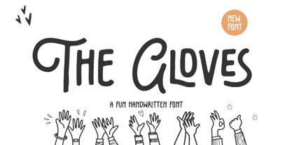 Introducing the new Fun Handwritten Font by Aestherica Studio. Proudly Present, The Gloves The Gloves is perfect for product packaging, branding project, megazine, social media, wedding, or just used to express words above the background. The Gloves also multilingual support. Enjoy the font, feel free to comment or feedback, send me PM or email.
 - Southeast by Haksen,
$13.00 Southeast The new fresh handmade brush script font. Very suitable for greeting cards, branding materials, business cards, quotes, posters, and more! This font are perfect for all brand :) Features : UpperCase & Lowercase Numerals & Punctuations Ligatures Multilingual characters (AÀÁÂÃÄÅCÇDÐEÈÉÊËIÌÍÎÏNÑOØÒÓÔÕÖUÙÜÚÛWYÝŸŸÆŒßÞàáâãäåæçèéêëìíîïðñòóôõöøùúûüýÿ) PUA ENCODEDZIP INCLUDED: - Southeast OTF - Southeast Swashes OTF Thanks for visited and reviewed. Happy Design, Haksen Letters
 - P22 Gothic Gothic by IHOF,
$24.95 The name says it all. Gothic from the old literary style and/or current subculture genre. And Gothic meaning a block or sans serif style of lettering. The concept was to take the classic German style lettering and create a contemporary extended block letter typeface. The result is a fusion of old and new.
 - Rockless by Fargun Studio,
$16.00 Rockless is handwritten stylish copperplate calligraphy fonts, combines from copperplate to contemporary typeface with a dancing baseline, classic and elegant touch. Can be used for various purposes. such as headings, signature, logos, wedding invitation, t-shirt, letterhead, signage, lable, news, posters, badges etc. Features All Uppercase and Lowercase Number & Symbol Supported Languages Ligatures PUA Encoded
 - Moxy Rush by Alit Design,
$21.00 Introducing "Moxy Rush" Font: Redefining Modern Blackletter Elegance Unleash the power of typography with "Moxy Rush," a remarkable font that seamlessly blends the timeless essence of blackletter style with a captivating contemporary twist. This font is a true masterpiece, meticulously designed to elevate your designs, projects, and artworks to new heights of sophistication and creativity.
 - Audrena by Putracetol,
$19.00 Audrena is a new elegant modern script font. A lovely, elegant and sweet script font. Audrena is perfect for styling logos, stationery, wedding event, invitation, quote, social media, websites and so much more! Come with Opentype feature with a lot of alternates, its help you to make great lettering.This font is also support multi language.
 - Masha by Vladislav Ivanov,
$15.00Masha is a new 3D font notable for its unique style and attractiveness. It is appropriate to use this font as addition to different pictures or pieces of art, it is a good final touch for something unusual and beautiful. The hand made letters provide individuality and an unusual appearance. It supports all European languages. - InkArt Labels by John Moore Type Foundry,
$24.95 Inkart is a font dingbats, shapes for new labels or frames that the user can supplement according to the requirements and purposes. It consists of a set uppercase containing the forms, and a set is lower case which has areas of the same shapes to be colored by layers. Contains retro and modern styles.
 - Caracas by John Moore Type Foundry,
$20.00 Caracas is a new family of sans serif fonts, looking friendly, sweet and comfortable to read. Where text flow between straight lines and round by becoming transparent in the interest of readability. Caracas is ideal for working in small letters and texts of a technical nature. Caracas is a humanistic approach to reading sans forms.
 - LA QATRIE by Hishand Studio,
$15.00 Experience refined design with La Qatrie, a display font that boasts an elegant look and a touch of luxury, setting a new standard for sophistication in typography. Perfect for those needing a touch of elegance, classy, stylish, beautiful bold type, and modernity for their design. Complete with ligatures alternates regular hollow icon kerning multilingual support
 - Unranked by Gassstype,
$23.00 Here comes our new font Unranked this is a sans handwritten that is written casually and quickly. this font are made with brushes on Procreate. Then crafted carefully drawn into vector format. That is why Unranked has Rough and strong characteristic more natural look to your text with a more modern look to your text.
 - Drakoheart Revofit Sans by G3 Typefaces,
$- Drakoheart Revofit is an initiative to make sans fonts. It’s one of my personal favorites, in fact. In its first release, this font had a cool appearance but was improved with better kerning and a cool look in this new release. Perfect to write some digital texts as in web articles, blogs and branding.
 - Retiro Std by Typofonderie,
$59.00 Full of life Hispanic Didot in 2 optical sizes Retiro is a daring interpretation of Spanish typography. Severe, austere and yet, full of life, Retiro is a vernacular version of Castilian and Andalusian in a typical Didot. Named after a lovely park in Madrid, Retiro started life as a a bespoke typeface designed to give a unique voice to the magazine Madriz. In 2006, the founder of Madriz was looking for a Didot for his new magazine. The Didot is the archetypal typeface used in high-end magazines. Retiro is a synthesis of these high contrast styles mixed with an Hispanic mind. Result is then, after 2-3 years of work, a typeface with countless variations to establish typographic shades adapted to different sections and pages of the Madriz. In 2014, it was necessary to further revise the typeface before its launch at Typofonderie. In order to keep its originality, the unique weight was retained, but complemented with optical size variants to set highly contrasted headlines into various sizes, visually balanced. How to use Retiro optical sizes? Each font provided in Retiro family is named according to the scale of body size: 24 pt and 64 pt. Of course, these names are referring to the body sizes used in typographic design. In the “glorious old days,” the letterpress period, it was customary to cut punches directly to the size at which typefaces would be used. The punchcutter had to visually adapt his design to the engraving size. The aim was to optimize the best contrast and general weight, but also to respect both design’s and reader’s needs. In Retiro’s case, intended for large titling sizes, it’s an adaptation of this ancient practice for our contemporary uses. Although each font is named by a typographic point size, do not feel obliged to use this font at this precise size, but why not, in larger or smaller. It’s rather the concept of gradients that must be preserved in layouts, rather than strictly size numbers. It’s up to the designer to select the right font size for his own designs. Granshan Awards 2012 Creative Review Type Annual 2011 Designpreis 2011 Club des directeurs artistiques, 41e palmarès Type Directors Club 2010 Certificate of Type design Excellence
 - Mecheria by Typodermic,
$11.95 Intricate and alluring, Mecheria transports you to a world of mystique and intrigue with its angular design and sensual swashes. This captivating typeface is both enigmatic and exotic, with a hint of gothic allure that beckons you closer. Its gentle curves are subtly rounded, yet filled with a tantalizing energy that leaves you breathless. With its connected script style, Mecheria flows seamlessly from letter to letter, creating a sense of fluid motion that draws you in. Each stroke of the pen is deliberate and precise, conveying a sense of luxury and sophistication that is unmatched by other typefaces. Inspired by the timeless elegance of the Amanda typeface from 1939, Mecheria is a work of art in its own right. It captures the essence of a bygone era, evoking a sense of nostalgia and longing for a simpler time. In the world of graphic design, Mecheria is a font that stands out from the crowd. Its angular design and sensual swashes make it perfect for luxury brands, high-end products, and exclusive events. So why settle for anything less than the best? Choose Mecheria and elevate your designs to new heights of elegance and sophistication. Most Latin-based European writing systems are supported, including the following languages. Afaan Oromo, Afar, Afrikaans, Albanian, Alsatian, Aromanian, Aymara, Bashkir (Latin), Basque, Belarusian (Latin), Bemba, Bikol, Bosnian, Breton, Cape Verdean, Creole, Catalan, Cebuano, Chamorro, Chavacano, Chichewa, Crimean Tatar (Latin), Croatian, Czech, Danish, Dawan, Dholuo, Dutch, English, Estonian, Faroese, Fijian, Filipino, Finnish, French, Frisian, Friulian, Gagauz (Latin), Galician, Ganda, Genoese, German, Greenlandic, Guadeloupean Creole, Haitian Creole, Hawaiian, Hiligaynon, Hungarian, Icelandic, Ilocano, Indonesian, Irish, Italian, Jamaican, Kaqchikel, Karakalpak (Latin), Kashubian, Kikongo, Kinyarwanda, Kirundi, Kurdish (Latin), Latvian, Lithuanian, Lombard, Low Saxon, Luxembourgish, Maasai, Makhuwa, Malay, Maltese, Māori, Moldovan, Montenegrin, Ndebele, Neapolitan, Norwegian, Novial, Occitan, Ossetian (Latin), Papiamento, Piedmontese, Polish, Portuguese, Quechua, Rarotongan, Romanian, Romansh, Sami, Sango, Saramaccan, Sardinian, Scottish Gaelic, Serbian (Latin), Shona, Sicilian, Silesian, Slovak, Slovenian, Somali, Sorbian, Sotho, Spanish, Swahili, Swazi, Swedish, Tagalog, Tahitian, Tetum, Tongan, Tshiluba, Tsonga, Tswana, Tumbuka, Turkish, Turkmen (Latin), Tuvaluan, Uzbek (Latin), Venetian, Vepsian, Võro, Walloon, Waray-Waray, Wayuu, Welsh, Wolof, Xhosa, Yapese, Zapotec Zulu and Zuni.
 - Containment by Typodermic,
$11.95 Introducing Containment, the ultimate font system that will elevate your design game to new heights. With its multilayered features, Containment is the perfect tool for creating headlines with a unique edge. Whether you want to add some fizz, gravel, snow, sand, or any other gritty effect, this font system has got you covered. Containing four fonts, namely the plain layer, shadow layer, crunchy-little-dots layer, and a combination of the three, Containment is designed to give you the creative freedom you need to craft stunning designs that stand out. The best part? This powerful font system is based on the renowned Tandelle typeface, known for its clean, sleek lines. As an advertising professional, you understand the importance of capturing your audience’s attention from the get-go. With Containment, you can create headlines that pop and grab your audience’s attention. Experiment with colors and add different layers to your headlines to create a unique look that will set your brand apart from the competition. In the fast-paced world of advertising, innovation is key, and Containment is the perfect tool for breaking the mold and taking your designs to the next level. Order Containment today and experience the power of a font system that combines style, creativity, and functionality like never before. Most Latin-based European writing systems are supported, including the following languages. Afaan Oromo, Afar, Afrikaans, Albanian, Alsatian, Aromanian, Aymara, Bashkir (Latin), Basque, Belarusian (Latin), Bemba, Bikol, Bosnian, Breton, Cape Verdean, Creole, Catalan, Cebuano, Chamorro, Chavacano, Chichewa, Crimean Tatar (Latin), Croatian, Czech, Danish, Dawan, Dholuo, Dutch, English, Estonian, Faroese, Fijian, Filipino, Finnish, French, Frisian, Friulian, Gagauz (Latin), Galician, Ganda, Genoese, German, Greenlandic, Guadeloupean Creole, Haitian Creole, Hawaiian, Hiligaynon, Hungarian, Icelandic, Ilocano, Indonesian, Irish, Italian, Jamaican, Kaqchikel, Karakalpak (Latin), Kashubian, Kikongo, Kinyarwanda, Kirundi, Kurdish (Latin), Latvian, Lithuanian, Lombard, Low Saxon, Luxembourgish, Maasai, Makhuwa, Malay, Maltese, Māori, Moldovan, Montenegrin, Ndebele, Neapolitan, Norwegian, Novial, Occitan, Ossetian (Latin), Papiamento, Piedmontese, Polish, Portuguese, Quechua, Rarotongan, Romanian, Romansh, Sami, Sango, Saramaccan, Sardinian, Scottish Gaelic, Serbian (Latin), Shona, Sicilian, Silesian, Slovak, Slovenian, Somali, Sorbian, Sotho, Spanish, Swahili, Swazi, Swedish, Tagalog, Tahitian, Tetum, Tongan, Tshiluba, Tsonga, Tswana, Tumbuka, Turkish, Turkmen (Latin), Tuvaluan, Uzbek (Latin), Venetian, Vepsian, Võro, Walloon, Waray-Waray, Wayuu, Welsh, Wolof, Xhosa, Yapese, Zapotec Zulu and Zuni.
 - Rabenau by Linotype,
$29.99 Rabenau (formerly Lucinde), the distinctly warm and legible type family For 30 years the graphic designer Axel Bertram worked at creating his typefaces: He developed complete new alphabets for magazines and typewriters as well as for the constant demand for typefaces for use by commercial artists. He has developed wall charts the size of advertising posters as teaching aids for training commercial and graphic artists to write in a clean, classic cursive script. In the eighties he used the American Chyron computer to design a screen font for television. In the mid-nineties he discovered for himself the fabulous possibilities offered by the Fontographer font software program and explored them playfully. From the results of these experiments, Axel Bertram selected a design for further development. From 2003 onwards the calligrapher and type designer Andreas Frohloff collaborated with him on the further development and production of the 16 fonts of the Rabenau™ typeface family.The Rabenau font was inspired by many factors: From the fonts used as book covers to typewriter fonts and even printed material from England dating from the beginning of the nineteenth century (e.g. those used by the skilled printer William Bulmer), Rabenau's relatively high contrast is offset by some organic tapers, subtley rounded bracketed serifs, and a fairly generous x-height. This makes for a typeface that looks especially good in print. Its broad repertoire of weights and styles - Condensed, Poster, and Shadow - give it added versatility, and make it ideal for setting both display and text in the same typeface. Throughout the heavier weights, the contrast is maintained. The Poster Italic sparkles, and will make a fine display type for dynamic headlines, or logotypes. This family of sixteen fonts works beautifully together. All Rabenau font styles have a large set of ligatures and thus cover typical letter combinations in many European languages. Besides the standard ligatures for ff, fi and fl, letter connections are also available for tt, th and fj or ffi, ffl and ffk. The range is completed with lovely arched transitions for the characters st, ck or ct. The latter gives the font that certain something, both in continuous text and above all in headlines.
 - P22 Operina by IHOF,
$24.95 Operina is based on a 16th-century lettering model of the scribe Ludovico degli Arrighi (Vicentino Ludovico degli Arrighi) used in his 1522 instructional lettering book, "La Operina da Imparare di scrivere littera Cancellarescha." This book contains what is considered to be the earliest printed examples of Chancery Cursive. Rather than try to reproduce a perfect, smooth, type-like version of Ludovico's hand, which has been attempted in the past, the designer opted to leave in some rough edges and, thereby, create a look that mimics the endearing artifacts of quill and ink lettering on parchment. When reviving an old style, a designer is faced with many challenging decisions, such as whether to aim for ultimate authenticity or to modify the alphabet for modern use. The decision here was to create a font that resembles the 16th-century Italian hand-lettering master's, but is also useful to the contemporary user. Because the letters U u W w J j and our modern Arabic numerals were not in use during the advent of these original letterforms, these had to be interpolated. To make a complete and useable font set, we also had to fashion many of the extra and diacritical characters to match the look of the alphabet. There are three fonts in this set: Romano(simple), Corsivo(more complex), and Fiore(swash). Romano is the most subdued, it contains Roman looking caps and has lining figures. Corsivo is more elaborate, it has more decorative capital letters and an alternate version of the lowercase with longer ascenders and descenders, and old style figures. Fiore, the swash font, is the most elaborate with the longest ascenders and descenders. You may not wish to use the Fiore version on its own, especially as all caps; it is meant to enhance the other two alphabets because it contains the most elaborate capitals and has many extra ligatures. P22 Operina Pro is an OpenType version that contains over 1200 characters. It features Small Caps, Old Style Figures, full European, Cyrillic and Greek character sets and a new OpenType first with automatic Roman Numerals. Just type any number and with the feature, it will convert to Roman Numerals!
 - Graveblade by Typodermic,
$11.95 Introducing Graveblade, the heavy metal typeface that’s sharp as a knife and just as deadly. With its blackletter shapes and brutal angles, Graveblade is the perfect typeface to give your message a sense of forceful aggression that will leave a lasting impression. Featuring blade-like forms and a menacing edge, Graveblade exudes the power and intensity of heavy metal music. This typeface is not for the faint of heart—it’s for those who are bold, daring, and unafraid to make a statement. Whether you’re promoting a metal band, creating a dark and edgy poster, or designing a logo for a horror movie, Graveblade is the typeface that will take your designs to the next level. Its sharp and knifelike design will cut through the noise and make your message stand out from the crowd. So get ready to unleash the power of Graveblade and take your designs to new heights of brutal beauty. You’ve got another thing coming if you think you can ignore the force of Graveblade. Are you ready to embrace the darkness? Then grab Graveblade today and let the heavy metal typeface speak for itself. Most Latin-based European writing systems are supported, including the following languages. Afaan Oromo, Afar, Afrikaans, Albanian, Alsatian, Aromanian, Aymara, Bashkir (Latin), Basque, Belarusian (Latin), Bemba, Bikol, Bosnian, Breton, Cape Verdean, Creole, Catalan, Cebuano, Chamorro, Chavacano, Chichewa, Crimean Tatar (Latin), Croatian, Czech, Danish, Dawan, Dholuo, Dutch, English, Estonian, Faroese, Fijian, Filipino, Finnish, French, Frisian, Friulian, Gagauz (Latin), Galician, Ganda, Genoese, German, Greenlandic, Guadeloupean Creole, Haitian Creole, Hawaiian, Hiligaynon, Hungarian, Icelandic, Ilocano, Indonesian, Irish, Italian, Jamaican, Kaqchikel, Karakalpak (Latin), Kashubian, Kikongo, Kinyarwanda, Kirundi, Kurdish (Latin), Latvian, Lithuanian, Lombard, Low Saxon, Luxembourgish, Maasai, Makhuwa, Malay, Maltese, Māori, Moldovan, Montenegrin, Ndebele, Neapolitan, Norwegian, Novial, Occitan, Ossetian (Latin), Papiamento, Piedmontese, Polish, Portuguese, Quechua, Rarotongan, Romanian, Romansh, Sami, Sango, Saramaccan, Sardinian, Scottish Gaelic, Serbian (Latin), Shona, Sicilian, Silesian, Slovak, Slovenian, Somali, Sorbian, Sotho, Spanish, Swahili, Swazi, Swedish, Tagalog, Tahitian, Tetum, Tongan, Tshiluba, Tsonga, Tswana, Tumbuka, Turkish, Turkmen (Latin), Tuvaluan, Uzbek (Latin), Venetian, Vepsian, Võro, Walloon, Waray-Waray, Wayuu, Welsh, Wolof, Xhosa, Yapese, Zapotec Zulu and Zuni.
 - Look by insigne,
$25.00 Look, folks! From what may just be the vernacular sign capital of the world, Chattanooga, Tennessee, it’s a brand new hyperfamily from insigne! Look includes three different related fonts, with three weights each. That’s over 70 fonts! Imagine: you turn onto a stretch of open country road. On the distressed, red background of an old barn wall, a large block of crisp white letters shout out: “See Rock City.” You soon realize this barn is not alone in competing for the passing eye. Far from it, ladies and gentlemen. This is just one of the many pieces of historic, hand-painted advertisements dotting the great Southern United States. Yes, these are the pieces of true Americana--the barns, the roadside signs, the machinery, the soda fountains, and more--that now inspire this splendid new set of three font families. This new, easily readable type from insigne digs deep to capture the very heart and passion of this splendid country’s lettering of the post-war era. Look’s compact frame quickly draws the audience to your headline, logo, subheading, or pull quote, working well in those compact spots of text without overpowering your content. You'll easily put the feeling of those days gone by into every piece with the natural beauty and simple usefulness of the Look hyperfamily. Each of the individual sub-families incorporates a variety of font weights with distressed attributes. Think Woodtype. Jeans. Antiques, folks. That deep, ingrained texture--that quality that will stand the test of time. And Look is flexible, too. Take, for example, Look Script. This powerhouse of a font offers thinner weights to give your work an easy-going, down-to-earth design. But bring in those heavier weights, and you'll have a muscular, assertive font that will go the whole nine rounds. Combine any of the Look families with Ornaments to really give your layouts a zing. Build an extraordinary design as well with Look’s swashes and alternates. To activate any of these alternates, just click on Swash, Stylistic or Titling Alternates in any OpenType-savvy application, or choose from the Glyph Palette. Explore hundreds of included extras to find that “cherry on top” for your one-of-a-kind project. There are over 70 fonts to choose from, including subfamily sans, serif, script and ornament fonts! You can't go wrong. To get the most bang for your buck, order the whole Look family now! Note on SHADOWS: Increase depth and make your designs pop! Add shadows to any of the Look fonts by duplicating the text content layer in place and switching it to its corresponding shadow. Color and offset to taste. Look shadows are offset automatically. In Illustrator, you may need to turn on Em Box Top for proper shadow alignment.
 - Strange Alphabets by Typodermic,
$11.95 Come one, come all, and see the beauty of Strange Alphabets. Inspired by the gilded book covers of the late 1800s and the iconic Siouxsie & the Banshees band logo of the early 1980s, this narrow Arts & Crafts typeface will transport you to another world. In OpenType savvy applications, the first and last letter of a word will receive a small diamond ornament, giving your words a touch of elegance. And if that’s not enough for you, words starting with M will have a single diamond that splits into three, while words starting with O will automatically use a tall O. But, if you want to force a tall O in the middle of a word, simply use a zero. Oolong lovers, rejoice! Words that begin with double O’s will receive a pair of tall O’s, while a pair of O’s in the middle or at the end of a word will be replaced by a linked ring ligature. But that’s not all! Accessing OpenType stylistic alternates allows you to change the A and H crossbars into small rings and remove all the diamonds from the M. And don’t forget about the hyphen, en dash, and em dash, which are replaced with ring ornaments. And if you’re feeling extra fancy, a separate diamond ornament ◆ is included under Unicode 25C6. Don’t let all these fancy features intimidate you. Play with your application’s OpenType features and see what happens. And if you want to disable the automatic OpenType substitutions, simply turn off your application’s standard ligatures feature. Experience the beauty of Strange Alphabets for yourself and let your words take on a life of their own. Most Latin-based European writing systems are supported, including the following languages. Afaan Oromo, Afar, Afrikaans, Albanian, Alsatian, Aromanian, Aymara, Bashkir (Latin), Basque, Belarusian (Latin), Bemba, Bikol, Bosnian, Breton, Cape Verdean, Creole, Catalan, Cebuano, Chamorro, Chavacano, Chichewa, Crimean Tatar (Latin), Croatian, Czech, Danish, Dawan, Dholuo, Dutch, English, Estonian, Faroese, Fijian, Filipino, Finnish, French, Frisian, Friulian, Gagauz (Latin), Galician, Ganda, Genoese, German, Greenlandic, Guadeloupean Creole, Haitian Creole, Hawaiian, Hiligaynon, Hungarian, Icelandic, Ilocano, Indonesian, Irish, Italian, Jamaican, Kaqchikel, Karakalpak (Latin), Kashubian, Kikongo, Kinyarwanda, Kirundi, Kurdish (Latin), Latvian, Lithuanian, Lombard, Low Saxon, Luxembourgish, Maasai, Makhuwa, Malay, Maltese, Māori, Moldovan, Montenegrin, Ndebele, Neapolitan, Norwegian, Novial, Occitan, Ossetian (Latin), Papiamento, Piedmontese, Polish, Portuguese, Quechua, Rarotongan, Romanian, Romansh, Sami, Sango, Saramaccan, Sardinian, Scottish Gaelic, Serbian (Latin), Shona, Sicilian, Silesian, Slovak, Slovenian, Somali, Sorbian, Sotho, Spanish, Swahili, Swazi, Swedish, Tagalog, Tahitian, Tetum, Tongan, Tshiluba, Tsonga, Tswana, Tumbuka, Turkish, Turkmen (Latin), Tuvaluan, Uzbek (Latin), Venetian, Vepsian, Võro, Walloon, Waray-Waray, Wayuu, Welsh, Wolof, Xhosa, Yapese, Zapotec Zulu and Zuni.
 - Deva Ideal by DizajnDesign,
$49.95 Deva Ideal was inspired by women’s beauty. It didn’t come only from the desire to create a new typeface. It also seeks to materialize beauty in a visual form. Instead of imitating the shapes of the female body or other formal attributes, Deva Ideal is an abstract expression of the women’s beauty. The unique character of the typeface is achieved by the use of soft, almost invisibly bent strokes, since one of the priorities of the typeface is not to disturb the eye of the reader with odd design details. Deva Ideal excels in her cold beauty and shows her sex appeal. The soft curves present in Deva Ideal differ from the masculine and technical shapes used in most contemporary typefaces. Deva Ideal has ideal proportions (90 / 60 / 90) and its shapes are essential and simple. Because of this, it is ideal for setting text in all kinds of printed matter: catalogues, books and magazines. The letter forms are wide and open, so text can be set in small sizes and thus space can be saved, while keeping the same degree of readability. The author wishes to acknowledge František Štorm for his invaluable opinions. Also to Palo Bálik and Peter Bilak for their contributions. I am specially grateful to all the devas (archaic expression for beautiful young girl), who inspired me to design this typeface. This is dedicated to Janka Ráczová, Jarka Krajčiová, Mariana Felgueiras and obviously to Martinka Filípková! Every use of Deva Ideal is a little homage to these interesting women.
 - Sherbrooke by Eyad Al-Samman,
$- Sherbrooke is a simple and sans serif font. I have chosen the name of this typeface after the "Sherbrooke" Street in Montreal, Canada, that I daily walked in for several months in the late 2005 while I was studying in Montreal, Quebec, Canada. I do adore this street and also I adore the whole city of Montreal. This font comes in two different weights. "Sherbrooke" can be used in wide fields of publications such as the titles of novels, literary texts, short stories, dictionaries, books, newspapers, websites, and magazines. It is suitable for T-shirts, mugs, advertisement light boards in malls, subtitles of movies, logos, cans of foods, and medicines' names. The font is more attractive when it is printed in calendars and for displaying the contents and paragraphs of electronic encyclopedias and different online websites. "Sherbrooke" is specifically designed for educational, journalistic, literary, and social purposes. The main characteristics of "Sherbrooke" Typeface are in its sans serif new designed letters and also in its lowercase special numerals. I think that these characteristics have made "Sherbrooke" exceptionally unique with its alphanumeric combinations. You can enjoy this typeface and use it anywhere at any product or service. It is simply gratuitous for all. The word "Sherbrooke" is a person's name. Sherbrooke Street - officially Rue Sherbrooke - is a major east-west artery at 31.3 kilometers in length and it is the second longest street on the Island of Montreal in Canada. The street is named for John Coape Sherbrooke, the Governor General of British North America from 1816 to 1818.
 - Blacker Sans Pro by Zetafonts,
$39.00 Blacker Sans Pro is a complete redesign and development of the original family designed by Francesco Canovaro in 2019 as a sans-serif variant of the successful Blacker created by Cosimo Lorenzo Pancini and Andrea Tartarelli. The original idea of Blacker Sans was to create a versatile pairing for Blacker, parting with its spiky wedge serifs but keeping its dark, elegant character and extending its weight range to 20 weights including italics. This Blacker Sans Pro family did also differ in contrast from the original Blacker family, choosing a more even and monolinear, almost grotesque approach. This choice that favored versatility over elegance left some of the original uses of Blacker not covered by its sans counterpart, and so two subfamilies were added, applying to the same skeleton varying degrees of contrast, from the readability-optimized medium contrast of Blacker Sans Text to the extreme variations of Blacker Sans Display, with its elegant juxtapositions of thin curves and thick black slabs. The original signature details of Blacker, like the hook shape of lowercase "f", have been complemented by new alternate forms, ligatures and swashes, with stylistic sets providing options to easily make logos and headings stand out. The wide range of OpenType features (that includes also small caps, positional numbers, and alternate punctuation) is applied to all the 60 weights of the family, each with over 1600 characters offering language support for 220+ languages using Latin, Cyrillic and Greek alphabets. Ready to make your text look gorgeous? Ditch your usual sans-serifs and try Blacker Sans Pro!
 - Merengue Script by Sudtipos,
$59.00 Merengue Script is the second typeface designed by Panco, once again together with Ale Paul, who supervised the whole development. In this opportunity, the process of shape research and the systematization of signs led him to dive into new waters. The objective was to generate a system of signs in which the construction of such was not directly bound to traditional calligraphy, nor to texts typography. Instead, the point was to create signs inspired in “Brush pen” calligraphy but with their main features drawn or literally illustrated. The result was a font with personality, authenticity and uncommon formal aspects that make Merengue Script an interesting, highly attractive and rather unusual font. From the very beginning, the search was based on creating a font with weight and good presence in big formats, but, at the same time, efficient for brief texts of small formats. The aim was to make it usable mainly in candy, sweets and chocolate packaging. The predominance of round shapes, harmonious modulations and funny and friendly-looking visual rhythms spark a special effect in the usage of Merengue Script. Texts are enhanced with an interesting visual charm, capable of transforming a very simple text into a virtual illustration that semantically reinforces the messages in a simple way, without putting legibility at risk. With a basic set of stylistic alternatives full of frills and flounces for initials, ornamental and final letters, plus a set of disconnected signs, Merengue Script offers a wide and versatile range of options for graphic designers in the process of packaging design.
 - Ningsih Script by Bexxtype,
$15.00 Hello! This font is a challenge from my future wife. Ningsih Script a new fresh & modern script with a handmade calligraphy style, decorative characters and a dancing baseline! So beautiful on invitation like greeting cards, branding materials, business cards, quotes, posters, and more!! Ningsih Script come with 520 glyphs. The alternative characters were divided into several Open Type features such as Swash, Stylistic Sets, Stylistic Alternates, Contextual Alternates. The Open Type features can be accessed by using Open Type savvy programs such as Adobe Illustrator, Adobe InDesign, Adobe Photoshop Corel Draw X version, And Microsoft Word. And this Font has given PUA unicode (specially coded fonts). so that all the alternate characters can easily be accessed in full by a craftsman or designer. Foreign Languages Support: ÀÁÂÃÄÅÇÈÉÊËÌÍÎÏÐÑÒÓÔÕÖØÙÚÛÜÝßàáâãäåæçèéêëìíîïðñòóôõöøùúûüýÿ Ningsih Script : Uppercase & Lowercase International Languange & Symbols Support Punctuation & Number PUA Unicode Range Standard Stylistic Alternates Stylistic Set 1-21 Character Variant Contextual. If you don't have a program that supports OpenType features such as Adobe Illustrator and CorelDraw X Versions, you can access all the alternate glyphs using Font Book (Mac) or Character Map Windows). If you have any question, don't hesitate to contact me by email bexxtype@gmail.com Thanks and happy designing :-) Thank You for purchase!
 - Antypica by Anfound Type,
$33.00 Antypica is a soft and friendly slab-serif font that draws inspiration from typewriter styles. This font is designed to be easily legible in both small and large sizes, making it a great option for various applications. Its simple yet timeless design with a modern twist makes it perfect for use in a wide range of design projects. This includes package design, ad campaigns, brand identities, movie titles, poster art, booklets, and even classified documents. With an impressive 790 glyph count, Antypica supports Basic Latin and Latin Extended-A. OpenType features further enhance typography by providing Small Caps and Small Numbers, Lining Figures, Oldstyle Figures, Superscripts, and Subscripts, Fractions, Tabular Lining Figures, Tabular Oldstyle Figures, Ligatures, and Contextual Alternates to prevent some unwanted letter pair collisions. Additionally, Stylistic Sets offer Stylistic Alternate Lowercase a, Alternate Cap T, Alternate Dollar Sign, and Slanted Hyphen to add calligraphic quality to text blocks, while the Special Set offers unique glyphs like Bitcoin and Interrobang. Antypica is highly versatile and can be used in many design applications. Small Caps and Small Numbers can be used creatively to create more visually engaging typography, and the optimized underline effect can be used to enhance the design. To access the Special Set in OpenType features, select it from the OpenType menu. To add special additional marks, type following in your text field. • For the Exclam-Comma mark, type ” ,! ” (comma+exclam) • For the Question-Comma mark, type ” ,? ” (comma+question) • For the Bitcoin mark, simply type " bitcoin " (not case sensitive). • For the alternate (Cap Height) Registered mark, type " registered " (not case sensitive). • For the Published mark, type " published " (not case sensitive). The font also has a small caps version of the Published Mark. • For the Numero mark, type " N° " (N + degree) (case sensitive). • For the Interrobang, type " bang " (not case sensitive). • For Price marking, type ” ,– ” (comma + one of these: hyphen, en dash, em dash). • For Dot(s) Pattern glyph, type " dots " (not case sensitive). • For Line(s) Pattern glyph, type " lines " (not case sensitive).
 - The font "Rounded, two." designed by Fran Board is a delightful exploration of geometry and softness, blended into a cohesive typographic form. As its name suggests, this font is characterized by its...
- Ah, "Future Earth" by Yautja – a font that's not your everyday Helvetica or Times New Roman. No sir, this font is what happens when typography decides to go on a space odyssey and ends up at a rave p...
- Wirey by Joshua Conley,
$22.00 Wirey is an uppercase hand drawn font inspired by bent copper wires. It is designed for headers, titles and posters where fonts need to be big and unique. Wirey is styled in a way that looks hand drawn but also keeps a simple, professional element within it.
 - Bolderist by Sign Studio,
$12.00 Bolderist is a bold serif font designed for writing that needs to be read easily and clearly. However, the Bolderist still has an artistic and elegant form. Each curve is integral and has a point at extrema. You will get a smooth shape on each side.
 - PeterPierre by Ingrimayne Type,
$6.95 PeterPierre is a stiff, awkward sans serif face. It has little variation in stroke width and the vertical and horizontal elements are connected with short, sharp curves. The condensed style was developed first and then, in a quest for legibility, it was widened into the regular style.
 - Cobra Hand by Kern Club,
$10.00 Cobra hand is a hand drawn display font. It has a graffiti tattoo style that fits many illustration styles well. It is has a playful cartoony side as well. It comes with upper case, lower case, numbers and punctuation marks. Have fun with this one! -Kern Club
 - Bokis by Sign Studio,
$10.00 Bokis is a sans serif family that has simple and strong characters. This font will provide a confident and impressive base headline to any of your designs. Balance on each side is well maintained. It's ideal for headlines, titles, posters, branding, and logotypes that require big impact.
 - Mixtures by 4RM Font,
$16.00 Made with 3 width sizes taking into account the width between each letter, and the harmony between each letter. Mixtures fonts impress with the density on each side. suitable for use in the use of display fonts, and designs such as posters, billboards, covers and others.
 - LGSH Davit by Edik Ghabuzyan,
$30.00 LGSH David has 7 upright weights and their Italics. The typeface supports Latin, Armenian and Cyrillic alphabet systems. It is an easily readable two side easily readable serif font. LGSH David is a contrast style font with very delicate lines which are quite bright and clear.
 - Superion by Subectype,
$19.00 Superion is a supercharged, street-wise brush font bursting with energy. Extra attention was given to quick strokes and sharp details. This font is perfect for challenging jobs, titles, t-shirts, websites, hoodies, clothing, headline, logotype, branding, advertising, event and various energetic print and digital media projects.