10,000 search results
(0.023 seconds)
- Skater Girl by Gleb Guralnyk,
$15.00 Hi! Presenting a cute pin-up style font named Skater Girl. It has a modern and vintage look at the same time. Also few ligatures and alternate glyphs are available in this typeface.
 - Ceres by Wilton Foundry,
$29.00 Ceres is has its roots in Cyan, our other font family. Like Cyan, Ceres has a complementary lowercase that provides more versatility than a classic Roman. It is arguably more elegant than Cyan with its accentuated serifs. The lowercase "e" and "g" give Ceres a distinct calligraphic personality. Ceres, the font, derived its name from Ceres the Roman goddess. In Roman mythology, Ceres is the goddess of growing plants (particularly cereals) and of motherly love. Ceres was usually equated with the Greek goddess Demeter. Ceres was the daughter of Saturn and Ops, wife-sister of Jupiter, mother of Proserpina by Jupiter and sister of Juno, Vesta, Neptune and Pluto. Ceres made up a trinity with Liber and Libera, who were two other agricultural gods. She also had twelve minor gods who assisted her, and they were in charge of specific aspects of farming.
 - Devilion by Letterhend,
$15.00 Say hallo to our newest item: Devilion, an amazing hand lettering bold script typeface with attractive swashes and alternates! This font is perfect to be applied especially in logos and various other formal forms such as invitations, labels, magazines, books, greeting/wedding cards, packaging, fashion, make up, stationery, novels, or any type of advertising purpose. This fonts comes in 2 style, Regular with clean script looks and Stamp to give an aged and vintage feel. Features : uppercase & lowercase numbers and punctuation multi-lingual ligatures alternates swashes PUA encoded What will you get : Devilion Regular Devilion Stamp We highly recommend using a program that supports OpenType features and Glyphs panels like many of Adobe apps and Corel Draw, so you can see and access all Glyph variations. Email us to letterhend@gmail.com if you need something! Happy Designing!
 - Wide House by Letterhend,
$16.00 Introducing Wide House, a playful and charming hand-written font that will add a touch of whimsy to your designs. This font has a casual and relaxed vibe that makes it perfect for projects that require a friendly and approachable feel. The letters are slightly wider than usual, giving it a modern yet comfortable appearance. Wide House works well for various design projects especially in logo, and the other various formal forms such as invitations, labels, logos, magazines, books, greeting / wedding cards, packaging, fashion, make up, stationery, novels, labels or any type of advertising purpose. Features : Uppercase & lowercase Numbers and punctuation Alternates & Ligatures Multilingual PUA encoded We highly recommend using a program that supports OpenType features and Glyphs panels like many of Adobe apps and Corel Draw, so you can see and access all Glyph variations.
 - Rusch by Proportional Lime,
$9.99 Adolf Rusch von Ingweiler, was in the 19 th century known mysteriously as the “R'' printer. He was the first printer North of the Alps to introduce the new Roman style of type known now as Antiqua. He was active in the city of Strasbourg from around the early 1460's to 1489. One wonders if the unusual form of “R'' was a personal conceit. This font is, therefore, an Antiqua style font and has over a 1000 defined glyphs with wide support for medieval characters that have since fallen out of use. The baseline was slightly tidied up in order to give the printed text an even cleaner look than the original. The letters are very close approximations of the original type catalogued by the “Veröffentlichungen der Gesellschaft für Typenkunde des 15. Jahrhunderts” as Typ.1:103R GfT1197.
 - Marioline Barnard by Asd Studio,
$14.00 Introducing my Marioline Barnard Script, a passionatly crafted fancy script. Marioline Barnard script fully meets my expectations for a script that gives you luxurious vibes as much as casual vibes, elegant but simple, strong but light vibes. Marioline Barnard comes with beautiful uppercase and lowercase alternates (up to 11 level alternates, ligatures include), and swashes. Marioline Barnard has Multilingual support (Western European characters) and works with following languages: English, French, Italian, Portuguese, German, Swedish, Norweigan, Danish, Dutch, Finnish, Indonesian, Filipino, and Malay. Marioline Barnard is modern script font, every single letters has been carefully crafted to make your text looks beautiful. With modern script style this font will perfect for many different project, example: invitations, greeting cards, posters, name card, quotes, blog header, branding, logo, book cover, fashion, apparel, letter, logotypes, wedding invitations, product labels, and clothing product, stationery and more. Thank you.
 - FF Real Text by FontFont,
$50.99 FF Real is a convincing re-interpretation of the German grotesque style from between 1998 and 1908, but with much more warmth and improved legibility as well as a hint towards the warmer American grotesques. Later on, not just slanted styles, but a “proper” italic version was added inspired by the way Roman and Italic are distinguished in traditional serif faces. NEW: a specially created set of obliques were added in 2018 to give designers more design flexibility, for those looking for a less calligraphic look. In 2020 the family was extended with matching condensed weights. FF Real was originally conceived by Erik Spiekermann as one text weight and one headline weight to be used as the only faces in his biography ‘Hello I am Erik’, edited by Johannes Erler, published in 2014. While Spiekermann drew the alphabets, he passed on the font data to Ralph du Carrois and Anja Meiners who cleaned it up and completed it. In the meantime, FF Real has been extended to a family of two styles and 65 weights each. The design of FF Real is rooted in early static grotesques from the turn of the century. Several German type foundries – among them the Berlin-based foundries Theinhardt and H. Berthold AG – released such designs between 1898 and 1908. The semi-bold weight of a poster-size typeface that was lighter than most of the according semi-bolds in metal type at the time, gave the impetus to FF Real’s regular weight. In the words of Spiekermann, the historical example is “the real, non-fake version, as it were, the royal sans serif face“, thus giving his new typeface the name “Real” (which is also in keeping with his four-letter names, i.e. FF Meta, FF Unit). FF Real is a convincing re-interpretation of the German grotesque style, but with much more warmth and improved legibility. With a hint towards the warmer American grotesques, Spiekermann added those typical Anglo-American features such as a three-story ‘g’ and an ‘8’ with a more defined loop. To better distinguish characters in small text sizes, FF Real Text comes in old style figures, ‘f’ and ‘t’ are wider, the capital ‘I’ is equipped with serifs, as is the lowercase ‘l’. What’s more, i-dots and all punctuation are round.
 - FF Real Head by FontFont,
$50.99 FF Real is a convincing re-interpretation of the German grotesque style from between 1998 and 1908, but with much more warmth and improved legibility as well as a hint towards the warmer American grotesques. Later on, not just slanted styles, but a “proper” italic version was added inspired by the way Roman and Italic are distinguished in traditional serif faces. NEW: a specially created set of obliques were added in 2018 to give designers more design flexibility, for those looking for a less calligraphic look. In 2020 the family was extended with matching condensed weights. FF Real was originally conceived by Erik Spiekermann as one text weight and one headline weight to be used as the only faces in his biography ‘Hello I am Erik’, edited by Johannes Erler, published in 2014. While Spiekermann drew the alphabets, he passed on the font data to Ralph du Carrois and Anja Meiners who cleaned it up and completed it. In the meantime, FF Real has been extended to a family of two styles and 65 weights each. The design of FF Real is rooted in early static grotesques from the turn of the century. Several German type foundries – among them the Berlin-based foundries Theinhardt and H. Berthold AG – released such designs between 1898 and 1908. The semi-bold weight of a poster-size typeface that was lighter than most of the according semi-bolds in metal type at the time, gave the impetus to FF Real’s regular weight. In the words of Spiekermann, the historical example is “the real, non-fake version, as it were, the royal sans serif face“, thus giving his new typeface the name “Real” (which is also in keeping with his four-letter names, i.e. FF Meta, FF Unit). FF Real is a convincing re-interpretation of the German grotesque style, but with much more warmth and improved legibility. With a hint towards the warmer American grotesques, Spiekermann added those typical Anglo-American features such as a three-story ‘g’ and an ‘8’ with a more defined loop. To better distinguish characters in small text sizes, FF Real Text comes in old style figures, ‘f’ and ‘t’ are wider, the capital ‘I’ is equipped with serifs, as is the lowercase ‘l’. What’s more, i-dots and all punctuation are round.
 - Bikini by Volcano Type,
$19.00 Bikini is a display-font that offers designers a variety of opportunities to create a lively and sophisticated typography. The font contains swash-capitals and roman capitals as well as two different forms of lowercase letters for endless combinations. Furthermore, a set of more than 60 ligatures is included. Bikini gets its charm by mixing up constructivist and handmade origination concepts. Although the letters show partially very expressive and overhanging details, the creation is strictly based on a matrix of circles and arcs (see drawing). In spite of its static and geometric basic elements Bikini seems to come to life and to break the rules of the grid, thus it looks somewhat psychedelic.
 - Leakpaint by Andrew Tomson,
$10.00 Hello friends! Drawing is a great way to pass the time. Sometimes, clumsy people can spill paint on paper or on an already completed drawing. What do we end up with? A ruined drawing or a new work of art? I think the latter. After all, every drawing is unique and a unique thing. Even if you are drawing a stick man! This font presents the opportunity to see what happens if invisible ink is spilled on it. This font is great for your new and unique projects for social media, lettering and just for home use! A little sloppy, a little bouncy, so it's so lively and magical! I wish you good luck and love!
 - Shout Out by Comicraft,
$19.00 Here's a big shout out to all our Loud and Proud font homies -- If you've got a good set of lungs on you -- fill 'em up and get ready to Shout, SHOUT! Yes, let it all out because this is a font you can't do without -- It will make you wanna SHOUT! Throw your hands up, SHOUT! Kick your heels back, SHOUT! Throw your head back, SHOUT! Come on now, SHOUT! And don't forget to say you will... Don't forget to SHOUT! Yeah yeah yeah yeah, SHOUT! A little bit softer now, (Shout) A little bit softer now, (Shout) A little bit softer now, (Shout) A little bit louder now, SHOUT! A little bit louder now, SHOUT! A LITTLE BIT LOUDER NOW! SHOUT! SHOUT! SHOUT! SHOUT! PHEW -- Who says Comicraft doesn't know how to Pump it Up AND Get Down?!
 - Alexa by Adobe,
$29.00In 1994, John Benson designed Alexa, Caliban and Balzano, three typefaces with a similar style. Characteristic of all of them is their calligraphic touch and the likeness to handwriting. Alexa shows a hint of a broad tipped pen style and its legible figures are reserved yet lively. Alexa is best for short and midsized texts as well as headlines and gives texts a personal, classic look. - Hero Sandwich Ingredients by Comicraft,
$19.00 As comic book readers know all too well, team ups are every super hero’s bread and butter... when the brave and the bold are in a pickle, and super villains are running onion rings around them, here’s how they roll: They Meat! They Team-Up with your taste buds! They Fight Hunger! Yes, some hero combos may get along better than others, but they are always more powerful together. So take a footlong bite out of crime, and make the subways safe again with our mouthwatering HERO SANDWICH! Prepared with plastic gloves on by those awfully nice chaps at the Comicraft deli. Anyway you slice it, these five Ingredients can be layered to generate a Hero Sandwich with the carbs and protein you need to deliver a knuckle sandwich to the bulking agents of your deadliest foes! See these families related to Hero Sandwich Ingredients: Hero Sandwich Combos Hero Sandwich Pro
 - Dupincel by Plau,
$30.00 A typeface for telling stories. After seven years through which Rodrigo Saiani worked on Dupincel, Plau’s team still had months of dedication until found a good way of summing up this typeface. All this effort was rewarded, though, when we came up with a motif that gave Dupincel the grandiosity it deserves. Telling stories is this typeface’s gift because it has the emotion for it, resources for it and the breadth for it. Like all that wasn’t enough, it has the scale for it: optical sizes Small, Medium and Large make Dupincel optimized for stories of every length. From short stories displayed big or long stories on small letters. We don’t want to dictate the types of stories either, anything goes. But if ornaments make a good fit with that story, we will be even more thrilled. In the end, Dupincel makes us want to find new stories to tell.
 - Megaverse VF by jpFonts,
$249.00 Megaverse VF Design 2023, Volker Schnebel JP-Fonts GmbH, Hamburg, Germany Megaverse VF opens up a universe that is beyond others. Not only its style is mega and the scope of the supported languages is beyond others, but the variety of variants opens up a design space that is unique. The complete family includes at least 90 fonts in 5 width levels from UltraCondensed to ExtraExpanded, each in 9 weights from Thin to Black, both upright and italic. It is a universal font that can be used for almost anything. From the official announcement or the informal letter to the letterpress and to the screen display as a corporate font: Megaverse is always convincing. Her character is quite graceful, but also neutral. She seems likeable, but also serious. She impresses with sharpness and precision and yet remains down-to-earth. Her wide range of variants is unique, both in terms of boldness and width. The very different forms of appearance fit together harmoniously as a whole, which gives the user an enormous freedom of design. Megaverse VF is a must-have for anyone who wants to keep adapting a typeface to different circumstances and who enjoys using variants that make the layout more colorful and perfect. All the advantages of the new variable font technology can be optimally applied with Megaverse VF, including optical scaling. Kerning, hinting and other technical requirements are carefully implemented so that the fonts work perfectly under any condition.
 - Granny Smith by BA Graphics,
$45.00Angular serifs give this font a unique look. Works well in all applications. - Vibration by Funk King,
$5.00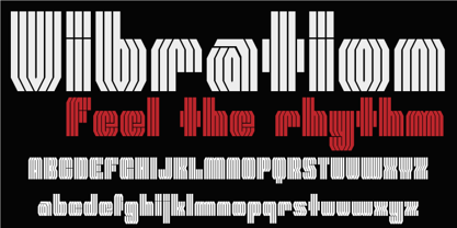 Vibration is a modular font. Use it to give energy to your designs.
 - Droid Sans - 100% free

- Eliyamoli script by Sulthan Studio,
$16.00 Eliyamoli Script a is modern script font, every single letters has been carefully crafted to make your text looks beautiful. With is modern script style this font will be perfect for many different projects. Examples: invitations, greeting cards, posters, name card, quotes, blog header, branding, logo, fashion, apparel, letter, stationery and more ! The alternative characters were divided into several Open Type features such as Swash, Stylistic Sets, Stylistic Alternates, Contextual Alternates. The Open Type features can be accessed by using Open Type savvy programs such as Adobe Illustrator, Adobe InDesign, Adobe Photoshop Corel Draw X version, And Microsoft Word. And this Font has given PUA unicode (specially coded fonts) so that all the alternate characters can easily be accessed in full by a craftsman or designer.
 - Redwood by Canada Type,
$29.95 Redwood is the fresh and lively digitization of the popular ATF landmark, Raleigh Cursive. Drawn by Willard Sniffin in 1929, and introduced by ATF in 1930, this classic script is prominently featured in almost every published type history book, and proudly listed among every letterpress printer's type assets. Redwood's unique calligraphy is complemented with a set of swash capitals unlike any others out there. Strength, grace and elegance rarely ever combine the way they do in this typeface.
 - Katigert by Oleg Gert,
$20.00 Katigert – is a rather friendly italic with a touch of measured severity, combines very sharp angles and bold shapes. The font works best for display. The font includes extended Cyrillic and Latin alphabets, punctuation marks and currencies.
 - Progs by Holis.Mjd,
$14.00 Progs Font is a messy, disorganized handwriting font equipped with several unique special alternates in the uppercase “O” and lowercase “o” letters, looks natural and realistic, suitable for social media, branding, quotes, packaging labels and other designs.
 - River Stone by Yumna Type,
$16.00 It may be difficult to find a font with characters and legibility rates when creating impactful visual designs. Amid the abundance of ordinary font options, the branding and marketing processes can remain stagnant because the absence of unique fonts will increase the risk of your visual designs getting blended with other people’s designs and be left forgotten. For that reason, we would be glad to introduce you to River Stone, a font to give you assistance to create prominent visual designs quickly and easily. River Stone is an uppercased display font in textured letter shapes with which it shows firm, eye-catchy impressions. The font’s textures can add dimensions to the letters’ displays and live up the design nuances. With the use of uppercases, this font is capable of protruding the desired messages and make the design displays more attractive. Its unique shapes will affect the legibility rate of the font, therefore, you need to use this font for big text sizes for a better legibility reason. In addition, this font provides you a clipart as a bonus and you can make use of the available features here as well. Features: Multilingual Supports PUA Encoded Numerals and Punctuations River Stone fits best for various design projects, such as brandings, posters, banners, headings, magazine covers, quotes, printed products, merchandise, social media, etc. Find out more ways to use this font by taking a look at the font preview. Thanks for purchasing our fonts. Hopefully, you have a great time using our font. Feel free to contact us anytime for further information or when you have trouble with the font. Thanks a lot and happy designing.
 - Linotype Textra by Linotype,
$40.99Linotype Textra is a clever twist on the sans serif genre, designed by Jochen Schuss and Jörg Herz in 2002. Schuss says this about Linotype Textra: "Two in one! The same Linotype Textra, which is so neutral and practical for long text passages turns into an eye-catching headline type when used in larger point sizes. The trick? It's all in the details. The type's clear, robust forms give it a high degree of legibility when used in smaller point sizes for texts. When used in larger sizes, the angular, slightly irregular forms that give the type its strong character become apparent. Hence the name Linotype Textra: pure text with a little something extra!" With 15 weights, the Linotype Textra family provides graphic designers with a good basis for almost any type of work. The five regular weights have matching true italics and old style figures, and the five small cap weights include tabular figures. - Coo Coo by chicken,
$23.00 So I made five rather odd characters for a logo for a friend… Then I thought I'd fill a couple of spare hours expanding it to a single alphabet… And some considerable time later I ended up with a whole font with full punctuation, a bunch of alternates, pretty broad international support and some OpenType features to keep things varied… There are elements of Art Deco, Art Nouveau, Lego, circuit boards and Ceefax, Memphis lamps and lab clamps, hieroglyphs, googly eyes and who knows what else… Intricate, insane, highly irregular, but somehow it hangs together… Throw down a few letters nice and big when the fancy takes you…
 - Raifin by Hooper Type,
$9.99 Out with the old in with the BOLD. Raifin is a messy, gory and fantastical piece of work which shoves two fingers up at conformity. A title font, a copy font, a bonkers font. An experimentation of the rules, or lack thereof. Enjoy!
 - Golden Hopes by Mans Greback,
$59.00 Golden Hopes is a modern signature typeface family. A high-quality handwriting font, it is perfect for creating signature logos and watermarks for your photography studio or a wedding invitation. Drawn and created in 2021, this lettering has a quick, optimistic style and a vivid personality. The script family consists of four handwritten styles: Slanted/Regular, Upright, Bold and Upright Bold. The font is built with advanced OpenType functionality and has a guaranteed top-notch quality, containing stylistic and contextual alternates, ligatures and more features; all to give you full control and customizability. It has extensive lingual support, covering all Latin-based languages, from North Europe to South Africa, from America to South-East Asia. It contains all characters and symbols you'll ever need, including all punctuation and numbers.
 - Miraikato Script by Mans Greback,
$49.00 Miraikato Script is a rustic handwriting typeface. As a cute brush writing, its naive and happy movements brings out the optimism and genuineness in any project. It has the flow and elegance of a formal font, while maintaining the youthful enjoyment of a real handwritten text. The Miraikato Script family is provided in six styles: The weights Thin, Regular and Bold, plus each weight as Italic. The font is built with advanced OpenType functionality and has a guaranteed top-notch quality, containing stylistic and contextual alternates, ligatures and more features; all to give you full control and customizability. It has extensive lingual support, covering all Latin-based languages, from North Europe to South Africa, from America to South-East Asia. It contains all characters and symbols you'll ever need, including all punctuation and numbers.
 - Mauritz by Mans Greback,
$59.00 Mauritz is a brush script typeface. A speedy handwriting, Mauritz was drawn and created by Mans Greback in 2021 to be the ultimate set of wild-style scripts for logotypes and branding. This calligraphy family consists of 10 high-quality fonts in a great variety of weights and styles: Mauritz Thin, Light, Regular, Bold and Black, and each one as Italic. The font is built with advanced OpenType functionality and has a guaranteed top-notch quality, containing stylistic and contextual alternates, ligatures and more features; all to give you full control and customizability. It has extensive lingual support, covering all Latin-based languages, from North Europe to South Africa, from America to South-East Asia. It contains all characters and symbols you'll ever need, including all punctuation and numbers.
 - Arando Script by Mans Greback,
$59.00 Arando Script is a retro script typeface. A perfected calligraphy with uniquely beautiful letterforms, Arando Script is a professional quality handwriting font family. Drawn and created by Mans Greback in 2022, it is perfect for a formal restaurant headline or feminine logotype design. Arando Script is provided in four styles: Regular, Bold, Italic and Bold Italic, which compliment each other and maximise your options and design experience. The font is built with advanced OpenType functionality and has a guaranteed top-notch quality, containing stylistic and contextual alternates, ligatures and more features; all to give you full control and customizability. It has extensive lingual support, covering all Latin-based languages, from Northern Europe to South Africa, from America to South-East Asia. It contains all characters and symbols you'll ever need, including all punctuation and numbers.
 - Rapid Writing by Misprinted Type,
$38.00 Rapid Writing is based on the Rapid and Muscular Methods of writing, where the whole arm instead of the wrist is used to write. Copybooks and vertical writing fostered form at the expense of freedom. Speed and muscular movement have fostered freedom at the expense of form. This font is based upon form and movement and brings spontaneity and freedom to calligraphy! The font is full contrast, swashes, round forms, ligatures, contextual alternates and other surprises. OPENTYPE FEATURES • 34 Contextual Alternates • 32 Standard Ligatures • Several Stylistic Alternates (2 options for A-Z/0-9) • Ending Swashes (Each character (A-Z) has up to 12 swash endings) Not to mention the font has 710 glyphs. HOW TO USE THE ENDING SWASHES It’s very simple! Simply write the word+ > (greater symbol). For example: Typography> Typography>> Typography>>> etc. After each “>” you get a different ending swash for each character. So there are lot’s of different combinations and alternatives to suit your needs! The font also comes with a PDF Manual. If you have any questions, please get in touch at hello@eduardorecife.com
 - Courage by Positype,
$35.00 High-contrast? High impact? Have Courage? Eye-catching and (extra, extra) bold, Courage balances ultra-high stroke weight, delicate details, and unique letterforms with a self-indulgent passion that will make you feel a little guilty using it. Honestly, use it large and don’t try to force it into a small space, because these fearless letterforms need room to move. Flavored with both upright and italic styles, each font includes an indulgent level of alternates, swashes and titling options, visual elements and more. A backstory with a different name Years ago, I was commissioned to take my Lust typeface and produce something unique to use for large format graphics for an event…cool. It needed to be hyper-contrast with a lot of over-the-top details. With a tight turnaround, I looked for primers within my development catalogue to help me, and settled on some early work on a typeface I had drawn called Hedonist. I used those sketches and its conventions to retrofit and build out Lust Hedonist (only to see the project go bust on the client’s end). I intended to go back shortly after the Lust Hedonist release to finalize a retail version of the OG Hedonist, but I never could settle on the look of the 'g' or the numerals, got distracted with other projects, and never picked it back up… until last year. After randomly doodling a fat, flat ‘g’ with an extremely tilted counter axis, I knew immediately how it could be used and that (re)set things in motion. Only problem was, in the process of refining the letterforms I began truly dissecting the pieces, rediscovering all of the recklessness within Hedonist, and decided on fundamentally rewriting the approach to the typeface… literally flaying it to the bone. I’m much, much happier with this finished typeface now, but the name no longer fit the moniker given to the first, adolescent approach—there’s far more audacity and cleverness in these letterforms, tenacious in their resolution now. As a result, the name Courage fit the mettle of this typeface so much more, so I kept it.
 - Hyper Turfu by Bisou,
$10.00 Made in La Chaux-de-Fonds (Switzerland), HyperTurfu was born during the shooting of “The Return of Hyperturfu Xpress 2”. A GoPro on a lego electric train, meters and meters of rails, an empty industrial space, loads of puppets, paper, cardboard, pizza boxes, lights, hot glue and a bunch of friends preparing a one shot scene for a month. The title of the movie was made out of lego pieces, painted with golden spray and hanged over the rails. It was the first inspiration for this awsome superbold font. HyperTurfu is thought from ground up to give a strong impact. It’s gothic retro science fiction 80’s style makes it best suitable for metal music albums or posters. As the “Banco” font it works perfectly with short texts for advertisement, bar, cofee shops concert places or even fancy hairdresser. Just hang it over a pet shop and see what cool animals will come in.
 - Neo Contact by Linotype,
$40.99Neo Contact is the typeface used on the packaging of Marlboro cigarettes (Marlboro “Reds,” the main line of the brand). The typeface is bold and condensed, designed in the Egyptienne style. Egyptienne types were first designed in the 1800s, as type founders - especially in the westward-expanding United States - began to dream up newer, bolder styles of letters for advertising usage. During the 1800s, it became increasingly important for businesses to set themselves, and their products, apart from competitors. This desire has remained with corporations, as well as with advertisers and designers, into the 21st century. In addition to cigarette packaging, Neo Contact (as part of Marlboro’s branding efforts) can be seen on numerous items, including Ferrari’s F1 racers, and at Formula 1 race tracks. The letters in Neo Contact are filled with personality. Their forms display two distinct weights of line, and the serifs are made up of tiny, strict slabs. Ball terminals round out the design. Neo Contact is a complete font, with a complete western character set. Typefaces in the Egyptienne style preceded the development and distribution of larger, crazier wood typefaces, but also share many similarities with these descendents. More traditional, text faces in the Egyptienne manner are also available from Linotype GmbH (e.g., Adrian Frutiger’s Egyptienne F). On the opposite end of the spectrum, we offer interesting, personality-filled wood display types, like Ponderosa as well. - Nafise by Sulthan Studio,
$10.00 A modern font with a Typeface display style, very attractive, coupled with several lowercase ligatures. This font is available in 3 thickness styles such as regular, Bold, and Out line . This font has uppercase, lowercase, numbers, punctuation, and language support.
 - Recipe for a lovely day by PizzaDude.dk,
$16.00 Originally I planned to call this font “pegefinger” which is index finger in danish. Due to the obvious reason that I drew the letters using my “pegefinger” :) Most letters mimic a loose (perhaps even childish) handwriting, but the legibility is never out of hand. I’ve added 5 different versions of each lowercase letter, and they automatically changes as you type!
 - Levato by Linotype,
$29.99 Levato, the first font designed by Felix Bonge, is an Antiqua that is full of character and is refined but by no means sterile. This typeface provides for a wide range of options for creating individual designs. It was not really Felix Bonge's intention to create a whole font family when, as a second year student, he began several exercises in contrast and proportion as part of the typeface design course of Professor Veljovi? at Hamburg University of Applied Sciences. However, these initial studies developed into a project that Bonge persisted with over the following years while working towards his degree. He continually had new insights and ideas that he was able to exploit for his font. Of particular importance, he claims, was a calligraphy seminar, which prompted him to completely rework his concept. It took him several years before his extensive font Levato™ was ready. Although the forms of Levato are ultimately derived from Renaissance Antiqua, Bonge has slightly increased the relative contrast in his version. This gives the font a graceful appearance that is further emphasized by the reduced x-height and the associated prominence of the ascenders. And, in addition, the relatively fine serifs, which are almost linear at their ends, infuse Levato with a hint of classical Antiqua á la Bodoni. At the same time, Bonge cleverly compensates for the sterilising tendency of this font form. Soft and rounded serif attachments and rounded line apexes offset the severe nature of the font and provide it with an aura of vivacity. This effect is promoted by the calligraphic-like foot of the lowercase h, n and m and the not quite horizontal bars of the uppercase E and F. Overall, Bonge has succeeded in creating a refined and yet very dynamic typeface. Levato is available in five weights; Light, Regular, Medium, Bold and Black, in each case with the corresponding italic versions. Bonge treats Levato Italic as a genuine cursive typeface. Its letters are thus slightly narrower than the analogous upright letters and their forms are considerably more curvilinear. All the versions of Levato boast an enormous range of characters to meet all possible requirements. In addition to four sets of minuscule and majuscule numerals for tabular and proportional typesetting, there are also small caps, numerous ligatures, ornamental characters and even swash variants of letters. With their generous, sweeping curves, the swash variants (available as OpenType versions) can be used for striking titling effects or as initials.
 - The Mount Saint by Putracetol,
$28.00 The Mount Saint - Bold Luxury Serif Font. The Mount Saint is a bold vintage style serif font with strong character and soft features. The Mount Saint is equipped with Swash, Stylistic and Titling alternates as well as with Standard and Discretionary Ligatures And this font is a stylish font that is both retro and bold font. It's thick curves give a 70s groovy vibe with the serifs bringing it slightly back to traditional. Comes with alternatives and ligatures, helps to create stunning logos, quotes, posts, blog posts. branding projects, magazine imagery, wedding invitations, and much more. The alternative characters were divided into several Open Type features such as Swash, Stylistic Sets, Stylistic Alternates, Contextual Alternates, and Ligature. The Open Type features can be accessed by using Open Type savvy programs such as Adobe Illustrator, Adobe InDesign, Adobe Photoshop Corel Draw X version, And Microsoft Word. This font is also support multi language.
 - Sweettooth by Gleb Guralnyk,
$12.00 Hi! Introducing a script font named Sweettooth. It's fully handcrafted and has a natural look. Also it has several ligatures to make it more authentic. Thank you and have a great day!
 - Beralissa by Jadatype,
$15.00 Beralissa is a script font with a calligraphy style. suitable for social media, logotype, products, advertisements, and so on. contains standard English letters, numbers, punctuation, alternates and several accents that support multilingualism.
