10,000 search results
(0.065 seconds)
- VVDS Sunshine Bridge by Vintage Voyage Design Supply,
$12.00 Sunshine Bridge is a retro modern font family, featuring a retro brush script with an artistic modern bold sans serif. They complement each other perfectly. You can use the Sans as main and Script as additional, or vice versa. This family gives you a modern look with a vintage mood. So, you can use it both as in vintage-look projects - Beer bar or Brewery logo etc, or as Modern magazine headline or any modern print. It includes a lot of OpenType Features in Script with Swashes and Alternates to give you a little more hand-touch look. The family includes: Clean and Pressed versions Well Kerned Multilingual Support OpenType Features Modern / Vintage look
 - Vilsuve by TypoBureau Studio,
$10.00 Vilsuve is a wide sans serif It’s a strong capitals and a sharp, open lowercase are effective in a variety of applications. Tempered by sharp edges and vibrant shapes. Free updates and feature additions FEATURES Uppercase / lowercase / Oblique / context alternates / Numbers and Punctuation / Foreign Language Support -USE- Vilsuve works great in any branding, films, magazines, header, logos. The different styles give you option to explore a whole host of applications, while the oblique and lowercase alternates fonts give a real modern feel to any project. if you have any issues regarding my file. Please let me know through email (typobureaustudio@gmail.com). I’m glad to help you :) Thank you ! Tubagus Iqbal T on behalf TypoBureau Studio
 - Sideroad by Melvastype,
$22.00 Sideroad is an intensive hand-drawn brush script font. It comes in two versions, Textured and Smooth. Textured version has this rough effect that comes when letters are drawn with pointed-brush on rugged surface. The Smooth version is, like the name says, smooth as silk with polished edges and properly drawn forms. Sideroad includes two sets of lower case letters to give variation and more imperfect hand-drawn effect. You can cycle these two sets by enabling Contextual Alternates OpenType feature. It also has set of lower cases without connector strokes. And a set of lower cases with end swashes. On top of these there are also a few underlines to give that final punch to your design.
 - Vegapunk by Factory738,
$15.00 The awesome sports font Vegapunk has unique cutouts, a dynamic slant, and gives the impression of power and speed. Ideal for fast-paced sports titles like auto racing, cycling, running sporting events, and automotive game logos and monograms, as well as other dynamic modern or vintage text. A wide variety of characters are offered by the available Ligatures and Italic styles, giving your project design an unique appearance. 5 Weights (Narrower, Narrow, Regular, Wide, Wider) 2 Styles (Regular and Italic) Basic Latin A-Z and a-z Numerals & Punctuation Stylistic Ligatures and Alternate glyps Multilingual Support for ä ö ü Ä Ö Ü ... Free updates and feature additions Thanks for looking, and I hope you enjoy it.
 - Graziella Script by Black Studio,
$25.00 Graziella Script is a calligraphy script font that comes with exquisite character changes, a kind of classic decorative copper script with a modern twist, designed with high detail for an elegant style. Graziella Script Manuscript is attractive because it is smooth, clean, feminine, sensual, glamorous, simple and very readable, because of its many fancy letter joints. I also offer a number of decent stylistic alternatives for multiple letters. Classic styles are very suitable to be applied in various formal forms such as invitations, labels, restaurant menus, logos, fashion, make up, stationery, novels, magazines, books, greeting / wedding cards, packaging, labels or all kinds of advertising purposes. . . . . . . Graziella Script has 436+ Glyph alternative characters, including multiple language support. With OpenType features with alternative styles and elegant binding. The OpenType feature works automatically, but you can access it manually and for the best results necessary for your creativity in combining these variations of the Glyph. I really hope you enjoy it! I can't wait to see what you do with the Graziella Script! Feel free to use the #Black Studio tag and the #Graziella Script font to show what you've been up to.
 - Basilio by Canada Type,
$29.95 In the late 1930s, old Egyptiennes (or Italiennes) returned to the collective consciousness of European printers and type houses — perhaps because political news were front a centre, especially in France where Le Figaro newspaper was seeing record circulation numbers. In 1939 both Monotype and Lettergieterij Amsterdam thought of the same idea: Make a new typeface similar to the reverse stress slab shapes that make up the titles of newspapers like Le Figaro and Le Frondeur. Both foundries intended to call their new type Figaro. Monotype finished theirs first, so they ended up with the name, and their type was already published when Stefan Schlesinger finished his take for the Amsterdam foundry. Schlesinger’s type was renamed Hidalgo (Spanish for a lower nobleman, ‘son of something’) and published in 1940 as ‘a very happy variation on an old motif’. Although it wasn’t a commercial success at the time, it was well received and considered subtler and more refined than the similar types available, Figaro and Playbill. In the Second World War, the Germans banned the use of the type, and Hidalgo never really recovered. Upon closer inspection, Schlesinger’s work on Hidalgo was much more Euro-sophisticated and ahead of its time than the too-wooden cut of Figaro and the thick tightness of Playbill. It has a modern high contrast, a squarer skeleton, contour cuts that work similarly outside and inside, and airy and minimal solutions to the more complicated shapes like G, K, M, N, Q and W. It is also much more aware of, and more accommodating to, the picket-fence effect the thick top slabs create in setting. Basilio (named after the signing teacher in Mozart’s Figaro) is the digital revival and major expansion of Hidalgo. With nearly 600 glyphs, it boasts Pan-European language support (most Latin languages, as well as Cyrillic and Greek), and a few OpenType tricks that gel it all together to make a very useful design tool. Stefan Schlesigner was born in Vienna in 1896. He moved to the Netherlands in 1925, where he worked for Van Houten’s chocolate, Metz department store, printing firm Trio and many other clients. He died in the gas chambers of Auschwitz in 1944. Digital revivals and expansions of two of his other designs, Minuet and Serena, have also been published by Canada Type.
 - Arthur Sans by SIAS,
$34.90 Arthur Sans is a new font design in the spirit of the Art Deco era, the age of elegance, stylishness and refinement. Use this unique typeface for distinctive personal stationary, outstanding business papers, captivating brochures and invitations; for marvellous posters, wonderful menus, hotel leaflets, exciting ads … for outstanding designs. You’ll find out that Arthur Sans is your friend for more than just fine typography. Five weights plus Italics – all equipped with a comprehensive Euro-Latin character set – will hardly leave anything to be desired. Additionally, the font Arthur Sans Regular contains an outstanding extra range of 70 ornamental characters, carefully designed to the very tone of the typeface, to give you a very special kick of extra value to enchant your designs. Alternatively, you can get this set of ornaments seperately, look at the Arthur Ornaments! Arthur Sans is but one part of a greater suite of exciting fonts: you may wish to also check out the sister fonts of the gorgeous Arthur Cabinet family, which will offer you another wonderful scope of fascinating typographic possibilities. For a matching Greek font go to Artemis. And finally, Arthur’s Irish friend is the fabulous Ardagh. __________________________________________________________________________________________
 - NaNa Arabic by Naghi Naghachian,
$75.00 NaNa Arabic is a new creation of Naghi Naghashian. It was developed in 2012/2013 on the basis of specific research and analysis of Arabic characters and definition of their structure. This innovation is a contribution to the modernisation of Arabic typography, giving the font design of Arabic letters real typographic arrangement and providing greater typographic flexibility. This step was necessary after more than two hundred years of relative stagnation in Arabic font design. NaNa Arabic supports Arabic, Persian and Urdu. It also includes proportional and tabular numerals for the supported languages. The NaNa Arabic Font Family is available in four weights: Thin, Light, Regular and Bold. The design of this font family is inspired by two classic scripts: Kufic and Naskh. The quasi-geometric character of Kofic melds with the calligraphic grace of Naskh, which was invented by Iben Moghleh, an Iranian savant of the ninth century. He lived in Baghdad and was assassinated at the instigation of an Abbasid caliph. He was a polymath and a renowned scholar. I dedicate the design of this font family to the memory of this great man.
 - Bandung Pro by Majestype,
$34.00 Bandung Pro from Majestype was made to capture the natural movement of a brush script infused with the elegance of copperplate hand. With 6 months in the making, we want to make sure that the character set connects each other as natural and seamless as handwriting would be. We give you vast amounts of glyph options(700+) added with lots of swashes and flourishes to give you an authentic look of hand-made brush letters. Aceserif Pro is an all-caps serif font inspired by traditional serif and art deco design. Equipped with 220 Glyphs and has the current OpenType features. We made the uppercase letters slightly larger than the lowercase letters to give a good impression when used in designs that don’t require a lot of words, such as headlines or headers. You can try it like this, “HeadlineS” - Capital letters are at the beginning and end of a word. Bandung Pro & Aceserif Pro is suitable for a wine label, photography, invitation, ID card, tattoo, poster, logo, title, tees, branding, etc.
 - Alonzo by Fenotype,
$25.00 Alonzo is a modern cosmopolitan who speaks several languages fluently. Alonzo comes in six weights and two widths, as well as corresponding italics, making a total 24 styles. Alonzo is an elegant, simplistic, high-contrast sans that is at home in high-end fashion and cultural environments, as well as in the world of restaurants and nightclubs. While Alonzo Condensed is more illustrative and works best in display use, headlines, logotypes, labels and all that, Alonzo Regular works in a wider range of contexts, from body text to editorial and catalogs and more. Alonzo is equipped with several OpenType features such as oldstyle figures, small caps, Standard Ligatures, Superior and Inferior Figures. In addition Alonzo has Stylistic Alternate lowercase "a" with round Bowl. Me llamo Alonzo. Mucho gusto, piacere di conoscerti, nice to meet you!
 - Vianova Serif Pro by Elsner+Flake,
$59.00 The font superfamily Vianova contains each 12 weights of Sans and Slab and 8 weights of the Serif style. The design from Jürgen Adolph dates back into the 1990s, when he studied Communication Design with Werner Schneider as a professor at the Fachhochschule Stuttgart. Adolph started his carrier 1995 at Michael Conrad & Leo Burnett. He was responsible for trade marks as Adidas, BMW, Germanwings and Merz. He has been honored as a member of the Art Directors Club (ADC) with more than 100 awards. On February 26, 2014, Jürgen Adolph wrote the following: “I was already interested in typography, even when I could not yet read. Letterforms, for instance, above storefronts downtown, had an irresistible appeal for me. Therefore, it is probably not a coincidence that, after finishing high school, I began an apprenticeship with a provider of signage and neon-advertising in Saarbrücken, and – in the late 1980s – I placed highest in my field in my state. When I continued my studies in communications design in Wiesbaden, I was introduced to the highest standards in calligraphy and type design. “Typography begins with writing” my revered teacher, Professor Werner Schneider, taught me. Indefatigably, he supported me during the development of my typeface “Vianova” – which began as part of a studies program – and accompanied me on my journey even when its more austere letterforms did not necessarily conform to his own aesthetic ideals. The completely analogue development of the types – designed entirely with ink and opaque white on cardboard – covered several academic semesters. In order to find its appropriate form, writing with a flat nib was used. Once, when I showed some intermediate designs to Günter Gerhard Lange, who occasionally honored our school with a visit, he commented in his own inimitable manner: “Not bad what you are doing there. But if you want to make a living with this, you might as well order your coffin now.” At that time, I was concentrating mainly on the serif version. But things reached a different level of complexity when, during a meeting with Günther Flake which had been arranged by Professor Schneider, he suggested that I enlarge the offering with a sans and slab version of the typeface. So – a few more months went by, but at the same time, Elsner+Flake already began with the digitilization process. In order to avoid the fate predicted by Günter Gerhard Lange, I went into “servitude” in the advertising industry (Michael Conrad & Leo Burnett) and design field (Rempen& Partner, SchömanCorporate, Claus Koch) and worked for several years as the Creative Director at KW43 in Düsseldorf concerned with corporate design development and expansion (among others for A. Lange & Söhne, Deichmann, Germanwings, Langenscheidt, Montblanc.”
 - Vianova Slab Pro by Elsner+Flake,
$59.00 The font superfamily Vianova contains each 12 weights of Sans and Slab and 8 weights of the Serif style. The design from Jürgen Adolph dates back into the 1990s, when he studied Communication Design with Werner Schneider as a professor at the Fachhochschule Stuttgart. Adolph started his carrier 1995 at Michael Conrad & Leo Burnett. He was responsible for trade marks as Adidas, BMW, Germanwings and Merz. He has been honored as a member of the Art Directors Club (ADC) with more than 100 awards. On February 26, 2014, Jürgen Adolph wrote the following: “I was already interested in typography, even when I could not yet read. Letterforms, for instance, above storefronts downtown, had an irresistible appeal for me. Therefore, it is probably not a coincidence that, after finishing high school, I began an apprenticeship with a provider of signage and neon-advertising in Saarbrücken, and – in the late 1980s – I placed highest in my field in my state. When I continued my studies in communications design in Wiesbaden, I was introduced to the highest standards in calligraphy and type design. “Typography begins with writing” my revered teacher, Professor Werner Schneider, taught me. Indefatigably, he supported me during the development of my typeface “Vianova” – which began as part of a studies program – and accompanied me on my journey even when its more austere letterforms did not necessarily conform to his own aesthetic ideals. The completely analogue development of the types – designed entirely with ink and opaque white on cardboard – covered several academic semesters. In order to find its appropriate form, writing with a flat nib was used. Once, when I showed some intermediate designs to Günter Gerhard Lange, who occasionally honored our school with a visit, he commented in his own inimitable manner: “Not bad what you are doing there. But if you want to make a living with this, you might as well order your coffin now.” At that time, I was concentrating mainly on the serif version. But things reached a different level of complexity when, during a meeting with Günther Flake which had been arranged by Professor Schneider, he suggested that I enlarge the offering with a sans and slab version of the typeface. So – a few more months went by, but at the same time, Elsner+Flake already began with the digitilization process. In order to avoid the fate predicted by Günter Gerhard Lange, I went into “servitude” in the advertising industry (Michael Conrad & Leo Burnett) and design field (Rempen& Partner, SchömanCorporate, Claus Koch) and worked for several years as the Creative Director at KW43 in Düsseldorf concerned with corporate design development and expansion (among others for A. Lange & Söhne, Deichmann, Germanwings, Langenscheidt, Montblanc.”
 - Vianova Sans Pro by Elsner+Flake,
$59.00 The font superfamily Vianova contains each 12 weights of Sans and Slab and 8 weights of the Serif style. The design from Jürgen Adolph dates back into the 90th, when he studied Communication Design with Werner Schneider as a professor at the Fachhochschule Stuttgart. Adolph started his carrier 1995 at Michael Conrad & Leo Burnett. He was responsible for trade marks as Adidas, BMW, Germanwings and Merz. He has been honoured as a member of the Art Director Club (ADC) with more than 100 awards. On February 26, 2014, Jürgen Adolph wrote the following: “I was already interested in typography, even when I could not yet read. Letterforms, for instance, above storefronts downtown, had an irresistible appeal for me. Therefore, it is probably not a coincidence that, after finishing high school, I began an apprenticeship with a provider of signage and neon-advertising in Saarbrücken, and – in the late 1980s – I placed highest in my field in my state. When I continued my studies in communications design in Wiesbaden, I was introduced to the highest standards in calligraphy and type design. “Typography begins with writing” my revered teacher, Professor Werner Schneider, taught me. Indefatigably, he supported me during the development of my typeface “Vianova” – which began as part of a studies program – and accompanied me on my journey even when its more austere letterforms did not necessarily conform to his own aesthetic ideals. The completely analogue development of the types – designed entirely with ink and opaque white on cardboard – covered several academic semesters. In order to find its appropriate form, writing with a flat nib was used. Once, when I showed some intermediate designs to Günter Gerhard Lange, who occasionally honored our school with a visit, he commented in his own inimitable manner: “Not bad what you are doing there. But if you want to make a living with this, you might as well order your coffin now.” At that time, I was concentrating mainly on the serif version. But things reached a different level of complexity when, during a meeting with Günther Flake which had been arranged by Professor Schneider, he suggested that I enlarge the offering with a sans and slab version of the typeface. So – a few more months went by, but at the same time, Elsner+Flake already began with the digitilization process. In order to avoid the fate predicted by Günter Gerhard Lange, I went into “servitude” in the advertising industry (Michael Conrad & Leo Burnett) and design field (Rempen& Partner, SchömanCorporate, Claus Koch) and worked for several years as the Creative Director at KW43 in Düsseldorf concerned with corporate design development and expansion (among others for A. Lange & Söhne, Deichmann, Germanwings, Langenscheidt, Montblanc.”
 - Yuk Ngexi by Product Type,
$17.00 Meet the Yuk Ngexi Font: Strong, Bold, and Fun in Gaming Style. Who says design has to be boring? With the Yuk Ngexi Font, you can bring a touch of power, thickness, and gaming style fun to your every project. The Yuk Ngexi font is the perfect solution for various projects that require a unique theme. Whether it's for movies, games, or streaming game events, this font provides unmatched appeal. This font is designed with a strong gaming touch, giving each character a bold and striking feel. The Yuk Ngexi font comes in four different style variants: Regular, Blury, Outline, and Shadow. This gives you the flexibility to bring in a variety of nuances in your designs. Yuk Ngexi also supports multiple languages, allowing you to connect with a global audience easily. With Yuk Ngexi Font, you don't just get a font, you get the key to bringing creativity, power, and fun to each of your designs. Download the Yuk Ngexi Font now and watch how your design turns into something extraordinary!
 - Cynthia June JF by Jukebox Collection,
$32.99 Cynthia June is an elegant and formal copperplate style script font from Jukebox. Perfect for weddings, dinners, holidays or any design that needs classic elegance, flair and femininity, this typeface will fit the bill! It includes an alternate set of swash caps and several alternate lowercase letters to expand its use. The font is named for a dear friend of the designer. Jukebox fonts are available in OpenType format and downloadable packages contain both .otf and .ttf versions of the font. They are compatible on both Mac and Windows. All fonts contain basic OpenType features as well as support for Latin-based and most Eastern European languages.
 - Stribe by Fateh.Lab,
$10.00 Stribe, this is an amazing work. Why? ... because this is not just talking about fonts, but more than that, with the spirit of Street Art, stribe invites you to explore with your wild ideas, I'm sure this will really make you feel happy in creating the work that you will wake up to the front. Supported by 3 font choices that are very sweet and also strong, stribe answers all your difficulties in choosing font support that suits your taste. And the most exciting thing is, you get a free bonus vector illustration that is very detailed and also has a very strong Street Art spirit, and is made very original, so what are you waiting for, have Stribe as soon as possible. Thank You
 - P22 Graciosa by IHOF,
$29.95 P22 Graciosa is a five font family based upon designs for a metal type by Carlos Winkow (1882–1952), a German type designer who lived and worked in Spain in the early 20th Century. Graciosa is a sort of hybrid blackletter/text font, with simplified blackletter caps and a serifed lowercase with subtle script flare. There is a Regular, Black, an open version called White, and an engraved version called Gris. The version called Multi serves as a fill font to allow for multi-colored layering options. A revival of these designs was initiated by Matthias Beck in 2015. The character set was expanded for use in 21 languages (OpenType Standard). The digitization and reintroduction of these old fonts—created in Spain and practically forgotten—makes them regain a new life. This project was subsidized by the Spanish Ministry of Education, Culture and Sport.
 - Click Brother by Grontype,
$15.00 Click Brother is an awesome and elegant script font which is first made by hand and deliver an unique style. This font comes with multiple ligatures and alternates to give you an extra creative work. Click Brother font support multilingual languages. The font is very good for logo tagline, Invitation Header, Flyer, magazine titles, etc. Make an amazing work with Click Brother Font. Features: Ligature and alternates Multilingual Support Numeral and punctuation Enjoy The Font. Regard Grontype
 - Firon by Maulana Creative,
$14.00 Firon is a modern Decorative Display font. Bold strokes, fun character with a bit of ligature and alternates. To give you extra creative work. Firon font support multilingual more than 100+ language. This font is good for logo design, Social media, Movie Titles, Books Titles, short text even long text letters, and good for your secondary text font with script or serif. Make stunning work with Firon font. This is all caps font style. Cheers, Maulana Creative
 - Skisterstone by Maulana Creative,
$12.00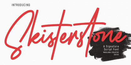 Skisterstones Signature Script Font Skisterstone is a Casual Signature Script font. With regular mono-line stroke, fun character with a bit of ligatures. To give you an extra creative work. Skisterstone font support multilingual more than 100+ language. This font is good for logo design, Social media, Movie Titles, Books Titles, a short text even a long text letter and good for your secondary text font with sans or serif. Make a stunning work with Skisterstone font. Cheers, MaulanaCreative
 - MC Kartoz by Maulana Creative,
$16.00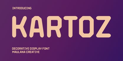 Kartoz is a modern Tech Decorative Display font. Medium stroke, fun character with a bit of ligatures and alternates. To give you an extra creative work. Kartoz font support multilingual more than 100+ language. This font is good for logo design, Social media, Movie Titles, Books Titles, a short text even a long text letter and good for your secondary text font with script or serif. Make a stunning work with Kartoz font. Caps only Fonts. Cheers, Maulana Creative
 - Feeltrips by Maulana Creative,
$15.00 Feeltrips is an all caps handwritten display font. With bold stroke, italic and fun character with a bit of ligatures. To give you an extra creative work. Feeltrips font support multilingual more than 100+ language. This font is good for logo design, Social media, Movie Titles, Books Titles, a short text even a long text letter and good for your secondary text font with sans or serif. Make a stunning work with Feeltrips font. Caps only fonts. Cheers, MaulanaCreative
 - Gastonica by Atharuah Studios,
$16.00 Introducing Gastonica; A stylish script font! Gastonica is a stylish handwritten script font designed with love and completely hand-drawn. Every letter created, shows a flow that looks elegant and stunning. Gastonica also has several ligatures to add an organic feel to every word that is displayed. It's the perfect choice for stylish branding & logo projects, product packaging, handwritten quotes, editorial design, and more. What's Included: Gastonica comes with a single font file that includes uppercase, lowercase, numbers, punctuation, and multilingual support. That's it! I hope you enjoy it. You can also say hello to me on Instagram: https://www.instagram.com/atharuah_ Thank You!
 - Librum by Hackberry Font Foundry,
$24.95 This is the serif text family for the book design group of font families which David designed in the process of writing "Practical Font Design With FontLab 5". The letterspacing is set wide for body copy use. The main purpose is readability and reading comfort. There are several whimsical graphics, plenty of OpenType features: oldstyle figures [tabular and not], small cap figures, lining figures [tabular and not], discretionary ligatures, small caps, and so on. The feature set is limited for the italic and bold versions. It produces an exceptional book. See Librum Book Design Group for a package containing all fifteen fonts,
 - Rimrocks by Atharuah Studios,
$16.00 Introducing Rimrocks; A stylish script font! Rimrocks is a carefully designed and completely hand-drawn font that has different dimensions in each letter creating a stunningly realistic look. Rimrocks also has several ligatures to add an organic feel to every word that is displayed. It's the perfect choice for stylish branding & logo projects, product packaging, handwritten quotes, editorial design, and more. What's Included: Rimrocks comes with a single font file that includes uppercase, lowercase, numbers, punctuation, and multilingual support. That's it! I hope you enjoy it. You can also say hello to me on Instagram: https://www.instagram.com/atharuah_ Thank You!
 - Fauna by Pasternak,
$12.00 Fauna is a stylish font inspired by hi-fi elements combined with square forms and straight lines. It also has the features of Constructivism, including solidity, emphasis on geometric shapes, and austerity. Bold futuristic characters make this font an ideal option for the development of a minimalistic and recognizable design, necessary for any modern project. It’s perfect for the creation of logos, titles, social media posts, posters, and ads. Due to the clear and eye-catching design of the characters, the font will surely attract your audience. It includes all basic symbols and characters. Plus, Fauna features proper kerning and supports several languages.
 - Latina by Latinotype,
$49.00 Latina is our first humanist typeface designed for use in continuous text. This font is based on calligraphy, but calligraphic features have been changed in order to make Latina a more neutral font. This prevents readers from losing their focus when reading continuous text. On the other hand, these same features get highlighted when using the font for headlines or display text. This 11-weight family includes italics and small caps, and supports 219 different languages as well as several sets of figures. Latina is the perfect choice for publishing design (books and magazines), branding and advertising.
 - Good Butter by Twinletter,
$12.00 This font is created with original hand-drawn strokes for a relaxed, beautiful, and elegant feel, which is dazzling for a variety of food-themed design projects as well as other designs. also, beautiful abstract typography harmony in this font impression for a wide variety of design projects, including natural handwriting in digital form for designs, quote designs, for social media business designs, advertisements, trademarks, promotional banners, posts, posters, signatures, and all designs need handwriting or whatever design you want. This font is equipped with uppercase, lowercase, numbers, punctuation marks, swhases, and several variations on each character including multi-language.
 - sonovovitch by 10four,
$24.95 Sonovovitch is a unicase display typeface inspired by the Russian Constructivist movement and Soviet Cold War era propaganda. Although a faux Russian font, Sonovovitch has language support for the true Cyrillic alphabet. Originally intended as an exercise in downsizing the typical font’s character set, Sonovovitch quickly expanded in the opposite direction, adding multiple variations for letterforms and utilizing Open Type features allowing for easy substitution of glyphs… creating plenty of variety for letter combinations. Open Type “Titling Alternates” even substitute completely foreign glyphs, never seen before in any language, allowing for totally alien typesetting. The results found in Sonovovitch are packed with bold character and eastern European influenced flair. Sonovovitch’s eclectic geometric forms lend itself to a multitude of graphic applications; from serious branding programmes, to light-hearted packaging, to sports jerseys, to hand-crafted DIY projects.
 - Mister Mustard by AdultHumanMale,
$12.00 MisterMustard is a chubby art deco style font, not thin or elegant, but plump and jolly. The font is available in two styles regular and italic. While it was designed to be playful, this font has both an uppercase and a lower case, so it works for practically everything (maybe not a headstone or obituary). It’s loaded with extra foreign glyphs so it gives you plenty of options. Buy. Install. Enjoy.
 - Chromate by Supfonts,
$18.00 Chromate - a charming family with 3 fonts in retro style of the 80s and 90s! The dense structure will give an incredible retro vibe to your project. There are 3 fonts at your disposal, Regular, Italic and Script. This set covers all your needs and allows you to keep the project in a single style. You no longer need to look for which font is suitable, everything is already here
 - HS Monsnow by Helipad Space,
$21.00 Introducing, HS Monsnow! An Experimental Condensed Display Font with the unique touch. It looks authentic and stylish that can be used for all your project needs.This font can be used at any time and on any project. So, HS Monsnow Font can't wait to give its touch to all your design projects such as magazine, movie, poster design, printing, personal branding, promotional materials, logotype, product packaging, etc. Thank You HS
 - Voska by Letrasupply Typefoundry,
$15.00 Voska font is a new collection of display serif typeface. Well designed font with high-contrast proportion, short serif and legit x-heights. Either sharp or rounded shape version both have classy, elegant yet explicit looks that works perfect mostly for branding, editorial purpose and more project on printing. Voska font contains alternate characters, ligatures and discretionary ligatures that give you an easy way to create awesome project.
 - Ramadan Elegant by Marmara,
$23.00 If you are a graphic designer, magazine editor, fashion stylist, industrial designer, publisher, printer or have a creative business, this font is for you, I believe it is a font that should be in your font folder for all your work.. Make awesome logotypes; When you write any word, it almost gives a logotype effect, I enjoyed working on it very much, I'm sure you will like it too...
 - Draftside by Rvandtype,
$10.00 Introducing Draftside, a captivating typewriter-inspired font meticulously crafted with a touch of vintage allure. This font seamlessly merges elegance with a cool, timeless aesthetic, rendering it an impeccable choice for a myriad of design applications. Draftside's distinctive charm elevates logos, giving them a unique and sophisticated edge. Whether you're working on branding projects, invitations, stationery, or designing for weddings, this font lends a classic yet contemporary vibe to your creations.
 - Thawed by Larin Type Co,
$13.00 Thawed This is a display font of a narrow specialization, its letters seem to have melted and flowed, but at the same time it retains the shape of the letters and is well read. It is perfect for branding, logos, labels, short display inscriptions and advertising materials from flyers to billboards. This font includes drops of style, they make it possible to make the font more voluminous and give detail.
 - Melowest by Zamjump,
$13.00 MELOWEST fonts are a broad category of fonts designed for short and often large format applications, such as billboards or posters; logotypes; headline or header in a magazine or website; and book covers. Display fonts go beyond style - they are. MELOWEST with a round style gives the impression of being flexible and not rigid. Includes: Uppercase Lowercase Numbers Punctuation Symbols Multilingual support PUA Encoded Characters Fully accessible without additional design software.
 - Northash by Arterfak Project,
$17.00 Introducing Northas the vintage stencil font inspired by the old-school signage and military design. This font has a bit condensed letterform that gives a strong look and dignified. Perfect for many themes such as sports, military, urban, wildlife, vintage, and more! Fonts featured : Uppercase Small caps Numbers Symbols & punctuation Accented characters Alternates Catchwords: in, out, the, with, de, of, at, and, etc. Thank you for your support and happy designing!
 - Camijo by Kavoon,
$15.00 Camijo is a contemporary serif typeface with characteristic and defined features. This font was inspired by the idea of mixing different types of terminals in order to give the font a singular appearance. Its design is composed of diverse styles such as Didone and contemporary faces. Camijo comes with a set of 352 characters. This font was specially designed for branding, advertising, editorial design, and use on Tv and social media.
 - Vegas x by XdCreative,
$25.00 Vegas-X is a futuristic squared display font. This font is inspired by films, books, science and space technology, composed of a squared shape with smooth curves that gives a modern and futuristic impression. Vegas-X It is perfect for display, logo, icon and it will look stunning on any poster flyer or print. Use this font for your designs and explore its endless possibilities. Thank you _xd