7,578 search results
(0.024 seconds)
- Bread Flour by Prioritype,
$19.00 Bread Flour - Bold Retro Serif Font. A fat serif font with a lingering retro feel. Equipped with stunning character alternatives to make your design more striking. Great for headlines, branding, logos, merchandise and so on. Type and type now to pour your creative ideas! Features: Uppercase, Lowercase, Numeral, Punctuation, Multilingual, Alternates, Ligatures & PUA Encoded. Multilingual contained: Afrikaans, Albanian, Asu, Basque, Bemba, Bena, Breton, Catalan, Chiga, Cornish, Danish, Dutch, English, Estonian, Filipino, Finnish, French, Friulian, Galician, German, Gusii, Indonesian, Irish, Italian, Kabuverdianu, Kalenjin, Kinyarwanda, Luo, Luxembourgish, Luyia, Machame, Makhuwa-Meetto, Makonde, Malagasy, Manx, Morisyen, North Ndebele, Norwegian Bokmål, Norwegian Nynorsk, Nyankole, Oromo, Portuguese, Quechua, Romansh, Rombo, Rundi, Rwa, Samburu, Sango, Sangu, Scottish Gaelic, Sena, Shambala, Shona, Soga, Somali, Spanish, Swahili, Swedish, Swiss German, Taita, Teso, Uzbek (Latin), Volapük, Vunjo, Zulu. Thanks!
 - VVDS Suffer by Vintage Voyage Design Supply,
$10.00 Do you hear that sound of Dick Dale's guitar? Here it is! Introducing you a new font family with retro surf rock vibes! Straight outta retro vinyl covers and surf gig posters to your font collection! We're all missed the sun, so grab this family and get some of the summer vibes. No matter what your next design project – a tiki t-shirt collection / summer rock festival or gigs / greeting cards / or a header for your new zine, - you'll get your goals with this family. A lot of alternates will give you a hand written's mood and absolutely unique typographic style. Up to 10 styles for some of them. Open Type Features as Stylistic Alternates, Small Caps and Fractions. Three styles: Clear, Roughen and Scratched. Three widths: Light, Regular and Bold.
 - Kosnat Trunks by Alit Design,
$22.00 Kosnat Trunks is a striking sans-serif display font that seamlessly blends retro aesthetics with a touch of modern design. With its wavy ligatures and a whopping 920 meticulously crafted glyphs, this font is a typographic masterpiece that will elevate your design projects to new heights. Key Features: Retro Charm: Kosnat Trunks exudes a delightful retro charm that harks back to the styles of the past, making it perfect for vintage-inspired designs. Wavy Ligatures: The unique wavy ligatures add a playful and dynamic element to the font, making your text visually captivating and memorable. Vast Glyph Library: With an extensive collection of 920 glyphs, Kosnat Trunks offers you unparalleled versatility in your design work. This includes uppercase and lowercase characters, punctuation, symbols, and special characters. PUA Unicode: Kosnat Trunks supports the Private Use Area (PUA) Unicode, ensuring compatibility across various platforms and applications. This feature allows you to access alternate characters and glyphs effortlessly. Multilingual Support: Whether your project requires Latin-based characters or extends to various international languages, Kosnat Trunks has you covered with its comprehensive multilingual support. Ideal Usage: Vintage Branding: Create eye-catching logos and branding materials for retro-inspired businesses and products. Poster Art: Craft attention-grabbing posters and promotional materials that demand attention. Editorial Design: Elevate your magazine layouts, book covers, and editorial spreads with this unique font. Packaging: Design packaging that stands out on the shelf and tells a compelling story. Web Design: Use Kosnat Trunks to add a touch of nostalgia and personality to your website headers and titles. Kosnat Trunks is not just a font; it's a design tool that empowers you to infuse your projects with a sense of nostalgia and style. Elevate your typography game with this versatile and captivating typeface.
 - Robur by Canada Type,
$24.95 It shouldn't be a surprise to anyone that these letter shapes are familiar. They have the unmistakable color and weight of Cooper Black, Oswald Cooper's most famous typeface from 1921. What should be a surprise is that these letters are actually from George Auriol's Robur Noir (or Robur Black), published in France circa 1909 by the Peignot foundry as a bolder, solid counterpart to its popular Auriol typeface (1901). This face precedes Cooper Black by a dozen of years and a whole Great War. Cooper Black has always been a bit of a strange typographical apparition to anyone who tried to explain its original purpose, instant popularity in the 1920s, and major revival in the late 1960s. BB&S and Oswald Cooper PR aside, it is quite evident that the majority of Cooper Black's forms did not evolve from Cooper Old Style, as its originators claimed. And the claim that it collected various Art Nouveau elements is of course too ambiguous to be questioned. But when compared with Robur Noir, the "elements" in question can hardly be debated. The chronology of this "machine age" ad face in metal is amusing and stands as somewhat of a general index of post-Great War global industrial competition: - 1901: Peignot releases Auriol, based on the handwriting of George Auriol (the "quintessential Art Nouveau designer," according to Steven Heller and Louise Fili), and it becomes very popular. - 1909-1912: Peignot releases the Robur family of faces. The eight styles released are Robur Noir and its italic, a condensed version called Robur Noir Allongée (Elongated) and its italic, an outline version called Clair De Lune and its condensed/elongated, a lined/striped version called Robur Tigre, and its condensed/elongated counterpart. - 1914 to 1918: World War One uses up economies on both sides of the Atlantic, claims Georges Peignot with a bullet to the forehead, and non-war industry stalls for 4 years. - 1921: BB&S releases Cooper Black with a lot of hype to hungry publishing, manufacturing and advertising industries. - 1924: Robert Middleton releases Ludlow Black. - 1924: The Stevens Shanks foundry, the British successor to the Figgins legacy, releases its own exact copies of Robur Noir and Robur Noir Allongée, alongside a lined version called Royal Lining. - 1925: Oswald Cooper releases his Cooper Black Condensed, with similar math to Robur Noir Allongée (20% reduction in width and vectical stroke). - 1925: Monotype releases Frederick Goudy's Goudy Heavy, an "answer to Cooper Black". Type historians gravely note it as the "teacher steals from his student" scandal. Goudy Heavy Condensed follows a few years later. - 1928: Linotype releases Chauncey Griffith's Pabst Extra Bold. The condensed counterpart is released in 1931. When type production technologies changed and it was time to retool the old faces for the Typositor age, Cooper Black was a frontrunning candidate, while Robur Noir was all but erased from history. This was mostly due to its commercial revival by flourishing and media-driven music and advertising industries. By the late 1960s variations and spinoffs of Cooper Black were in every typesetting catalog. In the early- to mid-1970s, VGC, wanting to capitalize on the Art Nouveau onslaught, published an uncredited exact copy of Robur Black under the name Skylark. But that also went with the dust of history and PR when digital tech came around, and Cooper Black was once again a prime retooling candidate. The "old fellows stole all of our best ideas" indeed. So almost a hundred years after its initial fizz, Robur is here in digital form, to reclaim its rightful position as the inspiration for, and the best alternative to, Cooper Black. Given that its forms date back to the turn of the century, a time when foundry output had a closer relationship to calligraphic and humanist craft, its shapes are truer to brush strokes and much more idiosyncratic than Cooper Black in their totality's construct. Robur and Robur Italic come in all popular font formats. Language support includes Western, Central and Eastern European character sets, as well as Baltic, Esperanto, Maltese, Turkish, and Celtic/Welsh languages. A range of complementary f-ligatures and a few alternates letters are included within the fonts.
 - Rachert by ahweproject,
$9.00 Rachert is a retro bold font that will bring you back to the 70s. Fall in love with its unique character and use it to create gorgeous wedding invitations, beautiful stationery art, eye-catching social media posts, and much more! Rachert is PUA encoded which means you can access all glyphs and swashes with ease!
 - Summer of 76 by Darumo,
$15.00 Introducing Summer of '76, a nostalgic multi-line font inspired by the 70's aesthetic. Perfect for big eye-catching headers. Сan be used for text blocks also. Includes two styles: solid and multi-line (regular). This font could be the perfect solution if you want to give a lovely retro touch to your designs.
 - Makeba by RagamKata,
$14.00 Makeba - Psychedelic Typeface This is a writing style that might suit what you need, strong and bold, psychedelic style. Add just the right amount of vintage flair to your retro graphics with this original psychedelic-style design. Suitable for music posters, album graphics, book titles, etc. Get powerful but still funky with Makeba - Psychedelic Typeface.
 - Sunflower by Chank,
$49.00 Hello Sunflower! Enjoy this new vintage-style typewriter font, inspired by an old portable typewriter. Combining Chank's grunge and retro font styles, it has a classic rustic beauty, like sunflowers growing alongside an old farmhouse. Enjoy a new, multi-purpose display font for all your labeling and headline needs. Looks great on the web, too!
 - Armont by HansCo,
$15.00 Armont is a Vintage typeface font, it will add an old-time charm to any design project. This collection of font is perfect for everything your project with vintage, retro, wild or organic style. Features : Uppercase & Lowercase ( in All Caps ) Numbers & Punctuation Multilingual Alternate character & ornament How to access alternate / ornament ? : https://hanscostudio.com/tutorial/ Enjoy!
 - Rotwobot LL by Leftover Lasagne,
$25.00 Rotwobot is a loveable modern typeface with a slight retro appeal. It comes with quite a lot of ligatures and also robots and musical instruments. The font features auto ligatures for duplicate letters, many connected letters, quite a few graphical elements that can be accessed by shortcuts (lowercase letter + number form 0-9) and smallcaps.
 - Bellerin by Mevstory Studio,
$15.00 Bellerin is one of my fonts based on a hand lettering project in 2020. I was very inspired by the famous retro typography designs form the late 60's till the 70's. So you won't need extra efforts for create an extrude effect for this font. This mean it will saves your time.
 - The Kitchen by Supfonts,
$14.00 The Kitchen is a groovy display with vintage charm, fashionable appearance with a touch of retro Font is an open type with clean shapes and precise kerning. It includes ligatures encoded by the PUA. Language support: All European languages Don't forget to subscribe so you don't miss out on the new awesome fonts Dima
 - SG Gluper by Studio Gulden,
$25.00 SG Gluper - inspired by the OG Cooper Black typeface that is intended for display use. This retro serif font combination can handle many typographic uses but is best suited for headlines, branding, and logos. It has a multilingual feature that supports more than 200 languages. Gluper also has an alternate version including swashes and ligatures.
 - Vegacute by PizzaDude.dk,
$20.00Vegacute is probably the most romantic font from pizzadude.dk to date! With it's elegant swings and jumpy x-height it stays true to the handwritten sketches that served as a model for this font. Use it for headlines or logos; use it for massive text or letters; either way, Vegacute wins with its retro-cuteness! - Kid Captain PB by Pink Broccoli,
$19.00 A spunky slim typeface inspired by a 1958 Dell Comic, The Captain and the Kids featuring the Katzenjammer Kids as a spinoff from the original comic which was in turn inspired by the famous children's story from the 1860's, Max and Moritz. Fun, informal, and retro spunky, all balled up in a single typeface.
 - Doblo by JCFonts,
$19.00 Doblo is a colorful and slightly retro layered type family designed by Joël Carrouché. Consisting of one master character, 8 different layers and a collection of extra ornaments, this fancy family allows several creative combinations and produces unique results. The fonts are delivered in OpenType format and include diacritics for most western & central European languages.
 - State of Love and Toast LL by Leftover Lasagne,
$25.00 State Of Love and Toast is a retro typeface reminiscent of the early 90’s. It’s certainly the Seattle of fonts. The font features auto ligatures for duplicate letters, quite a few graphical elements & shapes which can be accessed by shortcuts (lowercase letter + number form 0-9) and smallcaps (alternate versions of the lowercase letters).
 - The Marmars by Eotype,
$14.00 The Marmars is display typeface that has bold characteristics. This font can give your designs a playful and friendly impression. You can use this font for retro, vintage and urban designs. This font comes with alternative style and ligature features which are suitable for various projects such as logos, product labels, posters and many more.
 - Quimby by Match & Kerosene,
$25.00 Quimby is a retro inspired design marrying love for wedge serifs with grotesque fonts. Inspiration comes from various signage in Detroit, MI. Great for headlines, displays, logos, and short bodies of text. Quimby comes in two styles, and features true small caps, lining numerals for both cap heights, catch phrase words, fractions, and alternates.
 - Neon Planet by Din Studio,
$25.00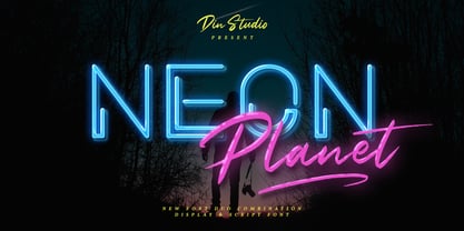 Neon Planet is a modern and futuristic font duo. Combining the neon shape design and the brush textured handwriting will make your design project more powerful. The font is suitable for any project that needs Retro, Modern, and Casual Vibes. Enjoy the Font! Features: Accents (Multilingual characters) PUA encoded Numerals and Punctuation (OpenType Standard)
 - Los Banditos by Dicky Syafaat,
$15.00 The classical vintage font Los Banditos comes in a serif and sans serif form with a lot of of stylistic alternates and ligatures that will give a unique, classic, amd retro look on your design projects. Use it as a Display font on a poster, logo, menu, clothing brand, magazine, movie, website and much more.
 - Leafstar by Letterhend,
$12.00 Leafstar is a vintage styled font duo. It comes with a unique sans and script with the retro feel. The are perfect to use in logotype, badges, sign boards, posters, headline text, apparel, wedding invitations and more. This font has many OpenType features like ligature, stylistic alternates, contextual alternates, swashes and has multi-language support.
 - Kholodos by Grigorij Gushchin,
$15.00 Kholodos - the slang name of the refrigerator in Russia. This font contains 383 characters, supports Latin, Cyrillic, Latin-1 Supplement, and also has the symbols of the Ukrainian and Belorussian alphabets. A font feature is a large number of alternates that define the connection of letters. Kholodos - the perfect solution for vibrant retro lettering.
 - Mansel by Prominent and Affluent,
$30.00 Mansel – an exquisite sans serif font that takes inspiration from retro design. Boasting an impressive range of weights, widths, and italic angles in both classic and variable formats, Mansel offers unparalleled flexibility for creating stunning visual compositions. With support for most Latin-based languages, this versatile font is perfect for professional projects with global reach.
 - P22 Sniplash by IHOF,
$24.95 Sniplash is a lively font inspired by cartoons and comics of the 1960s and '70s. Casual and organic, this font features curly lines and irregular weights in Regular, Light and Bold styles. This design defies serious analysis and offers a fun attitude for lighthearted design. Excellent for parties, retro packaging or any number of uses.
 - Mechaniclove by ahweproject,
$14.00 Mechaniclove is a gorgeous and bold handwritten font, crafted to give your headlines and logotype projects a retro touch. This font reads as strong, confident, and dynamic and can add tons of nostalgic character to your designs. This font is PUA encoded which means you can access all of the glyphs and swashes with ease!
 - InkArt Labels by John Moore Type Foundry,
$24.95 Inkart is a font dingbats, shapes for new labels or frames that the user can supplement according to the requirements and purposes. It consists of a set uppercase containing the forms, and a set is lower case which has areas of the same shapes to be colored by layers. Contains retro and modern styles.
 - The Kogles Script by Letterhend,
$19.00 Please welcome our newest script typeface, The Kogles, a nice script typeface with retro feel. This font is perfect to be applied especially in logos and the other various formal forms such as invitations, labels, logos, magazines, books, greeting/wedding cards, packaging, fashion, make up, stationery, novels, labels or any type of advertising purpose.
 - 914-SOLID - Personal use only

- ITC Musclehead by ITC,
$29.99ITC Musclehead is the work of type designer Timothy Donaldson, a robust, densely packed handwriting typeface. It almost looks like brushwork but was in fact made with a ruling pen which Donaldson had bought from a company in Salem, Massachusetts. He says, The world's gone ruling-pen mad at the moment [late 1990s] and I was beginning to tire of all the skinny splashiness of the letters that most people were making with them. I wanted to do something heavy and robust with the tool, so that's what I did."" - Song Composer JNL by Jeff Levine,
$29.00 The sheet music for the 1939 tune "Chico's Love Song (Ma-La-Ja Fa-La Pas-Ka Lah-Ta) [Cuban Double Talk]" may have had an odd title, but the main portion of it was hand lettered in an interesting style. Condensed letters with rounded corners complemented by sharp lines and angles give the characters an almost futuristic look, despite the fact that they were designed during the Art Deco era. This became the basis for Song Composer JNL, which is available in both regular and oblique versions.
 - Shaq Attack NF by Nick's Fonts,
$10.00No: Jethro Bodine didn't design this typeface although, to look at it, you might be tempted to think so. Rather, the pattern was a product of the fertile imagination of famed lettering artist Alf Becker. The lowercase letters are the same as the uppercase, but angled differently so, if you want a randomized appearance, you can activate Contextual Alternates and the font will do the shift-key double-clutching needed. Both versions include the complete Unicode Latin 1252, Central European 1250 and Turkish 1254 character sets, with localization for Moldovan and Romanian. - Bauer Bodoni by URW Type Foundry,
$39.99 Giambattista Bodoni of Parma designed and cut his typefaces circa 1790. The Bodoni types were the first of the Modern type designs in which hairlines contrast sharply with bolder stems, and serifs are unbracketed. The Bauer Bodoni font family derives from a cutting for metal type in 1926, retaining many of the original features. As with all versions of this typeface, the contrast between thick and thin strokes of Bauer Bodoni should be taken into consideration as the thin strokes can appear to fade out under certain printing processes.
 - Nefarious by Hanoded,
$15.00 A few fonts ago I mentioned the fact that I like posh English words; words you don’t really use in conversation. As I am busy expanding my ‘halloween’ font collection, I came across the beautiful word Nefarious. It means wicked or evil and when you say the word, it even sounds evil! Fantastic! Nefarious is a halloween/witches font. It looks like my Griezelig font, but it is rougher and spikier. Use Nefarious for your halloween invitations, posters and books about evil geniuses. Comes with all diacritics and a bunch of swashes as well.
 - Kickback by Comicraft,
$39.00 Joe Canelli is a crooked cop working in a corrupt police force. Joe is haunted by nightmares of powerlessness. When his partner is brutally murdered and he's betrayed by his colleagues, it appears that Joe's nightmares are coming true. With his back against the wall there's only one thing he can do -- turn against the criminal network that he once embraced... KICKBACK is a fast-paced, action-filled, noir-style, crime thriller from the co-creator of V FOR VENDETTA, David Lloyd. KICKBACK is also a font. This one.
 - Genki Desu by Hanoded,
$15.00 Genki Desu is one of those Japanese expressions that are used a lot and don’t really mean what you think they mean. You can use it as a greeting: O Genki Desu Ka? (お元気ですか - how are you), or to say you’re feeling fine (元気です - Genki Desu). The word Genki also means ‘energy’ or ‘vigor’. I am not an expert, in fact, there’s so much Japanese I can actually speak (shame on me), but Genki Desu is one of my favourites. Maybe just because it sounds so nice!
 - Grids by Din Studio,
$29.00 Grids is a display font designed in a racing theme showing a firm display and a sharp angle in each letter to give a unique attractive impression. Additionally, it provides interesting features to help designers maximize their design products. Features: Multilingual Supports PUA Encoded Numerals and Punctuation Use Grids in any project designs, for example, posters, banners, logos, book covers, headings, printed products, merchandise, social media, and so on. Find out more ways to use this font by taking a look at the font preview. Thanks a lot for purchasing our font. Happy designing.
 - Sonica by Sonic Savior,
$50.00The Sonica font family represents a modern typeface that is designed the express fluidity of motion. Sonica is the second font designed by the Sonic Savior team, and was specifically build for the group's website. The first font by the hand of this design team was Antediluvian, which consists of solid and down-to-earth glyphs - unearthed in fact, from ancient history. Sonica on the other hand is designed with a most volatile and dynamic geometry. If Antediluvian would be the alchemical Salt, Sonica would be its Mercury. - Bertram by ITC,
$29.00Bertram Plain is the perfect font for setting titles in comic strips and similar designs. UK designer Martin Wait created this font 1991, after he was inspired by the casual style of circus graphics. In fact, this jolly and lighthearted font was even named after one circus in particular: the Bertram Mills Circus. Bertram Plain is an all-caps font, with capital letters placed on both the upper and lowercase keyboard strokes. Additionally, Bertram Plain letters sport a 3D-like drop shadow, a distinctive feature when comparing this to many other display fonts. - Stipa Willington by Alcode,
$20.00 Stipa willington is a classic font I built it with my relaxed hands with the design of a classic font but having a modern element in it. It makes it particularly suitable for wedding media, book covers, greeting cards, logos, branding, business cards and certificates, in fact for any design work that requires a clasik, formal or luxury. Try Stipa willington, enjoy the richness of OpenType features and let her fun and elegant excitement make you happy and enhance your creativity! You can use this font very easily.
