2,596 search results (0.03 seconds)
  1. Meloneads 2 by PizzaDude.dk, $20.00
    Although being made of geometric shapes, Meloneads 2 is a playful and funny set of drawings.
  2. Latin #2 by Monotype, $29.99
    Typefaces designated as Latins were popular during the last half of the nineteenth century. One of the styles that continued to be popular into the twentieth century is the bold condensed typeface Latin. Readily identifiable by its triangular serifs and sharp terminals on the strokes of some of the lowercase letters, Latin Condensed makes an interesting display type and its condensed proportions easily solve copyfitting problems.
  3. Metrolite #2 by Linotype, $29.00
    In 1929 Chauncey Griffith at Mergenthaler commissioned W.A. Dwiggins to design a warmer and less mechanical Geometric Sanserif to compete with Futura. Dwiggins’ best efforts proved that human warmth had little to do with cool geometry; for twelve years, until the introduction of Spartan, Mergenthaler lost ground to Intertype’s licensed version of Futura.
  4. joeHand 2 by JOEBOB graphics, $19.00
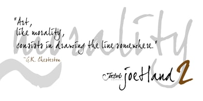
  5. Wonderbar 2 by Sharkshock, $125.00
    Wonderbar 2 is wacky, retro, and not to be taken too seriously. The wavy nature throughout the characters ensure that you're in for a wild ride. Alternating between upper and lowercase letters is like shifting gears. Uppercase characters take on a more undulating flow with stems that reach out to tickle you. Because of this slight overlap should be expected. In addition to Latin this childlike display font is equipped with Extended Latin for many European languages as well as Cyrillic. Try it in a children’s book, poster, or birthday invitations.
  6. Cindie 2 by Lewis McGuffie Type, $49.00
    Cindie 2 is an update of the optical type Cindie Mono. It retains the monospace-stacking system of the original, but some letters have been redrawn. It also now includes a lowercase and Cindie 2 has a script accompaniment (which isn’t mono and should be used with Contextual Alternates turned on!). Good for posters, branding and headlines, Cindie 2 has 26 monospaced widths which will fit any job. Cindie 2 also comes as a Variable Font.
  7. dearJoe 2 by JOEBOB graphics, $19.00
    DearJoe 2 is the second of four handwritten scripts by JOEBOB graphics. A complete character set with numbers and most (but not all) special signs.
  8. Xtreem 2 by Mans Greback, $59.00
    An updated version of the popular Xtreem typeface.
  9. Quadrille 2 by Solotype, $19.95
    This is a simplified Tuscan, free from excessive ruffles and flourishes. Types of this general design began to appear in profusion in the 1830, and continued as a popular form until the end of the nineteenth century. We added the lowercase to this one for increased usefulness.
  10. Tomoli 2 by PizzaDude.dk, $20.00
    Part 2 in the series of "things of more or less importance" which include different drawings.
  11. Engravers #2 by Linotype, $29.99
  12. Pax 2 by Linotype, $29.99
    Pax is clearly a didone, using Vox classification. The contrast between the thin lines and the thicker ones is noticeable, as you would expect from a didone. The basic form is relatively narrow, therefore I designed another Pax, slightly wider and darker, and called it Pax #2. Otherwise they are more or less identical. Pax is Latin for peace, on everyone's want list in 1995 - as well as every single year before and after that. Pax was released in 1995.
  13. 2 Quadro by Apostrof, $50.00
    This big family summarizes and develops the tradition of boldface squared-off 45° shear sanserifs. Known from the middle of 19th century and actively used in different times (1920s, 1970s) is still usable now, thanks to its brutal expression, monumentality and possibility to fully maximize the flatness without loss of readability. This font is especially good for filling letters with photos or to create geometrical “constructivist” compositions.
  14. Metromedium #2 by Linotype, $29.00
    American graphic designer William Addison Dwiggins' (W.A.D. for short) first typefaces were the Metro family, designed from 1927 onward. The project grew out of Dwiggins' dissatisfaction with the new European sans serif typefaces of the day, such as Futura, Erbar, and Kabel, a feeling he expressed in his seminal book Layout in Advertising. Urged by Mergenthaler Linotype to create a solution for the problem, Dwiggins began a professional relationship that would span over the next few decades. The first Metro family typeface to be released was Metroblack, brought to market by Linotype in 1929 (Metroblack #2™ the only one of the two versions that Mergenthaler Linotype eventually put into production which is available in digital form). With more of a humanist quality than the geometric styles popular in Europe at the time, Dwiggins drew what he believed to be the ideal sans serif for headlines and advertising copy. Metroblack has a warmer character than the Modernists' achievements, and the type is full of mannered curves and angled terminals (Metroblack also has an astoundingly beautiful Q). The other weights of the Metro family, Metromedium #2™ and Metrolite #2™, were designed by Mergenthaler Linotype's design office under Dwiggins' supervision. Despite having been created more than three-quarters of a century ago, the Metro family types have aged well, and remain a popular sans serif family. Although spec'd less often than other bestsellers, like Futura, Metro continues to find many diverse uses. The typeface has appeared throughout Europe and the North America for decades in newspapers and magazines, and can even help create a great brand image when used in logos and corporate identity. Dwiggins ranks among the most influential graphic designers and typeface designers of the 20th Century. He has several other quality fonts in the Linotype Originals, including the serif text faces Electra™ and New Caledonia™, as well as Caravan™, a font of typographic ornaments."
  15. Ninja 2 by Andinistas, $29.95
  16. Galerie 2 by ArtyType, $29.00
    Galerie 2 has a narrower styling and less contrast than its sister family but incorporates the same unique characteristics as Galerie within its elegant proportions. The close genetic proximity to Galerie enables dual deployment in text and artwork, each family complimenting the other in combinations of headings and copy. Galerie 2, like the full width Galerie volume, comes in 4 weights from Thin to Bold.
  17. tekken 6 2 - Unknown license
  18. Pure evil 2 - Personal use only
  19. Ascent 2 Stardom - Personal use only
  20. Liquidism part 2 - Unknown license
  21. SKULL TS 2 - Personal use only
  22. Formas geometricas 2 - Unknown license
  23. Lefferts Corners 2 - Unknown license
  24. Qbicle 2 BRK - Unknown license
  25. FD Textured 2 - Personal use only
  26. Icicle Country 2 - Unknown license
  27. Anderson Dings 2 - Unknown license
  28. Failed Font 2 - Unknown license
  29. LBC Cool 2 - Unknown license
  30. KR Corners 2 - Unknown license
  31. Teenage Girl 2 - Unknown license
  32. Shifty Chica 2 - Unknown license
  33. Hang 'Em 2 - Unknown license
  34. TGL 31034-2 - 100% free
  35. Planet Benson 2 - Unknown license
  36. PLATSCH 2 outline - Unknown license
  37. Picassos Expanded 2 - Unknown license
  38. Grudge 2 BRK - Unknown license
Looking for more fonts? Check out our New, Sans, Script, Handwriting fonts or Categories
abstract fontscontact usprivacy policyweb font generator
Processing