10,000 search results
(0.038 seconds)
- MEXURY by Product Type,
$15.00 Welcome to Mexury, a font that transports you to the future with an alluring modern and futuristic twist. Are you looking for the perfect solution for modern, futuristic, sci-fi, and future-themed projects? Mexury is the right choice. Mexury is a font designed to create a unique and sophisticated atmosphere. Each letter has a unique design, exuding a dazzling future and presenting an elegant look. With Mexury, your project will be in the spotlight and create an unforgettable impression. The main benefit of Mexury is its ability to deliver stunning styles. Each letter carries great visual uniqueness, giving your project a modern, stylish, and futuristic look. Inspired designs will steal the show and capture your audience’s imagination. Apart from that, Mexury also supports multilingualism, allowing you to display text in multiple languages without any restrictions. This flexibility ensures that you can easily reach a global audience and convey your message with consistent clarity across cultural contexts. Take your projects to the next level with Mexury. Let this font be the catalyst for the creation of eye-catching visuals and set the scene for a future full of innovation. Explore Mexury’s limitless potential and let your creativity flourish. With this font, you’re ready to enter the futuristic and stunning world of design. Choose Mexury and let this font be the perfect choice for your vibrant, modern, futuristic, sci-fi, and future projects.
 - Nextrue by Asenbayu,
$12.00 Nextrue font is a sans serif font with a sleek and sporty look. This font is shaped as a professional multipurpose font with a strong look in upright and a dynamic look in slant letter. You can use it in modern youth design, adventure, hobbies and sports. This font is perfect for a variety of projects, such as branding, poster displays, logo design, magazine covers, product labels, clothing and more. This font is perfect for taking your designs to the next level! Nextrue fonts feature opentype, kerning, ligatures, and alternative styles packed in 12 fonts (Condense, Extend, Slant). Nextrue fonts include uppercase, lowercase, numbers, punctuation and multilingual support.
 - Al Gracheva by Aluyeah Studio,
$120.00 Grace and Cheval, the inspiration for the name Gracheval. The word "cheva" comes from Old French cheval (horse) and literally means "horsemanship". Gracheva gives the impression of elegance and powerful like a horse galloping on the shore. Gracheva is a premium display typeface that conveys a charming elegance but powerful like a graceful wild horse that can be applied to many areas of design. Coming with 130+ stunning and super easy to use alternates and ligatures. Very suitable for apps, magazine, headline, website, ads, product package and all type of design project you have. Features: OpenType support Multilingual support (15 languages) PUA Encoded Super Easy to Use alternates - You can easily call alternates using special combination like A.2 S.2 A.E R.A etc. To get results like the preview just type G.3R.AC.HE.2V.2A.4
 - Allrounder Grotesk by Identity Letters,
$40.00 A true workhorse. The only Grotesk you’ll ever need. Allrounder Grotesk is a neutral, powerful Neogrotesk member of the Allrounder superfamily. An unobtrusive teamplayer as well as an excellent soloist, this hard-working sans-serif typeface is ready for any task you’ll throw it at. A workhorse that lives up to its name, Allrounder Grotesk consists of ten weights ranging from a delicate Air to a powerful Black with 900+ glyphs per font. Each weight is accompanied by carefully hand-corrected italics. Allrounder Grotesk supports more than 200 Latin-based languages, containing the complete “LatinPlus” glyph set developed by Underware. It also provides you with plenty of OpenType features and additional goodies: small capitals, ten sets of figures, case-sensitive forms, ligatures, superiors, fractions and arrows. Equipped like this, you’ll be ready for any kind of sophisticated typesetting scenario you might encounter. With Allrounder Grotesk, you’ve got a sans that works great for body text, yet looks crisp and clean in headlines and display sizes. Whether annual reports, magazine and editorial layouts, nonfiction books, branding and packaging work, large-scale advertising, forms and contracts, or contemporary posters: Allrounder Grotesk is up for it. This multitalented font family was developed in a 2-year process by Moritz Kleinsorge. It was the first release of the Allrounder superfamily, a series of typefaces sharing the same color and horizontal metrics (cap height, small cap height and x-height): a typesetting system whose components match each other perfectly. Any other part of this design kit, e. g., Allrounder Antiqua or Allrounder Monument, may be easily combined with Allrounder Grotesk. Perfect Pairing: Allrounder Antiqua + Allrounder Grotesk Allrounder Antiqua is the ideal complement to Allrounder Grotesk. They both share common vertical metrics and a common color. This allows you to pair both typefaces within the same layout—even within the same paragraph—without creating visual disruption. Head over to the Family Page of Allrounder Antiqua to get more information about this typeface. Design Trick: Bilingual Design With the Allrounder Superfamily Combining Allrounder Grotesk with Allrounder Antiqua is an ideal approach for bilingual designs, wherein both languages get the same emphasis yet are distinguished with two different typefaces. It's also best practice to set headlines in a different typeface than the body text if they harmonize with each other. Allrounder Grotesk and Allrounder Antiqua provide you with the perfect pair for this purpose. In any kind of design, in any type of medium, working with Allrounder fonts is effortless. That’s why Allrounder got its name.
 - Harmonics by Deniart Systems,
$20.00 ADD A LITTLE ZIG AND ZAG with Harmonics - a bold and angular font great for short texts and headlines. Create different affects by toggling between lowercase and uppercase letters - use lowercase for top-heavy triangular text, use uppercase for bottom-heavy triangular text, or mix upper & lower for a zig-zag affect. A great addition to any library.
 - Aure Teddy by Aure Font Design,
$23.00 Aure Teddy emanates the trusting tenderness of a favorite teddy bear. The hand-penned look of these forms engages the reader with a subtext of comfort. Teddy is delightfully legible as a text font and works well where a more organic look is wanted. It brings an unassuming charm to text and titles and a welcome empathy to astrological expressions and chartwheels. Its engaging charcter serves well in labeling diagrams and personalizing nametags. Teddy is an original design developed by Aurora Isaac. After more than a decade in development, 2018 marks the first release of the CJ and KB glyphsets in regular, italic, bold, and bold-italic. The CJ glyphset is a full text font supporting a variety of European languages. A matching set of small-caps complements the extended lowercase and uppercase glyphsets. Supporting glyphs include standard ligatures, four variations of the ampersand, and check-mark and happy-face with their companions x-mark and grumpy-face. Numbers are available in lining, oldstyle, and small versions, with numerators and denominators for forming fractions. Companion glyphs include Roman numerals, specialized glyphs for indicating ordinals, and a variety of mathematical symbols and operators. The CJ glyphset also includes an extended set of glyphs for typesetting Western Astrology. These glyphs are also available separately in the KB glyphset: a symbol font re-coded to allow easy keyboard access for the most commonly used glyphs. Aure Teddy fills a unique niche, being a modestly decorative font as well as a competant text font. Like Aure Jane, Aure Teddy serves well paired with the decorative touches of Aure Brash and Aure Sable. Give Aure Teddy a trial run! You may discover a permanent place for this font family in your typographic palette. AureFontDesign.com
 - Boxed Round by Tipo Pèpel,
$18.00 Boxed Round is a rounded version of the popular Boxed font, a typeface whit 18 weights, brightly conceived and designed to look good on small screen devices, but offering also enlightened looks on paper. The semi-modular geometric font shapes seek to be fully responsive to the grid of screen’s pixels to deliver a crisp, fluid reading rate. The rounded version offers a more warm, sweet, edible appearance that will give more freshness to your texts. Due to its extensive range of weights and subtle difference in thickness, compensating for the stain of characters between different CSS styles is really easy. It offers an extensive set of Latin characters, even the Cyrillic.
 - Axion SSF by Type Innovations,
$39.00 Axion SSF is an original design by Alex Kaczun. Axion SSF is a style variation based on his original Axion typeface family of fonts. It is a display font not intended for text use. It was designed specifically for display headlines, logotype, branding and similar applications. The entire font has an original look which is strong, dynamic, machine generated and can be widely used in publications and advertising. Axion SSF is a futuristic, techno-looking and expressive typeface with an appearance of machined parts with sharp and rounded edges. This attractive display comes in roman with lower case and lining figures. The large Pro font character set supports most Central European and many Eastern European languages.
 - Aretha by Lafontype,
$25.00 Aretha is a classy and beautifully designed sans serif. The main idea of Arteha is to combine the sans serif humanist font style with traditional styles so as to provide a pleasant atmosphere for the reader. The horizontal side of Aretha is designed with a slightly thinner so that the counter can look wider and also looks stiff in some parts to give a firm impression on the letters. Not only for display size, Aretha also works well in text size. Represents multilingual and is equipped with several Open Type features such as tabular figures and stylistic alternates in letters a, g, t and y, so this is very suitable to complement your various design needs.
 - Kaleko 105 by Talbot Type,
$19.50 Kaleko 105 is inspired by the classic, geometric sans-serifs such as Gill Sans, but has shallower ascenders and descenders for a more compact look. It’s a well-balanced, versatile, modern sans, highly legible as a text font and with a clean, elegant look as a display font at larger sizes. It includes old style non-aligning (lower case) numbers, both proportional and tabular as well as accented characters for Central European languages. The Kaleko 105 family comprises of six weights, and is closely related to Kaleko 205. The most notable differences between the two variations, are the single-storey lower case a and g in Kaleko 105, where they are two-storey in Kaleko 205.
 - Bosca by Larin Type Co,
$16.00 Bosca this is an elegant serif font family which includes 4 weights. It is multi-purpose and can be used for a variety of tasks. It can look either conservative and restrained or modern and elegant thanks to ligatures and alternative substitutes, they will add variety to your project and make it more attractive and give many options for creating your design. Heavier weights are great for headlines, logos, and other important things. light will look elegant and more discharged. The regular weight is perfect for text tasks, it has a balanced dynamics and is easy to read. This font is easy to use has OpenType features, and all characters in this font have PUA encoding.
 - Kaleko 205 by Talbot Type,
$19.50 Kaleko 205 is inspired by the classic, geometric sans-serifs such as Gill Sans, but has shallower ascenders and descenders for a more compact look. It’s a well-balanced, versatile, modern sans, highly legible as a text font and with a clean, elegant look as a display font at larger sizes. It includes old style non-aligning (lower case) numbers, both proportional and tabular as well as accented characters for Central European languages. The Kaleko 205 family comprises of six weights, and is closely related to Kaleko 105. The most notable differences between the two variations, are the two-storey lower case a and g in Kaleko 205, where they are single-storey in Kaleko 105.
 - Pill Gothic by Betatype,
$40.00 Pill Gothic walks the tightrope between a heads down, hard working, utilitarian sans and something that stands out, saying, "Look at me!" Designers looking for a type that will work in blocks of text for callouts, captions and headlines will find that unique balance with Pill. Pill Gothic asks the question: what is the effect of a few truly unique characters on the meaning of a type? In particular, the 'a' and the 'g', while relating strongly to the forms of the other characters, stand out from the traditional milieu of sans serif types. The name Pill Gothic came from early studies of the condensed weight where the lower case characters had the shape of a pill capsule.
 - Mecanica by Type Innovations,
$39.00 Mecanica is an original design by Alex Kaczun. It is a display font not intended for text use. It was designed specifically for display headlines, logotype, branding and similar applications. The entire font has an original look which is strong, dynamic, machine generated and can be widely used in publications and advertising. Mecanica is a futuristic, techno-looking and expressive typeface with an appearance of metal-like parts with some very sharp edges. This attractive display comes in roman with lower case and lining figures. The font also is available with true-drawn slant italics. Other design style variations include Swash as well as Ornamental Italic Capitals along with a few Ornamental Symbols to embellish and enhance the possibilities.
 - Poole by Poole,
$36.00Poole Standard is the "flagship" typeface from former wine label designer, Wesley Poole. It's a versatile friendly face, antique but not antiquated, elegant yet inviting. "I first used a hand lettered version of this look on the Carmenet label. I've had this alphabet designed in my head for some time. It's perfect for upscale work. Like wine, this font is well rooted in the past, but meant to be appreciated and used in the here and now. Poole Standard is a stylish headline face, yet works well as a text face because of its readability at smaller point sizes. (Other styles and weights are coming soon!) If you're looking for understated elegance, Poole Standard does the job. - Axion RND by Type Innovations,
$39.00 Axion RND is an original design by Alex Kaczun. Axion RND is a style variation based on his original Axion typeface family of fonts. It is a display font not intended for text use. It was designed specifically for display headlines, logotype, branding and similar applications. The entire font has an original look which has rounded corners throughout and is strong, dynamic, machine generated and can be widely used in publications and advertising. Axion RND is a futuristic, techno-looking and expressive typeface with an appearance of machined parts and rounded edges. This attractive display comes in roman with lower case and lining figures. The large Pro font character set supports most Central European and many Eastern European languages.
 - Kamerik 105 by Talbot Type,
$19.50 Kamerik 105 is inspired by the classic, geometric sans-serifs such as Futura and Avant Garde, but has shallower ascenders and descenders for a more compact look. It's a versatile, modern sans, highly legible as a text font and with a clean, elegant look as a display font at larger sizes. It includes old style non-aligning (lower case) numbers, both proportional and tabular and accented characters for Central European languages. The Kamerik 105 family comprises of six weights, and is closely related to Kamerik 205. The most notable differences between the two variations, are the single-storey lower case a and g in Kamerik 105, where they are two-storey in Kamerik 205.
 - Atelier Femme by PeachCreme,
$14.00 Introducing our new font trio "Atelier Femme"! Featuring an elegant upright serif, light and clean italic, and a casual handwritten script, this trio brings a splendid, clean visage to websites, logos, brand identities, quotes, and anything else you can think of! Atelier Femme Serif - being something between light and regular, Atelier Femme Serif is a versatile font that gives your projects a modern and minimalist look. Atelier Femme Italic - is a classy and supremely legible font that stands out in both large and small designs be it a display or body text. Atelier Femme Script comes with adorable lowercase beginning and ending swashes and 68 quirky ligatures for a custom handwritten look.
 - Altura by Jonahfonts,
$35.00 Uncommon-serifs with common Glyphs. Recommended for posters, titles, book covers, books, greeting cards, signage, packaging, invitations, magazine articles and advertising.
 - Delirian by Andrey Sharonov,
$35.00 Delirian Script & Ornaments Delirian is elegant script with contemporary mood and perfect forms, inspired by immortal classic calligraphy. Not too thin and not too thick, good balanced and variable, born for luxury and beauty. In my examples I show how this script can be used. It's great for logotypes, branding, wedding invitations, romantic cards, alcohol labels, packaging, spelling of names and others. Delirian Script comes with beautiful Uppercase and Lowercase letters, numbers and punctuation. In addition to the main character set, there are 158 alternates characters, 36 ligatures and 10 lengths of end-swashes. You also get Ornament set of 26 elements which harmoniously complements original script. Multilingual Support Script support Western European characters and works with following languages: English, Croatian, Danish, Dutch, Estonian, Faroese, Filipino, Finnish, French, German, Hungarian, Icelandic, Irish, Italian, Norwegian, Polish, Portuguese, Slovenian, Spanish, Swedish, Turkish. OpenType Stylistic Alternates works on the principle of simple combinations with activated Standard Ligatures option in OpenType panel (Adobe Photoshop, Adobe Illustrator). To get alternate just add for example number 2 (two) after any letter. Every Uppercase has 1-2 variations and Lowercase about 3-4 alternate characters. For example: A2 A3 - Uppercase; a2 a3 a4 - Lowercase; a.1 a.2 - Lowercase with underline. _1 _2 _3 - End-swashes Ligatures works with activated Discretionary Ligatures option in OpenType panel. This special features don't work in Microsoft Word.
 - ITC Dartangnon by ITC,
$29.99ITC Dartangnon is a work of English designer Nick Cooke and began with the thought, It's a long shot but it might just work as a font." It started as a doodle with a chunky pencil. "So many script fonts look too stylized so I thought I'd try to produce one that looks more like handwriting." He scanned the doodles and used Fontographer to draw a set of monoline letters. "Working quickly I soon drew the whole alphabet, and without being too pedantic about the characters joining exactly, I arrived at this script." ITC Dartangnon is an energetic font which remains legible even in small point sizes. And, Cooke adds, "It is supposed to be used as upper and lowercase only, NEVER just caps."" - Fruitypops by Set Sail Studios,
$16.00 Introducing Fruitypops! A friendly, versatile script font ready for any project. Hand drawn with a real marker pen on paper, Fruitypops is bold and standout yet maintains large counter spaces with its large loops and carefully crafted letterforms. With 56 ligatures, a full set of unconnected lowercase alternates, and a bold version included, it’s designed to be a go-to script font for any design brief in need of a personal touch. The Fruitypops family includes; 1. Fruitypops Regular • A handwritten script font containing upper & lowercase characters, numerals and a large range of punctuation. 2. Fruitypops Bold • A bold version of Fruitypops with thicker letterforms, great for use at smaller sizes. Lowercase Alternates • A full set of a-z lowercase alternates are included with unconnected strokes. These can be accessed by turning on ‘Stylistic Alternates’, via a Glyphs panel, or pasted via Font Book/Windows Character Map. 56 Ligatures • 56 ligatures are included for lowercase letters (see image). These are uniquely designed double and triple letter combinations designed to create realistic handwriting and fix tricky character pairings. These can be accessed by turning on ‘Standard Ligatures’, via a Glyphs panel, or pasted via Font Book/Windows Character Map. Language Support • English, French, Italian, Spanish, Portuguese, German, Swedish, Norwegian, Danish, Dutch, Finnish, Indonesian, Malay, Hungarian, Polish, Croatian, Turkish, Romanian, Czech, Latvian, Lithuanian, Slovak, Slovenian.
 - Interind Diary by Aminmario Studio,
$20.00 Introducing The new "Interind Diary" script font. A fashionable and super-chilled new handwriting font script with sexy stylish. Interind Diary font was created to look as close to a natural handwritten script as possible by including over 134 ligatures, and lowercase alternates.Comes with two styles of Regular and Italic. Mix and match lowercase regular with several lowercase alternatives to get your new ligature. Perfect for any awesome projects that need hand writing taste. With built in Opentype features, this script comes to life as if you were writing it yourself. It's highly recommended to use it in opentype capable software - there are plenty out there nowadays as technology catches up with design ... Other than Photoshop, Illustrator and Indesign, many standard simple programs now come with Opentype capabilities - even the most basic ones such as Apple's Text Edit, Pages, Keynote, iBooks Author, etc. Even Word has found ways to incorporate it. Thanks for checking out this font. I hope you enjoy it! AminMario
 - Maily by Nathatype,
$29.00 Maily is a display serif font to provide efficient quality, consistency and performance. It shows light, expressive, moving nuances in balanced function and creativity. The font’s main character is the hooks on each letters’ edges like other serif fonts. In addition, it is truly legible because of the wide spaces of the letters with which you may freely apply for any text sizes. You can also enjoy the available features in this font. Features: Stylistic Sets Multilingual Supports PUA Encoded Numerals and Punctuations Maily fits best for various design projects, such as posters, banners, logos, magazine covers, quotes, headings, printed products, invitations, name cards, merchandise, social media, etc. Find out more ways to use this font by taking a look at the font preview. Thanks for purchasing our fonts. Hopefully, you have a great time using our font. Feel free to contact us anytime for further information or when you have trouble with the font. Thanks a lot and happy designing.
 - Pokelor by Nathatype,
$29.00 Pokelor is a display serif font beautifully designed with harmony between function and beauty showing you elegant, modern yet less formal impressions. The little hooks’ continuity elements help the eyes to keep flowing from one letter to another. With wide spaces and easily noticeable letters, this font is truly legible with which you can apply for any text sizes. Furthermore, enjoy the interesting features available in this font. Features: Stylistic Sets Multilingual Supports PUA Encoded Numerals and Punctuations Pokelor fits best for various design projects, such as posters, banners, logos, magazine covers, quotes, headings, printed products, invitations, name cards, merchandise, social media, etc. Find out more ways to use this font by taking a look at the font preview. Thanks for purchasing our fonts. Hopefully, you have a great time using our font. Feel free to contact us anytime for further information or when you have trouble with the font. Thanks a lot and happy designing.
 - Myflora by Nathatype,
$29.00 Myflora is a high level serif font in simple styles to create formal, modern, elegant impressions on your designs. Like the other serif font, its main characteristic is the small hooks on the letters’ edges. Besides, its morphological letter forms are simply presented with high contrasts and wide spaces to be legible enough to use in any text sizes. Furthermore, you can enjoy the available features in this font. Features: Ligatures Multilingual Supports PUA Encoded Numerals and Punctuations Myflora fits for various design projects, such as posters, banners, logos, magazine covers, quotes, headings, printed products, invitations, name cards, merchandise, social media, etc. Find out more ways to use this font by taking a look at the font preview. Thanks for purchasing our fonts. Hopefully, you have a great experience using our font. Feel free to contact us for further information when you have a problem using the font. Thank you. Happy designing.
 - Mafins by Nathatype,
$29.00 Mafins is a combination font of thick display and serif fonts which is simply designed in formal, modern, elegant impressions like other serif fonts. The differences between the thick and thin lines on each character is dramatic and the letters' edges have small hooks for a legibility reason. Due to the great legibility, you can use this font for any text sizes. Make your every design perfect with Mafins font to create the best impressions on your designs. Features: Stylistic Sets Ligatures Multilingual Supports PUA Encoded Numerals and Punctuations Mafins fits for various design projects, such as posters, banners, logos, magazine covers, quotes, name cards, invitations, headings, printed products, merchandise, social media, etc. Find out more ways to use this font by taking a look at the font preview. Thanks for purchasing our fonts. Hopefully, you have a great experience using our font. Feel free to contact us if you require more information when you are dealing with a problem. Thank you. Happy designing.
 - The Bafger by Muksal Creatives,
$12.00 The Bafger is modern vintage serif font, and The Bafger features unique and modern serif look and feel.is a fancy and modern serif font will elevate a wide variety of projects, from logos and stationery to magazine covers and social media posts. This typeface will take your designs to the next level!
 - Racnegut by SimpleType Studios,
$15.00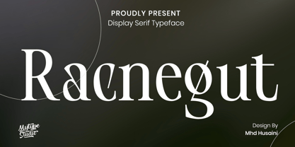 Racnegut is high contrast serif font features a mixed modern-classic design. Racnegut support multilingual languages, numbers, punctuation and alternative-ligatures. Create unique & amp; beautiful logotype, use it as an elegant solution for your next magazine layout, or choose Racnegut for any graphics that require a sleek look with a elegant flair.
 - Amovand by Zealab Fonts Division,
$10.00 Amovand is a versatile and unique half-side serif font, Amovand has a unique style with stylistic, alternates, ligatures and supports multilingual languages. Create unique & beautiful logotype, use it as an elegant solution for your next magazine layout, or choose Amovand for any graphics that require a sleek look with a elegant flair.
 - Zero Output by PizzaDude.dk,
$15.00 You may recognize the shapes of this font - it's because it's my Universitet font, but this time it took some beating, and turned into a grunge font! The output was Zero Output! It has 5 different versions of each letter and of course multilingual support! Go ahead and grunge up your next project!
 - Baluno by Luxfont,
$22.00 Introducing is a fun and playful pouty Baluno font. Font has embodied the graphic trend of cartoon flat illustrations and will successfully complement modern designs. The font has 2 types of faces, which can be used both independently and together by alternating letters in one word to avoid repeating letters, creating a unique heading. Family is ideal for children's themes, because the font resembles inflated balloons. Creates a relaxed mood and has fun. Set comes in many different carefully selected colors and gradient color options. Check the quality before purchasing and try the FREE DEMO version of the font to make sure your software supports color fonts. P.s. Have suggestions for color combinations? Write me an email with the subject "Baluno Color" on: ld.luxfont@gmail.com Features: Free Demo font to check it works. 2 types of faces. Lots of ready-made matched colors. Gradient color variants. Kerning. IMPORTANT: - Multicolor OTF version of this font will show up only in apps that are compatible with color fonts, like Adobe Photoshop CC 2017.0.1 and above, Illustrator CC 2018. Learn more about color fonts & their support in third-party apps on www.colorfonts.wtf -Don't worry about what you can't see the preview of the font in the tab "Individual Styles" - all fonts are working and have passed technical inspection, but not displayed, they just because the website MyFonts is not yet able to show a preview of colored fonts. Then if you have software with support colored fonts - you can be sure that after installing fonts into the system you will be able to use them like every other classic font. Question/answer: How to install a font? The procedure for installing the font in the system has not changed. Install the font as you would install the other fonts. How can I change the font color to my color? · Adobe Illustrator: Convert text to outline and easily change color to your taste as if you were repainting a simple vector shape. · Adobe Photoshop: You can easily repaint text layer with Layer effects and color overlay. ld.luxfont@gmail.com
 - Acre by Jonathan Ball,
$24.00 Acre is a geometric sans-serif type family of eight weights that's both inspired by and named after my great grandfather, Tex Acre. Tex was an artist and sign maker whose handcrafted signs illuminated the roadsides of the American Midwest and typified mid-century Americana. Acre is a tribute to him, his work, and many of my favorite early 20th century geometric typefaces. With eight weights ranging from Thin to Black, Acre is an extremely versatile family that can be used for display, text, or anything in between. Acre offers full European language support plus many OpenType features such as tabular and oldstyle figures.
 - ITC Franklin by ITC,
$40.99 The ITC Franklin™ typeface design marks the next phase in the evolution of one of the most important American gothic typefaces. Morris Fuller Benton drew the original design in 1902 for American Type Founders (ATF); it was the first significant modernization of a nineteenth-century grotesque. Named in honor of Benjamin Franklin, the design not only became a best seller, it also served as a model for several other sans serif typefaces that followed it. Originally issued in just one weight, the ATF Franklin Gothic family was expanded over several years to include an italic, a condensed, a condensed shaded, an extra condensed and, finally, a wide. No light or intermediate weights were ever created for the metal type family. In 1980, under license from American Type Founders, ITC commissioned Victor Caruso to create four new weights in roman and italic - book, medium, demi and heavy - while preserving the characteristics of the original ATF design. This series was followed in 1991 by a suite of twelve condensed and compressed designs drawn by David Berlow. ITC Franklin Gothic was originally released as two designs: one for display type and one for text. However, in early digital interpretations, a combined text and display solution meant the same fonts were used to set type in any size, from tiny six-point text to billboard-size letters. The problem was that the typeface design was almost always compromised and this hampered its performance at any size. David Berlow, president of Font Bureau, approached ITC with a proposal to solve this problem that would be mutually beneficial. Font Bureau would rework the ITC Franklin Gothic family, enlarge and separate it into distinct text and display designs, then offer it as part of its library as well. ITC saw the obvious value in the collaboration, and work began in early 2004. The project was supposed to end with the release of new text and display designs the following year. But, like so many design projects, the ITC Franklin venture became more extensive, more complicated and more time consuming than originally intended. The 22-font ITC Franklin Gothic family has now grown to 48 designs and is called simply ITC Franklin. The new designs range from the very willowy Thin to the robust Ultra -- with Light, Medium, Bold and Black weights in between. Each weight is also available in Narrow, Condensed and Compressed variants, and each design has a complementary Italic. In addition to a suite of new biform characters (lowercase characters drawn with the height and weight of capitals), the new ITC Franklin Pro fonts also offer an extended character set that supports most Central European and many Eastern European languages. ITC Franklin Text is currently under development.
 - FE Blacking Out by Egor Stremousov,
$50.00 A bunch of OpenType features to blacking out of texts. The font does not contain glyphs. Only black blocks that replace your text with OpenType features. Watch demo: https://youtu.be/qUQgUV0PIT0
 - Natom Pro by Mostardesign,
$25.00 A family of fonts with rhythm. Natom Pro is a modern and geometric font family adapted to the professional requirements of graphic designers, web designers and mobile application developers. Comprised of 19 styles including 8 styles designed especially for the design of headlines, Natom Pro is a very versatile family of fonts that can be used in many projects such as editorial design, branding or corporate identity creation, design of posters or logos, the creation of websites or the development of mobile applications. This font, with a resolutely contemporary aspect, also hides a unique typographic design since it has 2 distinct styles (Title and Roman) which have 2 different typographic rhythms in order to graphically differentiate the appearance of titles, subtitles and long paragraphs. With this design of rhythmically differentiated glyphs according to the styles, the headlines have a very graphic aspect while the long texts have a more classic aspect in order to keep optimal readability in all scenarios. Its architecture is also very modern since it was designed and drawn with particular attention to the geometry of the forms with clear and open endings cut at 90 degrees. The number of styles has also been simplified with the most used thicknesses (Extra Light, Light, Regular, Medium, Bold and Black) in order to speed up your graphic design process. For the more experienced designers, Natom Pro is also available in a variable version. Natom Pro is also equipped with powerful OpenType features like case sensitivity, true small caps, full ligature set, tabular figures for tables, « old styles figures » to elegantly insert figures into your sentences, numbers circled or even alternative characters to satisfy the most demanding professionals.
 - Hurringtown Script by OldStudioo,
$16.00 Hurringtown is a collective modern hand lettering. Come with uppercase and lowercase, stylistic set, alternates, multilingual, etc to mix and match your design. This font is perfect for your design, logo, label, badges, apparel design, etc. I also made a design to mix and match pairs of letters to fit your design. Files included: Hurringtown (OTF) Features you get: - Latin A -Z and a – z - Numbers - International Symbols - Multilingual Supports - Alternatives - Ligatures All characters are available through Glyph panel as well, even more each of the alternate letter has it’s own unicode (PUA) so you can copy/paste from Apple Font Book or Windows Character Map. Need to test out a word in this font? Just type it into the box below, and see what it looks like :) That's it! I really hope you enjoy it - please do let me know what you think, comments & likes are always hugely welcomed and appreciated. If you need help or advice, please contact me by e-mail " old.studio87@gmail.com "
 - Compatil Fact by Linotype,
$50.99Compatil is the first comprehensive type system which enables all typographical elements to be used to full effect in order to reproduce the message conveyed by text information. Four different type styles with a total of 16 weights including italics have been merged into a unique typographical network. There are now no limits to the font user's creativity. The system is a product of technical innovation and constitutes a new design approach which meets the highest aesthetic standards. For almost two years, a team of experts from Linotype has been working with initiator Professor Olaf Leu under the direction of Silja Bilz, Erik Faulhaber and Reinhard Haus to create the Compatil type system. Despite the Internet and TV, it is essential today to be able to absorb information quickly by being able to read it with ease. A fact that is becoming increasingly important both on-screen and on paper. It is the role of the font to increase legibility and to ensure typographically perfect results for text design work. The new Compatil type system meets all these needs. The Compatil is a part of the Platinum Collection. The following four different styles are available: Compatil Exquisit, Compatil Fact, Compatil Letter and Compatil Text. Compatil is available in various font formats: 16 separate OT Pro fonts including the small caps and Adobe Central European character set for OpenType-supporting applications like Adobe InDesign, or as 32 separate OpenType Com fonts for office communication, with the following special features: 1. Optimized display capabilities for computer screens eXcellent Screen Fonts (XSF-quality). 2. An extended, international character set, which supports 48 different languages for Microsoft Office applications like MS Word or as 64 PostScript fonts, which can be used in non-OpenType-supporting applications like Quark XPress. - Compatil Fact Paneuropean by Linotype,
$103.99Compatil is the first comprehensive type system which enables all typographical elements to be used to full effect in order to reproduce the message conveyed by text information. Four different type styles with a total of 16 weights including italics have been merged into a unique typographical network. There are now no limits to the font user's creativity. The system is a product of technical innovation and constitutes a new design approach which meets the highest aesthetic standards. For almost two years, a team of experts from Linotype has been working with initiator Professor Olaf Leu under the direction of Silja Bilz, Erik Faulhaber and Reinhard Haus to create the Compatil type system. Despite the Internet and TV, it is essential today to be able to absorb information quickly by being able to read it with ease. A fact that is becoming increasingly important both on-screen and on paper. It is the role of the font to increase legibility and to ensure typographically perfect results for text design work. The new Compatil type system meets all these needs. The Compatil is a part of the Platinum Collection. The following four different styles are available: Compatil Exquisit, Compatil Fact, Compatil Letter and Compatil Text. Compatil is available in various font formats: 16 separate OT Pro fonts including the small caps and Adobe Central European character set for OpenType-supporting applications like Adobe InDesign, or as 32 separate OpenType Com fonts for office communication, with the following special features: 1. Optimized display capabilities for computer screens eXcellent Screen Fonts (XSF-quality). 2. An extended, international character set, which supports 48 different languages for Microsoft Office applications like MS Word or as 64 PostScript fonts, which can be used in non-OpenType-supporting applications like Quark XPress. - Compatil Letter by Linotype,
$50.99Compatil is the first comprehensive type system which enables all typographical elements to be used to full effect in order to reproduce the message conveyed by text information. Four different type styles with a total of 16 weights including italics have been merged into a unique typographical network. There are now no limits to the font user's creativity. The system is a product of technical innovation and constitutes a new design approach which meets the highest aesthetic standards. For almost two years, a team of experts from Linotype has been working with initiator Professor Olaf Leu under the direction of Silja Bilz, Erik Faulhaber and Reinhard Haus to create the Compatil type system. Despite the Internet and TV, it is essential today to be able to absorb information quickly by being able to read it with ease. A fact that is becoming increasingly important both on-screen and on paper. It is the role of the font to increase legibility and to ensure typographically perfect results for text design work. The new Compatil type system meets all these needs. The Compatil is a part of the Platinum Collection. The following four different styles are available: Compatil Exquisit, Compatil Fact, Compatil Letter and Compatil Text. Compatil is available in various font formats: 16 separate OT Pro fonts including the small caps and Adobe Central European character set for OpenType-supporting applications like Adobe InDesign, or as 32 separate OpenType Com fonts for office communication, with the following special features: 1. Optimized display capabilities for computer screens eXcellent Screen Fonts (XSF-quality). 2. An extended, international character set, which supports 48 different languages for Microsoft Office applications like MS Word or as 64 PostScript fonts, which can be used in non-OpenType-supporting applications like Quark XPress.