10,000 search results
(0.028 seconds)
- Capitolium 2 by TypeTogether,
$58.00 Capitolium was designed in 1998 at the request of the Agenzia romana per la preparatione del Giubileo for the Jubilee of the Roman Catholic Church in 2000. This type design was the central part of the project for a wayfinding and information system to guide pilgrims and tourists through Rome. Capitolium also continues Rome’s almost uninterrupted two-thousand-year-old tradition of public lettering . It is a modern typeface for the twenty-first century and strongly related to the traditions of Rome. Soon after the completion of this project Unger began contemplating the possibility of bringing the atmosphere of this design to newspapers. Though Capitolium works well in most modern production processes and also on screens, it is too fragile for newsprint. For newspapers sturdier shapes were required as well as more characters to a line of text, and Capitolium News has a bigger x-height than Capitolium. Capitolium News is a thoroughly modern newsface, with classic letterforms linked to a strong tradition. Capitolium News for running text comes in the variations regular, italic, semibold, semibold italic, bold and bold italic. As is possible with most of Unger’s type designs, Capitolium News can be condensed and expanded without any harm to the letterforms. The update to this beautiful font family, Capitolium News, includes the addition of over 250 glyphs featuring full Latin A language support, new ligatures, 4 sets of numerals, arbitrary fractions and superiors/inferiors. Furthermore, kerning was added and fine tuned for better performance.
 - Meloneads 2 by PizzaDude.dk,
$20.00Although being made of geometric shapes, Meloneads 2 is a playful and funny set of drawings. - Latin #2 by Monotype,
$29.99Typefaces designated as Latins were popular during the last half of the nineteenth century. One of the styles that continued to be popular into the twentieth century is the bold condensed typeface Latin. Readily identifiable by its triangular serifs and sharp terminals on the strokes of some of the lowercase letters, Latin Condensed makes an interesting display type and its condensed proportions easily solve copyfitting problems. - Metrolite #2 by Linotype,
$29.00In 1929 Chauncey Griffith at Mergenthaler commissioned W.A. Dwiggins to design a warmer and less mechanical Geometric Sanserif to compete with Futura. Dwiggins’ best efforts proved that human warmth had little to do with cool geometry; for twelve years, until the introduction of Spartan, Mergenthaler lost ground to Intertype’s licensed version of Futura. - joeHand 2 by JOEBOB graphics,
$19.00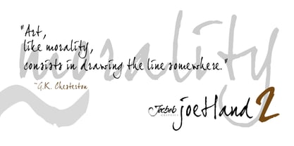
- Wonderbar 2 by Sharkshock,
$125.00 Wonderbar 2 is wacky, retro, and not to be taken too seriously. The wavy nature throughout the characters ensure that you're in for a wild ride. Alternating between upper and lowercase letters is like shifting gears. Uppercase characters take on a more undulating flow with stems that reach out to tickle you. Because of this slight overlap should be expected. In addition to Latin this childlike display font is equipped with Extended Latin for many European languages as well as Cyrillic. Try it in a children’s book, poster, or birthday invitations.
 - Cindie 2 by Lewis McGuffie Type,
$49.00 Cindie 2 is an update of the optical type Cindie Mono. It retains the monospace-stacking system of the original, but some letters have been redrawn. It also now includes a lowercase and Cindie 2 has a script accompaniment (which isn’t mono and should be used with Contextual Alternates turned on!). Good for posters, branding and headlines, Cindie 2 has 26 monospaced widths which will fit any job. Cindie 2 also comes as a Variable Font.
 - dearJoe 2 by JOEBOB graphics,
$19.00 DearJoe 2 is the second of four handwritten scripts by JOEBOB graphics. A complete character set with numbers and most (but not all) special signs.
 - Xtreem 2 by Mans Greback,
$59.00 An updated version of the popular Xtreem typeface.
 - Quadrille 2 by Solotype,
$19.95This is a simplified Tuscan, free from excessive ruffles and flourishes. Types of this general design began to appear in profusion in the 1830, and continued as a popular form until the end of the nineteenth century. We added the lowercase to this one for increased usefulness. - Tomoli 2 by PizzaDude.dk,
$20.00Part 2 in the series of "things of more or less importance" which include different drawings. - Engravers #2 by Linotype,
$29.99 - Pax 2 by Linotype,
$29.99Pax is clearly a didone, using Vox classification. The contrast between the thin lines and the thicker ones is noticeable, as you would expect from a didone. The basic form is relatively narrow, therefore I designed another Pax, slightly wider and darker, and called it Pax #2. Otherwise they are more or less identical. Pax is Latin for peace, on everyone's want list in 1995 - as well as every single year before and after that. Pax was released in 1995. - 2 Quadro by Apostrof,
$50.00 This big family summarizes and develops the tradition of boldface squared-off 45° shear sanserifs. Known from the middle of 19th century and actively used in different times (1920s, 1970s) is still usable now, thanks to its brutal expression, monumentality and possibility to fully maximize the flatness without loss of readability. This font is especially good for filling letters with photos or to create geometrical “constructivist” compositions.
 - Metromedium #2 by Linotype,
$29.00American graphic designer William Addison Dwiggins' (W.A.D. for short) first typefaces were the Metro family, designed from 1927 onward. The project grew out of Dwiggins' dissatisfaction with the new European sans serif typefaces of the day, such as Futura, Erbar, and Kabel, a feeling he expressed in his seminal book Layout in Advertising. Urged by Mergenthaler Linotype to create a solution for the problem, Dwiggins began a professional relationship that would span over the next few decades. The first Metro family typeface to be released was Metroblack, brought to market by Linotype in 1929 (Metroblack #2™ the only one of the two versions that Mergenthaler Linotype eventually put into production which is available in digital form). With more of a humanist quality than the geometric styles popular in Europe at the time, Dwiggins drew what he believed to be the ideal sans serif for headlines and advertising copy. Metroblack has a warmer character than the Modernists' achievements, and the type is full of mannered curves and angled terminals (Metroblack also has an astoundingly beautiful Q). The other weights of the Metro family, Metromedium #2™ and Metrolite #2™, were designed by Mergenthaler Linotype's design office under Dwiggins' supervision. Despite having been created more than three-quarters of a century ago, the Metro family types have aged well, and remain a popular sans serif family. Although spec'd less often than other bestsellers, like Futura, Metro continues to find many diverse uses. The typeface has appeared throughout Europe and the North America for decades in newspapers and magazines, and can even help create a great brand image when used in logos and corporate identity. Dwiggins ranks among the most influential graphic designers and typeface designers of the 20th Century. He has several other quality fonts in the Linotype Originals, including the serif text faces Electra™ and New Caledonia™, as well as Caravan™, a font of typographic ornaments." - Ninja 2 by Andinistas,
$29.95 - Galerie 2 by ArtyType,
$29.00 Galerie 2 has a narrower styling and less contrast than its sister family but incorporates the same unique characteristics as Galerie within its elegant proportions. The close genetic proximity to Galerie enables dual deployment in text and artwork, each family complimenting the other in combinations of headings and copy. Galerie 2, like the full width Galerie volume, comes in 4 weights from Thin to Bold.
 - Display Dots - 100% free

- Gauche Display - Personal use only

- Titanick-Display - Unknown license

- Blunder Display by Courtney Rhodes,
$19.95 - Standing Display by Gian Studio,
$16.00 Best collection of display fonts, don't miss it: Standing font is vintage elegant, these typefaces are truly made for one another. They work very well to give you the perfect design label you have designed. It's perfect for Logo, Advertising, Apparel Design, Label, Signage, Etc. Enjoy!
 - Quase Display by DSType,
$40.00 Quase is a very free interpretation of the types found in the “Specimen of Printing Types” by William Caslon from 1785. We didn’t want to follow any of the models introduced in the Specimens, but rather gather a series of typographic aspects that we found useful and interesting from the several sizes and styles available and then give them consistency and new proportions so they could fit our very own purpose. We wanted to start with Caslon and then transform it into an editorial typeface, hence the increase of the x-height and the radical reduction of the ascenders and descenders. Despite the Display, Headline and Text fonts we also wanted to make a single weight Poster version with, inspired by the mechanical script introduced in the Double-Pica Script, to be used in magazines or as a complementary display typeface.
 - Challah Display by Typophobia,
$25.00 Challah is a display font containing 295 glyphs. Letters are very diverse, but because they contain several shapes characteristic for each other - they retain a certain coherence. When creating the font, the main inspiration was to take from the Brazilian graffiti trend - Pichação and Korean typography. Most of the letters are the same size and width, however, when designing, we also tried to include at certain moments small "surprises" that will surely interest and surprise the user of the above-mentioned typeface. The font fits very well into the urban structure, therefore it perfectly matches the art on the walls with the art on the billboards, creating a kind of dialogue.
 - Rellita Display by Gatype,
$18.00 Rellita Display is a serif font with a luxurious, elegant, modern, unique and classy look. This font was specially created for luxury themed projects, branding projects, Magazine, Social Media, Branding, Logos, website headers or simply as a stylish text overlay to any background image. and Many more need a Luxury touch. . Rellita Display includes full set: Swash Ligature stand discretionary Ligatures uppercase and lowercase multilingual character number punctuation If there's anything else you're not sure about, feel free to message me :) That's it! Have fun using Rellita Serif! Display!!
 - Bolda Display by The Infamous Foundry,
$29.00 Bolda Display is a a-z lowercase display font in two styles; regular and outline. Lowercase is regular and uppercase is outline. Inspired by the 1970’s tennis, dart and ping pong fashion. Perfect for headlines, logos and everything above the body.
 - Kicked Display by Prioritype,
$23.00 "Kicked Display" is a display font with a unique and bold contrasting style. It is this bold and thin that makes this font memorable. Designing with pastel colors also looks more maximal with this font. Features: Uppercase, Lowercase, Numeral, Punctuation & Multilingual. Multilingual contained: Afrikaans, Albanian, Asu, Basque, Bemba, Bena, Breton, Catalan, Chiga, Cornish, Danish, Dutch, English, Estonian, Filipino, Finnish, French, Friulian, Galician, German, Gusii, Indonesian, Irish, Italian, Kabuverdianu, Kalenjin, Kinyarwanda, Luo, Luxembourgish, Luyia, Machame, Makhuwa-Meetto, Makonde, Malagasy, Manx, Morisyen, North Ndebele, Norwegian Bokmål, Norwegian Nynorsk, Nyankole, Oromo, Portuguese, Quechua, Romansh, Rombo, Rundi, Rwa, Samburu, Sango, Sangu, Scottish Gaelic, Sena, Shambala, Shona, Soga, Somali, Spanish, Swahili, Swedish, Swiss German, Taita, Teso, Uzbek (Latin), Volapük, Vunjo, Zulu. Thanks!
 - Varia Display by Tomtype,
$6.00 Introducing Varia Display, a font that emerged from the renowned challenge of 36 Days of Type. In the 2023's edition, I embarked on a journey to explore a wide variety of styles, leading to infinite possibilities for crafting unique letterforms. The result is a meticulously crafted variable font with a single weight axis, designed to push the boundaries of typographic aesthetics across all characters. With each letter and number embodying a distinct and innovative approach, this font offers a captivating typographic experience. With its distinctive and varied letterforms, this font is ideally suited for eye-catching main headlines and complementary typography. Whether you seek diversity or a touch of uniqueness, this font is sure to meet your creative needs. Embrace the world of possibilities it presents and elevate your designs to new heights. Key features: Meticulously designed Variable Font Single Weight Axis Multilingual support 374 glyphs Contact: If you have any doubts or questions please ask me via mail or Instagram hello@tomascastiglioni.com @tomtype
 - Stigsa Display by Seniors Studio,
$25.00 Stigsa Display is a high-contrast typeface inspired by transitional and contemporary typefaces. A vertical stress with sharp serifs, delicate and legible. Stigsa Display family consist of 35 fonts: 7 weigths and 5 widths. With 1143 glyphs each. Stigsa Display family with various styles will be an handy tool for a wide variety of designs. The typeface high contrast designed for use in big text sizes and medium sizes. Via the OpenType features allow for the implementation of typographic niceties such as small caps, tabular figures and oldstyle figures, ligatures, case-sensitive, fractions and extended language support.
 - Popten Display by Saffatin.co,
$10.00 Popten is a modern minimalist design typeface with semi condensed conture and include alternative character also some ligature. It is inspired by hype and urban design, freestyle and brutalism. Popten typeface suited for anything lifestyle project with trend design. It was designed to be versatile, to blend in your design with light or dark through thin to black weights can add a lot of touch of personality.
 - Disco Display by Cabeza Dura,
$40.00 Composed of compositional groups, with optical adjustments in the curves, Disco Display has been designed with special attention to kerning and tracking, allowing its use in both large and medium sizes, starring in large titles or filling entire covers with color. Inspired by the hippie movement, Disco Display provides sensuality, visual richness and compositional splendor, giving rise to the use of multiple colors or patterns in its forms, or rediscovering its counterforms.
 - Central Display by Prioritype,
$19.00 Central Display - A Display Serif Font (All Caps) This typeface is inspired by fashion magazines. Strong and classy character. For the main display is very suitable. For example in poster design, branding, social media posts, magazine covers and so on. Features: Uppercase, Lowercase, Numeral, Punctuation & Multilingual. Multilingual contained: Afrikaans, Albanian, Asu, Basque, Bemba, Bena, Breton, Catalan, Chiga, Cornish, Danish, Dutch, English, Estonian, Filipino, Finnish, French, Friulian, Galician, German, Gusii, Indonesian, Irish, Italian, Kabuverdianu, Kalenjin, Kinyarwanda, Luo, Luxembourgish, Luyia, Machame, Makhuwa-Meetto, Makonde, Malagasy, Manx, Morisyen, North Ndebele, Norwegian Bokmål, Norwegian Nynorsk, Nyankole, Oromo, Portuguese, Quechua, Romansh, Rombo, Rundi, Rwa, Samburu, Sango, Sangu, Scottish Gaelic, Sena, Shambala, Shona, Soga, Somali, Spanish, Swahili, Swedish, Swiss German, Taita, Teso, Uzbek (Latin), Volapük, Vunjo, Zulu. Thanks :)
 - Litho Display by Arkitype,
$9.00 Litho Display is a bold display typeface, it has 8 fonts in the family with four different styles. Litho Display has been created with bold headline and poster typography in mind. It is perfect for use on typography heavy posters, packaging or on screen idents. The four different styles Litho Display comes in is Regular, Rounded, Rough and Press each with an italic pairing. With these styles Litho Display is versatile for various different uses whether it needs to be clean type for a poster or on screen or a more rough and rustic style for some packaging.
 - Gella Display by Slava Antipov,
$29.00 Gella Display is a new sans serif family with high internal contrast. It has 10 weights and 4 widths, for a total of 40 styles. This font family good for typing large amounts of text and for headlines, logos, posters, covers, spectacular presentations, and more. Gella Display would be great for branding, websites and other tasks. The typeface supports a huge number of Latin and Cyrillic languages. Gella Display has many OpenType features such as ligatures, alternate characters, fractional numbers, and more.
 - Magilon Display by Masa Type,
$19.00 introducing our new "Magilon" Modern Retro with Fun and Elegant Style is perfect for branding, logos, invitation, master heads, and more. Magilon Features : Multilanguage Alternates PUA Encoded Ligatures Very easy to use in any software (Instructions included)
 - Vemoly Display by Arterfak Project,
$18.00 Vemoly Display - Modern Sans - Unique Loopy Sans Vemoly Display is a minimalist sans that is perfect for your upcoming aesthetic project. This font provides a combination of basic sans serif and loopy style. You can make fun by mixing and matching the upper and lowercase to get a unique, simple, and charming typographic design. Vemoly Display is a perfect choice for logo, social media, branding, poster, flyer, magazine, websites, fashion, mobile apps, decoration, wedding, and many more! Features : Uppercase : Basic Sans Lowercase : Display Numbers & punctuations Symbols Stylistic alternates Multilingual support Thank you and enjoy your Vemoly Display!
 - Eskos Display by Pesotsky Victor,
$10.00 Eskos Display is a bright and eye-catching headline set. It is designed specifically to attract attention and be the base of the composition. It is deliberately diagonal and gives a sharp oblique texture to the texts. Such an exciting font will be perfect for posters, headlines on media sites or magazines, and it can also be the base for a corporate identity. The font supportsBasic Latin, Cyrillic and more than 100 languages all together. Eskos Display was designed by Viktor Pesotsky.
 - Bergsland Display by Hackberry Font Foundry,
$24.95 This is a display version of a stylized sans serif font family that is very high-waisted and sleek called Bergsland Fashion. This four-font set has a Regular and a Black plus the italics. The stroke is only slightly modulated. The letterforms are higher, with a more open aperture, and sprinkled with breaks to add light and sparkle. This an attempt at a readable sans serif for text. It has many OpenType features and 465 characters per font: Caps, lower case, small caps, old style figures, numerators, denominators, accents characters and so on.
 - Flece Display by Putracetol,
$26.00 Flece Display - Modern Sans Font is a versatile font that offers the perfect blend of modern style and elegance. It features two distinct styles: calligraphy and sans serif, providing a unique combination that is both luxurious and contemporary. This font is well-suited for various design projects, including logos, titles, book covers, headlines, magazines, products, invitations, and weddings, where a touch of sophistication and visual impact is desired. In addition to its stunning aesthetic, Flece Display also offers a range of features and a comprehensive font package. The font includes both calligraphy and sans serif styles, allowing you to switch seamlessly between the two to achieve the desired look for your design. It provides an extensive collection of characters and glyphs, ensuring versatility and creative possibilities. With its modern and elegant style, Flece Display - Modern Sans Font is the ideal choice for creating impactful and visually stunning designs. Whether you're designing a logo for a high-end brand, crafting attention-grabbing titles, or creating sophisticated invitations, this font will elevate your design projects with its luxurious and contemporary aesthetic. With its versatile features and comprehensive font package, Flece Display offers both convenience and creative flexibility, making it a valuable asset for designers.
 - Mochita Display by Sign Studio,
$15.00 Mochita Display is indeed a font made to give a fun, funny and cute impression. Even so, it still maintains good detail and balances the negative space. This font would be perfect for logo designs, titles, product names, labeling, or anything with a fun design theme.


