10,000 search results
(0.046 seconds)
- Travel Kit SG by Spiece Graphics,
$39.00 Here’s an intriguing mixture of 1930s deco and modern tech fashion. Travel Kit Medium is a sturdy semi-serif hybrid with one foot in the past and another in the present. It is slightly low-waisted with extended crossbars on the capital A, E, F, H, K, and P. But the capital B, M, R and X are distinctively contemporary with the E and M repeated as unicase letters in the lowercase. Optional retro characters (notably the unicase e and m) have been provided if you prefer a more traditional overall look - and your software allows access to these characters. Simply find and replace the more modern letters with the older ones. In addition, small caps with even more alternate characters have been included for greater flexibility and convenience. Travel Kit Medium with Alternates is now available in the OpenType format. In addition to small caps, lining figures, oldstyle figures, and petite figures, this expanded OpenType version contains additional stylistic alternates and historical forms. These advanced features work in current versions of Adobe Creative Suite InDesign, Creative Suite Illustrator, and Quark XPress. Check for OpenType advanced feature support in other applications as it gradually becomes available with upgrades.
 - VVDS Fifties by Vintage Voyage Design Supply,
$15.00Fifties is a mix of classic geometric and a bit of humanistic grotesque. The goal was to create the font for present with look to the past. In other words, I tried to came back the Modernism aesthetics of XX century into nowadays. The result gives you 60 styles including Italic (Slanted). Your typography may be airy and elegant with Expanded Thin, catchy and expressive with Condensed Bold or dynamic and sharp with Expanded Bold Italic. You will find your way to use this family certainly. Theatre posters or party flyers, vintage t-shirt or modern web service, movie titles or magazine header and even infographic – Fifties will suit you everywhere. You may use the completed styles or may use a Variable Font. To make it as you want to. Weights: Thin / Light / Regular / Medium / Semi Bold / Bold. Widths: Condensed / SemiCondensed / Medium / SemiExpanded / Expanded OTF and Variable Font (TTF) OpenType features: Stylistic alternates for A, G, K, M, N, R, W, a, e, g, j, m, n, r, t, u, w, y; Fraction figures; Subscript and Superscript figures; Tabular figures; Typographic spaces: Em / En / Third / Quarter / Thin / Sixth / Hair - Premium Sans by ZeeshanFoundry,
$40.00 Premium Sans is a professional typeface which is aspired to solve the major typographic challenges in editorial, print, Graphic design, Commercial designs and other form of templates and documents such as pdf or ms word. It has four weights light, regular, semi bold, bold. Each with an italic profile, so in total it has 8 typefaces. We created this typeface to have attention of reader in Graphic commercial designs and as well as on editorial designs. The X-height plays a great role in readability of a typeface, so we tried to give it a reasonably high x-height with accordance to ascenders and descenders. We've engineered it in such a way that it can easily be paired with script, slab serif and serif typefaces. Premium sans is made on minimum required character set which will be handy while typing currency symbols like cents, dollars or euro and also be very useful when typing the characters consisting of diacritic. We've designed it in such a way that either you write a long content for editorial purposes or you create a typographic or graphic/commercial design it will look nice and fine which is the uniqueness of this font.
 - Hoax by More Etc,
$18.00 Introducing Hoax – a pre-worn sans serif with spirit, personality and distinction. This bold and semi-condensed sans serif is inspired by old copy machines and vintage prints. It is lively and eye-catching, ideal for where and when you want to make a lasting impression. Hoax is a celebration of character, a tribute to curiosity. Use this typeface and let everyone know that you mean business. OPENTYPE FEATURES: This font includes over 40 discretionary ligatures of prepositions and common words in English. These OpenType features can be accessed using OpenType friendly applications that allow the use of discretionary ligatures and stylistic sets. MULTILINGUAL SUPPORT: With over 700 glyphs, it has support for more than 150 languages, including Cyrillic script. List of discretionary ligatures: AND, ARE, AT, BY, FOR, EST, FEAT., FROM, IN, IS, OF, ON, OR, OUR, THAN, THAT, THE, TO, WITH, YOUR, CO. Each word is available in both upright and slanted versions. How to use: Activate the discretionary ligatures as you normally do in your OpenType friendly application. When activated, the words are in upright versions. To access the slanted versions, activate the first stylistic set (“Slanted Ligatures”). Happy typing!
 - Replete Sans by Sudtipos,
$49.00 Sudtipos’ new sans serif font Replete is inspired by the mixture of aesthetics and philosophies found on the streets of metropolitan cities the world over. Buildings constructed throughout the twentieth century, including those made in the Art Deco style or influenced by the Bauhaus’s gospel, stand side-by-side as symbols of their time. Typography is one factor that bonds these vistas, and simultaneously further complexifies them. Art deco letters appear on storefronts and signage in Europe’s oldest cities and as remnants of the Golden Age of economic expansion for Latin America. Typography, like architecture, sometimes coexists in perfect harmony, and other times in ideological opposition. But it is these juxtapositions in places such as Shanghai, New York, London, Buenos Aires and Tokyo that shape each city’s identity. Replete is inspired by this mixture. We wanted to create a useful modern sans serif family – a set of 7 weights with playful geometric alternates – that allows you to combine characters including wide-width and filled letterforms. Replete is apt for long texts, and equally, for instances where letterforms can stand together like a cityscape. Replete means full, packed and abounding … it is a sans, it is grotesque, it is geometric and it is Deco. Replete is a new family that has a little of everything we like, equipped with everything you need to design anything you want.
 - Black Puma by Gergely Soós,
$20.00 The Black Puma typeface was inspired by the rock beats and the honest spirit of today's indie music scene. Just as evolving garage bands', Black Puma’s strength lies in its fresh and brave approach: to playfully experiment and proudly take its imperfections as long as they are needed to stay real and honest. Black Puma's aim is to entertain, while expressing a strong human touch through its handmade and creatively assembled characters. Black Puma's varying rounded and edgy shapes create a vibrating yet coherent visual, which carries a positive, playful atmosphere. Its irregularities and extra bold characters empower Black Puma to have great and touching visual impact, which make it stand out of the mass flow of information delivered in the information society we live today. Black Puma font - with its 370 glyphs - includes all the accented characters of the Latin alphabet, and also comes with a couple of alternate characters (stylistic and contextual) to play around with. And, above all - as mentioned before - it includes its essence: the young spirit. So come, play around and have fun with Black Puma. Use it to create expressive, passionate posters, flyers and art work full of spirit for the awaiting young-minded public. You can find more artwork using Black Puma under the "Gallery" tab above.
 - Nassim Latin by Rosetta,
$60.00 Nassim is a contemporary typeface for multilingual text-setting. With its lively texture and balanced rhythm, Nassim is a proven workhorse for a vast array of applications, from literature to the sciences, scholarly publications to contemporary news. Nassim Latin is stout in colour and resolute in its construction, standing up to the demands of long-form reading. But the heartiness that keeps it going is balanced with lively details: the asymmetric serifs and calligraphic modulation allude just enough to broad-nib flourishes to keep the reader alert and looking for what comes next. Nassim has always been ahead of the curve, bridging the distinct typographic traditions of Arabic and Latin without forcing the typographer into compromise. Nassim Latin offers upright and true italic styles across five weights, supporting more than 110 languages, and designed to pair harmoniously in multi-script settings with Nassim Arabic. Beyond that, it is equipped with smart OpenType features like small caps, case-sensitive punctuation, and a full palette of ranging numerals, fractions, and superior and inferior figures ensure that Nassim Latin is up to any task, be it print publications or delivering late-breaking online news.
 - Typical Pro by Typicaltype,
$25.00 Get ready for a modern spin on your typographic projects with the Typical Pro Sans Serif Font 9 Weight. This font offers a clean, grotesk feel that is perfect for any technical or heading design. Its contemporary design makes a perfect choice for projects with a modern flair. With clean lines, tight letter spacing, and a classic sans serif style, this font is sure to bring a unique edge to any project. Enjoy the perfect mix of texture and proportion with this modern font. Get ready to take your typography to the next level with Typical Pro Sans Serif Font 9 Weight. Typical Pro Sans Serif Font is a grotesk typeface of modern design, with technical precision and a clean finish. Its 9 weight offers clear and refined letters that provide perfect legibility for headlines and other text styles. Its line height is consistent and balanced, making it suitable for producing high-impact visual messages. Its modern, straightforward letterforms give projects an air of sophistication, while retaining a firm technical backbone. With nine different weights, it is the perfect choice for any heading or label that requires a strong, contemporary look.
 - Mandrel by insigne,
$39.99 From the realm of insigne, a new family has risen. By name, Mandrel. Courtly in character and elegant in appearance, the face finds great favor among those with whom it seeks audience. With confident air, Mandrel carries itself gracefully before each pair of eyes, never faltering or stumbling in its refined step. But while dressed with gentility, this elegant family is not faint of heart when challenged. Crafted well for high-impact resistance, Mandrel steps boldly and prominently into the arena of the reader’s eye, boasting its tall x-heights, high contrast, confident bends, and sharp serifs. Skillfully, it wields its sharp serif endings, cutting swiftly through opponents’ crude clutter, which fights for the reader’s attention. From Thin to Black, nine weights and their matching italics make up this noble family. Mandrel furthermore includes an abundant treasury of OpenType variables to adorn your text. Ligatures, old-style figures, and stylistic sets are available to accompany the family’s 500 glyphs and its support for more than 70 languages. Raise your cup to this new Mandrel! With strong serifs and high contrast, you’ll find this champion ready to take up your challenge in many a test ahead.
 - RMU Manolo by RMU,
$35.00 Manolo was a Ludwig & Mayer in-house design from the beginning of the 20th century. Though more formal than many others, the design keeps its Art Nouveau air. This beautiful font was completely redrawn and redesigned with giving the numerals more style. Two stippled border elements were added which you can reach by typing [alt] + P and [alt] + p. Like most fonts of this era, RMU Manolo comes with a long s too. RMU Manolo encompasses most European languages, Central and West, plus Turkish.
 - Affiche by RMU,
$35.00 Based on the fin-de-siècle Helios Reklameschrift of the Klinkhardt foundry, Leipzig, Affiche preserves the beautiful art nouveau character of its hot-metal forerunner and was carefully extended to make it multilingual. For more historical authenticity, you can use the long s by typing [alt] and [b].
 - Wanwan by Jipatype,
$30.00 ฟอนต์วันวาน อักษรแบบตัวเขียนอ้างอิงจากสไตล์การเขียนแบบพู่กันให้ความรู้สึกพริ้วไหว มีสไตล์ให้เลือกใช้ 9 สไตล์ตเป็นตัวเอียงทั้งหมด และเพิ่มความน่าสนใจด้วยการไฮไลท์ตัวอักษรที่ต้องการจากนั้นเปิดใช้งาน Stylistic Set 01-09 (ss01-09) หรือ Access All Alternates (aalt) จะมีป็อปอัพเด่งขึ้นมาให้เลือกอักษรทางเลือกอื่นๆ ฟอนต์วันวาน เหมาะสำหรับการผาดหัว ข้อความสั่นๆ หรือจัดวางเป็นกลุ่มคำสั่นๆ - Wanwan, a calligraphy font based on a brush writing style. There are 9 styles with italic. Comes with Stylistic Set 01-09 (ss01-09) or Access All Alternates (aalt). Wanwan suitable for headline wedding cards and other graphic work.
 - TT Ricordi Allegria by TypeType,
$29.00 Please note! If you need OTF versions of the fonts, just email us at commercial@typetype.org TT Ricordi Allegria useful links: Specimen | Graphic presentation | Customization options TT Ricordi Allegria is a sleek and intelligent contemporary Florentine grotesque inspired by the half-erased lettering in Basilica di Santa Croce, Florence. TT Ricordi Allegria was drawn by Antonina Zhulkova and reflects in its graphics the transitional stage between the classic serif with varying proportions, gravitating towards the Roman capital type, and the Florentine sans serif. The font is characterized by variability in the proportions of characters, contrast between strokes, wedge-shaped triangular characters, and the absence of traditional serifs. The main visual feature of the typeface is its diversity and the ability, using different stylistic sets, to completely change the character and perception of the typeface. The drawing of the characters from the main set is strict, thanks to which the font looks stern, as if the inscription in the font was really carved out of stone. And with the help of another set, we can add roundness, or even smoothness, to the font. This is due to the fact that the letters (E R K Q J Y in Latin, and Л К Ж Э in Cyrillic) from the second set have either very noticeable "curls" or smooth, rounded "legs". In addition, the typeface includes a set of beautiful ligatures for use in display inscriptions, such as large headlines. An interesting moment when working on the typeface was the creation of the Cyrillic typeset, since the Cyrillic alphabet does not so easily fit into the concept of the Florentine grotesque and stressed semi-serif. The most difficult thing in working on the Cyrillic alphabet was to create a system of spacing for characters, as it was done in the Latin alphabet, and to make sure that when typing in Cyrillic, the drawing of the text remained beautiful. That is why the letters Д Л У Ы appearing in the font family are somewhat unusual to the eye, and the proportions of other characters in Cyrillic are not quite “classic” either. In general, the Cyrillic set looks more display than its Latin prototype, but at the same time it lacks the sense of historicity or legacy of the Soviet past, which often comes to the foreground when working on the design of the Cyrillic alphabet in this type of serifs. TT Ricordi Allegria consists of two weights (Regular and Bold) and one variable font. Each style includes over 750 characters, as well as 19 OpenType features. Interesting features of the typeface include three stylistic sets that greatly change the perception of the font, a set of bright display ligatures, a few neat icons that are suitable for breaking text and will emphasize the visual language of the font. Please note! If you need OTF versions of the fonts, just email us at commercial@typetype.org FOLLOW US: Instagram | Facebook | Website
 - Belladio by Mans Greback,
$69.00 Belladio is a beautiful calligraphic script typeface. An urban brush font, the handwriting is designed to help you to design professional graphics in cool, flowing styles; elevating your brand to the next level. It can be imagined on a t-shirt design or as a signature logotype. With its multiple alternates and ligatures, Belladio is sure to give any project a custom and genuine style. Use underscore _ to make a swash. Example: Ama_zing Use multiple underscores for different swashes. Example: Won_______der (Download required.) The font is built with advanced OpenType functionality and has a guaranteed top-notch quality, containing stylistic and contextual alternates, ligatures and more features; all to give you full control and customizability. It has extensive lingual support, covering all Latin-based languages, from North Europe to South Africa, from America to South-East Asia. It contains all characters and symbols you'll ever need, including all punctuation and numbers.
 - Spring Market Serif by BeckMcCormick,
$16.00Spring Market is a farmhouse-style serif font. One of my first-ever releases, it was lovingly hand-drawn and inspired by the countryside of Upstate South Carolina. Spring Market Rustic Farmhouse Serif Font has the perfect amount of rusticity and refinement for your next project. I recommend this font for logos, invitations, and your next home decor project that needs that shabby chic touch! Spring Market features European language support! - Victorian Ornamental Capitals by Intellecta Design,
$27.90 These are the classical arabesques published in Ludwig Petzendorfer's Schriften-Atlas. Eine Sammlung der wichtigsten Schreib- und Druckschriften aus alter und neuer Zeit nebst Initialen, Monogrammen, Mappen, Landeskarten und heraldischen Motiven fur die praktischen Zwecke des Kunstgewerbes, 1889. See Frompac 1889 Arabesques for another example of these arabesques.
 - Eilis by Agnieszka Ewa Olszewska,
$25.00 Another modern, fun, and experimental display font in my library. Looks like made with a strong gesture. A bit constructive with cursive elements. Contains 2 uppercase sets, and some extra characters. You can play with them and mix them at your will. Contains European languages diacritics and punctuation signs.
 - BrushtipTerrence by JOEBOB graphics,
$19.00 A spontaneous, fresh, honest and non-doctored brush script font with an almost complete set of extra characters. Excellent for people that want to put their statement on the wall, but don't have the hand for it, but it's also great for use in poster design, bookcovers and scrapbooking.
 - Churchward Legible by BluHead Studio,
$25.00 Churchward Legible is an extensive typeface family designed by New Zealand type designer Joseph Churchward. A geometric sans serif, it is, as its name boasts, highly legible and readable on screen as well as in print. The family includes five weights from Light to Extra Bold, with companion italics.
 - Rutin Tutin NF by Nick's Fonts,
$10.00Schrifti Alphabeti, a delightful collection of Cyrillic typefaces for posters from the former Soviet Union, strikes again, this time with a way-out West (Vladivostok?) theme. Extrabold, extra wide and delightfully different! Both versions of the font include 1252 Latin, 1250 CE (with localization for Romanian and Moldovan). - Naiche by Studio Sun,
$18.00 Naiche Font Family is a serif font with multi-weights experimental; it comes to 17 weights with five fonts master, from hairlines (Extra Thin) to Fat (Full). Each weight has a different style and contrast. The font was inspired by the classic 'Cooper' style, with an old-style form.
 - Black Bruno by Subectype,
$18.00 Black Bruno is a supercharged, street-wise brush font bursting with energy. It includes extra attention to quick strokes and sharp details. This font is perfect for challenging jobs, titles, t-shirts, websites, hoodies, clothing, headline, logotype, branding, advertising, event and various print and digital media with energy.
 - Single Fighter by Subectype,
$15.00 Single Fighter is a supercharged, street-wise brush font bursting with energy. With extra attention to quick strokes and sharp details, Single Fighter is guaranteed to deliver an unapologetically loud & fast-paced message; ideal for logos, apparel, quotes, product packaging, or anything which needs a typographic turbo-boost.
 - Main Feature JNL by Jeff Levine,
$29.00 Main Feature JNL is patterned after the plastic letters found on theater marquees. As an extra bonus, the | (bar) key has the phrase "double feature", the ^ (ascii circumflex) has the word "and" and the ~ (ascii tilde) has the phrase "with" for anyone doing a theater marquee mock-up.
 - Carrosserie by Letterwerk,
$27.00 Carrosserie is made for display use, inspired by the shapes of the ’30s. It is a capital letter font with alternate characters and special domain symbols (check the PDF in the gallery for details). The font is now available in thin, extra light, light, regular, medium, bold & fat. Enjoy!
 - Metal Stencil JNL by Jeff Levine,
$29.00 Metal Stencil JNL is a digital reconstruction of the brass stencil set used as a model for French Stencil JNL. Each character sits on its own individual 'card'. There is a limited character set consisting of letters, numbers, punctuation and a few extra glyphs including foreign currency symbols.
 - Civic Sans by CozyFonts,
$25.00 A Clean Sans Serif font family with a few stylish glyphs to give extra character e.g., L-R-Q-Z-W-g-t. Usage: Any applications is appropriate especially signs, directions, posters, graphics and use especially in Ads and billboards. There's 13 font variations in Civic Sans Font Family.
 - Surfing Ashtray by PizzaDude.dk,
$20.00 Inspired by old surfer movie posters from the 60'ies. Surfing Ashtray consists of straight lines only - ironically the direct opposite of the ocean waves that was a part of the inspiration of this font! Hit the waves with extra ligatures for double letters, swashes and alternate letters.
 - Neon Coughs by PizzaDude.dk,
$15.00 Neon Coughs - originally handdrawn, and then manually and digitally traced. That’s why this font appears super smooth, yet quote organic! Neon Coughs is super useful for kids products, posters, comics, cartoons or that design you’ve already made, but misses that extra boost! Of course there is multilingual support!
 - Cadaques by Supfonts,
$18.00 Cadaques is a bold, condensed font inspired by the nostalgia and aesthetics of the early 90s. Ideal for advertising, headlines, editorial design, branding, and posters. Cadaques Font Features: - Full Set of standard alphabet and punctuation - PUA Encoded - no special software needed to access extra characters - Multilingual Characters AÁĂÂÄÀĀĄÅÃÆBCĆČÇĊDÐĎĐEÉĚÊËĖÈĒĘẼFGĞĢĠḠHĦIIJÍÎÏİÌĪĮĨJKĶLĹĽĻŁMNŃŇŅÑ OÓÔÖÒŐŌØÕŒPÞQRŔŘŖSŚŠŞȘẞTŤŢȚUÚÛÜÙŰŪŲŮŨVWẂŴẄẀXYÝŶŸỲỸZŹŽŻ
 - Mula by Typesketchbook,
$55.00 Mula is an extra large super family of 80 styles. Mula has such a big abundance of contrast, styles, weights, width. The complete Mula family consists of regular, slim and rounded versions for use in a multifunctional settings, especially for cooperative work, websites, magazines, editorials, publishing, packaging and more.
 - Slim Kim by Wiescher Design,
$39.50 Slim Kim is the sister font of Julienne. It mixes perfectly with Julienn. So whenever you need an especially slim serif font this is it! Slim Kim has very spiky serifs, so I did not want to make an extra-slim version. Enjoy this spiky font, your Gert Wiescher.
 - My Brother by Subectype,
$16.00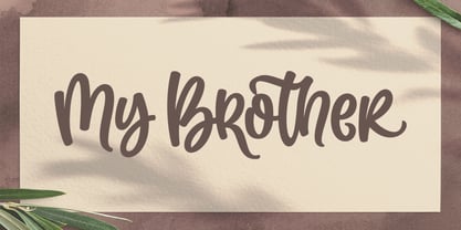 My Brother is a Modern Display font, this font come with extra alternate, ligature and swash ending. perfect for your awesome project, such as : logos, invitations, stationery, wedding designs, social media posts, advertisements, product packaging, product designs, labels, photography, watermarks, special events and much more ! Thank You, Subectype Studio
 - Oh Livey by Angele Kamp,
$28.00 Oh Livey is a casual brush script that has a fun, modern vibe. Put it on everything from quotes and websites, and use the extra clipart to make designing so much easier and fun. Oh Livey contains lots of ligatures which will give it that authentic handwritten feel.
 - Bitcrusher by Typodermic,
$11.95 Bitcrusher is not your ordinary typeface. It is a futuristic, ultra-compact sans-serif font that draws inspiration from the sleek design of automobiles and cutting-edge consumer electronics. Its unique compression capabilities allow you to pack more words into a single line than most techno typefaces can ever dream of. Available in five weights and four widths, Bitcrusher is a versatile font that gives you unprecedented control over your typography. If you need to fit more text into a tight space, Bitcrusher Condensed is the perfect choice. And if you want to push the limits of font compression, Bitcrusher Compressed has already reached the standard limit. For those who demand even more compactness, Bitcrusher Crammed has an abnormally small footprint, while Bitcrusher Crushed has an absurdly high density that defies all conventions. But no matter which variant you choose, you can be sure that Bitcrusher delivers consistent stem, space, and gap widths that allow you to break the rules of scaling and tracking. With Bitcrusher, you have complete control over your typography. Want thicker stems? Simply scale a narrower width to a bigger breadth. Need to go even tighter than Crushed? Make it even thinner. Bitcrusher is a font that cannot be broken. It is the ultimate tool for designers who demand precision and control over their typography. Choose Bitcrusher and discover the power of true compression. Most Latin-based European, Vietnamese, Greek, and most Cyrillic-based writing systems are supported, including the following languages. Afaan Oromo, Afar, Afrikaans, Albanian, Alsatian, Aromanian, Aymara, Azerbaijani, Bashkir, Bashkir (Latin), Basque, Belarusian, Belarusian (Latin), Bemba, Bikol, Bosnian, Breton, Bulgarian, Buryat, Cape Verdean, Creole, Catalan, Cebuano, Chamorro, Chavacano, Chichewa, Crimean Tatar (Latin), Croatian, Czech, Danish, Dawan, Dholuo, Dungan, Dutch, English, Estonian, Faroese, Fijian, Filipino, Finnish, French, Frisian, Friulian, Gagauz (Latin), Galician, Ganda, Genoese, German, Gikuyu, Greenlandic, Guadeloupean Creole, Haitian Creole, Hawaiian, Hiligaynon, Hungarian, Icelandic, Igbo, Ilocano, Indonesian, Irish, Italian, Jamaican, Kaingang, Khalkha, Kalmyk, Kanuri, Kaqchikel, Karakalpak (Latin), Kashubian, Kazakh, Kikongo, Kinyarwanda, Kirundi, Komi-Permyak, Kurdish, Kurdish (Latin), Kyrgyz, Latvian, Lithuanian, Lombard, Low Saxon, Luxembourgish, Maasai, Macedonian, Makhuwa, Malay, Maltese, Māori, Moldovan, Montenegrin, Nahuatl, Ndebele, Neapolitan, Norwegian, Novial, Occitan, Ossetian, Ossetian (Latin), Papiamento, Piedmontese, Polish, Portuguese, Quechua, Rarotongan, Romanian, Romansh, Russian, Rusyn, Sami, Sango, Saramaccan, Sardinian, Scottish Gaelic, Serbian, Serbian (Latin), Shona, Sicilian, Silesian, Slovak, Slovenian, Somali, Sorbian, Sotho, Spanish, Swahili, Swazi, Swedish, Tagalog, Tahitian, Tajik, Tatar, Tetum, Tongan, Tshiluba, Tsonga, Tswana, Tumbuka, Turkish, Turkmen (Latin), Tuvaluan, Ukrainian, Uzbek, Uzbek (Latin), Venda, Venetian, Vepsian, Vietnamese, Võro, Walloon, Waray-Waray, Wayuu, Welsh, Wolof, Xavante, Xhosa, Yapese, Zapotec, Zarma, Zazaki, Zulu and Zuni.
 - Cardiff, a font created by Altsys Metamorphosis, is an intriguing typeface characterized by its unique design elements and typographic qualities. This font distinguishes itself through a blend of tra...
- Rainier by Kimmy Design,
$10.00 I was inspired to create the Rainier type family during my summer back home in the Pacific Northwest. The concept behind it may be simple - a hand crafted font family - but what it delivers is quite complex! Here is a breakdown of everything you get: FONT FAMILIES: Two sub-families with unique styles - Rainier North and Rainier West WEIGHTS: 4 weights per family, broken down numerically - 100 (light), 300 (regular), 500 (bold), 700 (black) OPENTYPE: In each family, there are tons of OpenType options, offering lots of customizable opportunities (in order to access all these goodies, you must be using Illustrator, Photoshop, Indesign or Publisher). Because Rainier is 100% handmade, contextual alternatives allow each letter has three subtle variations, this way it keeps that authentic hand-drawn look. Additionally, a full alphabet with special descending swashes, as well as start and end swashes for capitals and small caps. Titling alternatives offer a full character set just to help with readability! Meant for captions or smaller text, these letterforms are easy on the eye and a great complement to the regular alphabet. Stylistic Alternatives add a little fun, providing a unified cap height, no matter what case you are using (all caps, small caps or lowercase.) Discretionary Ligatures are created only for capitals, and takes specific letter pairs and creates a unique ligature between them To get a better understanding of everything, please check out the quicker user guide (http://bit.ly/1W0Bfma) and print if you so desire (http://bit.ly/23W9ZV6) that helps you navigate your way around and get the most out of Rainier! Unfortunately those links aren't working right now and soon I will have them fixed. So sorry! ORNAMENTS: In addition to the font, you get a set of awesomely rustic ornaments designed and drawn to go specifically with Rainier! - Rustic Northwest Illustrations - Banners & Flags - Frames - Flourishes - Lines & Line Breaks - Arrows There are a lot of extras packed in this set, so make sure you check out the Ornaments User Guide to get the most out of it! Check it out here: http://bit.ly/1rRVJRx And that’s all folks! Hope you enjoy Rainier!
 - Phone Pro Hebrew by Tamar Fonts,
$30.00 Note: the 'Phone Pro Hebrew' typeface, includes just the Hebrew characters of the comprehensive "Phone Pro" family font, sold separately [on this MyFonts site], so they are economical for those interested just in the Hebrew Characters. And regarding the “Phone Pro” project in general, this is what I wrote: 'PRISTINE'; this font is—neither beautiful nor ugly, neither vigorous nor weak, neither traditional nor modern, neither serif nor sans serif, neither script nor printable, neither a text font nor a display font—it is rather all of the above, which makes it a more versatile typographic tool—[handwritten] characters that are well-suited for a wide variety of applications—from editorial design, [friendly] greeting cards... to branding, advertising, publicity and digital. Each glyph design combines its unique shapes and stylish ink-traps with parabolic curves. Each glyph design has been treated as an 'individual character'—the way I would treat a breathing, living, vulnerable and courteous human being; looking after each and every character as if it was my only child — bringing to light the authenticity and uniqueness of each individual, as well as my objective to bring about peace and harmony between them all as a whole. Designed with the intention of harmonizing between four scripts — Latin, Cyrillic, Greek and Hebrew; the whole family has a comprehensive set of characters—in addition to the Latin letters, the Phone typeface also has a full set of characters for Vietnamese, partially extended Cyrillic, Greek and Hebrew (sold separately). The t_t ligature is something unique to Phone, as well as the t_z ligature, among others and extras. A distinctive trait of the Phone typeface, is a high x-height combined with relatively short ascenders. The Phone typeface is in a way evoking the feeling of some Gaelic font and of the [Egyptian] Papyrus font (by Chris Costello, though, not being based on neither of those), having an exotic and an exquisite look, under the category of "Soft Fonts & Friendly Faces".
 - Bardamu by Groteskly Yours,
$25.00 Bardamu is a variable slab serif font family designed by Eugene Tantsurin and Anna Remm, and released by Groteskly Yours Studio. Bardamu is a type family that is open to interpretation and experimentation, yet this ambiguity does little to hide its inherent friendliness and good vides. Bardamu can easily be used in a variety of projects and feel at home both in graphic design, branding, web design or editorial design. Thanks to its unique letterforms and eye-catching design choices, it can be that final touch that makes your brand pop! One of the standout qualities of Bardamu is its remarkable versatility. Bardamu comes in 25 styles, allowing users to choose a style that best fits their needs. In addition to that, it offers a wide range of styles, from sleek backward-slanted italics at -20° to elegant upright styles, as well as regular 20° italics. For static fonts, there are two extra subfamilies available (10° Half Italic and 10° Half Reverse) that can be used for creating more complex hierarchy in any text. With a total of 25 static fonts and 1 Variable font, Bardamu is the perfect workhorse display slab serif with unlimited typesetting capabilities. Each font in the Bardamu family boasts an extensive 700+ character set, encompassing all major Latin-based languages, punctuation marks, symbols, and even supplementary characters. Bardamu takes flexibility to a whole new level with its incredible OpenType features that further enhance its versatility. With features such as Case-Sensitive Punctuation, Stylistic Alternates, Sub- and Superscript, Tabular Figures, and Localised Forms, you can fine-tune every detail of your design to perfection. Moreover, the multiple stylistic sets available in Bardamu allow you to switch between various versions of the same glyph effortlessly. Bardamu type family includes 25 static styles as well as a variable font. All styles can be purchased separately or as a full family package. Two styles can be downloaded free of charge. If you'd like to explore Bardamu further, we also offer free trials upon request.
 - Codo Mono by wearecolt,
$9.99 Codo Mono Modern monospace typeface Standard and italic styles, 6 weights + variable weight versions. Codo Mono is a carefully crafted monospaced typeface featuring stylistic alternatives to help make your design or branding stand out. Codo Mono Family: Codo Mono Thin Codo Mono Extra Light Codo Mono Light Codo Mono Regular Codo Mono Medium Codo Mono Bold Codo Mono Italic Thin Codo Mono Italic Extra Light Codo Mono Italic Light Codo Mono Italic Regular Codo Mono Italic Medium Codo Mono Italic Bold Plus: Codo Mono Variable weight Codo Mono Italic Variable weight This font has extensive Latin language support for Western, Central, and South-Eastern European. Designed to have great legibility with a modern feel, Codo Mono is well suited to branding, magazines, editorial copy, packaging, and more.