10,000 search results
(0.033 seconds)
- Evoque by Monotype,
$40.00 Evoque is a humanist serif type family designed for both text and display purposes. Its appearance is crisp and modern while echoing a classical Garamond heritage. The inspiration for Evoque came after reminiscing over Apple’s advertising of the eighties and nineties that utilised incredibly tightly-spaced headlines set in Apple Garamond. I wanted to create a typeface that evoked nostalgia of those times and that distinctive typographic style. A number of swash alternates and discretionary ligatures enhance Evoque, giving you the opportunity to add more flair and personality to your title and branding designs. Simply activate Stylistic Sets to start adding these flourishes to your typography. Other useful features include Small Caps at the click of a button, and Old Style Figures are an option to the default proportional figure style. There are 36 fonts altogether, with 6 weights in roman and italic from Thin to Heavy weights across Condensed, Narrow, and Regular widths. Evoque has an extensive character set (900+ glyphs) that covers every Latin European language. Please also take a look at Evoque Text which is specifically designed for the publishing sector. Key features: 6 weights in both roman and italic 3 widths – Regular, Narrow, Condensed 80 Alternates 26 Ligatures Small Caps Full European character set (Latin only) 900+ glyphs per font.
 - Change Serif by Borutta Group,
$39.00 Change Serif is a typeface family designed as a part of Mateusz Machalski's PhD project, carried out in 2015-2021. The main goal was to create a typeface allowing for the typesetting of complex humanistic texts, containing many historical letterforms. The starting point was the preparation of most of the glyphs provided in unicode for Latin, Cyrillic and Greek. From the formal point of view, the Change family is based on Renaissance proportions with contemporary details. Classic upright version is paired with expressive and calligraphic italics, inspired by the works of Robert Granjon. Each of the styles contains about 4,000 characters, allowing for a broad range of typesetting capabilities – multiscript publications, historical translations, and texts transcription. The crucial aspect was to treat all scripts equally. All OpenType features, such as swashes, final forms, decorative ligatures, can be found in Latin, Cyrillic and also Greek. The name of the typeface refers to the design process in which there are constant changes and corrections. On the other hand, it means to convey how this project influenced my perception of typography and allowed me to embrace it as a medium of artistic expression. Due to its similar proportions, Change works perfectly with the Gaultier typeface.
 - John Sans by Storm Type Foundry,
$49.00 The idea of a brand-new grotesk is certainly rather foolish – there are already lots of these typefaces in the world and, quite simply, nothing is more beautiful than the original Gill. The sans-serif chapter of typography is now closed by hundreds of technically perfect imitations of Syntax and Frutiger, which are, however, for the most part based on the cool din-aesthetics. The only chance, when looking for inspiration, is to go very far... A grotesk does not afford such a variety as a serif typeface, it is dull and can soon tire the eye. This is why books are not set in sans serif faces. A grotesk is, however, always welcome for expressing different degrees of emphasis, for headings, marginal notes, captions, registers, in short for any service accompaniment of a book, including its titlings. We also often come across a text in which we want to distinguish the individual speaking or writing persons by the use of different typefaces. The condition is that such grotesk should blend in perfectly with the proportions, colour and above all with the expression of the basic, serif typeface. In the area of non-fiction typography, what we appreciate in sans-serif typefaces is that they are clamorous in inscriptions and economic in the setting. John Sans is to be a modest servant and at the same time an original loudspeaker; it wishes to inhabit libraries of educated persons and to shout from billboards. A year ago we completed the transcription of the typefaces of John Baskerville, whose heritage still stands out vividly in our memory. Baskerville cleverly incorporated certain constructional elements in the design of the individual letters of his typeface. These elements include above all the alternation of softand sharp stroke endings. The frequency of these endings in the text and their rhythm produce a balanced impression. The anchoring of the letters on the surface varies and they do not look monotonous when they are read. We attempted to use these tricks also in the creation of a sans-serif typeface. Except that, if we wished to create a genuine “Baroque grotesk”, all the decorativeness of the original would have to be repeated, which would result in a parody. On the contrary, to achieve a mere contrast with the soft Baskerville it is sufficient to choose any other hard grotesk and not to take a great deal of time over designing a new one. Between these two extremes, we chose a path starting with the construction of an almost monolinear skeleton, to which the elements of Baskerville were carefully attached. After many tests of the text, however, some of the flourishes had to be removed again. Anything that is superfluous or ornamental is against the substance of a grotesk typeface. The monolinear character can be impinged upon in those places where any consistency would become a burden. The fine shading and softening is for the benefit of both legibility and aesthetics. The more marked incisions of all crotches are a characteristic feature of this typeface, especially in the bold designs. The colour of the Text, Medium and Bold designs is commensurate with their serif counterparts. The White and X-Black designs already exceed the framework of book graphics and are suitable for use in advertisements and magazines. The original concept of the italics copying faithfully Baskerville’s morphology turned out to be a blind alley. This design would restrict the independent use of the grotesk typeface. We, therefore, began to model the new italics only after the completion of the upright designs. The features which these new italics and Baskerville have in common are the angle of the slope and the softened sloped strokes of the lower case letters. There are also certain reminiscences in the details (K, k). More complicated are the signs & and @, in the case of which regard is paid to distinguishing, in the design, the upright, sloped @ small caps forms. The one-storey lower-case g and the absence of a descender in the lower-case f contributes to the open and simple expression of the design. Also the inclusion of non-aligning figures in the basic designs and of aligning figures in small caps serves the purpose of harmonization of the sans-serif families with the serif families. Non-aligning figures link up better with lower-case letters in the text. If John Sans looks like many other modern typefaces, it is just as well. It certainly is not to the detriment of a Latin typeface as a means of communication, if different typographers in different places of the world arrive in different ways at a similar result.
 - Ryzes by Ferry Ardana Putra,
$17.00 Introducing "Ryzes" – a font that plunges you into the immersive world of cyber graffiti with a distinct cyberpunk feel. This font is your gateway to a dystopian digital realm, combining edgy aesthetics with a futuristic vibe that speaks of rebellion and technology. "Ryzes" captures the very essence of the cyberpunk genre, offering a text that embodies the rebellious and high-tech spirit of a dystopian future. Each character resonates with the anarchic energy and unconventional style of cyber graffiti, making your designs pop with a captivating and distinctive edge. In our globalized world, language is a bridge that knows no borders. "Ryzes" is equipped with extensive multi-language support, ensuring that your message can be effectively communicated to audiences around the world, regardless of language or script. Complete Character Set: "Ryzes" boasts a comprehensive character set that includes both uppercase and lowercase letters, numerals, and a rich selection of symbols and punctuations. This versatility ensures that your text is not only visually stunning but also functionally adaptable. But that's not all. "Ryzes" takes your creativity a step further with an extruded version. This adds depth and dimension to your designs, allowing you to effortlessly create 3D text that embodies the cyberpunk aesthetic. The combination of the regular and extruded styles offers endless possibilities for crafting captivating 3D designs. Whether you're working on cyberpunk-inspired branding, futuristic posters, or any project that demands a cyber graffiti aesthetic, "Ryzes" is your ultimate companion for pushing the boundaries of design. Dive into a world where rebellion meets technology and let "Ryzes" be your creative tool in crafting designs that resonate with the electrifying spirit of the cyberpunk genre in 2D and 3D dimensions, bursting with color and pop culture excitement. ——— Ryzes features: A full set of Uppercase and Lowercase Numbers and punctuation Multilingual language support PUA Encoded Characters OpenType Features Layered Style +274 Total Glyphs ——— Ryzes Includes: Ryzes Regular Ryzes Extruded Left Ryzes Extruded Right
 - Mantika Book by Linotype,
$50.99 Mantika Book was originally conceived and drawn parallel to the first Agilita drawings. *[images: pencil drawings] It took several years before having a chance looking at these designs again. But then, my first impulse was to turn this alphabet into a new sanserif, which was to become Mantika Sans. This was the starting point to conceive a super family consisting of different design styles and corresponding weights. The initial drawings of Mantika Book were refined and an Italic was developed to go with it. The aim was to create a modern serif typeface which is reminiscent of humanistic Renaissance typefaces, yet without following a particular historic model. Its large x-height for one is far away from original Renaissance models. Mantika Book was designed as a companion serif typeface to Mantika Sans that can be set for lengthy texts as in books, hence its name. It shares the same x-height with Mantika Sans but has longer ascenders and descenders, making for better word shapes in long, continuous reading. The approach of an ›old-style‹ looking typeface with large minuscules makes Mantika Book also a choice for magazine text settings where one often needs smaller point sizes to fit in a multiple columns layout. The unique details of Mantika Book are the asymetric bracketed serifs in the upright font and its higher stroke contrast than usual in a Renaissance style. The stems are slightly curved inwards. Also, the Italics have a low degree of inclination, which makes longer passages of text set in Italic rather pleasing to read. Another feature Mantika Book shares with Mantika Sans is that all four weights take up the same line length. It covers all European languages plus Cyrillic and Greek, is equipped with lots of useful scientific symbols [double square brackets, angle brackets, empty set, arrows] and the regular weight has small caps. There is a kind of an old-style feeling to Mantika Book, yet these citations were turned into a contemporary serif typeface with a soft but sturdy character.
 - Morvien by Alit Design,
$19.00 Introducing Morvien Typeface - a bold and dynamic display font that brings a unique edge to your creative projects. With its distinctive torn shapes and powerful design, Morvien Typeface is the perfect choice for film titles, game interfaces, comic book lettering, superhero themes, and music posters. This font is not just a typeface; it's an artistic statement that adds a touch of drama and excitement to your visual creations. Torn Shapes Design: Morvien Typeface stands out with its edgy and torn shapes, giving your text a rebellious and energetic vibe. Each character is carefully crafted to convey a sense of dynamism and movement. Display Style: Morvien Typeface is designed specifically for display purposes, ensuring that your headlines and titles command attention. The bold and impactful strokes make it ideal for creating a strong visual impact. Ligatures and Alternatives: Morvien Typeface includes a rich set of ligatures and alternative characters, providing you with creative flexibility. Experiment with different combinations to customize your text and make it uniquely yours. 633 Characters: Morvien Typeface boasts an extensive character set with 633 characters, offering a wide range of options for your design needs. Whether you're working on a detailed project or a quick creative piece, Morvien Typeface has you covered. Multilingual Support: Morvien Typeface is crafted with global compatibility in mind, supporting multiple languages. Now you can express your creativity in various linguistic contexts without compromising on style. Versatile Usage: Morvien Typeface is well-suited for a variety of creative projects, including film titles, game interfaces, comic book lettering, superhero-themed designs, and music posters. Its versatility makes it a go-to choice for projects that demand a bold and expressive typographic style. Elevate your design projects with Morvien Typeface and let your text speak with intensity. Embrace the torn shapes, explore ligatures, and make a lasting impression with this powerful and versatile display font. Your creativity knows no bounds with Morvien!
 - Odile by Kontour Type,
$50.00 Odile is a text typeface with bracketed head and bracket-free bottom lower case serifs, a quality that counters rigidness most traditional slab serif typefaces possess. This contemporary design draws inspiration from an experimental typeface named Charter originally designed by the American book and type designer William Addision Dwiggins. It consisted of an informal lowercase alphabet, a narrow seemingly non-inclined vertical letter with script attributes, featuring non-joining letterforms. Dwiggins’ contemplated Charter as the italic companion to Arcadia, Experimental No. 221. The Charter project progressed sporadic stalled during the Second World War and came to a halt in 1955. Charter remained incomplete and was never commercially released. Assessing Charter’s whimsical design, its fragments were rethought and developed into a comprehensive text family. Odile Upright Italic reveals recognizable similarities shared by Dwiggin’s Charter and defines the design approach for the family. The steep calligraphic outstroke and low junctions off the stem as in the upright italic “n” or “r”, for example, are gradually lessened in the italic and moved up for the roman weights. The six optically balanced weights range from the delicate Light to stark Black, accompanied by display variants with feminine flair and ardent Ornaments. Two sorts of Initials, one amplified with interweaving swashes, the other more restrained, both are clearly derived from the Upright Italic. This mid-contrast serif offers a wide range of tools for text and display typographies with a palette of strict to playful. This family shines in magazine, book and display use. The graceful serifed type harmonizes perfectly with Elido, Odile’s sans companion. Sans and serif share the family array and OpenType features in perfect tune. Odile offers an extensive character set, numerous OT features including roman and italic Small Caps, five sets of numerals, alluring ligatures, and many more. OT stylistic variants (with accents) offer a one-story “a” for the roman weights, alternate “g” and “s” designs for the italics, and a variant “s” for the Upright Italic.
 - Paralucent by Device,
$39.00 Paralucent is versatile all-purpose modern sans. Available in seven weights, from Thin to Heavy, and in two widths each with corresponding italics, it avoids some of the more eccentric calligraphic quirks of Akzidenz or Helvetica or the cool precision of Univers for an elegant, functional, yet warm design. There are two additions to the core 28-weight family: a three-weight stencil set, and a four weight text family. The text weights have been adjusted for use at small point sizes, and feature more open character shapes, looser inter-letter spacing for improved readability, and lining numerals for use in listings and tables. Several core ideas inform Paralucent’s design. Prime attention has given to the negative space between characters, giving a more even “colour”, especially in text. For example, the J, L and T have shorter arms than comparable sans typefaces, while the M and W are wider. The A has a lower bar, opening up the interior counter. An unusually high lower-case x-height again helps to give a more even colour and improve legibility. Care has been taken to rationalise repeated elements like the tails on lower-case letters, or the Q and the “ear” of the g. Typographic design solutions that are consistent across all these features add more stylistic cohesion. ‘Ink traps’ are exaggerated incisions used to open up a letter's narrower internal angles, which can become clogged with ink, especially in small point sizes. Now largely redundant due to the high quality of modern print, they are still sometimes used as a stylistic quirk or design feature. Now that digital fonts are often reversed or outlined, or enlarged to enormous sizes, these can also lead to unexpected or obtrusive results. Paralucent takes these inevitable digital manipulations into account, and adds optical corrections without resort to ink traps. The family has been picked up by many UK and US publishers, featuring heavily in magazines like Loaded, Heat and TV Quick, as well as high-end coffee-table photography books and gallery websites. A perennial Device bestseller.
 - Tecna Dark Up Triangle BNF by Descarflex,
$30.00 The Tecn@ Dark&Light Triangle Background Nomenclature Font family is differentiated by the direction of the triangle tip in the 4 cardinal points. The family were designed to head, enumerate, indicate or highlight writings or design plans, for this reason, the characters are available only in capital letters and some signs or symbols that can serve such purposes. A triangle or empty character is included so that the user can use it overlaying any character of his choice or to be used alone. What is Lorem Ipsum? Lorem Ipsum is simply dummy text of the printing and typesetting industry. Lorem Ipsum has been the industry's standard dummy text ever since the 1500s, when an unknown printer took a galley of type and scrambled it to make a type specimen book. It has survived not only five centuries, but also the leap into electronic typesetting, remaining essentially unchanged. It was popularised in the 1960s with the release of Letraset sheets containing Lorem Ipsum passages, and more recently with desktop publishing software like Aldus PageMaker including versions of Lorem Ipsum. Why do we use it? It is a long established fact that a reader will be distracted by the readable content of a page when looking at its layout. The point of using Lorem Ipsum is that it has a more-or-less normal distribution of letters, as opposed to using 'Content here, content here', making it look like readable English. Many desktop publishing packages and web page editors now use Lorem Ipsum as their default model text, and a search for 'lorem ipsum' will uncover many web sites still in their infancy. Various versions have evolved over the years, sometimes by accident, sometimes on purpose (injected humour and the like). Where does it come from? Contrary to popular belief, Lorem Ipsum is not simply random text. It has roots in a piece of classical Latin literature from 45 BC, making it over 2000 years old. Richard McClintock, a Latin professor at Hampden-Sydney College in Virginia, looked up one of the more obscure Latin words, consectetur, from a Lorem Ipsum passage, and going through the cites of the word in classical literature, discovered the undoubtable source. Lorem Ipsum comes from sections 1.10.32 and 1.10.33 of "de Finibus Bonorum et Malorum" (The Extremes of Good and Evil) by Cicero, written in 45 BC. This book is a treatise on the theory of ethics, very popular during the Renaissance. The first line of Lorem Ipsum, "Lorem ipsum dolor sit amet..", comes from a line in section 1.10.32. The standard chunk of Lorem Ipsum used since the 1500s is reproduced below for those interested. Sections 1.10.32 and 1.10.33 from "de Finibus Bonorum et Malorum" by Cicero are also reproduced in their exact original form, accompanied by English versions from the 1914 translation by H. Rackham. Where can I get some? There are many variations of passages of Lorem Ipsum available, but the majority have suffered alteration in some form, by injected humour, or randomised words which don't look even slightly believable. If you are going to use a passage of Lorem Ipsum, you need to be sure there isn't anything embarrassing hidden in the middle of text. All the Lorem Ipsum generators on the Internet tend to repeat predefined chunks as necessary, making this the first true generator on the Internet. It uses a dictionary of over 200 Latin words, combined with a handful of model sentence structures, to generate Lorem Ipsum which looks reasonable. The generated Lorem Ipsum is therefore always free from repetition, injected humour, or non-characteristic words etc.
 - Teaberry Essence by Gassstype,
$22.00 Teaberry Essence is Sweetness Playful Font,elegant. This versatile has a wide range of applications ranging from greeting cards to kids’ crafts, and is guaranteed to add a sweet touch to your next design.social media posts,advertisements,watermark,invitation,stationery and any projects.
 - Foolish Talk by Bogstav,
$17.00 Foolish Talk is a roundish, tasty and delicious font. Kinda like something from the bakery, but without the calories! It has a comical look to it, but it could easily be used for organic products or even your next skateboard event poster!
 - Spearion by Outerend,
$20.00 Like spearheads moving in directions, the core idea of creating “Spearion” fonts was originated from concepts of speed, flow and movement. These slab fonts would be great for your next projects such as logos, film and TV credits, marketing materials, and many more!
 - Pottery by Nurf Designs,
$16.00 Pottery is a beatiful script font. This font is great for your next creative project such as logos, printed quotes, invitations, cards, product packaging, headers, Logotype, Letterhead, Poster, Apparel Design, Label, and etc. Pottery comes with uppercase, lowercase, numerals, punctuations, multilingual support .
 - Modern Times by Tural Alisoy,
$20.00 Modern Times font has been updated. To use the new version, go here. Modern Times font. 996 glyph, 100+ Languages Set. Multilingual support: Latin basic, Latin Extended, Cyrillic, Greek, Georgian, Central Europe, Turkish, Baltic, Romanian, Euro, West European diacritics Please test your alphabet
 - Fried Cassava by Gassstype,
$22.00 Fried Cassava - Natural Handwritten Font with a natural style and dramatic movement. Crafted manually with love and passion, This font is great for your next creative project such as logos, printed quotes, invitations, cards, product packaging, headers, Logotype, Letterhead, Poster, Label, and etc.
 - Kinglead by Almarkha Type,
$23.00 Kinglead – Fun Display Playful Sans full of charm . It will take any DIY-project to the next level! Kinglead is perfect for Craft , product packaging, product designs, label, branding projects, logo, wedding designs, social media posts, advertisements, watermark, invitation, stationery and any projects
 - Boochild by Gassstype,
$28.00 Boochild - Natural Handwritten Brush Font with a natural style and dramatic movement. Crafted manually with love and passion, This font is great for your next creative project such as logos, printed quotes, invitations, cards, product packaging, headers, Logotype, Letterhead, Poster, Label, and etc.
 - Good Looking Karma by Gassstype,
$25.00 Good Looking Karma is a Handwritten Brush font made with Procreate app with Rough style and dramatic movement this font is great for your next creative project such as logos, printed quotes, invitations, cards, product packaging, headers, Logotype, Letterhead, Poster, Label, and etc.
 - Sanstuy by Gassstype,
$22.00 Sanstuy - Dynamic Typeface Font with a natural style and dramatic movement. Crafted manually with love and passion, This font is great for your next creative project such as logos, printed quotes, invitations, cards, product packaging, headers, Logotype, Letterhead, Poster, Label, and etc.
 - Strands by J. DeAngelis Design,
$35.00 Strands is a carefully ink drawn font that grows on you. It looks and reads like spaghetti and vines! Spring is emerging with this font. Use it for headlines and logos. Each letter grabs on to the next producing playfulness and life!
 - Laksmi by Dotzeem,
$15.00 Introducing, Laksmi is a clean Variable Sans Serif Typeface for your Design that is fit for your next creative project such as logos, product packaging, Logotype, Letterhead, Poster, Apparel Design, Label, and etc. This Laksmi Typeface includes also support a Multilingual Characters.
 - Kotes by Gassstype,
$22.00 Kotes - Natural Handwritten Allcaps Font with a natural style and dramatic movement. Crafted manually with love and passion, This font is great for your next creative project such as logos, printed quotes, invitations, cards, product packaging, headers, Logotype, Letterhead, Poster, Label, and etc.
 - Diaper Money by Fonthead Design,
$19.00On October 15, 2006 we became proud parents of three babies. To commemorate (and help pay for diapers) I decided to release this baby-themed dingbat set. All proceeds for the next few years goes to pay for lots and lots of diapers. - Radio Volna by Supfonts,
$12.00 This is my new font, a classic calligraphic script, made with a thick brush. The font is super versatile and suitable for any project. You want to post on instagram? The menu in the cafe? A banner or sign on the website? It's easy! Classic never gets old, your design will always look fresh. And one more thing, this font fully supports Cyrillic! Oh Yes, this is cool news for Russian-speaking designers. Fresh font in the piggy Bank, and satisfied customers. --- Здравствуйте, друзья. Это мой новый шрифт, классическая каллиграфия толстой кистью. Шрифт супер универсальный и подойдёт для любых проектов. Хочешь пост в инстаграм? Меню в кафе? Баннер или надпись на сайт? ЛЕГКО Классика никогда не стареет, ваш дизайн будет выглядеть свежо всегда И еще одна фишка, этот шрифт полностью поддерживает кириллицу! О да, это крутая новость для русскоязычных дизайнеров. Свежий шрифт в копилку, и довольные клиенты --- Test it out below to see how it could look for your next project! Includes: Ful Cyrillic support Latin language support Uppercase and lowercase Numbers and punctuation Ligatures Check out my blog: https://www.instagram.com/zloillev pinterest.com/dmitriychirkov7
 - Costa Std by Typofonderie,
$59.00 A mediterranean style sanserif in 4 styles The original idea of Costa was to create a contemporary mediterranean typeface style. Costa is a synthesis of the purity, as found on Greek capitals, and softness, found in Renaissance scripts. First thing was the design concept that take its roots on the Chancery script. Such writing style appeared during Italian Renaissance. Later few typefaces have been developed from such cursive models. Today most serifed typeface italic take their roots on such triangular structure we can find on gylphs like the n, p, or d. The Costa capitals remains close to pure sanserif models when the lowercases features an ending serif on many letters like the a, n, d, etc. This ending serif being more like a minimal brush effect, creating a visual contrast and referencing the exoticness of the typeface. Knowing that the Costa typeface family began life in the 90s as a bespoke typeface for Costa Crociere, an Italian cruise company — it suddenly makes sense and explains well why Jean François Porchez focused so much on Italian Chancery mixed to a certain exotism. The curvy-pointed terminals of the Costa n can obviously get find on other glyphs, such as the ending of the e, c and some capitals. So, the sanserif looks more soft and appealing, without to be to pudgy or spineless. The general effect, when set for text, remains a sanserif, even not like Rotis Semiserif. Costa is definitly not a classical typeface, or serif typeface which convey past, tradition, historicism as Garamond does beautifully. Because of the Costa crocieres original needs, Costa typeface was designed to be appropriate for any uses. Anytime you’re looking for good mood, qualitative effects, informal tone, cool atmosphere without to be unconvential or blowzy, Costa will convey to your design the required chic and nice atmosphere, from large headlines sizes, brands, to small text sizes. It’s a legible typeface, never boring. A style without neutrality which doesn’t fit comfortably into any typeface classification! Does it proves the novelty of its design and guarantees as well as its originality? Its up to you to be convinced. Barcelona trip Originally not planned, this need appeared because of a trip to Barcelona at the time of the project, where Jean François was giving a lecture. He wanted to pay an homage to that invitation to create something special. So, he designed during his flight some variations of the Spanish Ch, following ideas developed by the Argentinian type designer Rubén Fontana for his typeface called Fontana ND (published by the Barcelona foundry Bauer). Then, he presented during his lecture variations and asked to the audience which design fit the best to their language. They selected the design you can find in the fonts today. Read more about pairing Costa Type Directors Club 2000 Typographica: Our Favourite Typefaces 2004
 - Nutcake CatchWords by Andinistas,
$49.00 INSPIRED BY THE LOVERS OF LETTERS AND ANCIENT ANIMATED DRAWINGS: We present one of our most desired typographical tools of 2019: NUTCAKE CATCH-WORDS! Designed and produced by #carlosfabiancg and #a_freitez at different times and places in Venezuela and Colombia. Each word design was like “travel to the old school of hand lettering of 1930” due to the number of options and alternatives we discarded to solidify meticulous researches and Bezier drawings, based on analysis and synthesis of empty and full calligraphy, first done with a round brush and then perfected with pencil and paper. For this reason, each NUTCAKE CATCH-WORDS design contains a high dose of cursive expressiveness, apparently handwritten, and that is why our customers can take advantage of more than 160 words compiled in a single OTF file. NOTE: if you need any new word with the NUTCAKE CATCH-WORDS style, please write us and we will gladly design it to include it in your file. Below the list of 160 catch words: and, An, All, As, After, Ante, Avec, Break, Bright, Big, Back, Both, Best, Body, Butter, Breakfast, By, Bajo, Coffe, Café, Closet, Can, Cocktail, Cookies, Custom, Cabe, Con, Contra, Could, Crisp, Candy, City, Chocolate, Chocolat, Come, Del, Don't, Deliver, Desde, Di, Durante, Enjoy, Eat, Example, El, En, Entre, Front, Fire, Free, Fashion, For, Fresh, Friday, Family, Going, Great, Go, Heres, Here, Hand, Hacia, Hasta, Have, I'm, It’s, Imagine, It, Join, Just, Jam, Kitchen, Kiss, Know, Keep, Like, Life, Lady, La, Las, Les, Los, Le, Love, Money, More, Master, My, Mediante, Now, now, New, new, next, nuevo, nueva, Off, out, ofertas, oferta, offer, offers, Please, Para, Per, Page, Quality, Queen, Question, Valley, Queso, Right, Road, Save, See, Show, Something, So, Según, Sin, So, Sobre, Sale, Shop, Style, Styles, Sweet, Special, To, the, The, Theres, There, To, This, Three, They, That, Tras, Think, Time, Take, Transfer, Until, Vacation, Value, Vote, What, Hats, With, Welcome, Which, You, Y, You're, you, Zip, Zoom, Zombie.
 - P22 Daddy-O by P22 Type Foundry,
$24.95 Based on the lettering and graphic design of the Beat Generation era, Daddy-O was produced in conjunction with the Whitney Museum of American Art to coincide with the exhibition Beat Culture and the New America: 1950-1965. These way gone fonts and extras both capture and affectionately satirize the graphic design of the era. Package now features poet Rod McKuen in an updated version of the Beatsville album cover from 1959.
 - Period Borders NF by Nick's Fonts,
$10.00 Here’s a collection of border elements taken from the pages of nineteenth and early twentieth century type specimen books of various American foundries. Download the PDF provided for each font for simple guides to constructing various borders. All characters have identical widths, so use spaces between left and right-side elements. For best results, set solid (no extra leading) and use flush left, flush right or center justification to assure proper alignment.
 - Metro Nova by Linotype,
$57.99 Metro Nova comprises seven weights, from ultra thin to extra black in regular proportions, and six weights as condensed designs. Each has an italic counterpart for a total of 26 fonts. The family is available as OpenType® Pro fonts, which provide for the ability to easily insert typographic features such as ligatures, fractions and alternate characters. Pro fonts also offer an extended character set to support most Central European and many Eastern European languages.
 - West West by Fenotype,
$25.00 West West is a high-contrast condensed display serif. West West has extra large x-height making it suitable for efficient choice for distinguishable display use such as headlines, packaging, magazines, posters and advertising, among any other. In large sizes, you can also try tighter tracking for maximum impact. With certain of Art Nouveau shapes and massive contrast West West is a great choice anywhere you need a stylish and fashionable touch.
 - North Queen by Typeskets,
$22.00 North Queen is a Variable font and Font Family with 8 weights, starting from thin to extra bold, this font belongs to the classic serif nuanced font, very suitable for making label designs, posters, headlines, and many more, you might be able to add this font in your font collection VARIABLE We hope you enjoy this font! please feel free to comment if you have any thoughts or feedback. Thanks for purchasing and happy creating!
 - Spoiler by PizzaDude.dk,
$16.00 Now here's a font that won't spoil anything! It's my ALL CAPS brush font with slightly uneven and quirky lines. Just enough to make font look lively and fresh, but not overdoing it. Every letter has 7 different versions, which automatically cycles as you type - and I have added an extra SMALL CAPS for each letter. Exchange every letter here and there with SMALL CAPS, and you will get an even more authentic result!
 - Smoothread by Dhan Studio,
$14.00 Smoothread is a handwritten brush font, a contemporary approach to design, handmade natural look, suitable for use in title design such as clothing, invitations, book titles, stationery designs, quotes, branding, logos, greeting cards, T-shirts, packaging designs, posters, and more. Smoothread has two weights: Smoothread Regular and Smoothread Slant. They are complete with uppercase and lowercase letters, as well as multi-language support, numbers, punctuation. Ligatures and extra swash characters are also provided.
 - Spoodbrush by Dhan Studio,
$20.00 Spoodbrush is a new lowercase brushed textured font family designed to perfectly combine the different styles with one another and allow you to create beautiful designs with a personal touch. It also contains some ligatures and swashes and additionally a Spoodbrush Sans style. Perfect for branding, logos, product packaging, posters, invitations, greeting cards, news, blogs, and everything requesting personal charm. Fonts Included : Spoodbrush One Spoodbrush Two Spoodbrush Bold Spoodbrush Slant Spoodbrush Sans Spoodbrush Extra
 - Notulen Serif Display by Siwox Studios,
$49.00 Notulen is an Serif Display Typeface, Extra Bold style and nicely balanced curves. Notulen is inspired by Classic typography and now come with modern serif nuance. Short serifs with slightly rounded corners make this font legible at small points. Having several alternative letter variations makes it easy to work on all design projects and works perfectly for Logos, Headlines, Posters, Packaging, T-shirts, Postcards, Invitation, Wedding Sign, Sign Painting, Signboard, and much more. Thank you,
 - P22 Bangersfield by IHOF,
$29.95 Bangersfield is a four-member font family from Robby Woodard. With line treatments clearly inspired by cased meat products, these fonts function as a healtier alternative to Comic Sans. The casual hand lettering works well for light-hearted design and comic lettering. These fonts are stuffed with opentype features, extra ornaments, and a full Central European character set—over 400 characters per serving. Satisfy your hunger for a fresh take on a stale genre!
 - Northen by Garisman Studio,
$15.00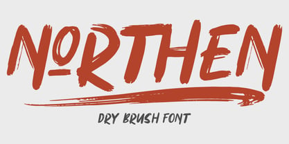 Northen combines attractive curves with a fresh urban edge; delivering a stylish script which is guaranteed to add an eye-catching appeal to your logo designs, brand imagery, handwritten quotes, product packaging, merchandise & social media posts ADVANTAGES: - Simple installation - Work for PC and MAC - Multilingual Support - EXTRA SWASH - Detailed dry brush I hope you enjoy this font. If you have questions, don't hesitate to give me a message :) Thank You! - Garisman Studio
 - Mudstone by PintassilgoPrints,
$20.00 The cool, the sans and the light: Mudstone fonts are proudly packed with nice oddities and quirks. These are definitely fonts for getting noticed, in an affirmative, authentic way. Mudstone fonts are all caps, each with at least 2 sets of uppercase letters that will cycle at the command of the contextual alternates feature. There are also stylistic alternates in each font, for that extra something. Critically cool, seriously creative, dangerously unique. Definitely trying? Cool!!
 - Aduana by Fabio Ares,
$- Aduana is the first typographic product of argentine-chilean typographic archeology project called "Valpo. Ciudad de Letras" (Fabio Ares & Karin Thiers, since 2016). Based on the letter located on the front of the Customs building (Valparaíso, Chile). The resultant family can be described as display type and modern renaissance style, with geometric shapes and serif and mild line modulation. The proceeds from the sale of the fonts will be used to finance the project.
 - UT Marmalade by Uniontype,
$20.00 Marmalade Script by Uniontype is a modern multilingual type family inspired by vintage monoline fonts. The family consists of light, regular, bold and printed styles. Choose сolor and offset according to your taste. Marmalade Script provides advanced typographical support with contextual alternates, ligatures and swashes. That way, you’ll have automatic access to the dozens extra glyphs in each of the fonts. Marmalade Script is good for menu, signs, packaging, posters, letterings and logos.