10,000 search results
(0.045 seconds)
- Pablo Handwriting by SoftMaker,
$15.99 Digitized handwriting fonts are a perfect way to give documents the “very special touch”. Invitations look simply better when handwritten than when printed in bland Arial or Times New Roman. Short handwritten notes look authentic and appealing. There are numerous occasions where handwritten text makes a better impression. “Pablo Handwriting” is a beautiful typeface that mimics true handwriting closely. Use Pablo Handwriting to create stunningly beautiful designs easily.
 - Phil Handwriting by SoftMaker,
$15.99 Digitized handwriting fonts are a perfect way to give documents the “very special touch”. Invitations look simply better when handwritten than when printed in bland Arial or Times New Roman. Short handwritten notes look authentic and appealing. There are numerous occasions where handwritten text makes a better impression. Phil Handwriting is a beautiful typeface that mimics true handwriting closely. Use Phil Handwriting to create stunningly beautiful designs easily.
 - Kigara by Anatoletype,
$16.00Kigara was Elena’s first attempt at designing a text typeface. The result is not exactly a conventional book face. Strongly influenced by handwriting, Kigara is best suited for short texts set at medium to large sizes. However, its open letter shapes and subtle serifs make it a very readable face in smaller sizes as well. Kigara will also make headlines as a modest, light-hearted display typeface. Kigara is named after an African mushroom - hence the mushroom vignettes and African ornaments in the OpenType version and the ‘B’ set. Both the sets also include small caps, alternate figures, special ligatures and other expert glyphs. - Modum by The Northern Block,
$- A contemporary serif font family. The design takes influence from traditional serif forms to develop a precise, highly functional text face with a low contrast. Smooth radius details are blended with carefully drawn angles that give a crisp, distinctive aesthetic when used across body copy. Modum is a stylish modern day serif with great charm, harmony and practicality that is best suited for complex hierarchical projects, such as editorials, newspapers and text based books. Details include 8 weights and true italics, over 800 characters with alternative lowercase a, e, g and y. 7 variations of numerals, true small caps with accents, ligatures, manually edited kerning and Opentype features.
 - Exec Corners by Wiescher Design,
$35.00 I created the »EXEC« sans font during the years 2018 to mid 2020. The »EXEC«-Corners-family is a very special, unusual design. »EXEC«-Corners has 7 weights, ranging from Thin to Bold (plus 7 italics). This exceptional font is suited for editorial, book text, advertising and packaging, logo, branding, small text as well as web and screen design. »EXEC«-Corners has advanced typographical support including ligatures, small caps, alternate characters, case-sensitive forms, fractions, super- and subscript characters. »EXEC«-Corners comes with a range of figures—oldstyle and lining figures, each in tabular and proportional widths. »EXEC«-Corners supports Basic-, Western-, and Central-European Latin-based languages including Turkish.
 - Venis by Chank,
$99.00 On first impression, Venis is a traditional text typeface: clean, simple and elegant with nice contrast. On closer inspection, you'll notice nuances that add charm and wonder, much like its name (rhymes with "tennis"). Is this font a serif or sans serif? Hmmmm, it never really commits. Further design liberties were taken to create unique qualities in its characters, which are best exemplified by the signature lowercase y. This font family is optimized for print, and has worked beautifully for letterpress projects including wedding invitations and birth announcements. Venis will also work well in newsletters, brochures, proposals, magazines, books, and other text-heavy paper products, bringing creative elegance to your designs.
 - Beneta by Linotype,
$29.99Karlgeorg Hoefer designed Beneta in 1991, inspired by the Littera beneventana, the script of the Benedictine scribes from the 10th to the 12th century. During this time, scribes began to use wider pens and set them at a 45 degree angle to the paper, which caused their scripts to have radical stroke contrasts. This script was mainly used for books and certificates but disappeared by the end of the 13th century. Beneta revives the characteristics of this historic script, changing a line of text into an almost ornamental space. Beneta should be used in middle to larger point sizes for shorter texts and headlines. - Revival 565 by ParaType,
$30.00 Revival 565 is the Bitstream version of type Berling. The face was created by Karl-Erik Forsberg for the Swedish Berling foundry in 1951, with other weights added in 1958. The design is an old style roman, particularly useful for books, journals, and other text applications. Despite the fact that it has higher contrast than most old style typefaces, Berling has the classic features of old style romans with its small x-height, and ascenders that exceed the height of the capital letters. Berling is good for text settings as well as display work. Cyrillic version was developed for ParaType by Manvel Shmavonyan in 2008.
 - FF Celeste Sans by FontFont,
$65.99 British type designer Chris Burke created this sans FontFont between 1994 and 2004. The family has 8 weights, ranging from Regular to Black (including italics) and is ideally suited for book text, editorial and publishing as well as logo, branding and creative industries. FF Celeste Sans provides advanced typographical support with features such as ligatures, small capitals, alternate characters, case-sensitive forms, fractions, and super- and subscript characters. It comes with a complete range of figure set options – oldstyle and lining figures, each in tabular and proportional widths. This FontFont is a member of the FF Celeste super family, which also includes FF Celeste and FF Celeste Small Text.
 - Love Rose by Gatype,
$12.00 Love Rose is a beautiful script suitable for branding, wedding invitations, and any other romantic project. love rose is coded with PUA Unicode, which allows full access to all additional characters without having to design any special software. Mac users can use Font Book, and Windows users can use Character Map to view and copy any additional characters for pasting into your favorite text editor / application. you need a program that supports Adobe Illustrator CS, Adobe Indesign & CorelDraw X6-X7, Microsoft Word 2010 or a later version. How to access all alternative characters using Adobe Illustrator: https://www.youtube.com/watch?v=XzwjMkbB-wQ How to access all alternative characters, using the Windows Character Map with Photoshop: https://www.youtube.com/watch?v=Go9vacoYmBw
 - Love Moment by Gatype,
$12.00 Love moment is a pretty script perfect for branding, wedding invitations, and any other romantic project. you need a program that supports Adobe Illustrator CS, Adobe Indesign & CorelDraw X6-X7, Microsoft Word 2010 or a later version. How to access all alternative characters using Adobe Illustrator: https://www.youtube.com/watch?v=XzwjMkbB-wQ Love moment is coded with PUA Unicode, which allows full access to all additional characters without having to design any special software. Mac users can use Font Book, and Windows users can use Character Map to view and copy any additional characters for pasting into your favorite text editor / application. How to access all alternative characters, using the Windows Character Map with Photoshop: https://www.youtube.com/watch?v=Go9vacoYmBw
 - Hansplatz Grotesk by Heypentype,
$20.00 Hansplatz Grotesk is a sans serif type family of nine weight. Influenced by Akzidens Grotesk, Hansplatz typeface bring a new approach to this utilitarian style of grotesk. With more square proportions rather than geometric style, Hansplatz grotesk aimed to ease typesetting job when arranging a words or paragraph easily. A wide range of weight gives flexibility to every design project, hansplatz fit nicely to grid-system because of proportions. Furthermore Hansplatz Grotesk supplied with smart Opentype scripting to assist typesetter and designer very easily to Hansplatz feature. Hansplatz Grotesk truly a utilitarian, workhorse, neutral, and of course faceless. But, it makes the work done quickly. For display use, Hansplatz Grotesk Black to Semi-Bold is recommended, for paragraph heavy design, use regular and light weight. To spice up, adding Hairline or extra-light weight will make a design execution looks great and catchy but not intimidating.
 - Geller by Ludka Biniek,
$29.00 A truly faithful ally for every designer looking for fresh yet familiar and reliable font choice. Geller was created as a part of graduation project in Typowa Pracownia at Academy of Fine Arts in Warsaw. It is a typeface family especially intended for newspapers, magazines, and advertising. Geller family comes in two optical sizes - headline and text, so it is a complete solution for editorial purposes. During the design process, the technical needs of certain typographic fractions were examined. The capital letters were specially and purposely designed: its modern proportions (derived from Didone fonts) with optimized inner lights as well as short ascenders and descenders work very well within titles and leads. In addition to a wide range of OpenType features, Geller contains bullets & dingbats providing many possibilities of entry points in editorial design. Compact diacritics, proportionally tall x-height, narrow letter construction, all these features allow easy typesetting of narrow text columns and spreads.
 - Romper by DearType,
$29.00 Romper is a slightly narrow handwritten sans in four weights and it is perfect if you want to convey a casual and friendly feel. It was designed with the idea to be used on comic books, mobile applications and children’s books, thus it has a Dancing Baseline version (Romper DB) and a Slanted version (each of them in four weights as well). The family is equipped with 450+ glyphs, has Latin Extended and Cyrillic Support (both Russian and Bulgarian) and a lovely set of extras. The family includes a lot of discretionary ligatures and alternate letters for more variety in the design. Overall, Romper is cute, amiable and really versatile, so it will fit most applications - think greeting cards, menus, merchandise, books, packaging, websites, etc.
 - Ramelik by Letterena Studios,
$17.00 Proudly present Ramelik, a modern and classy black letter font that has a unique style and modern look. This typeface is perfect for an elegant & luxury logo, book or movie title design, fashion brand, magazine, clothes, lettering, quotes, and so much more. ** Uppercase
 - Abonity by Dhan Studio,
$21.00 Abonity is a modern handwritten font, with stylized characters that look quirky but interesting to use in a variety of modern designs such as clothing, invitations, tittle books, stationery designs, quotes, branding, logos, greeting cards, t-shirts, packaging designs, posters and more.
 - Serabut Brush by Siwox Studios,
$11.00 Serabut Brush! A fresh and natural font ready to give your design project looks great. This is very suitable for a beautiful tagline, title, cover book, logo, some of the daily quotes, invitation, poster, and any design project that needs natural touches.
 - Hey Comrade by Hanoded,
$15.00 Hey Comrade is a very messy script font. It was made with a bamboo satay skewer (which I had soaked in ink). Hey Comrade would look good on book covers, packaging and in magazines. Comes with a 5-year plan of diacritics.
 - TOMO Nara by TOMO Fonts,
$20.00 TOMO Nara adds plenty of joy to any logo, layout or UI. Geometric shapes and a funny look come together in this font – thus, Nara might be the perfect choice for toys, books, packaging, posters or even webapps! Let’s have some fun!
 - Racula by Typefactory,
$14.00 Racula is an fun, scary, and amazing gothic serif. It will add a unique and stunning look to your designs. It is perfect for fun scary games, children horror story book, logos, branding, advertising, Halloween projects, gothic designs, apparel, tattoos, and more!
 - Caverson by Letterena Studios,
$10.00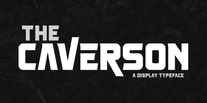 Proudly present Caverson Typeface, a modern and classy slab serif font with a unique style and fancy look. This typeface is perfect for an elegant & luxury logo, book or movie title design, fashion brand, magazine, clothes, lettering, quotes, and so much more. **Uppercase
 - Rocket Please by PizzaDude.dk,
$17.00 A charming font with shaky lines and 6 different version for each letter. Use it for something that needs a handmade and/or organic look. That could be children's books, posters, greeting cards, product packaging ... anthything that needs a special appearance and charm.
 - Brooky by Gatype,
$14.00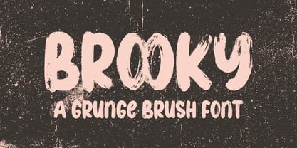 Brooky is a modern, handwritten font, with stylized characters that look unique but are attractive for use in a variety of modern designs such as clothing, invitations, book titles, stationery designs, quotes, branding, logos, greeting cards, t-shirts, packaging designs. , posters and more.
 - Melvens by Ronny Studio,
$21.00 Melvens is an experimental combination font. includes 2 fonts that have very different styles and appearances, but make this font look unique. This font is perfect for your design needs such as poster design, logo design, branding, social media design, books, magazines, etc.
 - Tough Cookie by Hanoded,
$15.00 Tough Cookie is a handmade font that looks like it has been cut out. It comes in three varieties that work together really well. Use it for your book covers and product packaging, or (if you’re a tough cookie) for your christmas cards…
 - Suifak by Letterena Studios,
$10.00 Suifak is a modern and classic serif typeface that has its own unique style and fashionable look. This typeface is perfect for an elegant and luxurious logo, book or movie title design, fashion brand, magazine, clothes, lettering, quotes, and so much more.
 - Brock Restar by Letterena Studios,
$10.00 Brock Restar is a modern and classic display typeface that has its own unique style and fashionable look. This typeface is perfect for an elegant and luxurious logo, book or movie title design, fashion brand, magazine, clothes, lettering, quotes, and so much more.
 - West Yard by Typefactory,
$14.00 West Yard is a bold, western looking display font. Whether you are using it for cartoon-related designs, children’s games, quotes, titles, brand names, book covers, posters, or just any creation that requires a touch of beauty, this font is a great choice.
 - Mia Love by Dhan Studio,
$20.00 Mia Love is a special brush font designed to look bold, with a perfect texture, suitable for today's designs. Perfect for use in design titles such as invitations, signboards, book titles, stationery designs, quotes, branding, logos, greeting cards, packaging designs, posters, and more.
 - Alaya Roza by Supfonts,
$15.00 Alaya Roza supports both Cyrillic and Latin layout. You can write an attractive invitation or issue menu. It is of a classic style that will fit perfectly into any project. Шрифт поддерживает как кириллическую так и латинскую раскладку. Вы можете писать привлекательные приглашения или оформлять меню. Классическое начертание идеально впишется в любой проект :) Test it out below to see how it could look for your next project! Includes: Regular Script Latin languages support Cyrillic languages support Uppercase and lowercase Numbers and punctuation Ligatures Check out my blog: https://www.instagram.com/di.zigner pinterest.com/dmitriychirkov7 Enjoy
 - Amnestia by Arterfak Project,
$14.00 Amnestia is a vintage serif typeface with a modern-classic feel. Inspired by vintage signage and minimalist serif style, this All-Caps font comes with 100+ alternates that gives you more options to get many variations in your designs. Amnestia has a medium height that looks perfect for display or sub-text. Amnestia available in 2 styles, distressed and normal, and is a great choice to be used in logos, insignia, apparel, labels, packaging, posters and more. Amnestia has a stylistic set 01 - 10 as the alternates of the letterforms. Some alternates have swashes and tails that you can explore to get more possibilities to create different typographic looks.
 - Kessel 105 by Talbot Type,
$19.50 Kessel 105 is inspired by the classic, geometric sans-serifs such as Futura, but has shallower ascenders and descenders for a more compact look, and features an art deco influence with sharp points at the apex of many characters. It's a versatile, modern sans, highly legible as a text font and with a clean, elegant look as a display font at larger sizes. It includes old style non-aligning (lower case) numbers, both proportional and tabular as well as accented characters for Central European languages. The Kessel 105 family comprises of six weights and is closely related to Kessel 205, it’s more intensely Deco flavoured cousin.
 - Kessel 205 by Talbot Type,
$19.50 Kessel 205 is inspired by the classic, geometric sans-serifs such as Futura, but has shallower ascenders and descenders for a more compact look, and features an art deco influence with sharp points at the apex of many characters, lowered crossbars and an oblique crossbar on the lower case e. It's a versatile, modern sans, highly legible as a text font and with a distinctive, elegant look as a display font at larger sizes. It includes old style non-aligning (lower case) numbers, both proportional and tabular as well as accented characters for Central European languages. The Kessel 205 family comprises of six weights and is closely related to Kessel 105.
 - John Sans by Storm Type Foundry,
$49.00 The idea of a brand-new grotesk is certainly rather foolish – there are already lots of these typefaces in the world and, quite simply, nothing is more beautiful than the original Gill. The sans-serif chapter of typography is now closed by hundreds of technically perfect imitations of Syntax and Frutiger, which are, however, for the most part based on the cool din-aesthetics. The only chance, when looking for inspiration, is to go very far... A grotesk does not afford such a variety as a serif typeface, it is dull and can soon tire the eye. This is why books are not set in sans serif faces. A grotesk is, however, always welcome for expressing different degrees of emphasis, for headings, marginal notes, captions, registers, in short for any service accompaniment of a book, including its titlings. We also often come across a text in which we want to distinguish the individual speaking or writing persons by the use of different typefaces. The condition is that such grotesk should blend in perfectly with the proportions, colour and above all with the expression of the basic, serif typeface. In the area of non-fiction typography, what we appreciate in sans-serif typefaces is that they are clamorous in inscriptions and economic in the setting. John Sans is to be a modest servant and at the same time an original loudspeaker; it wishes to inhabit libraries of educated persons and to shout from billboards. A year ago we completed the transcription of the typefaces of John Baskerville, whose heritage still stands out vividly in our memory. Baskerville cleverly incorporated certain constructional elements in the design of the individual letters of his typeface. These elements include above all the alternation of softand sharp stroke endings. The frequency of these endings in the text and their rhythm produce a balanced impression. The anchoring of the letters on the surface varies and they do not look monotonous when they are read. We attempted to use these tricks also in the creation of a sans-serif typeface. Except that, if we wished to create a genuine “Baroque grotesk”, all the decorativeness of the original would have to be repeated, which would result in a parody. On the contrary, to achieve a mere contrast with the soft Baskerville it is sufficient to choose any other hard grotesk and not to take a great deal of time over designing a new one. Between these two extremes, we chose a path starting with the construction of an almost monolinear skeleton, to which the elements of Baskerville were carefully attached. After many tests of the text, however, some of the flourishes had to be removed again. Anything that is superfluous or ornamental is against the substance of a grotesk typeface. The monolinear character can be impinged upon in those places where any consistency would become a burden. The fine shading and softening is for the benefit of both legibility and aesthetics. The more marked incisions of all crotches are a characteristic feature of this typeface, especially in the bold designs. The colour of the Text, Medium and Bold designs is commensurate with their serif counterparts. The White and X-Black designs already exceed the framework of book graphics and are suitable for use in advertisements and magazines. The original concept of the italics copying faithfully Baskerville’s morphology turned out to be a blind alley. This design would restrict the independent use of the grotesk typeface. We, therefore, began to model the new italics only after the completion of the upright designs. The features which these new italics and Baskerville have in common are the angle of the slope and the softened sloped strokes of the lower case letters. There are also certain reminiscences in the details (K, k). More complicated are the signs & and @, in the case of which regard is paid to distinguishing, in the design, the upright, sloped @ small caps forms. The one-storey lower-case g and the absence of a descender in the lower-case f contributes to the open and simple expression of the design. Also the inclusion of non-aligning figures in the basic designs and of aligning figures in small caps serves the purpose of harmonization of the sans-serif families with the serif families. Non-aligning figures link up better with lower-case letters in the text. If John Sans looks like many other modern typefaces, it is just as well. It certainly is not to the detriment of a Latin typeface as a means of communication, if different typographers in different places of the world arrive in different ways at a similar result.
 - Canastra by Ivan Rosenberg,
$16.00 Canastra Typeface is a stylish vintage font inspired by 70’s groovy vibe with a touch of modernity. It looks amazing at display sizes and is easily readable in text size. Canastra Typeface comes with access to your OpenType features, selection of 383 alternate glyphs and ligatures. Canastra Typeface is a serif font made mainly for headlines, titles, and other short texts and is well-suited for advertising, vintage mood board, branding, logotypes, packaging, titles, editorial design and modern and vintage design.
 - Thei by Andfonts,
$29.00 Thei is a calligraphy font that helps designers to create beautiful compositions. It looks stunning on wedding invitations, cards, quotes, greeting cards, logos, business cards and every other design which needs a customized touch. How quickly to create main decor element: 1.Type == (equal signs). Or type any Text========== Then move decor elements in the right position. ***Don’t change size of text during this process, because it may not create decor elements (ligatures). Or choose the décor element in Glyphs category.
 - Ogonyok by Russian Fonts,
$15.00 Accidental grotesque with a fiery character. Three font styles: Regular, Italic, Retalic. For each typeface an additional ornament was developed. The «Ogonyok» works well in larger sizes. Looks cool on titles, logos, music album covers, posters, packaging and in short texts. Special gorgeous ornaments will complement and enhance any design. Just try to type the text at the bottom of this page and you will see for yourself. Multilingual. Support: Cyrillic, Latin, extended Latin (Western European, Central European, South-East).
 - Adriane Swash by Typefolio,
$59.00 The Swash version of Adriane Text features the best characteristics of this lineage, without losing the strong personality and elegant design featuring in your text styles, Adriane Swash brings a fancy look to this classic style. The family comes with a complete character set in Uppercase, Lowercase and Small Caps, and the Swash option can be activated through the OpenType features panel, including glyphs initial, intermediate and final, plus a wide range of stylistic ligatures, alternate glyphs, ornaments and languages.
 - AZ Placid by Artist of Design,
$15.00 AZ Placid font is basically a rough outline that lends well to other Serif fonts. This font utilizes an "old look" to the line work which is designed to have a "worn feel" to it. Ideal for use as headline or sub-head text in you design.
 - Shining Glory by Jos Gandos,
$15.00 Shining Glory is a new modern & fresh calligraphy script with natural script style. This font will make your design look elegant, natural and stylish. Shining Glory calligraphy script font is great for quote design, branding, wedding, photography, simply design with stylish text overlay to any background image.