10,000 search results
(0.047 seconds)
- Doctrine by Barnbrook Fonts,
$75.00 A contemporary sans-serif typeface with an agreeable character, Doctrine Sans is the moderate comrade of the display typeface Doctrine Stencil. From the obscure starting point of the North Korean national airline livery, Doctrine was developed to encompass a series of more mature typographic influences. Doctrine draws influence from the classic mid-century neo-grotesques and, while it retains a sense of crisp modernity, it exudes a more contemporary and human character. The rounded, lighter weights speak with graceful composure while the large x-height, low contrast and squarer, heavier, weights give Doctrine an affable charm and a persuasive voice. The alternate characters borrow elements from humanist and geometric styles and provide an idiosyncratic, experimental counterpart to the primary character set.
 - Ashemore Softened by insigne,
$32.00 Following the success of the Ashemore family, it became clear that a rounded version of Ashemore would be a great addition to the product line that would allow designers even more design choices. Ashemore Softened’s rounder forms compliment the face well as the original font eschewed straight lines. The rounded terminators give the face a sense of friendliness that is unsurpassed. The distinct and flamboyant style of Art Nouveau and the Arts and Crafts style remain, but the blunted terminators give the face a more technological and contemporary look and feel. The Ashemore Softened family has a full range of six weights from thin to black and includes condensed and extended options for a total of 36 fonts. The typeface also includes some unique OpenType alternates that make the superfamily even more versatile. Ashemore Softened is equipped for complex professional typography, including alternates, small caps and many alternate characters. The face also has a number of numeral sets, including tabular figures, fractions, old-style, lining figures and superiors and inferiors. OpenType-capable applications such as Quark or the Adobe Suite can take full advantage of automatic ligatures and alternates. You can find these features demonstrated in the .pdf brochure. Ashemore Softened also includes the glyphs to support a wide range of languages, including Central, Eastern and Western European languages. In all, Ashemore Softened supports over 40 languages that use the extended Latin script, making the new addition a great choice for multi-lingual publications and packaging. The original Ashemore was designed by Jeremy Dooley with production assistance from Lucas Azevedo and Marcelo Magalhaes. Kerning assistance from iKern.
 - Today Sans Now by Elsner+Flake,
$59.00 With the publication of the “Today Sans Now” Elsner+Flake extends its offering of the “Today Sans Serif” type family, developed in 1988 by Volker Küster for Scangraphic, by another cut so that the gradation of the stroke width can now be more finely calibrated. The type complement is available for 72 Latin-based languages as well as Cyrillic. Where available, small caps were integrated, and mathematical symbols as well as fractions were included. In order to make the symbols for text applications in regard to headlines more flexible, the insertions which were formerly added, for technical reasons in order to sharpen the corners, were eliminated, and the optical size adjustments of the vertical and diagonal stem endings (I, v, H, V) to the horizontal bars (z, Z) were scaled back. Already since the end of 1984, Volker Küster experimented with broad sticks of chalk and a broad felt pen in order to develop a new sans serif typeface which, in the interest of easy legibility, would be built on the basic structures and proportions of the Renaissance-Antiqua. Using a normal angle of writing, his experiments lead to the form structure of the characters: a small contrast between bold and light weights, serif-like beginning and end strokes in some of the lower-case characters, and the typical, left-leaning slant of all round lower-case letters and the typical left-leaning axis of all round letter forms. In this way, a rhythmization of a line of type was achieved which created a lively image without being “noisy”. With this concept, Volker Küster has enlarged the Sans Serif by a distinctive, trend-setting form variation.
 - Delm by Typesketchbook,
$39.00 Delm font family is one of those large and useful families that you really can’t miss if you are looking for typeface combining originality and legibility. Delm is one of these – a sans serif with geometric modern look designed very smart with soft round look and very specific inktraps that complement its uniqueness. It is developed in 9 separate weights ranging from Hairline to Black, each coming with corresponding slanted version (called ‘Oblicua’). The light weights look more elegant, gentle and with more sensible feeling for geometry while the black versions are more soft, friendly even puffy and the geometric skeleton of the family is dominated by the overall roundness. The mid-weights are strong and prominent setting right the middle point in the contrast range of the family. Delm is a font with dedication – with so many options for different character contrast combined with slanted styles, it is perfect for editorial design where it could be easily used either for text or display font. Editorial is not of course the only application – you could successfully rely on this typeface if create brand or corporate identity, typographic posters, signboards, instruction plates, etc. Very diverse and original, this font will not leave you unsatisfied – moreover – it will surely make you try it in more and different designs be it printed or designed for screen. Web sites, banners, applications and e-books are places where Delm will show its best because of its originality, finely tuned contrast and its enhanced legibility. Fully equipped with OpenType features like ligatures and multilingual support, Fontmatters highly recommends to get the whole Delm font family for maximum results and satisfaction.
 - Quinoa by Catharsis Fonts,
$29.00 Quinoa is display typeface by Catharsis Fonts that unites the seemingly opposed concepts of clean geometric architecture and organic humanist warmth. While it is designed for display and editorial purposes, its accessible forms make for comfortable reading even at small text sizes. Its exuberant adaptive "f", "j", "Q" and refreshing titling alternates bring display text to life. Quinoa covers multilingual Latin, Cyrillic, Greek, Hebrew, Arabic, and Armenian. The Quinoa family spans four stylistic cuts (Quinoa, Quinoa Titling, Quinoa Round, and Quinoa Text) with matching hand-slanted obliques, each of which comes in nine weights. The Titling cut offers a number of alternate capital letter designs with lowercase-inspired forms for a refreshing unicase look, and the Round cut additionally removes the spurs from arched letters like n. The text cut introduces true diagonals and a two-storey "a" for a more sober, reading-friendly look. A host of other OpenType features including ligatures, contextual alternates, small caps, figure sets, and character variants are built into all cuts. Furthermore, the small caps of Quinoa, Quinoa Titling, and Quinoa Text are available as dedicated font files under the names "Quinoa SC", "Quinoa Unicase" and "Quinoa Text SC" for ease of use. Acknowledgements: I am thankful to the TypeDrawers and the Typografie.info communities for great feedback and support. In particular, Thorsten Daum has been tremendously helpful with suggestions and quality control. Thanks to Craig Eliason and Jan Willem Wennekes for their help with the Latin, Alexander L. Stetsiuk for Cyrillic, Ofir Shavit and Jonathan N. Washington for Hebrew, Khaled Hosny for Arabic, and Hrant H. Papazian for Armenian.
 - Axeo Sans by Asritype,
$15.00 As mentioned on previous released font Axeo (freeform serif), now, the original sanserif font is released with similar name, Axeo Sans. Axeo was release first when Axeo sans is still in minimal glyphs and font weights. However, Axeo sans is released with more fonts, 7 font in roman and 7 in italic/oblique versions, instead of semi condensed. 7 fonts is in roman form of weight: Light, Regular, Medium, Semi Bold, Bold, Extra Bold and Black; and 7 fonts in italic/oblique versions of its weight, respectively. This font weight offers the user to use the best fit to the usage. Axeo sans is neutral typeface, designed for general use. This font has also more glyphs variations and OpenType features. More than 700 glyphs for each cut. While the OpenType is equipped with: Large unmarked Basic Latin caps (ss02-ss05); normal character variation for some letters (ss01); Small caps (c2sc and smcp); superscript for 1, 2, and 3; ordinals for a and o; 5 basic fractions; standard and discretionary ligature; kerning; case sensitive and ornaments. Large Caps is unique setting, additional letters for font variations lover/user, applicable for first letter of paragraph, sentences, for design mean, just for fun or other usage.
 - Nebbiolo by Jonahfonts,
$39.00 A single-stoked gothic font with UltraLight, Light, DemiBold, Bold and Extra Bold weights. Usage recommendations: Captions, packaging, cards, posters, ads, book jackets, manuals, menus, fashions.
 - Antique Shadow by Wooden Type Fonts,
$15.00A modified remake of one of the popular wooden type fonts of the 19th century. This is an extra bold, shadowed, sans serif suitable for display. - Haunted House by HiH,
$8.00 Halloween lends itself to graphic images: witches, ghosts, bats, jack-o'lanterns and haunted houses. When we think of a haunted house, we generally think of a large, abandoned, derelict Victorian wood-frame house. The style is usually Second Empire or Queen Anne. There tends to be a lot of decoration. There is usually a porch or two with decorative spindle work. There is probably a tower, either square with a mansard roof such as one might see in Paris or round with a conical roof borrowed from a Loire Valley chateau. These houses were generally built in the United States between 1860 and 1900, products of the exuberance of a time before income tax. It took at least three servants to maintain such a house and was very expensive. Few can afford them today. That is why so many were converted to professional offices, multi-family dwellings or simply abandoned. HAUNTED HOUSE is our typographical contribution to Halloween. Based on our font PETRARKA ML, it features decorative capitol letters that utilize the silhouette of a Second Empire style house complete with a dead tree and a full moon. The font includes 8 ornaments suitable for flyers and party invitations. Revision 2.000 eliminates dual encoding, harmonizes metrics, adds new glyphs, and adds open type features. The zip package includes two versions of the font at no extra charge. There is an OTF version which is in Open PS (Post Script Type 1) format and a TTF version which is in Open TT (True Type)format. Use whichever works best for your applications.
 - Blippys by Maulana Creative,
$14.00 Blippys is a cartoonish handwritten display font. With extra bold rough stroke, fun character with a bit of ligatures. To give you an extra creative work. Blippys font support multilingual more than 100+ language. This font is good for logo design, Social media, Movie Titles, Books Titles, a short text even a long text letter and good for your secondary text font with sans or serif. Make a stunning work with Blippys font. Cheers, Maulana Creative
 - Ginloops by Maulana Creative,
$14.00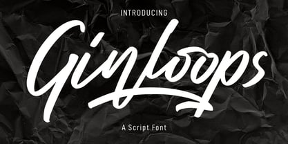 Ginloops is a fancy unique script font. With bold stroke, slanted and fun character with a bit of ligatures and extra swashes. To give you an extra creative work. Ginloops font support multilingual more than 100+ language. This font is good for logo design, Social media, Movie Titles, Books Titles, a short text even a long text letter and good for your secondary text font with sans or serif. Make a stunning work with Ginloops font. Cheers, MaulanaCreative
 - Regon by Dicubit,
$9.00 Regon is a modern sans serif typeface/font family (18 fonts) designed with carefully handcrafted. This perfectly made to be applied in logo or branding, stationery, books, packaging, fashion, magazines, t-shirt, novels, labels and many advertising purposes. Styles: Thin, Extra Light, Light, Regular, Medium, Semi Bold, Bold, Extra Bold, Black (All with Italic). Features: Uppercase, Lowercase, Number, Punctuation, Symbol, Multilingual. All the pictures used in the preview are not included. They are intended only for illustration purpose.
 - Silo Soft by TypeUnion,
$25.00 Designed and built in London by TypeUnion, Silo soft is a fluid sans serif typeface embodying energetic curves and a clean, functional structure. The Silo Soft Family is made up of 6 weights, which range from a delicate Extra-Light, all the way through to a punchy, loud Extra-bold and each carry a versatility for multiple applications and uses. Silo soft features open type alternate characters, and extensive language support to provide a flexible, substantial user experience.
 - Remah Pro by Rosario Nocera,
$12.00 Originally created in 2014 but redesigned and improved in 2020, Remah Pro is an eclectic and versatile sans serif font family consisting of 5 weights, from extra light to extra bold with its respective condensed. When looking for something different, Remah Pro is certainly the best choice: the wavy shapes that defines it are intertwined with clean cuts and sharp edges, making it suitable for typographic experimentation and ideal for display work, logo design, posters and billboards.
 - MC South Great by Maulana Creative,
$13.00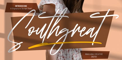 Southgreat is an expressive signature script font. With regular felt-tip stroke, fun character with some of ligatures and extra swash. To give you an extra creative work. Southgreat font support multilingual more than 100+ language. This font is good for logo design, Social media, Movie Titles, Books Titles, a short text even a long text letter and good for your secondary text font with sans or serif. Make a stunning work with Southgreat font. Cheers, MaulanaCreative
 - Qualyters by Maulana Creative,
$14.00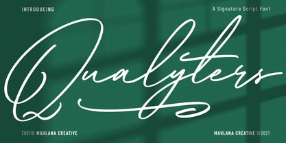 Qualyters is a fancy unique signature script font. With clean mono-line stroke, fun character with a bit of ligatures and extra swash. To give you an extra creative work. Qualyters font support multilingual more than 100+ language. This font is good for logo design, Social media, Movie Titles, Books Titles, a short text even a long text letter and good for your secondary text font with sans or serif. Make a stunning work with Qualyters font. Cheers, MaulanaCreative
 - Quickstages by Maulana Creative,
$14.00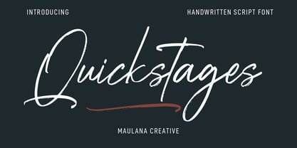 Quickstages is an expressive brush script font. With bold contrast stroke, fun character with a bit of ligatures, alternates and extra swash. To give you an extra creative work. Quickstages font support multilingual more than 100+ language. This font is good for logo design, Social media, Movie Titles, Books Titles, a short text even a long text letter and good for your secondary text font with sans or serif. Make a stunning work with Quickstages font. Cheers, Maulana Creative
 - Night Wind Sent by Ana's Fonts,
$12.00 Night Wind Sent is an elegant handwritten script font family inspired by old-fashioned handwritten postcards and letters. It includes ligatures (for a true handwritten feel), stylistic alternates, handwritten small caps, and swashes (for an extra bit of drama). Plus! Extra versions of the font: underline and strikethrough, and an ornaments font, to help decorate your text. Night Wind Sent is perfect for any design that needs a handwritten look, such as signatures, notes and quotes, logos and branding.
 - Eletric Lady by RM&WD,
$49.00 Electric Lady in a light script with a great amount of different possibilities. With Electric Lady font family you can to turn on various features (Ligatures, Stylistic Alternates, Contextual Alternates, Swashes, 3 completely different Stylistic sets) to auto swap out letter sets with alternate versions. - More than 3,000 glyphs - 100 different numbers shapes - 110 different ornaments In the Extra 2 style, you'll find many different standalone words, kitchen icons, menu icons, swashes, and extra fun characters!
 - Ironhopes Monoline Signature by Maulana Creative,
$13.00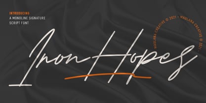 Ironhopes is a casual classic signature script font. With light mono-line stroke, fun character with some of ligatures and extra swash. To give you an extra creative work. Ironhopes font support multilingual more than 100+ language. This font is good for logo design, Social media, Movie Titles, Books Titles, a short text even a long text letter and good for your secondary text font with sans or serif. Make a stunning work with Ironhopes font. Cheers, MaulanaCreative
 - Pinup New by Gleb Guralnyk,
$14.00 Hi, introducing a smooth vintage font - Pinup New. It has a nice tasty shape with a tiny separate accents. Pinup New font supports most of the european languages and also has ukrainian cyrillic characters. Pinup New consists of three fonts with separate accents for more convenient manipulating and recoloring. Also there are an extra characters with modifyed letters shape, such as ligatures and alternates. Make sure that your app does support an OpenType features to access this extra characters.
 - Olney by Philatype,
$20.00 A square sans stripped down to basic, neutral shapes. Olney is primarily a display family with lighter weights that will remain legible at text sizes. The letterforms of Olney are designed to appear consistent, sturdy, and technical. Careful attention was given to the pure, almost modular forms, to ensure that the family looks timeless, rather than resorting to a contemporary or futuristic aesthetic. Each weight includes a thorough set of diacritics for Western and Central European languages.
 - Inerta by Mint Type,
$35.00 Inerta is a neutral, but not flavourless, cross between a geometric sans and a neo-grotesk. It is designed to work perfectly in UI/UX applications, and to remain readable in smallest font sizes. With over 950 glyphs, the font family offers extensive language support and many typesetting options to choose from. The typeface can be customised with several sets of alternate glyphs and OpenType features. The Cyrillic part contains alternates for Bulgarian as well as alternative Ukrainian forms.
 - Citadina by Graviton,
$24.00 Citadina font family has been designed for Graviton Font Foundry by Pablo Balcells in 2016. It is a sans serif typeface with a geometrical, mechanic, neutral appearence and a slightly condensed design which makes it particularly effective for space economizing. It has been conceived to be most suitable for short and middle length text blocks, as well as on all sized headlines. Citadina consists of 12 styles. Each containing small caps and glyph coverage for several languages.
 - Kanyon by Hurufatfont,
$19.00 Kanyon is a family of typefaces created from basic geometric forms based on the equal width system. Its clean and neutral structure and 3 different widths provide ease of use in different design channels. With its rich OpenType features, multi-language support and small capital characters, it has a wider usage area than its counterparts. Ideal for packaging, labels, routing designs, mobile applications, brand designs, logos, all kinds of presentation and editorial designs, indoor and outdoor printing works.
 - Cern by Wordshape,
$20.00 Cern is a family of20 weights of neutral, yet formally nuanced grotesk typefaces that takes inspiration from the original metal types from Switzerland, yet had a slightly larger x-height for more pronounced legibility. Cern is designed to be highly readable in print and on-screen. The italic variations are true italics and have been designed for smooth, fluid reading and text-setting. The Cern family works equally well for text typesetting and for display design work.
 - Gunar by The Northern Block,
$39.00 A geometric sans serif with a square chiseled appearance. Precise curves are met with straight lines and tapered angles to produce a fresh, technical typeface. It’s large x-height and neutral width give it good legibility at small point sizes. These refined rectangular features make it ideally suited to a wide range of modern applications. Details include 550 characters with alternative lowercase a, e, g and y. 5 variations of numerals, manually edited kerning and Opentype features.
 - Anisette Std Petite by Typofonderie,
$59.00 Geometric font inspired by shop signs in 4 styles Anisette has sprouted as a way to test some ideas of designs. It has started with a simple line construction (not outlines as usual) that can be easily expanded and condensed in its width in Illustrator. Subsequently, this principle of multiple widths and extreme weights permitted to Jean François Porchez to have a better understanding with the limitations associated with the use of MultipleMaster to create intermediate font weights. Anisette built around the idea of two widths capitals can be described as a geometric sanserif typeface influenced by the 30s and the Art Deco movement. Its design relies on multiple sources, from Banjo through Cassandre posters, but especially lettering of Paul Iribe. In France, at that time, the Art Deco spirit is mainly capitals. Gérard Blanchard has pointed to Jean Francois that Art Nouveau typefaces designed by Bellery-Desfontaines was featured before the Banjo with this principle of two widths capitals. The complementarity between the two typefaces are these wide capitals mixed with narrow capitals for the Anisette while the Anisette Petite – in its latest version proposes capitals on a square proportions, intermediate between the two others sets. Of course, the Anisette Petite fonts also includes lowercases too. Anisette Petite, a geometric font inspired by shop signs in 4 styles So, when Jean François Porchez has decided to create lowercases the story became more complicated. His stylistic references couldn’t be restricted anymore to the French Art-déco period but to the shop signs present in our cities throughout the twentieth century. These signs, lettering pieces aren’t the typical foundry typefaces. Simply because the influences of these painted letters are different, not directly connected to foundry roots which generally follow typography history. The outcome is a palette of slightly strange shapes, without strictly not following geometrical, mechanical and historical principles such as those that typically appear in typefaces marketed by foundries. As an example, the Anisette Petite r starts with a small and visible sort of apex that no other similar glyphs such as n or m feature, but present at the end of the l and y. The famous g loop is actually inspired by Chancery scripts, which has nothing to do with the lettering. The goal is of course to mix forms without direct reports, in order to properly celebrate this lettering spirit. This is why the e almost finishes horizontally as the Rotis – and the top a which must logically follow this principle and is drawn more round-curly. This weird choice seemed so odd to its designer that he shared his doubts and asked for advise to Jeremy Tankard who immediately was reassuring: “Oddly, your new top a is fine, it brings roundness to the typeface, when the previous pushes towards Anisette Petite to unwanted austerity.” The Anisette Petite, since its early days, is a mixture of non-consistent but charming shapes. Anisette, an Art Déco typeface Anisette Petite Club des directeurs artistiques, 46e palmarès Bukva:raz 2001
 - FS Untitled Variable by Fontsmith,
$319.99Developer-friendly The studio has developed a wide array of weights for FS Untitled – 12 in all, in roman and italic – with the intention of meeting every on-screen need. All recognisably part of a family, each weight brings a different edge or personality to headline or body copy. There’s more. Type on screen has a tendency to fill in or blow so for each weight, there’s the choice of two marginally different versions, allowing designers and developers to go up or down a touch in weight. They’re free to use the font at any size on any background colour without fear of causing optical obstacles. And to make life even easier for developers, the 12 weight pairs have each been designated with a number from 100 (Thin) to 750 (Bold), corresponding to the system used to denote font weight in CSS code. Selecting a weight is always light work. Easy on the pixels ‘It’s a digital-first world,’ says Jason Smith, ‘and I wanted to make something that was really functional for digital brands’. FS Untitled was made for modern screens. Its shapes and proportions, x-height and cap height were modelled around the pixel grids of even low-resolution displays. So there are no angles in the A, V and W, just gently curving strokes that fit, not fight, with the pixels, and reduce the dependency on font hinting. Forms are simplified and modular – there are no spurs on the r or d, for example – and the space between the dot of the i and its stem is larger than usual. The result is a clearer, more legible typeface – functional but with bags of character. Screen beginnings FS Untitled got its start on the box. Its roots lie in Fontsmith’s creation of the typeface for Channel 4’s rebrand in 2005: the classic, quirky, edgy C4 headline font, with its rounded square shapes (inspired by the classic cartoon TV shape of a squidgy rectangle), and a toned-down version for use in text, captions and content graphics. The studio has built on the characteristics that made the original face so pixel-friendly: its blend of almost-flat horizontals and verticals with just enough openness and curve at the corners to keep the font looking friendly. The curves of the o, c and e are classic Fontsmith – typical of the dedication its designers puts into sculpting letterforms. Look out for… FS Untitled wouldn’t be a Fontsmith typeface if it didn’t have its quirks, some warranted, some wanton. There’s the rounded junction at the base of the E, for example, and the strong, solid contours of the punctuation marks and numerals. Notice, too, the distinctive, open shape of the A, V, W, X and Y, created by strokes that start off straight before curving into their diagonal path. Some would call the look bow-legged; we’d call it big-hearted. - FS Untitled by Fontsmith,
$80.00 Developer-friendly The studio has developed a wide array of weights for FS Untitled – 12 in all, in roman and italic – with the intention of meeting every on-screen need. All recognisably part of a family, each weight brings a different edge or personality to headline or body copy. There’s more. Type on screen has a tendency to fill in or blow so for each weight, there’s the choice of two marginally different versions, allowing designers and developers to go up or down a touch in weight. They’re free to use the font at any size on any background colour without fear of causing optical obstacles. And to make life even easier for developers, the 12 weight pairs have each been designated with a number from 100 (Thin) to 750 (Bold), corresponding to the system used to denote font weight in CSS code. Selecting a weight is always light work. Easy on the pixels ‘It’s a digital-first world,’ says Jason Smith, ‘and I wanted to make something that was really functional for digital brands’. FS Untitled was made for modern screens. Its shapes and proportions, x-height and cap height were modelled around the pixel grids of even low-resolution displays. So there are no angles in the A, V and W, just gently curving strokes that fit, not fight, with the pixels, and reduce the dependency on font hinting. Forms are simplified and modular – there are no spurs on the r or d, for example – and the space between the dot of the i and its stem is larger than usual. The result is a clearer, more legible typeface – functional but with bags of character. Screen beginnings FS Untitled got its start on the box. Its roots lie in Fontsmith’s creation of the typeface for Channel 4’s rebrand in 2005: the classic, quirky, edgy C4 headline font, with its rounded square shapes (inspired by the classic cartoon TV shape of a squidgy rectangle), and a toned-down version for use in text, captions and content graphics. The studio has built on the characteristics that made the original face so pixel-friendly: its blend of almost-flat horizontals and verticals with just enough openness and curve at the corners to keep the font looking friendly. The curves of the o, c and e are classic Fontsmith – typical of the dedication its designers puts into sculpting letterforms. Look out for… FS Untitled wouldn’t be a Fontsmith typeface if it didn’t have its quirks, some warranted, some wanton. There’s the rounded junction at the base of the E, for example, and the strong, solid contours of the punctuation marks and numerals. Notice, too, the distinctive, open shape of the A, V, W, X and Y, created by strokes that start off straight before curving into their diagonal path. Some would call the look bow-legged; we’d call it big-hearted.
 - Boqueta by BRtype,
$18.00 The design of Boqueta was inspired in stencil and modular forms. The project was selected for Bienal Letras Latinas 2006. The three styles include 21 discretionary ligatures.
 - Price Tag by Turtle Arts,
$20.00Price Tag is a bold, graphic alphabet inspired by labels and vintage price tags. A touch of grunginess makes this alphabet look extra cool in larger sizes. - Tauern by ParaType,
$25.00 A family of extra compressed styles designed at ParaType in 1993 by Alexander Tarbeev. For use in advertising and display typography. Decorative versions were added in 1996.
 - Hiew by Okaycat,
$29.95 Okaycat presents "Hiew". Hiew is a connected font with serif, some bold personality making your message clear. Includes European accents and extra characters to meet publication needs.
 - George Gibson by Baseline Fonts,
$24.00George Gibson is based on handwriting samples dating back to mid-1800s England. The font features additional characters for foreign language support, as well as extra glyphs. - Large OT by DSType,
$19.00First designed in 1999 Large now becomes LargeOT and it's available in Regular, Extra and Italic. Includes plenty of OpenType features, like SmallCaps, Alternates, Ligatures and Swashes. - Bemack by Dhan Studio,
$17.00 BEMACK is handwritten made with a brush pen, this font will tear through your text with unmistakable energy, dynamic and spontaneous flow. To help you create stunning custom handwriting displays. BEMACK comes with alternates character, ligature, punctuation, numerals. Also included is a bonus extras swashes, handmade designed to perfectly for headlines and short texts. Use it for magazines, t-shirt, packaging, logos, advertising, quotes, branding, posters, editorials, cover artwork, movies, websites, etc BEMACK is coded with Unicode PUA, Allows full access to all the extra characters without having special software designing. Mac users can use Font Book, and Windows users can use Character Map to view and copy any of the extra characters to paste into your favorite text editor / app. Thanks so much for looking and Enjoy it!
 - Tanglewoods by Nicky Laatz,
$10.00 A romantic little modern calligraphy font duo that will all whisk you off your feet! It comes with an extra dingbat font with oodles of sweet little flourishes and embellishments too! Tanglewoods Script has a lovely whimsical character with the natural organic flow from a real calligraphy pen. It’s perfect for weddings, feminine logos, branding, invitations, quotes, social media, websites, and well....just about anything pretty! :) It includes opentype features - stylistic alternates for the lowercase letters, and a comprehensive set of natural looking Ligatures to add to the natural nature of the typeface. The Complimentary sans serif font, Tanglewoods Sans, is a whimsical and light-hearted uppercase font. The extra dingbat font, Tanglewoods Extras, has 62 beautiful flourishes and embellishments, all available by hitting the keystrokes A-Z, a-z and 0-9.
 - PLASTIC PILL - Personal use only

- BoomBox - Unknown license


