10,000 search results
(0.03 seconds)
- TwentyFourNinetyOne by steve mehallo,
$19.91 TwentyFourNinetyOne [2491] is a reinterpretation of the alphabet of 1919 by Theo van Doesburg; the original a true rendering of the thinking of the Dutch-based art movement “de Stijl.” Jump forward to 1980 and prop lettering used on the Buck Rogers in the 25th Century television series; a vernacular typeface that was a utilitarian mix of geometry and pixel-based forms, used to symbolize the futuristic universe of 2491. At times it would appear on spaceships, laser guns, signage at space ports or in one episode, a Spandex tapestry. It only seemed logical to combine and rethink the letterforms, add ligatures + other extras, and see what the results would be. Futuristic, fun and bold to read! 2491: In the future, all type will look like this.
 - Paradigm Pro by Shinntype,
$59.00 Originally released in 1995 as a three font family, Paradigm forcefully addressed the emaciating effect that digitization was then exerting upon traditional serifed typography. Investigating the new media of a much previous era, Nick Shinn deconstructed the first roman type, designed by Sweynheym and Pannartz in 1467, and gleaned, from its minuscules, the low contrast and discreet serif treatment (portrayed by a novel convex effect), which he subsequently applied to both capitals and lower case of a classically proportioned Venetian invention. In 2008 the glyphs, metrics and hinting of the 1995 fonts were refined, Extra Bold and Light weights added, a full range of OpenType features instituted, and the number of characters per style increased almost threefold. A major upgrade to a unique typeface.
 - ZT Mota by Khaiuns,
$14.00 ZT Mota is a bold and elegant typeface. It has a temperamental character but is more flexible towards various stylistic designs, reflecting more in its graphics the transitional stage between classical serifs of varying proportions, leaning towards the stylized types of Roman culture. All the ZT Mota styles are based on the same core but with a completely different expression which is to have an extra large x-height and bold so that the font looks bold as if the writing on the font was actually carved out of stone, perfect for an efficient choice for use of distinguishable displays such as headlines, packaging, magazines, posters, and advertisements, among others. I hope you have fun using ZT Mota Thanks for using this font ~ Khaiuns X zelowtype
 - One United Font by TypoGraphicDesign,
$9.00 The typeface One United Font is designed from 2020 for the font foundry Typo Graphic Design by mäd • madeleine maros × Manuel Viergutz as a political statement #leavenoonebehind The display font is inspired in the past and present. 3 font-styles (Bubble, Bubble Behind, Outline) + 1 icon-style with 390 glyphs (Adobe Latin 1) incl. 100+ decorative extras like icons, arrows, dingbats, emojis, symbols, geometric shapes (type the word #LOVE for ❤ or #SMILE for ☺ as OpenType-Feature dlig) and stylistic alternates (3 stylistic sets). For use in logos, magazines, posters, advertisement plus as webfont for decorative headlines. The font works best for display size. Have fun with this font & use the DEMO-FONT (with reduced glyph-set) FOR FREE!
 - Joaquin Imperial by Hatftype,
$17.00 Joaquin Imperial – Blackletter Typeface Font is a display font that is inspired by gothic and horror style because its shape is very unique and is perfect for any project that you will use with this theme. Joaquin Imperial with opentype features such stylistic alternates, stylistic sets & ligatures good for logotype, poster, badge, book cover, tshirt design, packaging and any more. Features : 1.Uppercase & Lowercase 2.Multilingual support 3.Number 4.Symbol 5.Punctuation. 6.Extra Dingbat 7.Support in Mac and Windows OS -Support in design application (photoshop, illustrator, and more). There it is. I really hope you enjoy it. Comments & likes are always welcome and accepted. More importantly, don’t hesitate to send a message if you have a problem or question.
 - Aabak by Polimateria,
$39.00 Aabak is a sumptuous modern typeface family. The high contrast, super elegant, didone like shapes were infused with a little fluidity from 60’s psychedelic lettering, the results is a contemporary face that screams freshness. It is ideal for branding, advertising, headlines, posters, movie titles, and much more! This design deliberately sabotages a lot of white space to have that compressed punchy look. The tear drop terminals and the melting serifs create a surprisingly superb combo. Sharp joints were smoothen to convey a warm and subtle feeling. Aabak comprises a total of 18 styles, 6 weights in 3 different cuts: Upright, Italic and Swash. The Swash styles have also a terminal forms feature that gives that extra lush feel. Have fun playing with it!
 - Delugional by Roland Hüse Design,
$24.00 Delugional is an Atlantis theme typeface, it's character set is an imaginary alphabet inspired by Greek style scripts mixed with Classic Latin. This font is a display font family of two weights, Regular and Bold. It can be used for various creative/mythological and fantasy theme projects from book covers to games or movie titles. There are some OpenType features such as Stylistic Alternates and Discretionary Ligatures along with some extra symbols like sun, moon, snake and the stylised map of Atlantis in place of stylistic set 02 of uppercase "O". I have also created a font presentation video you can view it on youtube here: https://youtu.be/f7bKdoffWnI I hope you enjoy this one as much as I did while creating, Good luck with your project!
 - Narapati by Dotzeem,
$15.00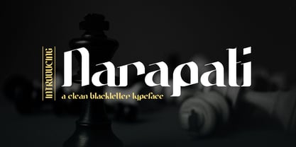 Introducing, Narapati is a clean Blackletter Typeface for your Design Narapati is a clean Blackletter Typeface for your Design that is fit for your next creative project such as logos, product packaging, Logotype, Letterhead, Poster, Apparel Design, Label, and etc. This Narapati Typeface includes also support a Multilingual Characters.
 - Yariko by Mevstory Studio,
$35.00 Yariko is a typeface that has a modern, bold, clean, simple, and futuristic look. The basic shape of this typeface is like two rectangles arranged side by side with simple, unique joints and accents. Perfect for logo, brand and apparel projects. Airforced Typeface Include : Letters Alternates Numeral Multilingual Support
 - Ladoni by Diogo Pisoeiro,
$15.00 This typeface is inspired on Bodoni, but this is like his gross sister, because it has angles instead of curves. Is a typeface with personality, strong and robust but at the same time sweet with his italics. This typeface has 5 weights, regular, italic, bold, poster and poster italic.
 - Old Dreadful No. 7 by Bitstream,
$29.99Old Dreadful No. 7 is truly a unique typeface design. Bitstream’s designers and other employees all contributed individual letterforms to the character set. This typeface is definitely not recommended for long blocks of texts! David Robbins expanded his contribution of the capital I into a complete typeface, Eyeballs. - VTC Krinkle-Kut - Unknown license

- VTC Krinkle-Kut - Unknown license

- VTC Letterer Pro - Unknown license

- VTC Bad DataTrip - Unknown license

- VTC Bad DataTrip - Unknown license

- VTC Optika - Unknown license

- VTC Optika - Unknown license

- VTC SubwaySlam Caps - Unknown license

- Nettally by Twinletter,
$12.00 Nettally is a lovely signature font with a delicate and feminine vibe about it. This typeface gives off a sense of elegance, simplicity, and charm. Please feel free to use this typeface in your own project. This typeface was created with a refined natural touch of handwriting to produce parts and compositions that meet your demands. As a result, this typeface is ideal for crafts, children’s writing, adventure posters, and other similar applications.
 - Gmbh Sans by EchadType,
$9.99 GMBH SANS The architectural sans-serif in sharp junctions silhouette. Designed as a display typeface for headline sizes. Typeface maintains it's unique identity even in all lowercase letters due to 21 degrees slanted stems (vertical strokes of letters). Variable typefaces provides subtle gradation of 6 weights. Each weight retains the same character width (except character i and l). Typeface supports: Latin characters with diacritical marks; Cyrillic characters (Ukrainian, Russian); Hebrew; Contains additional monetary symbols (₿Ξ₴₹₪)
 - Pinatas Masters by Piñata,
$17.00 Original Foundry: TypeType Original name: TT Masters Pinatas Masters is a very emotional typeface. This typeface will add to your design sincerity and warmth. Pinatas Masters typeface consist of 4 different subfamilies: Pinatas Masters, Pinatas Masters Birds, Pinatas Masters Rough and Pinatas Masters Condensed. Each subfamily consists of 5 styles: Thin, Light, Regular, Bold and Black. Scope of typeface: DIY, handmade stuff, interior design, infographics, graphic design, logotypes, packaging, design of exhibitions, presentations.
 - Destine by Ef Studio,
$15.00 Destine is a modern display typeface that has high contrast and hairline serif. The typeface inspired by Didot and Bodoni. Destine typeface has opentype features like stylistic ligatures and stylistic alternate to beautify any design project. This typeface is compatible for branding, logo, book magazine, headline, wedding invitation, and so on. You will get : Destine Regular font with full set of lowercase and uppercase letters, numerals and punctuation, multilingual characters, ligatures & alternates.
 - SchmalfetteGotisch - 100% free

- SK Pangramma by Shriftovik,
$48.00 SK Pangramma is a modern universal geometric typeface. For greater universality, it was developed in two stylistic variations: sans serif and slab serif. The uniqueness of the typeface is supported by stylistic alternatives that give the character set the spirit of modern typeface design. The SK Pangramma typeface is named this way because it supports more than 200 languages, including the Extended Latin Alphabet, Cyrillic, and even Greek. Thanks to a wide range of characters, alternatives, and two stylistic variations, the typeface is great for design projects of any complexity, no matter whether it is printed products or web design.
 - SK Rohkea by Shriftovik,
$48.00 SK Rohkea is a modular display typeface that combines strict geometry and smoothness of lines. The main features of the typeface are the constant inclination of the oval and the elongation of forms. They give the typeface a unique character, especially when it is used in large inscriptions and headings. The SK Rohkea typeface has capital and lowercase letters that support the extended Latin and Cyrillic set and even icons! Thanks to the combination of modernity and refinement, the typeface is great for the widest range of design tasks, no matter whether it is printing or web design.
 - First Prize by Letterhead Studio-VG,
$45.00 First Prize typeface has simple shapes. It is a narrow, heavy sans serif typeface with geometrical logic and quite predictable constructions of characters. The idea behind it was to combine constructed structure of the skeleton and some calligraphic ideas, swashes and cursiveness. At the moment First Prize typeface consists of three narrow styles: bold, upright italic and italic. Cursive weights have beautiful ending swashes and initials. There are few alternative shapes for A&N. As a Display typeface First Prize will work very well with any other typefaces for the good of any project in print or online.
 - POLIGRA by Borutta Group,
$39.00 POLIGRA is an experimental typefamily and a homage to traditional printing of the pre-war era in Poland. Most of the typefaces based on traditional printing are either clean, geometric typefaces or completely distressed lettering. The POLIGRA project explored everything in between. The letters, cleaned up, redesigned where necessary, and defined in their entirety, have a friendly and warm character, as if taken out of the press. The selection of typefaces was based on theater and sports posters. All of them have blocky and geometric character, each of them is an all-caps typeface. The POLIGRA family includes 13 typefaces.
 - ITC Honda by ITC,
$29.99This simplified blackletter typeface shares some geometric characteristics with a line of typefaces popular that were especially popular in Germany during the 1920s and 30s. Their forms may have originally come about after a desire to mix the classical Fraktur" forms found in typefaces like Linotype Luthersche Fraktur or Fette Fraktur with more modern sans serif typefaces, like Basic Commercial or Futura. ITC Honda's letters are rather narrow and angular. The type can be used for a number of headlines or logo purposes, and is best legible when set large. A similar typeface in our library is Linotype Gotharda." - Ghosthey by Alit Design,
$14.00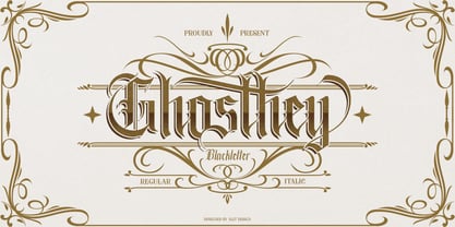 ✒️Ghosthey Typeface✒️is a font inspired by the Blackletter typeface, made with a modern impression but still looks strong and unique. Supported by alternative options such as swash, ligature and alternative characters, making The Ghosthey Typeface Blackletter very easy to create designs with strong or dark themes. In addition, The Ghosthey Typeface Blackletter is also supported with multilingual characters that can be used in several international languages. The Ghosthey Typeface is very suitable for use in making music album cover designs, tattoo logos, wishkey labels, packaging pomades and so on which are made with dark and strong concepts.
 - SK Phlegmatica by Shriftovik,
$10.00 SK Phlegmatica™ is a heavy geometrical grotesque with an industrial spirit. The typeface is built on a contrast between thin and wide lines. Such contrast creates certain frames, which in turn give room for experiments with the rhythm of symbols. The monumental shape of the typeface with the rhythmic contrast of the characters creates a unique pattern in the text line. In addition to the visual advantages, the typeface has technological advantages. SK Phlegmatica is a monospaced multilingual typeface that supports more than 100 Latin and Cyrillic languages. The typeface is great for highlighting titles, working with posters, and web design.
 - Remboland by Alit Design,
$18.00 ✒️Remboland Typeface✒️is a font inspired by the Blackletter typeface, made with a modern impression but still looks strong and unique. Supported by alternative options such as swash, ligature and alternative characters, making The Remboland Typeface Blackletter very easy to create designs with strong or dark themes. In addition, The Remboland Typeface Blackletter is also supported with multilingual characters that can be used in several international languages. The Remboland Typeface is very suitable for use in making music album cover designs, tattoo logos, wishkey labels, packaging pomades and so on which are made with dark and strong concepts.
 - Wood Sans by TypoGraphicDesign,
$19.00 The typeface Wood Sans is designed from 2021 for the font foundry Typo Graphic Design by Manuel Viergutz. The display typeface is a digital version of original wood letters from a german flea market find. 8 font-styles (Clean, Clean Invest, Clean Mix, Rough, Rough Misprint, Rough Alt, Rough Dark & Icons) with 450 glyphs (Adobe Latin 2) incl. 100+ decorative extras like icons, arrows, German Capital Sharp S, dingbats, emojis, symbols, geometric shapes, catchwords, decorative ligatures (type the word #LOVE for ♥︎or #SMILE for ☺ as OpenType-Feature dlig) and stylistic alternates (3 stylistic sets). For use in logos, magazines, posters, advertisement plus as webfont for decorative headlines. The font works best for display size. Have fun with this font & use the DEMO-FONT (with reduced glyph-set) FOR FREE! ■ Font Name: Wood Sans ■ Font Styles: 8 font-styles (Clean, Clean Invert, Clean Mix, Rough, Rough Misprint, Rough Alt, Rough Dark & Icons) + DEMO (with reduced glyph-set) ■ Font Category: Display for headline size ■ Font Format:.off (for Print) + .woff (for Web) ■ Glyph Set: 450 glyphs (Latin 2 incl. decorative extras like icons) ■ Language Support: 69 languages: Afrikaans, Albanian, Asu, Basque, Bemba, Bena ,Breton ,Catalan ,Chiga ,Cornish ,Danish ,Dutch ,English ,Estonian ,Faroese ,Filipino ,Finnish ,French ,Friulian ,Galician ,German ,Gusii ,Indonesian ,Irish ,Italian ,Kabuverdianu ,Kalenjin ,Kinyarwanda ,Luo ,Luxembourgish ,Luyia ,Machame ,Makhuwa-Meetto ,Makonde ,Malagasy ,Manx ,Morisyen ,North Ndebele ,Norwegian Bokmål ,Norwegian Nynorsk ,Nyankole ,Oromo ,Portuguese ,Quechua ,Romansh ,Rombo ,Rundi ,Rwa ,Samburu ,Sango ,Sangu ,Scottish Gaelic ,Sena ,Shambala ,Shona ,Soga ,Somali ,Spanish ,Swahili ,Swedish ,Swiss German ,Taita ,Teso ,Uzbek (Latin) ,Volapük ,Vunjo ,Welsh ,Western Frisian ,Zulu ■ Design Date: 2021 ■ Type Designer: Manuel Viergutz
 - Romans Lovers by Alit Design,
$12.00 Introducing Roman Lover Elegant typeface + Bonus Boho Illustrations The Roman Lover Serif typeface is an elegantly themed font that has a dynamic serif style. The details of the shape of the "Roman Lover Serif Elegant typeface" are very smooth and flow to create unique and beautiful curves. Elegant Serif typefaces such as “Roman Lover Serif Elegant typeface” are very easy to apply to any design, especially those with an elegant and smooth concept, besides that this font is very easy to use both in design and non-design programs because everything changes and glyphs are supported by Unicode (PUA). The Roman Lover Serif Elegant typeface contains 573 glyphs with many unique and interesting alternative options. Plus, there's a cool serif font family for header and description text from Thin to Heavy. In the poster preview all the letters are in the Roman Lover Serif Elegant typeface.
 - Enoway by Valentino Vergan,
$17.00 Enoway is a modern elegant typeface, which leans towards the Neue Nouveau style. The Enoway typeface was inspired by the early the Art Nouveau typographic designs, which was characterized by decorative designs and embellished stroke endings. The Enoway typeface has a high-contrast and a thin hairline, this gives the typeface a modern but nostalgic look. The Enoway typeface comes in two styles, Regular and Oblique. The Enoway typeface can be paired with a minimal sans serif or light script font, this combination will give your next project a modern and unique look. The Enoway typeface is very versatile and can cover a wide range of project such as: fashion branding, mastheads, magazines, feminine logos, facebook banners, wedding invitations, Instagram posts, websites, blog posts, pull quotes, editorials, product packaging, trendy social media posts, advertisements and much more. If you are looking for something modern and nostalgic for you next project, Enoway is the font for you. ENOWAY INCLUDES A FULL SET OF: Uppercase and lowercase letters. Numbers. Punctuation. Ligatures. Alternate characters. Multilingual symbols. We hope you enjoy using the Enoway typeface.
 - Parisine Std by Typofonderie,
$59.00 Ultra legible forceful sanserif in 32 fonts Parisine was born as official parisian métro signage typeface. This family of typefaces has become over years one of the symbols of Paris the Johnston for the London Underground or the Helvetica for the New York Subway. The Parisine was created to accompany travelers in their daily use: ultra-readable, friendly, human while the context is a priori hostile. Meanwhile, Parisine is now a workhorse and economical sanserif font family, highly legible, who can be considered as a more human alternative to the industrial-mechanical Din typeface family. More human, but not fancy: No strange “swashy” f, or cursive v, w etc. on the italics, to keep certain expected regularity, important for information design, signages, and any subjects where legibility, sobriety came first. Born as signage typeface family, the various widths and weights permit a wider range of applications. In editorial projects, the Compress version will enhances your headlines, banners, allowing ultra large settings on pages. The Narrow version will be useful as direct compagnon mixed to standard width version when the space is limited. The various Parisine typeface subfamilies Parisine is organised in various widths and subsets, from the original family Parisine, Parisine Gris featuring lighter versions of the usual weights and italics, Parisine Clair featuring extra light styles, to Parisine Sombre with his darker and extremly black weights as we can seen in Frutiger Black or Antique Olive Nord. Many years of adjustments were necessary to refine this complex family. Initially, Parisine was designed by Jean François Porchez in 1996 for Ratp to solely fulfil the unique needs of signage legibility. Parisine remain the official corporate typeface of the public transport in Paris, the worldwide capital for tourism, and now integral part of the French touch. Directly related, Parisine Office was initially created for Ratp’s internal and external communication, Parisine Office is available at Typofonderie too. Not connected with Ratp and public transports, Parisine Plus was created as an informal version of Parisine. Parisine: Introducing narrow and compressed families About Parisine Parisine helps Parisians catch the right bus Observateur du design star of 2007
 - Missale Incana by astype,
$38.00 Missale Incana is a redesigned, new interpretation of a typeface from Herbert Thannhaeuser. Its a strong calligraphic roman typeface, well suited for headlines. OpenType features:
 - Mono Condensed by ParaType,
$30.00The typeface was designed at ParaType (ParaGraph) in 1990 by Alexander Tarbeev based on Pragmatica typeface, 1989 by Vladimir Yefimov. A monospaced condensed sans serif. - Aeroport by Brownfox,
$45.00 Aeroport is a new typeface in the spirit of both German geometric sans serifs and Swiss neogrotesques. Its deliberately wide proportions and relatively short capitals account for the excellent way the type carries the line. Its short ascenders and descenders allow for very tight leading. When used in large point sizes, Aeroport reveals its industrial ancestry and its unconventional design: the somewhat unbalanced top of the lowercase a, the capital B that has deliberately not been compensated optically, the overly wide capital M. In smaller sizes the type creates a starkly different effect: its measured widths and low contrast make a text setting appear neutral and homogenous. This versatility is what makes Aeroport a multipurpose sans serif suitable for a wide variety of typographic applications. The family includes four weights with their italics and a monospased style. Character set includes an alternate lowercase a, two sets of figures and currency symbols, uppercase punctuation, and a set of arrows. Includes Latin and Cyrillic sets supporting over forty languages. Designed by Gayaneh Bagdasaryan & Vyacheslav Kirilenko, 2017.
 - Zin Slab by CarnokyType,
$46.00 Zin Slab is a contemporary slab-serif typeface designed for various situations of typographic usage. Characteristic feature is a large x-height and balans between neutral construction of letters (strictly vertical axis) and dynamic open forms (opened terminals). Another typical feature is a visually narrower connection between stems and strokes. The complete font family consist of three width proportions (Normal, Condensed and Extended). Every sub-family has 5 weights, ranging from Light to Black with matching Italics. Each font includes small capitals, old-style and tabular figures, standard and discretionary ligatures, alternate glyphs and a many of typographic options applied by the Opentype features. Zin Slab can be effectively used for both text and display typesetting. It can be used especialy in magazine layouts and editorial design, as well in advertising typography, orientation systems, corporate identities and many other situations. Zin Slab is a member of the Zin super family, which also includes Zin Sans, Zin Serif and Zin Display fonts. You can try Demo styles in Medium weight fully for free.


