10,000 search results
(0.043 seconds)
- Spinosa BT by Bitstream,
$50.99Stephen Chick, of In Your Typeface Productions (IYTP) foundry, has created this rather prickly type design. Although for display, it is surprisingly legible at smaller point sizes. There is an Inline version, and also an Inline Extra version, which has only the inner contours of the Inline itself, which can be combined with the Regular to create cool two-color effects. The extended glyph set supports Central Europe. - Messner by Juraj Chrastina,
$29.00 Hairline fonts are very clean, shining, elegant and even luxurious. They look great in fashion magazines, in the expansive world of beauty and glory. Messner is an extra-light all-caps face, especially suitable for larger sizes. Simplicity, purity and readability of its classic forms were on the first place in the creation process. Messner was a resource for designing the Kammerlander family and their combination looks very natural.
 - Earmark NF by Nick's Fonts,
$10.00This extra stout slab serif derives its inspiration from two Vincent Pacella designs: Pacella Barrel and Pacella Colossus. Essentially it’s an all-caps font, but there are biform variants of a, e, m, n and u, so you can mix things up to create more interesting headlines. This font contains the complete Latin language character set (Unicode 1252) plus support for Central European (Unicode 1250) languages as well. - Black Finger by Rochart,
$10.00 Black Finger is a allcaps hand brushed font, with natural authentic brush, and also provided some alternate, ligatures and Swashes Extra. Brand new stylish textured fonts and Make it easy for made logotype Handlettering Style. It will be great for Logotypes, Posters, Digital Lettering Arts, Clean Design, Branding Design, Sign, Merchandise and Social Media Posts. This font contain of Uppercase, Lowercase, Number, Symbol, Punctuation, also support multilingual and already PUA encoded.
 - Conquera by Device,
$39.00 Conquera is an extended caps-only font in five weights plus an inline. It is refined and masculine without being heavy-handed - the angled stokes and pointed vertices lend it a stylish, upmarket Moderne poise. Suitable for man's grooming products, supercar showroom brochures, high-end developments, space vehicles and home technology. Letterspacing at small sizes adds extra sophistication. Includes an alternative A with a triangular crossbar and full international character set.
 - Deliver by PizzaDude.dk,
$20.00 I am here to deliver! I used a semi dry brush for this font, and when views at large sizes you can really enjoy the brush traces. The font keeps the authentic feeling of something hastily written with a brush. Along with he very tight spacing and kerning, it does it job! Quite good for headlines that needs that extra punk, or T-shirts design, posters, Instagram photos or interactive designs!
 - Allura by TypeSETit,
$24.95 The casual characters of Allura Regular are simple and clean and very legible, with an almost handwritten calligraphic appeal. The script and formal sets offer a softer, more formal look. This exceptionally diverse font was designed with advertising, display and package design in mind. The OpenType Pro version of Allura combines all three styles along with extra alternate glyphs and flourished graphics to give the professional designer maximum flexibility.
 - Rivalries by Epiclinez,
$18.00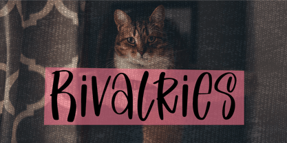 Rivalries is a font for anyone who wants to use a font that's endearing, cute, and friendly. It's the perfect font for children's products, quotes, or any time you need that little extra happiness. So what’s included : Basic Latin Uppercase and Lowercase Numbers, symbols, and punctuations Multilingual Support. Accented Characters : ÀÁÂÃÄÅÆÇÈÉÊËÌÍÎÏÑÒÓÔÕÖØŒŠÙÚÛÜŸÝŽàáâãäåæçèéêëìíîïñòóôõöøœšùúûüýÿžß PUA Encoded and fully accessible without additional design software Simple Installations works on PC & Mac Thank You!
 - Berkah Raya Arabic by Nirmana Visual,
$39.00 Introducing Berkah Raya Arabic our stunning Arabic style font, crafted to add an extra level of sophistication and cultural depth to your designs. Our Arabic style font features a harmonious balance of curves and angles, creating a sense of flow and rhythm that perfectly captures the beauty of Arabic calligraphy. beautiful typographic harmony for a diversity of design projects, including logos & branding, social media posts, advertisements & product designs.
 - Saltstar by Grontype,
$16.00 Saltstar is an modern elegant san serif font, created with care. The font is rounded point and unique shapes. It come with extra ligatures and alternative. This font is specially created for your branding need such as invitational card, flyer font, magazine heading layout and any other project. Saltstar Features: Uppercase Characters Lowercase Characters Numerals, Punctuation, Currency etc Multilingual Support Thankyou for choosing this font, Happy creating Regard, Grontype
 - Quebra Condensed by Vanarchiv,
$55.00 Quebra Cond is an extend display sans-serif font family, available with four widths (Extra Condensed, Condensed, Normal and Expanded) and ten weights, italics versions are available. The main strokes contain small breaks simulating modulated variations on the letterforms, these details are more present on large body sizes. All font versions contain Latin and Cyrillic encoding characters and also ligatures, case-sensitive forms, fractions, oldstyle and finally tabular figures.
 - Bonema by Typebae,
$15.00 Bonema is a retro-style font that encapsulates the spirit of the psychedelic era. The letters are decorated with elaborate, sparkling patterns that give off a surreal, free-spirited vibe. The fascinating and intriguing personality of the typeface will undoubtedly transport viewers to another time and place. Features: Full Set of standard alphabet and punctuation PUA Encoded - no special software is needed to access extra characters Multilingual Character
 - Riborn by Garisman Studio,
$15.00 Rebirth begins with light streaks that form a vintage style with a touch of rough and stamp. Riborn with 4 fonts in number, as "ribs" in your design work, and able to beautify also strengthen your work in the form of type logos, typography, hand-lettering, packaging, t-shirts, labels, and much more. This family also equipped with an extras weight, which includes beautiful ornaments in a classic and minimalist impression.
 - Alpharain by Supfonts,
$18.00 Alpharain is a modern and at the same time absolutely incredible Serif with reverse contrast. A bright font will give the mood to your project Thanks so much for checking out my shop, and please get in touch if you have any questions! Alpharain Font Features: - Full Set of standard alphabet and punctuation - Handwritten ligatures - PUA Encoded - no special software needed to access extra characters - Multilingual Characters AÁĂÂÄÀĀĄÅÃÆBCĆČÇĊDÐĎĐEÉĚÊËĖÈĒĘẼFGĞĢĠḠHĦIIJÍÎÏİÌĪĮĨJKĶLĹĽĻŁMNŃŇŅÑ OÓÔÖÒŐŌØÕŒPÞQRŔŘŖSŚŠŞȘẞTŤŢȚUÚÛÜÙŰŪŲŮŨVWẂŴẄẀXYÝŶŸỲỸZŹŽŻ aáăâäàāąåãæbcćčçċdðďđeéěêëėèēęẽfgğģġḡhħiıíîïìijīįĩjȷkķlĺľļłmnńňņñoóôöòőōøõœpþ qrŕřŗsśšşșßtťţțuúûüùűūųůũvwẃŵẅẁxyýŷÿỳỹzźžż
 - Spire by GroupType,
$19.00 Originally designed by Sol Hess for the Lanston Monotype Foundry in 1938, this revival was designed by Ann Pomeroy in the early 90s. Spire is a condensed serif with a very 1930s retro look. PLEASE NOTE: Each Spire font (Regular, Extra Light and Monoline) include a companion Expert font in the download. The Experts feature several alternate glyphs. The Family includes three Styles and three Expert styles. 6 fonts all together.
 - PODIUM Soft by Borutta Group,
$39.00 PODIUM Soft is variations of PODIUM Sharp typeface designed in 2019. Family consist of 13 styles from ultra compressed to extra expanded. Main purpose of this project was idea to make hybrid between different modular and geometric woodtypes that I found in old polish specimens: Rex, Blok, Bacarat etc. Thanks to big range of different styles, PODIUM will be perfect choice for visual identities, posters and display usage.
 - PuffiClaude BT by Bitstream,
$50.99PuffiClaude by Matt Desmond is a real piece of work. Great for funky display stuff, its got some jive junk hanging around every character. This OpenType font has many goodies including extra ligatures, superiors and inferiors, unlimited fractions, and a hip little smiley face. Hey, maybe it's a portrait of Claude! There are so many funky glyphs that it even supports Central European languages. Man, that's hip! Hook up. - Queen Elena by Beary,
$8.00 Introducing the elegant new Queen Elena Font! For those of you who are needing a touch of elegance and modernity for your designs, this font was created for you! Queel Elena has the added bonus of having 'multiple personalities'! It has 2 sets of extra alternate lowercase letters, which allow you to create different feels for different projects. Features: - Uppercase Lowercase - Number & Symbol - Alternates for each characters - Multilingual Happy Creating!
 - Saitama by Khurasan,
$9.00 Saitama is a new calligraphy handwritten typeface, elegant and vintage feel character set. Saitama includes a full set capital and lowercase letters, as well as multi-lingual support, currency figures, numerals, punctuation & some extra glyphs. Thank you for checking and i hope you enjoy it. Always put your heart into it and don’t worry to try. I hope you have as much fun using it as i did making it. Khurasan
 - Neptunian by Aiyari,
$16.00 Introducing a new casual handwriting typeface called Neptunian. Inspired by quick dry brush strokes combined with the spirit of sea, sun and summer vibes. The typeface is ideal for logos, quotes, invitations, signage, posters, websites, greeting cards, packaging, headers, printed quotes, cover albums, etc. Neptunian comes with open type features such as stylistic alternates, stylistic sets, & ligatures. To help you make stunning design, Neptunian also comes with extras swash.
 - Black Borough by sizimon,
$25.00 Black Borough is brush font, hand-painted with extra attention to quick-strokes and dry textures. Very cool for logos, name tag, handwritten quotes, product packaging, merchandise, social media & greeting cards. And very easy to make design t-shirts and other products. Very save time in making the design of a product. It contains a full set of lower & uppercase letters, a large range of punctuation, numerals, and multilingual support.
 - Rogue Style by Sensatype Studio,
$15.00 An Retro Vintage Classy Serif font that we created special for elegant branding needs, with extra alternates in unique shape will be ready to add value of your brand. Rogue Retro Vintage Classy Serif ready with: Any options to get creative variations (combination of Alternate characters) Preview as a inspirations that you can do with Rogue font Ready with Lowercase and Uppercase characters Wish you enjoy our font. :)
 - Callge Style by Sensatype Studio,
$15.00 An Unique Modern Display Font that we created special for Elegant and Classy branding needs, with extra characters alternate in unique shape will be ready to add value of your brand. Callge Display Ligature Sans Serif ready with: Any options to get creative variations (combination of Any Alternates) Preview as a inspirations that you can do with Callge font Ready with Lowercase and Uppercase characters Wish you enjoy our font. :)
 - Sincerely Yourz by Outside the Line,
$19.00 Sincerely Yourz is another font in the Love Letters series from Outside the Line. It is a hand-printed font with extra letter spacing. All the letters have about the same height. All vowels are lower case whether they are caps or not. This font has a fresh contemporary hand-lettered look. While it can be used as a headline font it is really designed for body copy.
 - Graffick by Graffiti Fonts,
$12.99 Graffick is a mechanical style created by merging a little traditional type design & typography with a little basic graffiti lettering theory. Extra ascenders and descenders have been added to many of the capital letters to add a more varied & specialized appearance. This layered type system provides for the easy creation of outline/fill effects with regular, italic, wide and outline styles as well as baseline & caps-height alignment options.
 - BOXDON Titling by TYDTYP,
$15.00 BOXDON is an extra heavy expanded typeface which was especially designed for VERTICAL layout. Each shape looks like a box and has minimum graphical treatment to distinguish each character. It means that the counter space is not enough to use this typeface for small font sizes, however, for titles this typeface should give incredible effects. I highly recommend using it with software that is compatible with vertical layout. (e.g. Adobe illustrator)
 - Quebra Expa by Vanarchiv,
$55.00 Quebra Expa (Expanded) is an extend display sans-serif font family, available with four widths (Extra Condensed, Condensed, Normal and Expanded) and ten weights, italics versions are available. The main strokes contain small breaks simulating modulated variations on the letterforms, these details are more present on large body sizes. All font versions contain Latin and Cyrillic encoding characters and also ligatures, case-sensitive forms, fractions, oldstyle and finally tabular figures.
 - Quintus by JOEBOB graphics,
$22.00 This font is an adaptation of the typeface I designed for TJX Europe, which was used in their branding campaigns for the TK MAXX stores all over Europe. Most characters were given a major facelift and also a few extra ligatures were added in the process. Quintus comes with a regular and a bold version so it offers more variety in use. It also works well in all caps.
 - Malihah by Abo Daniel,
$11.00 introducing MALIHAH - Lettering Font Pack- MALIHAH is great for lettering, quotes, wedding card, logo, t-shirt designs, mugs, interior ornaments, tote bag designs, cards, banners, social media, and anything about craft projects. It came with 4 different fonts with extra doodle font. Features: - Uppercase - Lowercase - Numeral - Multilingual - doodles - PUA encoded Let's create your own quote to be beauty lettering art. I hope you love it. regards, Abo Daniel Studio
 - Lumetry by Sensatype Studio,
$15.00 A Modern Classy Luxury Font that we created special for Luxury and Fashion branding needs, with extra characters alternate in unique shape will be ready to add value of your brand. Top Luxury Modern Classy Font ready with: Any options to get creative variations (combination of Any Alternates) Preview as a inspirations that you can do with Top Luxury font Ready with Lowercase and Uppercase characters Wish you enjoy our font. :)
 - Art Party by A New Machine,
$19.00 Art Party is a hand-drawn font suitable for headlines of all kinds when you want a handmade look. Prissy Pots owner Erin Solomon drew the playful letters, which include regular and bold versions. Each face also offers an entirely separate set of upper and lowercase letters accessible in your applications' glyphs palettes. With contextual alternates turned on, these extra letters show up automatically, yielding a more natural, random look.
 - Odell by The Organic Type,
$29.99 Odell is a fun, whimsical, yet elegant handwritten font that was created in a light-hearted manner for use in things like menus, invitations, bed and breakfast collateral and whatever else you can dream up. Odell features extra thin letters and it is designed to be creative, a little fancy, and very legible. There are tons of foreign characters to choose from so you can write in other languages as well.
 - Antique by Storm Type Foundry,
$26.00The concept of the Baroque Roman type face is something which is remote from us. Ungrateful theorists gave Baroque type faces the ill-sounding attribute "Transitional", as if the Baroque Roman type face wilfully diverted from the tradition and at the same time did not manage to mature. This "transition" was originally meant as an intermediate stage between the Aldine/Garamond Roman face of the Renaissance, and its modern counterpart, as represented by Bodoni or Didot. Otherwise there was also a "transition" from a slanted axis of the shadow to a perpendicular one. What a petty detail led to the pejorative designation of Baroque type faces! If a bookseller were to tell his customers that they are about to choose a book which is set in some sort of transitional type face, he would probably go bust. After all, a reader, for his money, would not put up with some typographical experimentation. He wants to read a book without losing his eyesight while doing so. Nevertheless, it was Baroque typography which gave the world the most legible type faces. In those days the craft of punch-cutting was gradually separating itself from that of book-printing, but also from publishing and bookselling. Previously all these activities could be performed by a single person. The punch-cutter, who at that time was already fully occupied with the production of letters, achieved better results than he would have achieved if his creative talents were to be diffused in a printing office or a bookseller's shop. Thus it was possible that for example the printer John Baskerville did not cut a single letter in his entire lifetime, for he used the services of the accomplished punch-cutter John Handy. It became the custom that one type founder supplied type to multiple printing offices, so that the same type faces appeared in various parts of the world. The type face was losing its national character. In the Renaissance period it is still quite easy to distinguish for example a French Roman type face from a Venetian one; in the Baroque period this could be achieved only with great difficulties. Imagination and variety of shapes, which so far have been reserved only to the fine arts, now come into play. Thanks to technological progress, book printers are now able to reproduce hairstrokes and imitate calligraphic type faces. Scripts and elaborate ornaments are no longer the privilege of copper-engravers. Also the appearance of the basic, body design is slowly undergoing a change. The Renaissance canonical stiffness is now replaced with colour and contrast. The page of the book is suddenly darker, its lay-out more varied and its lines more compact. For Baroque type designers made a simple, yet ingenious discovery - they enlarged the x-height and reduced the ascenders to the cap-height. The type face thus became seemingly larger, and hence more legible, but at the same time more economical in composition; the type area was increasing to the detriment of the margins. Paper was expensive, and the aim of all the publishers was, therefore, to sell as many ideas in as small a book block as possible. A narrowed, bold majuscule, designed for use on the title page, appeared for the first time in the Late Baroque period. Also the title page was laid out with the highest possible economy. It comprised as a rule the brief contents of the book and the address of the bookseller, i.e. roughly that which is now placed on the flaps and in the imprint lines. Bold upper-case letters in the first line dramatically give way to the more subtle italics, the third line is highlighted with vermilion; a few words set in lower-case letters are scattered in-between, and then vermilion appears again. Somewhere in the middle there is an ornament, a monogram or an engraving as a kind of climax of the drama, while at the foot of the title-page all this din is quietened by a line with the name of the printer and the year expressed in Roman numerals, set in 8-point body size. Every Baroque title-page could well pass muster as a striking poster. The pride of every book printer was the publication of a type specimen book - a typographical manual. Among these manuals the one published by Fournier stands out - also as regards the selection of the texts for the specimen type matter. It reveals the scope of knowledge and education of the master typographers of that period. The same Fournier established a system of typographical measurement which, revised by Didot, is still used today. Baskerville introduced the smoothing of paper by a hot steel roller, in order that he could print astonishingly sharp letters, etc. ... In other words - Baroque typography deserves anything else but the attribute "transitional". In the first half of the 18th century, besides persons whose names are prominent and well-known up to the present, as was Caslon, there were many type founders who did not manage to publish their manuals or forgot to become famous in some other way. They often imitated the type faces of their more experienced contemporaries, but many of them arrived at a quite strange, even weird originality, which ran completely outside the mainstream of typographical art. The prints from which we have drawn inspiration for these six digital designs come from Paris, Vienna and Prague, from the period around 1750. The transcription of letters in their intact form is our firm principle. Does it mean, therefore, that the task of the digital restorer is to copy meticulously the outline of the letter with all inadequacies of the particular imprint? No. The type face should not to evoke the rustic atmosphere of letterpress after printing, but to analyze the appearance of the punches before they are imprinted. It is also necessary to take account of the size of the type face and to avoid excessive enlargement or reduction. Let us keep in mind that every size requires its own design. The longer we work on the computer where a change in size is child's play, the more we are convinced that the appearance of a letter is tied to its proportions, and therefore, to a fixed size. We are also aware of the fact that the computer is a straightjacket of the type face and that the dictate of mathematical vectors effectively kills any hint of naturalness. That is why we strive to preserve in these six alphabets the numerous anomalies to which later no type designer ever returned due to their obvious eccentricity. Please accept this PostScript study as an attempt (possibly futile, possibly inspirational) to brush up the warm magic of Baroque prints. Hopefully it will give pleasure in today's modern type designer's nihilism. - As of my knowledge cut-off in early 2023, there isn't a widely recognized font specifically named "Chilluns." However, allowing for the playful and laid-back connotation of the name—evocative of "chi...
- Bubbleboy is a charming, lively font that seems to burst with cheerful energy and playful charm, evoking the whimsy of childhood bubble letters yet refined enough for both personal and professional p...
- TT Backwards by TypeType,
$29.00 TT Backwards useful links: Specimen | Graphic presentation | Customization options About TT Backwards: TT Backwards is an experimental font project inspired by the USSR typography and fonts of the late 70s and early 80s. Shop signs, posters, and book design—this is where we drew the inspiration for our project. TT Backwards consists of two complementary font subfamilies, a Script and a Grotesque, each of them includes 5 typefaces in 5 different weights (Thin, Light, Regular, Bold, Black). TT Backwards Script is a noncontrast almost monolinear solid script inspired by shop signs, poster and book design of the USSR. TT Backwards Script features a large number of Latin and Cyrillic ligatures (more than 70 items), which allows to make the script versatile and sophisticated to the max. And thanks to the implementation of a huge number of context alternates, all lowercase letters are joined softly and without breaks, and they meet the uppercase letters beautifully and correctly. TT Backwards Script supports the following OpenType features: liga, case, ordn, frac, sups, sinf, numr, dnom, tnum, onum, pnum. TT Backwards Sans is a narrow grotesque, which takes us back to the book design of late 70s and early 80s with its ductile characters. It is created considering its use in the small text size. TT Backwards Sans has a number of pronounced peculiarities: high x-height, exaggerated extenders, and big visual compensators and ink traps. Apart from the basic visual solution, TT Backwards Sans contains two experimental stylistic sets, which markedly change the overall visual perception of the text. SS01 alters high-frequency symbols of the Cyrillic alphabet, and SS02 significantly changes the high-frequency symbols of the Latin alphabet. FOLLOW US: Instagram | Facebook | Website TT Backwards OpenType features: case, ordn, frac, sups, sinf, numr, dnom, tnum, pnum, liga, zero, salt, ss01, ss02. TT Backwards language support: Acehnese, Afar, Albanian, Alsatian, Aragonese, Arumanian, Asu, Aymara, Banjar, Basque, Belarusian (cyr), Bemba, Bena, Betawi, Bislama, Boholano, Bosnian (cyr), Bosnian (lat), Breton, Bulgarian (cyr), Cebuano, Chamorro, Chiga, Colognian, Cornish, Corsican, Cree, Croatian, Czech, Danish, Embu, English, Erzya, Estonian, Faroese, Fijian, Filipino, Finnish, French, Friulian, Gaelic, Gagauz (lat), Galician, German, Gusii, Haitian Creole, Hawaiian, Hiri Motu, Hungarian, Icelandic, Ilocano, Indonesian, Innu-aimun, Interlingua, Irish, Italian, Javanese, Judaeo-Spanish, Judaeo-Spanish, Kalenjin, Karachay-Balkar (lat), Karaim (lat), Karakalpak (lat), Kashubian, Khasi, Khvarshi, Kinyarwanda, Kirundi, Kongo, Kumyk, Kurdish (lat), Ladin, Latvian, Laz, Leonese, Lithuanian, Luganda, Luo, Luxembourgish, Luyia, Macedonian, Machame, Makhuwa-Meetto, Makonde, Malay, Manx, Maori, Mauritian Creole, Minangkabau, Moldavian (lat), Montenegrin (lat), Mordvin-moksha, Morisyen, Nahuatl, Nauruan, Ndebele, Nias, Nogai, Norwegian, Nyankole, Occitan, Oromo, Palauan, Polish, Portuguese, Quechua, Rheto-Romance, Rohingya, Romanian, Romansh, Rombo, Rundi, Russian, Rusyn, Rwa, Salar, Samburu, Samoan, Sango, Sangu, Scots, Sena, Serbian (cyr), Serbian (lat), Seychellois Creole, Shambala, Shona, Slovak, Slovenian, Soga, Somali, Sorbian, Sotho, Spanish, Sundanese, Swahili, Swazi, Swedish, Swiss German, Swiss German, Tagalog, Tahitian, Taita, Tatar, Tetum, Tok Pisin, Tongan, Tsonga, Tswana, Turkish, Turkmen (lat), Ukrainian, Uyghur, Vepsian, Volapük, Võro, Vunjo, Xhosa, Zaza, Zulu.
 - Ollie by Eclectotype,
$40.00 Meet Ollie, a casual signage script whose friendly, bouncy exterior belies a heart of sophisticated OpenType programming. This font is designed to make the most of OpenType savvy applications, and as such is recommended for professional design use. Or to put it another way: Make sure that contextual alternates and ligatures are always turned on! Ollie includes about 900 glyphs, many of which are automagical substitutions to keep the text flowing smoothly, and to pseudo-randomly pick different glyphs to avoid repetition. With contextual alternates turned on (as they should be by default), most lowercase letters will alternate between at least two different forms. The powerful OpenType programming makes the font itself ‘look back’ (up to eight characters) on previously used letters; typing “banana” will give you three different a’s and two different n’s (the last a is a special ‘end form’ character). The calt feature controls many other ‘special effects’ which all add together to give a smooth-flowing, hand-lettered look. These effects include start and end forms (and indeed, ‘loner’ forms) of many letters, which are automatically substituted in at beginnings or ends of words, or when the previous or next letter doesn't connect. Another special feature tests to see if there is room for the crossbar of t (or tt ligature) to extend further over the previous or next letter, or both, as is often the case. The last main effect of the calt feature is to substitute certain letters typed before any ‘e’ character, to make for a more natural connection (see the pe combination in ‘Eclectotype’ in the first poster). Ligatures should be on by default, for a much nicer looking tt combination, and a few others besides. The swash feature should be used sparingly (one glyph at a time, really) to apply a more extravagant look to g,j and y in the lower case, and quite a few of the upper case too. Oldstyle figures are included, as well as the lining defaults. Now to delve into the stylistic alternates... These are all included in the salt feature, or for uses of applications that support them, separated into stylistic sets thus: ss01 - (with swash feature on) L and G swashes get even swashier. ss02 - standard s changes to a connected script s form. ss03 - r takes on a script form. ss04 - z also gets a scriptier look. [the previous three sets also change any versions of s, r or z with diacritics] ss05 - a useful underline function. When enabled, typing two or more underscores will extend a cool underline under the previous letters. More underscores = longer underline. ss06 - the Polish script lslash changes to its more standard form. ss07 - E, S and B change to a more top-heavy alternate form. ss08 - An alternate form for A characters. ss09 - Alterative rounder forms of M and N. ss10 - An alternate ampersand. That about wraps up the features. Now all that’s left is for you to license the font and get experimenting!
 - Hushy by Fargun Studio,
$16.00 Hushy is a Rounded Bold and modern display typeface featuring characters that stand out from every background. It has multilingual language, it useful for your a cool and coolest project up next. Suitable for logos, posters, packaging, branding, cool invitations, etc.
 - The Heista Killer by Almarkha Type,
$29.00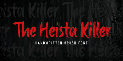 The Heista Killer – Handwritten Brush font with a clear style and dramatic movement this font is great for your next creative project such as logos, printed quotes, invitations, cards, product packaging, headers, Logotype, Letterhead, Poster, Apparel Design, Label, and etc.
 - Buttercell Script by Wacaksara co,
$16.00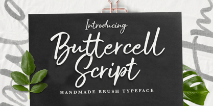 Buttercell Script is a hand brush script available in clean and rough edge versions. This font is great for your next creative project such as Logotype, printed quotes, invitations, cards, product packaging, headers, Letterhead, Poster, Apparel Design, Label, and etc.