10,000 search results
(0.038 seconds)
- Borough Pro by The Type Fetish,
$45.00 Inspired by a hand painted sign from Lanesboro, MN. Borough is an OpenType font that contains four variations of every character in its extended character set. Using Contextual Alternatives in OpenType savvy applications will allow the font to rotate through the variations to give a more random look to the text.
 - Bohemio by Wiescher Design,
$39.50 Bohemio was designed in memory of Gunter Böhmer, an artist famous for his many book covers of the 1950s in Germany. The cover I took as an inspiration for this font is that of a book called Stiller (by Max Frisch). Bohemio sounds similar to "Böhmer" (which means the one from Bohemia) and it is also an alliteration to artisty. I thought "Bohemio" to be a nice name for this very strong, almost expressionist design. Yours very artsy craftsy Gert Wiescher
 - Monk by 4RM Font,
$27.00 Monk font is made with an extra expanded style and combined with the value of beauty and authenticity so that it looks like it has a solid impression. suitable for use in graphic design such as logos, billboards, posters, and large graphic designs.
 - FS Sally by Fontsmith,
$80.00 Bookish A little bit bookish, but quietly elegant and well-proportioned, FS Sally is a graceful font family. It’s a refreshingly uncomplicated design that brings sophistication to text and display type, and a distinctive aplomb to both large and small volumes of text. Hidden talents There’s more to FS Sally than meets the eye. Choose Standard for the Latin alphabet or Pro if you work with Cyrillic and Greek typography. There’s a large range of special features, including elegant small caps and a set of discretionary ligatures to add a traditional flavour to figures and fraction sets. Rhythmic There’s a rhythm and flow to FS Sally – the result of the classic but asymmetric design of its serifed feet and shoulders. The inward curve of the serif at the shoulder and the outward curve at the foot subliminally guide the eye through each letterform, and the flicked feet of the “a”, “d” and “u” add an extra kick of energy to the rhythm. The italic forms have their own flow, too, with a pen-like fluency that retains the formal discipline required for a text type. Regular to heavy FS Sally’s five weights, all with italics, cover every kind of print application. The regular weight is elegant in display and an easy read in longer texts. A subtle step up from the regular is the medium, which was created to deliver a stronger colour and finish in poorer printing conditions. The semibold offers a strong alternative to the regular at smaller sizes, and its intermediate feel suits it to sub-headings, title pages and calmer designs. The bold works excellently in book and title headings, and FS Sally Heavy lends weight and punch to poster headlines and logotypes.
 - FS Sally Paneuropean by Fontsmith,
$90.00Bookish A little bit bookish, but quietly elegant and well-proportioned, FS Sally is a graceful font family. It’s a refreshingly uncomplicated design that brings sophistication to text and display type, and a distinctive aplomb to both large and small volumes of text. Hidden talents There’s more to FS Sally than meets the eye. Choose Standard for the Latin alphabet or Pro if you work with Cyrillic and Greek typography. There’s a large range of special features, including elegant small caps and a set of discretionary ligatures to add a traditional flavour to figures and fraction sets. Rhythmic There’s a rhythm and flow to FS Sally – the result of the classic but asymmetric design of its serifed feet and shoulders. The inward curve of the serif at the shoulder and the outward curve at the foot subliminally guide the eye through each letterform, and the flicked feet of the “a”, “d” and “u” add an extra kick of energy to the rhythm. The italic forms have their own flow, too, with a pen-like fluency that retains the formal discipline required for a text type. Regular to heavy FS Sally’s five weights, all with italics, cover every kind of print application. The regular weight is elegant in display and an easy read in longer texts. A subtle step up from the regular is the medium, which was created to deliver a stronger colour and finish in poorer printing conditions. The semibold offers a strong alternative to the regular at smaller sizes, and its intermediate feel suits it to sub-headings, title pages and calmer designs. The bold works excellently in book and title headings, and FS Sally Heavy lends weight and punch to poster headlines and logotypes. - Nexa Rust by Fontfabric,
$35.00 Nexa Rust from Fontfabric Type Foundry is a multifaceted font system consisting of font sub-families Sans, Slab, Script, Handmade and Extras. Each of these sub-families contains a number of font weights which have a characteristic warm, rough look and display a few degrees of saturation. Nexa Rust is a rough version of the already popular Nexa and Nexa Slab families with added new matching Nexa Script and Nexa Handmade fonts. Along with all of this, you will also discover added groups of extras which could serve as a foundation or add that extra “cherry on the cake” to each unique design.
 - Combinado by My Creative Land,
$20.00 Please welcome a new Combinado Font Family that has it all: elegant display sans serif and serif fonts in three weights each; a modern calligraphy script that looks beautiful next to them; a sans serif font designed specifically for the best on-screen reading experience, which comes in two weights (for now! more to come); and the last but not least - Design Elements font that has more than 70 elements to compliment your designs. This font family is very universal and you can use it everywhere: websites, instagram ads, magazines, books, cards and invitation designs, as well as in all possible personal design project that do not fit in any of the listed categories! Enjoy!
 - Maglift by suhadidesign,
$17.00 Maglift serif 200+ ligature collections Hi ladies and gentlemen! Due to the popularity of the market for modern fonts, I created a serif font that suits your needs. The Maglift font is a modern serif font with 200+ ligatures. is here to become a market favorite. We made this font look elegant, classy, easy to read, stylish, attractive and easy to use. Maglift Font is a great choice for magazine designs, newspapers, fashion, classy designs, newspapers, modern, books, brand names, branding and other projects. The Maglift font is here to enhance the quality of your designs. Follow us for the next classy font creation :) Feature: • Uppercase • Lowercase • Multilingual Support • Numbers and punctuation • 200+ Ligature collections
 - Sispectly Harmonies Italic by suhadidesign,
$15.00 Sispectly Harmonies classic and nostalgic serif Hi ladies and gentlemen! In accordance with market demand for classic retro design fonts, I created a serif font that suits your views. The Sispectly Harmonies font is a classic nostalgic serif font. is here to become a market favorite. We made this font look elegant, classy, easy to read, stylish, attractive and easy to use. Sispectly Harmonies Font is a great choice for retro designs, logos, magazines, classic, classy designs, newspapers, modern, books, brand names, branding, and other projects. The Sispectly Harmonies font is here to enhance the quality of your designs. Follow us for the next classy font creation :) Feature: • Uppercase • Lowercase • Regular version • Italicized version • Multilingual Support • Numbers and punctuation
 - Draetha by Hackberry Font Foundry,
$24.95 Draetha is the 6-font companion to Biblia and Biblia Serif. But it is definitely designed to be used with Biblia Serif for book design and production. It is a nearly monoline sans with a clean style which contrast beautifully with Biblia serif. The Black versions push monoline to the extreme of boldness. It has the same font metrics as Biblia and Biblia Serif. The only compromise is that Ultra is too extreme to be able to provide small caps or oldstyle figures. It is designed with text spacing, to work in text with Biblia and Biblia Serif. For heads and subheads, you will need to adjust the tracking. But it tracks well.
 - Persepolis by Si47ash Fonts,
$19.00 Childish but heavyweight! A rounded bubbly heavy font that was designed for texts related to kids and children. With its melted and soft forms, it brings delight and makes your letters to be pleasant to be read. Apadana font support Persian, Arabic and also Basic Latin. A joyful choice for all the designers and creatives. Shahab Siavash, the designer has done more than 30 fonts and got featured on Behance, Microsoft, McGill University research website, Hackernoon, Fontself, FontsInUse,... Astaneh text and headline font which is one of his latest designs, already got professional typographers, lay-out and book designers' attention as well as some of the most recognizable publications in Arabic/Persian communities.
 - Tzimmes by Dada Studio,
$29.00 Tzimmes is a tasty morsel for those who love tasty letters. The fleshy serifs combined with the subtle references to calligraphy create a distinctive character that will turn every text into a feast for the eyes. The family consists of 22 weights including true italics. This will allow you to freely compose even the most demanding projects. Book? Magazine? Logotype? Everything available à la carte! Light and bold weights, due to their strong personality, are perfect for display uses. At the same time, Regulars create a harmonious structure that provides good legibility in long texts. Tzimmes covers all latin languages and cyrillic. It contains a wide set of numerals, small capitals, fractions, ligatures and other OpenType goodies. Bon appetite!
 - FF More by FontFont,
$72.99 Polish type designer Lukasz Dziedzic created this serif FontFont in 2010. The family has 30 weights, ranging from Light to Black in Condensed, Normal and Wide (including italics) and is ideally suited for advertising and packaging, book text, editorial and publishing, logo, branding and creative industries as well as small text. FF More provides advanced typographical support with features such as ligatures, small capitals, alternate characters, case-sensitive forms, fractions, and super- and subscript characters. It comes with a complete range of figure set options – oldstyle and lining figures, each in tabular and proportional widths. As well as Latin-based languages, the typeface family also supports the Cyrillic writing system. In 2011, FF More received the CommArts award.
 - Zornale by Eurotypo,
$20.00 The "Zornale", is an original manuscript that contains a large amount of data, providing a daily record of the books acquired by the Venetian bookseller Francesco de Madiis, between 1481 and 1488. Zornale is a family of text fonts in five weights that can be combined with the variant Caption with short ascenders and descendants. The family is completed with true italics in two weights (light italics and italics) specially designed for use in reading texts. These fonts have been designed with precise kerning and full OpenType features: Small caps, old-style numbers, Swashes, stylistic and contextual alternates, ligatures and case-sensitive forms. Each font contains 549 glyphs for complete control and enhance typographic refinement.
 - FF Milo by FontFont,
$83.99 American type designer Michael Abbink created this sans FontFont between 2006 and 2008. The family has 9 weights, ranging from Thin to Black (including italics) and is ideally suited for advertising, packaging, book text, editorial, publishing, logo, branding, small text as well as wayfinding and signage. FF Milo provides advanced typographical support with features such as ligatures, small capitals, alternate characters, case-sensitive forms, fractions, and super- and subscript characters.It comes with a complete range of figure set options – oldstyle and lining figures, each in tabular and proportional widths. In 2011, FF Milo received the Letter.2 award. This FontFont is a member of the FF Milo super family, which also includes FF Milo Serif.
 - Bookseller Cp by Cyanotype,
$20.00 Bookseller Cp is a typeface designed for books and legible text at a smaller sizes, with an old book feeling. This typeface is the reinterpretation of a sample found in a French book, published between 1882 and 1893 and its author —Ernest Michel— lived between 1837 and 1896. This sample has influence from Didot, Scotch Roman and Clarendon (typefaces which were in use at that time). This reinterpretation expands the basic set for the contemporary era. Bookseller Cp includes small caps, old style figures, lining figures, fractions and basic Cyrillic alphabet. Everything in 3 different optical widths. You can save some lines with Reduced weight or fill some lines with Ample weight. All of them with italics, bold and bold italics. Bookseller Cp is also available in Book size. 12 fonts for legibility at small sizes. Subhead & Title sizes are now in development. Finally this typeface was the result of the course Digital Reinterpretation of Classic Typography by Oscar Guerrero Cañizares at Domestika. Do you require additional glyphs? Please contact me to consider your request in order to expand Bookseller in further updates.
 - Tazugane Gothic by Monotype,
$187.99 The Tazugane Gothic typeface family is the first original Japanese typeface created by Monotype. Designed by Akira Kobayashi, Kazuhiro Yamada and Ryota Doi of the Monotype Studio, the Tazugane Gothic typeface offers ten weights and was developed to complement the classic Latin typeface, Neue Frutiger. The design of the Tazugane Gothic typeface balances an original, humanistic style with elements of traditional Japanese handwriting. The two typefaces work together in a natural, seamless and adaptable manner so that Japanese and Latin texts can be used side-by-side for a wide range of applications, including in magazines, books and other print media; on digital devices; in branding and corporate identity systems; and in signage for buildings, highways and mass transit. Tazugane Gothic was updated to support the “Reiwa” new era symbol. Reiwa can be written as two kanji: 令和. This update to Tazugane Gothic includes Reiwa designed as a single ligature and is encoded as U+32FF. The inspiration for the Tazugane Gothic typeface is as elegant as its design. Since antiquity, cranes have been regarded in East Asia as auspicious birds for their noble appearance and elegance in flight. The typeface is named Tazugane Gothic in honor of the longevity of the crane, with the goal that it will be used for many years to come. The combination of the Tazugane Gothic typefaces’ traditional and humanistic elements, along with its intended ability to complement popular Latin typefaces, makes it one of the most uniquely flexible designs for applications where Japanese and Latin texts can be used together. The typeface family was created to have wide appeal, with a pleasing and consistent experience for readers, for use on screen, in print, in signage, packaging and advertising. Tazugane Gothic has 10 weights. The Light, Book, Regular, Medium and Bold weights are considered best for text sizes. The Ultra Light, Thin, Heavy, Black and Extra Black weights are recommended for headline sizes.
 - Rabie by Ethar Elaagib,
$29.00 Rabie is a cute, bubbly handwritten typeface that makes your design projects look friendlier, thanks to its curviness and cuteness. With over 300 ligatures, Rabie has the look of a truly handcrafted typeface with naturally flowing letters. Rabie comes as a variable font, ranging from extralight to extrabold weights, to help you customize the look as needed. Rabie is full of love, hugs and cuddles. This playful typeface has an inviting vibe that suits a variety of design projects from branding design and logos, to children's books and stationery.
 - Federico by Olga Umpeleva,
$30.00 Federico is a typeface based on the handwriting of Federico Garcia Lorca, the eminent Spanish poet and playwright (1898-1936). Original version was designed for a book about Lorca. The face has two styles. One looks like an original poets writing, the second looks like if Lorca would write with a ball pen. Federico includes many alternative glyphs and ligatures, which make it look like a real writing of an emotional, negligent, creative man. Despite the fact that Garcia Lorca has written in spanish, the font has western and eastern european, cyrillic, turkish letters.
 - Blizes by Negara Studio,
$19.00 Introducing BLAZES Typeface is a solid brush font written with a brush and slightly thick ink. written slowly so that it produces a solid brush. Then they are scanned and drawn one by one until they become vector format. BLAZES are perfect for branding project designs, Logo designs, product packaging, Quotes - or simply as a stylish text overlay on any background image BLAZES Features: -Uppercase -Lowercase -Numeral -Multilingual Support -Punctuation Thanks a lot regards, Anugerah Negara
 - Better Delight by Zeenesia Studio,
$15.00 Better Delight - Handwritten Font Better Delight is a handwritten script font with a simple and classy style, this font is great for your next creative projects such as watermark on photography, logo design, wedding, invitation, quotes, book cover, business card, and many other design project. From business cards to photo watermarks.
 - Rockwall NF by Nick's Fonts,
$10.00 Two offerings from the Page specimen book, Aldine and Aldine Extended, provided the patterns for this family of Western-style standards, named for the smallest county in Texas, at least area-wise. Both flavors of this font feature the 1252 Latin, 1250 Central European, 1254 Turkish and 1257 Baltic character sets.
 - Silkstone by Zeenesia Studio,
$15.00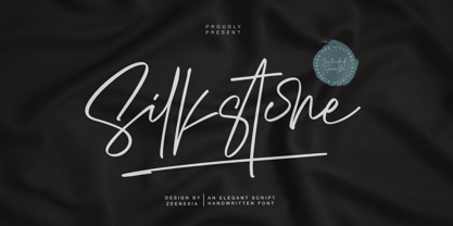 Presenting! Silkstone - Handwritten ScriptFont Silkstone is a handwritten script font with a simple and classy style, this font is great for your next creative projects such as watermark on photography, logo design, wedding, invitation, quotes, book cover, business card, and many other design project. From business cards to photo watermarks.
 - JH Fares by JH Fonts,
$45.00Jh Fares is a modern / simple Kufic style font. The user may notice plenty of white space around the text leading to a highly readable font. The Kufic script is one of the oldest Arabic Handwriting, first appeared in el Koufa - Iraq. The original calligraphy was derived from the Aramaic letters; later it went thru lots of enhancements. Its typical uses include decorative writings for Mosques / palaces, Magazines / Newspapers / Books titles and Greetings. - Old Style 7 by Linotype,
$29.00The name Old Style No. 7 comes from a time when foundries released a variety of typefaces under one name. Linotype produced Old Style No. 7, which was based on an early 1870s typeface from the Bruce Typefoundry, which had based its design on a type from the Scottish foundry Miller and Richards. Old Style No. 7 is a reliable text type that is serviceable for both books and shorter copy demands, such as magazines. - Monotype Scotch by Monotype,
$29.00Scottish typefounders exerted a strong influence on the development of "transitional" typefaces, the bridge from "oldstyle" (Jenson, Garamond) to "modern" (Bodoni, Didot) designs. Scotch Roman designs were first cut by Englishman Richard Austin and cast by the Scottish typefounder Alexander Wilson and Son in Glasgow. Scotch Roman font has wide proportions, short descenders, bracketed serifs, and large, strong capitals. Its subtle charm makes it suitable for any text setting, particularly books and magazines. - Calisto by Monotype,
$29.99The appeal of Calisto as a text face lies in its very even color on the page, while its robust construction means that it can work equally well at display sizes. The slightly calligraphic treatment of letter shapes and the classical proportions give Calisto a clean elegance on the page. The Calisto font is a graceful and interesting addition to the typographer's repertoire and will prove particularly useful for book, magazine and advertising work. - HotTamale by Jeff Kahn,
$29.00 HotTamale is suitable for display and text. Its large x-height provides excellent legibility at small point sizes. It is bouncy and playful, yet unlike some fonts that are exaggerated or distorted in style, HotTamale is highly refined. Avoid the monotony of repeating glyphs! HotTamale includes OpenType contextual alternates for a random and spontaneous appearance. HotTamale is vivacious, warmhearted, direct, and suitable for packaging, restaurant use, websites, magazines, lively heads, sub-lines, and children’s books.
 - Only Kidding by PizzaDude.dk,
$20.00 Massive text suits my Only Kidding very well. Even at small sizes it is super legible, and it really keeps that handmade image. At larger sizes the crunchiness really comes forward and may surprise you how detailed edges the letters has got! I am going to use this font for one of my children's books - I am thinking something adventure-ish! What you think? Comes with fi and fl ligatures and double letter substitutions!
 - Nova Hispane by Ixipcalli,
$30.00 NovaHispane typeface is a serif typeface with a clear, serious, elegant, old and modern touch at the same time. This typeface is perfectly suitable to be used in books, magazines or any printed media that requires showing a set of traditional or modern styles. Its four weights Light, Regular, Bold, and Heavy make a well-marked visual game for highlighting words from text; in addition to having the italic forms for each weight.
 - Cattini Script by Eurotypo,
$22.00 Cattini Script is a casual and organic font, perfect combination between elegance and informality! The OpenType features include standard and contextual alternates, swatches, initial forms and ligatures. All this makes the text lively and bouncy, without the monotony of obviously repeated letterforms. Cattini font can be the option to create headlines, logos and posters for branding and packaging, invitations, greeting cards, magazines and book covers, children's material, fashion, and where you want it.
 - Castle by Linotype,
$29.99This family, which includes faces in light, book, bold, and ultra weights, more stroke contrast than is typical of sans serifs, making it very legible in text. Because of its large x-height, it is recommended for used in point sizes ranging from 12 point upward. Of course, it functions well in display sizes, too. The contrast between the four weights makes this family optimal for use in hierarchical advertising systems, and corporate identity uses. - Redriver by Niznaztype,
$9.00 Redriver is a postmodern font in a futuristic graphic style, mixing characteristics from postmodern, contemporary and even older design styles. Redriver's strength will be the soul of your graphic designs. Redriver is perfect for futuristic and postmodern graphic art, editorial design, posters, t-shirts, book covers, headlines, advertising, branding, movies titling, and more. Redriver can be used for both short or long text in your designs and comes in 3 styles: thin, regular, and bold.
 - PF Playskool Pro by Parachute,
$69.00 A great fun typeface with a straightforward childlike simplicity. It really hits home with kids, but if you want to add this extra playful personality to your designs this is the one to use. It has a strong, easy to read structure, which makes it ideal for children’s books, toys and other fun applications. Designer Alexandros Papalexis has discover the kid within. You can too!
 - Mulberry Script by Cultivated Mind,
$27.00 Mulberry is a beautiful handwritten calligraphy script that comes with lovely alternates, ligatures, extras and ornaments. Choose between Mulberry Script or Mulberry Script Pro and two font weights (Regular/Bold). Mulberry Script comes with a basic set of alternates. Mulberry Script Pro comes with four sets of alternates including ligatures. This typeface can be used for fashion, apparel, stationery, magazines, letterpress, film, books and marketing.
 - Bogue Slab by Melvastype,
$29.00 Bogue is a slab serif type family of 8 weights and matching italics. Bogue Slab comes with a lots of stylistic alternates that makes it very versatile in various uses like logos, editorial design, branding, web design, package design and much more. You can use it to create short powerful phrases and headlines and also use it in longer text like lead paragraphs and body texts. So if you are looking for a versatile slab serif font you have found it! Bogue Slab is a slab serif version of Bogue
 - Bocksay Mira by Trifásica Studio,
$9.00 Bocksay Mira is a text font family inspired by the manuscript Mira Caligraphiae Monumenta created between 1561 and 1596 by Georg Bocskay and Joris Hoefnagel for the Holy Roman Emperor. All shapes were taken from the original records in both regular and italic style: lower case (p. 5, 72), uppercase (p. 47, 121), small caps (p. 122, 7). The high contrast forms and the wide spacing makes this family suitable for long texts but also for titling uses, having always that calligraphic and stylish look. Find the original script here
 - Sunsive by Yukita Creative,
$14.00 Sunsive Sans Serif Font family is the perfect choice for clean, minimalist, and professional designs. With a variety of weights and styles, it's suitable for headlines, body, web, print, and modern branding. This font provides a bold and elegant look to your graphic projects. Sunsive Sans Serif Font family provides a variety of variations from Regular to Black, allowing you to customize the appearance of the text according to your needs. From simple Regular to powerful Black, each weight provides flexibility in designing text with a professional, modern touch.
 - Cheva Display by Letteralle,
$24.00 Introducing, Cheva Display! a bold font with a touch of fine curves. Cheva Display brings vintage look as well as modern designs. With a variety of alternative letters and ligatures, it will make your text more unique and interesting. Cheva Display is a very versatile font, perfect for editorial projects, Logo design, Wedding, Clothing Branding, product packaging, magazine headers, or simply as a stylish text overlay to any background image. What's you get : - Full Uppercase & Lowercase Character. - Alternates & Ligatures. - Numeral, Punctuation, Multilingual Accents. Any Questions? Just Ask! I hope you enjoy! Letteralle Studios
 - Minimaly by Luxfont,
$18.00 Introducing clean, minimalistic and actually fonts family. Balanced letter height and width - based on analysis of current design trends. Text typed in this font does not distract attention from design, but organically complements any design. Ideal for short phrases, footnotes and headlines. Font has High readability in large volumes of text. Branding with this font looks trendy and expensive. Minimaly font family is versatile in use and very modern. Features: Clean letters and absolute minimalism 6 fonts in family: - Thin, Thin Italic - Regular, Italic - Bold, Bold Italic Kerning ld.luxfont@gmail.com