4,518 search results
(0.017 seconds)
- Saitama by Khurasan,
$9.00 Saitama is a new calligraphy handwritten typeface, elegant and vintage feel character set. Saitama includes a full set capital and lowercase letters, as well as multi-lingual support, currency figures, numerals, punctuation & some extra glyphs. Thank you for checking and i hope you enjoy it. Always put your heart into it and don’t worry to try. I hope you have as much fun using it as i did making it. Khurasan
 - MC Cluchy by Maulana Creative,
$14.00 Cluchy playful display font. Heavy stroke, fun character with a bit of ligatures. To give you an extra creative work. Cluchy playful display font support multilingual more than 100+ language. This font is good for logo design, Social media, Movie Titles, Books Titles, a short text even a long text letter and good for your secondary text font with script or serif. Make a stunning work with Cluchy playful display font.
 - Neptunian by Aiyari,
$16.00 Introducing a new casual handwriting typeface called Neptunian. Inspired by quick dry brush strokes combined with the spirit of sea, sun and summer vibes. The typeface is ideal for logos, quotes, invitations, signage, posters, websites, greeting cards, packaging, headers, printed quotes, cover albums, etc. Neptunian comes with open type features such as stylistic alternates, stylistic sets, & ligatures. To help you make stunning design, Neptunian also comes with extras swash.
 - Black Borough by sizimon,
$25.00 Black Borough is brush font, hand-painted with extra attention to quick-strokes and dry textures. Very cool for logos, name tag, handwritten quotes, product packaging, merchandise, social media & greeting cards. And very easy to make design t-shirts and other products. Very save time in making the design of a product. It contains a full set of lower & uppercase letters, a large range of punctuation, numerals, and multilingual support.
 - Summer Dear Font Duo by Lucky Type,
$12.00 Let me introduce the latest beautiful combination of handwritten font Summer Dier Font Duo + Extras. The Summer Dier Font typeface is designed to make your next great project look more natural and stand out. The Summer Dier Font includes several Opentype Ligatures included to make the typeface look more natural and lastly, it has over 30 handcrafted additions to help your future designs look prettier. Thank you very much for viewing.
 - Rogue Style by Sensatype Studio,
$15.00 An Retro Vintage Classy Serif font that we created special for elegant branding needs, with extra alternates in unique shape will be ready to add value of your brand. Rogue Retro Vintage Classy Serif ready with: Any options to get creative variations (combination of Alternate characters) Preview as a inspirations that you can do with Rogue font Ready with Lowercase and Uppercase characters Wish you enjoy our font. :)
 - Callge Style by Sensatype Studio,
$15.00 An Unique Modern Display Font that we created special for Elegant and Classy branding needs, with extra characters alternate in unique shape will be ready to add value of your brand. Callge Display Ligature Sans Serif ready with: Any options to get creative variations (combination of Any Alternates) Preview as a inspirations that you can do with Callge font Ready with Lowercase and Uppercase characters Wish you enjoy our font. :)
 - Hatchira by Maulana Creative,
$13.00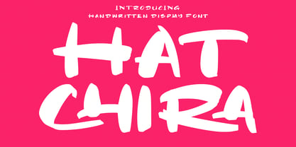 Hatchira is a Japan vibes handwritten display font. With reverse contrast stroke, fun character. To give you an extra creative work. Hatchira font support multilingual more than 100+ language. This font is good for logo design, Social media, Movie Titles, Books Titles, a short text even a long text letter and good for your secondary text font with sans or serif. Make a stunning work with Hatchira font. Cheers, Maulana Creative
 - Voltura by Maulana Creative,
$13.00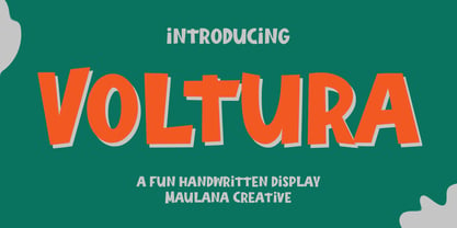 Voltura is a handwritten display font. With sharp bold stroke, fun character. To give you an extra creative work. Voltura font support multilingual more than 100+ language. This font is good for logo design, Social media, Movie Titles, Books Titles, a short text even a long text letter and good for your secondary text font with sans or serif. Make a stunning work with Voltura font. Cheers, Maulana Creative
 - Gumpops by Maulana Creative,
$13.00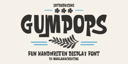 Gumpops is a cute handwritten display font. With bold sharp stroke, fun character. To give you an extra creative work. Gumpops font support multilingual more than 100+ language. This font is good for logo design, Social media, Movie Titles, Books Titles, a short text even a long text letter and good for your secondary text font with sans or serif. Make a stunning work with Gumpops font. Cheers, Maulana Creative
 - Sincerely Yourz by Outside the Line,
$19.00 Sincerely Yourz is another font in the Love Letters series from Outside the Line. It is a hand-printed font with extra letter spacing. All the letters have about the same height. All vowels are lower case whether they are caps or not. This font has a fresh contemporary hand-lettered look. While it can be used as a headline font it is really designed for body copy.
 - Broukha by Maulana Creative,
$15.00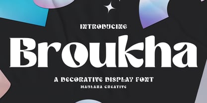 Broukha is a decorative display font. With bold contrast stroke and fun character. To give you an extra creative work. Broukha font support multilingual more than 100+ language. This font is good for logo design, Social media, Movie Titles, Books Titles, a short text even a long text letter and good for your secondary text font with sans or serif. Make a stunning work with Broukha font. Cheers, Maulana Creative
 - Norsics by Maulana Creative,
$12.00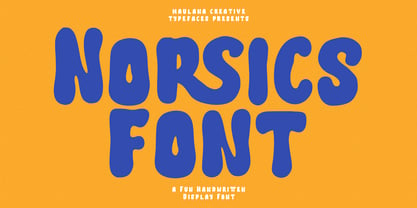 Norsics is a casual modern handwritten display font. With wavy bold stroke, fun character. To give you an extra creative work. Norsics font support multilingual more than 100+ language. This font is good for logo design, Social media, Movie Titles, Books Titles, a short text even a long text letter and good for your secondary text font with sans or serif. Make a stunning work with Norsics font. Cheers, Maulana Creative
 - Graffick by Graffiti Fonts,
$12.99 Graffick is a mechanical style created by merging a little traditional type design & typography with a little basic graffiti lettering theory. Extra ascenders and descenders have been added to many of the capital letters to add a more varied & specialized appearance. This layered type system provides for the easy creation of outline/fill effects with regular, italic, wide and outline styles as well as baseline & caps-height alignment options.
 - BOXDON Titling by TYDTYP,
$15.00 BOXDON is an extra heavy expanded typeface which was especially designed for VERTICAL layout. Each shape looks like a box and has minimum graphical treatment to distinguish each character. It means that the counter space is not enough to use this typeface for small font sizes, however, for titles this typeface should give incredible effects. I highly recommend using it with software that is compatible with vertical layout. (e.g. Adobe illustrator)
 - LT DIE HARD by Latam Type Foundry,
$9.00 LT DIE-HARD FONT DUO+EXTRAS is a handcrafted typeface, carefully designed to capture the essence of strength and determination. With its horrible and worn strokes, this font transmits a sensation of resistance and solidity, Each letter is made in a unique style, creating a sense of movement and dynamism in the text. DIE-HARD typeface is ideal for projects requiring a strong and determined approach, such as posters, titles, logos...
 - Quebra Expa by Vanarchiv,
$55.00 Quebra Expa (Expanded) is an extend display sans-serif font family, available with four widths (Extra Condensed, Condensed, Normal and Expanded) and ten weights, italics versions are available. The main strokes contain small breaks simulating modulated variations on the letterforms, these details are more present on large body sizes. All font versions contain Latin and Cyrillic encoding characters and also ligatures, case-sensitive forms, fractions, oldstyle and finally tabular figures.
 - Quintus by JOEBOB graphics,
$22.00 This font is an adaptation of the typeface I designed for TJX Europe, which was used in their branding campaigns for the TK MAXX stores all over Europe. Most characters were given a major facelift and also a few extra ligatures were added in the process. Quintus comes with a regular and a bold version so it offers more variety in use. It also works well in all caps.
 - Malihah by Abo Daniel,
$11.00 introducing MALIHAH - Lettering Font Pack- MALIHAH is great for lettering, quotes, wedding card, logo, t-shirt designs, mugs, interior ornaments, tote bag designs, cards, banners, social media, and anything about craft projects. It came with 4 different fonts with extra doodle font. Features: - Uppercase - Lowercase - Numeral - Multilingual - doodles - PUA encoded Let's create your own quote to be beauty lettering art. I hope you love it. regards, Abo Daniel Studio
 - Spaziel Serif Round by Maulana Creative,
$12.00 Spaziel Round serif is a modern serif font. With regular round stroke, and fun character. To give you an extra creative work. Spaziel font support multilingual more than 100+ language. This font is good for logo design, Social media, Movie Titles, Books Titles, a short text even a long text letter and good for your secondary text font with Script typeface. Make a stunning work with Spaziel font. Cheers, MaulanaCreative
 - Debright by Maulana Creative,
$13.00 Debright is a fat handwritten display font. With low bold contrast stroke, fun character. To give you an extra creative work. Debright font support multilingual more than 100+ language. This font is good for logo design, Social media, Movie Titles, Books Titles, a short text even a long text letter and good for your secondary text font with sans or serif. Make a stunning work with Debright font. Cheers, Maulana Creative
 - Lumetry by Sensatype Studio,
$15.00 A Modern Classy Luxury Font that we created special for Luxury and Fashion branding needs, with extra characters alternate in unique shape will be ready to add value of your brand. Top Luxury Modern Classy Font ready with: Any options to get creative variations (combination of Any Alternates) Preview as a inspirations that you can do with Top Luxury font Ready with Lowercase and Uppercase characters Wish you enjoy our font. :)
 - Trigar by Maulana Creative,
$13.00 Trigar is an all caps font. With 2 style stroke, fun character. To give you an extra creative work. Trigar font support multilingual more than 100+ language. This font is good for logo design, Social media, Movie Titles, Books Titles, a short text even a long text letter and good for your secondary text font with script or handwriting. Make a stunning work with Trigar font. Cheers, Maulana Creative
 - Art Party by A New Machine,
$19.00 Art Party is a hand-drawn font suitable for headlines of all kinds when you want a handmade look. Prissy Pots owner Erin Solomon drew the playful letters, which include regular and bold versions. Each face also offers an entirely separate set of upper and lowercase letters accessible in your applications' glyphs palettes. With contextual alternates turned on, these extra letters show up automatically, yielding a more natural, random look.
 - Odell by The Organic Type,
$29.99 Odell is a fun, whimsical, yet elegant handwritten font that was created in a light-hearted manner for use in things like menus, invitations, bed and breakfast collateral and whatever else you can dream up. Odell features extra thin letters and it is designed to be creative, a little fancy, and very legible. There are tons of foreign characters to choose from so you can write in other languages as well.
 - Torgny, a font designed by Mattia Marchi, is a notable typeface that stands out for its unique character and versatility. This font encapsulates a blend of traditional and modern elements, making it ...
- Noad Sans by Groteskly Yours,
$60.00 Noad Sans is an experimental sans serif typeface with a strong character and some very unique visual features. At the core of Noad Sans is a sturdy sans serif with closed apertures and fairly simple letterforms. The defining feature of Noad Sans, however, is its visualised nodes: all control points of Bézier curves in each of the fonts in the family are intentionally visualised. The effect of this feature is largely defined by the usage: in titles and larger bodies of text, the visualised nodes stand out and create a rhythmic pattern of their own. In smaller sizes, the sans serif base of the font becomes more prominent and the nodes create a visual fuzz. Noad Sans comes in 6 styles and as a Variable Font with two axes–Optical Size and Slant. The size of each node can be changed from the smallest (Mini and Mini Italic) to the largest (Extra and Extra Italic). Variable Font technology allows you to fine tune the size of the nodes and the slant angle, so that your version of Noad Sans can be truly unique. Noad Sans has a large character set of 570+ glyphs, covering the vast majority of Latin based languages. In addition to that there are dozens of special characters, punctuation, numbers, and symbols. Noad Sans is equipped with a number of useful OpenType features, such as Case-Sensitive Punctuation, Stylistic Alternates, Ligatures, Fractions and many more. Noad Sans began as an experimental project, and during its development the spirit of experimentation was at the heart of the project. Thanks to the unique nature of the typeface, it can feel at home in a variety of settings: from web development, graphic and product design to more novel uses like 3D and NFTs. Noad Sans type family includes 6 static fonts (Mini, Mini Italic, Regular, Regular Italic, Extra and Extra Italic) and one variable font. Each style can be purchased separately. There is a free trial version of Noad Sans that can be downloaded free of charge on MyFonts. For more information on the typeface, feel free to download Noad Sans PDF Specimen.
 - Mr Palker by Letterhead Studio-YG,
$35.00 A slab serif Mr Palker and grotesque Mr Palkerson build one superfamily together. These are blank types. In a way even the display ones. Typefaces for newspapers, announcements, cheap advertising and police posters. Mr Palker and Mr Palkerson will turn every language into a fence. And due to six types of faces one can choose what material should the fence be made from — from Thin steel rods to the Black stone blocks. In their simplest appearance Mrs P&P are intended for the solid blank composition in victorian or industrial style. They are quite decent, a bit old-fashioned slab serif and grotesque with closed aperture. All my types have layers. Walker and Palkerson also do. Besides the standard set of symbols, they have 4 add-ons. 1. Alternate glyphs, including unicase ones. 2. Ligatures with A letter. 3. Extra tall small caps. 4. Two-storey ligatures. All this options are intended for the complex composition. The additional letters are rather eccentric as their main function here is to imitate the victorian oddities. Imitate, parody, just not repeat. There are lower-case As and Es in the set in height of small caps and uppercases. They can turn every writing into the unicase. The lower-case A (as well as uppercase and small caps version of it) has deliberately by my taste grown a ludicrous tail. To compensate it I’ve built all the possible ligatures - ад, ал, ая. There are 35 of this ligatures all together. Take a closer look at the Russian letters D, L, K, Ya from the main set as well as their alternates. The additional glyphs are one more comic than the other — on purpose to imitate (not to repeat!) the victorian set. This sets have lowercase numbers. And small caps numbers as well. What a modern typeface without them. They also have an У-letter with a generously curvy tail. As if before the WWI. The Latin of course has alternates as well. It has letters to make the perfect French sound more like the russian provincial version of it. The tails of Js and Ts can be made a little bit more open — or a little bit closed. My favorite feature here, an invention of a kind - extra tall small caps. It allows to compose logos with the small caped uppercases directly from the keyboard. The small caps of this typefaces are usually much taller than the customary ones. This is the kind of small caps that Palker and Palkerson have. More to that, the strokes’ weight and the letters width are corresponded to the uppercases. Just a ready set for making a logo a la 1913 style. With a unicase, one has to mind! One more trick with the tall small caps is a possibility to make them work like lower uppercases. Their height is just in between of lower- and uppercases. Isn’t it great to have an additional set of uppercase working ponies in stock for the case of emergency. And finally — the trademark of Palkers family, two-storey ligatures. They are made in the height of uppercases and turn every writing into an ornament or a puzzle of a kind, while at the same time making them much shorter. Each face has 90 of them. Mainly those are twins: CC, BB, DD and so on. ll this things are for the unhasty compositing, even for lettering. Which means that for the things which are not there you always should have Command+Option+O and some patience. Also — among the two storey ligatures one also can find some belvedere villas. All my types are glasses from the one kaleidoscope. The P&Ps family was preliminary part of the victorian set, which already has 1 Cents and Clarendorf - optionally one can add Costro, Gordoni, Handy, Guardy, Surplus, Red Ring, Red Square, Babaev to the list. And also Sklad, Odessa, Dreamland, Romb, Platinum - here, at Letterhead’s, every second one is victorian. All together our typefaces can allow one to set advertisement of any kind, even the trickiest one, and compose everything, from the coffee place’s menu to the antiquarian magazine.
 - Mr Palkerson by Letterhead Studio-YG,
$35.00 A grotesque Mr Palkerson and slab serif Mr Palker build one superfamily together. These are blank types. In a way even the display ones. Typefaces for newspapers, announcements, cheap advertising and police posters. Mr Palker and Mr Palkerson will turn every language into a fence. And due to six types of faces one can choose what material should the fence be made from — from Thin steel rods to the Black stone blocks. In their simplest appearance Mrs P&P are intended for the solid blank composition in victorian or industrial style. They are quite decent, a bit old-fashioned slab serif and grotesque with closed aperture. All my types have layers. Walker and Palkerson also do. Besides the standard set of symbols, they have 4 add-ons. 1. Alternate glyphs, including unicase ones. 2. Ligatures with A letter. 3. Extra tall small caps. 4. Two-storey ligatures. All this options are intended for the complex composition. The additional letters are rather eccentric as their main function here is to imitate the victorian oddities. Imitate, parody, just not repeat. There are lower-case As and Es in the set in height of small caps and uppercases. They can turn every writing into the unicase. The lower-case A (as well as uppercase and small caps version of it) has deliberately by my taste grown a ludicrous tail. To compensate it I’ve built all the possible ligatures - ад, ал, ая. There are 35 of this ligatures all together. Take a closer look at the Russian letters D, L, K, Ya from the main set as well as their alternates. The additional glyphs are one more comic than the other — on purpose to imitate (not to repeat!) the victorian set. This sets have lowercase numbers. And small caps numbers as well. What a modern typeface without them. They also have an У-letter with a generously curvy tail. As if before the WWI. The Latin of course has alternates as well. It has letters to make the perfect French sound more like the russian provincial version of it. The tails of Js and Ts can be made a little bit more open — or a little bit closed. My favorite feature here, an invention of a kind - extra tall small caps. It allows to compose logos with the small caped uppercases directly from the keyboard. The small caps of this typefaces are usually much taller than the customary ones. This is the kind of small caps that Palker and Palkerson have. More to that, the strokes’ weight and the letters width are corresponded to the uppercases. Just a ready set for making a logo a la 1913 style. With a unicase, one has to mind! One more trick with the tall small caps is a possibility to make them work like lower uppercases. Their height is just in between of lower- and uppercases. Isn’t it great to have an additional set of uppercase working ponies in stock for the case of emergency. And finally — the trademark of Palkerson family, two-storey ligatures. They are made in the height of uppercases and turn every writing into an ornament or a puzzle of a kind, while at the same time making them much shorter. Each face has 90 of them. Mainly those are twins: CC, BB, DD and so on. ll this things are for the unhasty compositing, even for lettering. Which means that for the things which are not there you always should have Command+Option+O and some patience. Also — among the two storey ligatures one also can find some belvedere villas. All my types are glasses from the one kaleidoscope. The P&Ps family was preliminary part of the victorian set, which already has 21 Cents and Clarendorf - optionally one can add Costro, Gordoni, Handy, Guardy, Surplus, Red Ring, Red Square, Babaev to the list. And also Sklad, Odessa, Dreamland, Romb, Platinum - here, at Letterhead’s, every second one is victorian. All together our typefaces can allow one to set advertisement of any kind, even the trickiest one, and compose everything, from the coffee place’s menu to the antiquarian magazine.
 - Pais by Latinotype,
$39.00 "País" is a contemporary and modern grotesque sans serif, inspired by the grotesques of the early 20th century, but more geometric and with a wider x-height than its referents; making it ideal for the current times. "País" comes in 2 versions, each with 9 weights, from thin to black, and matching italics, for a total of 36 fonts. The standard sans serif version is fresh, clean, and more ideally neutral. It's a perfect choice for editorial design, branding, headlines, or any other piece of graphic design. The "País Alt" version has more expressive and modern characters, with some giving it a much more playful image. It is ideal for logos, packaging, web and television use. País contains a total of 682 characters that make it possible to write in more than 200 Latin languages and basic Cyrillic.
 - Radiate Sans by Studio Sun,
$20.00 Radiate Sans is a Humanist - Geometric Sans Serif fonts, Simple geometric letters shapes, medium contrast character style, It was designed lately 2018. and published on April 2020. Radiate Sans is a neutral typeface, have stroke modulation (strokes that clearly vary in width along their line) or alternating thick and thin strokes. Radiate Sans intended as a display typeface that could be used for posters and advertisements, as well as for the text of documents that need to be clearly legible at small sizes or from a distance, such as book blurbs, timetables and price lists. The family include 5 font weights, with a bonus 4 Widths in the OpenType version. It supports ISO Adobe 2, Adobe CE, Latin Extended characters, Standard Greek, and Standard Cyrillic. OpenType features include small caps, old style figures, superscript and subscript, ordinals, proportional lining figures, and case forms.
 - Magnum Sans by FontMesa,
$19.00 Magnum Sans is a strong neutral sans serif consisting of eleven weights with true Italic, Oblique and an alt upright set called Alfa. The definition of Magnum is a large wine bottle that's twice the capacity of one 750ml bottle, today the name is used in any product offering double the capacity, Magnum Sans achieves this by offering two slanted and two upright versions plus a standard and pro set. Designed to be highly readable Magnum Sans is ideal for text, signage, headlines and media broadcasting or anywhere else quick readable lettering is needed. This standard version supports characters sets for central and eastern European countries with code-pages of 1252 Latin1, 1250 Latin 2, 1257 Baltic and 1254 Turkish. Note: for additional language support, please see our Magnum Sans Pro family, which includes Vietnamese, PinYin and Greek.
 - Magenos Soft by Graphite,
$18.00 Magenos Soft is the rounded version of Magenos typeface family. It is a modern geometric sans serif family characterized by its simplicity and extensive functionality. With its open apertures, geometric architecture and low contrast strokes, it expresses a sincere tone with a modernistic, neutral, yet friendly personality. It has been designed to work well for a wide range of applications and is a reliable workhorse. Equally suitable for print and screen usage, it works well for both text and display at a wide range of point sizes. The addition of true italics gives the whole family a dynamic edge and flexibility. Magenos Soft comes with many OpenType features including stylistic alternates, standard ligatures, oldstyle and lining (proportional and tabular) numerals, slashed zero and a variety of symbols, making it a perfect choice for contemporary and professional typography.
 - Bluset Now Mono by Elsner+Flake,
$35.00 Bluset Monospaced enlarges the re-worked and expanded text- and headline typeface family Bluest Now with 6 new cuts. The concept for Bluest Now was based, in its original form, on a corporate design typeface by Elsner+Flake in 2004, ordered by the Landor Agency for a large German energy corporation. Regularly re-worked and brought up to modern standards, the typeface is still used to this day. Because of its large x-height and its well-balanced appearance, Bluset Now Mono is also excellent for use in small typesizes. The three Roman cuts, Regular, Medium and Bold, and the corresponding obliques, allow a clear differentiation of base- and display applications for every typesize. The character complement has been created for 72 Latin-based language areas and thus allows a neutral text exchange across language borders. Translation Inga Wennik
 - Zin Display by CarnokyType,
$46.00 Zin Display is a contemporary typeface designed for various situations of typographic usage. Characteristic feature is a large x-height and balance between neutral construction of letters (strictly vertical axis), dynamic open forms (opened terminals) and sharp instrokes, outstrokes and serifs. Another typical feature is a visually narrower connection between stems and strokes. The complete font family consist of three width proportions (Normal, Condensed and Extended). Every sub-family has 5 weights, ranging from Light to Black with matching Italics. Zin Display can be effectively used especially for display typesetting but works for longer text as well. It can be used especialy in magazine layouts and editorial design, as well in advertising typography, orientation systems, corporate identities and many other situations. Zin Display is a member of the Zin super family, which also includes Zin Sans, Zin Slab and Zin Serif fonts.
 - Mixed Tape by Ksenia Belobrova,
$35.00 Mixed Tape is a brush typefamily inspired by music and based on calligraphy. It has 3 different styles so that you can choose which you need or combine them as you like. Mixed Tape Regular is a casual neutral brush script, Mixed Tape Small is a more elegant variation and Mixed Tape Capitals is an energetic, probably even brutal brush script. You can freely play with the three of them creating your typographic compositions. You can use Mixed Tape for posters, prints, menus, packaging, book covers and headlines, cards and as a starting point for logotypes. Mixed Tape has a lot of alternates and ligatures which are built into the ‘Liga’ feature that is turned on by default. It also has swashes, titles, fractions, ordinals and case sensitive forms. Let’s all enjoy good music and typography!
 - Goga by Narrow Type,
$42.00 Introducing Goga, a versatile sans serif family available in 10 weights from hairline to black. It is a typeface that combines the best of geometric sans serifs and neo-grotesques. It draws inspiration from typefaces like Avenir on the one hand and Helvetica on the other. Although Goga is a universal and neutral typeface, it is rather warmer and friendly in nature. If you want to add more juice to your project, you can do so by using unusual stylistic alternates of the lowercase g (hence the name Goga). Goga is a typeface suitable for both large sizes and smaller text, thanks to its large x-height. It contains Latin-extended character set, and thus supports most Latin languages. It also offers many open type features such as fractions, old-style figures, tabular figures, discretionary ligatures and more.
 - Compasse by Dharma Type,
$24.99 Compasse is a semi-condensed sans-serif family designed by Ryoichi Tsunekawa and the whole family consists of 12 style: six weights from Thin to ExtraBold and their matching Italics. The range of styles provides flexibility for title, headline and body text. And the large x-heights increases legibility and readability. The basic skeleton of their letterform was not designed over-modularly but moderately semi-modularly (adjusted by designer's experience). Therefore the typical artificiality and unnaturalness which come from module-design does not exist in this family. The sophisticated letterform and its universal, neutral, and standard design make it possible to be used across a wide range of applications in all medias, all purposes. Compasse supports almost all european languages: Western, Central, South Eastern Europeans and afrikaans. And superior figures, inferior figures, denominators, numerators and fraction can be accessed by using OpenType features.
 - Block Capitals by K-Type,
$20.00 BLOCK CAPITALS is a square, geometric, small caps display face that avoids fashionable foibles and exudes the neutral, unpretentious functionality of time-honoured block lettering. The family has three widths (Narrow, Normal and Wide), and the Bold weights are loosely based on well-used squared nets – 3x5, 4x5 and 5x5. However, the typeface escapes its grid origins whenever necessary with slightly modulated stroke weights, sensitive spacing and careful kerning. The aim is to retain the strength and simplicity of strictly geometric characters while introducing barely perceptible refinements that add elegance and usability. That said, letters and numbers line up horizontally without overlapping the capline or baseline, even the tail of the Q does not descend below the Baseline. Diacritics are modesty proportioned, accented characters extending no farther than necessary, allowing the leading on multiple lines of text to be kept to a minimum.
 - Auchentaller by HiH,
$12.00 Auchentaller was inspired by a travel poster by Josef Maria Auchentaller in 1906. To our knowledge, it was never cast in type. Grado lies on the northern Adriatic, between Venice and Trieste. At one time the port for the important Roman town of Aquileia. With the decline of the Roman Empire, the upper Adriatic region came under the rule of the Visigoths, the Ostrogoths, the Byzantines, the Lombards, the Franks, the Germans, the Venetians and finally, in 1796, the Austrian Hapsburgs. So it remained until the dissolution of the Austro-Hungarian Monarchy in 1919, following World War I, when the seaport of Trieste was awarded to Italy. With Trieste came Montefalcone, Aquileia and Grado. The area was marked by years of political tension between Italy and Yugoslavia, exemplified by the d'Annunzio expedition to capture Fiume (Rijeka) in September, 1919. Some basic discussion of the period from 1919 to 1939 may be found in Seton-Watson’s Eastern Europe Between The Wars (Cambridge 1945) and Rothschild’s East Central Europe Between The Two World Wars (Seattle 1974). In 1965 I was traveling by train from Venice to Vienna. Crossing the Alps, the train stopped for customs inspection at the rural Italian-Austrian border, just above Slovenia. We were warned not to get off the train because there were still shooting skirmishes in the area. Through all this, Grado remained literally an island of tranquility, connected to the mainland by a only causeway and lines on a map. Auchentaller not only painted the beach scene at Grado, he moved there, living out the rest of his life in this comfortable little island town. His travel illustration contains the text from which the design of our font Auchentaller is drawn. The text translates: "Seaside resort : Grado / Austrian coastal land". Please see our gallery images to see a map locating Grado, as well as Auchentaller’s painting of the resort. Auchentaller is a monoline all-cap font, light and open in design , with a lot of typically art nouveau letter forms. Included in our font are a number of ligatures. As is frequently seen in designs by German speakers, the umlaut is embedded in the O & U below the tops of the letters. This approach led to two whimsies: a happy umlauted O and a sad umlauted U. This font has a clean, crisp look that is very appealing and very distinctive. Auchentaller ML represents a major extension of the original release, with the following changes: 1. Added glyphs for the 1250 Central Europe, the 1252 Turkish and the 1257 Baltic Code Pages. Add glyphs to complete standard 1252 Western Europe Code Page. Special glyphs relocated and assigned Unicode codepoints, some in Private Use area. Total of 336 glyphs. 2. Added OpenType GSUB layout features: pnum, liga, salt & ornm. 3. Added 116 kerning pairs. 4. Revised vertical metrics for improved cross-platform line spacing. 5. Revised ‘J’. 6. Minor refinements to various glyph outlines. 7. Inclusion of both tabular & proportional numbers. 8. Inclusion of both standard acute and Polish kreska with choice of alternate accented glyphs for c,n,r,s & z. Please note that some older applications may only be able to access the Western Europe character set (approximately 221 glyphs). The zip package includes two versions of the font at no extra charge. There is an OTF version which is in Open PS (Post Script Type 1) format and a TTF version which is in Open TT (True Type)format. Use whichever works best for your applications.