10,000 search results
(0.07 seconds)
- Aquacia by Coniglio Type,
$9.95A stencil font you won't find anywhere else. Part of Market LTD, a collection of limited faces, mostly alpha-numeric and some just plain numeric, used primarily in retail and display situations and titling. - Brando by Studio K,
$45.00 Brando is a rounded slab serif that is both firm and gentle, soft and strong. It’s a versatile display face ideal for branding, titling and headlines where warmth and weight are of equal importance.
 - Downtown by Aboutype,
$24.99Mono-weight extra condensed display face. Lowercase sits on a floating baseline. Downtown was designed for all media and works best at 24 point and above. Downtown requires subjective display kerning and compensation. - Bitstream Vera Sans - Unknown license

- RM Imber by Ray Meadows,
$19.00 A great new display face. The slight serif gives extra character to this solid looking design, whilst the outline version has an open, clean look.
 - Paragon by Greater Albion Typefounders,
$12.50 Paragon is a display Roman family of nine faces, combining elements of formality and fun. It embodies a high degree of contrast between near hairline horizontal strokes and bold vertical strokes. The family is offered in three widths and in regular, small capitals and title faces. Use Paragon to lend impact to your next design project.
 - Delphian by Monotype,
$29.99Designed by Robert Hunter Middleton in 1928, Delphian is one of Middleton's most handsome display typefaces. The Delphian face has many uses, from book titles to corporate identity material, where a modern, yet classic look is desired. - An Electronic Display LED LCD LED7 Seg dots 2 by Fortune Fonts Ltd.,
$15.00 * For when you need the most realistic looking electronic display. * See User Manuals Main advantages: - Spacing between characters does not change when entering a decimal point or colon between them. - Custom characters can be produced by selecting any combination of segments to be displayed. Low cost electronic displays have a fixed number of segments that can be turned on or off to represent different symbols. A digital watch would be the most common example. Fonts typically available for depicting electronic displays are often in the artistic style of these common LED or LCD displays. They provide the look-and-feel, but fall short when technical accuracy is required. Failure to represent an accurate and consistent representation of the real thing can be a cringe-worthy experience for the product design and marketing team, or even the hobbyist for that matter. To solve this problem, Fortune Fonts has released a range of fonts that accurately depict the displays typically found on low cost electronic devices: watches, answering machines, car stereos, alarm clocks, microwaves and toys. These fonts come with numbers, letters and symbols predefined. However, they also allow you to create your own segment combinations for the custom symbols you need. When producing manuals, marketing material and user interfaces, accuracy is an all-or-nothing concept. Instructions in the user manual describe how to turn these fonts into realistic displays according to your own design, in the manner of the images above. If you cannot see a license option for your specific application, such a license may be purchased from here. By purchasing &/or using &/or distributing the fonts the buyer user and distributor (including Monotype Imaging Inc. & Monotype Imaging Hong Kong) agree to (1) indemnify & hold harmless the foundry, for any consequential, incidental, punitive or other damages of any kind resulting from the use of the deliverables including, but not limited to, loss of revenues, profits, goodwill, savings, due to; including, but not limited to, failure of the deliverables to perform it’s described function, or the deliverable’s infringement of patents, copyrights, trademarks, design rights, contract claims, trade secrets, or other proprietary rights of the foundry, distributor, buyer or other parties (2) not use the fonts to assist in design of, or be incorporated into, non-software displays
 - LTC Spire by Lanston Type Co.,
$24.95 LTC Spire with alternate caps was designed by Lanston’s type director Sol Hess in 1937. Spire Roman was designed without lowercase. But it includes alternate rounded caps which transform this extra condensed “fat face” into more of an art deco titling face. Spire Roman has been used within department store logos, luxury hotel signage, perfumes, etc, etc.
 - Hadrian LP by LetterPerfect,
$39.00 Hadrian Bold pushes the limits for an extra-condensed titling face. Though remaining in the tradition of the 20th-century 'grotesque' designs, its heavy verticality and tight spacing demand attention for headlines at virtually any size.
 - Toshna by astype,
$35.00 Toshna is a classic garaldic typeface family offering three real optical type sizes. The Display weight for titles and headlines is kept very tall, thin and graceful. The Book weight for body text is drawn essentially wider, more round with robust, bold details. The punctuations and accents strictly serve the demands of body text. They are substantially bigger and more readable. Despite the fact that the width is running economically, the user notes the fonts ‘big face, that qualifies for eye friendly long texts.
 - Racer - 100% free

- Bloxhall by Ana's Fonts,
$16.00 Bloxhall is a sans serif display font with an art deco inspired style. This font family includes outline, faded and layered versions, with an extra offset variation to make layering super easy. Bloxhall's different variations and solid retro look, make it a perfect set for poster design, logotypes & branding, editorial design, titles, short phrases & slogans. Your creativity is the limit!
 - Rapido Racers by Putracetol,
$22.00 Introducing “Rapido Racers” - a Quirky Display Speed Font that encapsulates the essence of speed, agility, and dynamism. Crafted meticulously to resonate with the fast-paced world of racing and e-sports, this font is a harmonious blend of pixel perfection and artistic craftsmanship. With 13 unique variations, each tailored to fit the theme of speed and sportiness, Rapido Racers is versatile yet specific in its application. Whether you’re designing logos that stand testament to the electrifying world of racing or branding materials that echo the swift movements of e-sports athletes, this font is your companion. Its strong display characteristics make it ideal for crafting eye-catching titles on posters or headings on web pages.
 - LT Stopwatch - 100% free

- Musubi by Jonathan Ball,
$19.00 Musubi is juicy, flavorful display face inspired Tiki culture. Use it to make a big splash on posters and signage. This swinging face's special features include Small Capitals, tropical symbols, and decorative borders. Its funky and flared design is also perfect for a spooky Halloween bash!
 - Prospect by ParaType,
$25.00 PT Prospect™. An original serif family designed in 1997-2001 by Natalia Vasilyeva and licensed by ParaType. A face of wide proportions and free lettershapes. The serifs have slanted edges. Based partially on the hand lettering of the author. For use in titling and display composition.
 - Trailer Park Numerals by Coniglio Type,
$9.95Trailerpark numbers 0-9 were rather old fashioned 1950's cut aluminum numbers, you've seen digitized nowhere else but here! Part of Market LTD, a collection of limited faces, mostly alpha-numeric and some just plain numeric, used primarily in retail and display situations and titling. - Cooper BT by ParaType,
$30.00Bitstream Cooper was designed at Bitstream in 1986 by means of adding light, medium, and bold styles, with the corresponding italics, to the existing black ones. Based on Cooper Black, 1919, by Oswald Bruce Cooper, which was firstly released as a hand composition font in 1922 by Barnhart Brothers & Spindler of Chicago and later spread by ATF. Cooper Black is an extra bold face based on Cooper Old Style. Bitstream Cooper is an old style face with rounded serifs and tilted back ovals. For use both in text (normal weights) and in advertising and display typography (heavy weights). Cyrillic version was developed for ParaType in 2000 by Manvel Shmavonyan and based on TM Oswald face of TypeMarket, 1996, by Victoria Grigorenko. - Annlie by ITC,
$29.99Annlie™ Extra Bold and Annlie Extra Bold Italic are two display faces designed by Fred Lambert in 1966 for the Annlie type family. These two samples from the Annlie family are both fat faces. Fat faces were offshoots of the modern, or Didone, typefaces that were de rigueur during the early 1800s. These fat faces were among the first typefaces to be used solely for advertising purposes. Naturally, they were always used in larger point sizes, in display functions. Annlie could be called an optimization of these old advertising typefaces. With high x-heights, ultra contrast between thick and thin strokes, and perfectly engineered drawing techniques, Annlie is a highly crafted typeface. Give it a spin in your next advertising campaign! Annlie’s fine thin strokes are very graceful in their appearance, and lend a strong, yet soft, feminine feeling to anything they touch. - Mynaruse by insigne,
$22.00 Mynaruse is an elegant and regal roman inscriptional titling family. It has sharp and elongated serifs that give the face extra punch. The face shines in settings that call for elegance and splendor. Mynaruse’s six weights range from a fine, delicate thin to a powerful and solid heavy weight. Mynaruse includes many useful OpenType features, including a set of swash alternates, alternate titling forms, ligatures and miscellaneous alternates. OpenType-capable applications such as Quark or the Adobe suite can take full advantage of the automatically replacing ligatures and alternates. This family also includes the glyphs to support a wide range of languages.
 - Battleforce 5 - Personal use only

- Decima+ by TipografiaRamis,
$29.00 Decima+ is a subfamily addition to Decima, a new face by TipografiaRamis. Decima+ is an upright variation of Decima italics and is built in three weights. The unique difference of this typeface is that it presents a softer and more human look, while retaining the condensed geometric structure of its counterpart. Decima+ is a display face, with bold weight most suited for titling use. Decima+ is released as OpenType single master with a Western CP1252 character set.
 - Bishops Stinger by Folding Type,
$9.00 Ouch! Bishops Stinger is a unique isometric display typeface, perfect for bold headlines and logotypes. The blunt serifs and terminals that appear on select letters help ground the faced-paced look. When used for a block of text at smaller sizes the style resembles old script writing but with a retro futuristic twist.
 - Luscombe by Greater Albion Typefounders,
$9.50 Luscombe is a boisterous and lively display face, recalling the shaded and outlined faced much beloved of 1920s poster and advertising artists, while offering a regularity of outline that those faces often did not achieve. Itís ideal for poster and display work, or for signage with a subtle period feel. Mix the two faces to add emphasis where it's needed.
 - Pontoon by Phat Phonts,
$20.00Extended sans serif display face. - Valor by Tim Rolands,
$29.00Valor is a display face inspired by uncial forms seen through a modern roman lens. The result is a type with strong contrast between thick and thin strokes and a highly geometrical construction that even so retains a hint of the charm of hand-written uncial letters. A number of alternate forms and ligatures add to the personality of the face and offer flexibility in usage. Best suited for large titling work such as in posters or book and magazine covers. - 57 Rodeo by Baseline Fonts,
$24.00A practical yet unique display face designed to offer attention-getting headlines and an alternative to the normal wild west faces. - Petre Devos NF by Nick's Fonts,
$10.00At first glance, this unusual display face might appear to be a product of the 1960s, with its highly unconventional letterforms and its plastic, fantastic highlight treatment. However, this font is in fact inspired by a ca. 1930 poster for a Belgian beer of the same name. The uncredited Flemish designer was clearly a head of his time (ouch!). - Ames' Text by Greater Albion Typefounders,
$16.00 Ames’ text is designed for use in its own right and also as a complement to our Ames’ Roman family. Ames’ text is a ‘New-Style’ Didone family offered in three weights and three widths. It is designed to embody clarity combined with contrast between horizontal and vertical strokes, but with sufficient stroke width in both directions to display well at small point sizes. All typefaces include small capital forms, new and old style numerals (and ‘small capital’ numerals for consistency). Ames’ text is distinctive enough for use in headings and titles, but comes into it own as a text face. Keep a lookout for our forthcoming Ames Display faces…
 - Adamantine by Scriptorium,
$12.00A super-bold Victorian period display face. - Bayview JNL by Jeff Levine,
$29.00Around the turn of the 20th Century, the Inland Type Foundry produced a display face named Studley. It was a variation on a design by another foundry called Florentine. A condensed face with a bold, clean look, the design resembled the warmth and feel of a classic wood type. Best applied to headlines and titles, the font reads amazingly well at even 18 point renderings. Jeff Levine had added his own personal touch to his digital version of this old favorite and renamed it Bayview JNL. - Sign Lettering JNL by Jeff Levine,
$29.00 In the 1909 edition of the Atkinson Sign Painters’ instruction books is an extra bold sans serif alphabet and numerals called “Advertisers’ Thick and Thin Plug”. This hand lettered display face is now available digitally as Sign Lettering JNL in both regular and oblique versions.
 - Dociel by Maulana Creative,
$15.00 Dociel playful display font. Heavy stroke, fun character with a bit of ligatures. To give you an extra creative work. Dociel playful display font support multilingual more than 100+ language. This font is good for logo design, Social media, Movie Titles, Books Titles, a short text even a long text letter and good for your secondary text font with script or serif. Make a stunning work with Dociel playful display font.
 - MC Cluchy by Maulana Creative,
$14.00 Cluchy playful display font. Heavy stroke, fun character with a bit of ligatures. To give you an extra creative work. Cluchy playful display font support multilingual more than 100+ language. This font is good for logo design, Social media, Movie Titles, Books Titles, a short text even a long text letter and good for your secondary text font with script or serif. Make a stunning work with Cluchy playful display font.
 - Movie Usher JNL by Jeff Levine,
$29.00 Decorative, Display, Headline, Serif, 1920s, Hand Lettered, Engraved, Incised, Bold, Extra Bold, Retro, Vintage, Nostalgic An ad in the July 27, 1928 issue of The Film Daily for FBO Pictures was an encouragement to all theaters to accept the emergence of 'talking pictures' and "Don't be Panicked by Sound". The headline text was hand lettered in an extra bold serif type face with engraved [incised] lines. The lettering has been redrawn as the digital type face Movie Usher JNL, and is available in both regular and oblique versions.
 - Fraset by Maulana Creative,
$12.00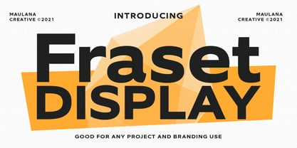 Fraset Display is a modern sans serif display font. With bold stroke, fun character with some of ligatures. To give you an extra creative work. Fraset Display font support multilingual more than 100+ language. This font is good for logo design, Social media, Movie Titles, Books Titles, a short text even a long text letter and good for your secondary text font with script or signature typeface. Make a stunning work with Fraset Display font. Cheers, MaulanaCreative
 - Vertrina by Greater Albion Typefounders,
$8.95 Vertrina marries four virtues: elegance, simplicity, character and usefulness. It started as an idea to combine two things: the elegance of classical Roman typefaces and of classical Roman architecture. The result is that rarest of all things - a truly new face that is elegant yet characterful but not so obtrusive as to be restricted to display work. All the faces' uprights mirror the elegant taper of Roman columns, as used in the most simple and elegant form of Roman architecture. The serifs are a subtle shape that mirrors the pediments and corbels of that same order of architecture. Vertrina is a family of eight faces, four upper and lower case faces, suitable for the elegant setting out of text, and four small capitals faces ideal for headings and titles. You'll find regular and bold weights and normal and condensed width, as well as a range of Opentype ligatures. All faces are offered individually and in family groups. Bring some simple elegance to your work.
 - Renslaer by Ingrimayne Type,
$7.00 A condensed and stiff-looking typeface with an enormous x-height, Renslaer is meant for use as a display face. It has the feel of some of the 19th century display faces, which often had the same sort of unpolished look.
 - Blueshift by PintassilgoPrints,
$24.00 An expressive disconnected script and a stylish display face that play together devilishly well. Add some handsome extras to the mix and voilà Blueshift, a hand-drawn family with a remarkable contemporary accent. Splendid designs are guaranteed for all! (And tonight Mr. Kite is topping the bill.)


