6,591 search results
(0.02 seconds)
- Silo by TypeUnion,
$25.00 Designed and built in London by TypeUnion, Silo is a fluid sans serif typeface embodying energetic curves and a clean, functional structure. The Silo Family is made up of 6 weights, which range from a delicate Extra-Light, all the way through to a punchy, loud Extra-bold and each carry a versatility for multiple applications and uses. Silo features open type alternate characters, and extensive language support to provide a flexible, substantial user experience.
 - Exorts Compressed by Seventh Imperium,
$15.00 Exorts Compressed is a display font family. This square condensed sans is designed with an increased cap character and tight kerning to give the ability create the large and bold typography. It is made specifically for editorial design, headlines, posters, magazines, clothing and other purpose printed material. The family comes in weight from extra light to extra bold and have italic version of each weight. Features include: OpenType stylistic sets, ligature, and Multiple Language Support.
 - Quebra Ex Condensed by Vanarchiv,
$55.00 Quebra Ex Cn (Extra Condensed) is an extend display sans-serif font family, available with four widths (Extra Condensed, Condensed, Normal and Expanded) and ten weights, italics versions are available. The main strokes contain small breaks simulating modulated variations on the letterforms, these details are more present on large body sizes. All font versions contain Latin and Cyrillic encoding characters and also ligatures, case-sensitive forms, fractions, oldstyle and finally tabular figures.
 - Bengawan by Panritype Studio,
$13.00 Bengawan is a modern, elegant, beautiful script. It has beautiful characters and it's perfect for project such as logos, wedding invitation, posters, social media headlines, birthday cards and also match with other design project. Bengawan comes with natural ligatures and extra alternates that can make your project more beautiful and elegant. Features: - Natural Ligatures - More Extra Alternates - PUA Encoded - Multilanguage Support Thank You For Download. Have question(s)? drop here: fajry.al.fatih13@gmail.com Thank You
 - Ardena Variable by Julien Fincker,
$185.00 About Ardena: Ardena is a modern sans-serif typeface family. While neutral and clear at first glance, it can be characterized as both pleasant and confident due to its open, rounded forms and vertical terminals. It can be used in both a restrained and expressive way. The thinner and thicker weights are particularly suitable for strong headlines, while the middle weights can be used for typographic challenges and body text. Completed with an extensive character collection, it becomes a real workhorse. A versatile allrounder that is up to all challenges – for Corporate Identity, Editorial, Branding, Orientation and Guidance systems and much more. Variable Font The Variable Font contains 2 axes: weight and oblique – all in just one file. Features: With over 1064 characters, it covers over 200 Latin-based languages. It has an extended set of currency symbols and a whole range of Open Type Features. There are alternative characters as stylistic sets, small caps, automatic fractions – just to name a few. Arrows and numbers: In particular, the extensive range of arrows and numbers should be highlighted, which are perfectly suited for use in orientation and guidance systems. Thanks to Open Type Features and an easy system, the various designs of arrows and numbers can also be simply "written" without first having to select them in a glyph palette. The principle is easily explained: If a number is placed in round or square brackets, it will automatically be displayed in an outlined circle or square. If you add a period to the number, it is displayed in a full circle or square. The same principle also applies to the arrows. The arrows themselves are combinations of greater/less symbols with the various slashes or hyphens. Get the static version of the Ardena family here: https://www.myfonts.com/fonts/julien-fincker/ardena/
 - Circle Two Letter by Fauzistudio,
$12.00 Cilcle TwoLetter Monogram Logo Font Family with OpenType magic that can adjust to front and back letters, there are 10 frame variations that you can access at numbers 0-9 how to activate it simply by adding a number in front of your initials, typing something (0AB - 9AB) it will automatically compose . you can use it on any Logo project it is perfect to add to your collection. Cilcle TwoLetter font FAMILY – includes 9 weights (Thin, Extra light, Light, Regular, Medium, Semi Bold, Bold, Extra Bold, Black) : Cilcle TwoLetter Thin Cilcle TwoLetter Extralight Cilcle TwoLetter Light Cilcle TwoLetter Regular Cilcle TwoLetter Medium Cilcle TwoLetter Semibold Cilcle TwoLetter Bold Cilcle TwoLetter Extra Bold Cilcle TwoLetter Black Hope you enjoy. Intuisi Creative
 - Pentagram Two Letter by Fauzistudio,
$9.00 Pentagram TwoLetter Monogram Logo Font Family with OpenType magic that can adjust to front and back letters, there are 10 frame variations that you can access at numbers 0-9 how to activate it simply by adding a number in front of your initials, typing something (0AB - 9AB) it will automatically compose . you can use it on any Logo project it is perfect to add to your collection. Pentagram TwoLetter font FAMILY – includes 9 weights (Thin, Extra light, Light, Regular, Medium, Semi Bold, Bold, Extra Bold, Black) : Pentagram TwoLetter Thin Pentagram TwoLetter Extralight Pentagram TwoLetter Light Pentagram TwoLetter Regular Pentagram TwoLetter Medium Pentagram TwoLetter Semibold Pentagram TwoLetter Bold Pentagram TwoLetter Extra Bold Pentagram TwoLetter Black Hope you enjoy. Intuisi Creative
 - Berimbau by PintassilgoPrints,
$29.00 Berimbau is a whimsical narrow hand-drawn typeface. It’s stylish, versatile and loaded with amazing OpenType features that do their magic in OpenType savvy applications. Its sprightly swashes and twisting stylistic alternates (say that 3 times fast!) play together to deliver a really cool contextual feature that, in a push-button way, substitutes the first letter in a word with its left swash version and the last letter with its right swash version (please type a space before and after the words).The feature also applies stylistic variants to some of the intermediate letters. Which button to push? The Contextual Alternates one! If you're not a one-click-way-person you can pick your preferred glyphs through the glyphs palette. There you’ll find at least 4 variations for each letter: left swash, right swash and 2 regular forms that correspond to the upper and lower case keys. Some letters also have a 5th variation that acts as stylistic alternate. This font is conveniently packed with the ‘access all alternates’ functionality, so when you click on a glyph at the glyphs palette you’ll see all variations available for it, making it easier to choose the one that will fit better. A bold weight was made to provide that extra-strength when a bit of… boldness is needed. Please note that it doesn’t have the advanced OpenType features (but is still very charming!). Yet, both weights have a handy set of ornaments for added yumminess.
 - Glade by Dear Alison,
$24.00 My latest typeface is a formal, copperplate script named Glade. Beginning as a project for a client who wanted several widths of a formal script style, the project never saw fruition. However, it did get me excited about the idea of a width family of steel nib scripts, ranging from extra narrow to extra wide, and the result is the Glade family. To give Glade a minor modern makeover from the original intent, the lowercase has been scaled up, and the Capitals scaled down for a more friendly personality. The character set has been expanded, and OpenType support has been added for unlimited fractions, ordinals, superiors and inferiors. So if you have the need for a formal connecting script, but are short on space, try Glade Narrow or Glade Extra Narrow. If space is not an issue, then the Regular, Wide or the generously gracious Extra Wide should do nicely. And if you get the whole family, well then you are set for anything that comes your way.
 - Blank Manuscript by Aah Yes,
$14.95Blank Manuscript allows you to produce sophisticated musical scoresheets even on basic Word Processors - anything from simple plain staves to complex full-page orchestral scores of your own design, to write in the notation yourself. The basic stuff is really easy and straightforward, but there's some quite advanced things you can do as well. So Copy and Save these Instructions. • The main stuff is simple and tends to follow the initial letter. Treble, Bass and Alto clefs are on upper case T B A (there are more clefs, below). The 5 Lines for the clefs are on L or l. • A small v will give a small vertical line (like a bar line) and a Big U will give a Big Upright - these can start or end a line or piece. • Time Signatures - type the following letters: Think of W for Waltz and it's easy to remember that 3/4 time is on W. Then from that they go up or down together like this: V=2/4 W=3/4 X=4/4 Y=5/4 Z=6/4 Compound Times are on H I J K like this: H=3/8 I=6/8 J=9/8 K=12/8 Common Time and Cut Common symbols can be found on semi-colon and colon respectively (all begin with Co- ). 2/2 3/2 are on lower case a and b, 7/4 and 7/8 are on lower case c and d, 5/8 is on small k (think POL-k-A) • Flat signs are on the numbers. Flat signs on LINES 1 to 5 are on numbers 1 to 5. Flat signs on SPACES 1 to 5 are on numbers 6 to 0 (space 1 being above line 1, space 5 being above the top line of the stave). Sharp signs are on the letters BELOW the long-row numbers. Which is q w e r t for the sharp signs on Lines 1 to 5, and y u i o p for sharp signs on spaces 1 to 5. Doing it this way means it works the same for all clefs, whether Treble, Bass, Alto, Tenor or any other. Sharp and Flat Signs always go in this order, depending on how many sharps or flats your key signature requires: Treble Clef Sharps t i p r u o e Flats 3 9 7 4 2 8 6 Bass Clef Sharps r u o e t i w Flats 2 8 6 3 1 7 = Alto Clef Sharps o e t i w r u Flats 7 4 2 8 6 3 1 • Guitar Chord Boxes are on G and g (G for Guitar) Upper Case G has a thick line across the top Lower case g has an open top, for chords up the fretboard TAB symbols are available: Six-string Tablature is on s & S for Six. Four-string Tablature is on f & F for Four. (Lower case has the "TAB" symbol on it, Upper Case has just the lines to continue.) Five-string tablature, is on lower case "j" (as in BAN-j-O) and of course L or l will continue the 5 lines. •RARE CLEF SIGNS including Tenor Clef, are on various punctuation marks, i.e. dollar, percent, circumflex, ampersand & asterisk, above the numbers 4 to 8. NOTE: The important symbols were kept on the letter and number keys, which are fairly standard all over, but some of the less important symbols are on various punctuation keys, which in different countries are not the same as on my keyboard. If it comes out wrong on your system, all I can say is it's right on the systems we've tried, and they'll be in here somewhere, probably on a different key. CLOSING THE ENDS OF THE LINES and BAR-LINES is done with the 3 varieties of brackets - brackets, brace and parentheses - Left/Right for the Left/Right end of the line. Parentheses L/R () which are above 9, 0 give a clef with a small vertical upright (the same as a bar line). Brace L/R and Brackets L/R (both on the 2 keys to the right of P on my keyboard) will close off a staff line with tall upright bars. Brace gives a double upright - one thick, one thin. Brackets give a single tall upright. A Big Upright is on Big U, (Big U for Big Upright) and a small vertical line is on small v (small v for small vertical). The Big Upright is the maximum height, and the small vertical is exactly the same height as a stave. And there's a tall upright Bar, on Bar (which is to the left of z on my keyboard, with Shift,) which is the same height as the bar on upper case U but twice as broad. • There's a staff intended for writing melodies, which is a little bit higher up than an ordinary treble clef giving a space underneath to put lyrics in - on m and M for Melody line. Lower case has the Treble Clef on, Upper case M has just the higher-up staff lines with no clef. (Use mMMMMMMM etc.) However this clef will be in the wrong place to put in sharp and flat signs, key signatures and so on, so if you use this clef you'll have to write the sharps, flats and key signature yourself. There's also a clef that's smaller (less tall) than the ordinary clef, but with the same horizontal spacing so it will align with other standard-sized clefs - on slash (a plain clef) and backslash (with a Treble Clef). • There are some large brackets for enclosing groups of staves, such as you'd use on large orchestral scores, on Upper Case N O P Q R, which can aid clarity. N and O on the left, Q and R on the right. P is a Perpendicular line to be used on both sides to increase the height of the enclosure, in this way but with the staff lines in between: N Q P P P P P P O R OTHERS —————————————— • Repeat marks are on comma (left) and period/full stop (right). • Hyphen is left as a sort of hyphen - it's a thin line like a single staff line, with the same horizontal spacing as ordinary staff lines - in case you want to draw a line across for a Percussion Instrument, or a Title or Lyric Line. • Space is a Space, but with HALF the width or horizontal spacing as ordinary staff lines, so 2 space symbols will be the same width as a clef symbol or line. • Grave (to the left of 1 on the long row, or hold down Alt and type 0096 then let go) gives a staff line that is one eighth the width of an ordinary staff line. • If you want manuscript in a clef and key which requires a flat or sharp sign in the space underneath the 5 lines, they’re on = equals and + plus . SYMBOLS • Many of these symbols will only be useful if you have worked out in advance which bars will need them, but they are here in case you've done that and wish to include them. • Symbols for p and f (piano and forte) are on 'less than' and 'greater than' < > (above comma and full stop) and m for mezzo is on Question, next to them. They can be combined to make mp, mf, ff, pp, etc. These signs -- and other signs and symbols like Pedal Sign, Coda Sign and so on -- can be found on various punctuation mark keys, including above 1, 2, 3 in the long row, and others around the keyboard. There's a sort of logic to their layout, but in different countries the keys are likely to give different results to what is stated here, so it's probably best to just try the punctuation and see if there's any you might want to use. (But on my keyboard a Coda sign is on circumflex - because of the visual similarity. Pedal sign is on underscore. A "Sign" symbol is on exclamation mark.) They were only included in case you really need them to be printed rather than handwritten. • However, a Copyright symbol is deemed necessary, and also included are a "Registered" symbol and a TradeMark symbol. They are found in the conventional places, and can be accessed by holding down ALT and typing 0169, 0174 or 0153 respectively in the numberpad section and letting go. • Staff lines with arco and pizz. above are on capital C and D respectively ---C for ar-C-o. • An empty circle above a staff line (to indicate sections by writing letters A, B, C or 1,2,3 inside for rehearsal marks) is on n. The actual signs for an A, B, C and D in a circle above the staff line can be produced by holding down ALT and typing 0188, 0189, 0190 and 0191 respectively and letting go. • The word "Page", for indicating page numbers, is on the numbersign key. • The two quotes keys, (quote single and quote double) have symbols representing "Tempo is", and "play as triplets", respectively. • INSTRUMENT NAMES There's a whole lot of Instrument Names built in (over a hundred) which can be printed out above the clef, and you do it like this. Hold down Alt and type in the given number in the numberpad section, then let go. For Piccolo it's 0130, for Flute it's 0131, Cornet is on 0154, Violin is on 0193, and the numbers go up to over 0250, it's a fairly complete set. There's also a blank which is used to align un-named clefs on 0096. Put them at the very beginning of the line for the best results. Here they are: WOODWIND Piccolo 0130 Flute 0131 Oboe 0132 Clarinet 0133 Eng Horn 0134 Bassoon 0135 Soprano Sax 0137 Alto Sax 0138 Tenor Sax 0139 Baritone Sax 0140 Saxophone 0142 Contrabassoon 0145 Recorder 0146 Alto Flute 0147 Bass Flute 0148 Oboe d'Amore 0149 Cor anglais 0152 Pipes 0241 Whistle 0242 BRASS Cornet 0154 Trumpet 0155 Flugelhorn 0156 Trombone 0158 Euphonium 0159 Tuba 0161 French Horn 0162 Horn 0163 Tenor Trombone 0164 Bass Trombone 0165 Alto Trombone 0166 Piccolo Cornet 0167 Piccolo Trumpet 0168 Bass Trumpet 0170 Bass Tuba 0171 Brass 0172 VOICES Vocal 0175 Melody 0176 Solo 0177 Harmony 0178 Soprano 0179 Alto 0180 Tenor 0181 Baritone 0182 Treble 0183 Bass 0197 (see also PLUCKED STRINGS) Descant 0184 Mezzo Soprano 0185 Contralto 0186 Counter Tenor 0187 Lead 0206 BOWED STRINGS Strings 0192 Violin 0193 Viola 0194 Cello 0195 Contrabass 0196 Bass 0197 Double Bass 0198 Violoncello 0199 Violin 1 0200 Violin 2 0201 Fiddle 0252 PLUCKED STRINGS Harp 0202 Guitar 0203 Ac. Gtr 0204 El. Gtr 0205 Lead 0206 Bass 0197 Ac. Bass 0207 El. Bass 0208 Slide Gtr 0209 Mandolin 0210 Banjo 0211 Ukelele 0212 Zither 0213 Sitar 0214 Lute 0215 Pedal Steel 0216 Nylon Gtr. 0238 Koto 0239 Fretless 0244 KEYBOARDS + ORGAN Piano 0217 El. Piano 0218 Organ 0219 El. Organ 0220 Harpsichord 0221 Celesta 0222 Accordion 0223 Clavinet 0224 Harmonium 0225 Synth 0226 Synth Bass 0227 Keyboards 0228 Sampler 0249 PERCUSSION and TUNED PERCUSSION Percussion 0229 Drums 0230 Vibes 0231 Marimba 0232 Glockenspiel 0233 Xylophone 0234 Bass marimba 0235 Tubular Bells 0236 Steel Drums 0237 Kalimba 0240 OTHERS Harmonica 0246 Mouth Organ 0247 FX 0251 Intro 0243 Verse 0245 Refrain 0248 Chorus 0250 un-named 0096 (this is a small spacer stave for aligning clefs without a name) ALSO copyright 0169 registered 0174 TradeMark 0153 Rehearsal marks 0188-0191 (giving A, B, C, D in a circle, an empty circle is on n ) Clef signs for Treble Bass Alto without any staff lines 0253-0255 An Alphabetic List of all signs: a 2/2 time b 3/2 time c 7/4 time d 7/8 time e sharp sign, centre line f Tab sign for 4-string tab g Guitar Chord Box, no nut h half-width stave I sharp sign, third space up j Tab sign for 5-string tab k 5/8 time l Lines - 5 horizontal lines for a stave m Melody Clef - a standard clef but placed higher up, with Treble sign n Stave with an empty circle above o sharp sign, fourth space up p sharp sign, space above stave q sharp sign, bottom line r sharp sign, fourth line up s Tab sign for 6-string tab t sharp sign, top line (fifth line up) u sharp sign, second space up v vertical line (bar-line) w sharp sign, second line up x Fretboard, four strings y sharp sign, first space up z Fretboard, five strings A Alto Clef B Bass Clef C “arco” above stave D “pizz.” above stave E Double Vertical Lines F Four Horizontal lines (for 4-string tab) G Guitar Chord Box with nut H 3/8 time I 6/8 time J 9/8 time K 12/8 time L Lines - 5 horizontal lines for a stave M Melody Clef - a standard clef but placed higher up, plain N Bounding Line for grouping clefs - top left O Bounding Line for grouping clefs - bottom left P Bounding Line for grouping clefs - Perpendicular Q Bounding Line for grouping clefs - top right R Bounding Line for grouping clefs - bottom right S Six Horizontal lines (for 6-string tab) T Treble Clef U tall, thin Upright line V 2/4 time W 3 / 4 time X 4/4 time Y 5/4 time Z 6/4 time 1 flat sign, first line up (the lowest line) 2 flat sign, second line up 3 flat sign, third line up 4 flat sign, fourth line up 5 flat sign, fifth line up (the top line) 6 flat sign, first space up (the lowest space) 7 flat sign, second space up 8 flat sign, third space up 9 flat sign, fourth space up 0 flat sign, space above stave - RM Imber by Ray Meadows,
$19.00 A great new display face. The slight serif gives extra character to this solid looking design, whilst the outline version has an open, clean look.
 - Maori New Zeeland by Otto Maurer,
$18.00 Maori New Zeeland is made for all MAORI Tribal fans. It comes with many MAORI Tribal Graphics and a extra Font for two color style!
 - Filou by Volcano Type,
$19.00Filou is a genuine bastard inspired by three different typefaces. It consists of three weights: "Regular", "Medium" and "Extra" which can be easily mixed together. - Cattapilla by Typadelic,
$14.95 How cute can you get? Cattapilla's open type version has extra ligatures and stylistic alternates, perfect for scrapbooking, greeting cards, announcements or any creative project.
 - Nebbiolo by Jonahfonts,
$39.00 A single-stoked gothic font with UltraLight, Light, DemiBold, Bold and Extra Bold weights. Usage recommendations: Captions, packaging, cards, posters, ads, book jackets, manuals, menus, fashions.
 - Antique Shadow by Wooden Type Fonts,
$15.00A modified remake of one of the popular wooden type fonts of the 19th century. This is an extra bold, shadowed, sans serif suitable for display. - MGT Vallery Hills by Magetype,
$15.00 When I was surfing the internet, with rock n 'roll music. I accidentally found a picture of a hotel sign with a very unique style, namely: Mid-century Modern (MCM). It looks very pretty and charming to me. And inspired me to create Font Family. And I am proud to present the Vallery Hills Font Family. This font is in the Retro style of the 50s to 60s. Okay, here are the specifications. 1. Vallery Hills Schrift There is one unique thing about this font. Usually, script fonts with Retro style always have an angled anatomical shape, but I made this font upright. The goal is to make a difference with other script fonts I've seen. By the way, this font comes in two styles, namely: Regular and Bouncy. Why do I make it like that? Because I want to make this font into two different functions, namely: If you want to make it a Display Font, which is usually used for Headings, then use the Bouncy style. And if you want to use it as Bodytext, then use Regular. 2. Vallery Hills Sherift This second font is a font that is very synonymous with the Mid-century Modern (MCM) era. A very distinctive form of the serif font of that era. Similar to the first font, this font also has 2 styles, namely: Regular and Bouncy. You can combine this font with the other two fonts in Vallery Hills. It could be Title, or Bodytext. And you can also combine two styles, namely: Regular and Bouncy. Try! 3. Vallery Hills Suns Sherift This last font is Sans Serif. Also has 2 styles like his two brothers, namely: Regular and Bouncy. The goal is actually the same. I am sure you are cooler to create a design that uses this font family. Well, there is one advantage of this font from its two siblings, which is that it has a feature, namely: SMALLCAPS. Which will be an option when you are bored with the mediocre shape or style of Lowercase. Try combining the Smallcaps with Uppercase or Lowercase. Must be cool! : D Oops, almost forgot. This font consists of several font formats, namely: OTF, TTF, and Webfonts. And of course everything is MULTILANGUAGE. OK, friends. That's all I can describe about the Vallery Hills Family. Hopefully it will please all of you. Cheers!
 - Blippys by Maulana Creative,
$14.00 Blippys is a cartoonish handwritten display font. With extra bold rough stroke, fun character with a bit of ligatures. To give you an extra creative work. Blippys font support multilingual more than 100+ language. This font is good for logo design, Social media, Movie Titles, Books Titles, a short text even a long text letter and good for your secondary text font with sans or serif. Make a stunning work with Blippys font. Cheers, Maulana Creative
 - Ginloops by Maulana Creative,
$14.00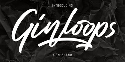 Ginloops is a fancy unique script font. With bold stroke, slanted and fun character with a bit of ligatures and extra swashes. To give you an extra creative work. Ginloops font support multilingual more than 100+ language. This font is good for logo design, Social media, Movie Titles, Books Titles, a short text even a long text letter and good for your secondary text font with sans or serif. Make a stunning work with Ginloops font. Cheers, MaulanaCreative
 - Regon by Dicubit,
$9.00 Regon is a modern sans serif typeface/font family (18 fonts) designed with carefully handcrafted. This perfectly made to be applied in logo or branding, stationery, books, packaging, fashion, magazines, t-shirt, novels, labels and many advertising purposes. Styles: Thin, Extra Light, Light, Regular, Medium, Semi Bold, Bold, Extra Bold, Black (All with Italic). Features: Uppercase, Lowercase, Number, Punctuation, Symbol, Multilingual. All the pictures used in the preview are not included. They are intended only for illustration purpose.
 - Silo Soft by TypeUnion,
$25.00 Designed and built in London by TypeUnion, Silo soft is a fluid sans serif typeface embodying energetic curves and a clean, functional structure. The Silo Soft Family is made up of 6 weights, which range from a delicate Extra-Light, all the way through to a punchy, loud Extra-bold and each carry a versatility for multiple applications and uses. Silo soft features open type alternate characters, and extensive language support to provide a flexible, substantial user experience.
 - Remah Pro by Rosario Nocera,
$12.00 Originally created in 2014 but redesigned and improved in 2020, Remah Pro is an eclectic and versatile sans serif font family consisting of 5 weights, from extra light to extra bold with its respective condensed. When looking for something different, Remah Pro is certainly the best choice: the wavy shapes that defines it are intertwined with clean cuts and sharp edges, making it suitable for typographic experimentation and ideal for display work, logo design, posters and billboards.
 - MC South Great by Maulana Creative,
$13.00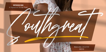 Southgreat is an expressive signature script font. With regular felt-tip stroke, fun character with some of ligatures and extra swash. To give you an extra creative work. Southgreat font support multilingual more than 100+ language. This font is good for logo design, Social media, Movie Titles, Books Titles, a short text even a long text letter and good for your secondary text font with sans or serif. Make a stunning work with Southgreat font. Cheers, MaulanaCreative
 - Qualyters by Maulana Creative,
$14.00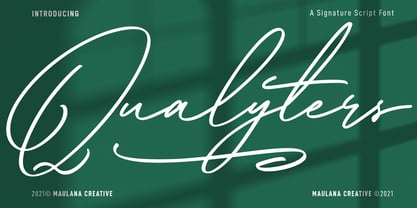 Qualyters is a fancy unique signature script font. With clean mono-line stroke, fun character with a bit of ligatures and extra swash. To give you an extra creative work. Qualyters font support multilingual more than 100+ language. This font is good for logo design, Social media, Movie Titles, Books Titles, a short text even a long text letter and good for your secondary text font with sans or serif. Make a stunning work with Qualyters font. Cheers, MaulanaCreative
 - Quickstages by Maulana Creative,
$14.00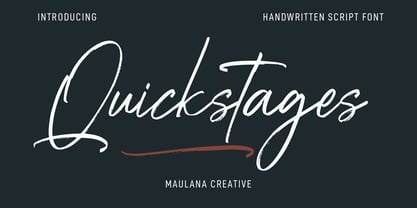 Quickstages is an expressive brush script font. With bold contrast stroke, fun character with a bit of ligatures, alternates and extra swash. To give you an extra creative work. Quickstages font support multilingual more than 100+ language. This font is good for logo design, Social media, Movie Titles, Books Titles, a short text even a long text letter and good for your secondary text font with sans or serif. Make a stunning work with Quickstages font. Cheers, Maulana Creative
 - Night Wind Sent by Ana's Fonts,
$12.00 Night Wind Sent is an elegant handwritten script font family inspired by old-fashioned handwritten postcards and letters. It includes ligatures (for a true handwritten feel), stylistic alternates, handwritten small caps, and swashes (for an extra bit of drama). Plus! Extra versions of the font: underline and strikethrough, and an ornaments font, to help decorate your text. Night Wind Sent is perfect for any design that needs a handwritten look, such as signatures, notes and quotes, logos and branding.
 - Ironhopes Monoline Signature by Maulana Creative,
$13.00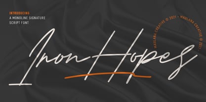 Ironhopes is a casual classic signature script font. With light mono-line stroke, fun character with some of ligatures and extra swash. To give you an extra creative work. Ironhopes font support multilingual more than 100+ language. This font is good for logo design, Social media, Movie Titles, Books Titles, a short text even a long text letter and good for your secondary text font with sans or serif. Make a stunning work with Ironhopes font. Cheers, MaulanaCreative
 - Pinup New by Gleb Guralnyk,
$14.00 Hi, introducing a smooth vintage font - Pinup New. It has a nice tasty shape with a tiny separate accents. Pinup New font supports most of the european languages and also has ukrainian cyrillic characters. Pinup New consists of three fonts with separate accents for more convenient manipulating and recoloring. Also there are an extra characters with modifyed letters shape, such as ligatures and alternates. Make sure that your app does support an OpenType features to access this extra characters.
 - Olney by Philatype,
$20.00 A square sans stripped down to basic, neutral shapes. Olney is primarily a display family with lighter weights that will remain legible at text sizes. The letterforms of Olney are designed to appear consistent, sturdy, and technical. Careful attention was given to the pure, almost modular forms, to ensure that the family looks timeless, rather than resorting to a contemporary or futuristic aesthetic. Each weight includes a thorough set of diacritics for Western and Central European languages.
 - Inerta by Mint Type,
$35.00 Inerta is a neutral, but not flavourless, cross between a geometric sans and a neo-grotesk. It is designed to work perfectly in UI/UX applications, and to remain readable in smallest font sizes. With over 950 glyphs, the font family offers extensive language support and many typesetting options to choose from. The typeface can be customised with several sets of alternate glyphs and OpenType features. The Cyrillic part contains alternates for Bulgarian as well as alternative Ukrainian forms.
 - Citadina by Graviton,
$24.00 Citadina font family has been designed for Graviton Font Foundry by Pablo Balcells in 2016. It is a sans serif typeface with a geometrical, mechanic, neutral appearence and a slightly condensed design which makes it particularly effective for space economizing. It has been conceived to be most suitable for short and middle length text blocks, as well as on all sized headlines. Citadina consists of 12 styles. Each containing small caps and glyph coverage for several languages.
 - Kanyon by Hurufatfont,
$19.00 Kanyon is a family of typefaces created from basic geometric forms based on the equal width system. Its clean and neutral structure and 3 different widths provide ease of use in different design channels. With its rich OpenType features, multi-language support and small capital characters, it has a wider usage area than its counterparts. Ideal for packaging, labels, routing designs, mobile applications, brand designs, logos, all kinds of presentation and editorial designs, indoor and outdoor printing works.
 - Cern by Wordshape,
$20.00 Cern is a family of20 weights of neutral, yet formally nuanced grotesk typefaces that takes inspiration from the original metal types from Switzerland, yet had a slightly larger x-height for more pronounced legibility. Cern is designed to be highly readable in print and on-screen. The italic variations are true italics and have been designed for smooth, fluid reading and text-setting. The Cern family works equally well for text typesetting and for display design work.
 - Config by Adam Ladd,
$25.00 Config was influenced by geometric sans with circular forms but the proportions have been condensed by incorporating straight sides for a design that is sturdy and efficient yet friendly. The neutral design with subtle details makes it functional for type setting in small and large sizes. Its clean nature makes it readable at small sizes but the touch of character—as seen in the notched joints, rounded details, and horizontal/vertical terminals—make it interesting at large sizes.
 - Gunar by The Northern Block,
$39.00 A geometric sans serif with a square chiseled appearance. Precise curves are met with straight lines and tapered angles to produce a fresh, technical typeface. It’s large x-height and neutral width give it good legibility at small point sizes. These refined rectangular features make it ideally suited to a wide range of modern applications. Details include 550 characters with alternative lowercase a, e, g and y. 5 variations of numerals, manually edited kerning and Opentype features.
 - Boqueta by BRtype,
$18.00 The design of Boqueta was inspired in stencil and modular forms. The project was selected for Bienal Letras Latinas 2006. The three styles include 21 discretionary ligatures.
 - Price Tag by Turtle Arts,
$20.00Price Tag is a bold, graphic alphabet inspired by labels and vintage price tags. A touch of grunginess makes this alphabet look extra cool in larger sizes. - Tauern by ParaType,
$25.00 A family of extra compressed styles designed at ParaType in 1993 by Alexander Tarbeev. For use in advertising and display typography. Decorative versions were added in 1996.
 - Hiew by Okaycat,
$29.95 Okaycat presents "Hiew". Hiew is a connected font with serif, some bold personality making your message clear. Includes European accents and extra characters to meet publication needs.
 - George Gibson by Baseline Fonts,
$24.00George Gibson is based on handwriting samples dating back to mid-1800s England. The font features additional characters for foreign language support, as well as extra glyphs.