1,905 search results
(0.017 seconds)
- Home Address JNL by Jeff Levine,
$29.00
- Saturate - Unknown license

- HippityDippity by Ingrimayne Type,
$9.00
- Unknown Error - Unknown license

- Honeymoon by Haksen,
$13.00
- Haymer by Greater Albion Typefounders,
$9.50
- Ashley Crawford AT by Monotype,
$29.99 - DS Kolovrat - Unknown license

- DS Yermak_D - Unknown license

- DSCyrillic - Unknown license

- DS Sharper - Unknown license

- DSMotterHo - Unknown license

- DS Motter Style - Unknown license

- DS Rada - Unknown license

- DS Progress - Unknown license

- Archive Garfield by Archive Type,
$19.95 - Ripster by RodrigoTypo,
$29.00
- DS Rada_Double - Unknown license

- Futhark AOE - Unknown license

- Stylo - Unknown license

- Steelyard by TypeArt Foundry,
$45.00
- Sutro Initials by Parkinson,
$20.00
- DS OlymPix - Unknown license

- DS Moster - Unknown license

- DS Hiline - Unknown license

- DS Init - Unknown license

- DS VTCorona Cyr - Unknown license

- DS Izmir - Unknown license

- Spinosa BT by Bitstream,
$50.99 - DS Stamp Cyr - Unknown license

- DS Eraser Cyr - Unknown license

- DS BroadBrush - Unknown license

- Nadejda - Unknown license

- DS Motion Demo - Unknown license

- Cruise by Funk King,
$5.00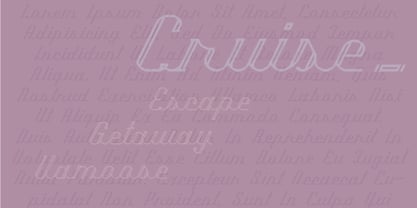
- Bing by Galapagos,
$39.00 - Competition by sportsfonts,
$15.00
- DS Down Cyr - Unknown license

- DS CenturyCapitals - Unknown license

- DS FlashSerif - Unknown license


